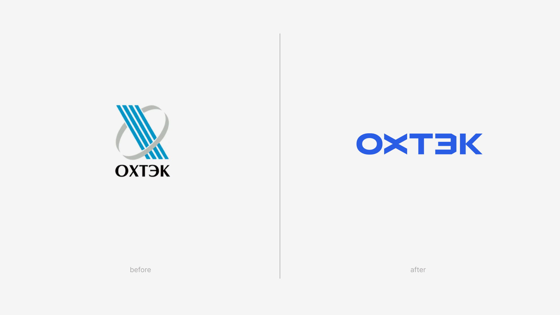
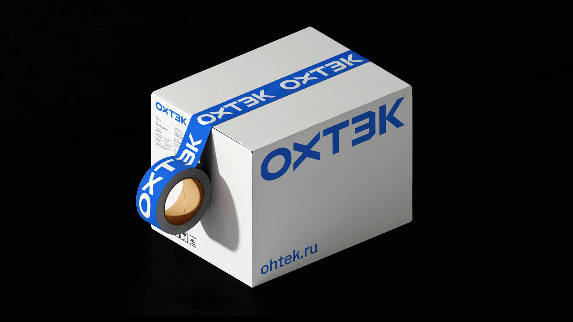
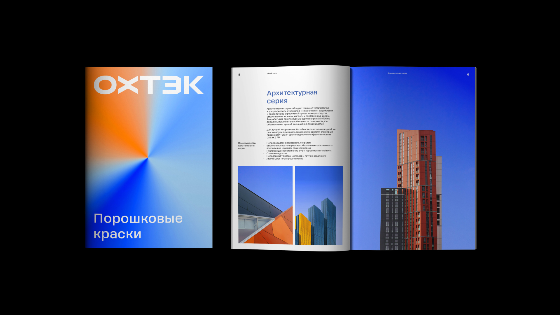
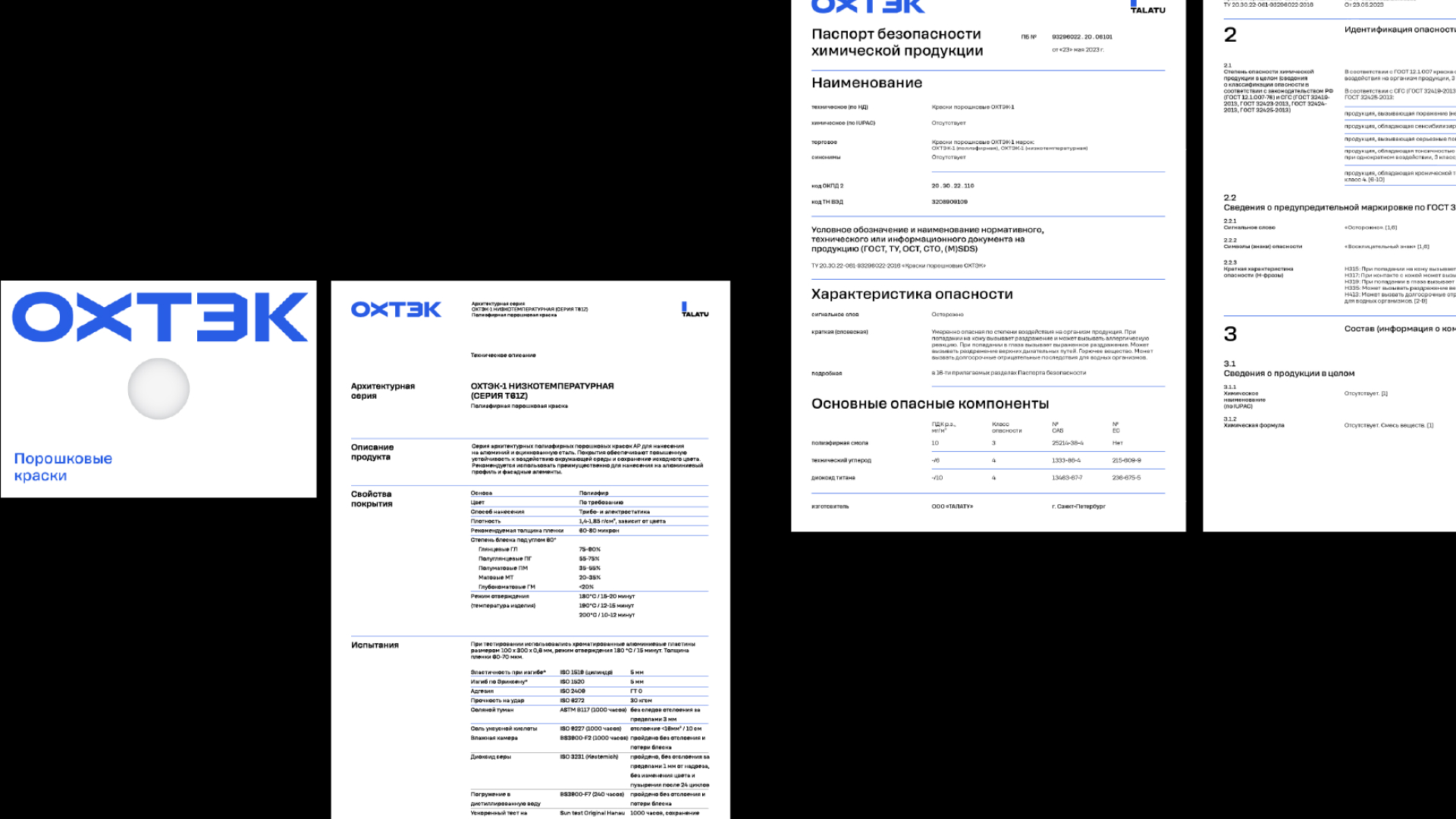
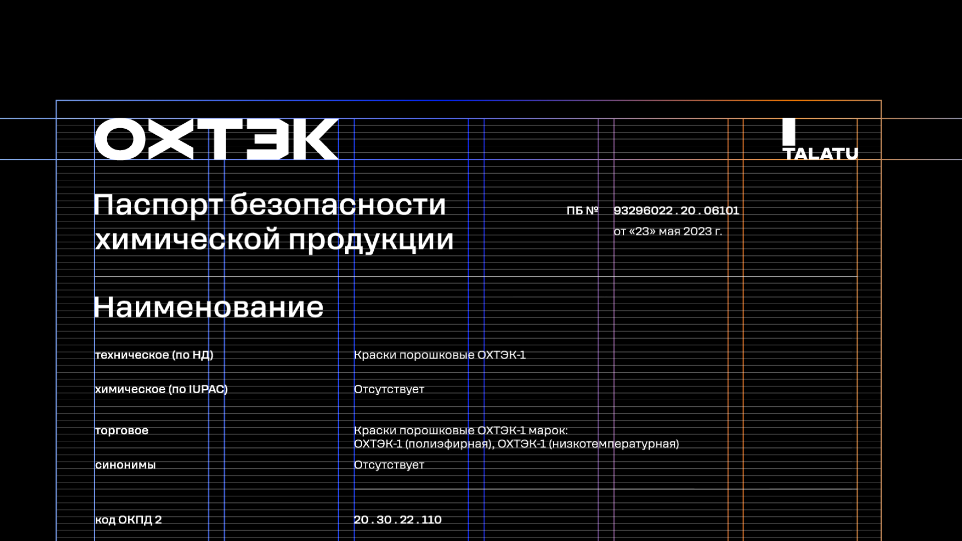
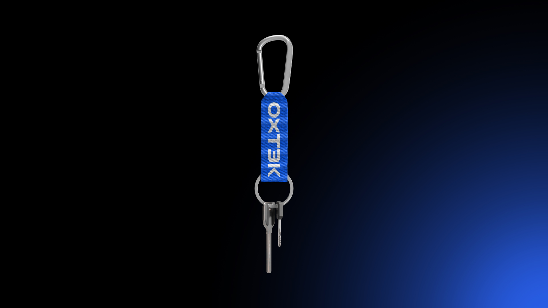
The Linii agency developed the brand identity and layout design for the Ohtek brand communication media. The wide range of paint applications became the main metaphor in the corporate style for the updated Okhtek trademark of the Talatu brand.
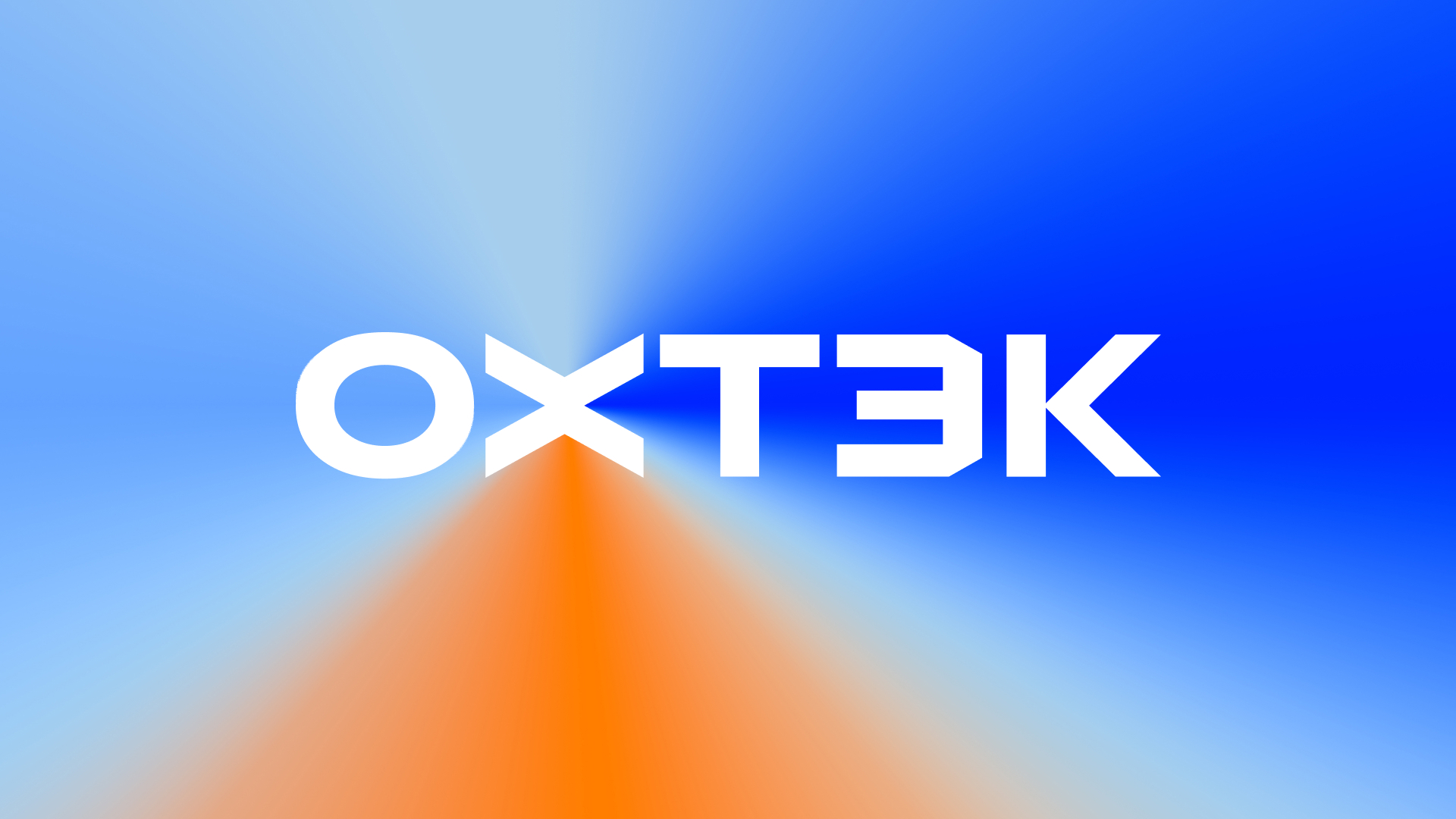
The idea of the logo is an accent letter x, which combines several symbols: the sprayer used to apply powder paints to surfaces served as an allusion to a wide range of coatings and application situations.
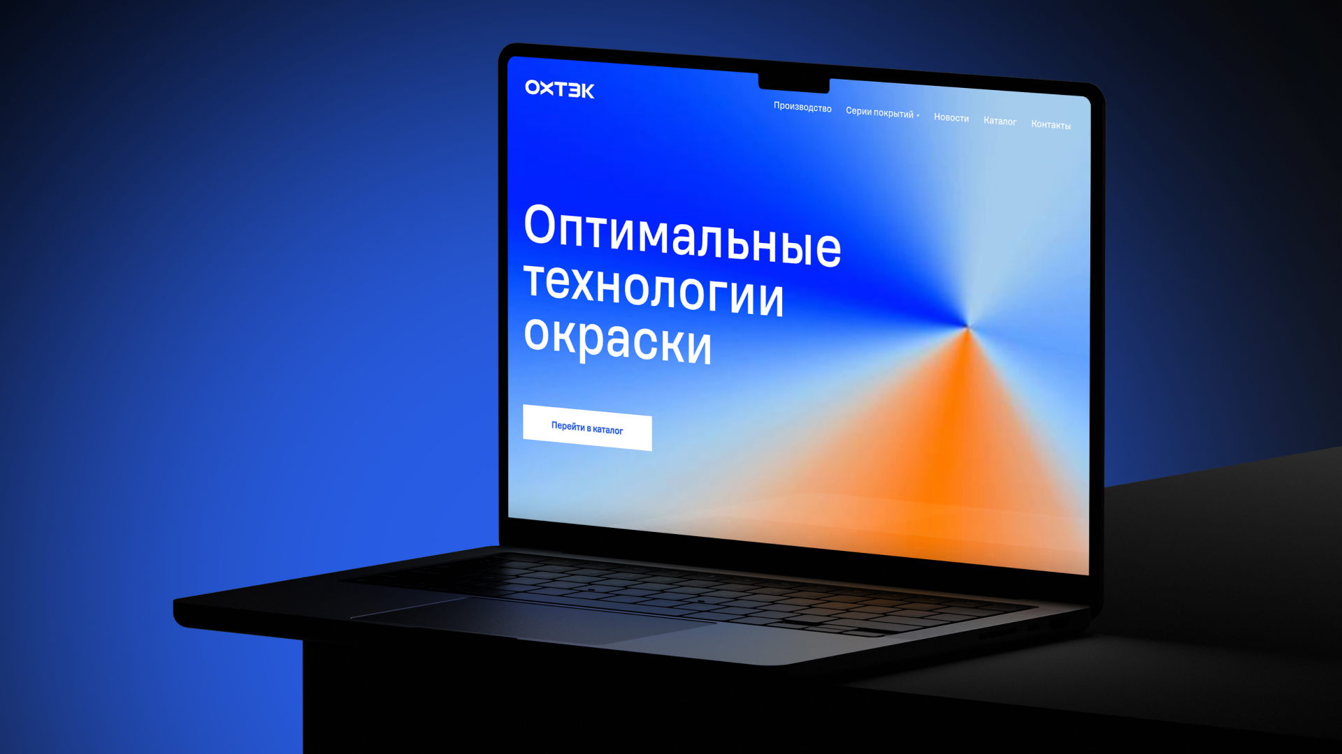
The blue color is the main one in the identity. Additional colors are used to create a vibrant gradient and can also help with photo manipulation. The basic version of the gradient is radiating from the center with a specific color order to achieve maximum contrast.
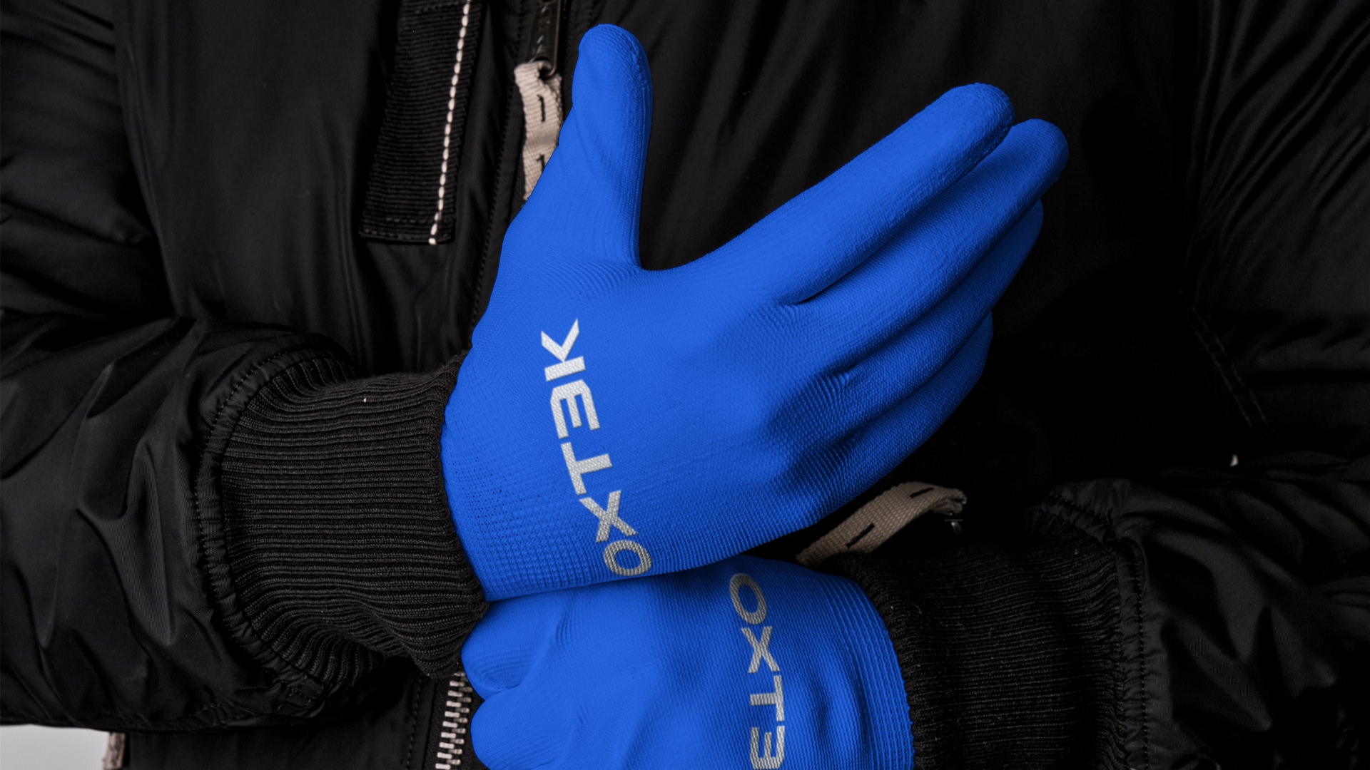
The photo style uses close-ups of finished products covered with powder coating, photographs of people directly involved in the process of applying paint, as well as large architectural or industrial objects covered with paint.

CREDIT
- Agency/Creative: LINII
- Article Title: Ohtek Brand Identity by Linii: A Fresh Take on Paint Application Design
- Organisation/Entity: Agency
- Project Type: Identity
- Project Status: Published
- Agency/Creative Country: Russia
- Agency/Creative City: Moscow
- Market Region: Europe
- Project Deliverables: 2D Design, Brand Design, Brand Identity, Web Design
- Industry: Manufacturing
- Keywords: powder; paints; identity
-
Credits:
Creative director: Tema Semenov
Creative director: Yulya Plotnik
Art director: Anya Pazyuk
Designer: Daria Panyukova
Designer: Nastya Kuprina
Designer: Anton Andreev
Project manager: Anastasia Shibalkina
Designer: Anya Sitnikova


