


About: Can we make the design of a brand that makes products for harmonious households more harmonious? Absolutely! We have developed a new image for Plast Team, a manufacturer of eco-friendly plastic: Nordic restraint, but full of warmth, comfort and meaning. Plast Team, a company with Danish roots, specialises in home products made of plastic and positions itself as a universal brand. Here everything is organised — for the kitchen, bathroom, dressing room and garden. Being a confident leader in the market, the company, however, at some point faced the need for rebranding. A large number of lines, a wide range of products – all this required more clarity and structure, as well as a concept and image that would be easy to grasp.So, Ohmybrand had several tasks: development of a design concept, differentiation by product lines and creating a unified system of pictograms.
Concept: One of the distinctive features of Plast Team is their “harmonies” – sets of products designed to create the feeling of comfort and order, a kind of ideal world where everything is organized. In addition, it was important to emphasize the environmental friendliness and safety of the brand — they use recyclable plastic and only safe materials. Moreover, they are socially responsible and minimalistic in a European way.Based on the Danish origin of the brand, we decided to make the notion of “Scandinavian harmony” the basis for positioning — warmth, comfort and conciseness that create an image of hygge. This is how the concept of “a city for people” was born. This is a city where everything fits the inhabitants, where it is cozy not only in summer, but also during the long winter. The city has its own image and uniqueness, but it is always harmonious, without visual noise and fuss.
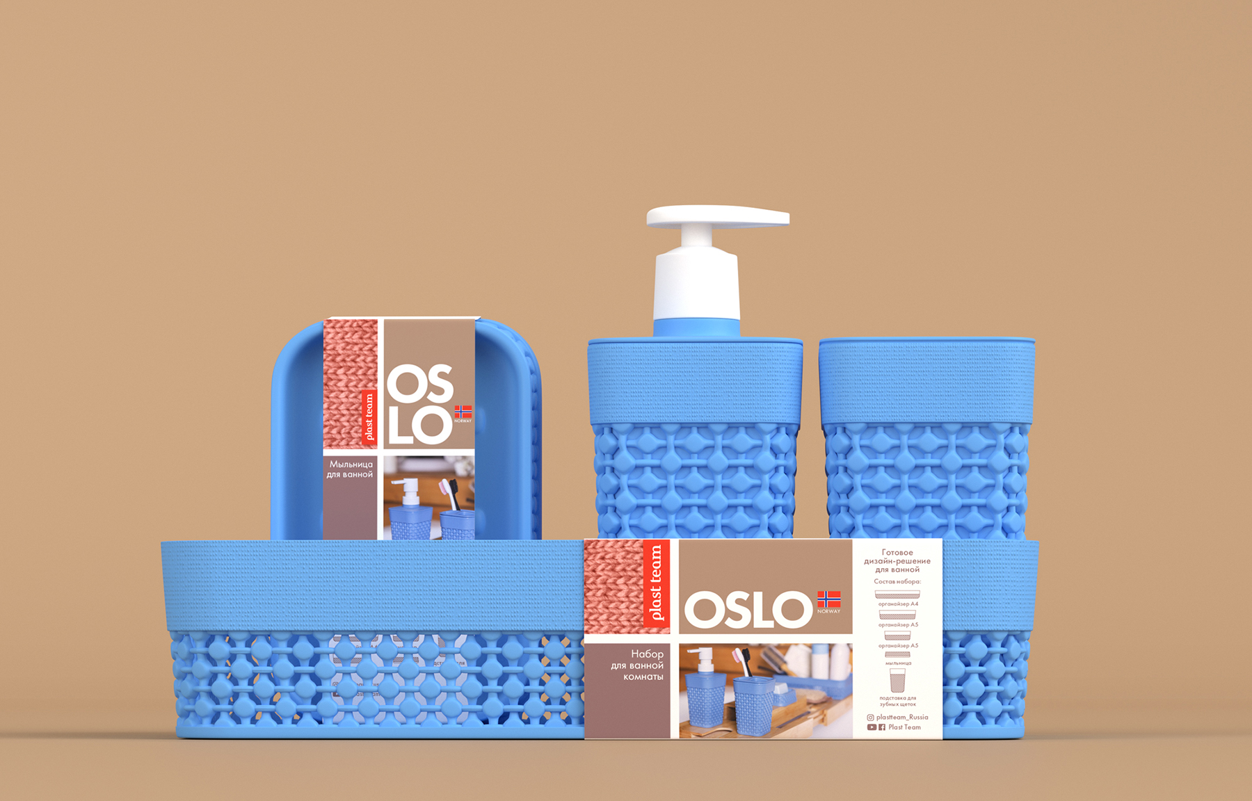
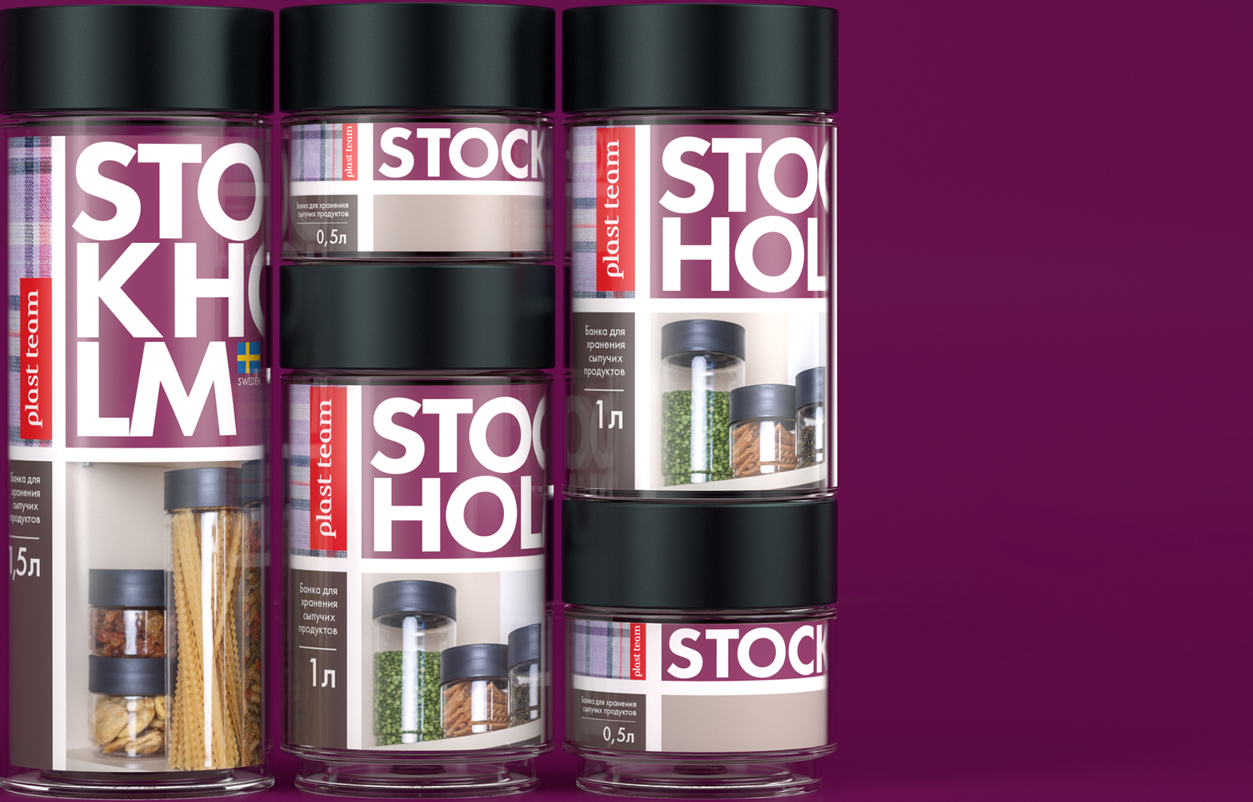
Visual solution: The design for Plast Team is based on the concept of the Scandinavian countries flags that consist of four sectors. All the necessary information is placed in the vertical and horizontal sectors — the name of the line, a recognisable texture, whether it is a knitted fabric or wood, the name of the product as well as a block of pictograms. Each line has its own colour scheme, but the shades and structures are always warm, muted and pastel, which fits in with the general mood of the brand’s new positioning.
So, there are rational and modern Oslo, traditional and comfortable Stockholm, solid and respectable Bergen, innovative and progressive Copenhagen. Which city to choose?
CREDIT
- Agency/Creative: Ohmybrand
- Article Title: Ohmybrand Rebranding of Plast Team Trademark
- Organisation/Entity: Agency
- Project Type: Packaging
- Project Status: Published
- Agency/Creative Country: Russia
- Agency/Creative City: Moscow
- Market Region: Asia, Europe
- Project Deliverables: Brand Identity, Brand Redesign, Creative Direction
- Format: Basket, Bucket, Can, Jar
- Substrate: Glass Bottle, Plastic, Pulp Paper
- Industry: Retail
- Keywords: packaging, design, eco-plastic, home, Scandinavian design, orginisers
-
Credits:
Creative Director: Nadie Parshina
Art Director: Anna Rufova


