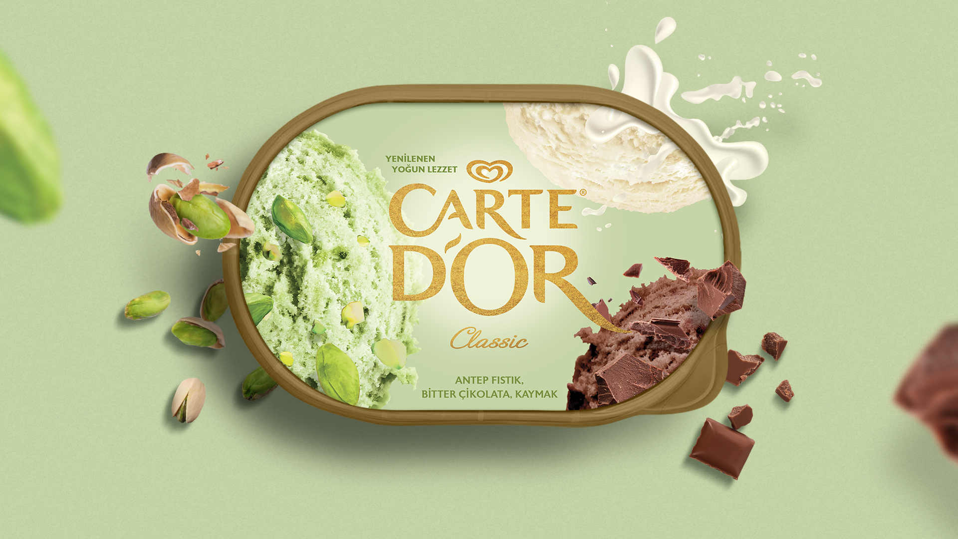
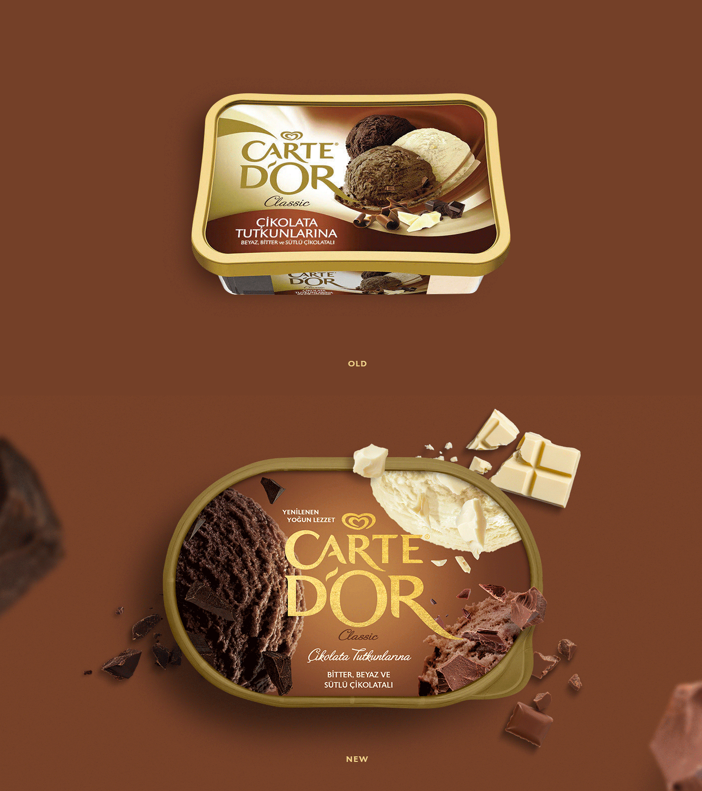
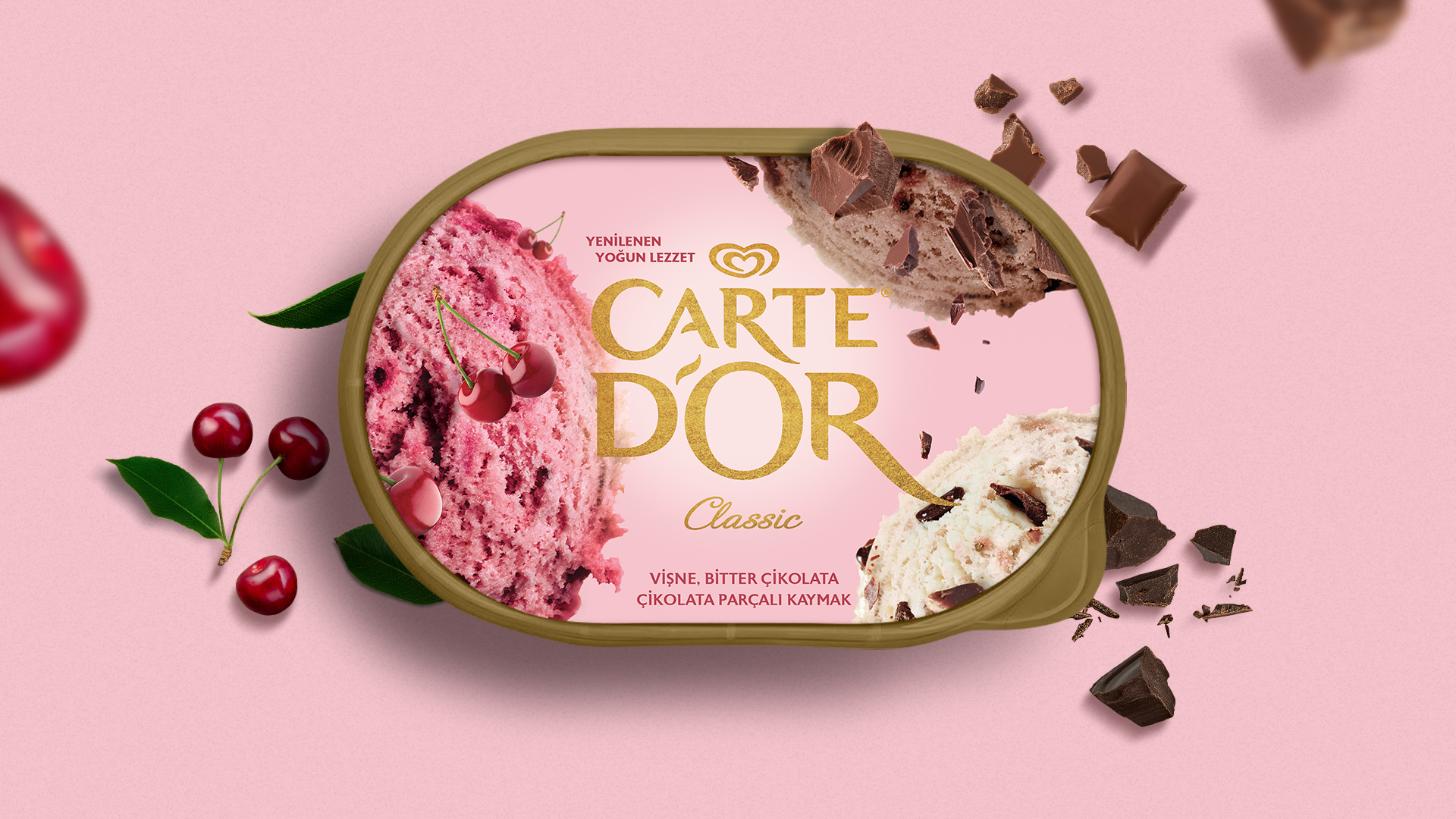
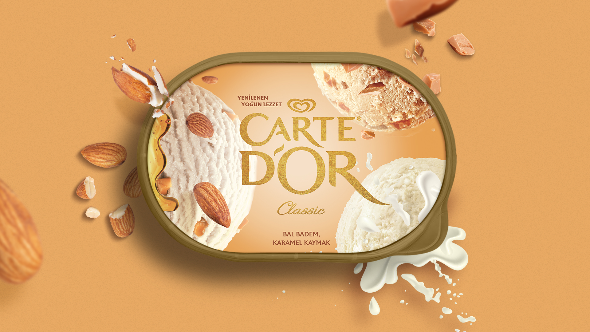
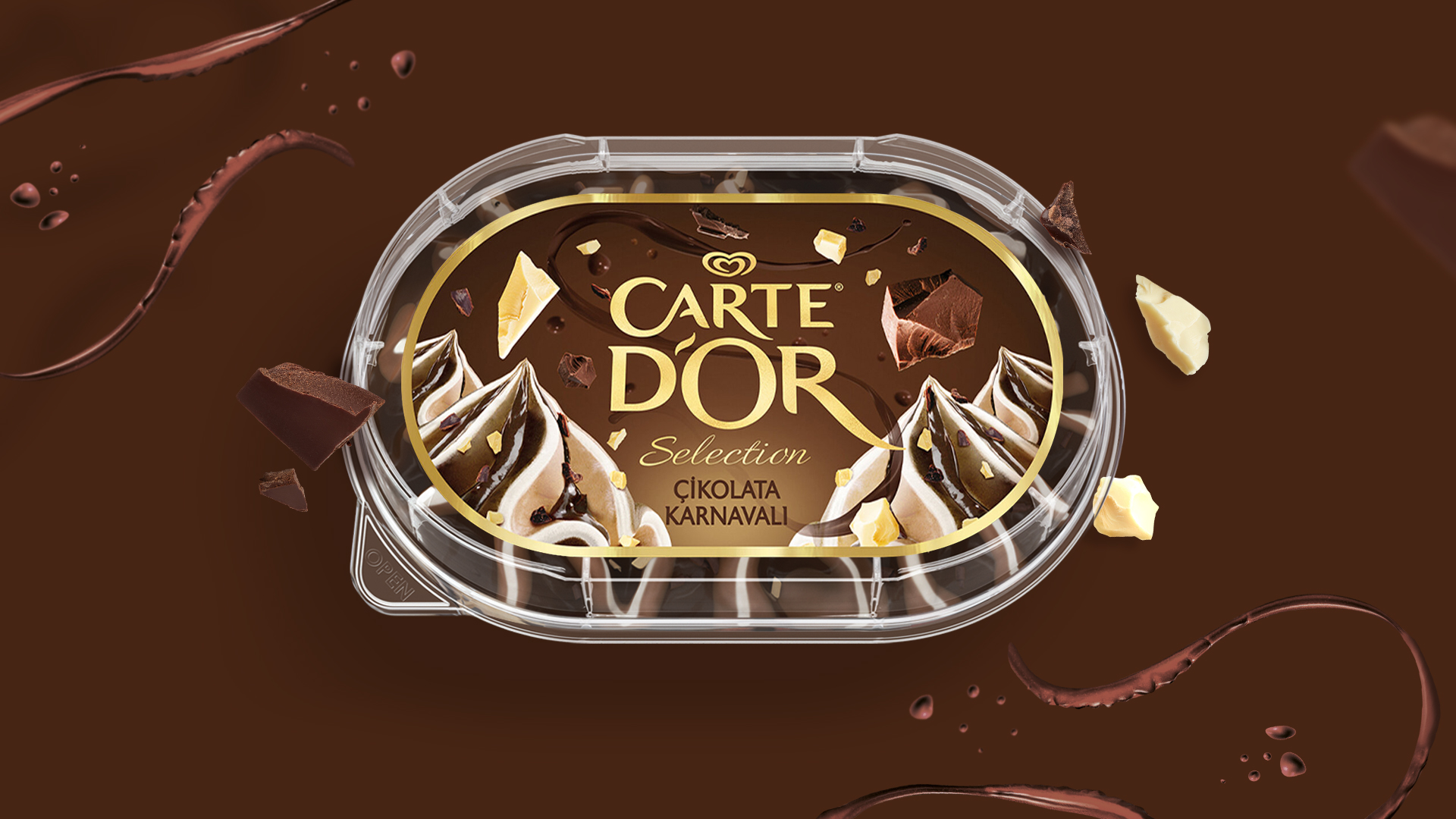
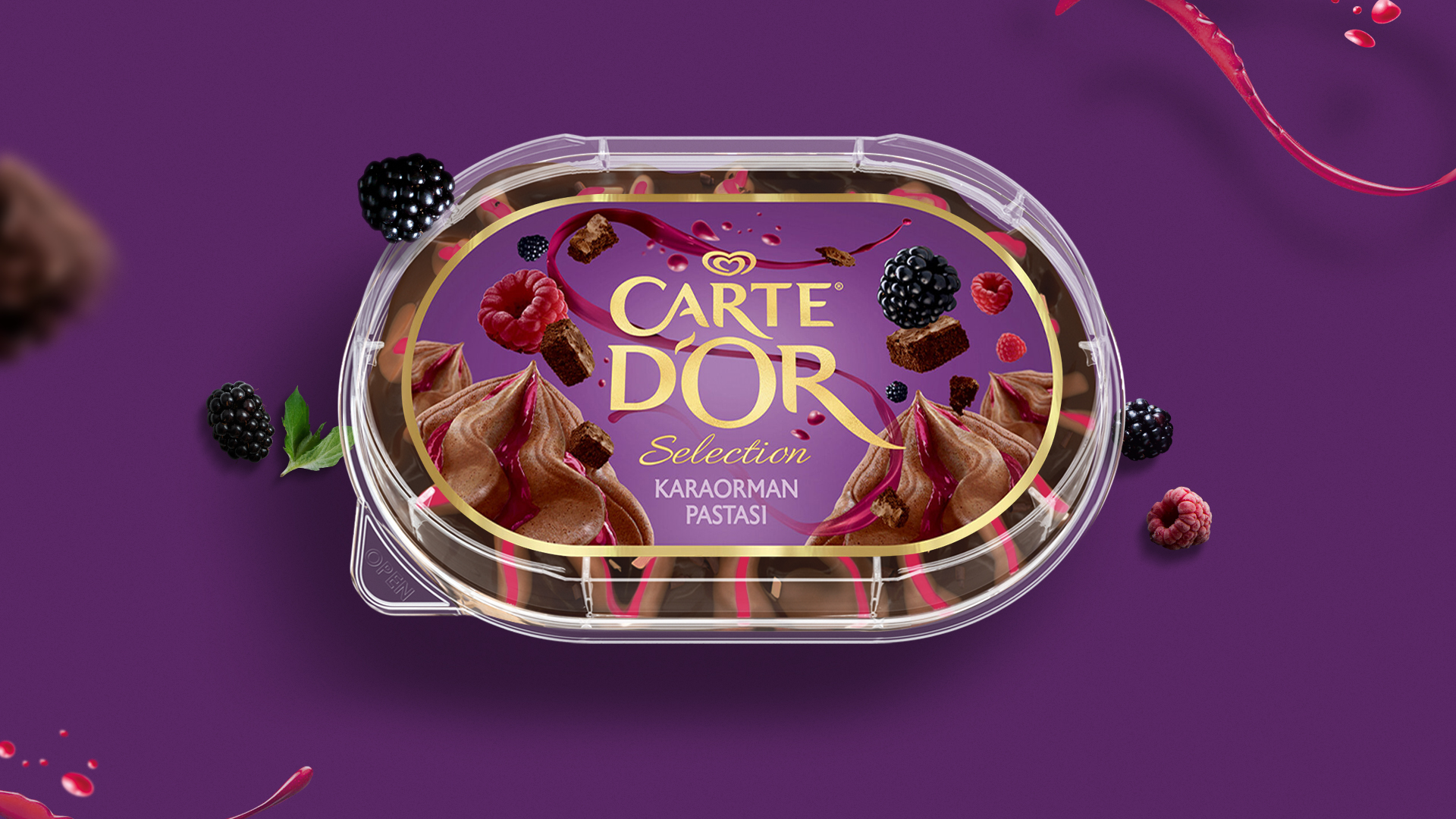
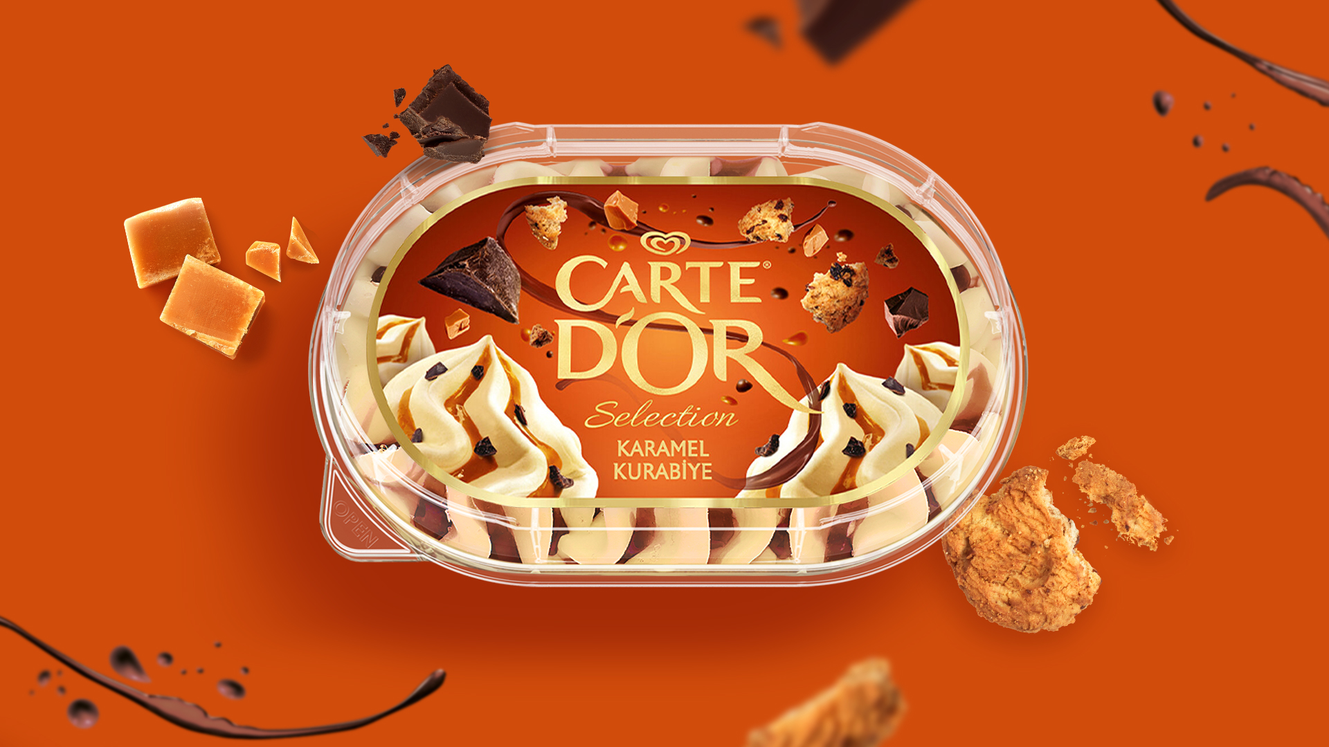
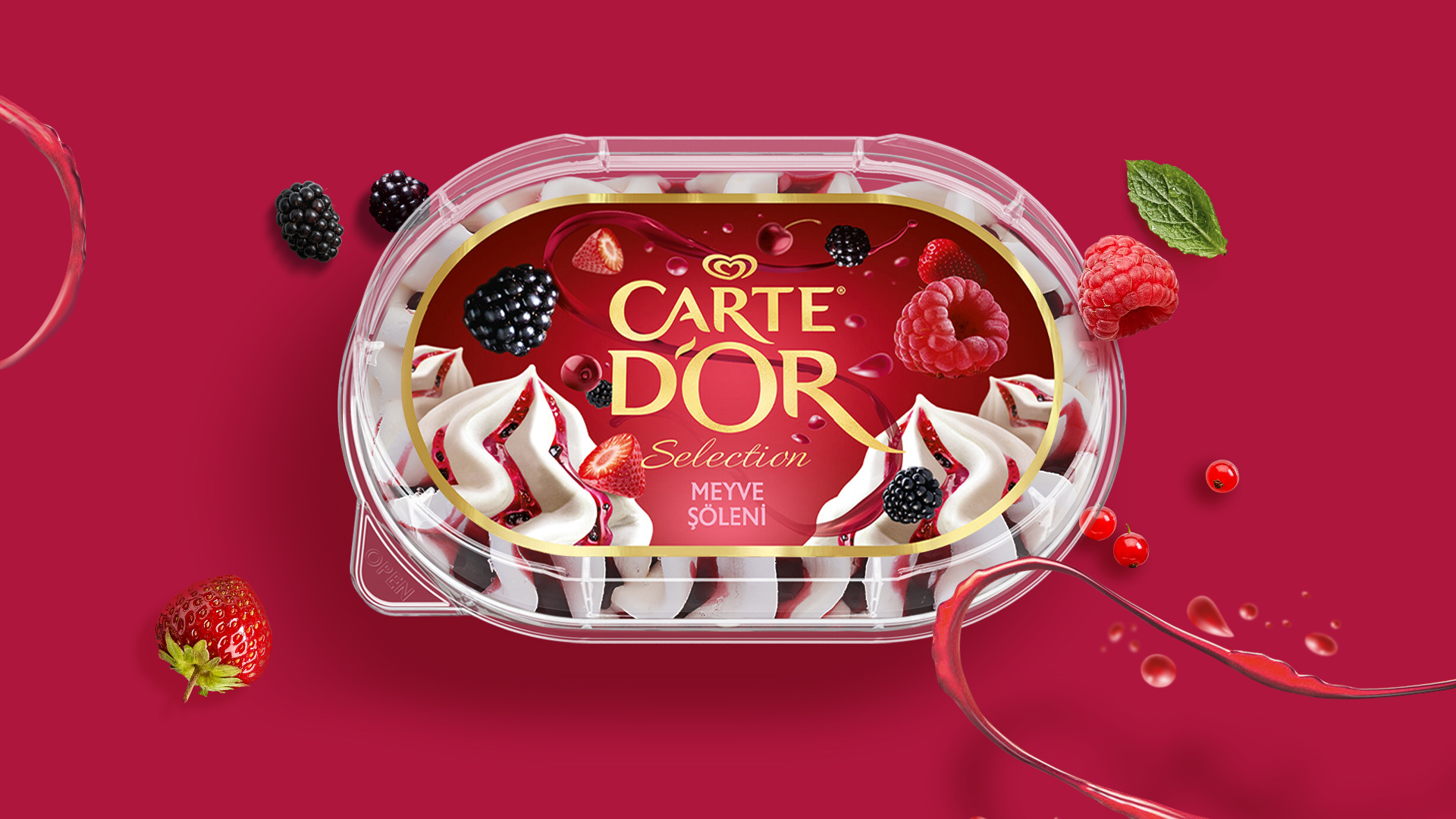
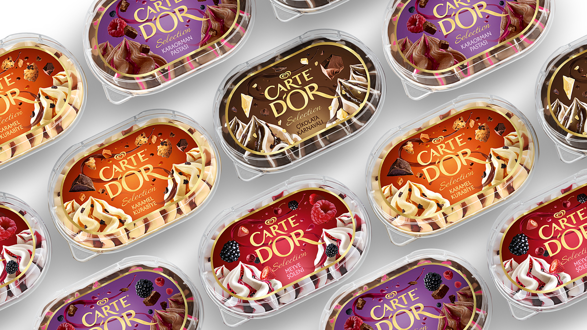
Designing packaging for ice-creams require unique nuances in comparison with other F&B packaging work. For example, you need to make sure that the visuals are just as appetizing even when the surface of the pack is frozen and/or covered with ice. This is why a lot of attention should be paid to the color scheme used and the relationship between various visual elements. This is the balance where we focused our efforts on. We aimed to build a meaningful relationship between the typographical and photographic elements while maintaining the modular integrity of the series as a whole.
We have implement the structure built in Carte d’Or Classic series onto the Carte d’Or Selection line as well.
CREDIT
- Agency/Creative: Ogilvy İstanbul
- Article Title: Ogilvy Istanbul Create New Carte d’Or Packaging Design
- Organisation/Entity: Agency, Published Commercial Design
- Project Type: Packaging
- Agency/Creative Country: Turkey
- Market Region: Europe
- Project Deliverables: Graphic Design, Packaging Design, Rebranding, Tone of Voice
- Format: Box
- Substrate: Plastic
FEEDBACK
Relevance: Solution/idea in relation to brand, product or service
Implementation: Attention, detailing and finishing of final solution
Presentation: Text, visualisation and quality of the presentation


