


Oenou Yi – Winery Rebranding & Packaging Design
At the heart of Omodos village, one of Cyprus’ most picturesque wine regions, Oenou Yi carries forward a story of tradition and terroir with a fresh contemporary identity. The rebranding and packaging design are built around the spirit of place, celebrating both the authenticity of local varieties and the elegance of modern winemaking.
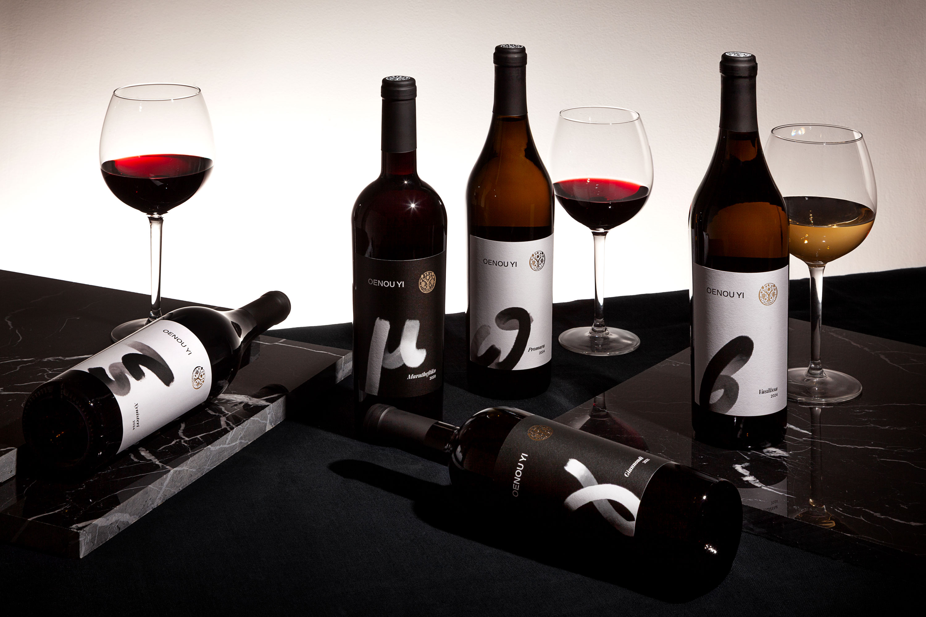
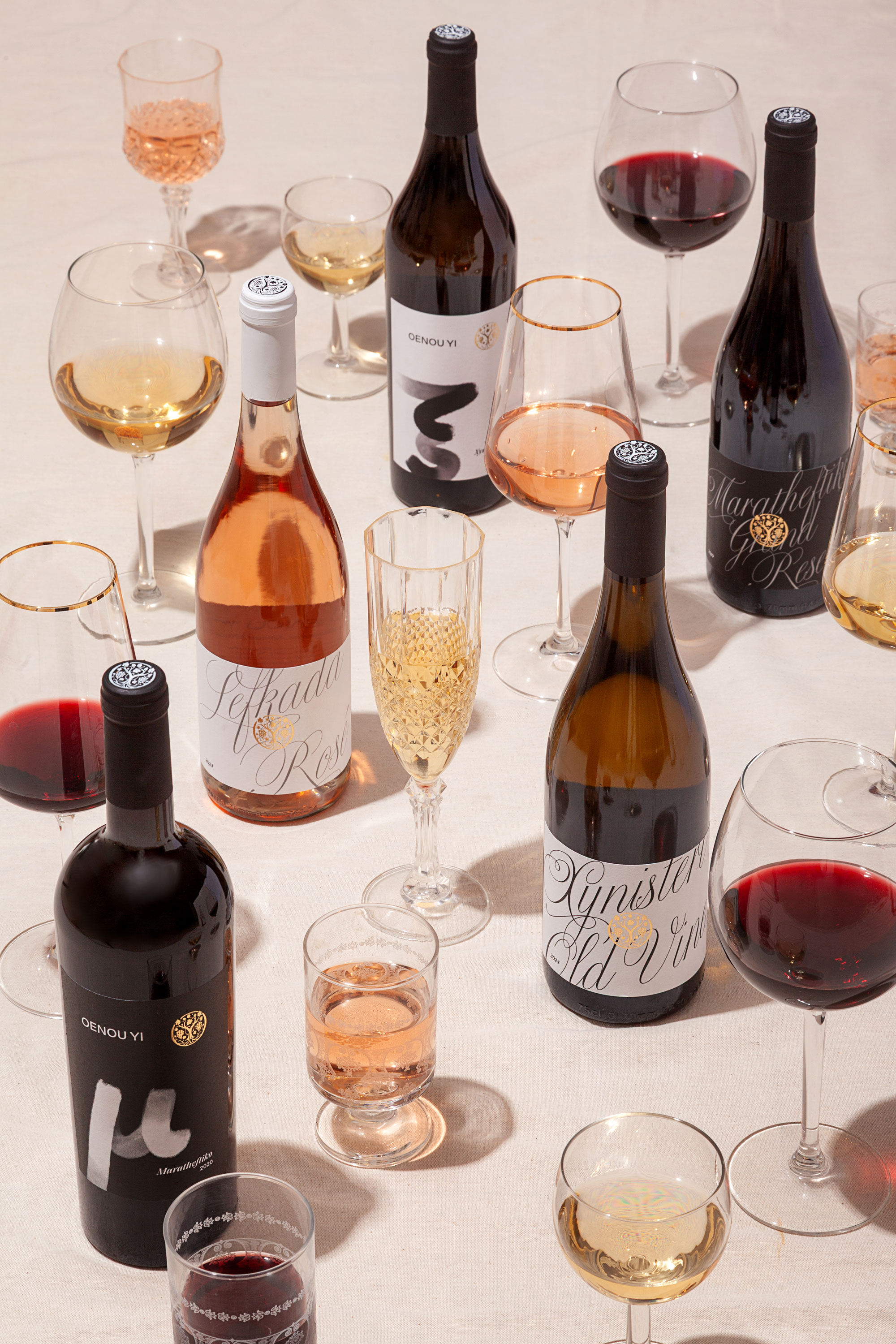
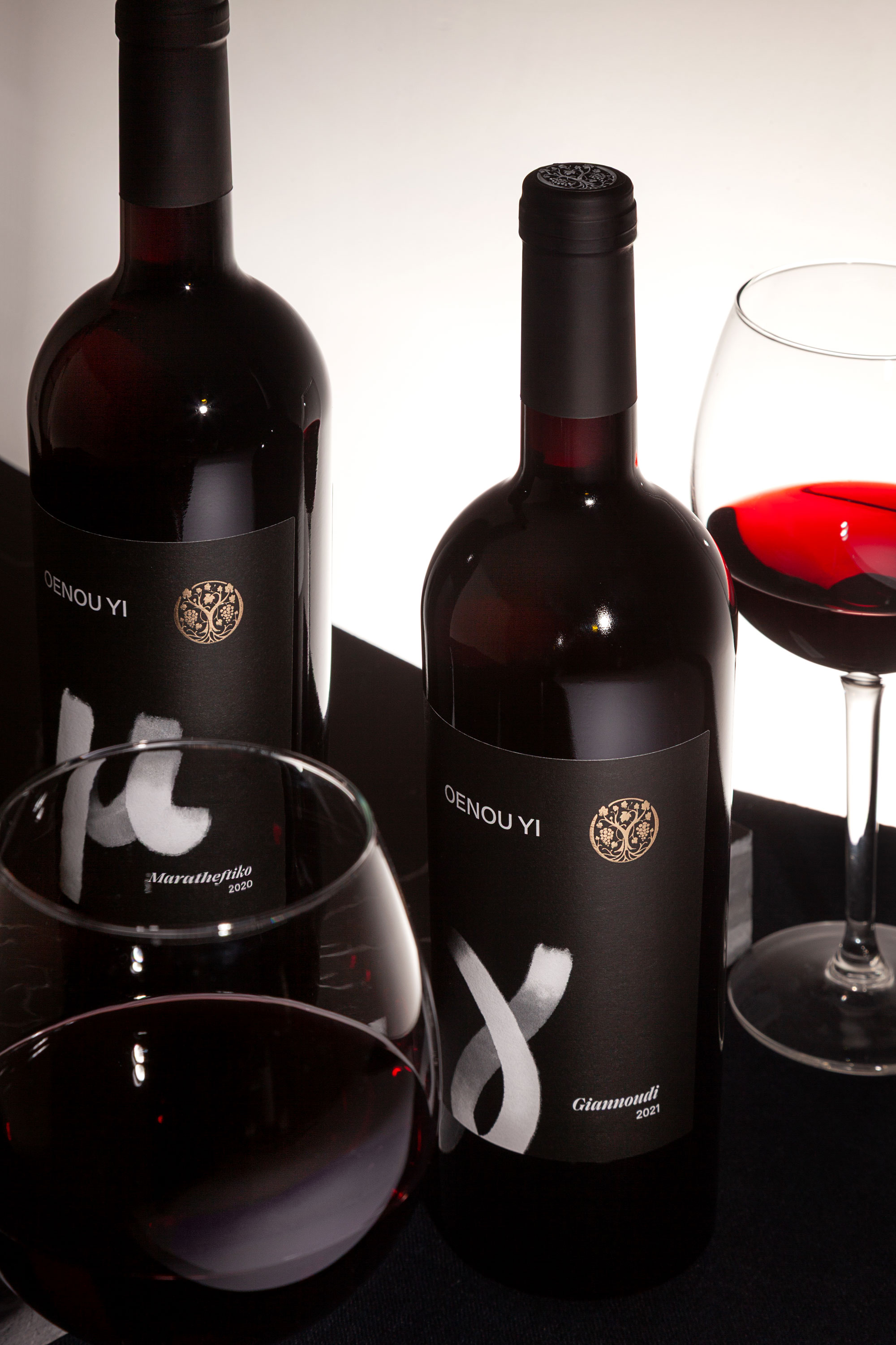
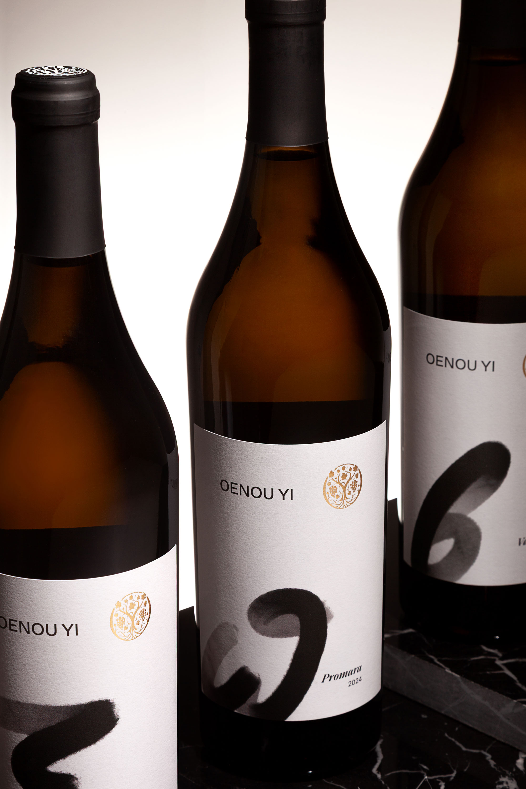
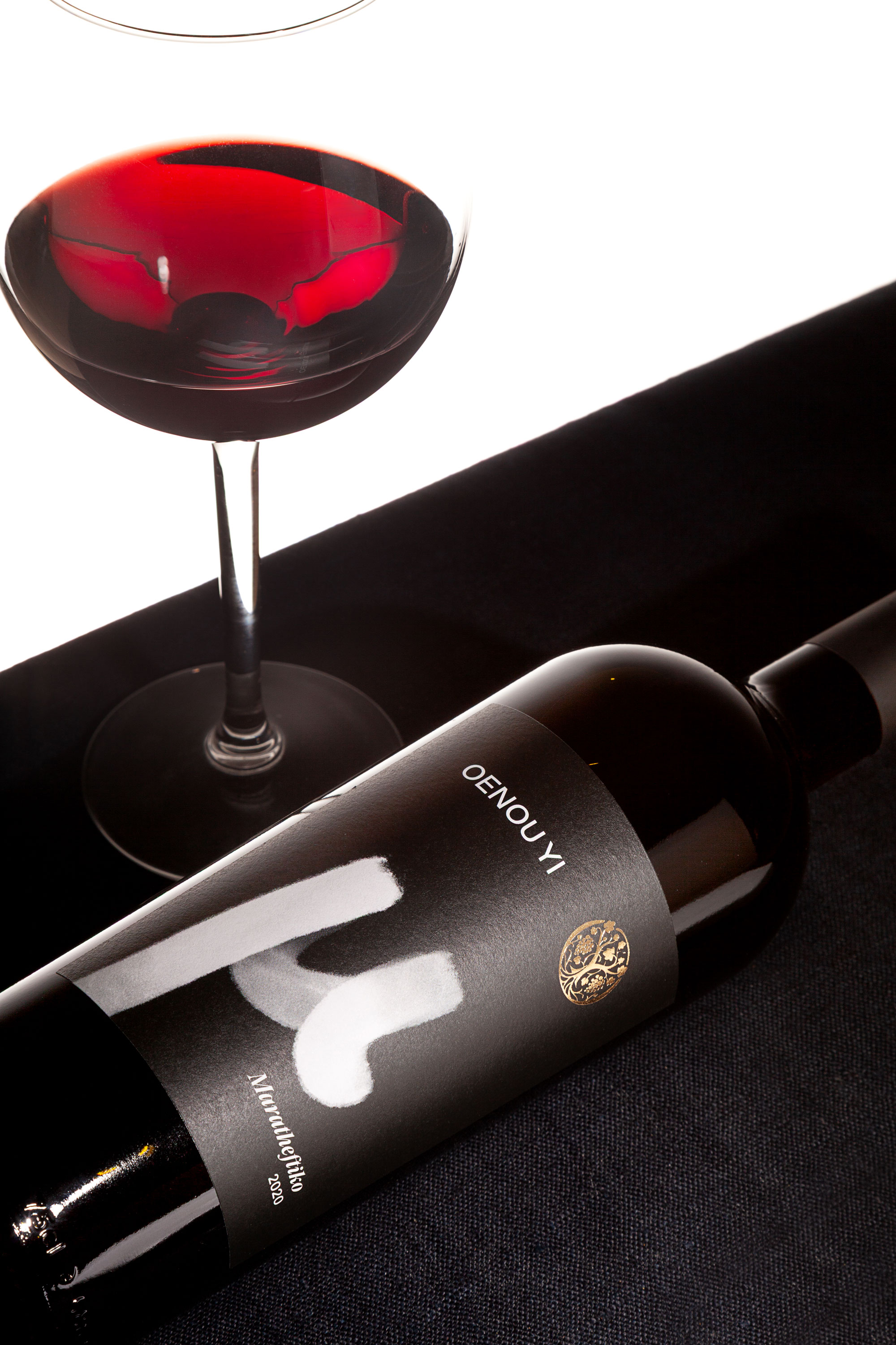
The Indigenous Series pays homage to Cyprus’ native grapes through a strikingly simple yet powerful system. Each wine is represented by the first Greek letter of its variety—an emblematic symbol that transforms the alphabet into a visual tribute to heritage. The iconic Μ for Μαραθευτικό or Ξ for Ξυνιστέρι becomes not only a letter but a proud marker of identity.
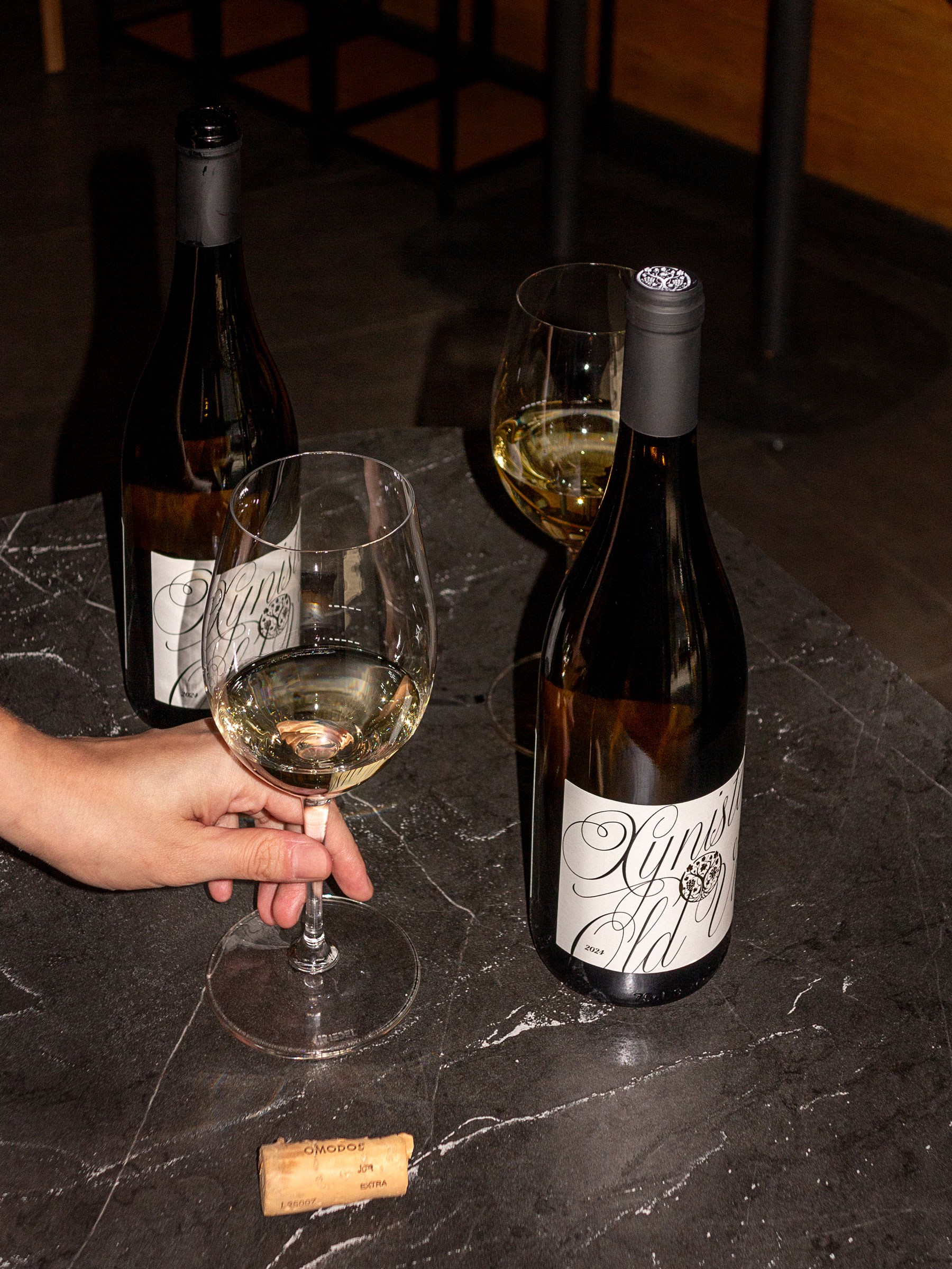
For the Horeca line, the design shifts into a more glamorous and expressive voice. Bold calligraphy defines this collection, exuding sophistication and vibrancy, tailored to stand out in restaurants, hotels, and bars. The dynamic typographic style speaks of celebration, refinement, and the joy of sharing wine in lively settings.
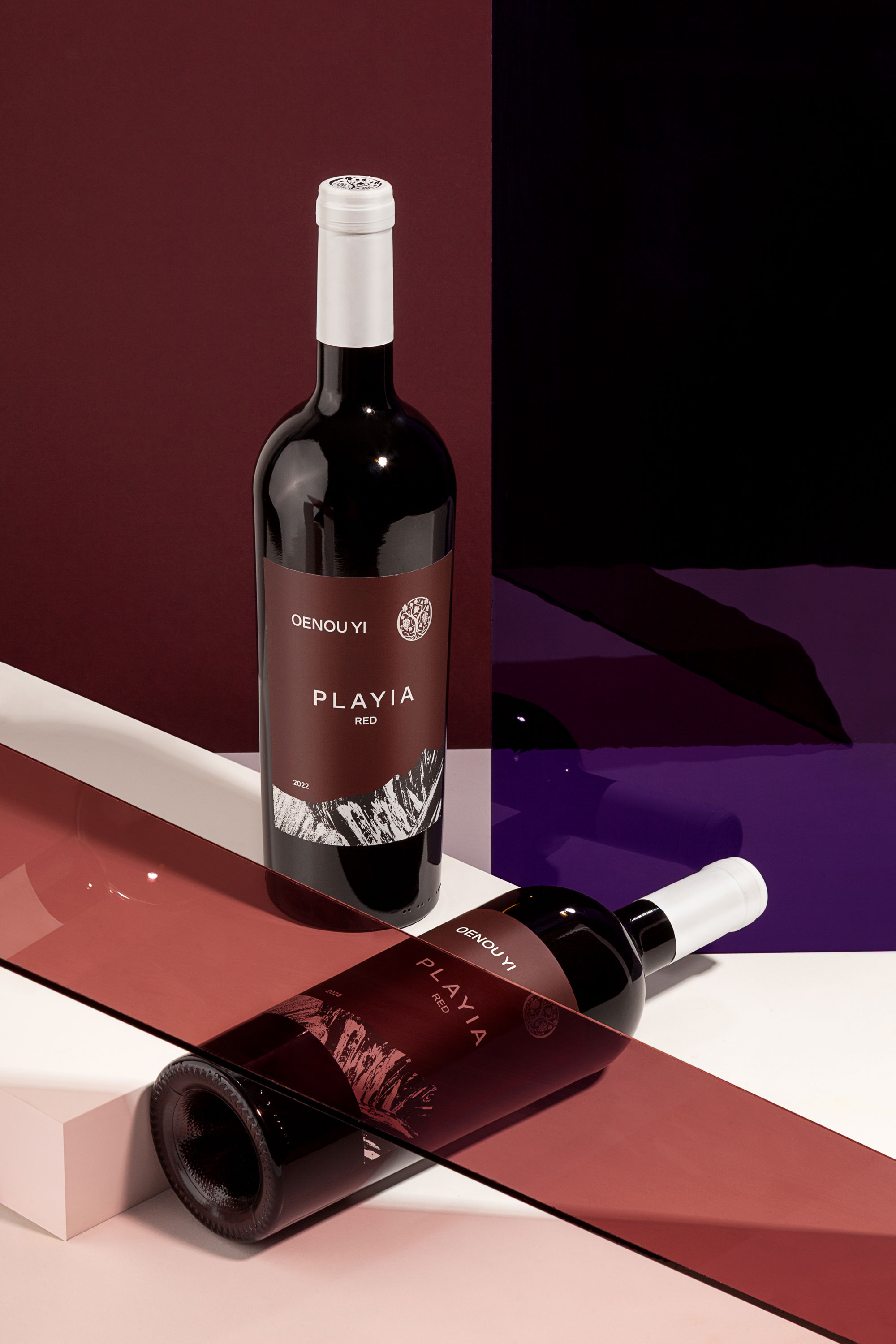
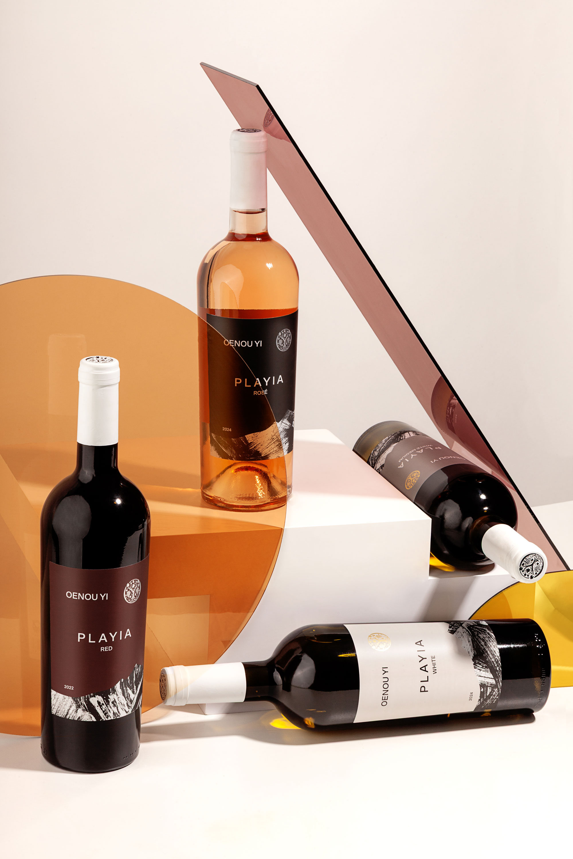
The Playia collection, named after the Greek word “Πλαγιά” meaning slope, draws inspiration from the rolling vineyards surrounding Omodos. Here, the labels echo the rhythms of the landscape, capturing the character of the terroir and the slopes that nurture the vines.
Together, the three design directions create a coherent yet diverse visual identity—minimal, elegant, and deeply connected to Cyprus’ land and culture. Each bottle becomes a storyteller, carrying the essence of Omodos into every pour.

CREDIT
- Agency/Creative: Studio Karystios
- Article Title: Oenou Yi Winery Rebranding and Packaging Design by Studio Karystios
- Organisation/Entity: Freelance
- Project Type: Packaging
- Project Status: Published
- Agency/Creative Country: Cyprus
- Agency/Creative City: Pafos
- Market Region: Global
- Project Deliverables: Packaging Design
- Format: Bottle
- Industry: Food/Beverage
- Keywords: wine, Cyprus
-
Credits:
Photographer: Anna Tsiami


