Objective: The Ode brand sought to establish a distinctive typographic identity that complemented its commitment to excellence and paid homage to craftsmanship and circularity, mirroring the essence of its sustainable Cod production.
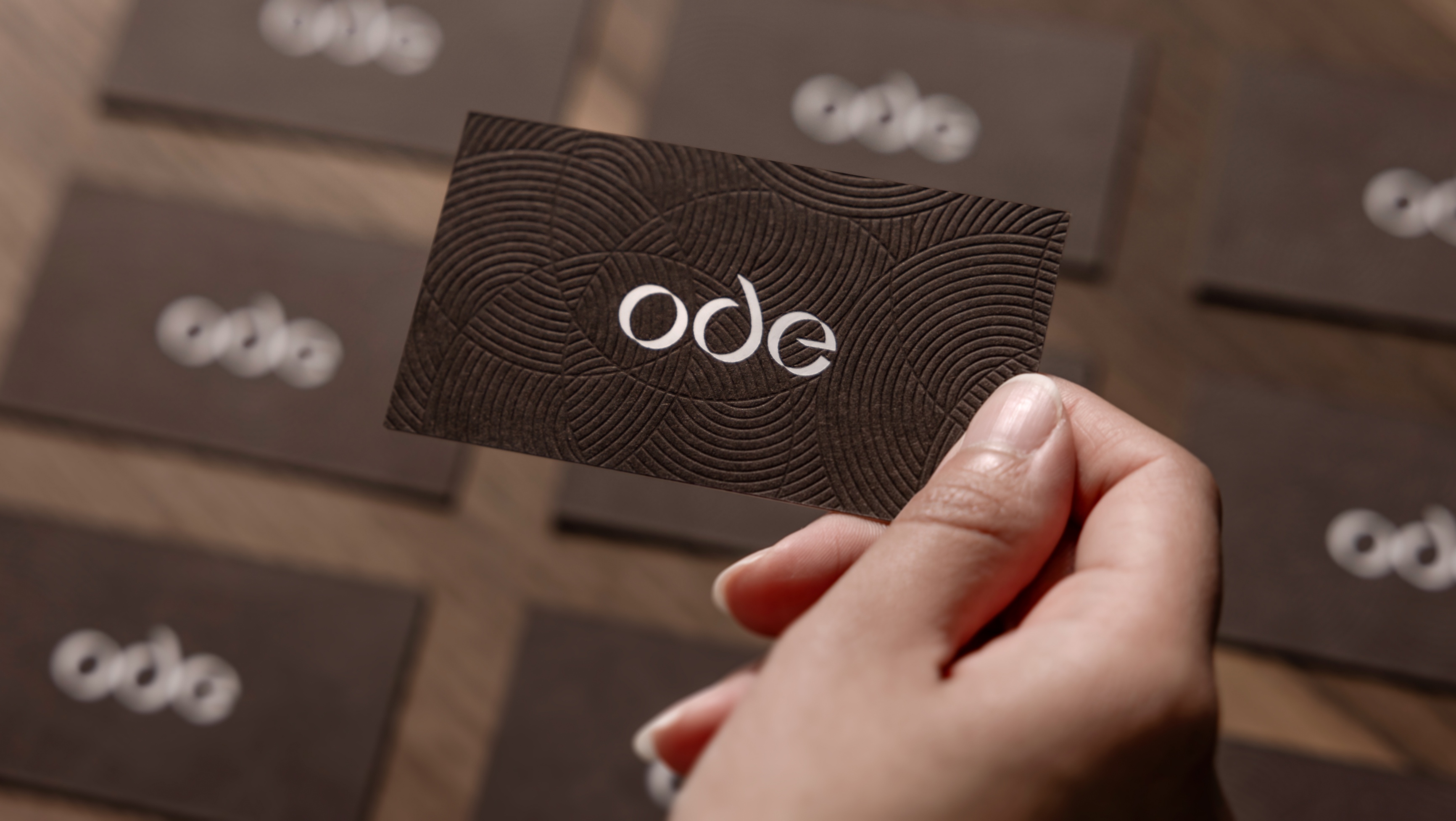
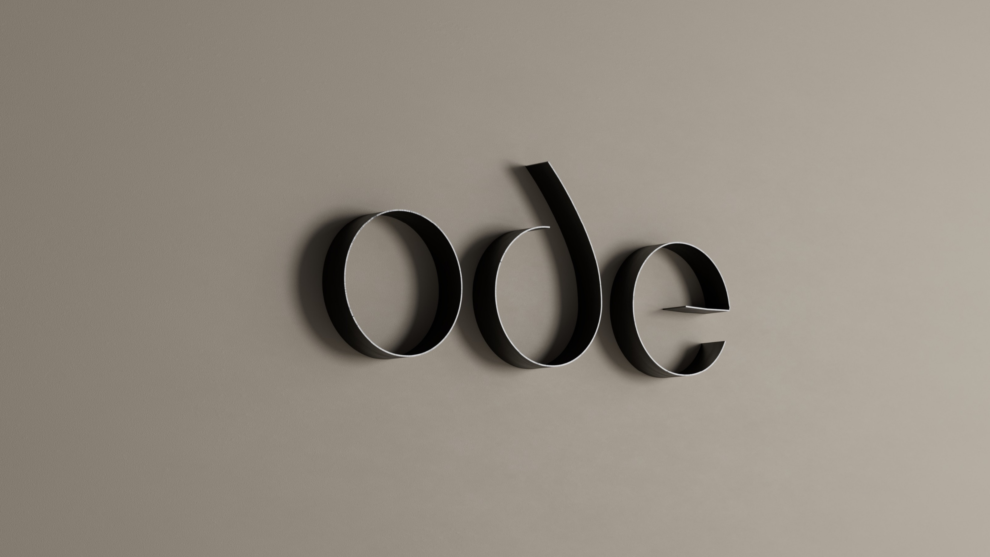
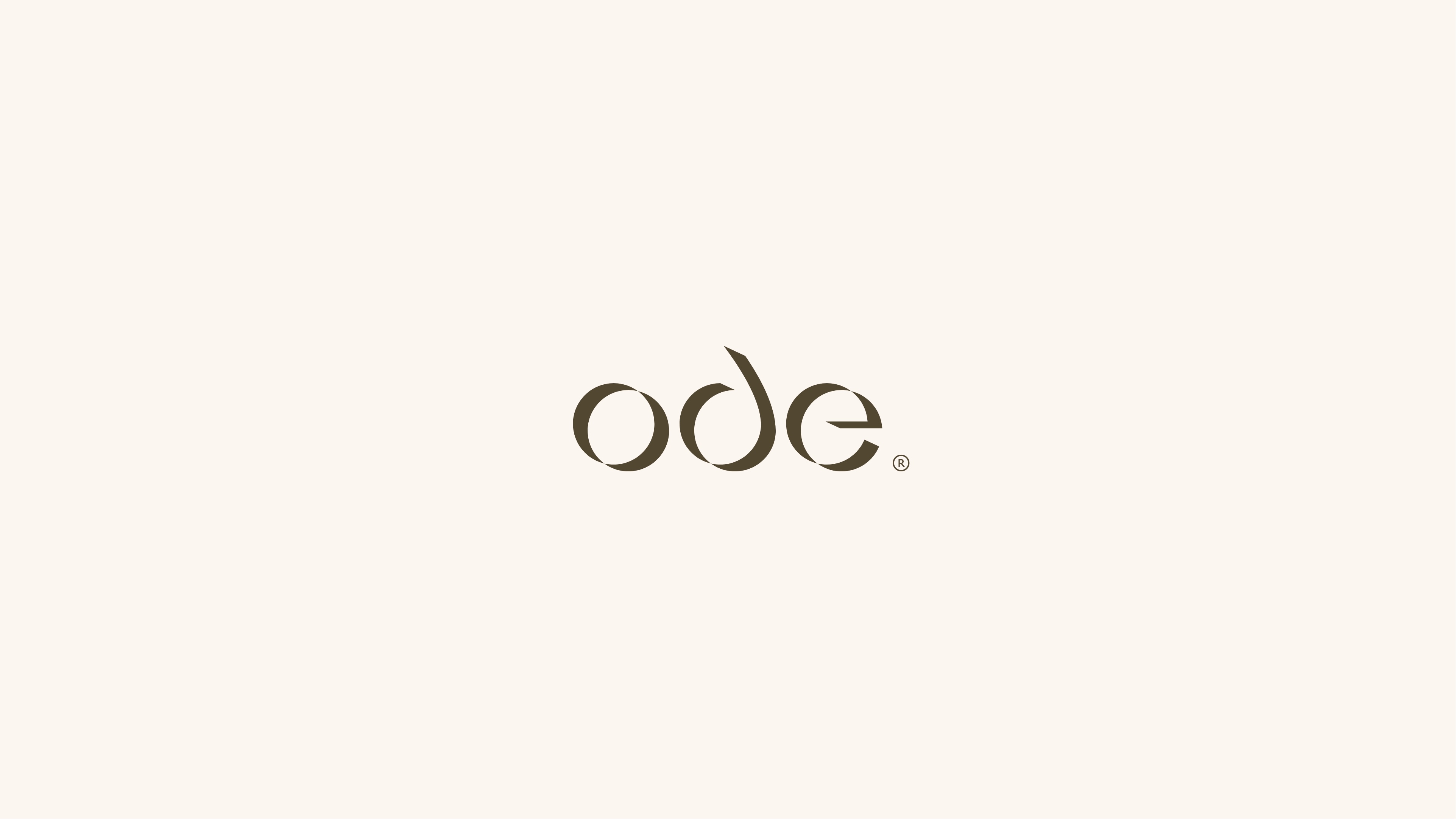
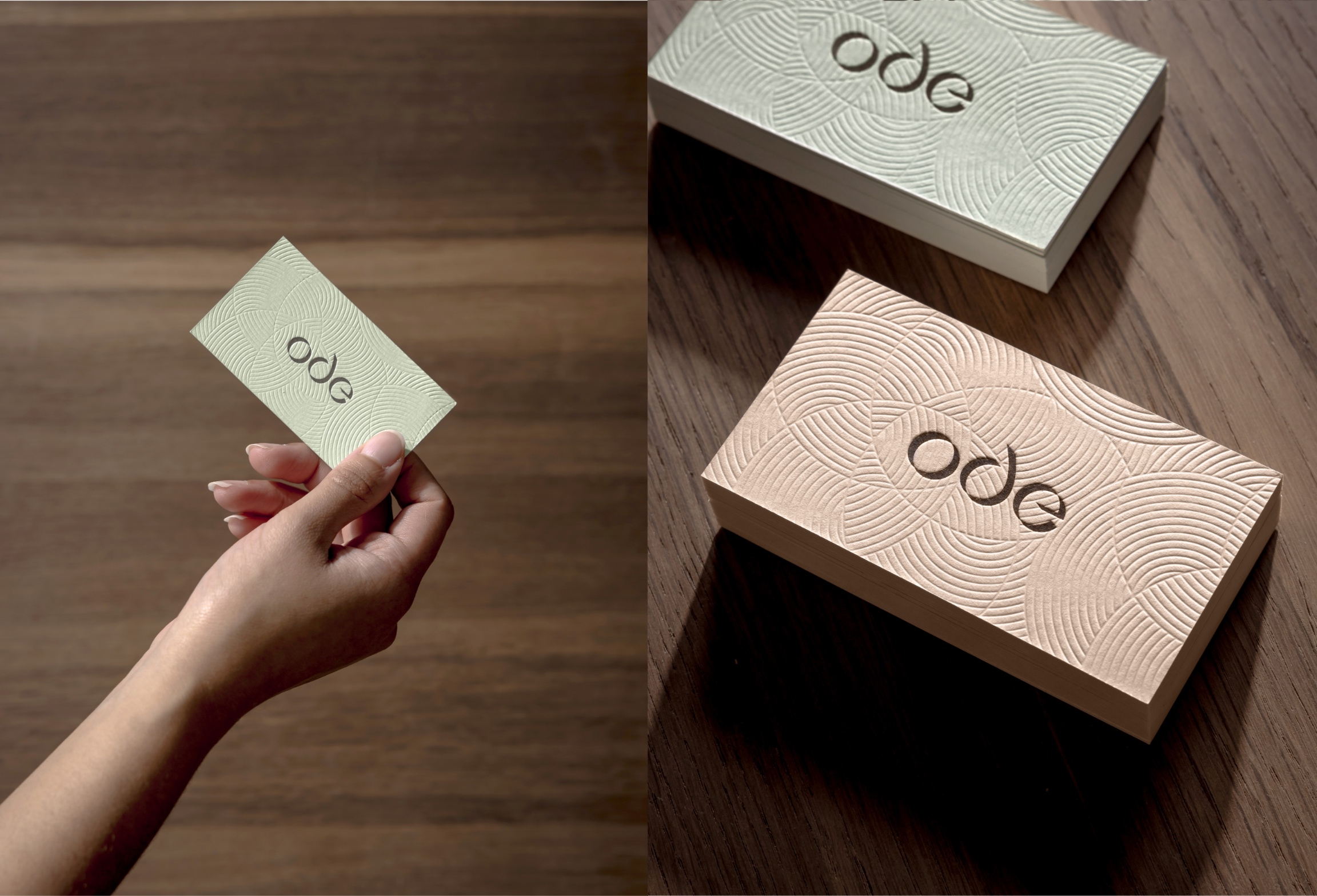
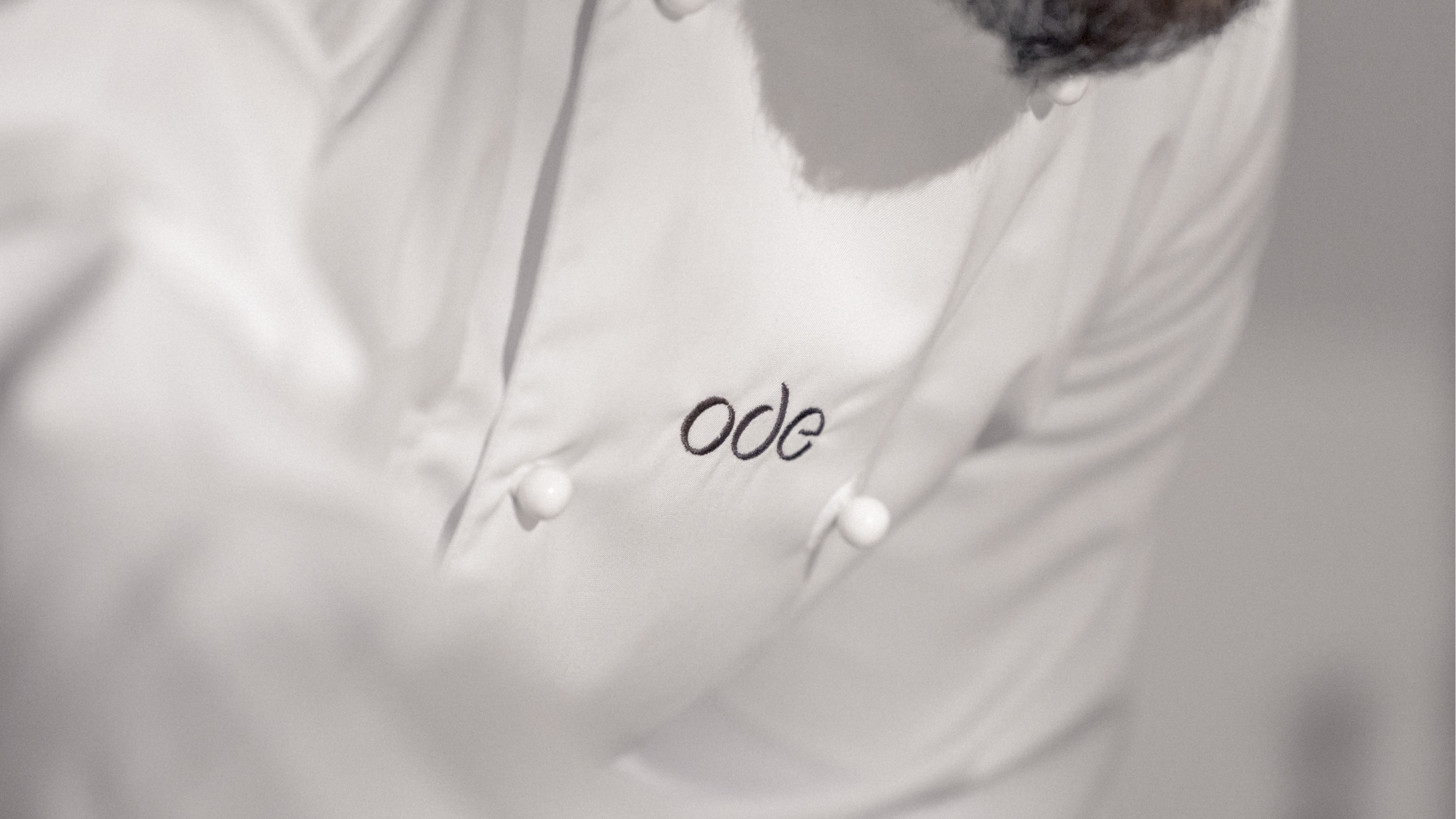
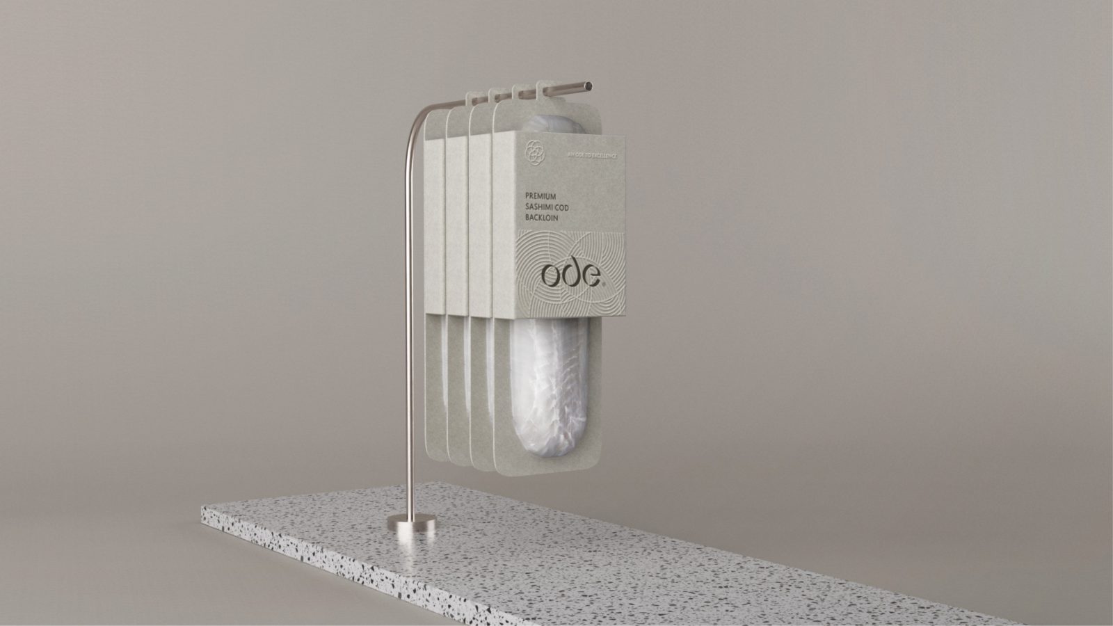
Design Principles: Ode Typography is meticulously crafted based on the principles of circularity and the perpetual movement of time. The short and rounded font mirrors the shape and form of the word “cod” itself, establishing a visual connection with the heart of the brand.
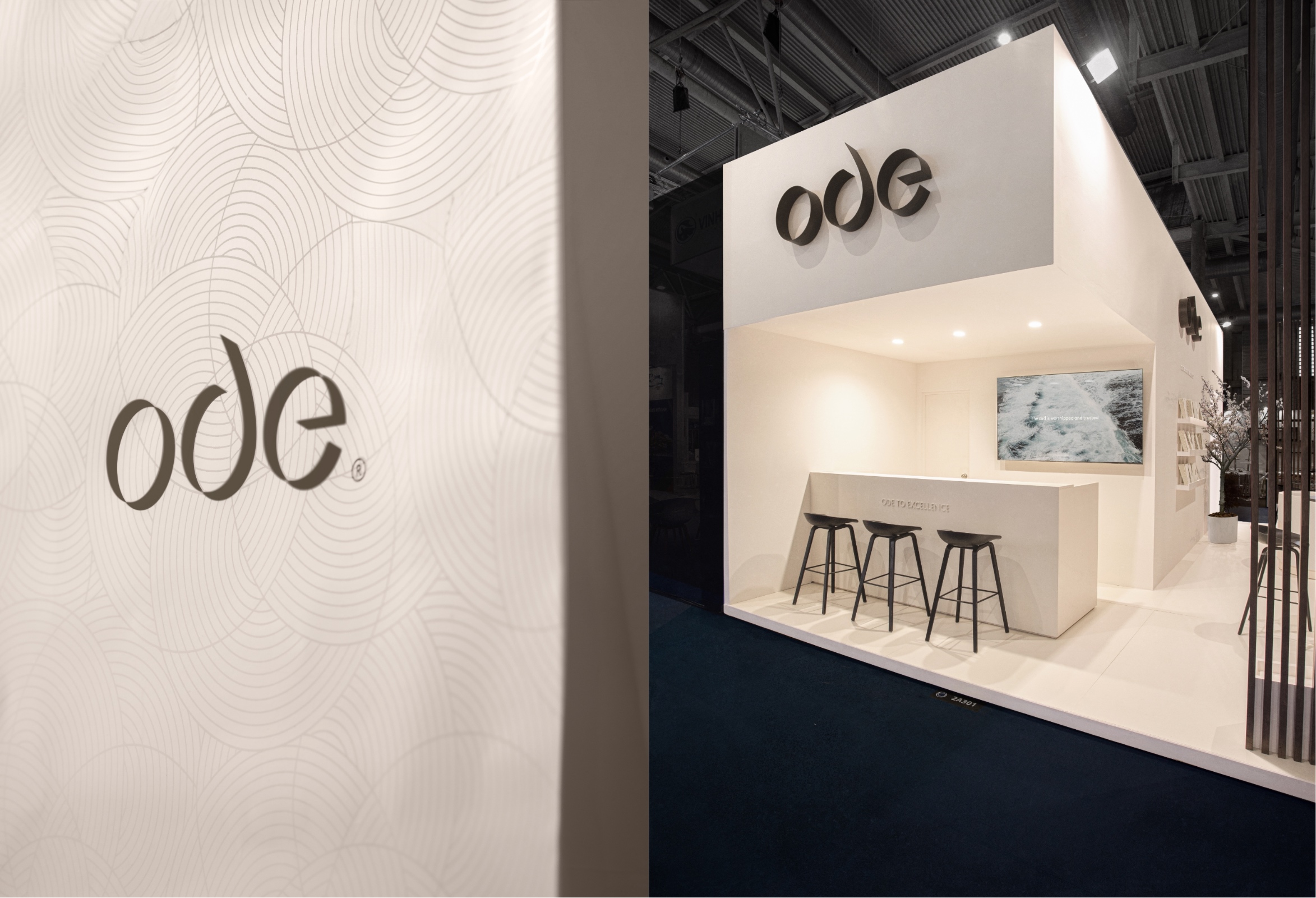
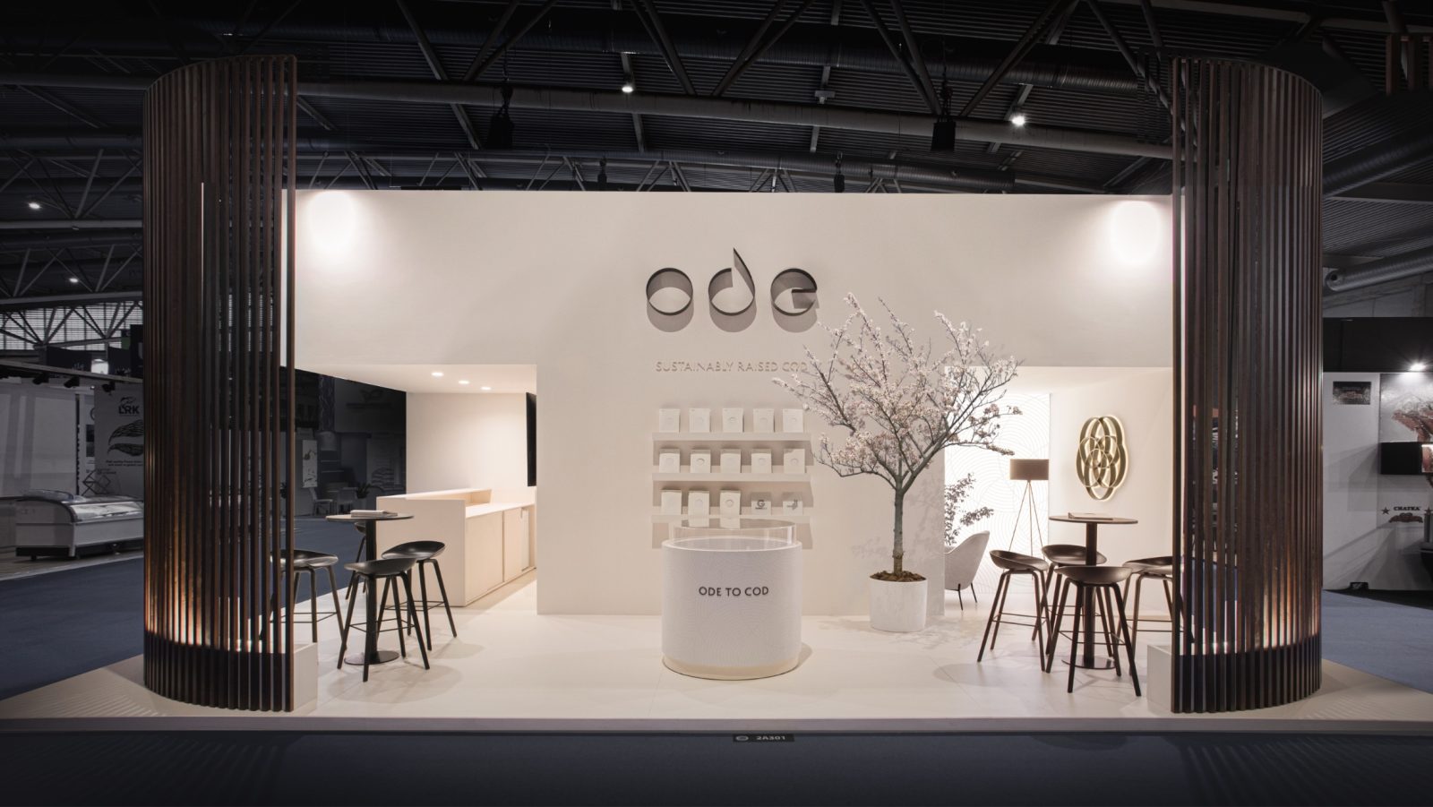
Dynamic Shadows: Adding dynamic shadows within the typography introduces a layer of ambiguity, depth, and volume. This strategic use of shadows is not merely a design element; it’s a visual representation of the brand’s dedication to complexity and the nuanced journey of Cod from farm to fork.
Ambiguous Yet Cohesive: While creating an element of ambiguity, the shadows contribute to the cohesive visual expression of the typography. This deliberate choice adds layers to the brand identity, emphasising the multifaceted nature of Ode—from its roots in craftsmanship to its commitment to circularity.
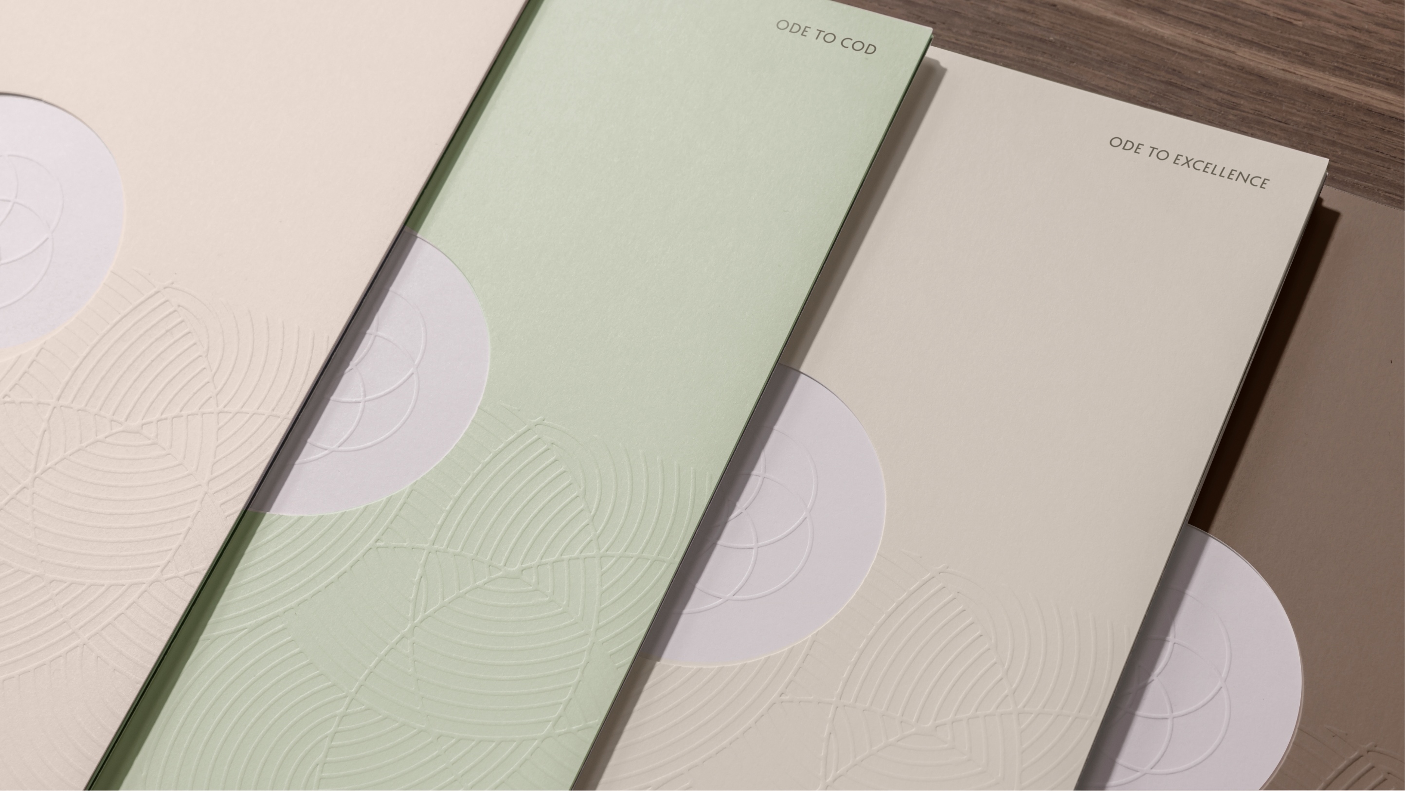
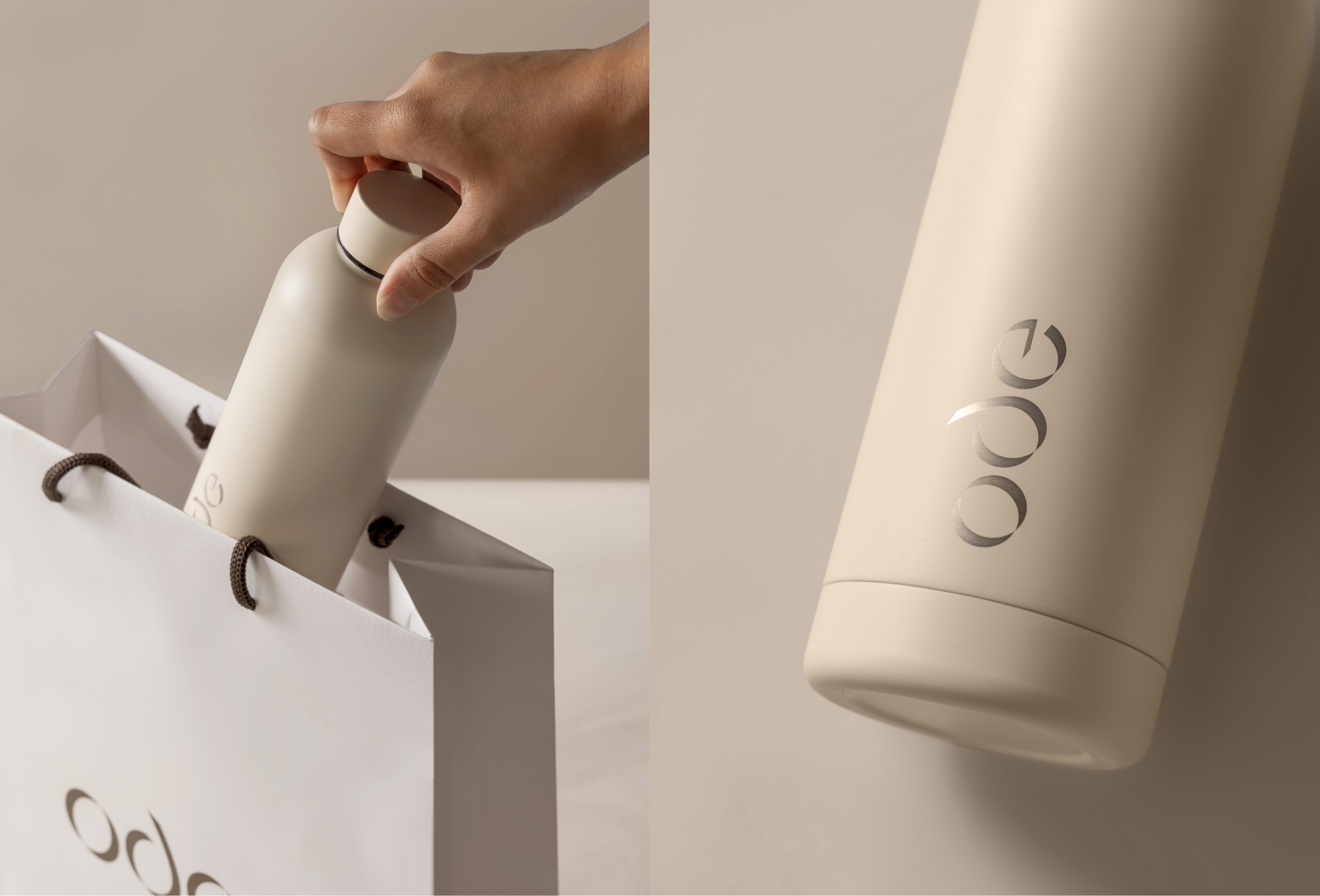
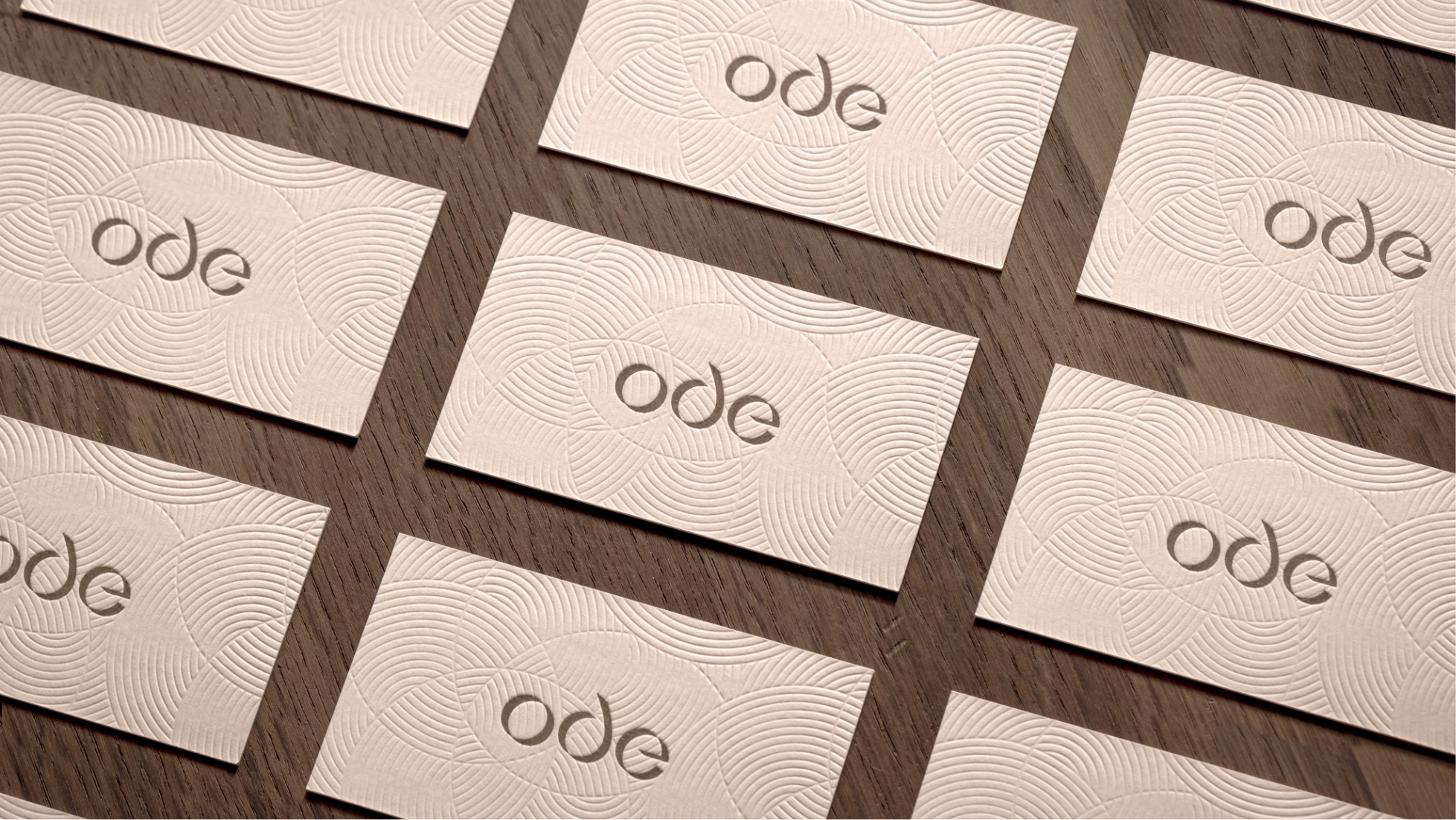
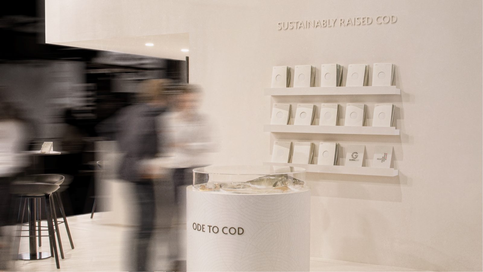
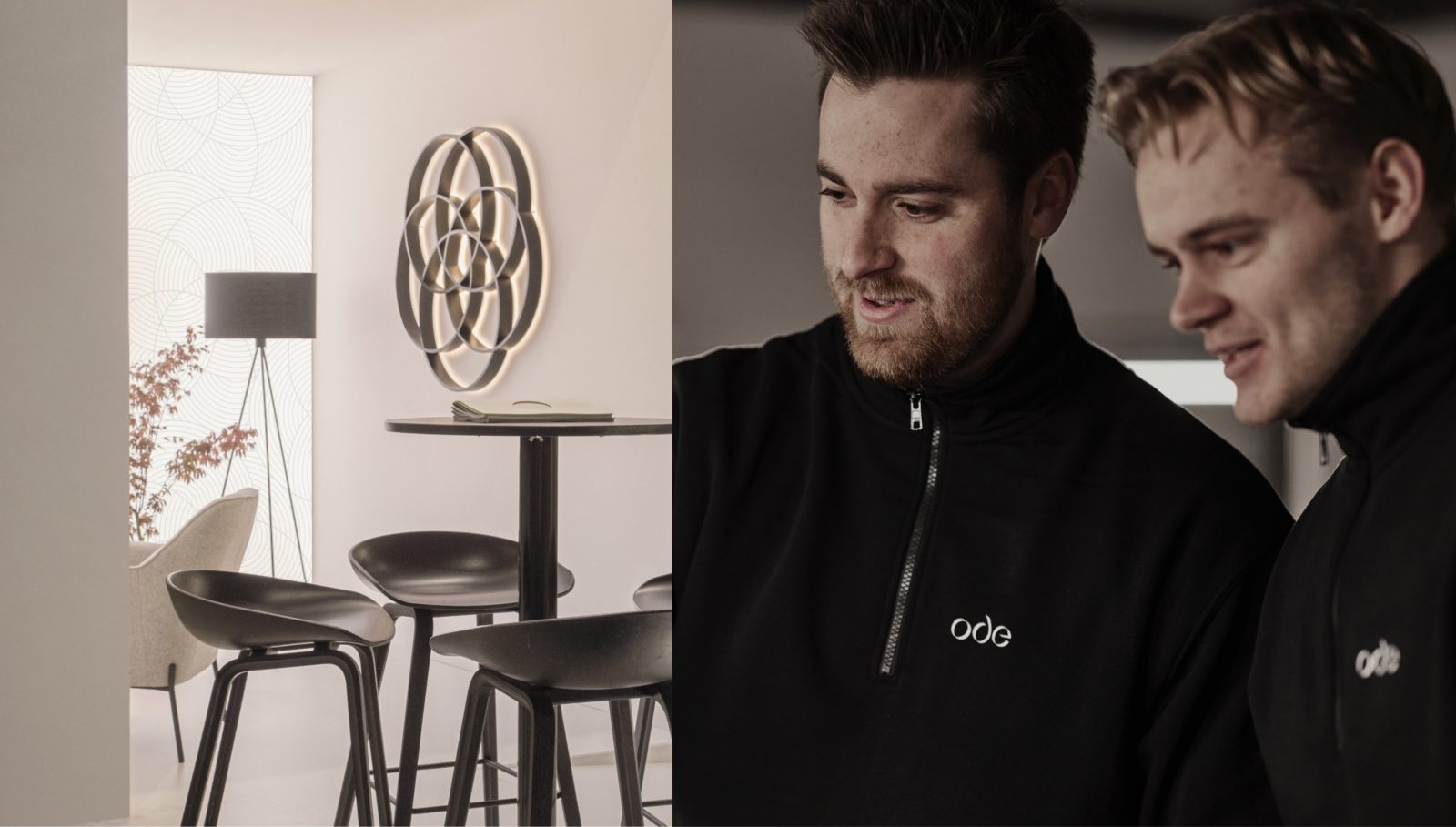
Reproducibility: With its circular and short-rounded expression, the typographic system is designed with reproducibility in mind. Whether applied physically or digitally, the Ode Typography maintains its integrity, ensuring a consistent and recognisable brand presence across various applications.
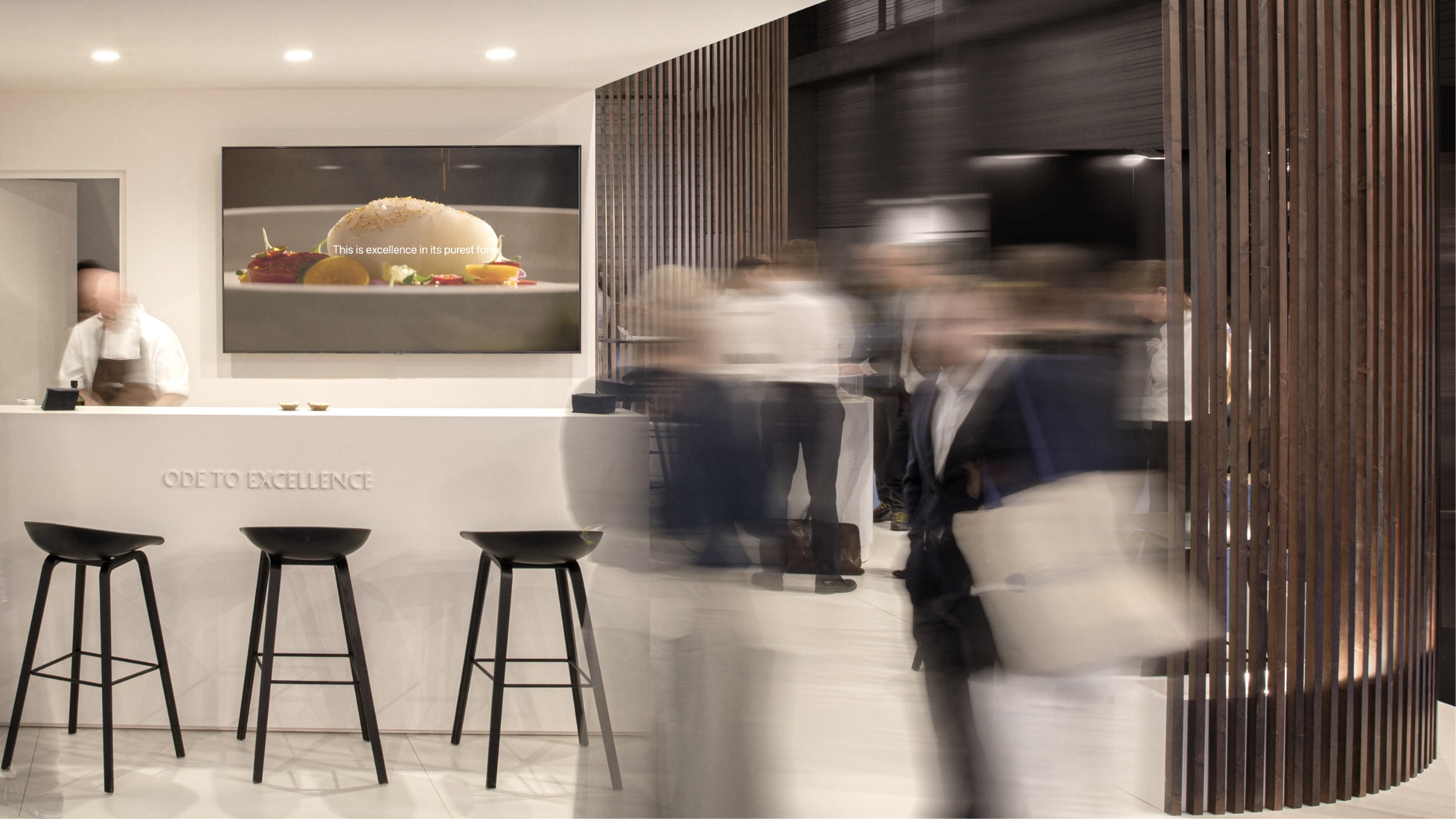
Custom Logotype: Ode Typography goes beyond being a standard font; it evolves into a custom logotype. This bespoke design reinforces the brand’s individuality, echoing the uniqueness of Ode’s sustainable Cod production and its dedication to culinary excellence.
The rounded expression of the typography not only reflects the shape of the word “cod” but adds a touch of warmth and approachability. It creates an inviting visual language, inviting consumers to connect with the brand personally.
An Ode to Craftsmanship and Circularity: Every curve, shadow, and nuance in the Ode Typography is an ode to craftsmanship and circularity. It is a visual symphony that harmonises with the brand’s ethos, celebrating the product and the journey that brings it to fruition.
Ode Typography has become a visual ambassador for the brand, resonating with consumers as a symbol of craftsmanship, circularity, and dedication to sustainable luxury.
Future Implications: As Ode continues to make strides in the industry, the Ode Typography is a testament to the brand’s commitment to visual excellence and innovation. It’s not just letters on paper; it’s a design philosophy that encapsulates the very soul of Ode.
CREDIT
- Agency/Creative: KIND (Conceptual Branding AS)
- Article Title: Ode Typography – A Visual Ode to Craftsmanship and Circularity
- Organisation/Entity: Agency
- Project Type: Typography
- Project Status: Published
- Agency/Creative Country: Norway
- Agency/Creative City: Bergen
- Market Region: Europe
- Project Deliverables: Typography, Writing
- Industry: Food/Beverage
- Keywords: WBDS Agency Design Awards 2023/24
- Keywords: Typography, Brandmark Typeface/Type
-
Credits:
Chief Creative Director: Tom Emil Olsen
Design Director: Knut Harald Longva
Senior Designer: Agnieszka Gawlik
Senior Designer: Emil Olsen
Senior Designer: Saurabh Kumar
Senior Designer: Lorenzo Galbiati
Graphic Designer: Mihail Mihaylov
Graphic Designer: Tiare Hernández Payano
Graphic Designer: Clara Auda
Graphic Designer: Piotr Deres
Video/Photographer: Isak Norum
Cinematographer: Stian Servoss
Director of Photography: Christoffer Meyer
Key Account Manager: Beate Myren Romslo
Key Account Manager: Marianne Erdal Holm
Project Manager: Laure Mediavilla
Strategic Brand Director: Thomas Danielsen
Strategic Brand Consultant: Jan Willy Skjølberg
Strategic Brand Consultant: Brede Lie Reime


