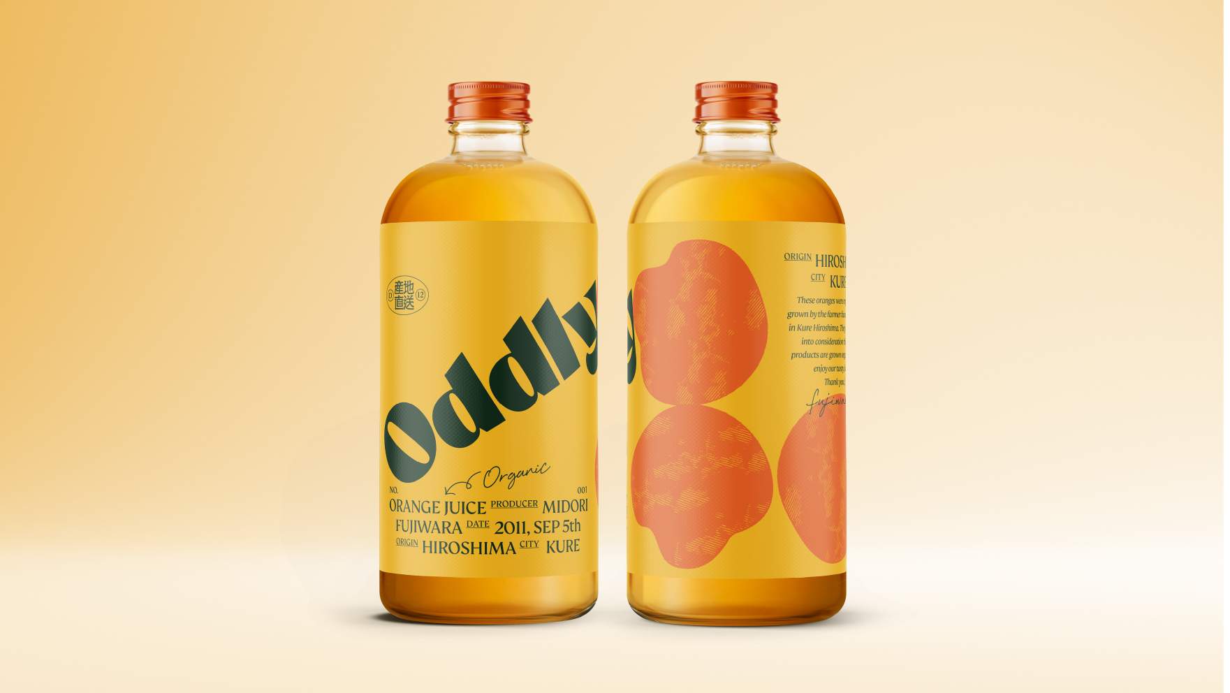
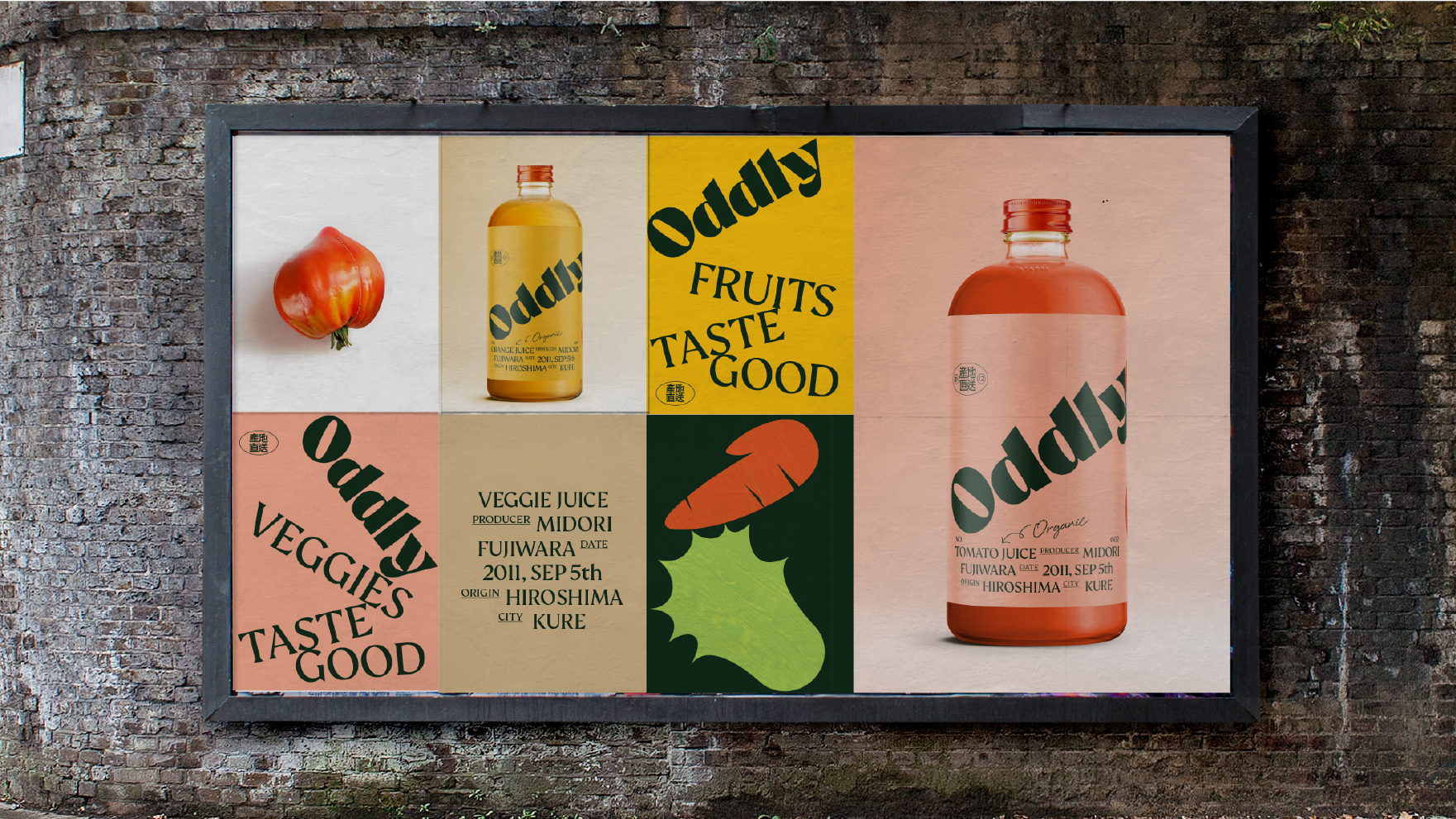
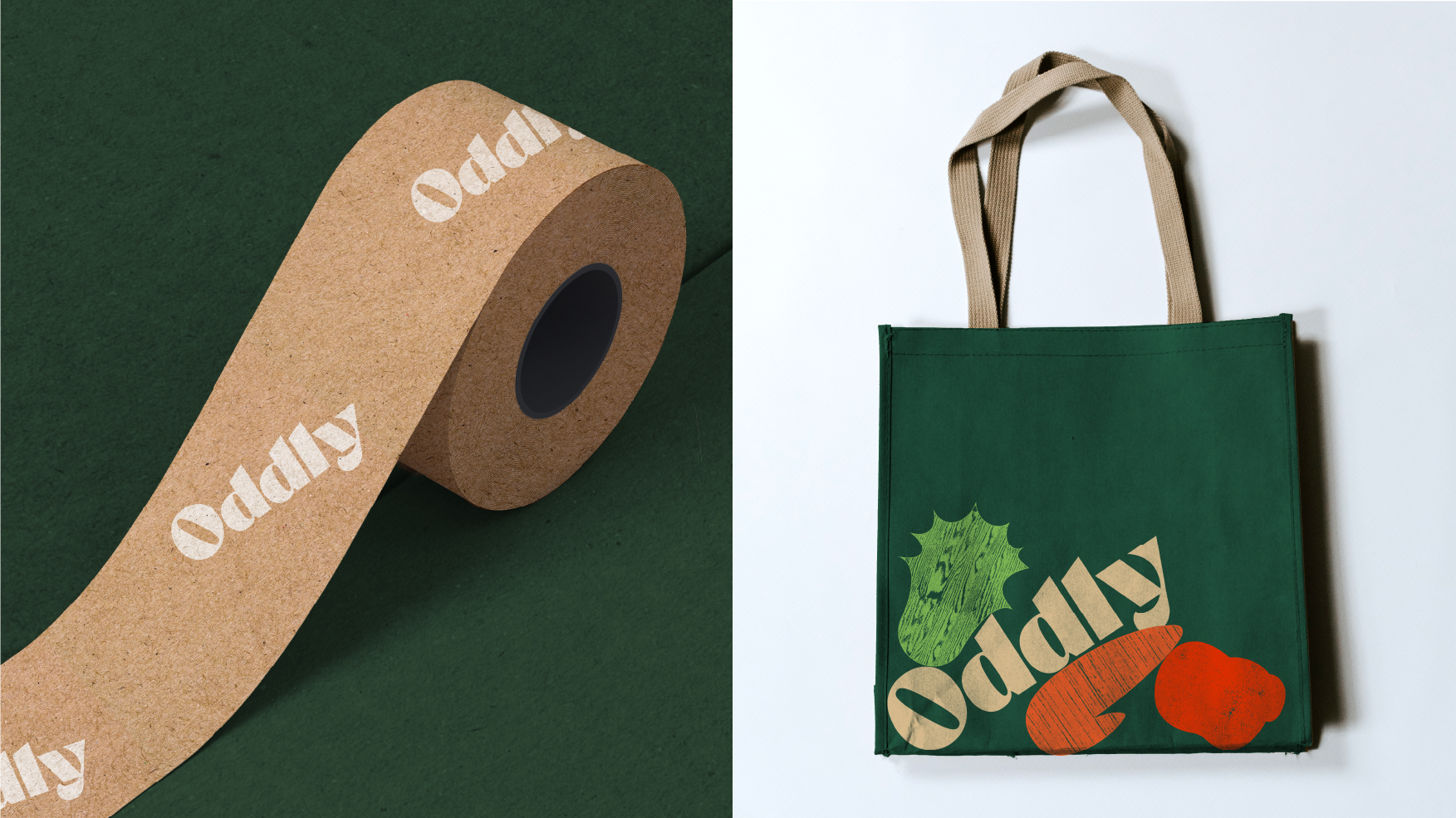
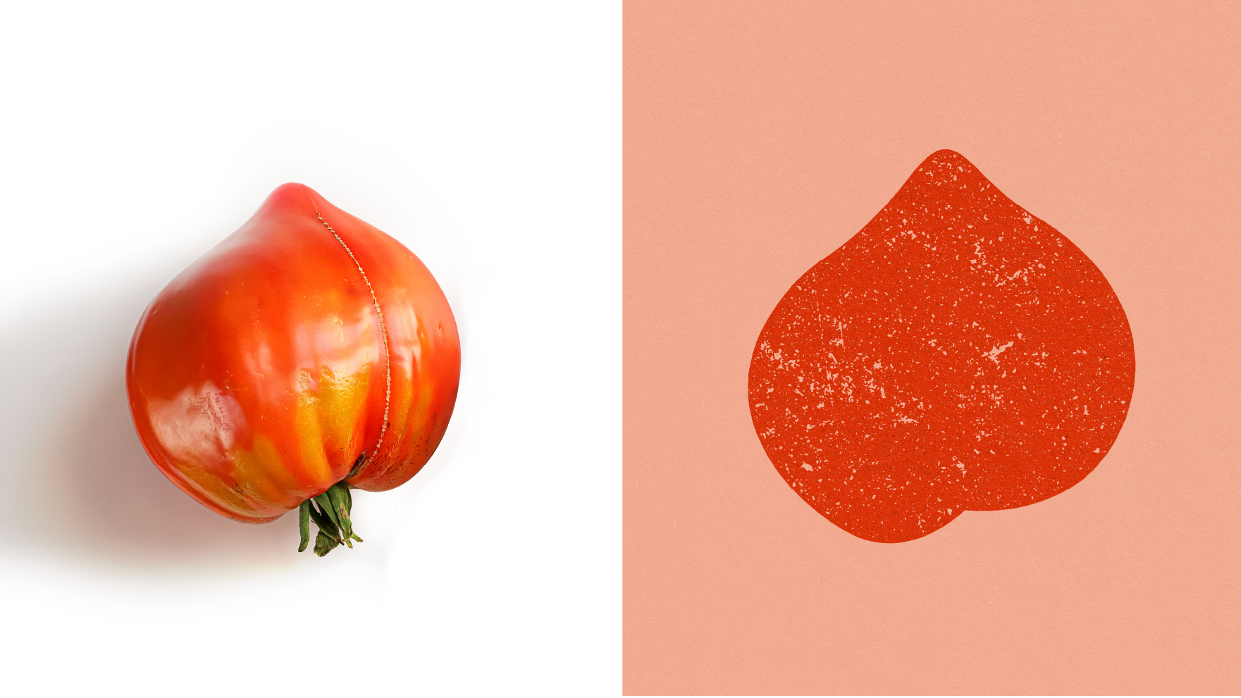
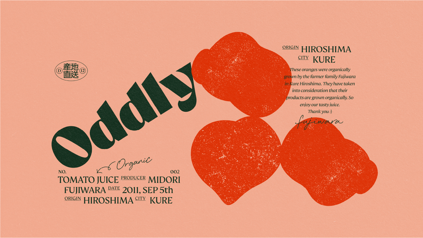
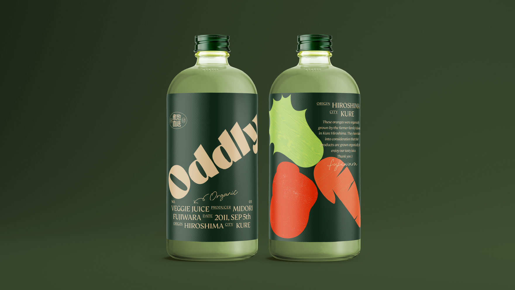
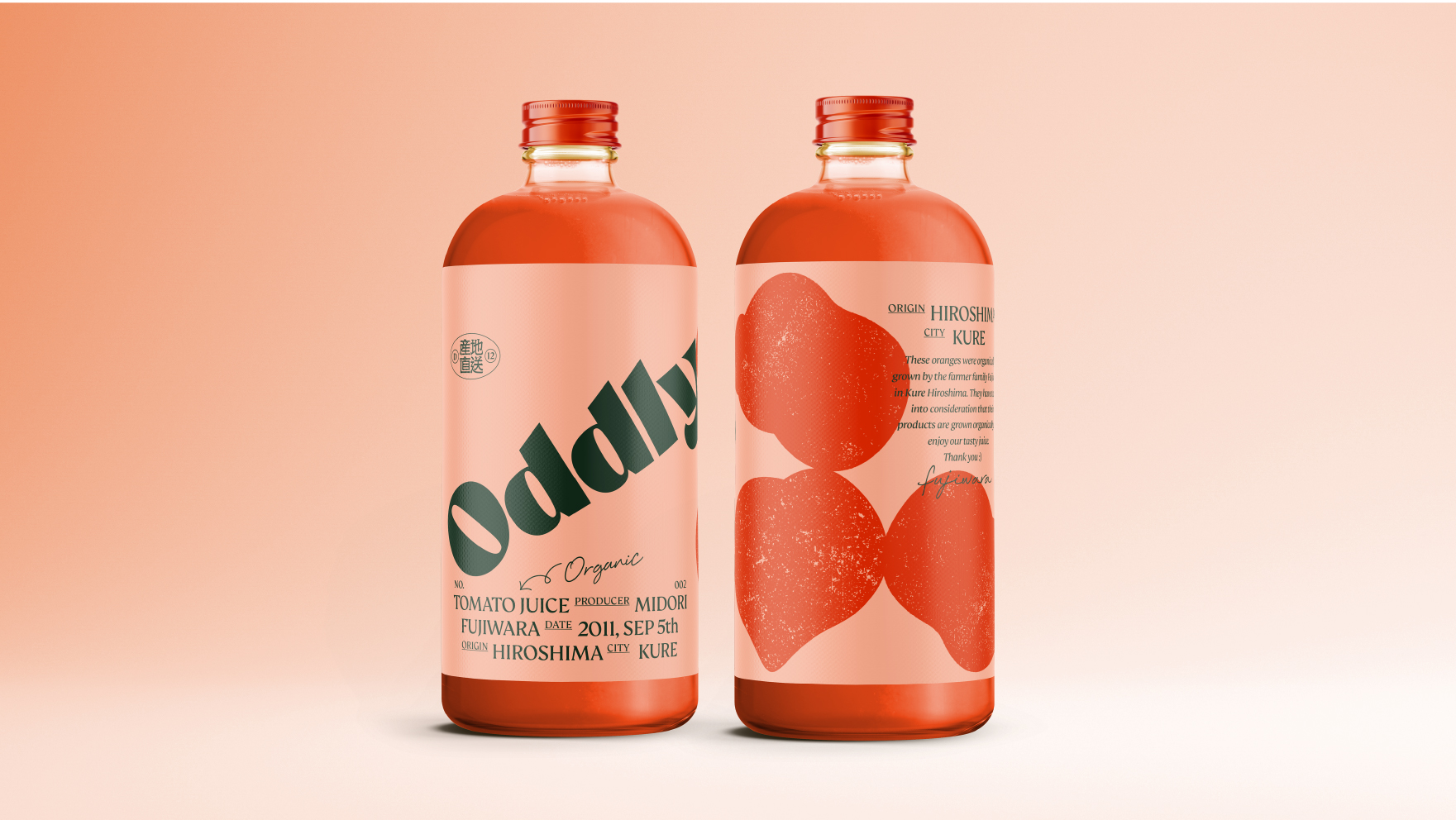
The owner of Odlly uses veggie that are too ugly for their products. We wanted to use the “ugly shape” of the vegetables since it conveys organic, less mechanical feelings. Also using the typography that are imperfectly stacked, just like the vegetables and fruits that are in the delivery box. The result became quite modern expression with the twist of organic feeling.
CREDIT
- Agency/Creative: Stamp
- Article Title: Oddly Viggie Juice Packaging Design Created by Stamp
- Organisation/Entity: Agency, Published Commercial Design
- Project Type: Packaging
- Agency/Creative Country: Japan
- Market Region: Asia
- Project Deliverables: Brand Creation, Brand Identity, Branding, Graphic Design, Identity System, Packaging Design, Tone of Voice
- Format: Bag, Bottle, Box
- Substrate: Glass
FEEDBACK
Relevance: Solution/idea in relation to brand, product or service
Implementation: Attention, detailing and finishing of final solution
Presentation: Text, visualisation and quality of the presentation


