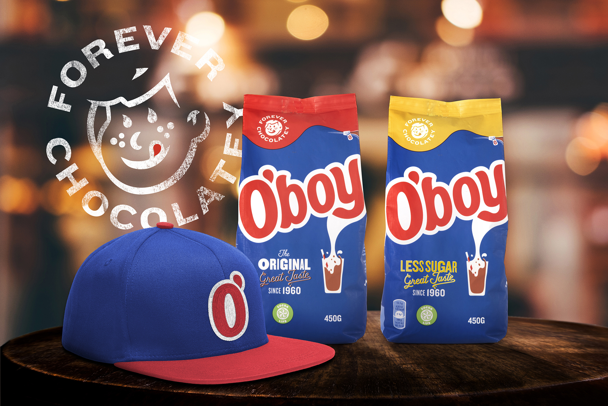
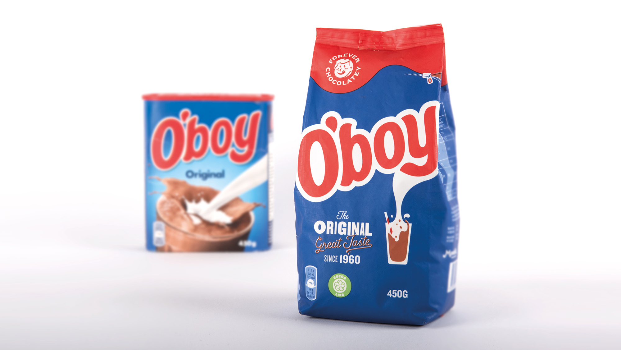
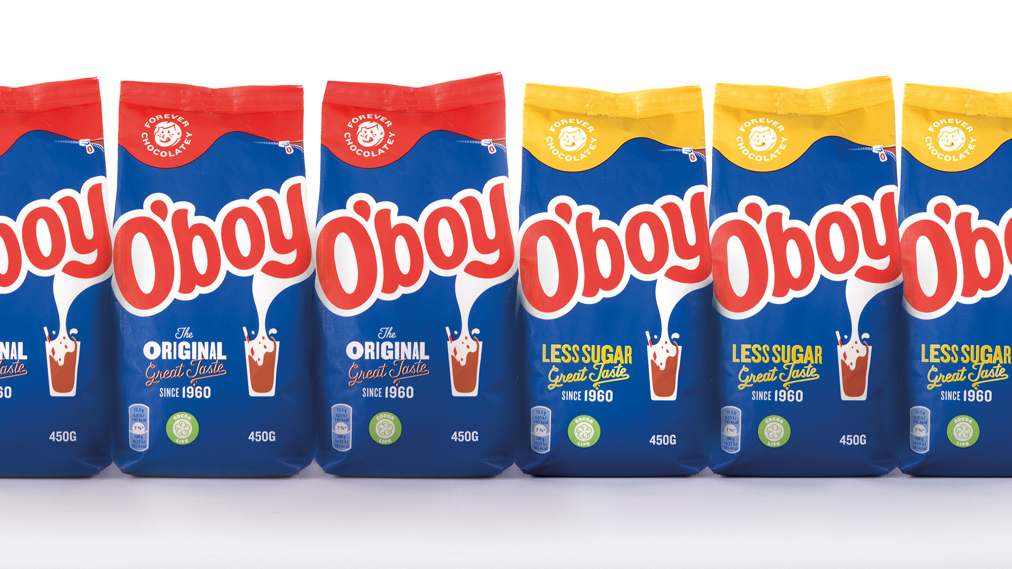
The Brief: O’boy is Sweden’s most loved chocolate drink, turning milk to magic since 1960. Mondelez International asked Design Bridge Amsterdam to revamp the youthful personality of the brand, playing with its retro-nostalgic side to connect with a new generation of Swedish parents while retaining O’boy’s iconic status delivered on a more sustainable pack.
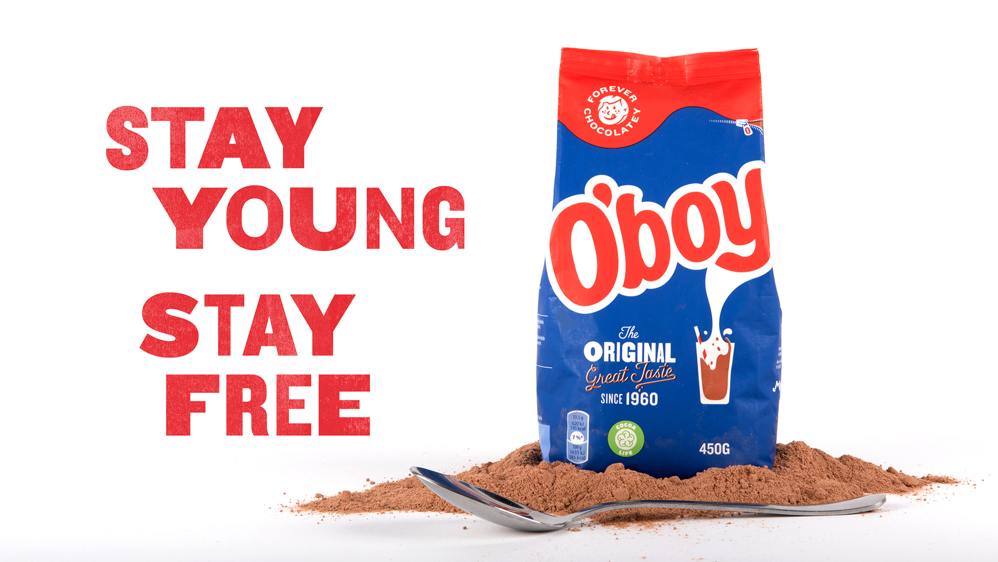
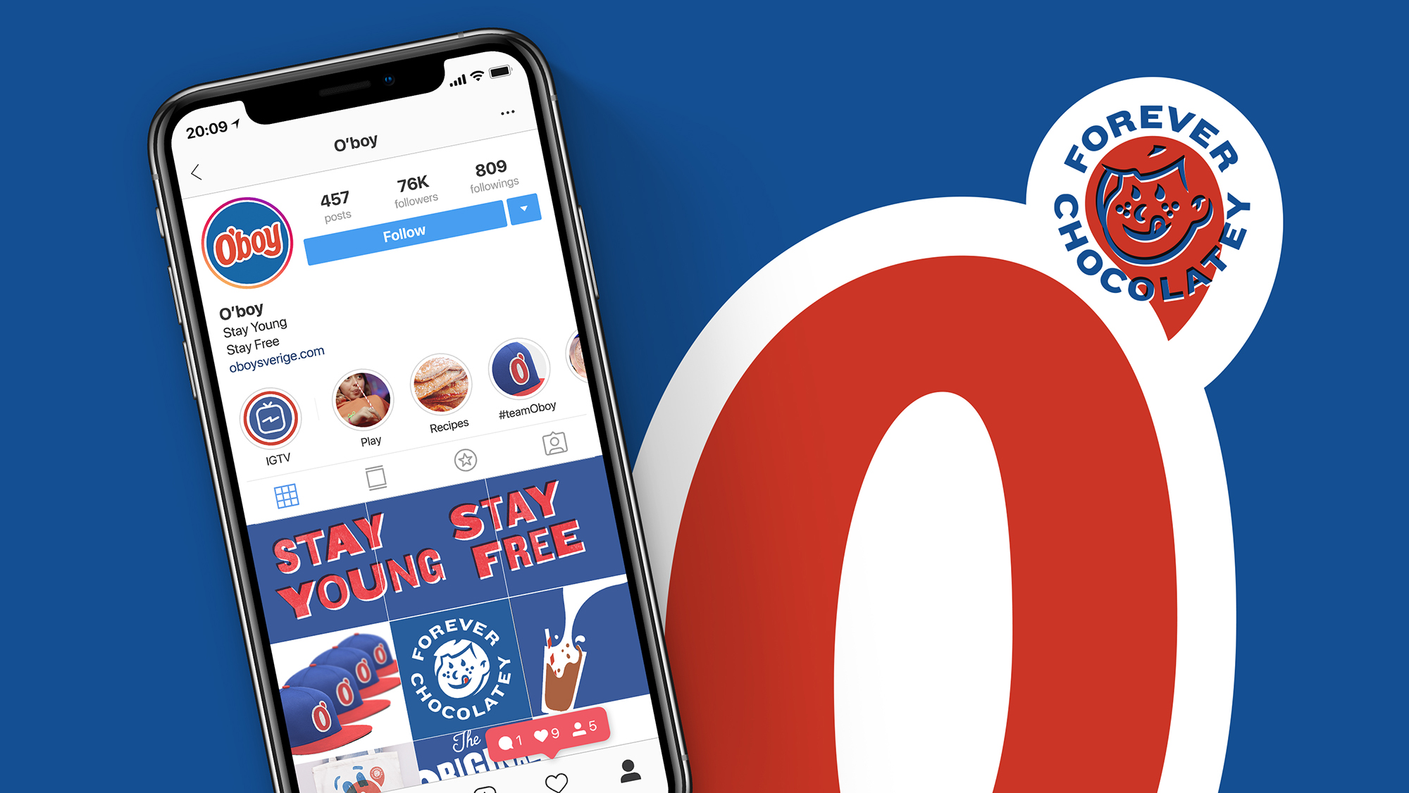
The Solution: The big idea ”Stay Young, Stay Free.” O’boy is the chocolate powder mix that tastes like childhood and lets you stir the freedom of youth back into your everyday.
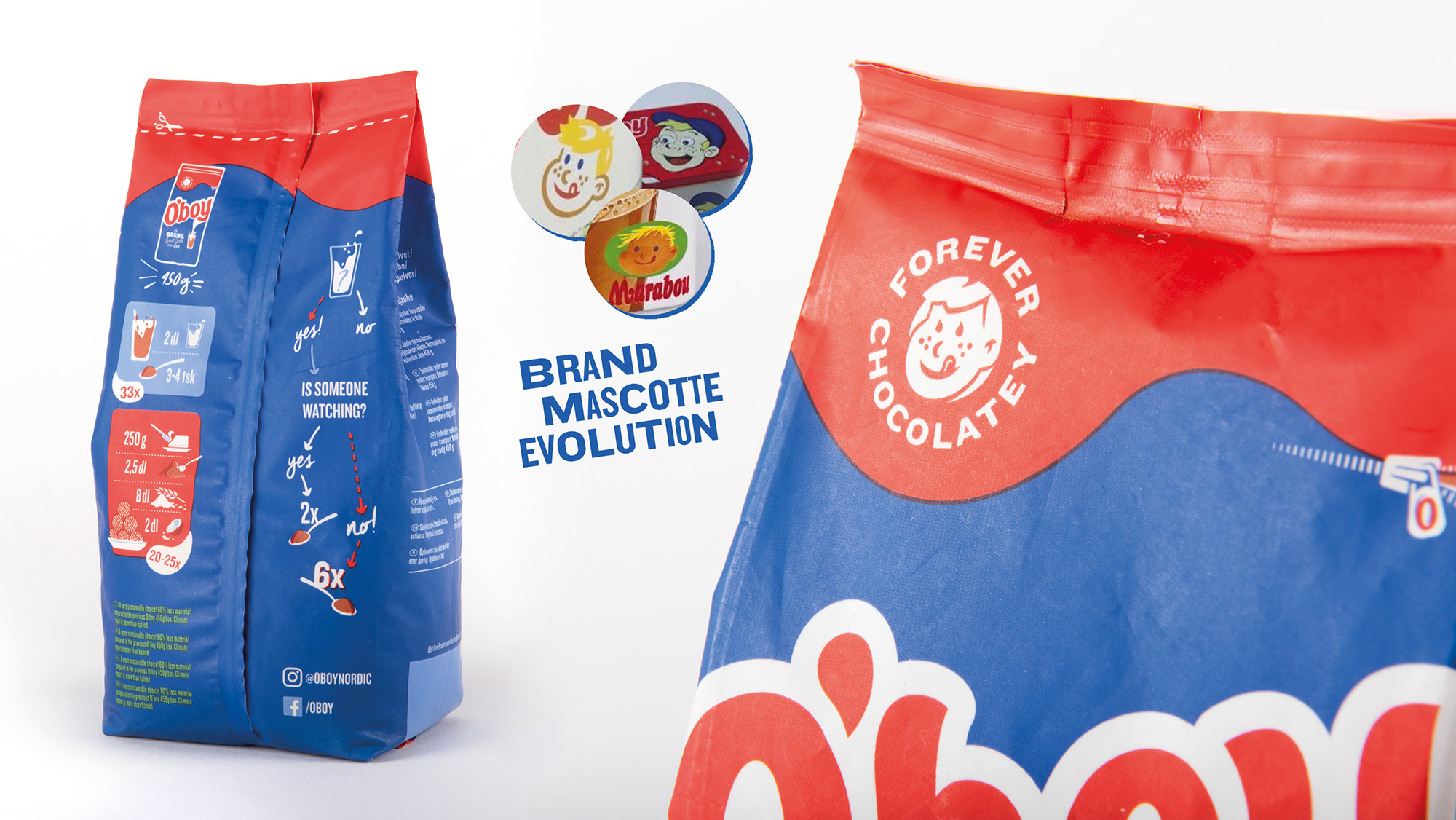
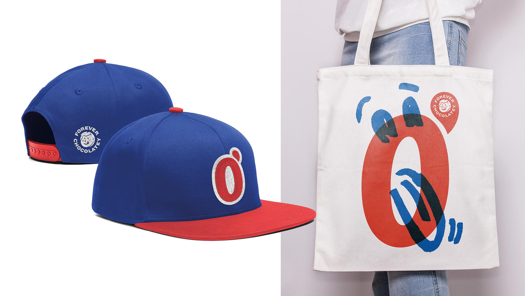
The Execution: We amplified O’boy’s truly ownable and distinctive assets – the bold blue and iconic wordmark – while doing away with category generics. By reviving the “Forever Chocolatey” brand mascot, we reclaimed an ownable and legendary brand ingredient and dialled up brand personality. A new playful typography system and a wordmark restyling supports the bold and expressive new identity.
The vintage look and feel of the printing techniques contributes to the authenticity of the brand.
The Outcome: In Sweden, O’boy wasn’t just a brand in the category, it created the category. How do you make-over a national hero? By making sure it stays in the hearts of the kids of yesterday, today and tomorrow. Stir on, O’boy!
CREDIT
- Agency/Creative: Design Bridge
- Article Title: O’Boy – Stay Young Stay Free – Revamping a National Icon
- Organisation/Entity: Agency, Published Commercial Design
- Project Type: Packaging
- Agency/Creative Country: Netherlands
- Market Region: Europe
- Project Deliverables: Brand Creation, Brand Identity, Brand Redesign, Brand Rejuvenation, Brand Strategy, Brand World, Branding, Graphic Design, Identity System, Illustration, Packaging Design, Product Architecture, Rebranding, Research, Tone of Voice
- Format: Bag, Tray
- Substrate: Pulp Carton, Pulp Paper


