


Project Description
Oaten is a modern oat porridge brand created to simplify everyday breakfasts while maintaining a strong visual identity. The goal of this project was to design a packaging system that feels clean, approachable, and retail-ready, while clearly communicating nutrition and flavor at first glance. The brand focuses on honest ingredients, warm mornings, and a balanced lifestyle, avoiding overly complex or cluttered design approaches.
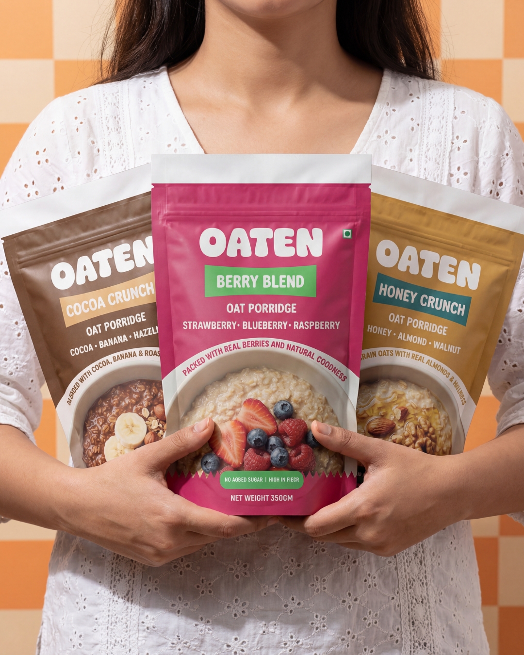
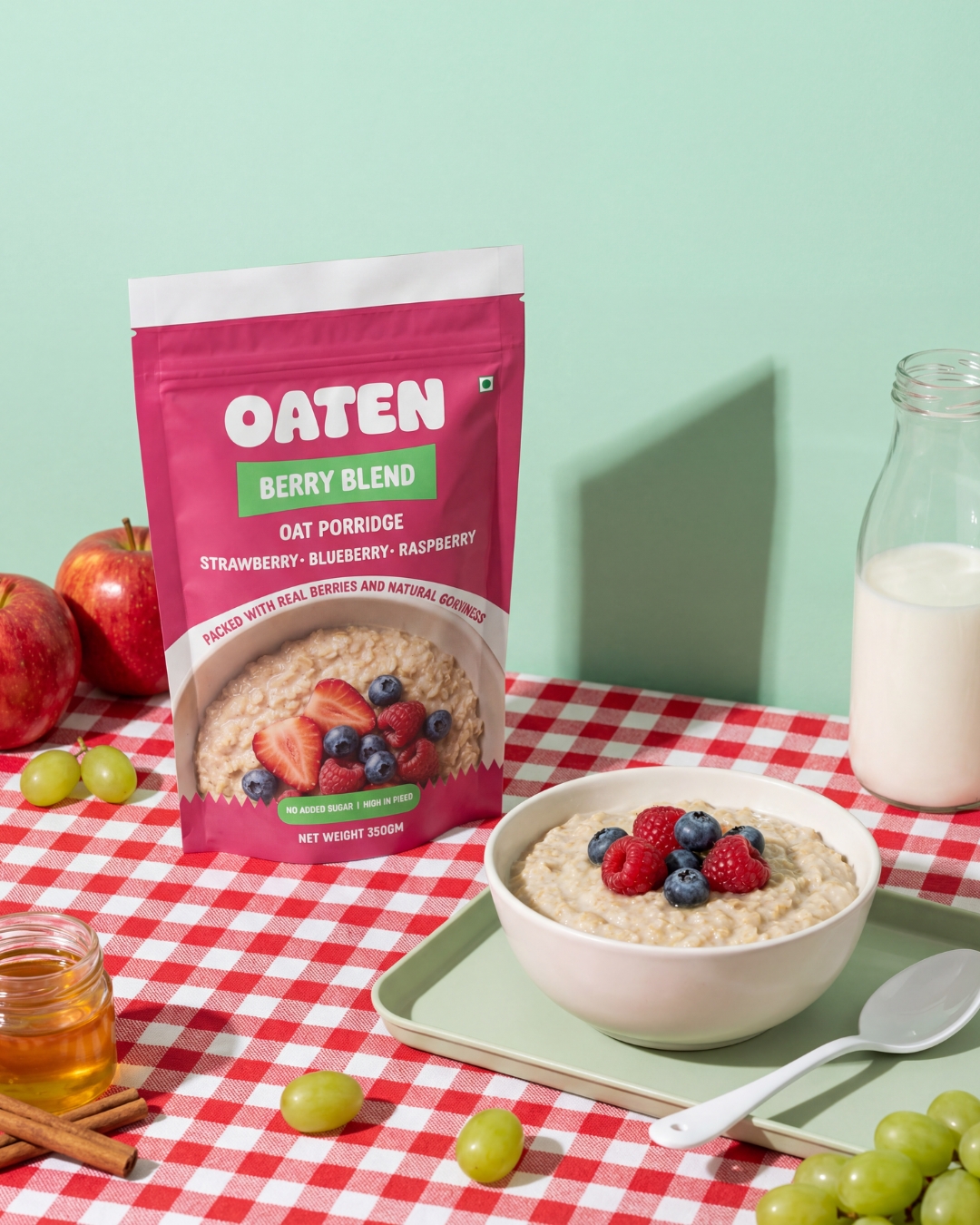
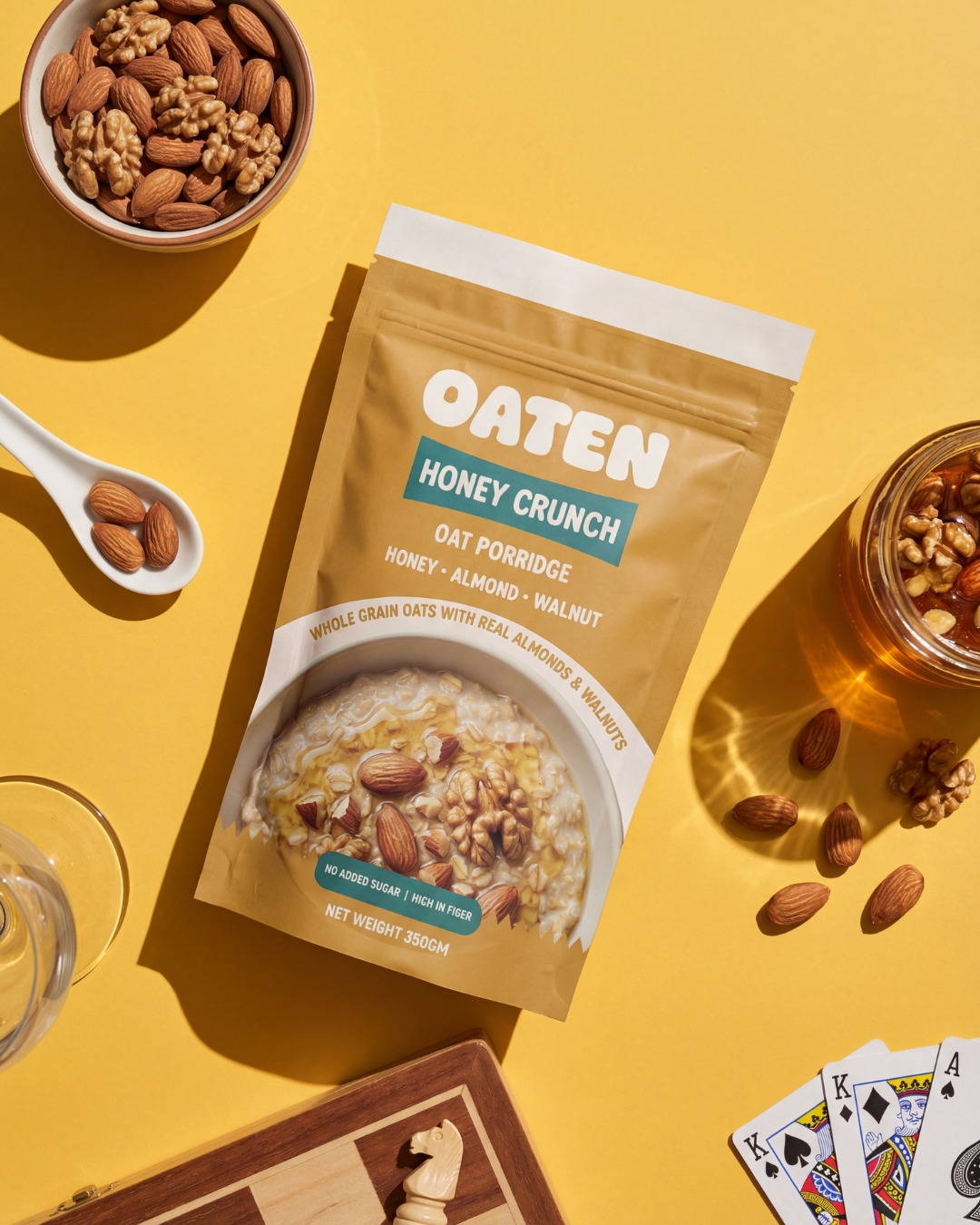
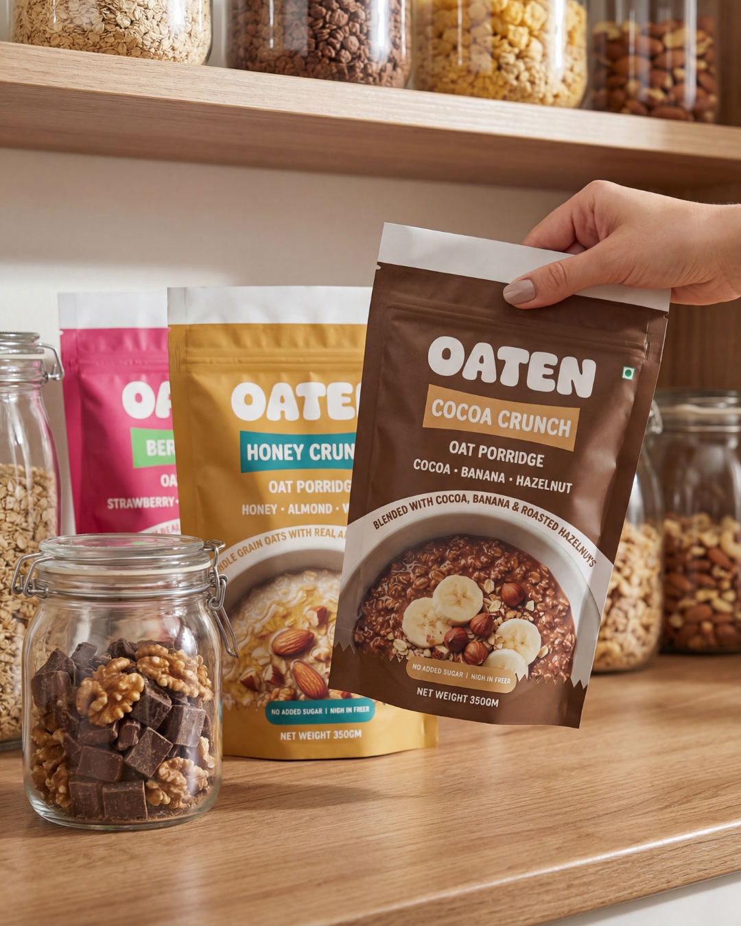
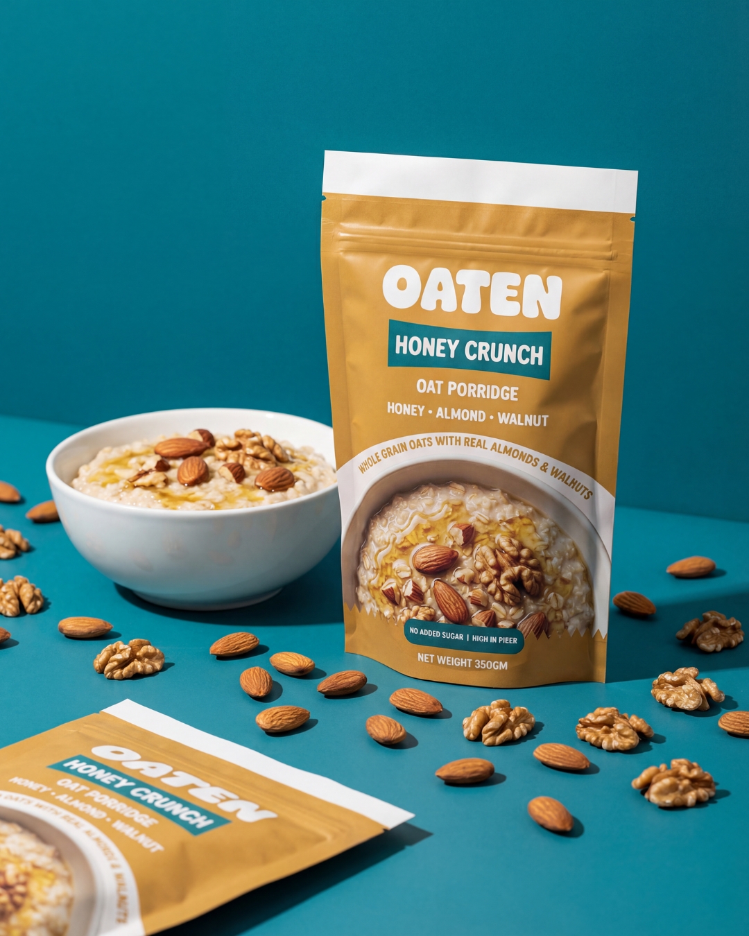
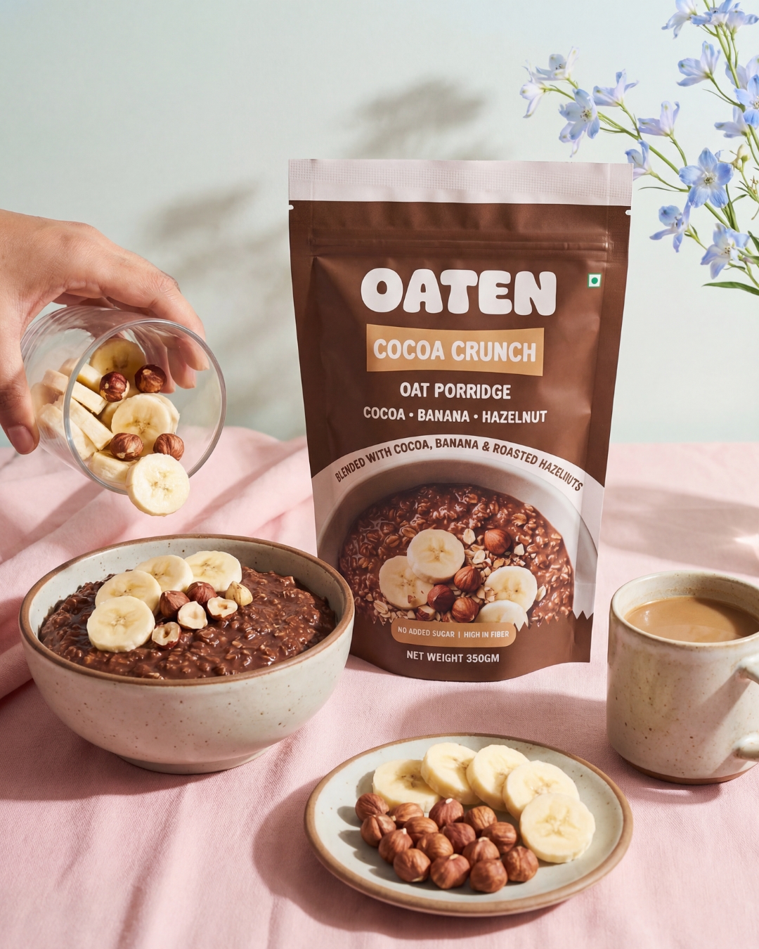
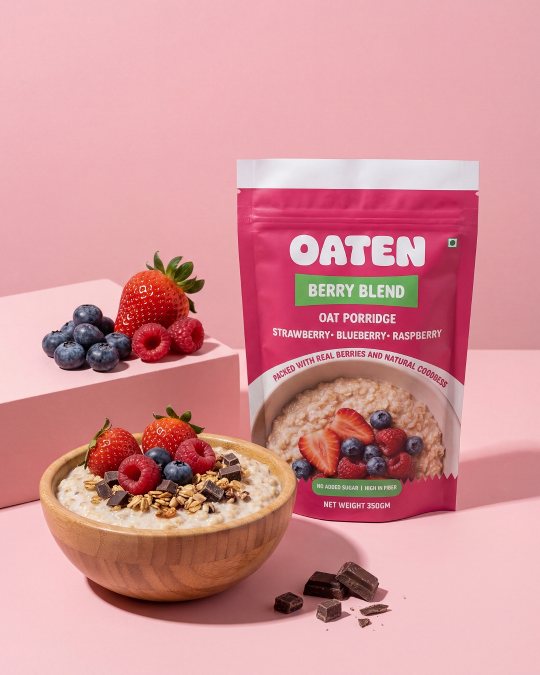
The packaging is built around a consistent layout system that ensures clarity across all variants. A bold logo, centered hierarchy, and structured information flow make the product easy to read on shelf. Each flavor is distinguished through a strong color palette—Berry Blend uses vibrant pink tones for freshness, Cocoa Crunch uses deep brown for indulgence, and Honey Crunch uses warm golden hues to represent comfort and natural sweetness. This creates a visually balanced lineup that stands out while maintaining brand consistency.
Food imagery plays a key role in the design. Each pack features a top-view bowl of oat porridge with real ingredients, enhancing appetite appeal and reinforcing authenticity. The use of simple typography and minimal yet effective claims such as “No Added Sugar” and “High in Fiber” ensures the packaging remains informative without feeling overwhelming.
Overall, Oaten is designed as a modern FMCG brand that blends functionality with visual appeal. The result is a cohesive packaging system that feels fresh, contemporary, and ready for real retail environments.
CREDIT
- Agency/Creative: Husain Studio
- Article Title: Oaten — Modern Oat Porridge Packaging Design
- Organisation/Entity: Freelance
- Project Type: Graphic
- Project Status: Published
- Agency/Creative Country: India
- Agency/Creative City: Nagpur
- Market Region: Asia
- Project Deliverables: Brand Creation
- Industry: Food/Beverage
- Keywords: Oat, Branding, Packagi
-
Credits:
Husain Sabir: Husain Sabir


