


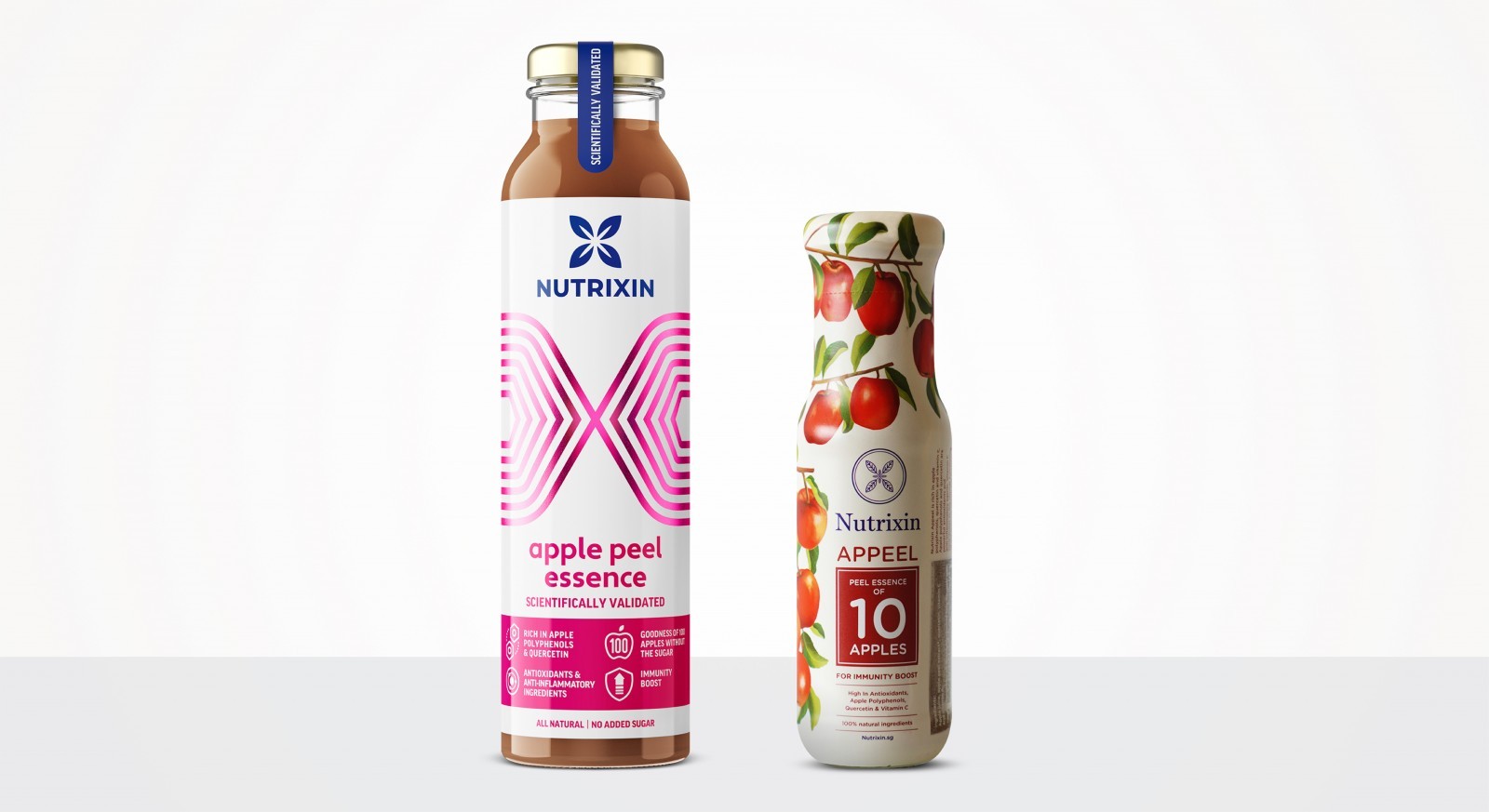
Nutrixin came to us with a problem. They have an existing brand, and an innovative range of peel essence drinks out in the market, but most consumers viewed it only as juice, and couldn’t see the real nutraceutical benefits of the product’s unique offering.
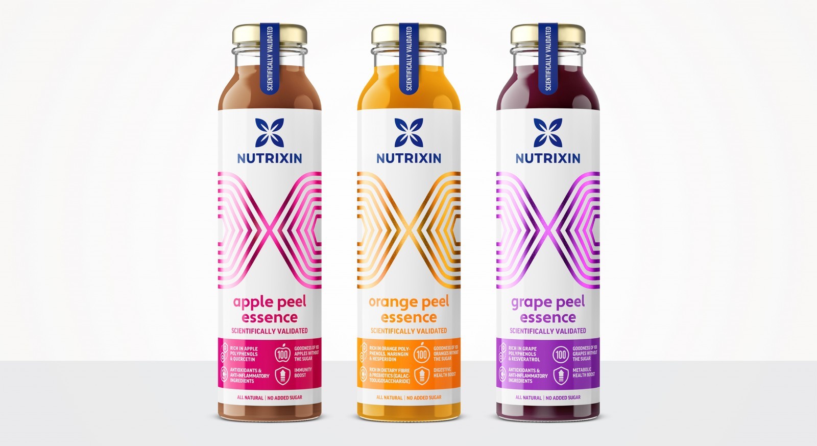
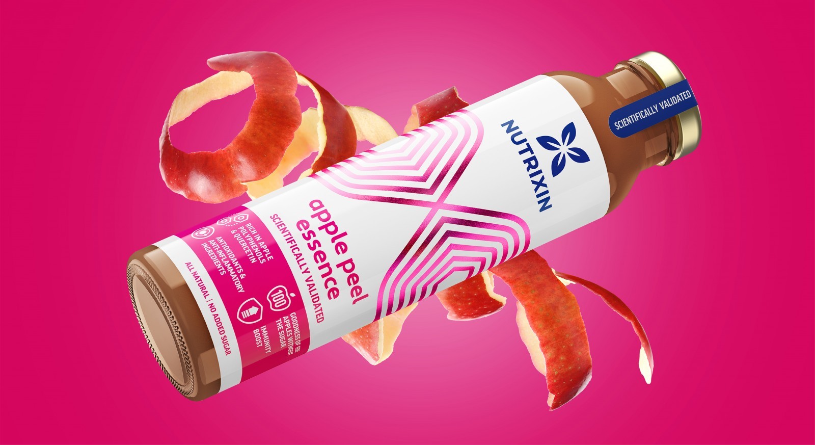
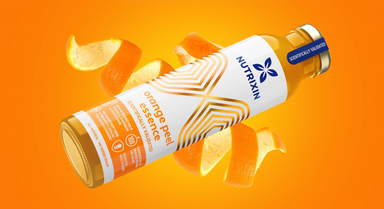
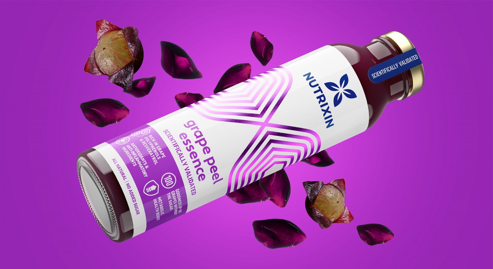
It was clear to us that the packaging and brand visual identity didn’t match the brand’s positioning. We started by simplifying the visual look. Science can be intimidating, so creating a simplified identity and introducing a bold line graphic element gave the brand and packaging a compelling look without looking dry or overly medical.
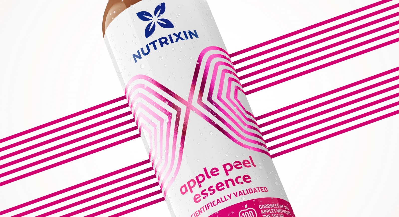
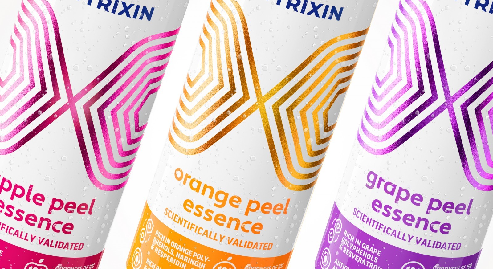
The ‘X’ formation of the leaves icon within the Brand ID not only represents the nutrients sourced from Nature but is also inspired by the idea of X as a multiplier (of various benefits in health) as well as the word “Xin” (meaning heart in Chinese, signifying the brand’s dedication to health and well-being)
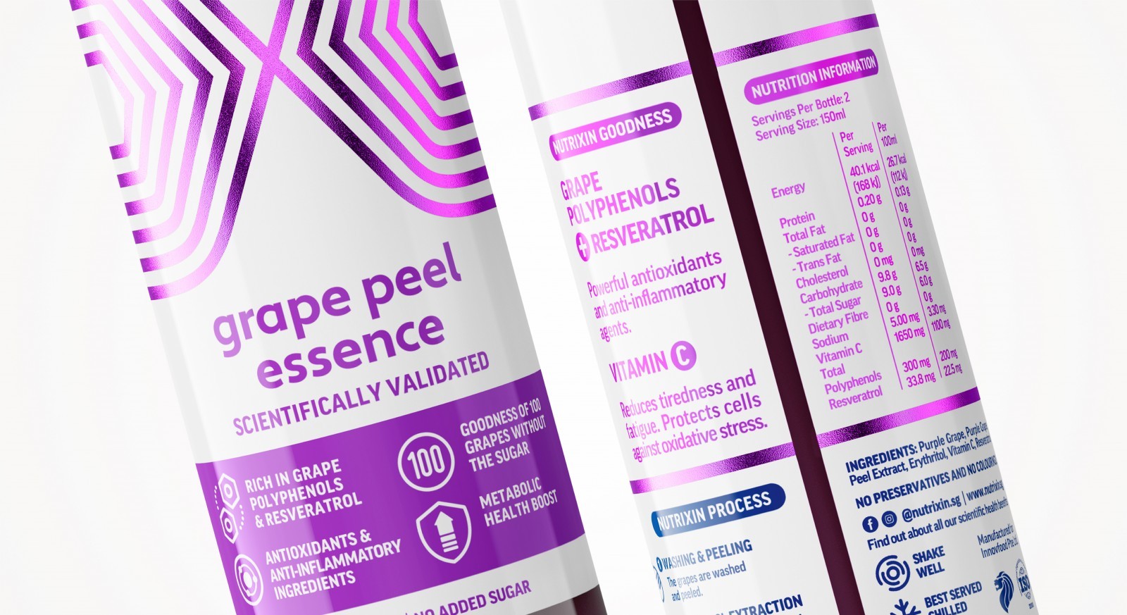
The line graphic elements were crafted with scientific cues in mind, as well as linking back to the idea of the “X”. On the back of pack, the line assets extend out to form a heart shape, connecting the elements back to the idea of “Xin”. To reflect the product’s clinically-proven benefits, we crafted icons featured on the front and back-of-pack to highlight the key product attributes.
The bold use of colours instils a modern, friendly design look, giving a perfect balance of science and fun. We position the design hierarchy so that the consumers will identify the brand identity being displayed in blue on white, closely similar to the old pack. As this is a relaunch, it was essential to highlight brand awareness.
We managed the amount of supplied copy by sectioning the copy with colour and icons, for ease of navigation and to give it a more appealing look. We created comfortable white space around the “X” graphic to provide the pack with a lighter feel. The colour-blocking below the line graphics not only holds the benefit icons but also helps with variant identification.
We selected a matt lamination and a metallic foil to highlight the “X” graphic for the sticker packaging label. The contrast between these two features allows the pack to maintain a natural look with the matt substrate, but also have strong stand-out with the metallic.
The redesign positions Nutrixin in a space where the brand initially intended, communicating to consumers that their range of nutraceutical peel essence beverages are all-natural, scientifically validated, and highly beneficial – a perfect solution to one’s daily health needs. But at the same time giving the consumer a feeling of fun and vitality from the design cues featured on the packaging.
CREDIT
- Agency/Creative: Kiilat Creative
- Article Title: Nutrixin Packaging Redesign by Kiilat Creative


