


Project Background
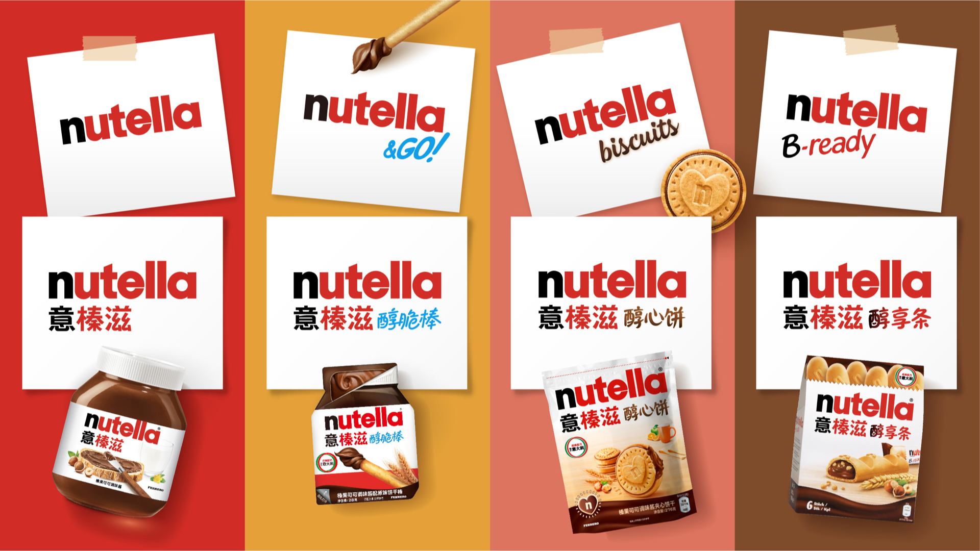
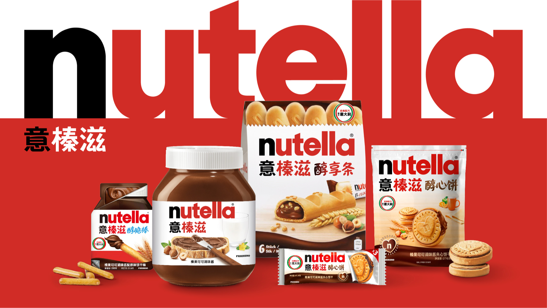
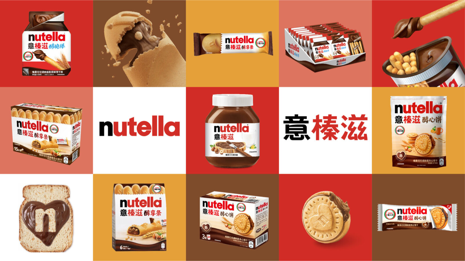
Nutella expanded its global product range, bringing four core offerings to China: Biscuits (醇心饼), B-ready (醇享条), Go! (醇脆棒), and the classic Jar (榛果可可酱). To deepen its connection with Chinese consumers, Nutella aimed to design its Chinese logos to align with local cultural preferences while retaining its international essence.
Design Considerations and solutions
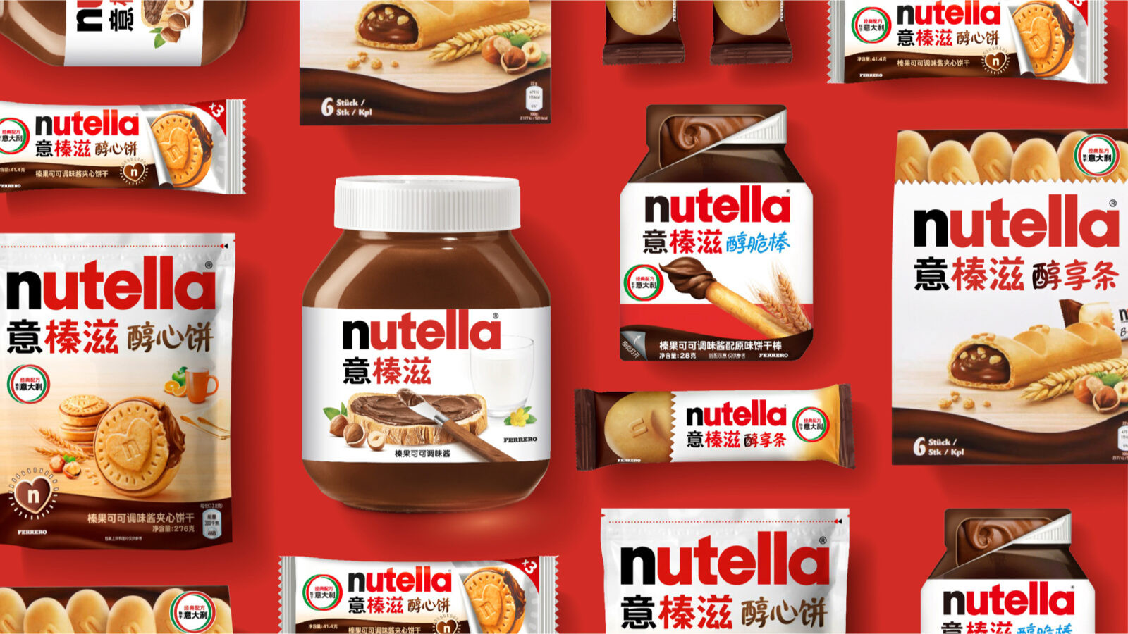
The project focused on achieving cultural-linguistic harmony by balancing the need for a localized Chinese identity with Nutella’s iconic global branding, while ensuring visual consistency between Chinese and English logos across all product lines. we wanted to capture each sub-range’s unique attributes, such as portability, texture, and emotional appeal, while maintaining a cohesive master brand identity.
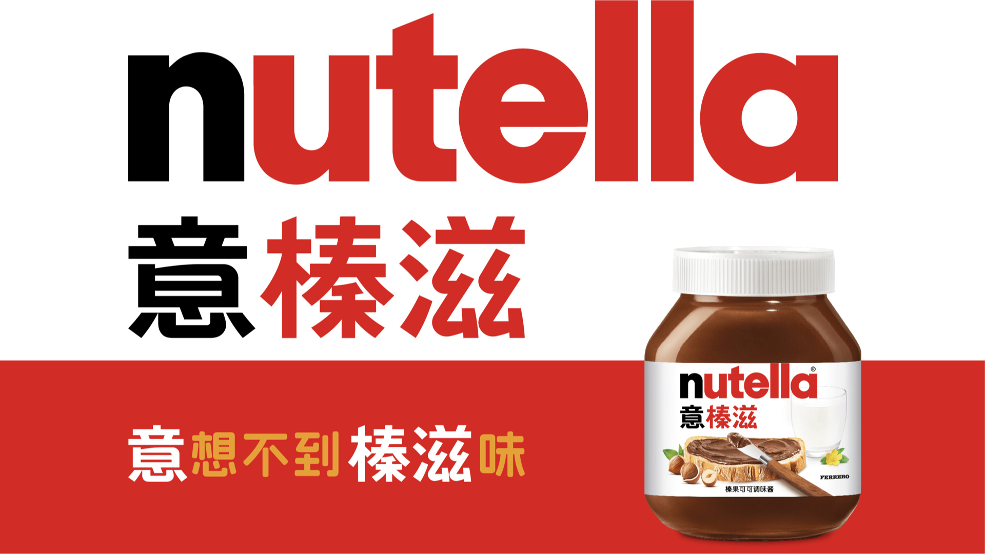
Look at established “Nutella意榛滋” as the master brand, unifying all sub-brands under a shared typographic framework. We based on well selected Chinese basic font to craft, so to echo with Nutella’s modern, rounded English letterforms.
We deconstructed the “日” component from the Chinese character “意” , which resembles the English letter “n” in shape, creating a design that visually echoes the “n”; For the character “滋”, we drew inspiration from the circular form inherent in the letter “a”, replacing the original blunt corners in the Chinese typeface with smooth, rounded curves; This approach enhances the overall logo with a softer and more harmonious aesthetic. Regarding the character “榛”, we referenced the glyph characteristics of the letter “t” in the English logo by diagonally cutting off the flat corner of the “木” radical, ensuring its angled cut aligns with the “t”‘s diagonal stroke.
when it comes to sub-range customization
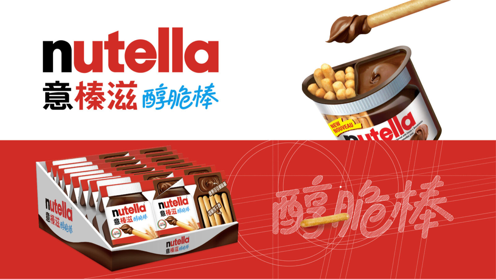
Nutella & Go! (醇脆棒): Tilted typography and dynamic angles conveyed portability and energy.
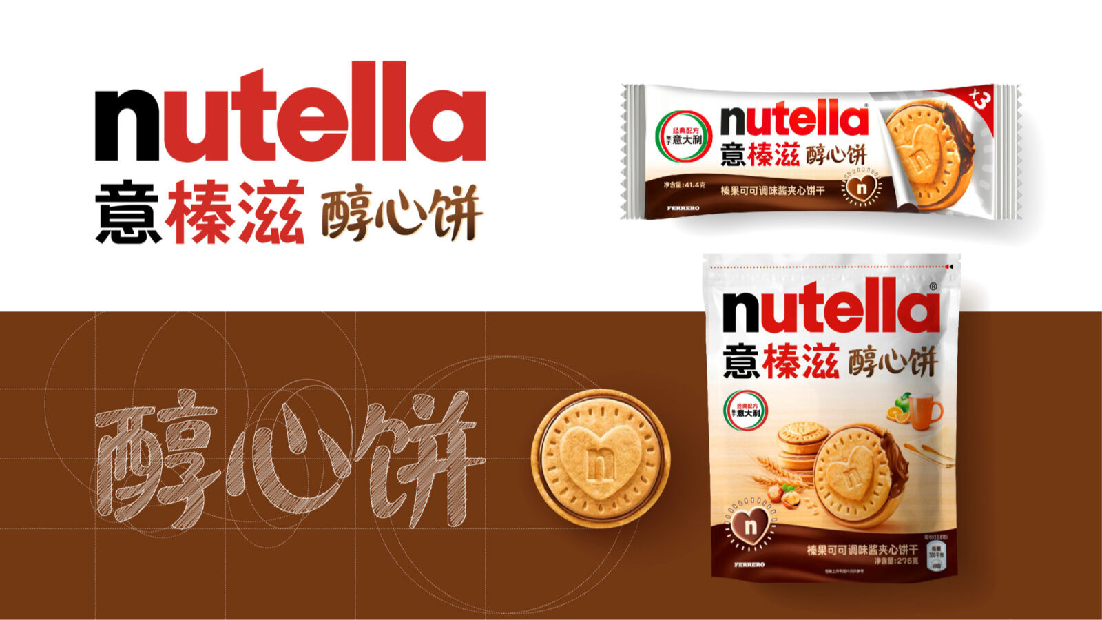
Nutella Biscuits (醇心饼): Integrated a heart-shaped curve into the “心” character, paired with warm hues to evoke sharing and affection.
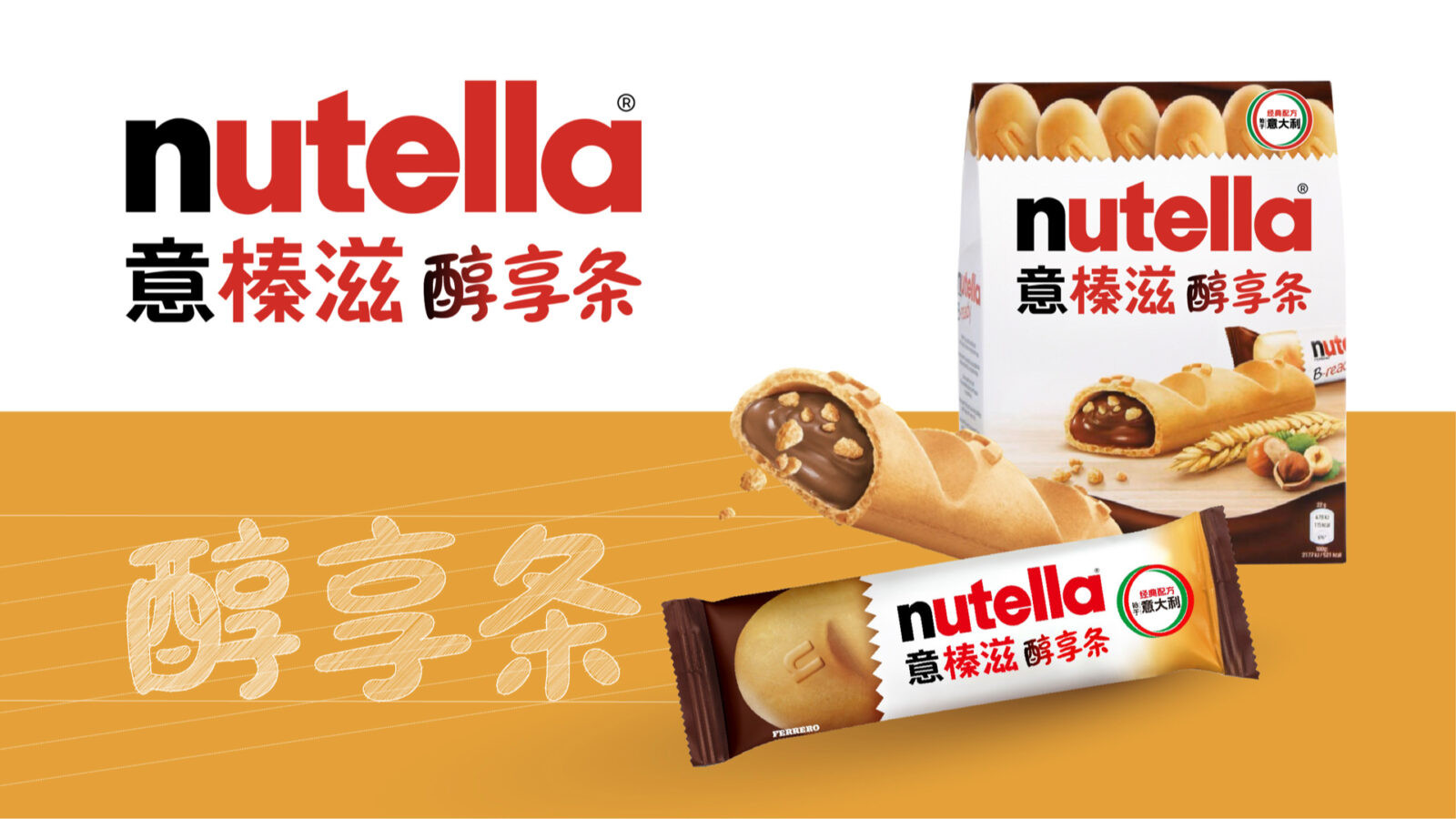
Nutella B-ready (醇享条): Used gradient effects on “醇” to mimic the product’s hazelnut filling, emphasizing texture and indulgence.
Project Result
The newly designed Chinese logos achieved a harmonious balance between global sophistication and local relevance. A cohesive yet flexible identity system strengthened Nutella’s presence in China, with sub-ranges clearly differentiated yet visually interconnected.
By fusing Nutella’s iconic playfulness with Chinese aesthetic sensibilities, ShinyBay’s design not only elevated the brand’s visual appeal but also deepened its emotional connection with consumers—turning every product into a delicious invitation to experience “unexpected hazelnut joy.”

CREDIT
- Agency/Creative: ShinyBay Design
- Article Title: Nutella Chinese Logo Design by ShinyBay
- Organisation/Entity: Agency
- Project Status: Published
- Agency/Creative Country: China
- Agency/Creative City: Shanghai
- Market Region: China
- Project Deliverables: 2D Design, Brand Creation, Brand Identity, Design, Graphic Design, Identity System, Label Design, Logo Design, Packaging Design, Typography
- Industry: Food/Beverage
- Keywords: WBDS Agency Design Awards 2025/26


