


Challenge:
Since 2008, Nusi has been one of Uzbekistan’s most familiar confectionery brands, particularly in the bulk cookies segment. However, as the product line expanded over the years, a critical problem emerged — visual inconsistency. Each new product was developed at different times by different designers, resulting in a fragmented brand image.
Our task was to unite all products under one cohesive, emotionally engaging, and easily recognizable visual system that would strengthen Nusi’s presence on the shelf and boost sales.
Research & Insights:
Our deep market and psychological analysis revealed:
Mascots drive memorability: Products with mascots are remembered up to 37% more by consumers (international FMCG studies). Warm colors boost appetite and impulse: Red tones increase purchase likelihood by 12%, evoking energy, joy, and warmth. Market gap: The local confectionery sector lacked truly sincere and story-driven brands — opening a clear opportunity for Nusi to lead.
Creative Solution:
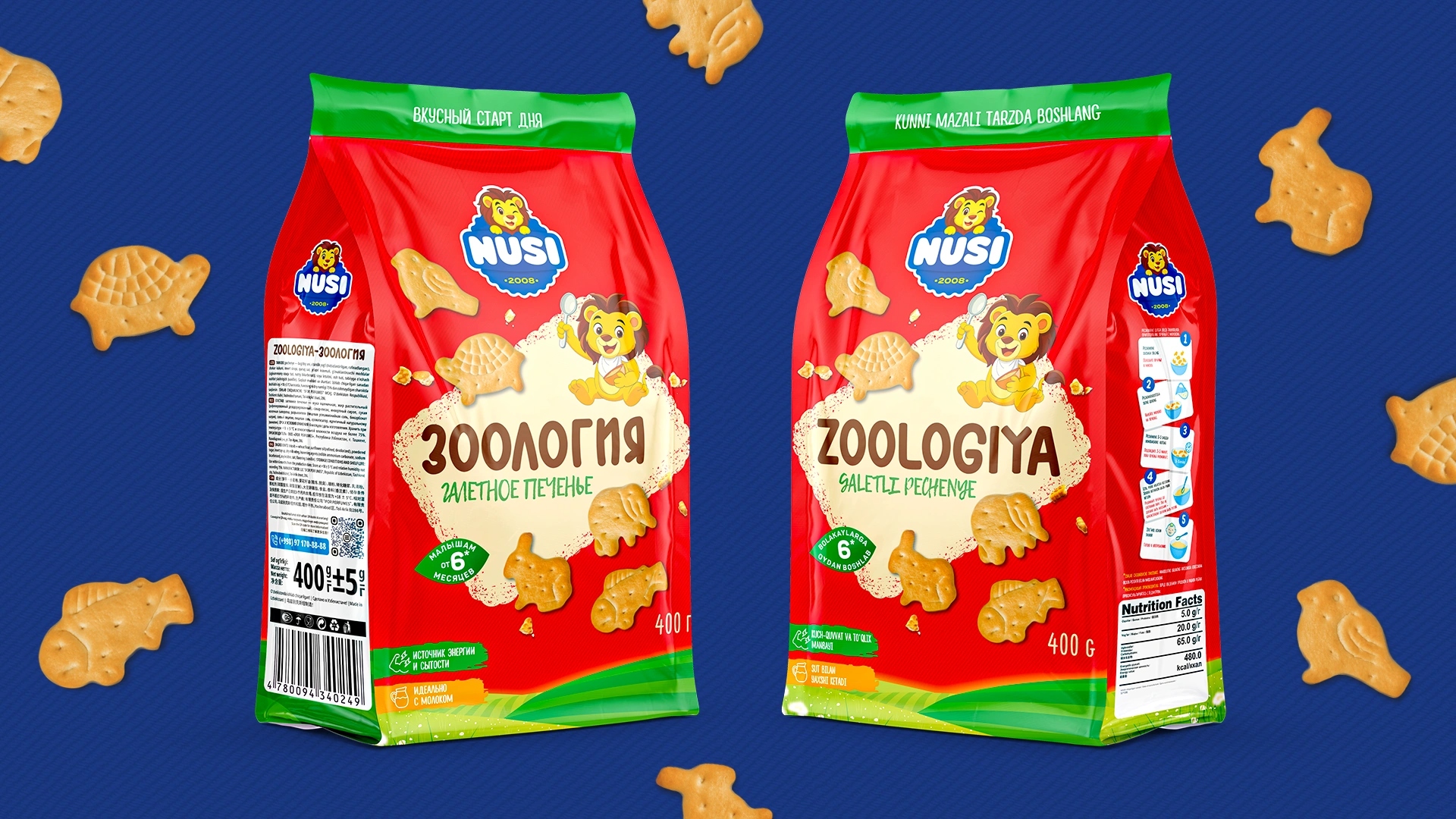
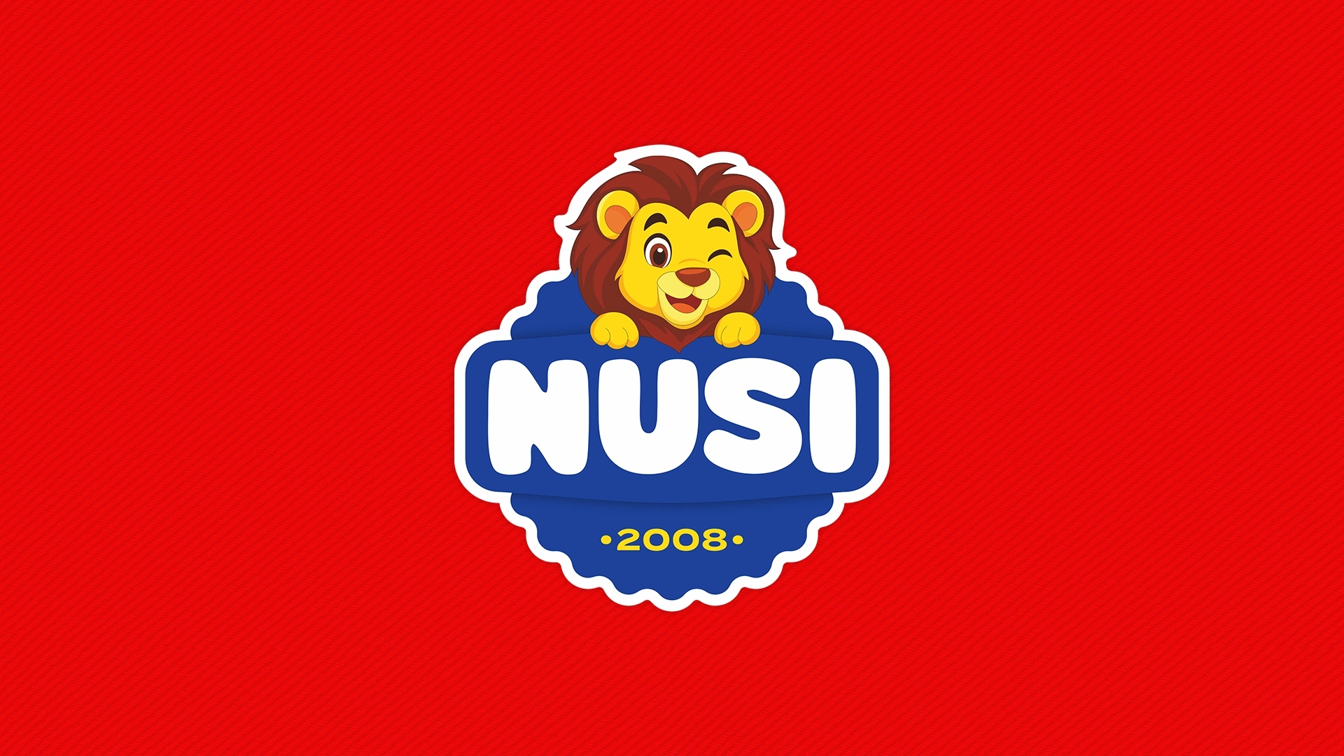
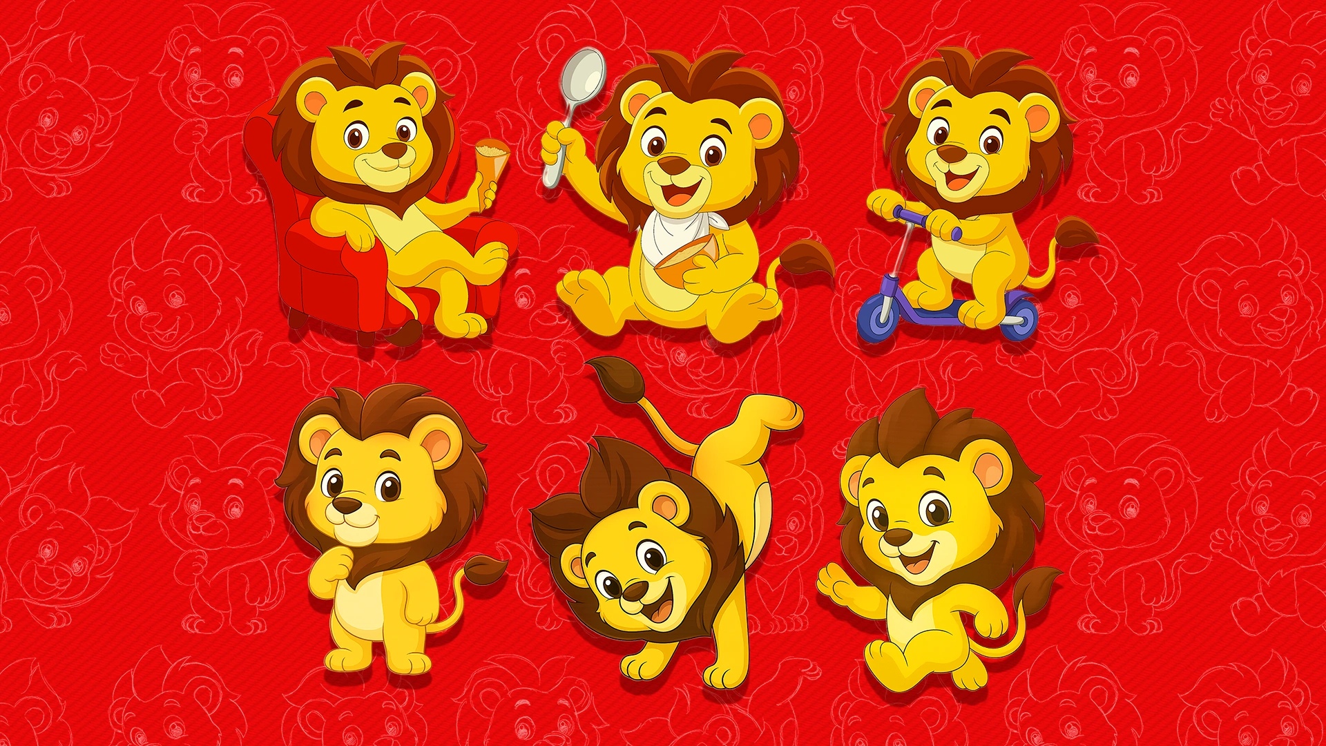
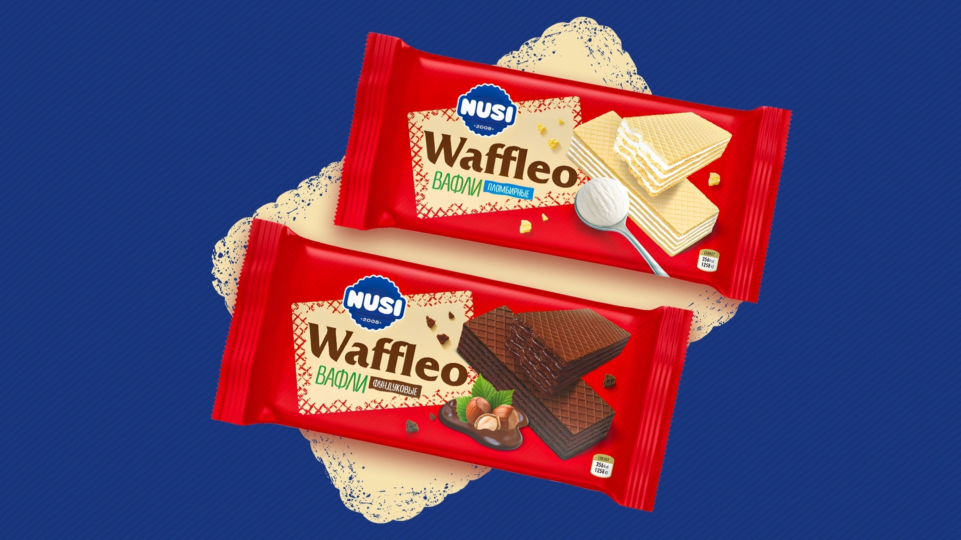
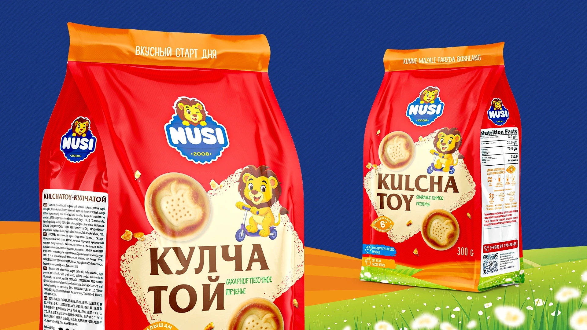
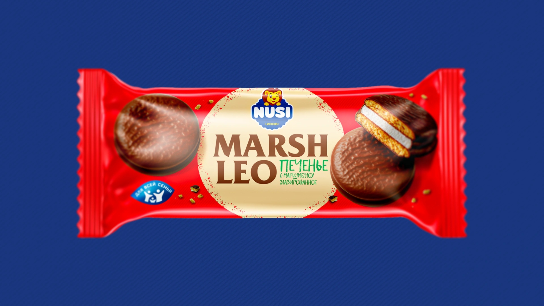
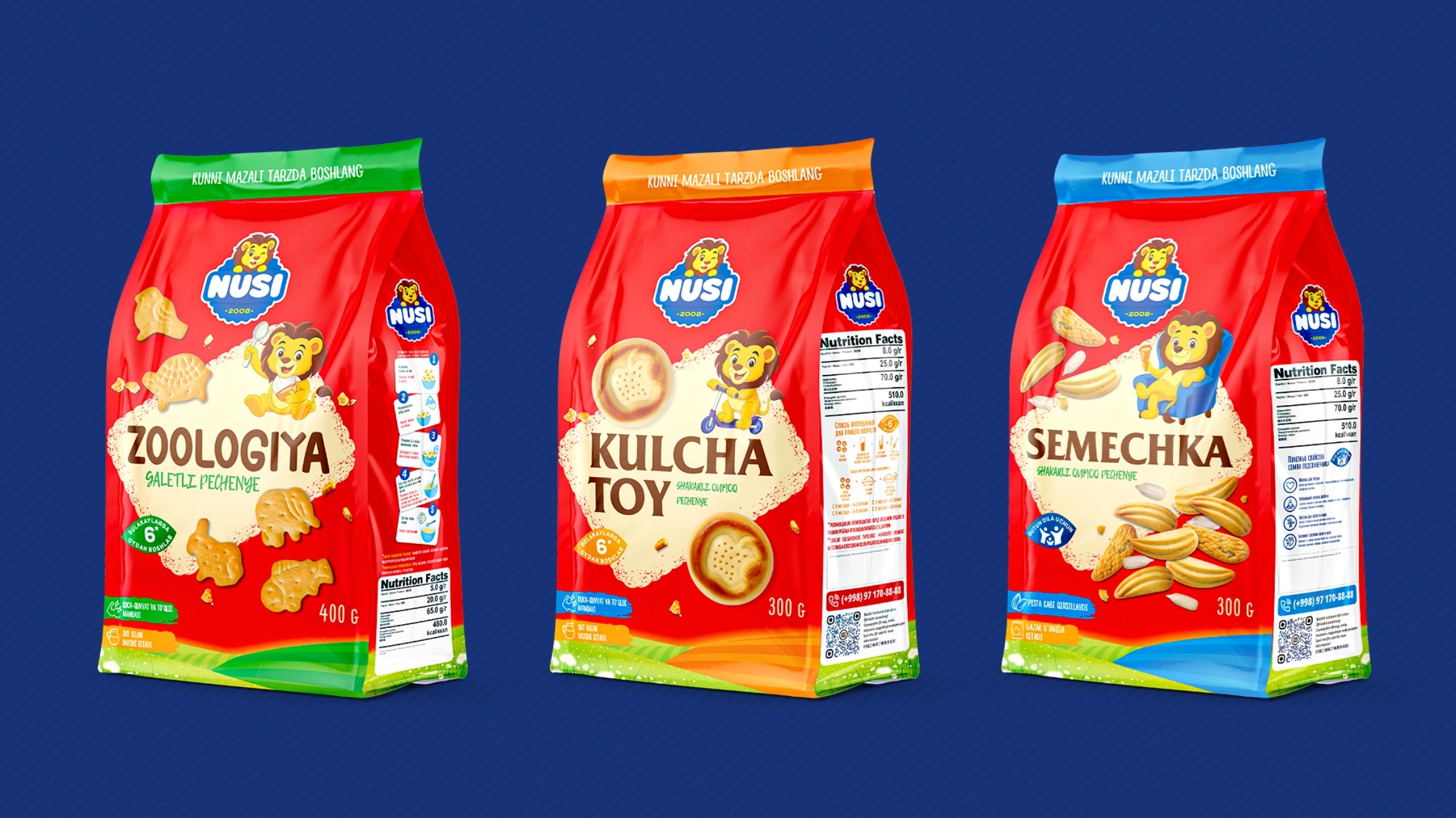
We built a unified and flexible design ecosystem for all Nusi products: Logo Rebranding: The logo was refreshed to appear more friendly, modern, and legible across all packaging types. Mascot Development: We introduced Shercha, a playful and kind lion cub representing the brand’s leadership and friendliness. As “king of animals,” the lion embodies Nusi’s confidence and top position in its segment. Adaptive Mascot System: Shercha changes character depending on the product — playful on kids’ cookies like Zoology or energetic on Kulcha Toy. This gives each SKU its own personality within a single universe.
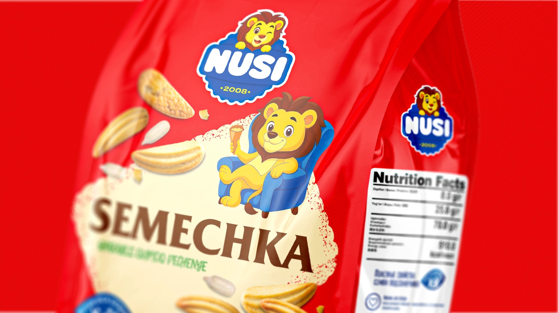
Strategic Exception: For the best-selling Arabica cookies, the familiar palette was preserved but adapted to the new visual system to maintain customer loyalty. 3D Realism: Each product received photorealistic 3D renders to enhance appetite appeal and consistency across the portfolio.
Results:
The rebranding transformed Nusi from a visually scattered assortment into a strong, cohesive, and emotionally vibrant brand. On shelves, the brand now stands out instantly — uniting all products through recognizable color, character, and emotion. The new mascot, the Lion, became not just a packaging element but a long-term communication asset for campaigns, merch, and storytelling. As Paul Rand said: “Design is not just what it looks like, but how it works.” – and this design truly works: it drives recognition and sells.
CREDIT
- Agency/Creative: Minim Design Agency
- Article Title: Nusi – Rebranding for a Confectionery Brand by Minim Design
- Organisation/Entity: Agency
- Project Type: Packaging
- Project Status: Published
- Agency/Creative Country: Uzbekistan
- Agency/Creative City: Tashkent
- Market Region: Asia
- Project Deliverables: Character Design, Logo Design, Packaging Design, Rebranding
- Format: Box, Wrap
- Industry: Food/Beverage
- Keywords: Packaging Design, Rebranding, Mascot, Confectionery, Brand System, Logo Redesign, 3D Visualization, FMCG, Shelf Impact, Brand Consistency, Storytelling, Uzbekistan
-
Credits:
Agency: Minim Design


