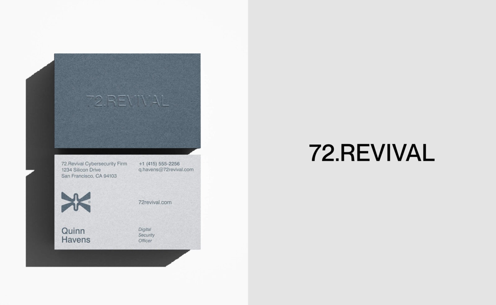
For 72.Revival, we set out to craft a visual identity that doesn’t just look strong—it feels strong. Cybersecurity can often feel cold, technical, and even overwhelming, but we wanted the 72.Revival brand to break through that stereotype. The goal was to create a brand that radiates confidence and trust while making people feel secure, empowered, and in control of their digital landscapes. The identity balances sophistication with approachability, blending cutting-edge technology with a human, reassuring touch.
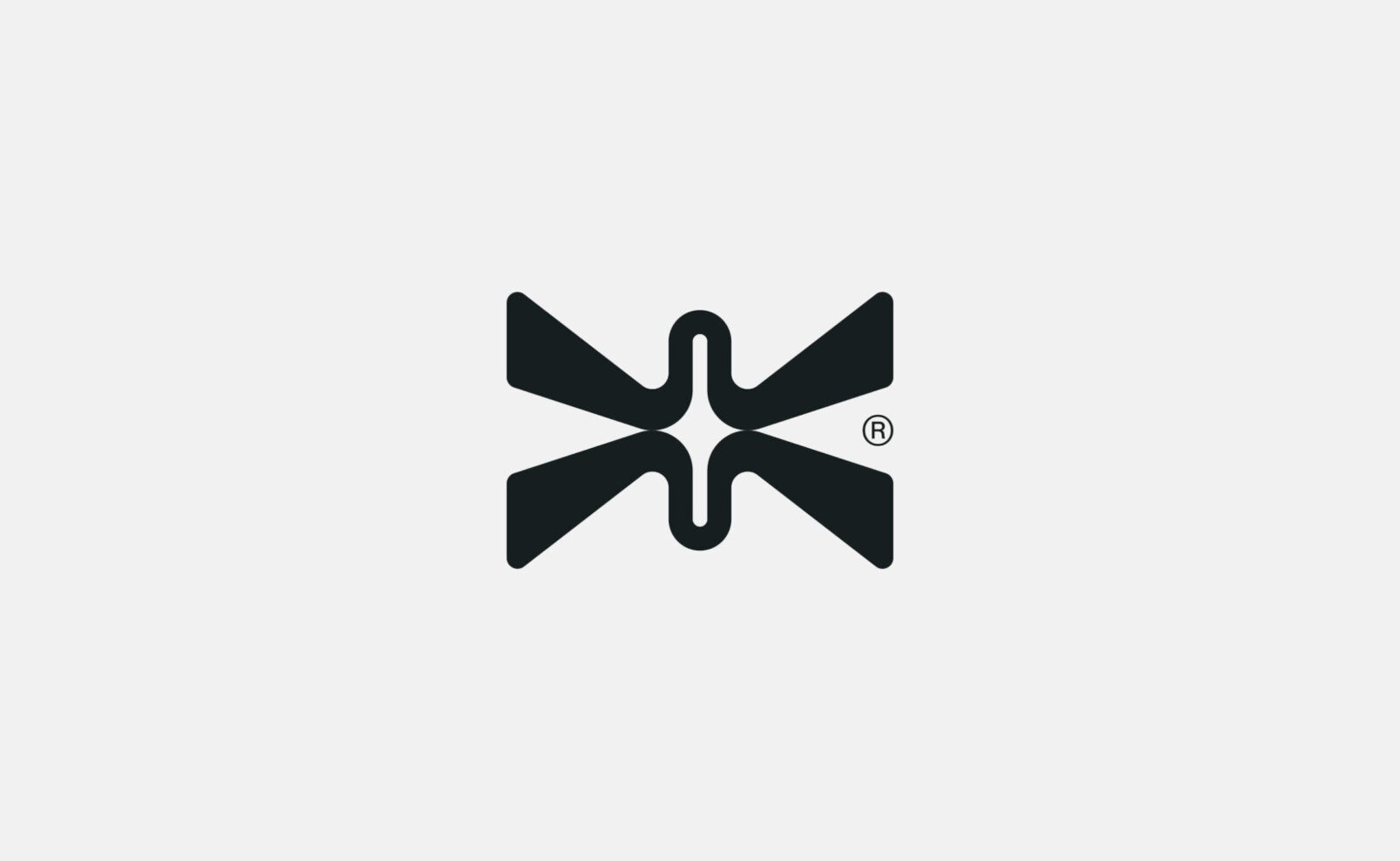
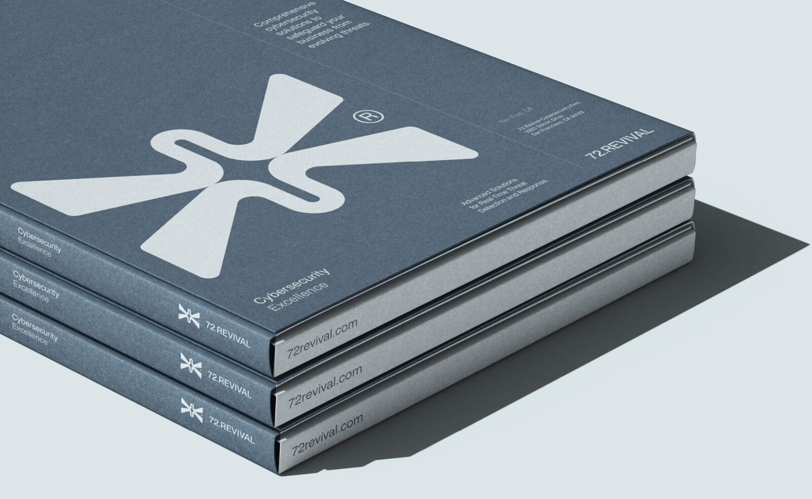
At the heart of the identity is the logo—a bold and symmetrical mark with a story to tell. Its interlocking shapes form a central cross-like figure, representing unity, precision, and strength. This design is all about connection: the connection between people and technology, between vulnerability and protection, and between today’s challenges and tomorrow’s solutions. The shapes flow seamlessly together with aerodynamic grace, symbolizing forward momentum and the brand’s dedication to staying ahead of evolving threats. It’s simple, it’s strong, and it leaves a lasting impression.
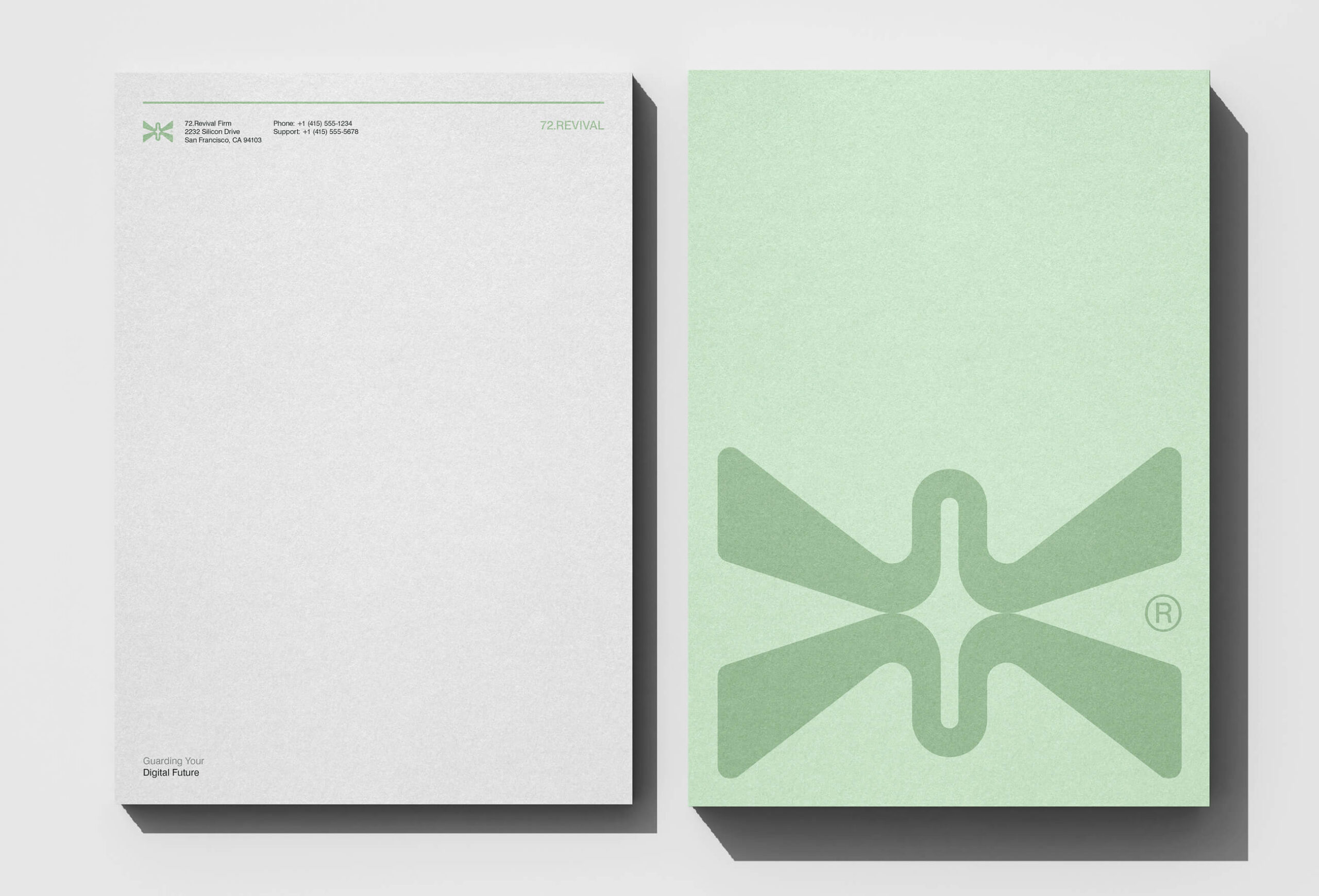
The visual identity doesn’t stop there. We created a color palette that merges cool, calming greens and blues with warm, optimistic accents, striking a perfect balance between trustworthiness and energy. The typography, Swiss721, was chosen for its clean and modern lines. It’s polished enough to convey professionalism while remaining approachable—a perfect embodiment of 72.Revival’s commitment to both innovation and customer care. Every design element is intentional, designed to translate complex cybersecurity concepts into something that feels clear and accessible.
This logo isn’t just a visual mark—it’s a promise. It reassures clients that they are protected in a fast-moving, unpredictable digital world. It’s a design that says: “You’re in safe hands.” It represents not only security but also the confidence to move forward. It’s a mark that speaks to resilience, adaptability, and the unwavering commitment to protecting what matters most. Together with the broader identity, it captures the essence of 72.Revival—a brand that turns complexity into clarity and transforms trust into action.


CREDIT
- Agency/Creative: Numinous Agency
- Article Title: Numinous Agency Redefines Cybersecurity Branding with 72.Revival’s Confident New Logo
- Organisation/Entity: Agency
- Project Status: Published
- Agency/Creative Country: United States of America
- Agency/Creative City: Portland, Maine
- Project Deliverables: Brand Design, Brand Identity, Brand Mark, Identity System, Logo Design
- Industry: Technology
- Keywords: WBDS Agency Design Awards 2024/25
- Keywords: WBDS Agency Design Awards 2024/25
-
Credits:
Founder/Creative Director: Geovanie Radcliffe


