


The Auralen Rebrand: Clarity as Craft
Some rebrands are about going bigger. More color. More voice. More energy.
But sometimes, the most meaningful shift comes from pulling things back.
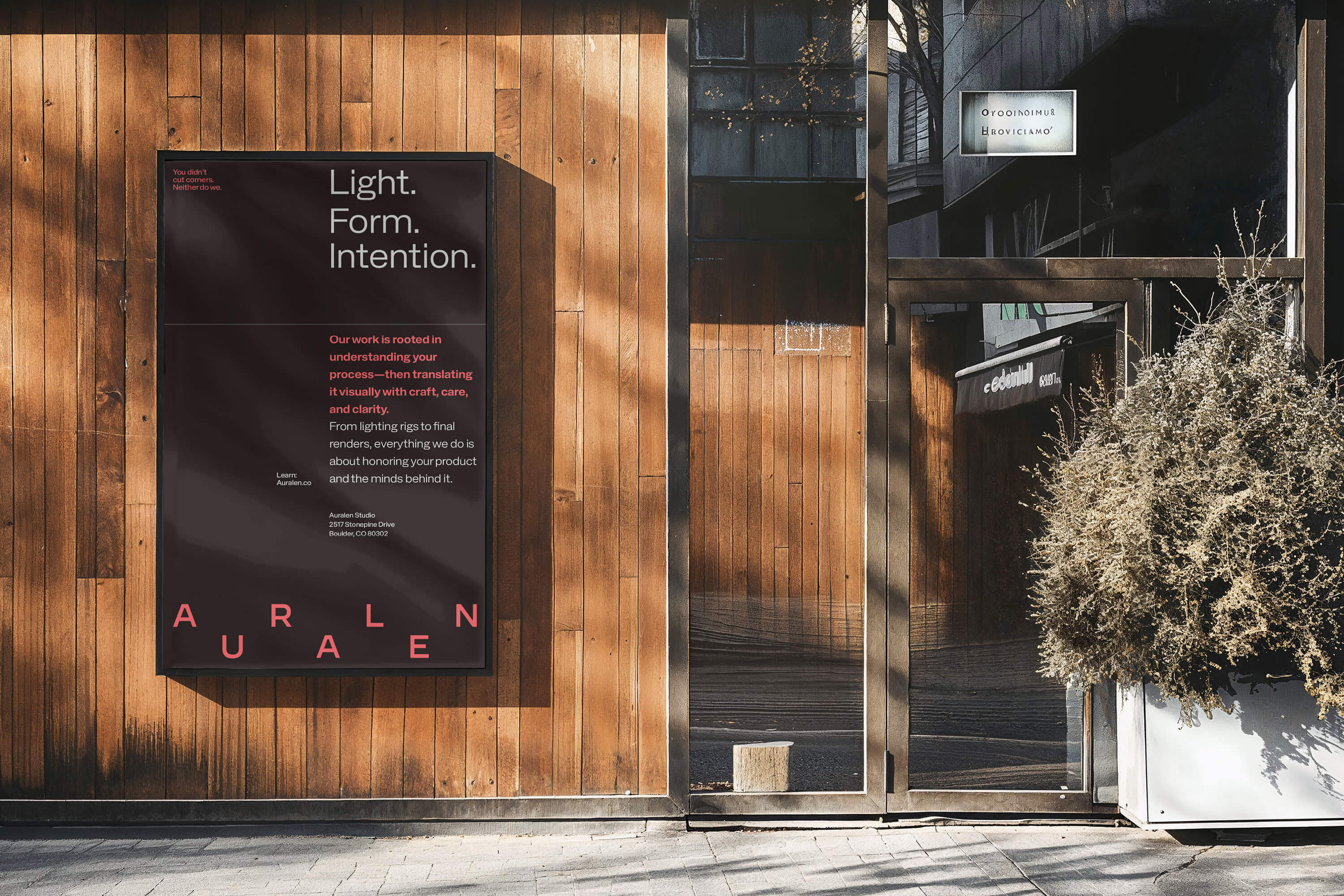
Auralen is a Colorado-based studio specializing in product photography and 3D visualization. Their work is grounded in precision—every shadow, texture, and surface is intentional. Nothing flashy. Everything thoughtful. So when it came to branding, we knew this couldn’t be about making a louder impression. It had to feel like them: steady, sharp, and stripped back to only what matters.
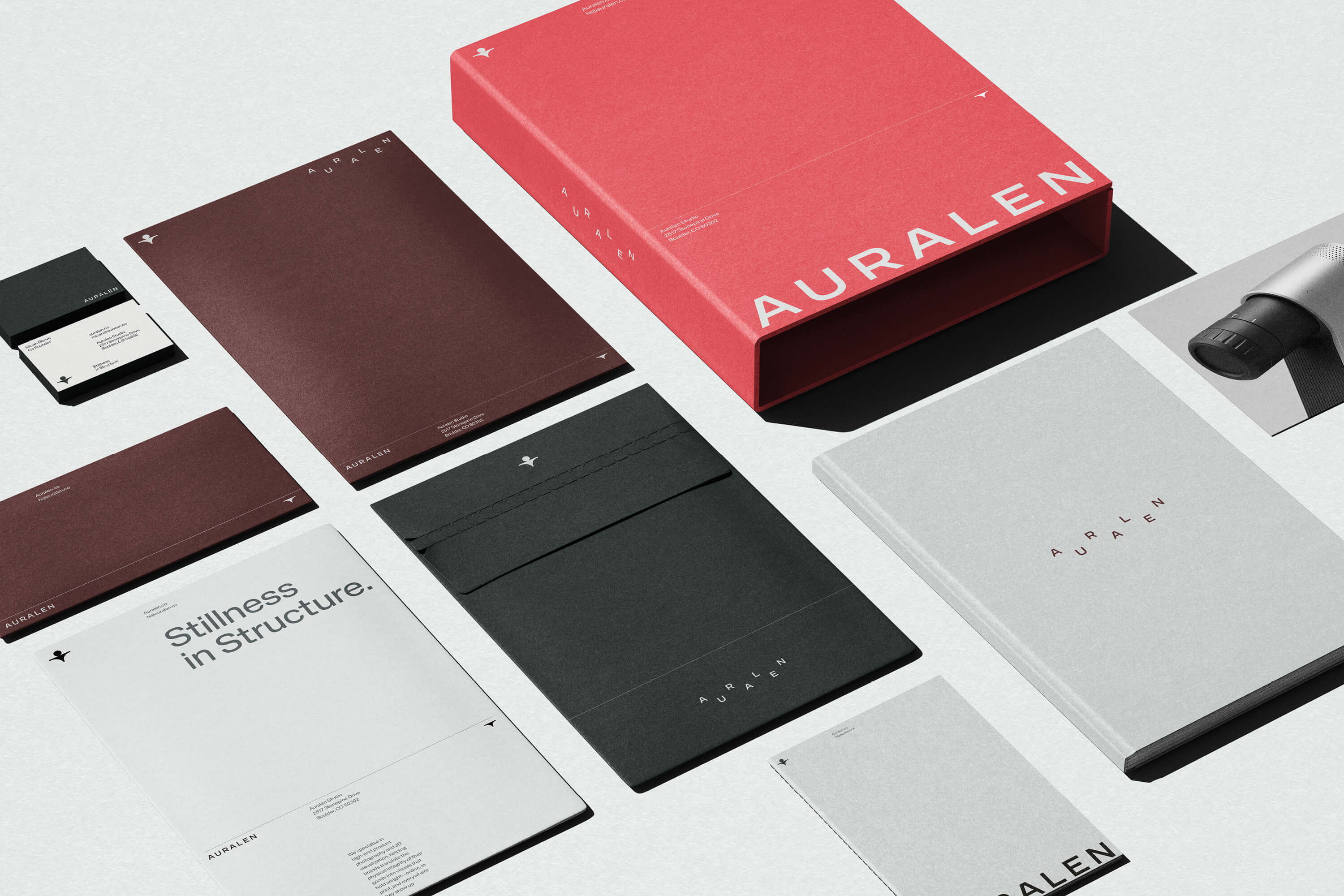
We worked with Auralen to create a full brand identity system that mirrors their ethos. The goal wasn’t to decorate—it was to distill. To bring structure, clarity, and quiet confidence to a brand that already had depth. What we built is minimal by design, but rich in intention.
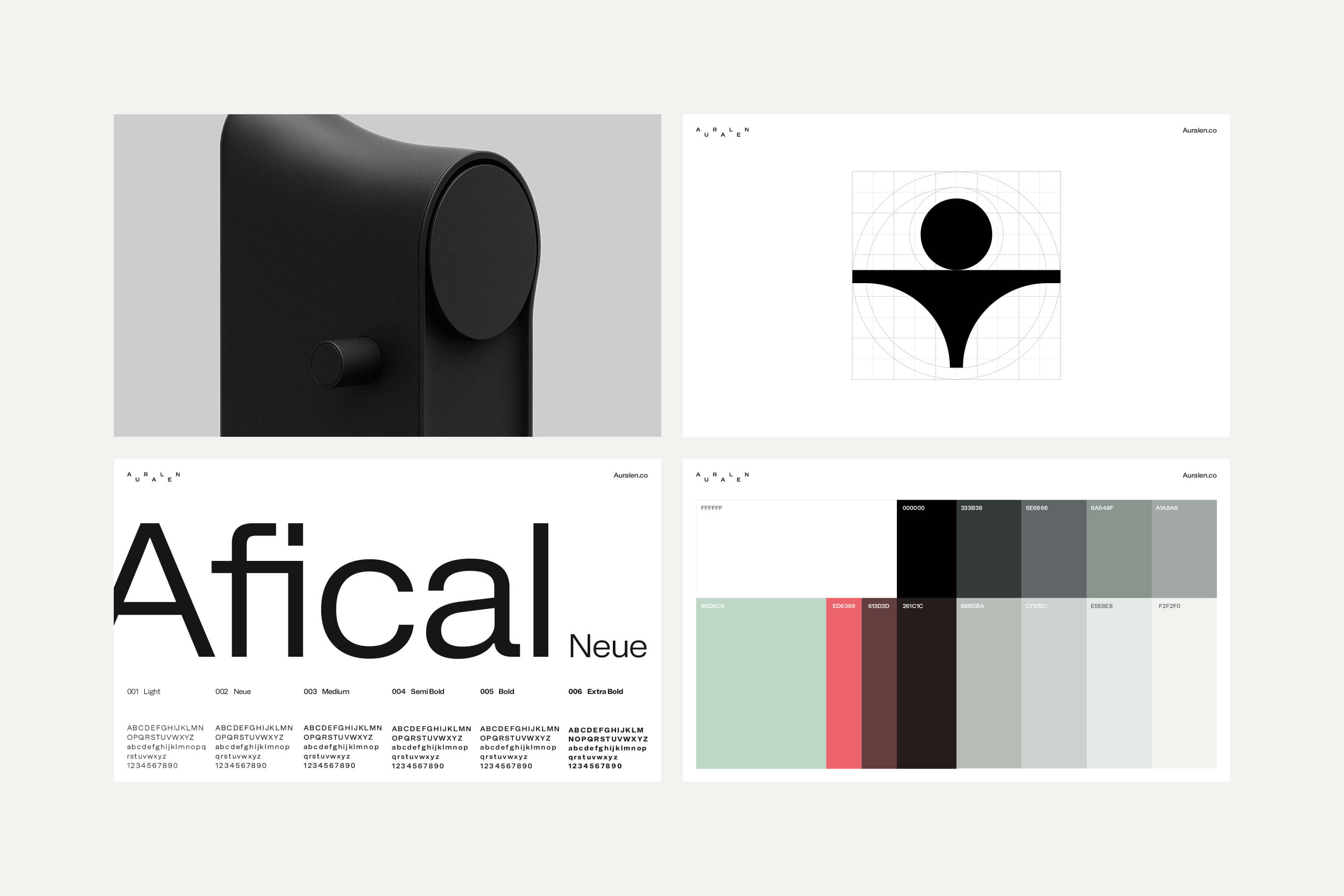
The symbol is rooted in geometry and restraint. It draws subtle cues from camera lenses, architecture, and the idea of human connection—but avoids anything overly literal. It sits easily next to their work, never competing for attention. It exists to support, not to speak over.
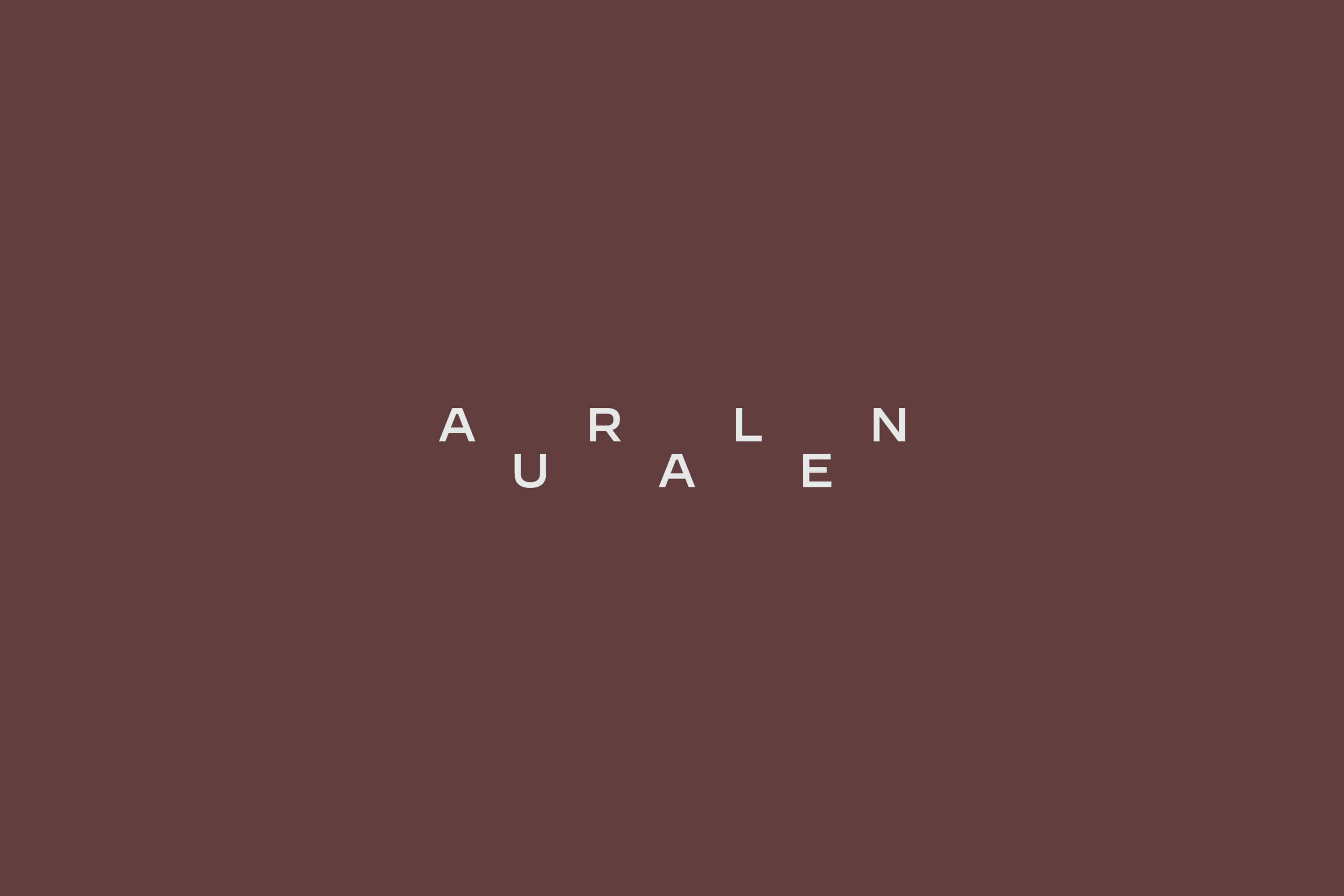
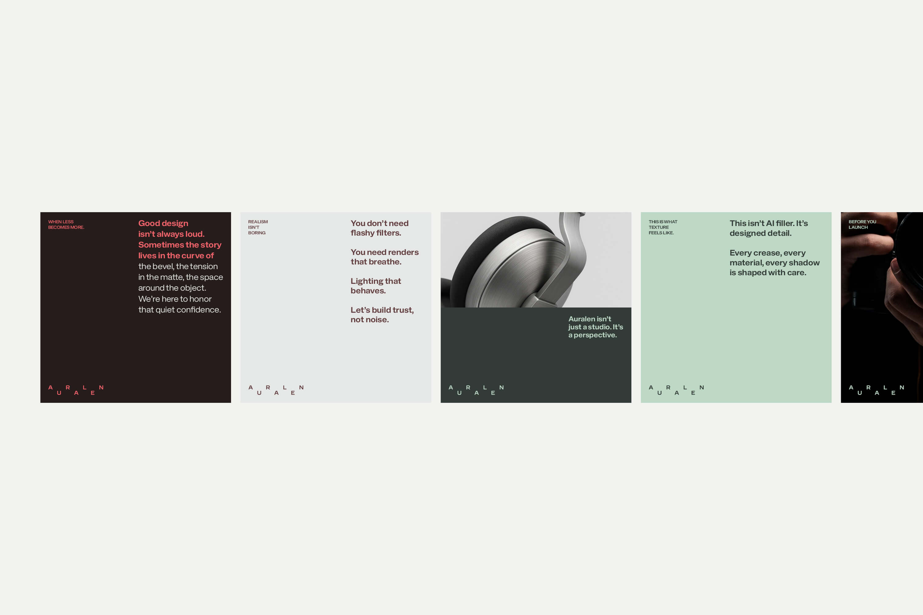
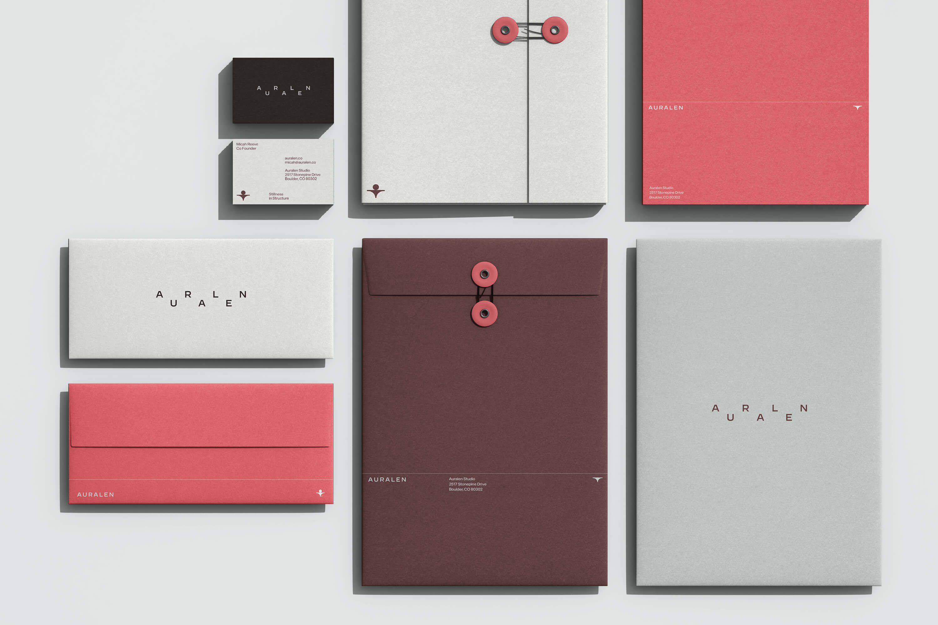
Typography is crisp and neutral, chosen not to stand out, but to hold space. With clean rhythm and considered spacing, the type system lends weight where needed—without ever feeling heavy.
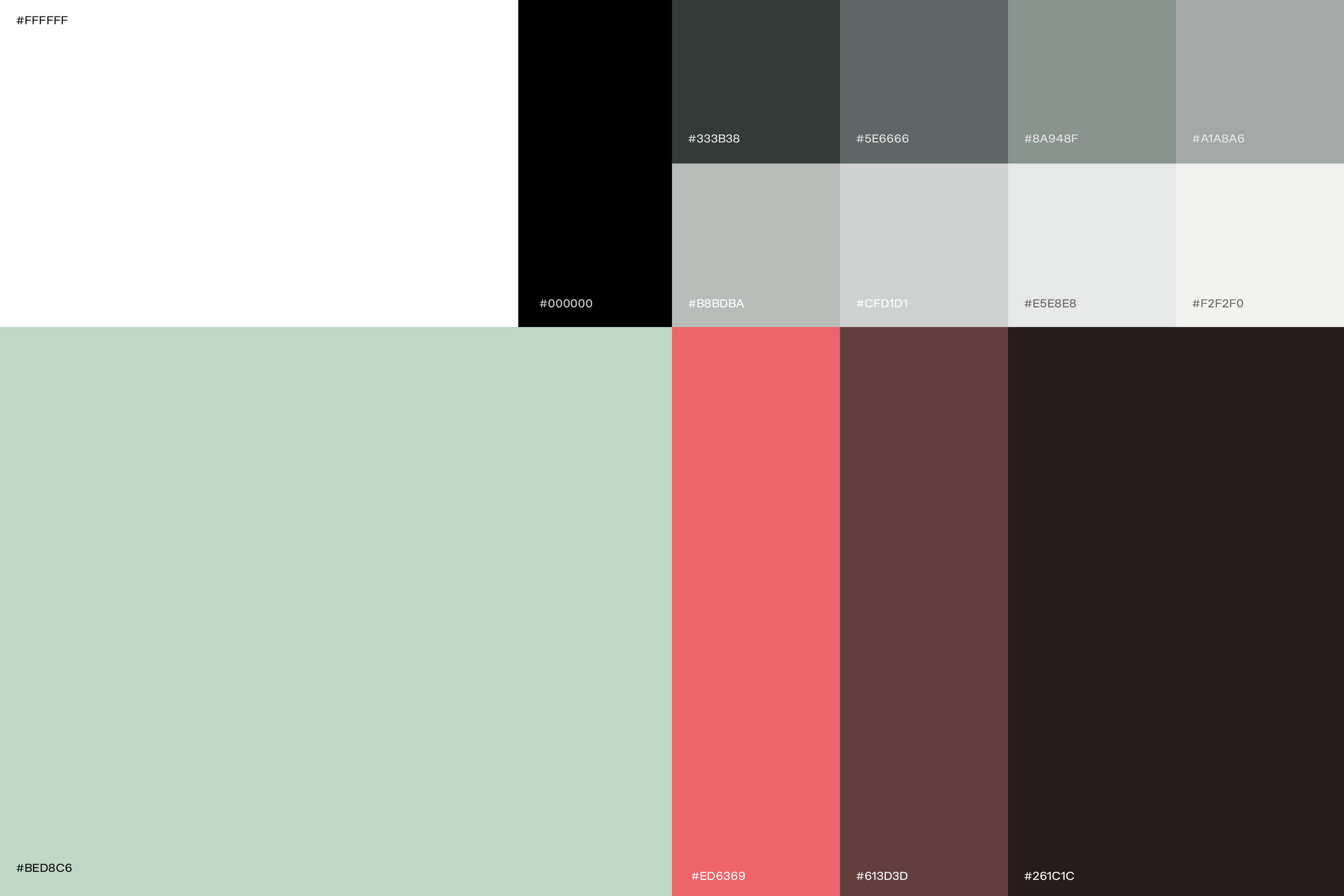
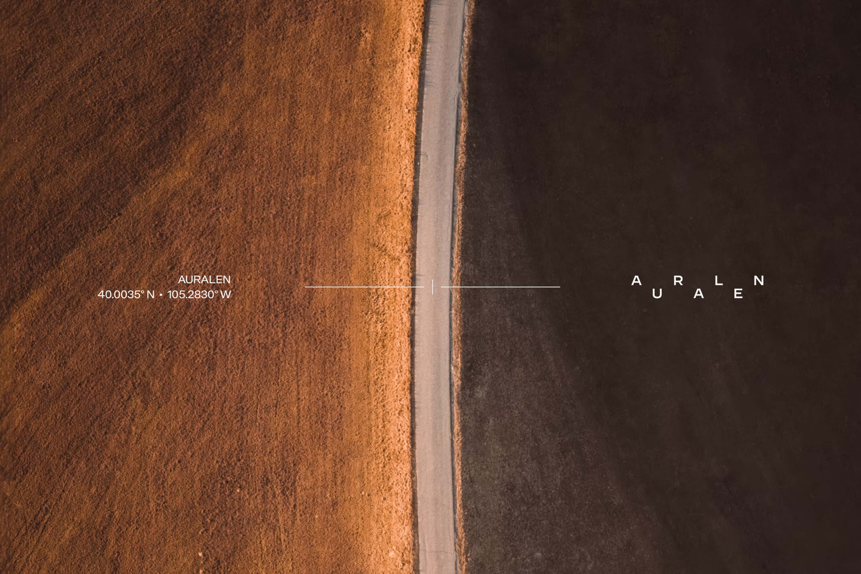
The color palette is pulled from nature and studio environments: slate, pine, off-white, ash. Tones that feel grounded, tactile, and quietly confident. Nothing is loud. Nothing demands. It all sits just under the surface, exactly where it should.
Throughout the process, we focused on building a system. One that Auralen could carry with them across formats and moments—from campaign visuals to on-set signage. Every template, layout, and style rule was designed to make space for the work, not overshadow it.
What emerged is a brand identity that doesn’t fight for attention. It holds presence in a different way—calm, clear, and intentional. Auralen doesn’t need to shout. Their work speaks for itself. This brand just helps it speak a little more clearly.


CREDIT
- Agency/Creative: Numinous Agency
- Article Title: Numinous Agency Redefines Auralen With a Quietly Confident Visual Identity
- Organisation/Entity: Agency
- Project Type: Identity
- Project Status: Published
- Agency/Creative Country: United States
- Agency/Creative City: CASCO
- Market Region: North America
- Project Deliverables: Brand Creation, Brand Design, Brand Guidelines, Brand Identity, Brand Mark, Logo Design
- Industry: Professional Services
- Keywords: Brand Idenitty,
-
Credits:
Creative Director/Founder: Geovanie Radcliffe


