


The future of cocoa is under threat.
Climate change is disrupting global cocoa yields. Demand is rising. Prices are surging. And the environmental toll of traditional chocolate production is mounting. The industry is in the eye of a perfect storm, and survival means rethinking everything.
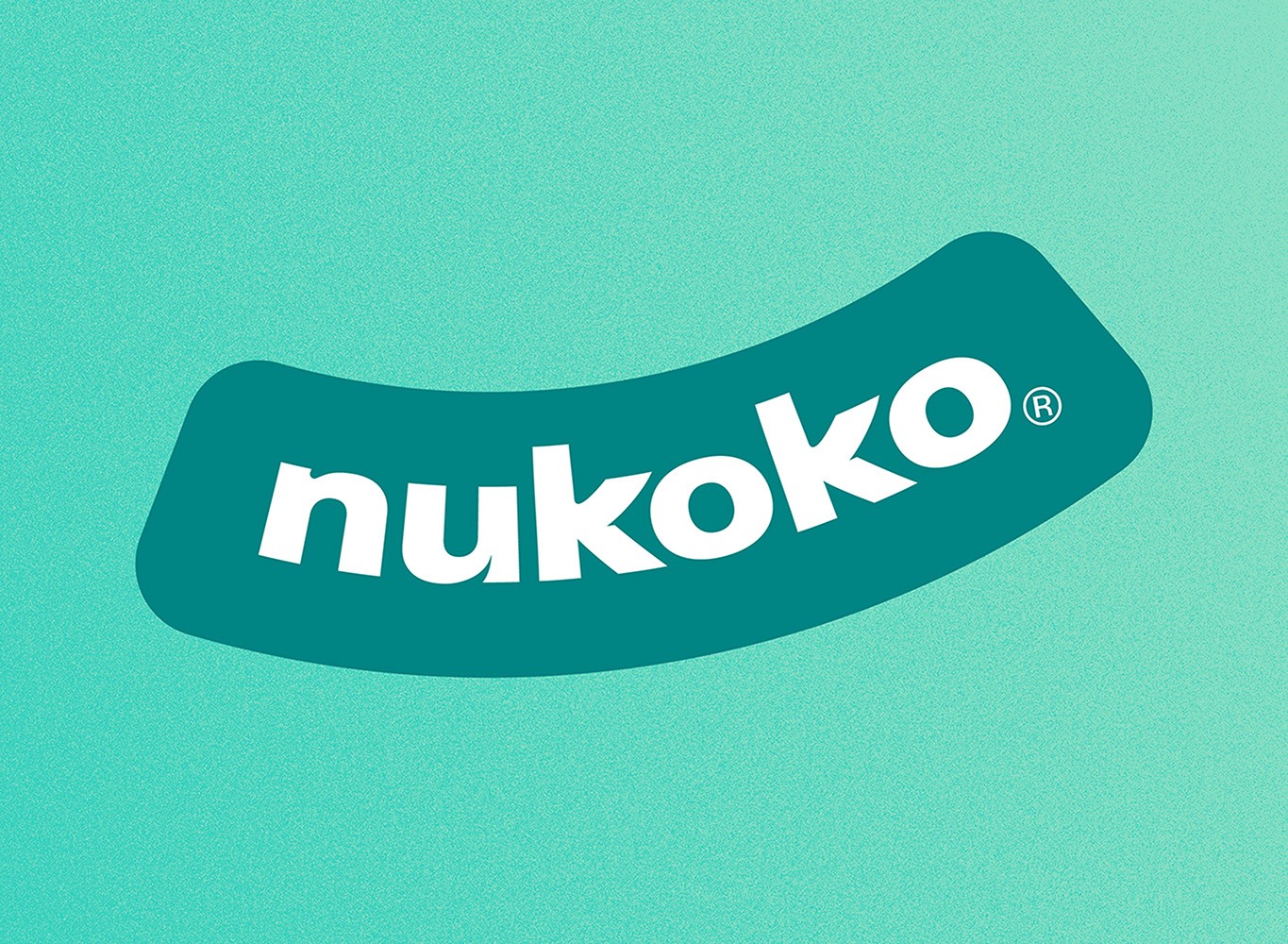
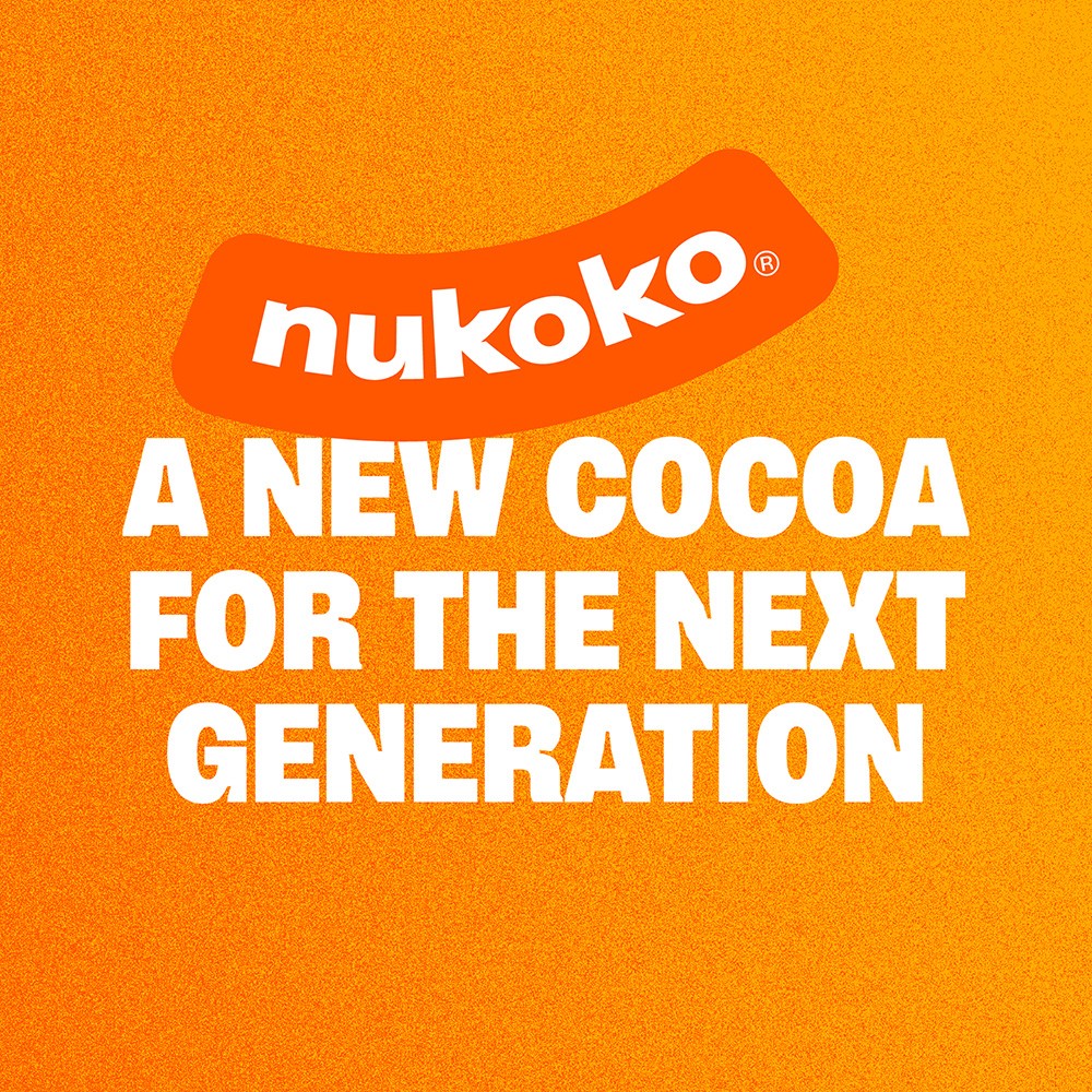
That’s where Nukoko® comes in.
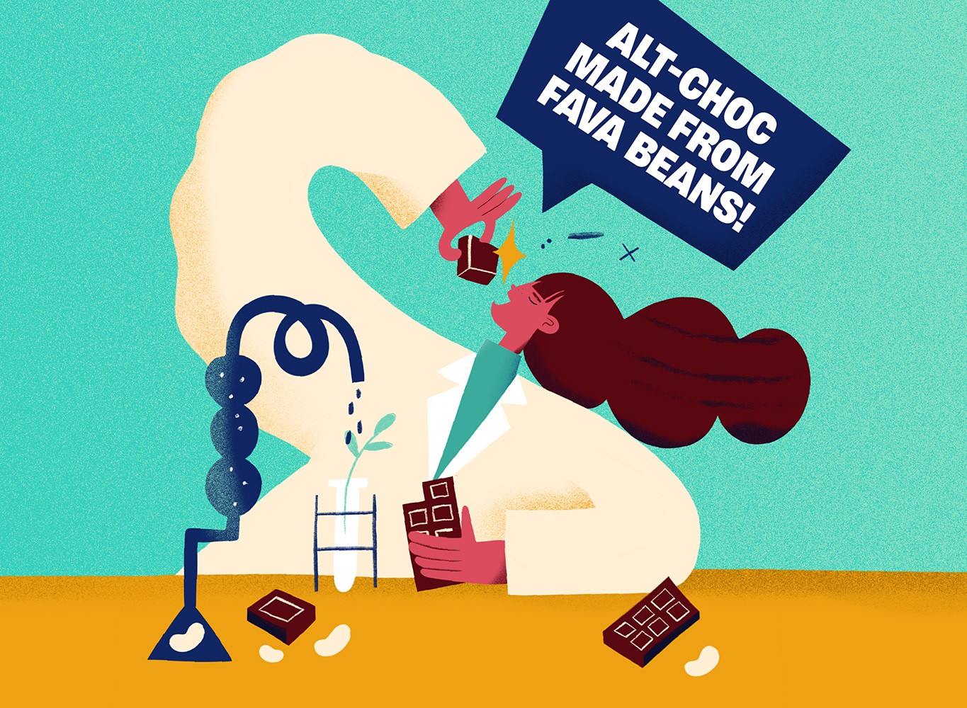
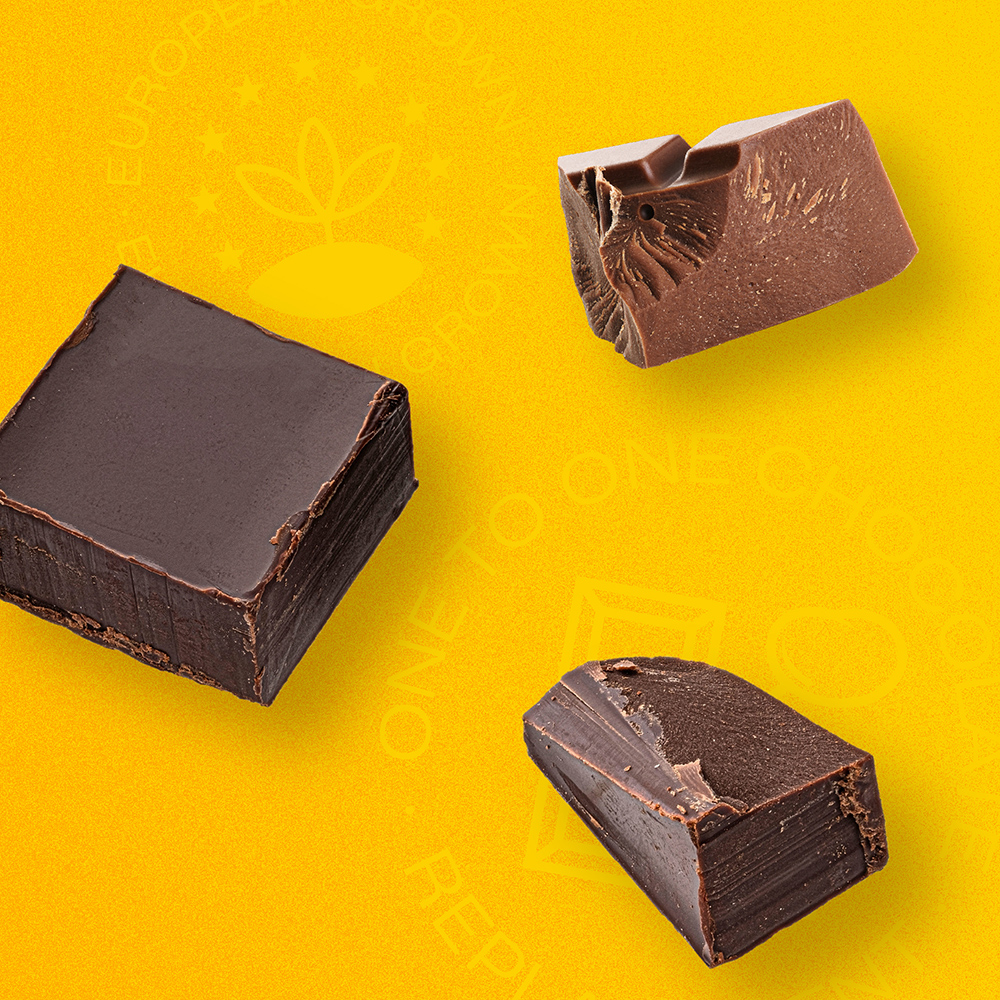
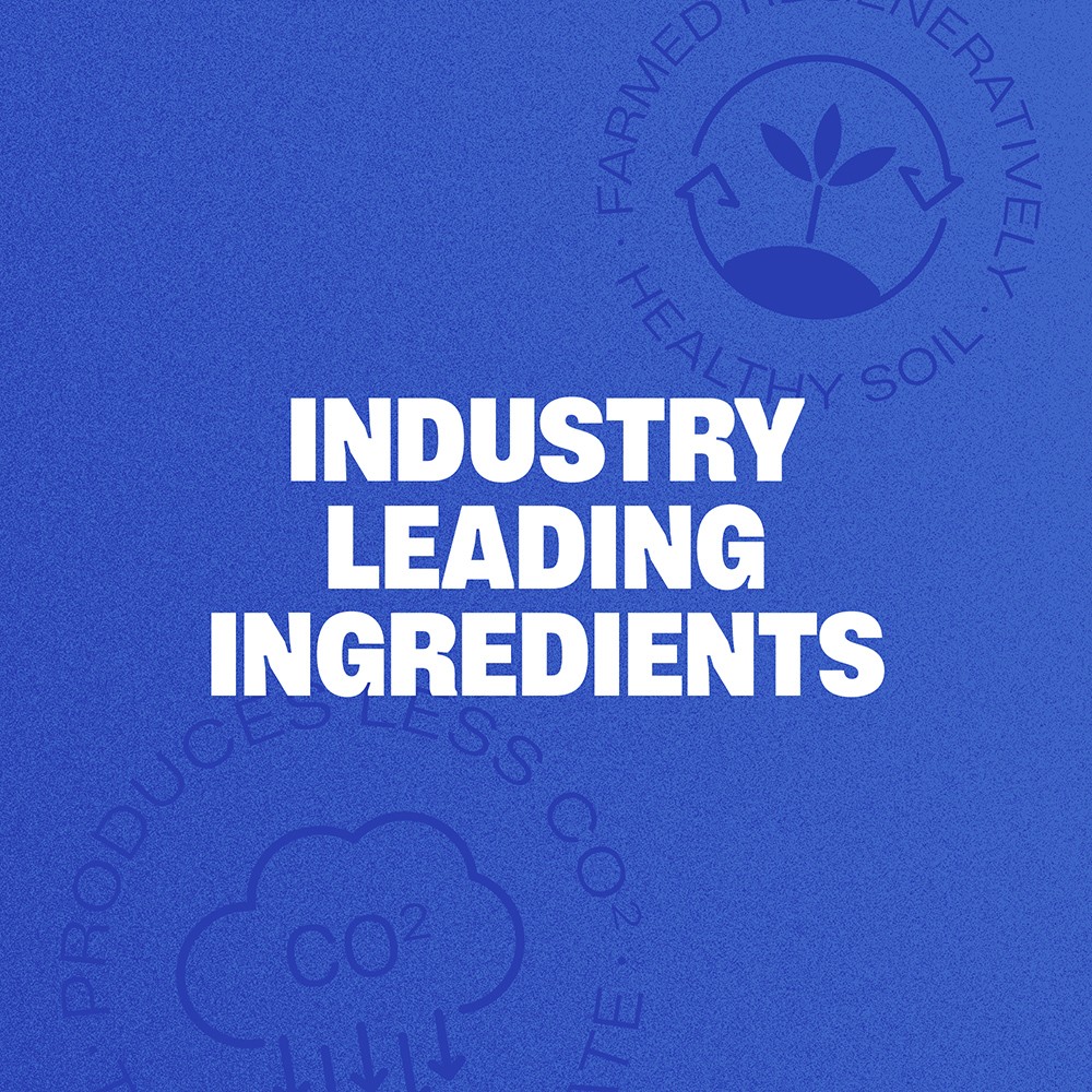
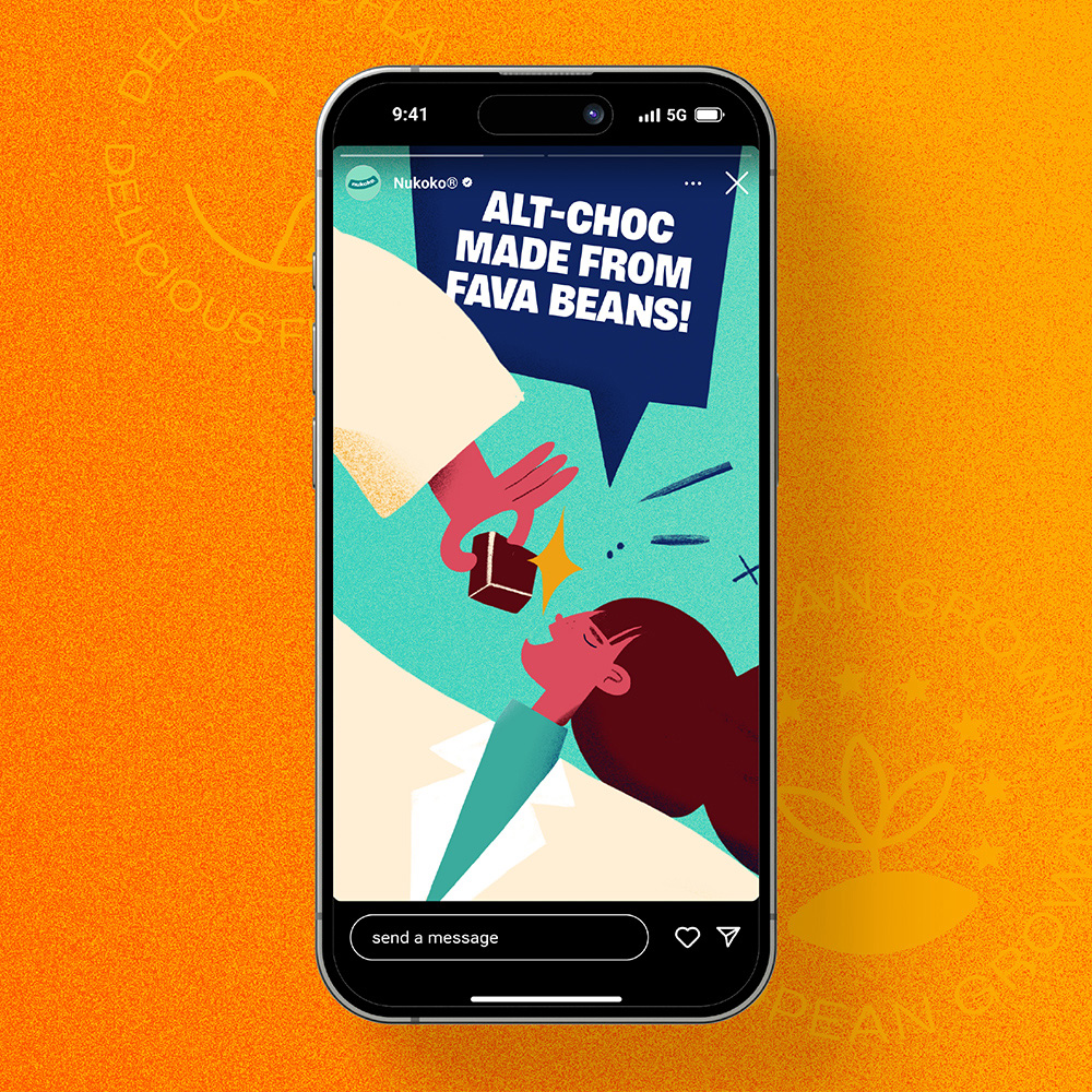
Born in the UK, Nukoko® is a cocoa-tech company pioneering a 100% cocoa-free chocolate alternative, made from locally grown European fava beans. It looks, melts, and tastes like chocolate, but without the cocoa. Lower environmental impact. Shorter supply chains. Sustainable, scalable, and designed for a new era of chocolate-making.
Nukoko®’s mission is to partner with the world’s biggest chocolate brands, offering a future-friendly, cocoa-free alternative that is better for the planet that is just as indulgent.
When Nukoko® approached us, they had the tech and the vision but needed a brand to match. Something that felt as bold and innovative as their mission. A brand that could speak fluently to both B2B partners in the food tech and FMCG world and to forward-thinking consumers.
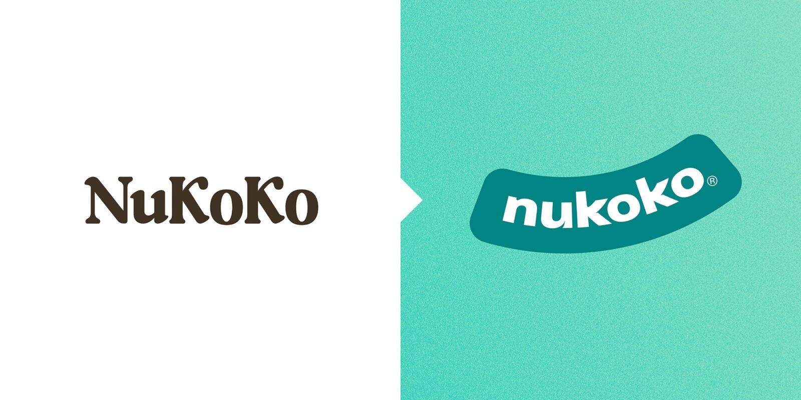
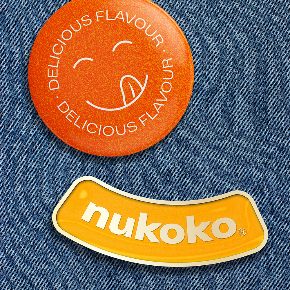
The Nukoko® team chose the name Nukoko® for its resemblance to “New Cocoa,” a fitting nod to the product’s purpose. However, in a happy twist of fate, our discovery process later revealed that nukoko also means “happiness” or “smile” in Ewe, a regional language spoken in Ghana, one of the world’s most important cocoa-producing regions. What better reason to, literally, give the identity a smile? Serendipity at its best!
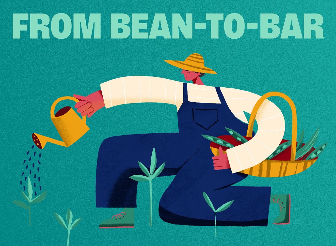
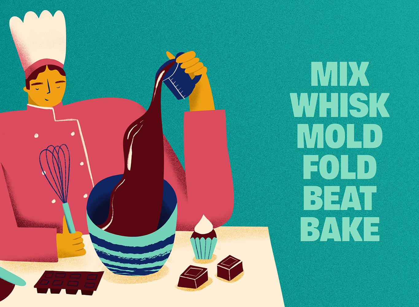
We helped them evolve from a grassroots look into a polished, professional, and charismatic challenger brand. This transformation included a fresh, optimistic colour palette designed to stay vibrant and dynamic over time, along with bold, modern typography. We developed a provocative yet playful tone of voice and introduced a friendly, irreverent illustration style and brand texture to simplify and humanise the science (trust us when we say we know chocolate lovers don’t find hard data all that inspiring and appetising!). We also created a photographic language that captures the spirit of the farming process and the bean-to-bar approach. The result is a visual identity system that is as inviting as it is inventive.
With help from SoreThumbStudio®, Nukoko® now stands as a brand ready to challenge convention and rewrite the chocolate narrative.
CREDIT
- Agency/Creative: SoreThumbStudio
- Article Title: Nukoko Chocolate for the Next Generation by SoreThumbStudio
- Organisation/Entity: Agency
- Project Type: Identity
- Project Status: Published
- Agency/Creative Country: United Kingdom
- Agency/Creative City: London
- Market Region: Europe, Global
- Project Deliverables: Brand Architecture, Brand Creation, Brand Design, Brand Guidelines, Brand Identity, Brand Mark, Brand Redesign, Brand Strategy, Brand Tone of Voice, Brand World, Branding, Design, Logo Design
- Industry: Food/Beverage
- Keywords: Nukoko® – Chocolate for the Next Generation
-
Credits:
Creative Director: Mike Nash


