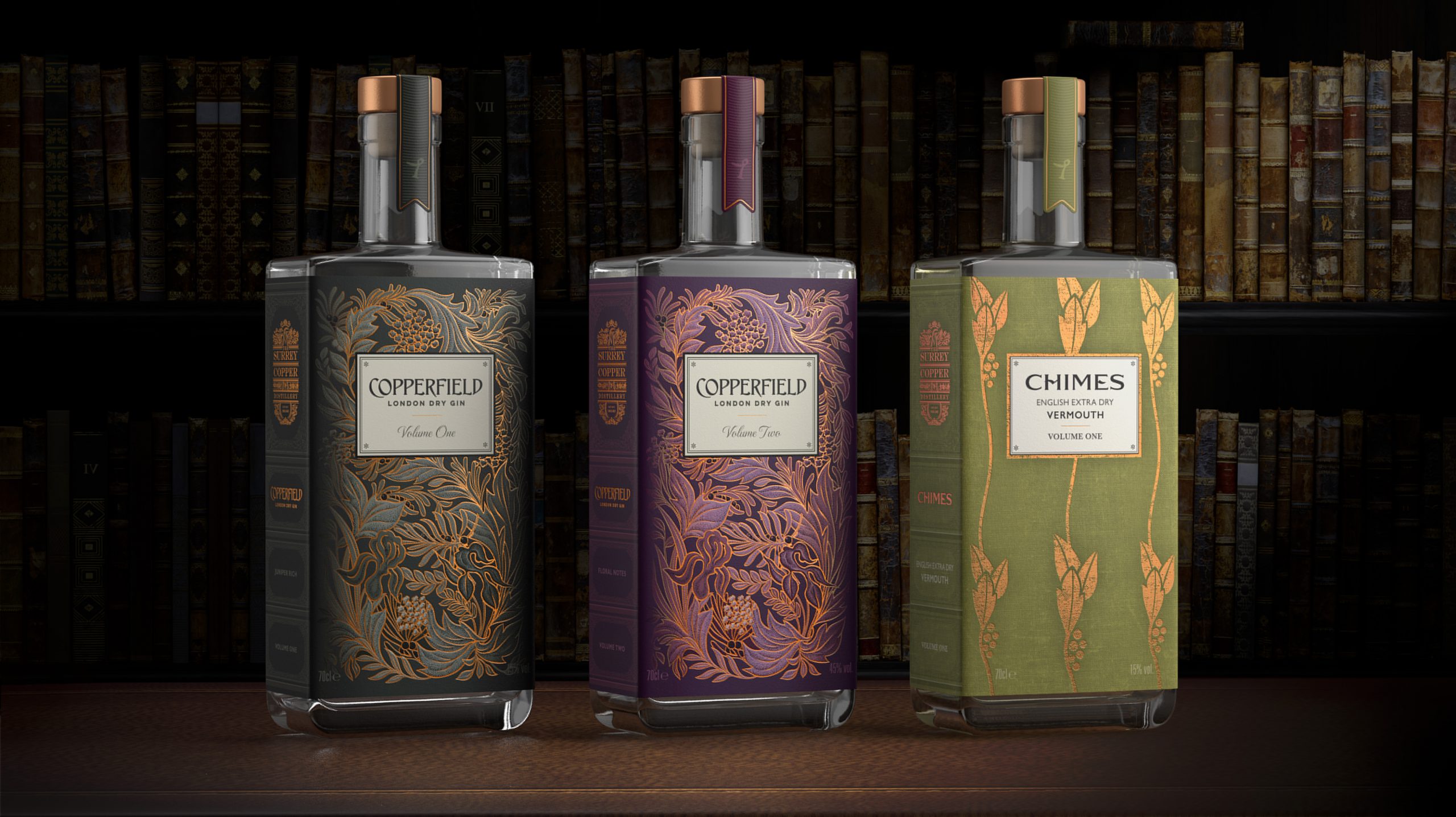
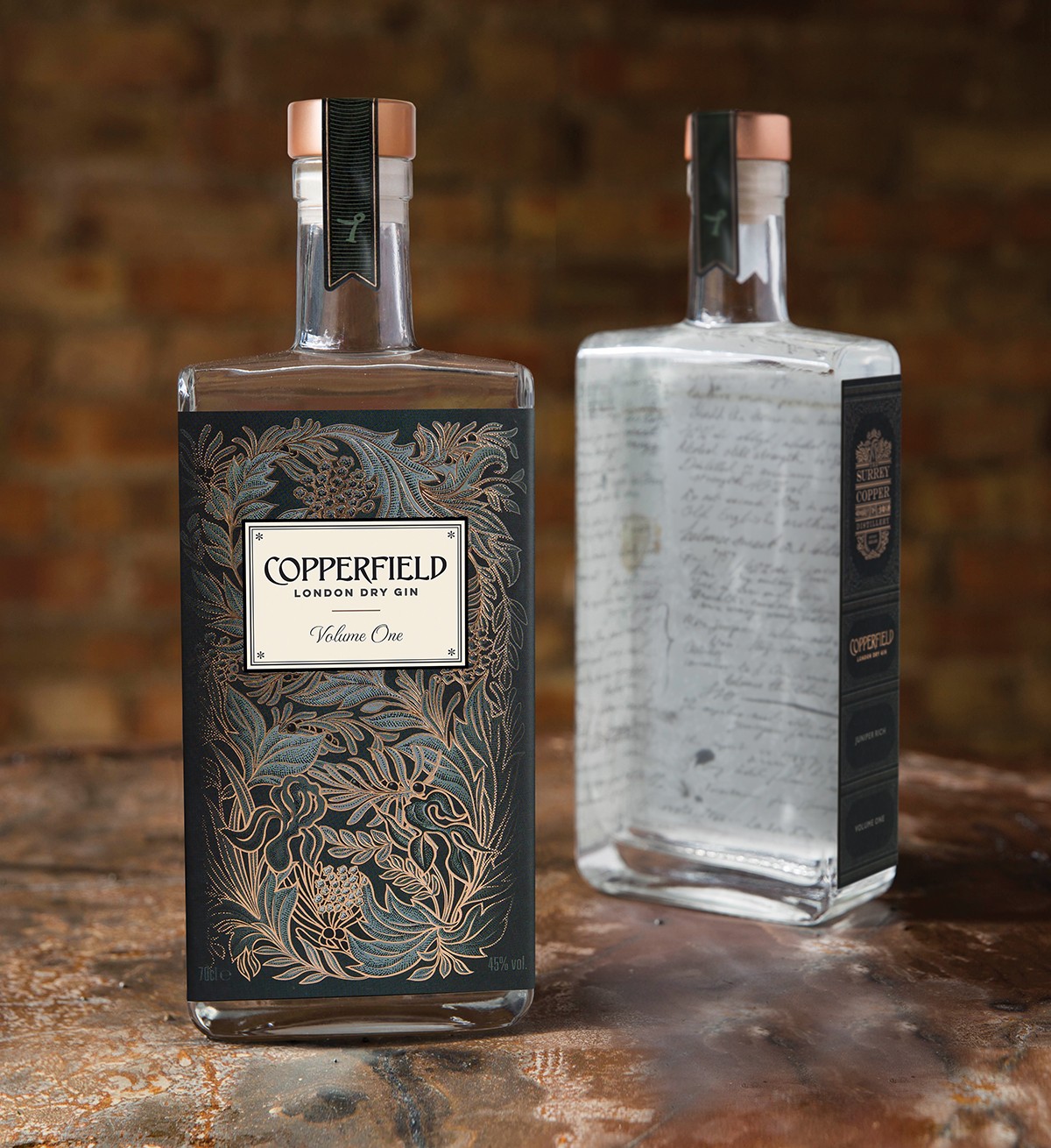
The Surrey Copper Distillery required an identity and packaging design for their distillery and their first release, Copperfield London Dry Gin, with the challenge to create a brand that would stand out in the saturated gin category, whilst also being able to evolve and adapt for future spirit releases from the distillery. The brief later extended to also designing the second release, an English Extra Dry Vermouth as well as a second Gin.
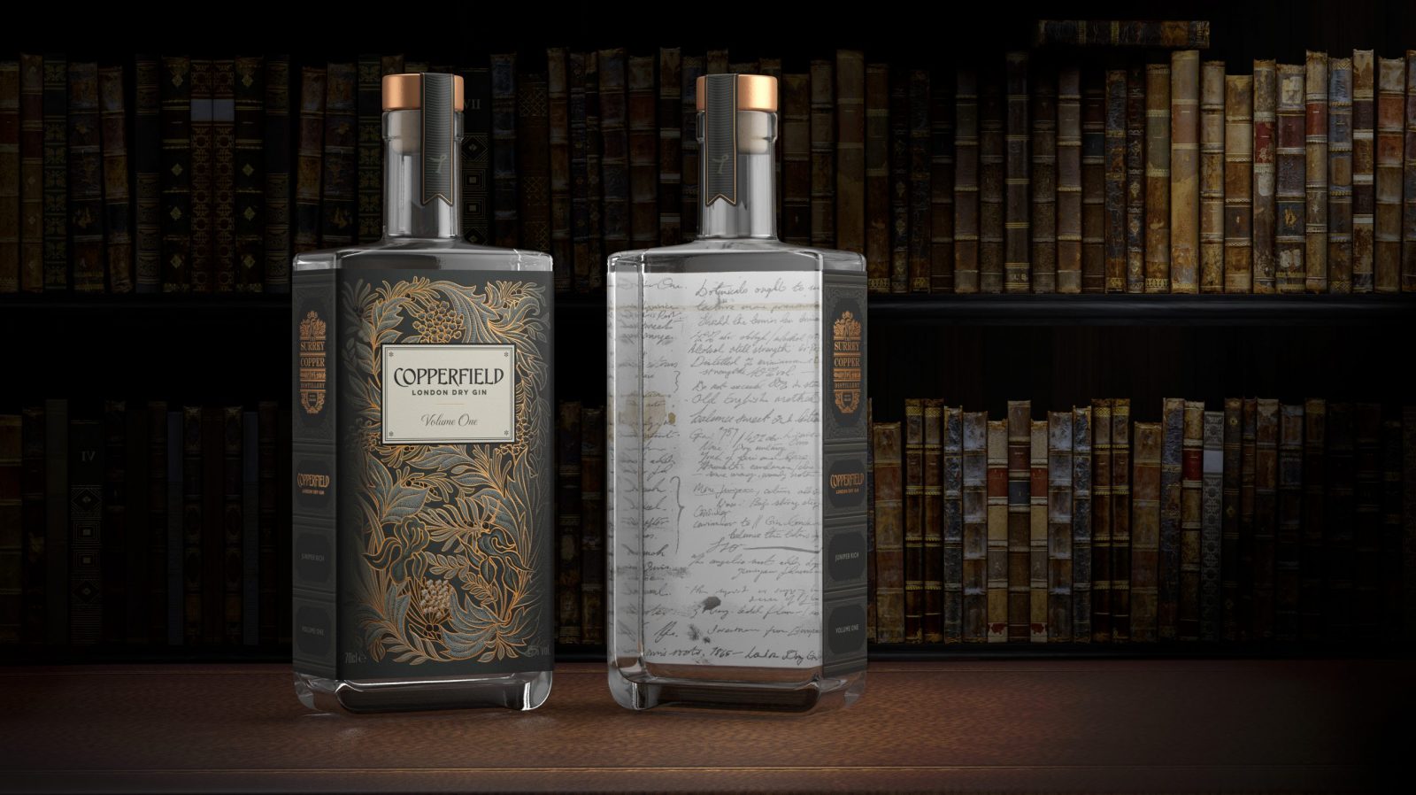
Copperfield Gin is hand-bottled and hand-labeled. The idea of creating a book inspired bottle came out of the Distillery founders’ background in academia and their passion for collecting rare and vintage books, especially Charles Dickens. Naming the first volume ‘Copperfield’ was a direct reference to Dickens but also alludes to the copper still used in the creation of this London Dry Gin.
The bookplate label is embellished with a detailed bespoke illustration featuring interwoven botanicals that overlay rich copper foiling to replicate a cover from the golden era of book design.
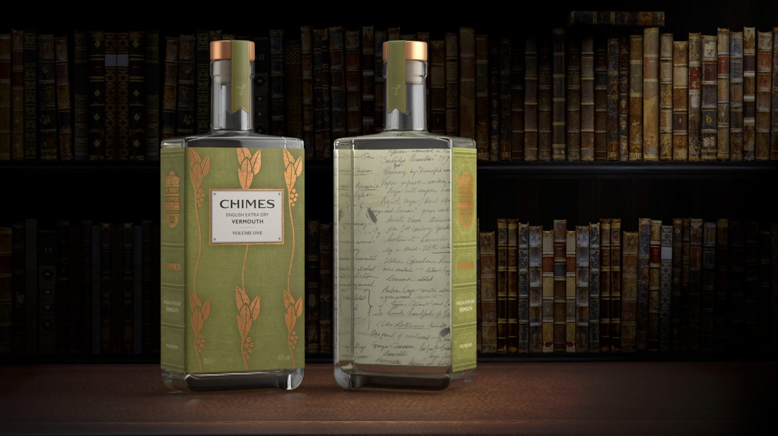
Following the theme set for the distillery and their first release, the packaging of the second release, Chimes English Extra Dry Vermouth, is named after Charles Dickens’ The Chimes: A Goblin Story of Some Bells that Rang an Old Year Out and a New Year In – a book he penned in 1844 whilst living in Genoa during a year-long Grand Tour of Italy. The hand-drawn design is inspired by vintage books, drawing upon a wide range of influences from the period, including the Arts & Crafts Movement, Art Nouveau and Orientalism. The stylised pictorial representation of grape vines replicate the floral patterns found on book covers from the late 1800’s.
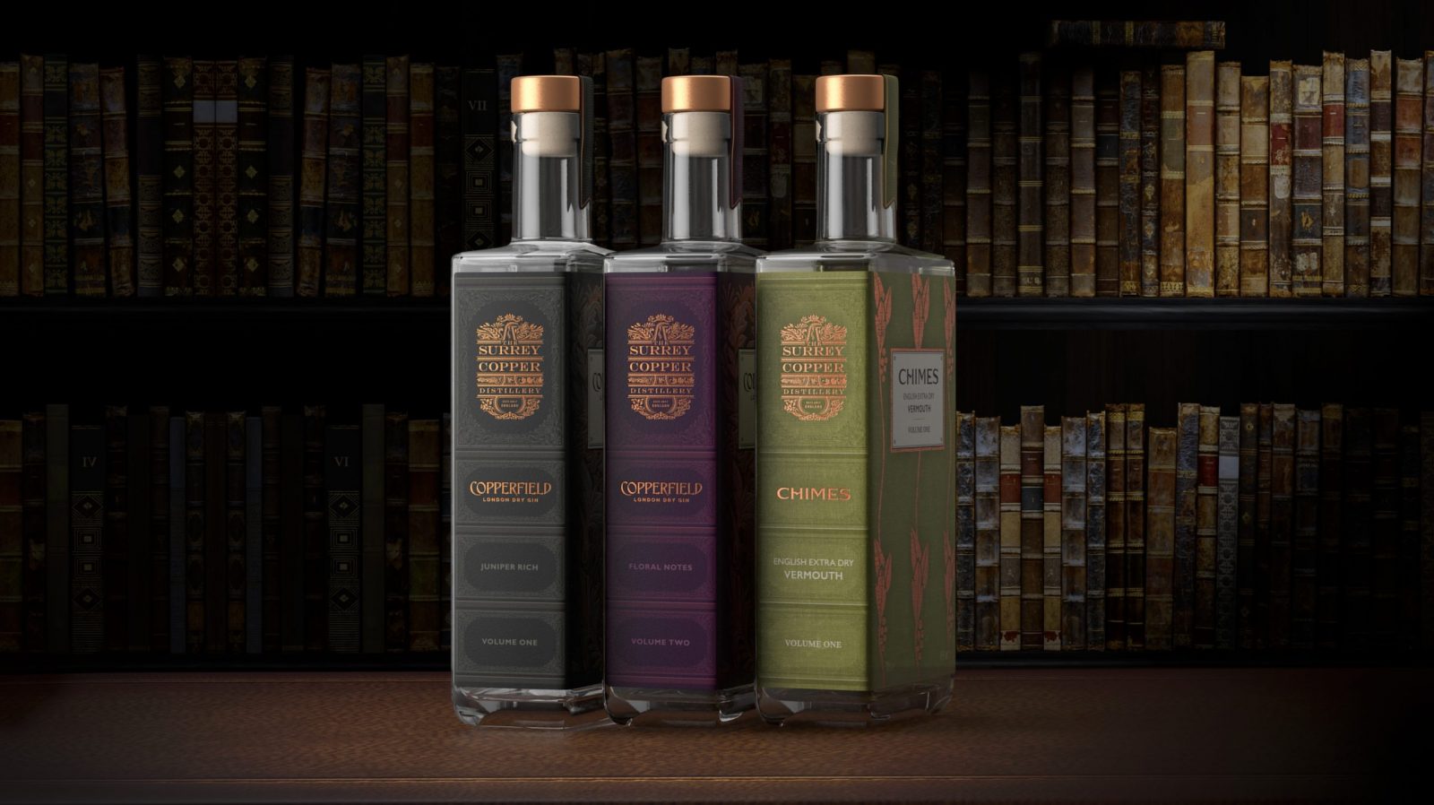
The ‘spine’ of the bottles feature The Surrey Copper Distillery identity and allow the volumes to be stored together as a library. The label is reverse-printed to reveal the bottle’s inner secrets in the form of distilling notes that can be seen through the liquid. The hand written script gives a true sense of delving back in time to unearth the liquids’ inspirations and includes excerpts from the Master Distiller’s own notebook, made during the development process. The bottle is sealed with a copper stopper and a tamper proof ‘bookmark’.
The two releases have been incredibly well received and exceeded the Distillery’s expected sales with demand now outweighing supply. The display-ability and collectability of the spirits and the packaging ensures that consumers eagerly await the future releases from the distillery.
CREDIT
- Agency/Creative: Nude Brand Creation
- Article Title: Nude Brand Creation – The Surrey Copper Distillery
- Project Type: Packaging
- Project Status: Published
- Keywords: WBDS Agency Design Awards 2019/20


