


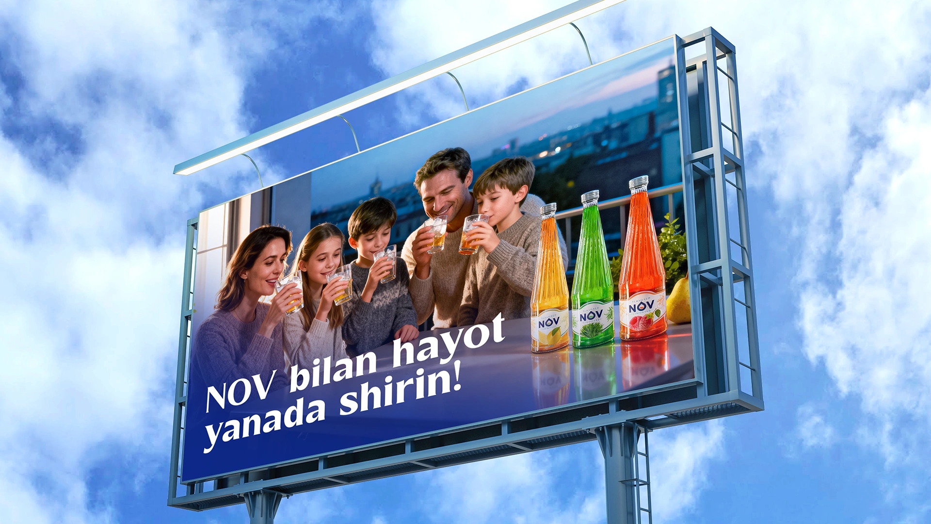
Challenge:
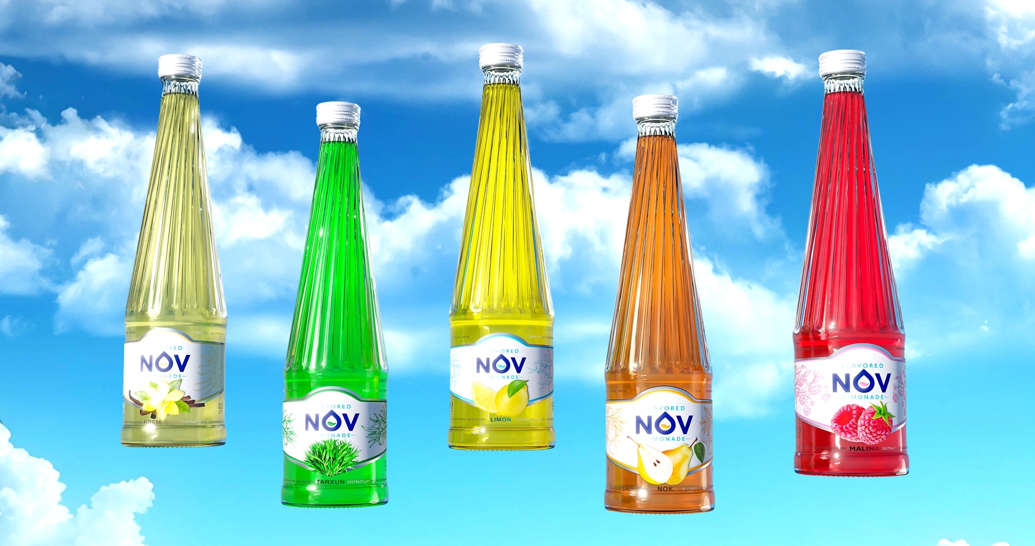
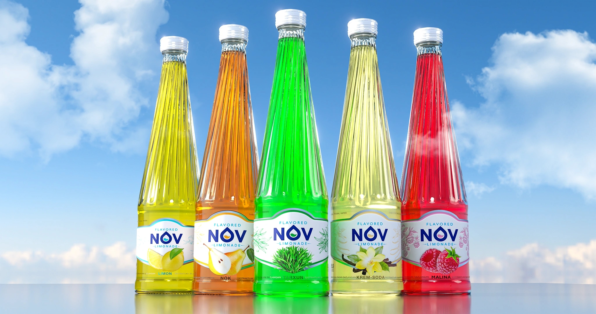
Following the successful launch of NOV mineral water, the client approached Minim Design to extend the brand architecture into a new category — fruit carbonated lemonades. The key challenge was to preserve the recognizable NOV identity while introducing the brightness, emotion, and juiciness that define the lemonade category. The flavors included lemon, pear, tarragon, cream soda, and raspberry.
Research & Insights:
Our analysis highlighted three critical points:
– Shelf-driven decisions: According to Nielsen, up to 70% of lemonade purchases are made impulsively at the shelf, guided primarily by visual cues.
– The drink must “participate” in the design: The vibrant colors of the beverage and the faceted glass bottle needed to become assets within the visual system.
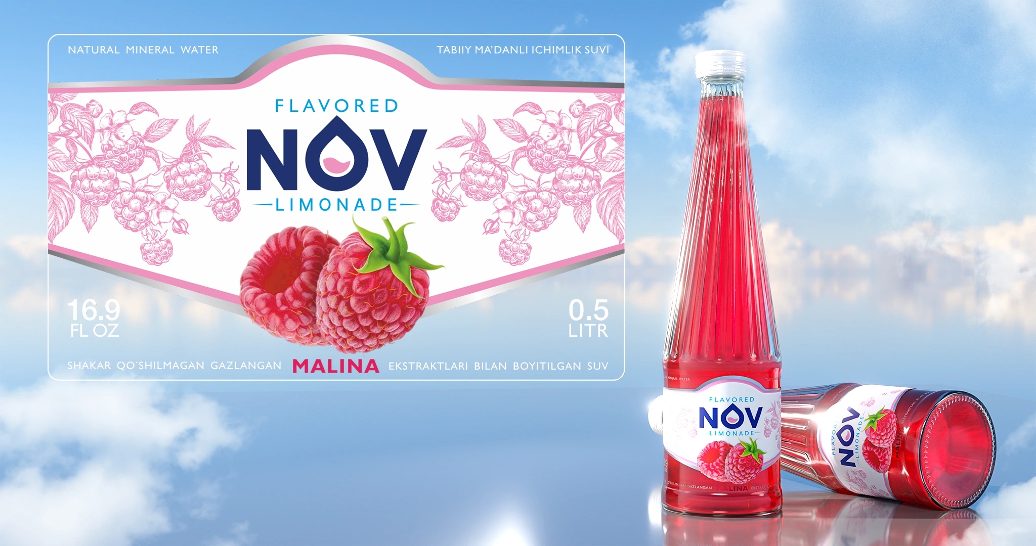
Transparency as a premium cue: Transparent label windows are a growing trend in the premium beverage segment — yet still rare in Uzbekistan’s lemonade category — providing an opportunity for differentiation.
Creative Solution:
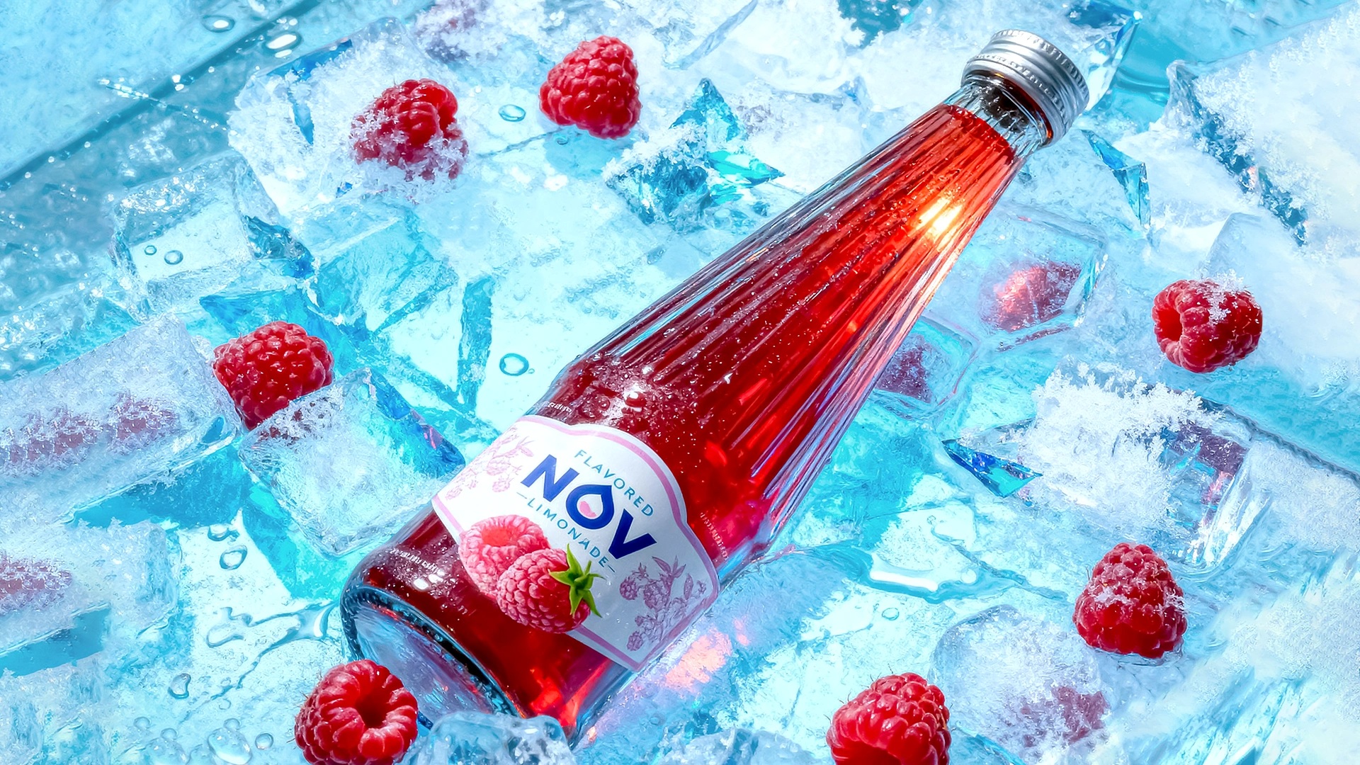
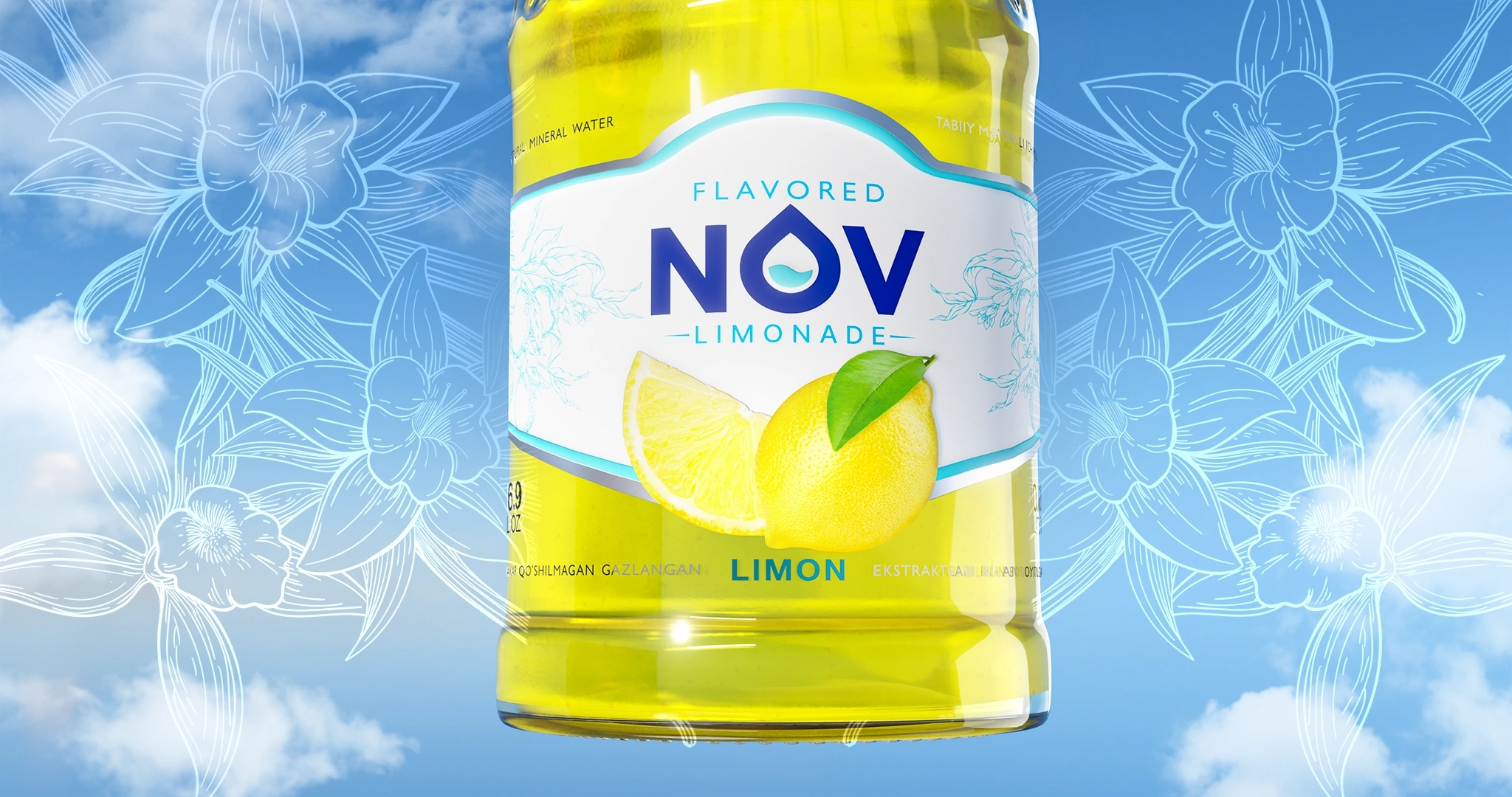
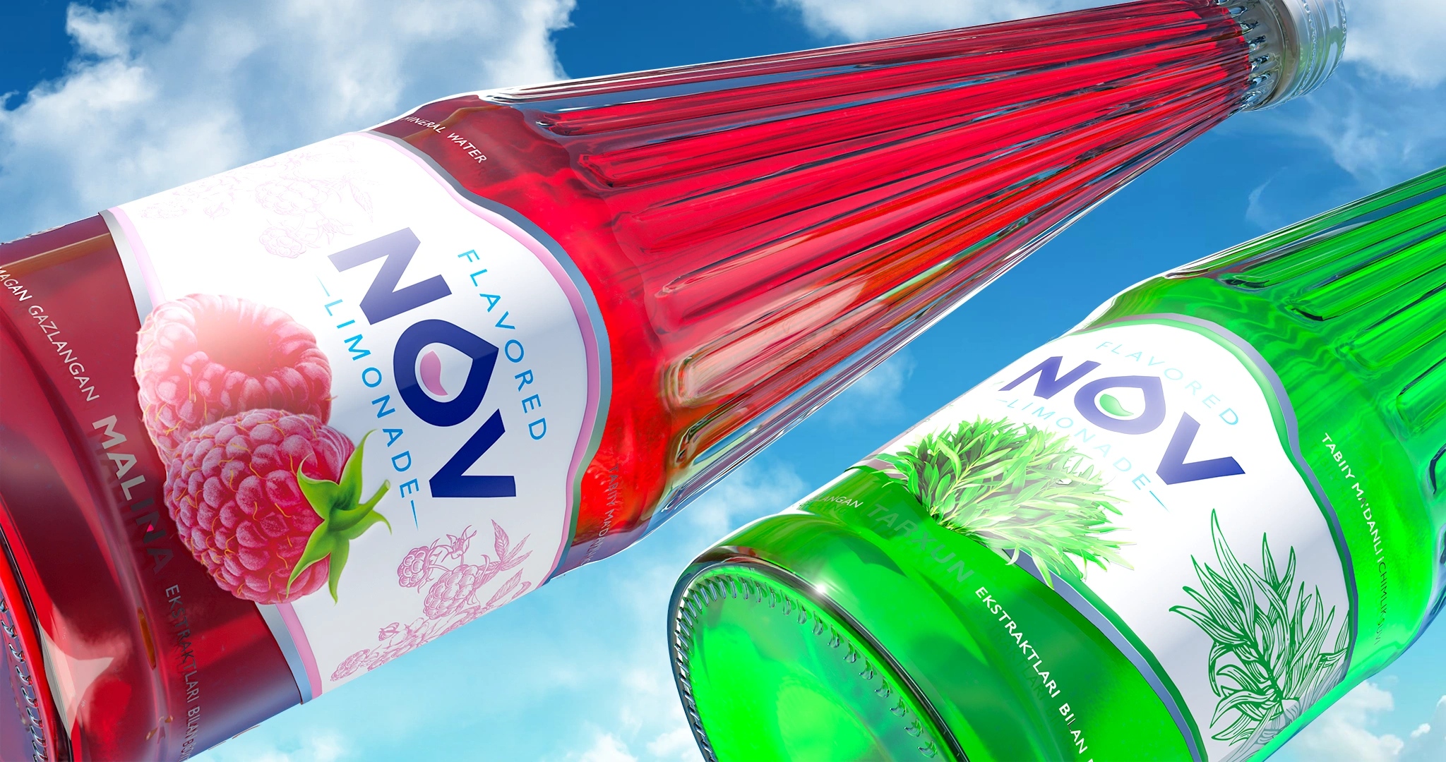
1. Central Fruit Visual
Each label features a highly realistic fruit illustration (lemon, pear, raspberry, etc.), delivering instant flavor recognition from any angle and creating appetite appeal.
2. Botanical Background Graphics
Delicate botanical elements were placed along the sides of the label, harmonized to each flavor’s color palette. These illustrations add sophistication, character, and emotional warmth without overwhelming the design.
3. Transparent “Window” System
Portions of the label are printed on transparent film, integrating the drink’s own color directly into the design. Typography and key elements sit atop the transparency, allowing the product itself to become part of the visual identity. This enhances the premium perception and strengthens shelf presence.
Result:
The NOV lemonade line received a fresh, modern, and emotionally rich visual identity.
– The design preserves core NOV brand elements while injecting vibrant energy into the new category.
– The bottle and label now work as a unified system, with the beverage becoming the central hero.
– The concept is fully scalable for new flavors, ensuring long-term consistency and brand growth.
Overall, the redesign significantly amplifies shelf impact, reinforces trust, and positions NOV as a premium, recognizable, and consumer-centric beverage brand.
CREDIT
- Agency/Creative: Minim Design Agency
- Article Title: NOV Label Design for Carbonated Lemonades by Minim Design
- Organisation/Entity: Agency
- Project Type: Packaging
- Project Status: Published
- Agency/Creative Country: Uzbekistan
- Agency/Creative City: Tashkent
- Market Region: Asia
- Project Deliverables: Brand Design, Label Design, Packaging Design
- Format: Bottle
- Industry: Food/Beverage
- Keywords: Packaging Design, Label Design, Lemonade, Beverage Branding, Transparent Label, Fruit Illustration, Premium FMCG, Shelf Impact, Visual Identity, Carbonated Drinks, Uzbekistan
-
Credits:
Agency: Minim Design


