
Stratedgy – Nourishables Brand Project
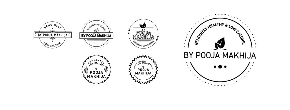
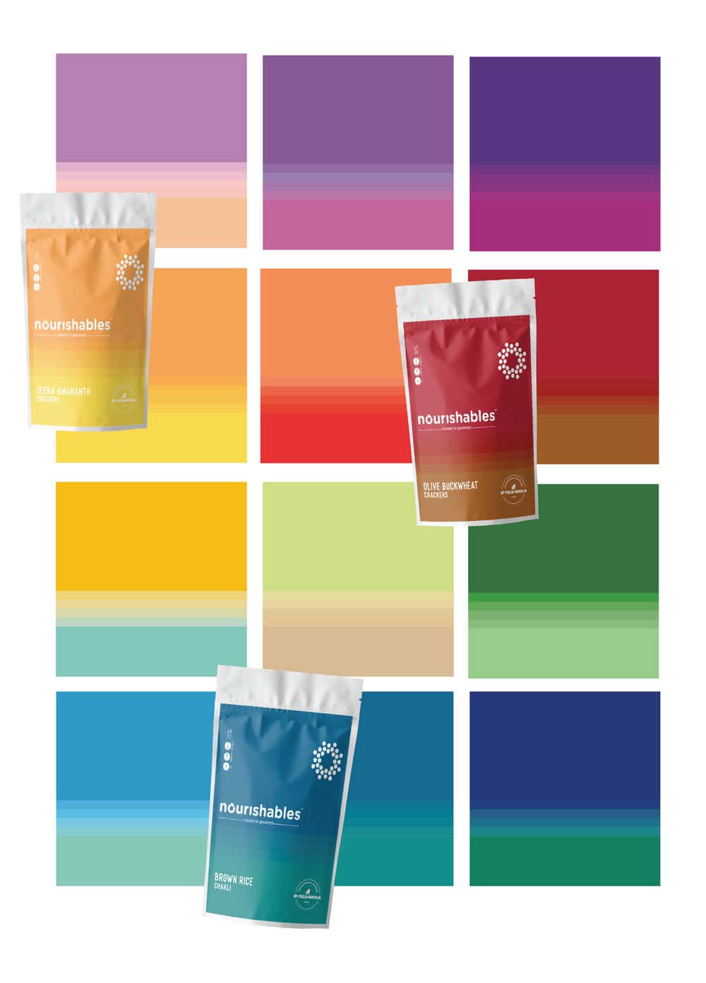
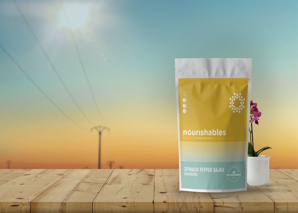
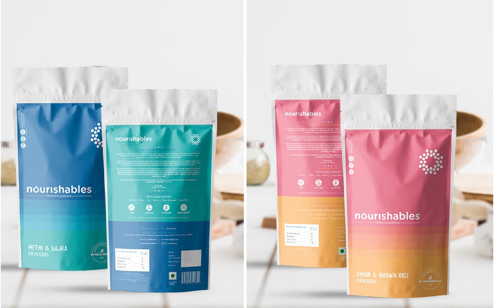
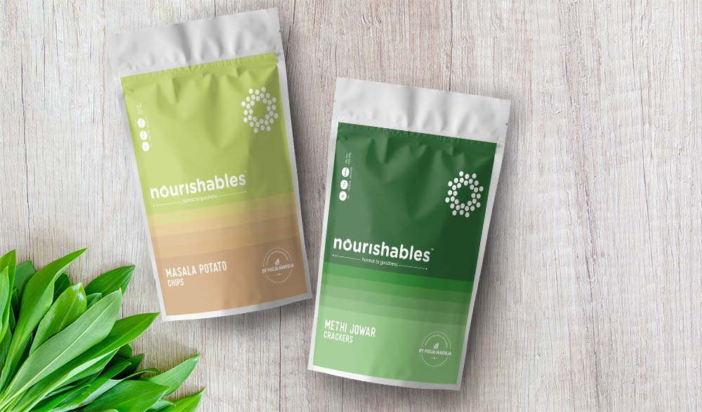
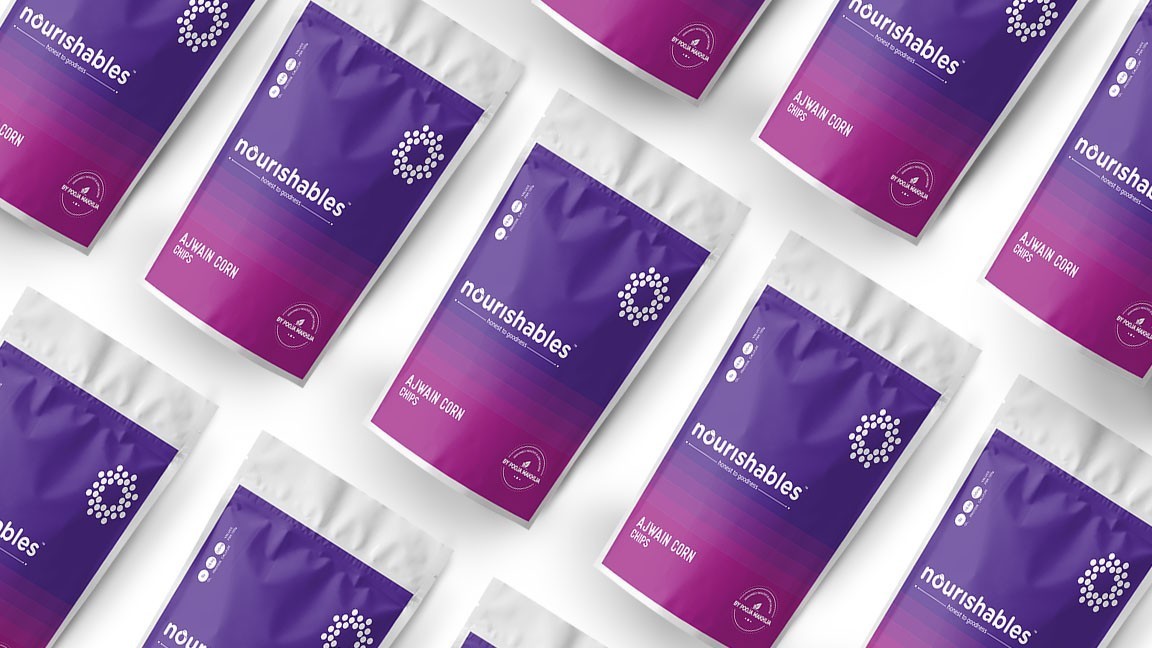
Nourishables:A venture of healthy snacks by Pooja Makhija, renowned nutritionist in India. Logo Creation:We zeroed in on a brand identity that is bold yet the rounded font gives a sense of innocence and freshness. The logo itself symbolises – healthy, happy and goodness.Colour Story:Nature presents to us a colour palette in it’s most natural and high definition form. Taking inspiration from the various hues in the sky during sunset and sunrise we devised a colour story and divided it into colour patches for each of the variants. The seamless transition from one colour to another shows how nature strikes it’s perfect balance and harmony in colours.Iconography:The simple yet informative iconography reasserts the brand values and is used to attract attention to details without it being too wordy for a customer to read through.Seal of goodness:Pooja Makhija, the name itself is a brand in the market. Her word has become synonymous to health and goodness amongst the customer, thus a stamp on the packaging was designed to authenticate the ‘honest to goodness’ motto that the brand ‘nourishables’ stands for. It’s a mark of promise, quality and genuinely healthy product from Pooja Makhija herself.