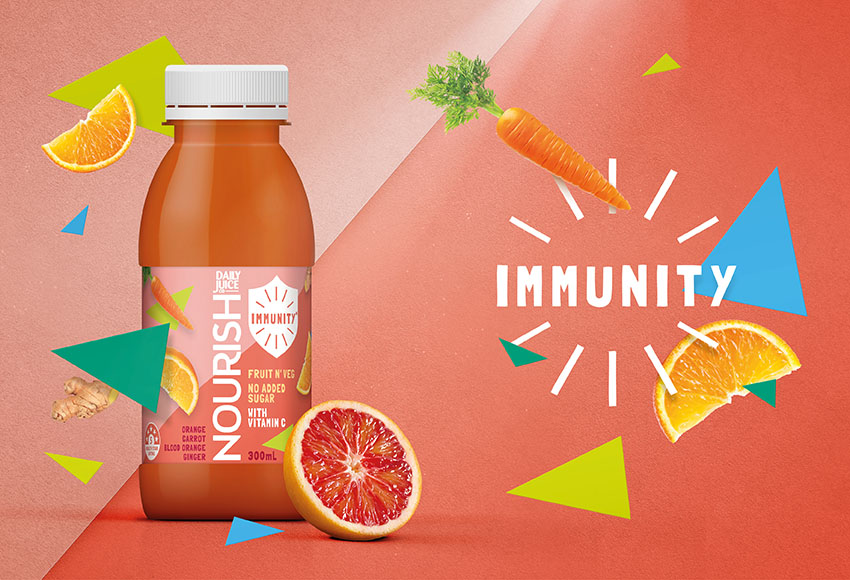
In today’s world everybody is looking for products with benefits – those that make them feel good inside and out. Daily Juice set out to reinvigorate their Nourish juice range to more boldly communicate the product benefits – real fruit and vegetable juice with no added sugar. Juice just the way it should be.
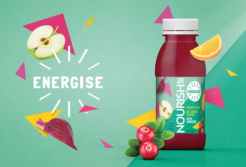
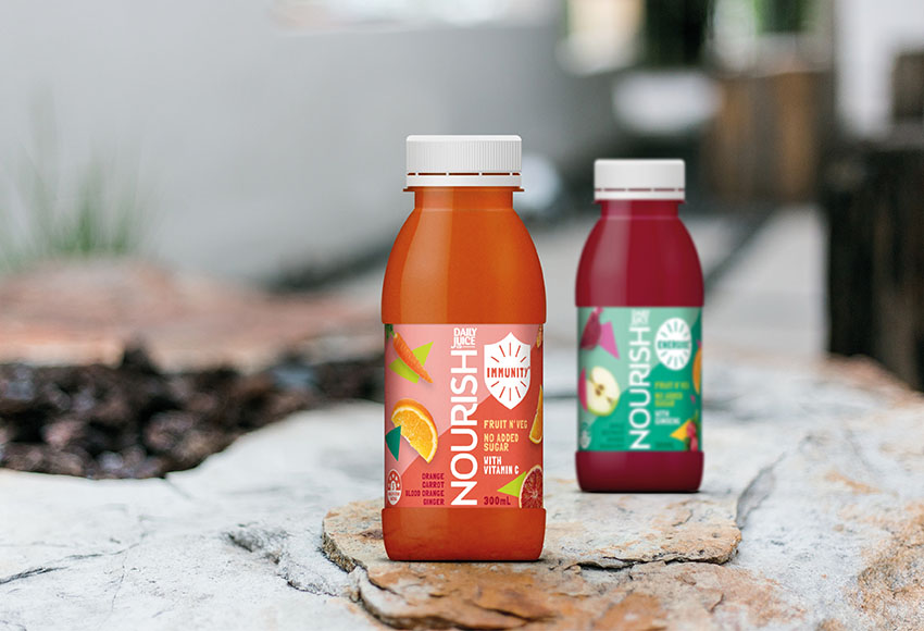
The shift to a new on-the-go 300ml convenience format created the perfect opportunity to relook at the packaging and create a design that reflected the better-for-you trends of today’s consumers – not too serious, benefit led design and clear flavour navigation for strong shelf standout.
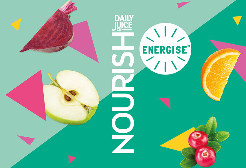
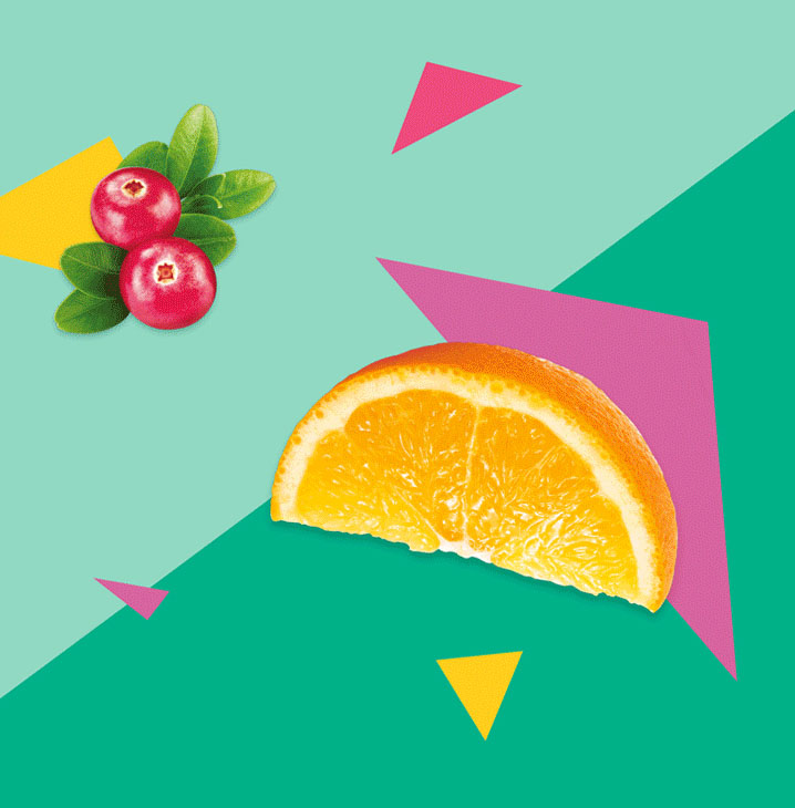
Inspired by geometric forms and compositions of the Bauhaus design movement, the Edison Agency used brightly coloured geometric shapes and fruit and vegetable photography to speak to the vitality of the product and hero the individual health benefits of each of the juice blends.
The result is a vibrant and disruptive new design solution – what’s not to love!


CREDIT
- Agency/Creative: The Edison Agency
- Article Title: Nourish Juice Range, A Fresh New Design With a Playful Wellbeing Focus
- Organisation/Entity: Agency, Published Commercial Design
- Project Type: Packaging
- Agency/Creative Country: Australia
- Market Region: Oceania
- Project Deliverables: Brand Redesign, Brand Rejuvenation, Brand Strategy, Graphic Design, Packaging Design, Rebranding
- Format: Bottle
- Substrate: Plastic


