


Building a specialised brand in the accounting, auditing and consulting sector. With an approach based on reliability and compliance, the brand performs thorough and accurate audits, ensuring that companies are in compliance with accounting regulations and established standards. In addition, its expert advisors help companies identify opportunities for financial optimization, implement best practices and make informed decisions to achieve long-term success.
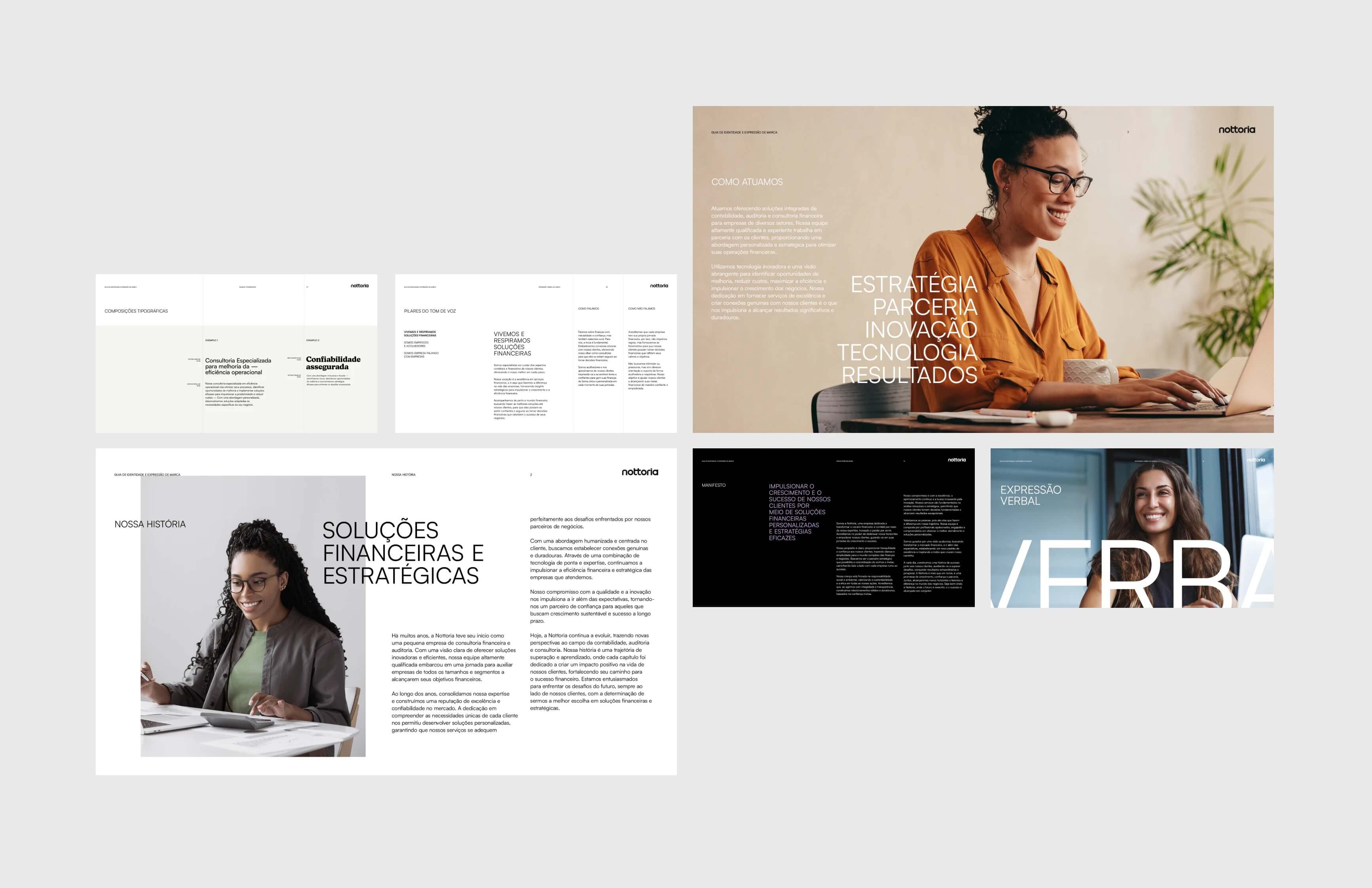
The project involved a remodelling of the brand name, an unmistakable, comprehensive and functional graphic identity. The company’s mission is to provide strategic insights and high-quality services to drive growth and financial efficiency for its clients. Based on this, we defined key points that will help in the construction of the new identity.
The new brand that revolutionises traditional accounting, The new brand breaks the mould of traditional accounting firms. She comes up with an innovative approach, becoming more approachable, humane and invigorated. With a modern and welcoming approach, we seek to bring a new perspective to the world of accounting.
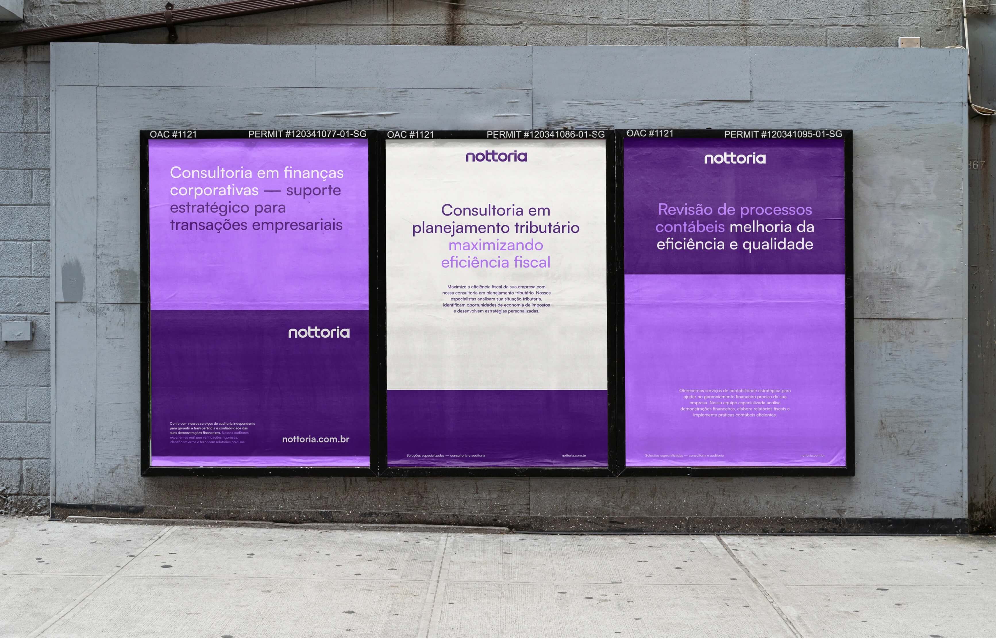
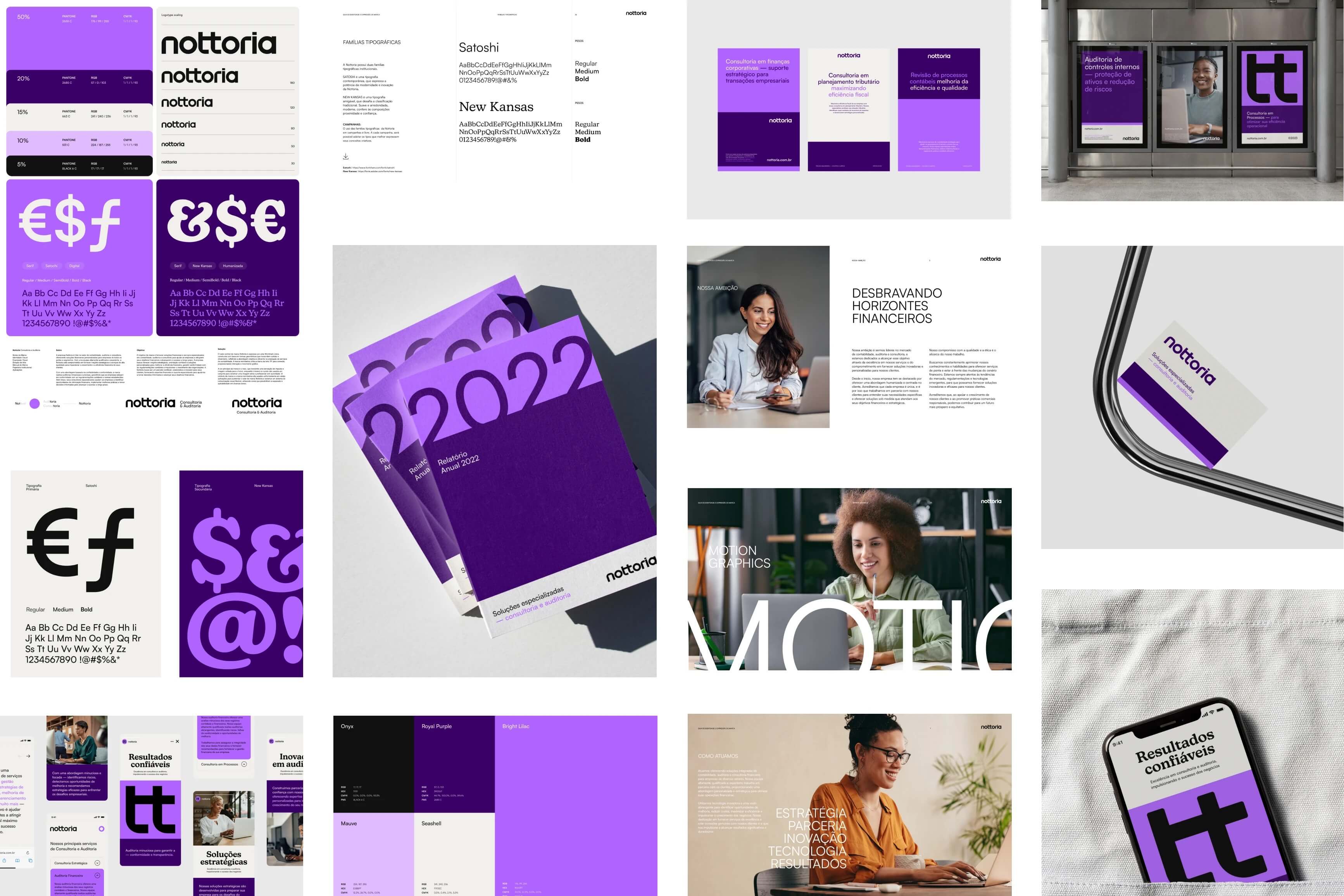
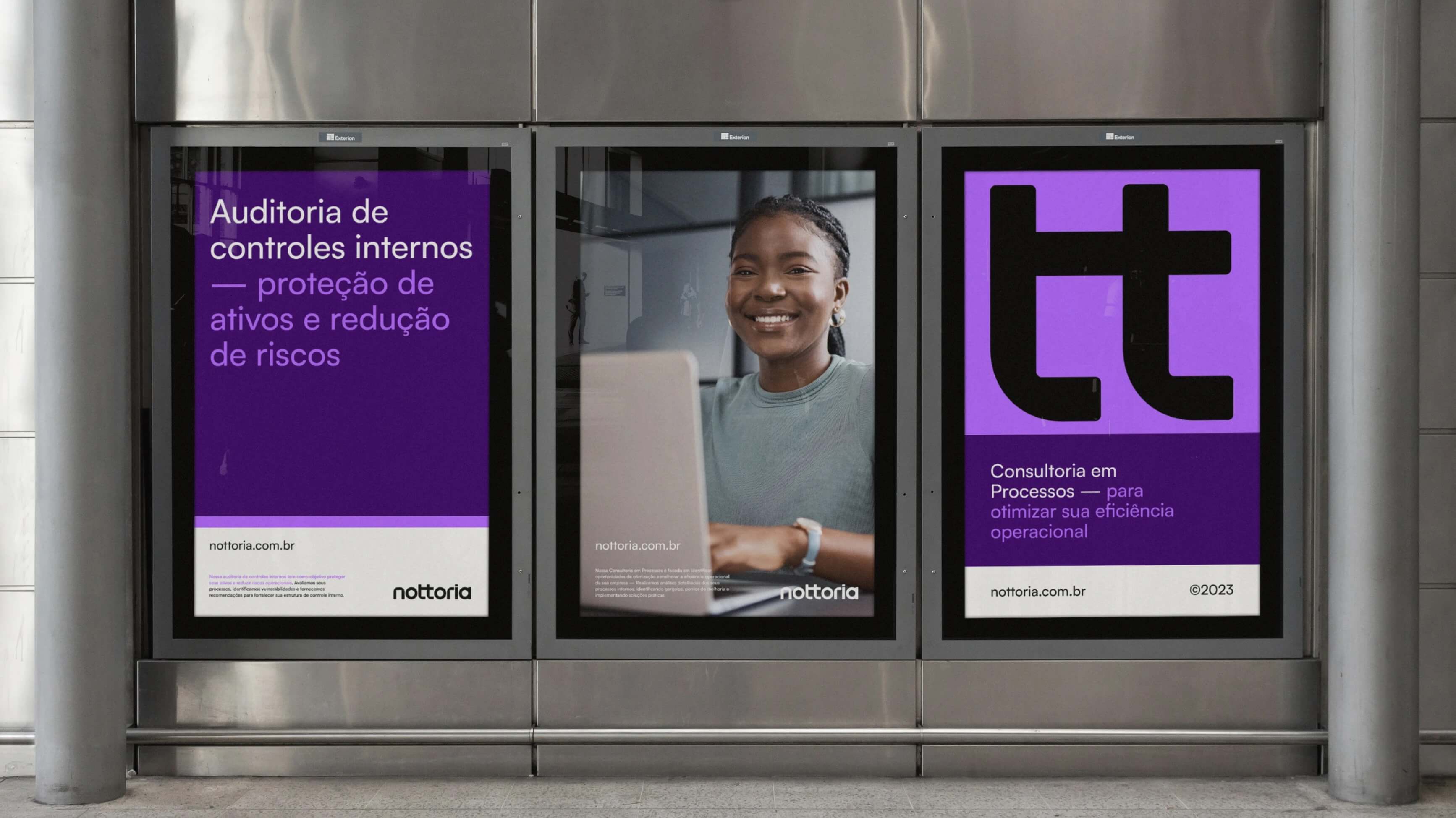
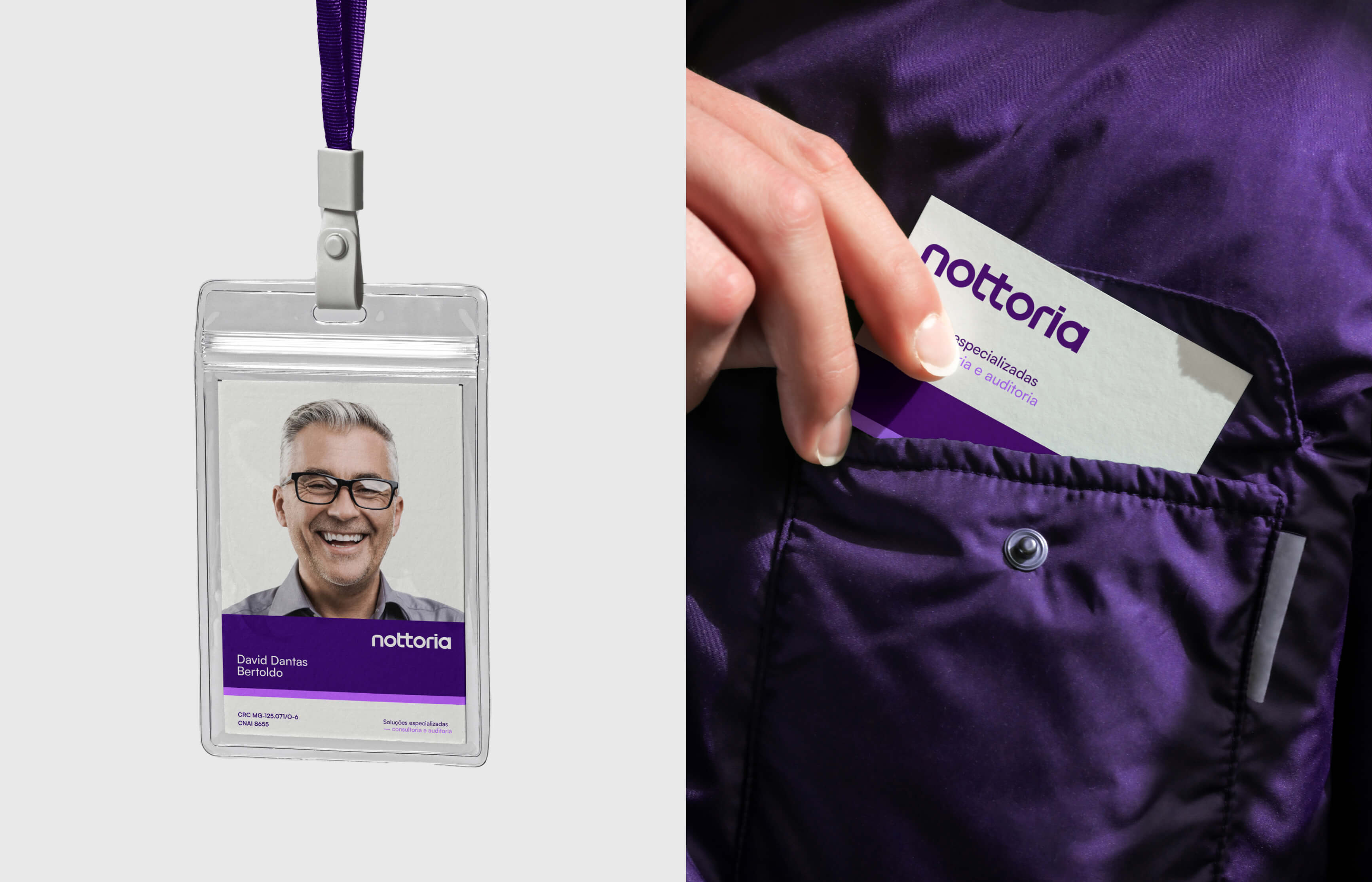
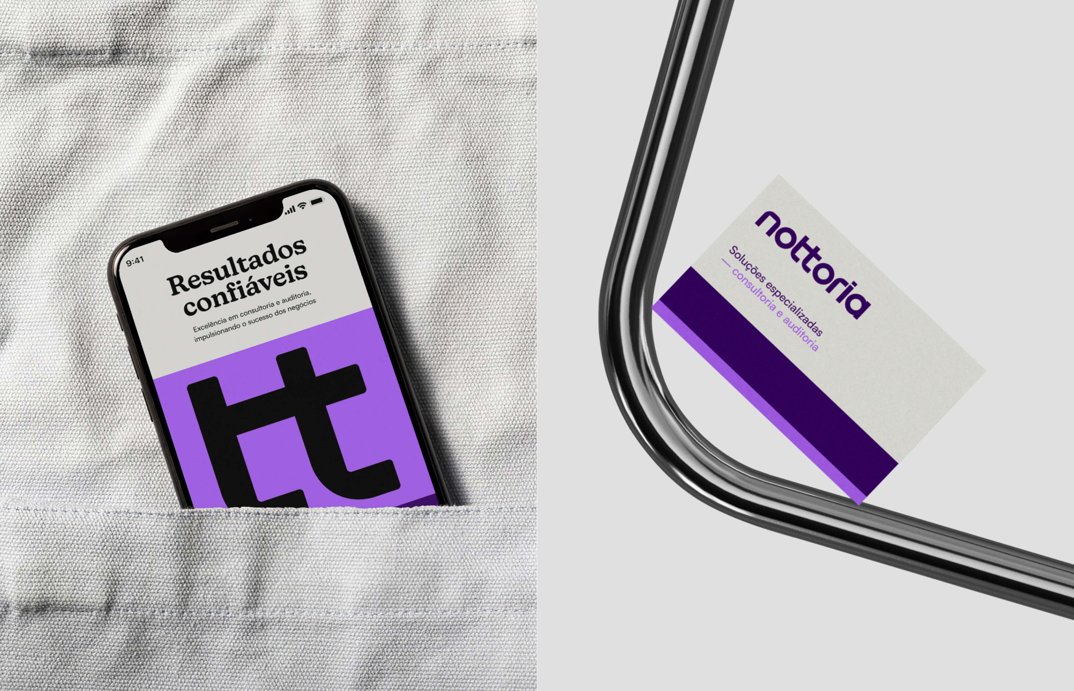
Expressing solidity, dynamism and efficiency in the visual language: The core value of the Nottoria brand is expressed by a unique wordmark, built on geometric shapes that convey solidity and dynamism, reflecting the objective and efficient approach to providing accounting services.
Three central words gave us the name: Connection and synergy are essential values that inspired the brand’s naming process. The name ‘Nottoria’ was created by combining the old name ‘notable’ with the key services of ‘consulting’ and ‘auditing’ resulting in a perfect union. Nottoria looks powerful and modern, clearly conveying the dynamic and innovative character of the brand.
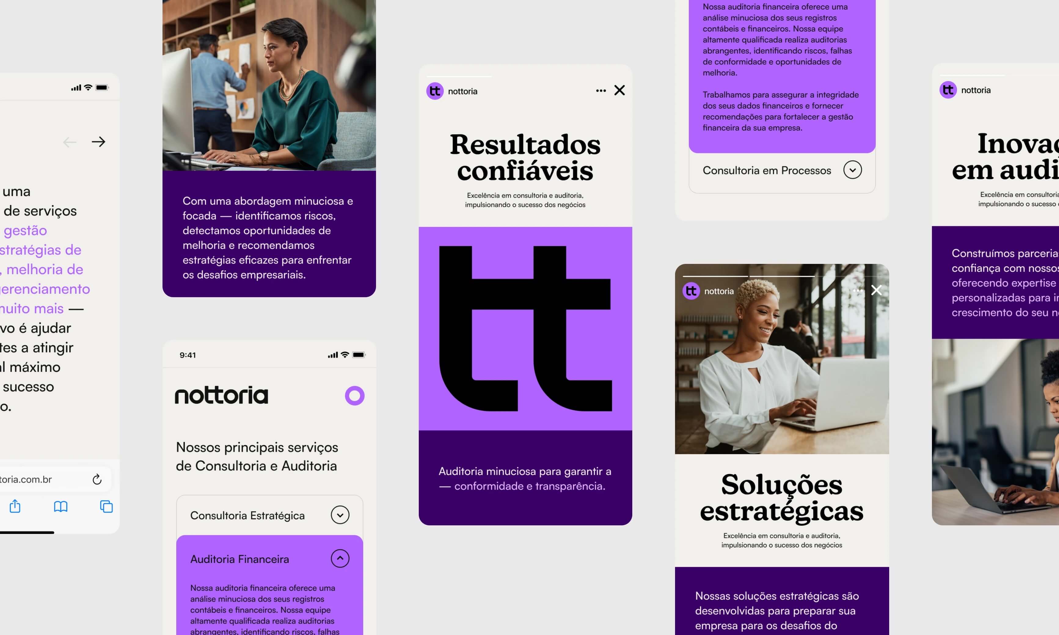
Movement and dynamism capable of withstanding all types of conditions. The word mark uses the bar of the letter “tt” for connection, providing interaction and graphic movement.Based on an intelligent modular grid, the system adjusts to each different application. Plus, high-quality images, typography, and colors are arranged to fit together perfectly.
CREDIT
- Agency/Creative: Estudio Kuumba
- Article Title: Nottoria Accounting Brand Design by Estudio Kuumba
- Organisation/Entity: Freelance
- Project Type: Graphic
- Project Status: Published
- Agency/Creative Country: Brazil
- Agency/Creative City: Minas Gerais
- Market Region: South America
- Project Deliverables: Animation, Art Direction, Brand Design, Brand Guidelines, Brand Identity, Brand Strategy, Graphic Design
- Industry: Financial
- Keywords: Brand Design, accounting, visual identity
-
Credits:
Designer: David Silva


