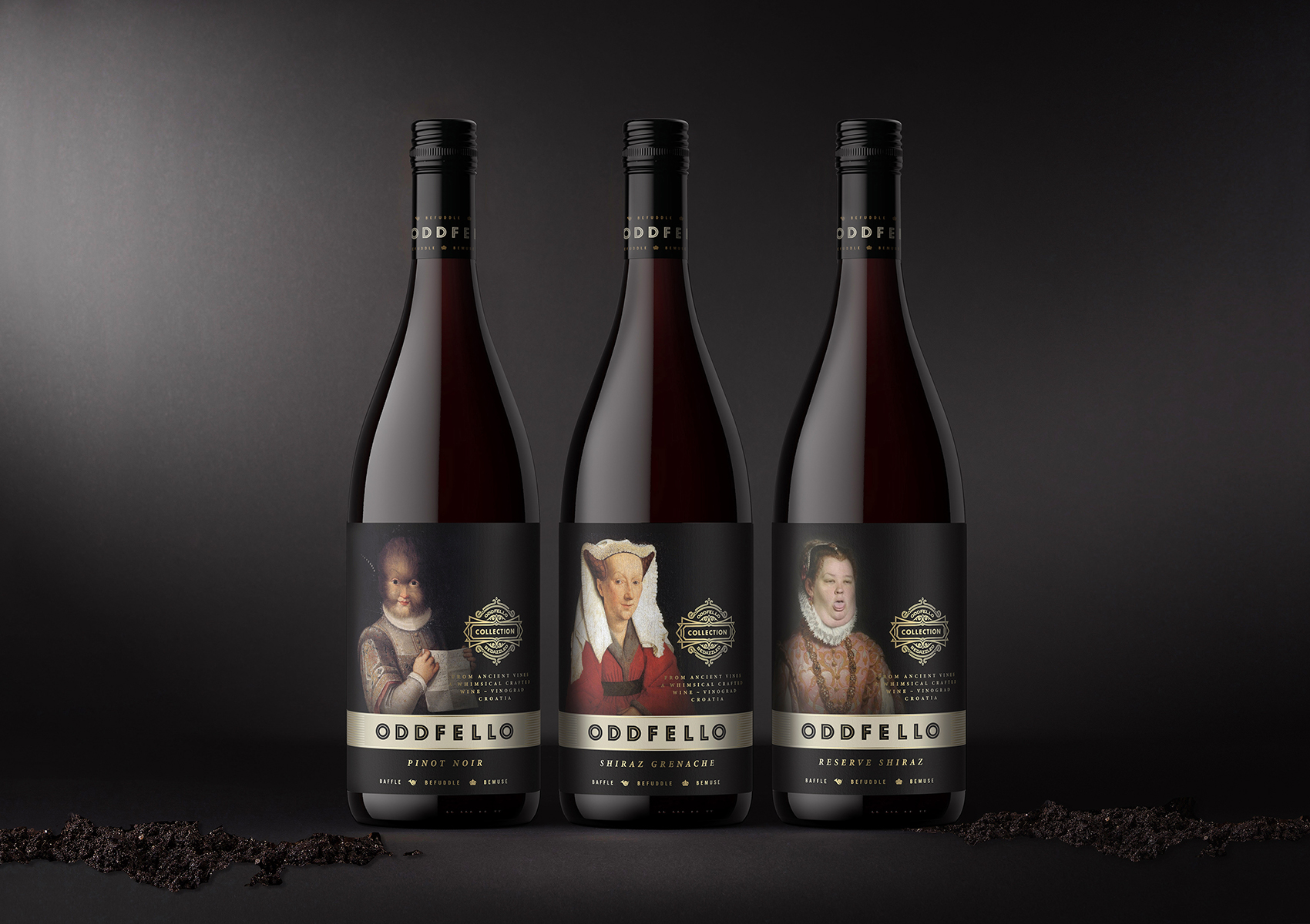
After having been obsessed with wine packaging and design throughout most of my professional life, the Oddfello project reignited my passion for this category. Briefed in early 2018, it had finally come to fruition a few years later. Tasked with concepting, naming and designing a range of wine packaging for an independent, boutique wine producer.
The name, concept and packaging design was inspired by the family run vineyard which dates back to the Renaissance era and is nestled on the hills overlooking the crystal clear waters of the Adriatic Sea. It also happens to be a place not far from where the HBO series Game Of Thrones was filmed, on the Dalmatian coast, in Split and Dubrovnik. Like the characters from the Game OF Thrones… Oddfellos are medieval personalities, flawed and yet redeemable with their odd but likable eccentricities.
The design intentionally taps into the aristocratic heritage of the characters that frequented the area. A visual journey that recalls these characters depicted in well-known artists paintings, which date to that period in history. These often eccentric and odd visitors enjoyed the fruits of vinograds ancient vines, that to this day still produce elegant blends. Thanks to the influence of the Greeks from two and a half thousand years ago, wine is still produced in Croatia. Today, the country now has more than 300 geographically defined wine-producing areas within its rugged borders.
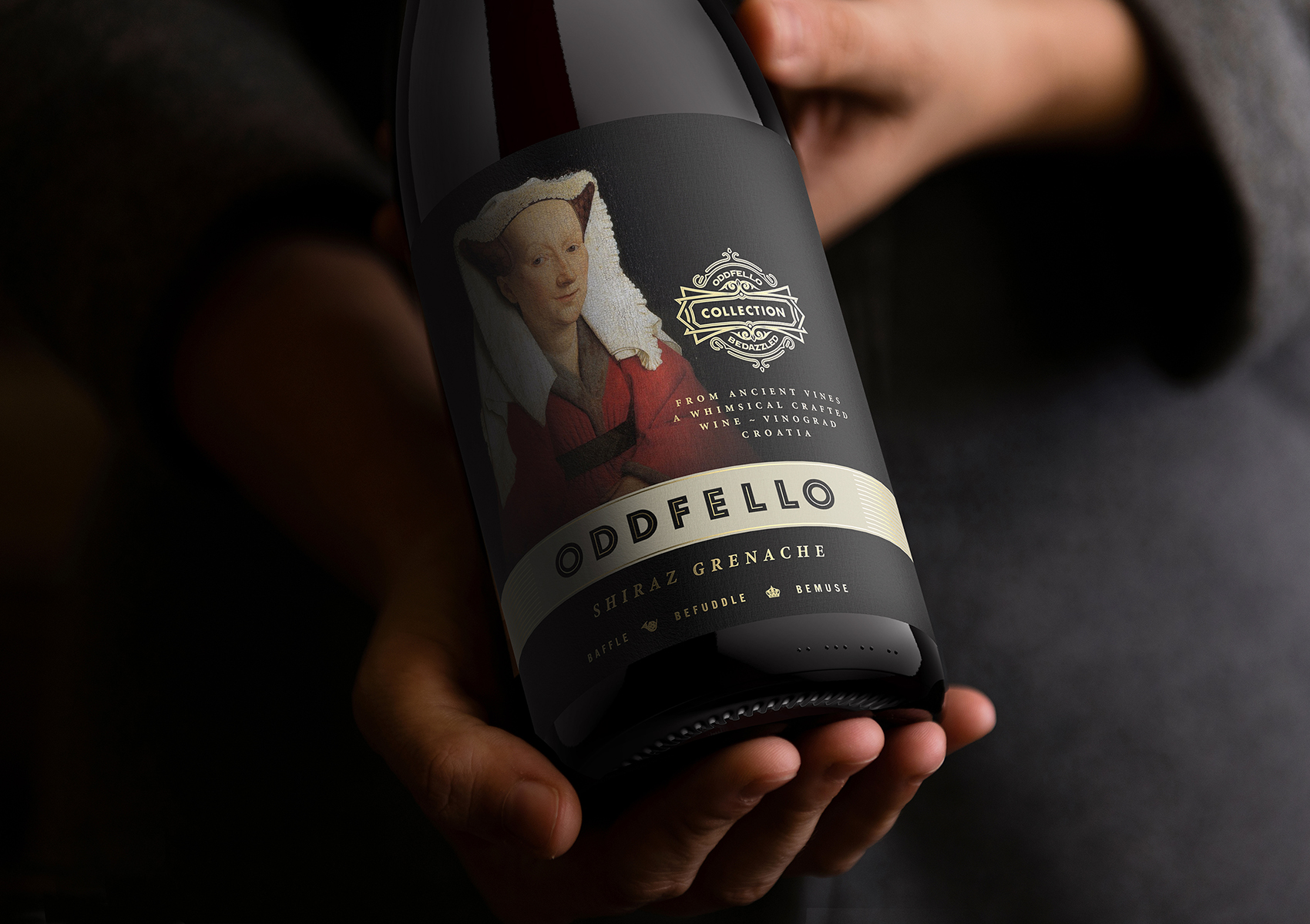
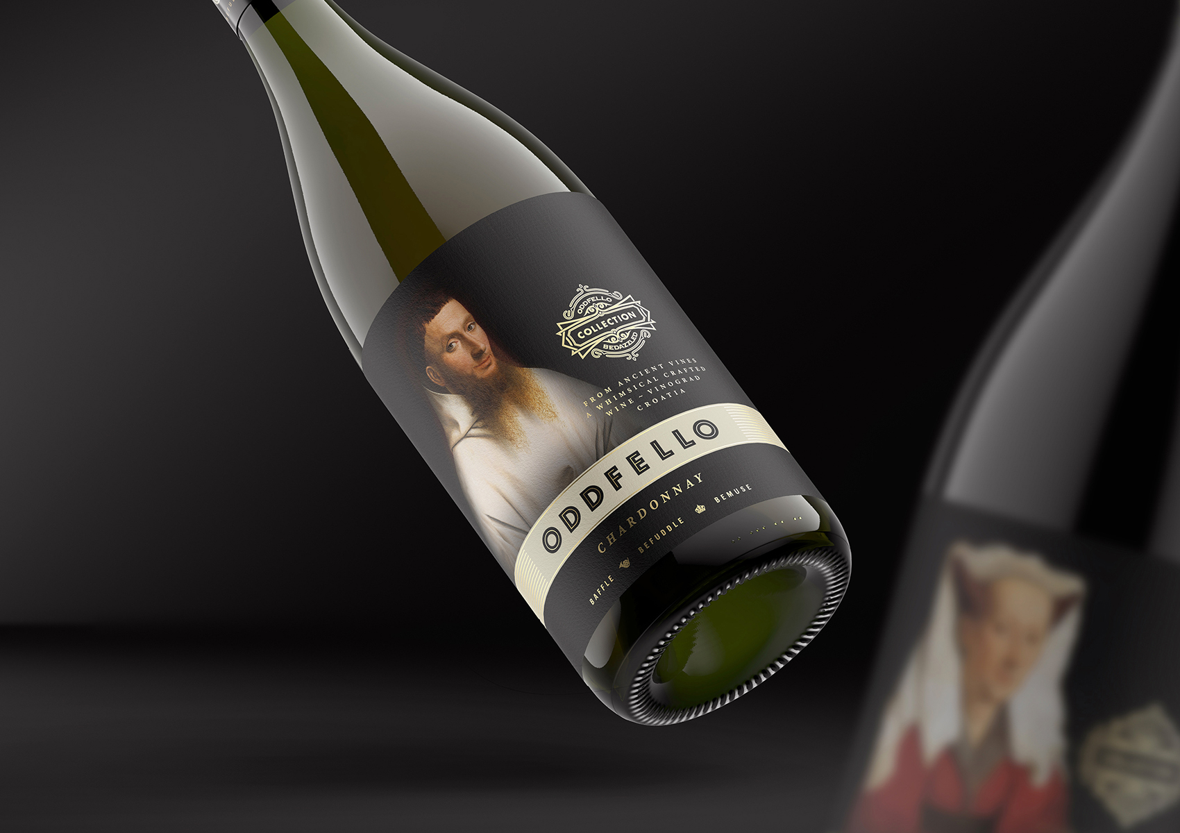
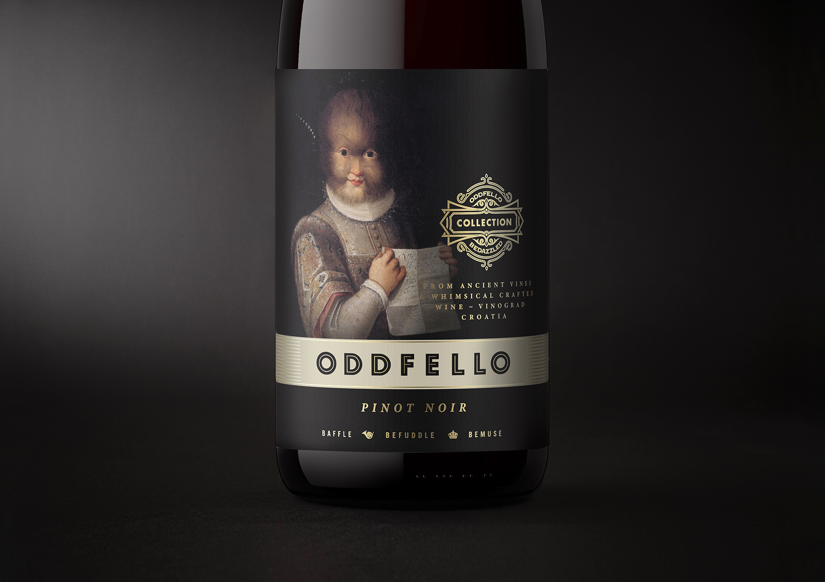
The purpose was to create a unique and memorable identity and packaging for the brand. While I didn’t want the new labels to become too traditional looking, the tone of the imagery brings a little freshness and modernity to the labels. The typography is understated and strikes a balance between image and branding.
The Oddfello packaging design gives a nod to its ancient beginnings through classic typographic treatment and restrained use of gold foil and imagery that delivers a slightly irreverent and medieval twist, in a light-hearted way. All of which makes it relevant to modern consumers and at the same time making an elegant statement about the wine.
CREDIT
- Agency/Creative: Mario Milostic
- Article Title: Nothing Ordinary About These Oddfello Wines Labels Designed by Mario Milostic
- Organisation/Entity: Freelance, Published Commercial Design
- Project Type: Packaging
- Agency/Creative Country: Australia
- Market Region: Multiple Regions
- Project Deliverables: Brand Creation, Brand Identity, Brand Naming, Graphic Design, Packaging Design, Product Naming, Structural Design, Tone of Voice
- Format: Bottle
- Substrate: Pulp Paper


