Soy milk is rising in popularity as an alternative to cow’s milk because of the tremendous damage dairy has on the human body, animals, and our environment.
Despite the measurable health, environmental, and ethical benefits that soy milk brings, it is represented in the South African beverage market in hideous packaging and is typically kept separate and out of sight of the consumer.
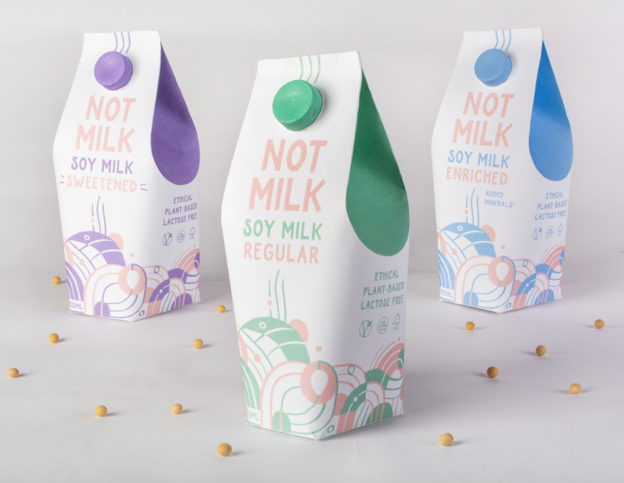
Soy milk in South Africa is dominated by Good Hope – owned by Clover, the dairy giant. Good Hope’s packaging is cluttered with confusing hierarchy: making it difficult to distinguish between dairy and plant-based milk, and difficult to differentiate between sweetened, regular, and enriched variants.
We reenvisioned soy milk packaging in a differentiating, attractive and accessible way.
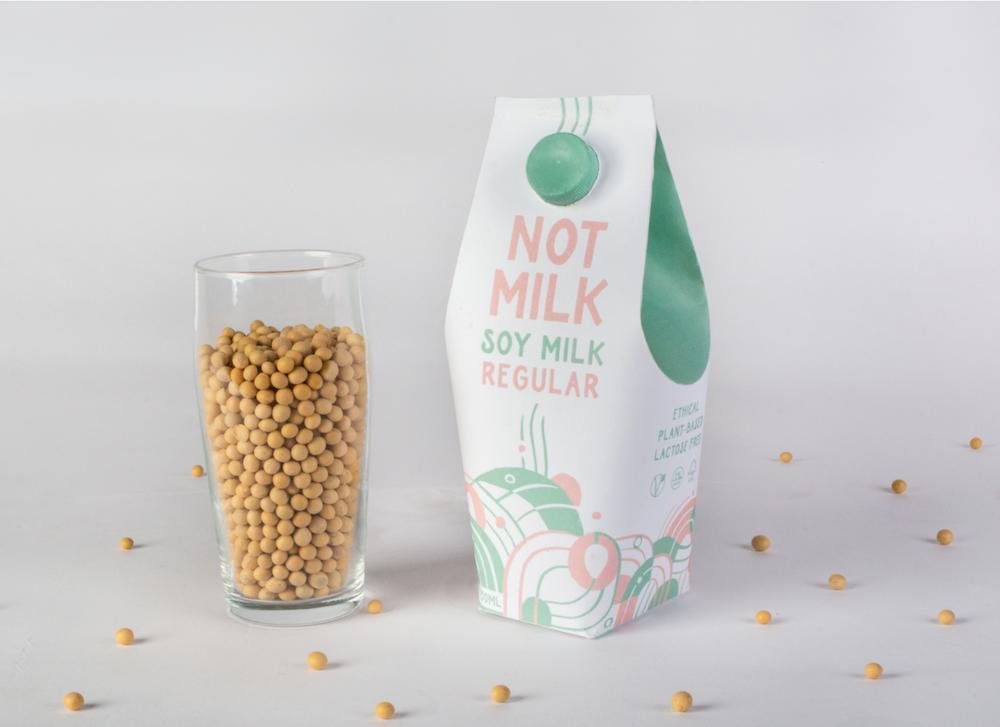
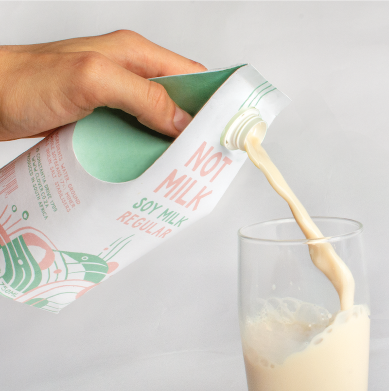
“NOT MILK” is an eye-catching mark which both differentiates itself from cows milk in an obvious way, while compelling the consumer to question ‘regular’ milk.
“Why would regular milk be a problem?” is answered on the flip side of the carton, presenting the viewer with the ways in which soy milk is better for them.
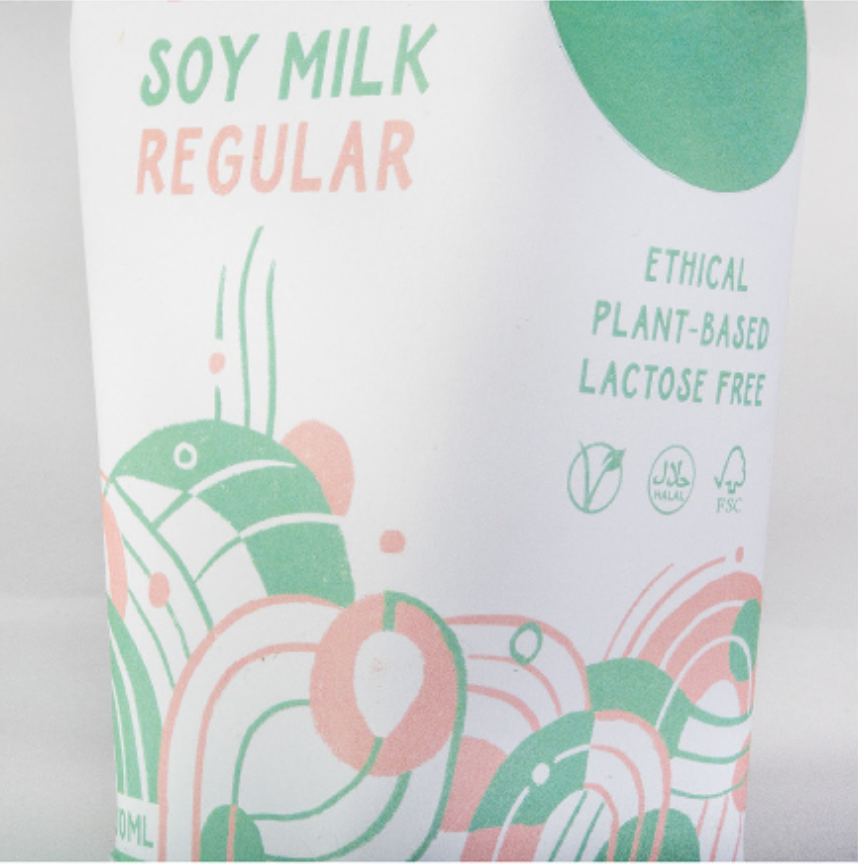
We developed a visual language in order to assist with the identification of the product as containing natural, plant-based milk, different from animal milk. The illustration uses curvilinear line and a playful repetition of form, presenting a tone that is friendly and accessible. The design communicates the processes behind the production of soybeans and their milk: soybeans, crop fields, leaves. The highly dynamic landscape produces the idea of a sense of bubbling and churning.
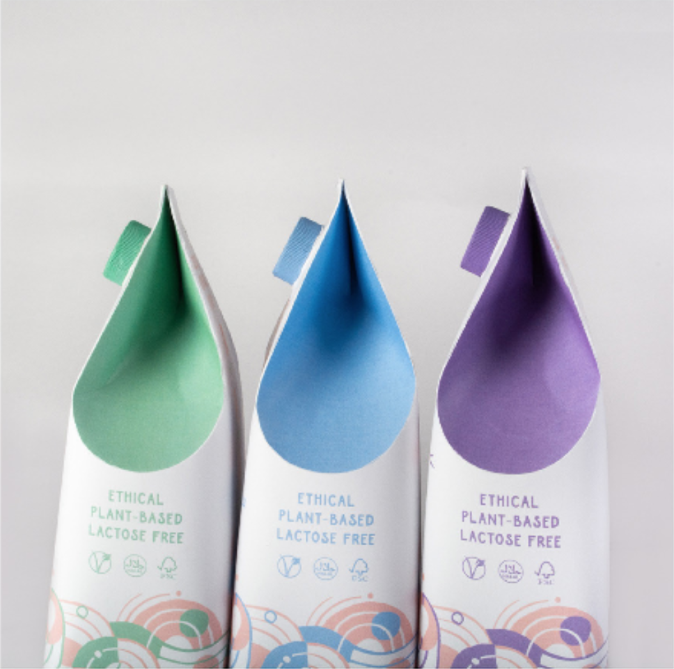
The bottle is both eye-catching and different from regular milk. The visual elements grow from the illustrative landscape and lead the viewer’s eye from the logo to the back of the bottle, where the visual narrative continues.
The curved shape of the side of the bottle alludes to the idea of a drop of liquid. The bottle’s curved design is ergonomic and easy to pour, inspired by an Organic Valley design. The packaging looks at the shape of the bean itself as an organic, curved shape.
Because soy milk is typically purchased for an individual in a household, a normal 1L bottle is too large for consumption. The bottles are therefore 750ml.
CREDIT
- Agency/Creative: Conlan Design
- Article Title: NOT MILK Packaging for a milk alternative
- Organisation/Entity: Student, Non Published Concept Design
- Project Type: Packaging
- Agency/Creative Country: South Africa
- Market Region: Africa
- Project Deliverables: Brand Rejuvenation, Brand Strategy, Graphic Design, Illustration, Packaging Design, Photography, Research, Tone of Voice
- Format: Bottle
- Substrate: Pulp Carton


