by north™ – Move
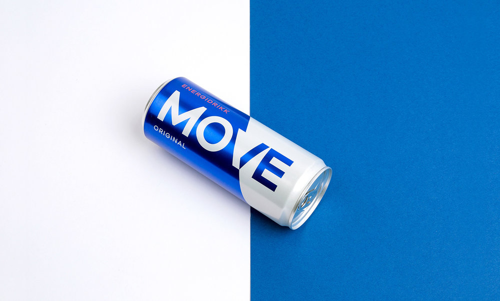
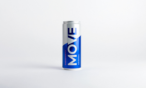
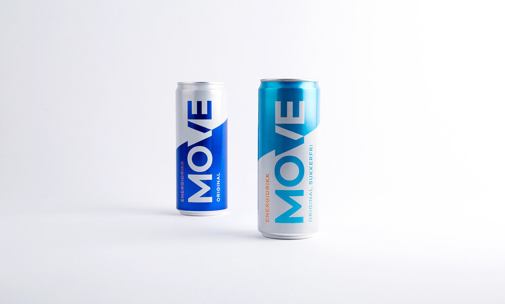
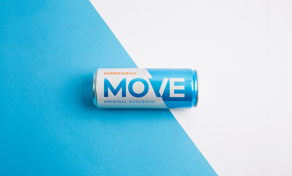
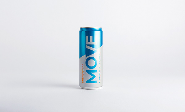
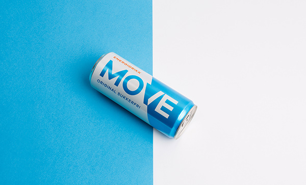
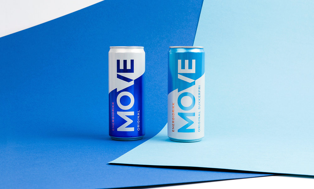
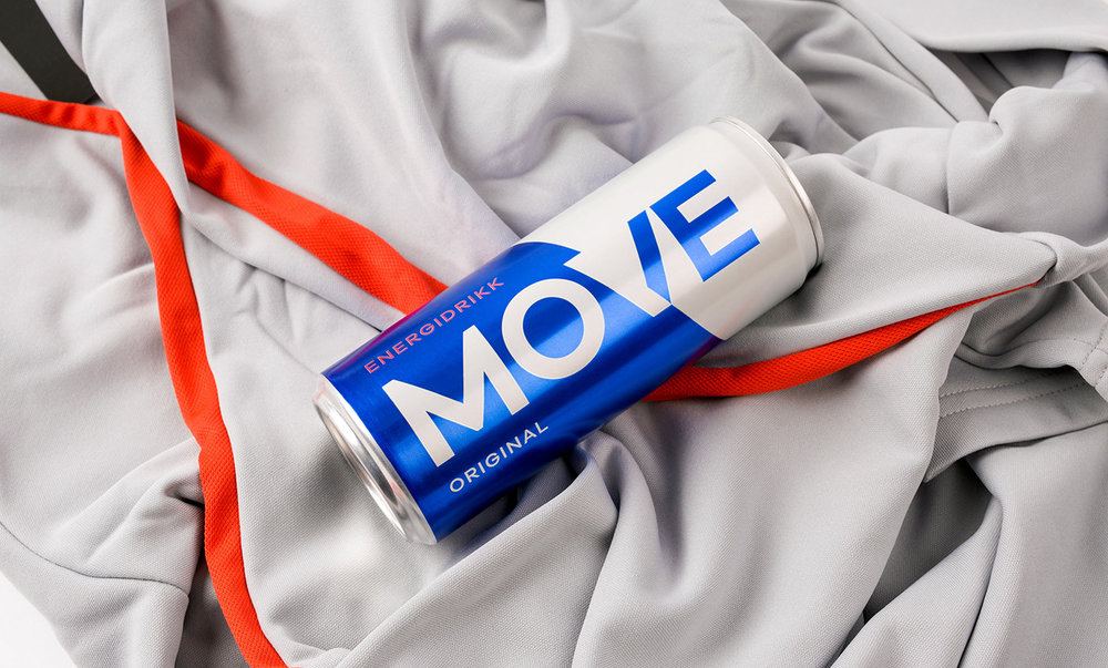
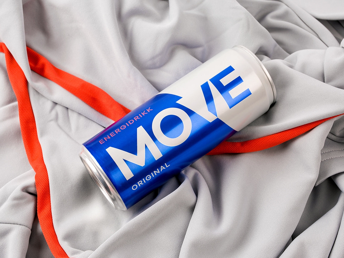
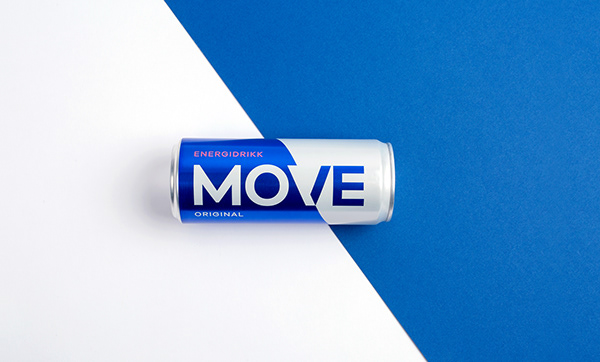
“By north™ was commissioned to develop name, visual language and packaging for Coops new, private label energy drink (Coop is the second-largest department store retailer in Norway). The name Move was chosen to convey an active lifestyle for everyone, and to differentiate the product from the established brands in the category, which more often than not have masculine names and borrow their visual language from action sports and gaming. The visual language is inspired by classic sports brand and conveys motion and action through the juxtaposition of the Move logotype and a basic, geometric shape. This solution allows for a clear visual distinction between the packaging for the original version and the sugar-free version, and also opens up the possibility for other varieties under the Move-name in the future.”