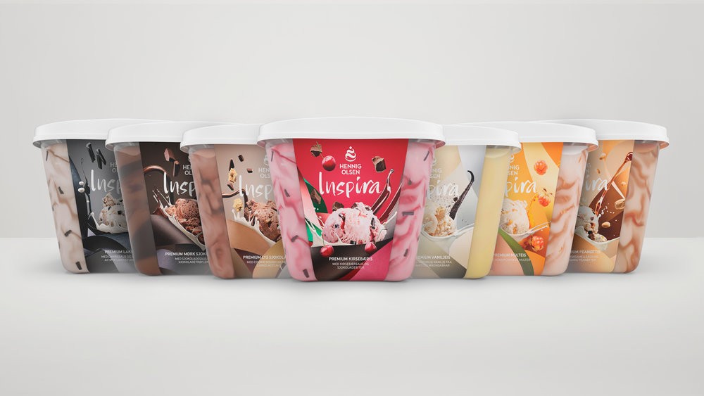
Anti . , Martine Strøm , Gaute Aase – Inspira Ice Cream
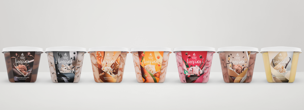
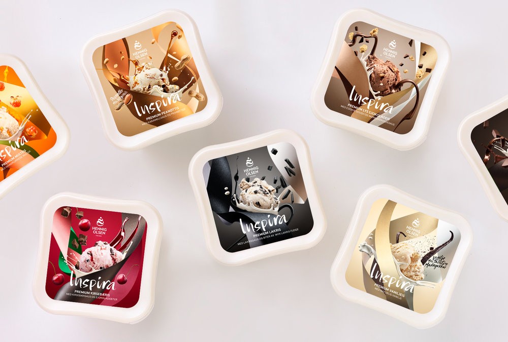
Inspira is one of the more exclusive ice cream ranges by Hennig-Olsen with more premium ingredients. The prevoius design was clean and nice, but costumers had difficulty separating the different tastes in store. Based on this the client asked us to renew the design to better communicate the variety of tastes and ingredients of each ice cream. Rich in taste, and exclusive.
Elements for the new packaging:
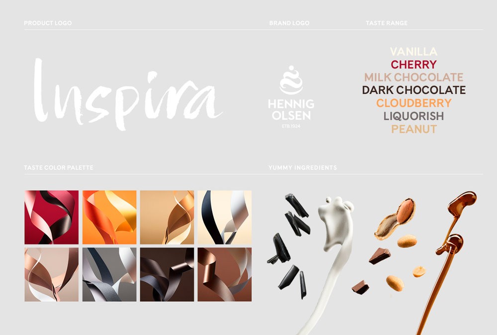
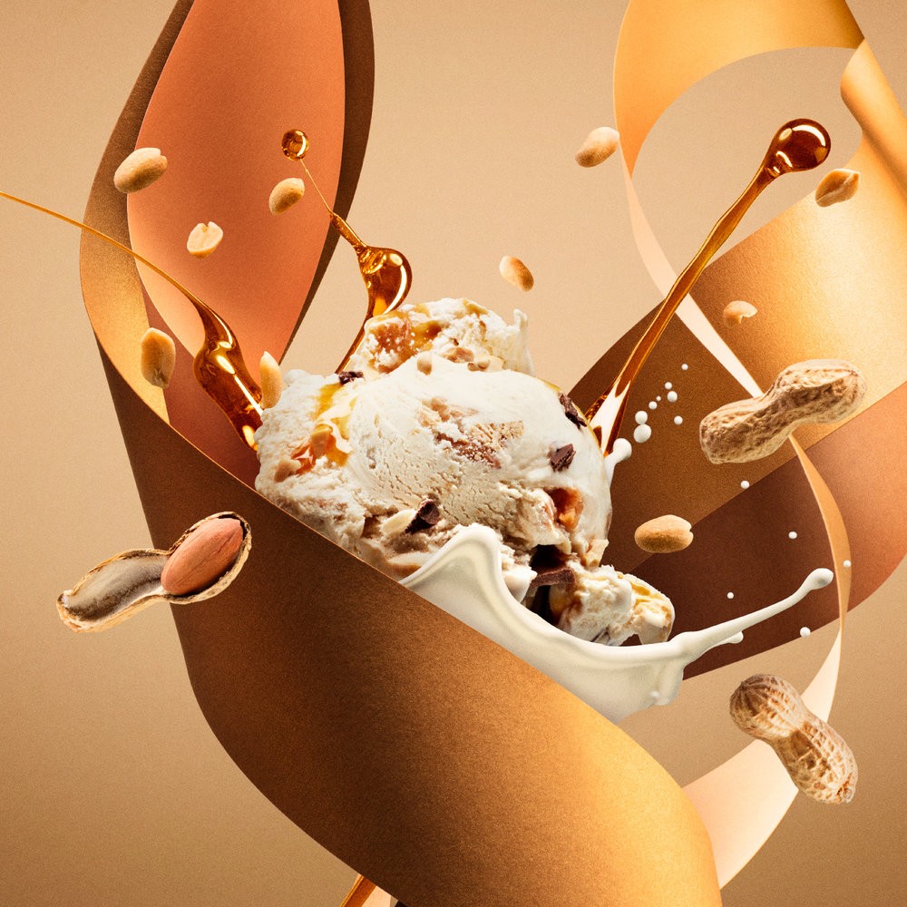
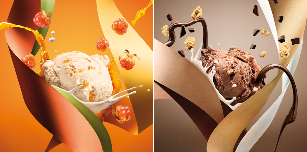
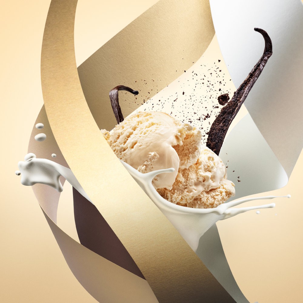
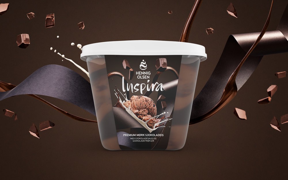
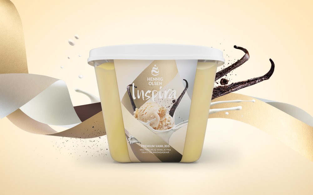
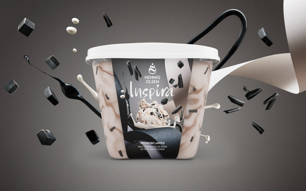
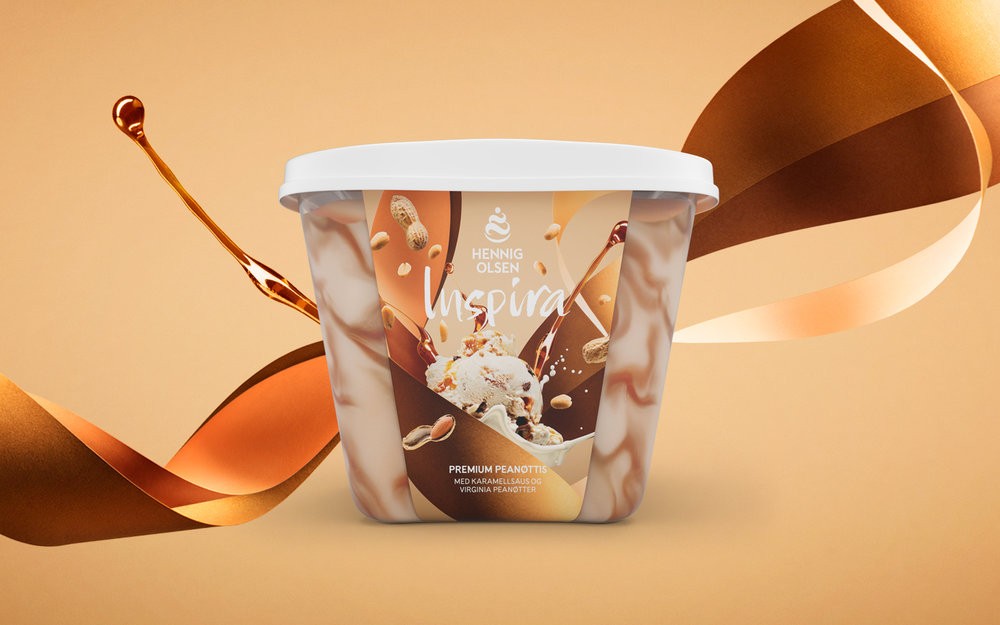
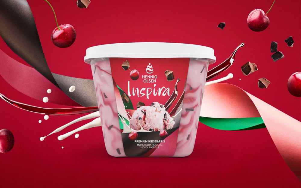
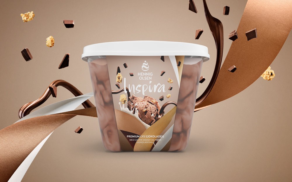
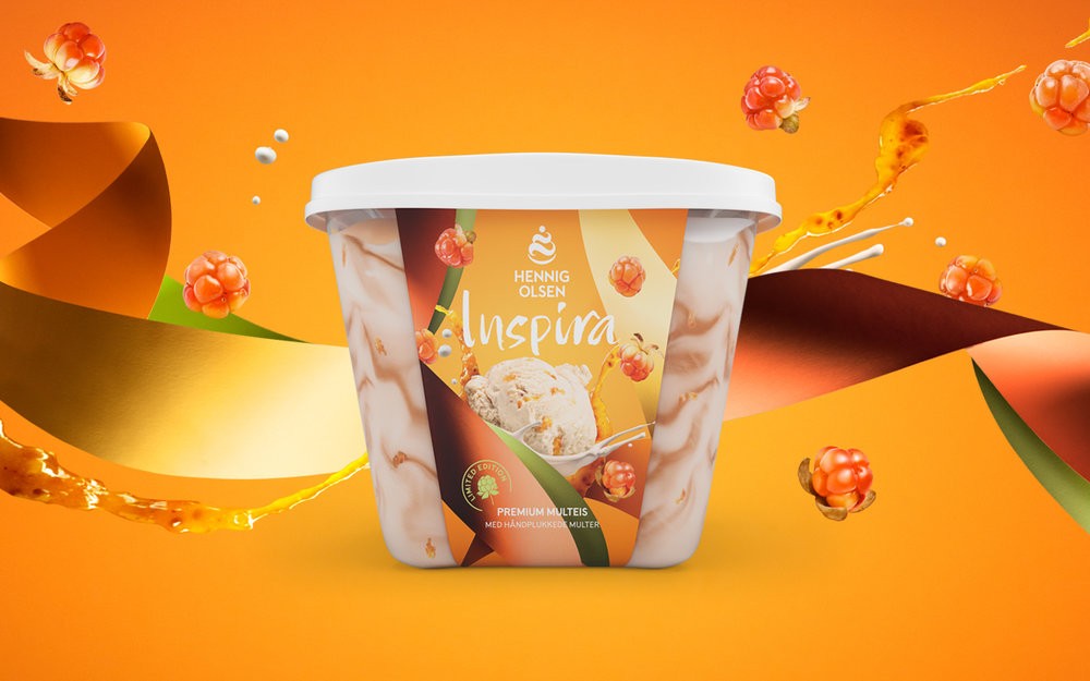
“TASTE IMAGES: We did a studio photoshoot with all the ingredients, icecream and a specific colour scheme for each ice cream. All the elements were shot separately, and then put together in a composition, or an “explosion of taste”.”
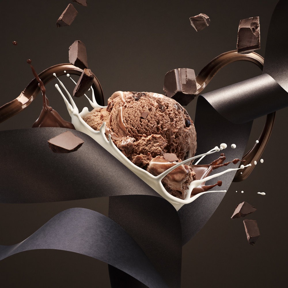
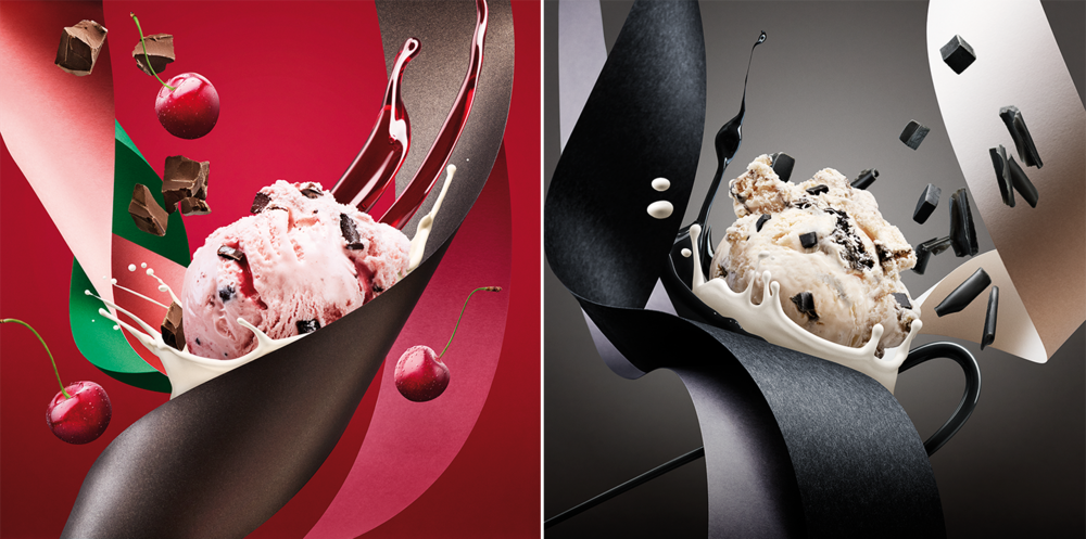
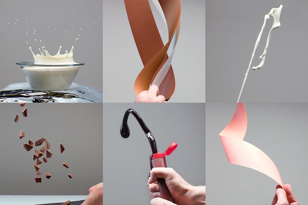
“BEHIND THE SCENES
All the ingredients are tossed, splashed and shot in our studio, including the paper “ribbons” and the ice cream scoops.”
“PACKAGING
When the ice creams are presented one by one, the ingredients and colour from the packaging is used to create an environment bursting with flavour.”
CREDIT
- Agency/Creative: Anti . , Martine Strøm , Gaute Aase
- Article Title: Norwegian Premium Ice Cream Redesign with a Focus on Tastes and Ingredients
- Project Type: Packaging
- Format: Box
- Substrate: Plastic


