by north™ – Isbjørn Sommerøl
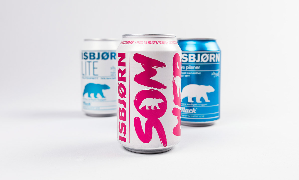
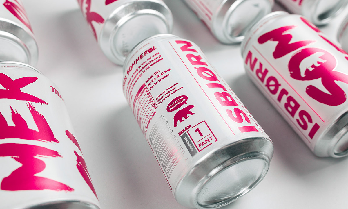
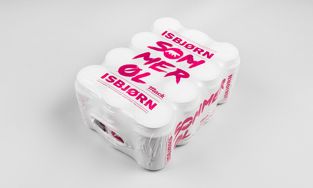
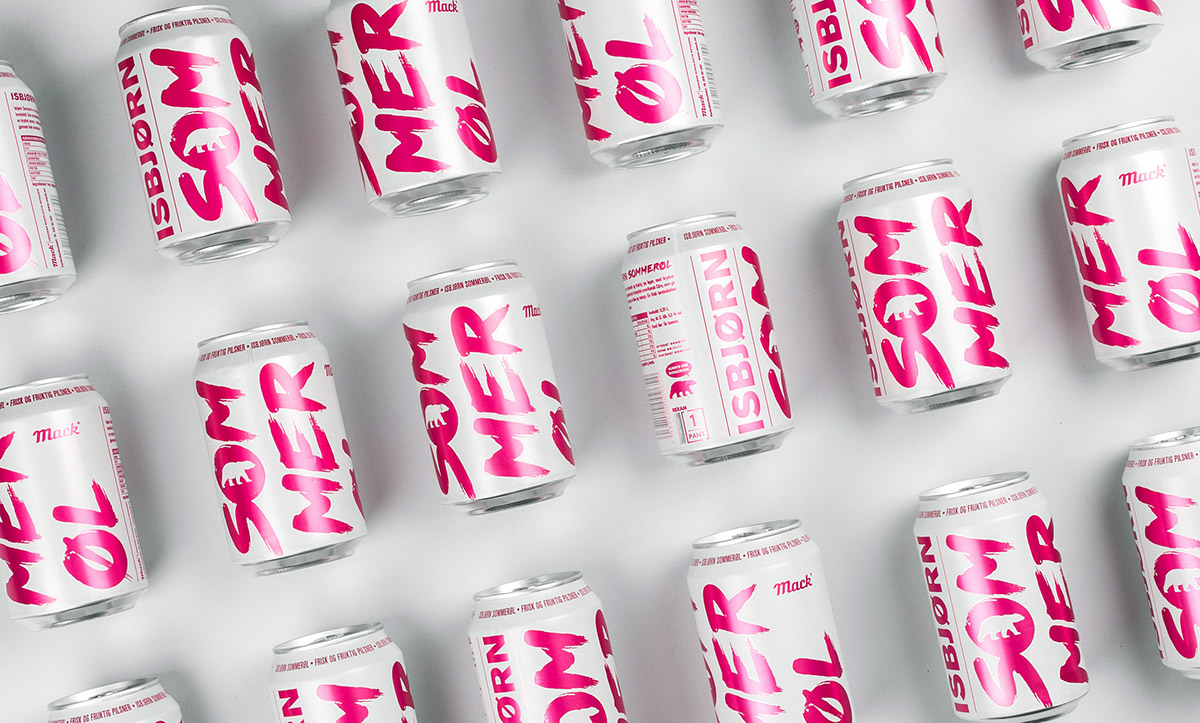
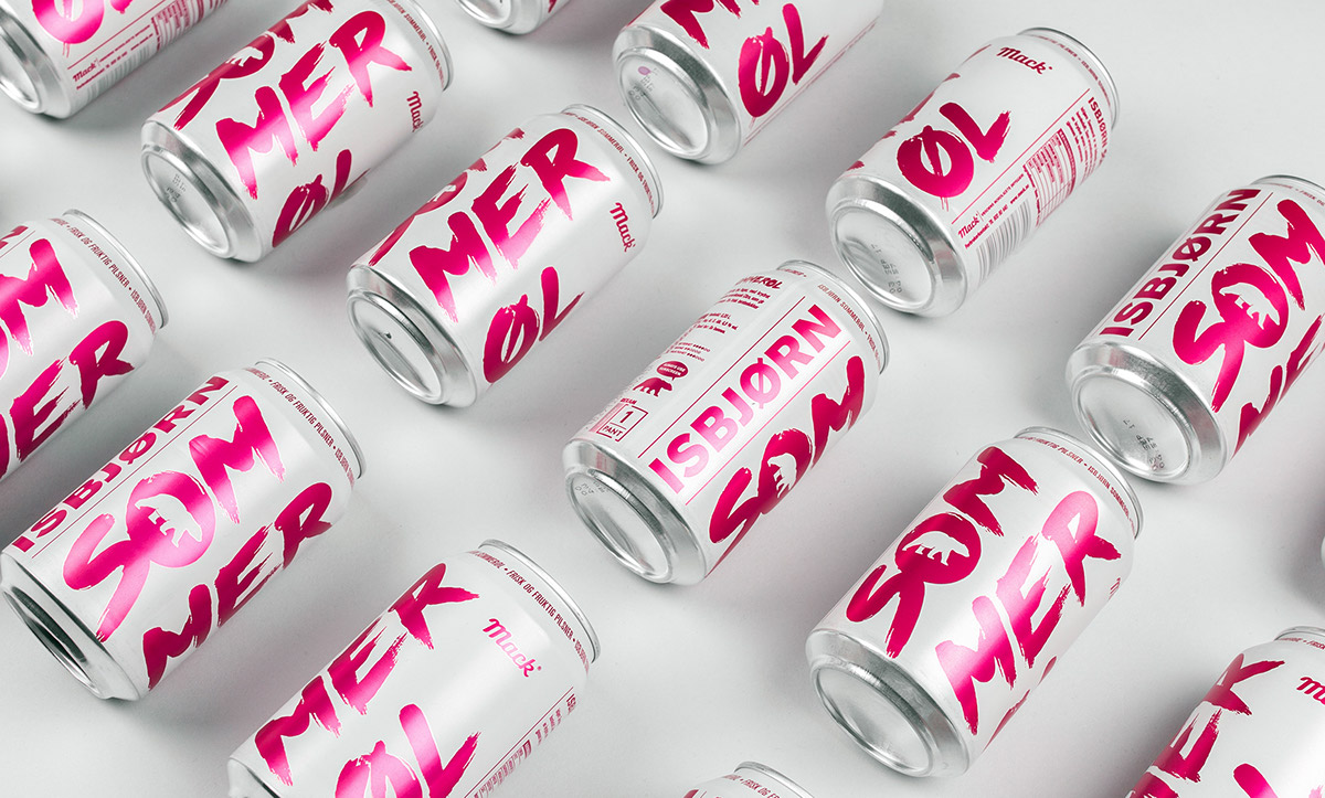
“Isbjørn Sommerøl is the third product in the Isbjørn-family. Following the success of Isbjørn and Isbjørn Lite, Mack wanted to refresh their summer beer line-up. Summer beers have traditionally been a significant seasonal category for Norwegian breweries, but in recent years it has seen a steady decline in sales. To refresh the category, Mack brewed an Isbjørn flavoured with Citra hops, and we made a new iteration of the design, this time using white and magenta (a colour seldom or never seen in the beer-shelves in Norway). By setting the text “sommerøl” vertically on the can, and hyphenating it som-mer-øl, we also added a typographic pun. When you turn the can around, you will at one point read “mer øl”, which translates to “more beer” in Norwegian.”