


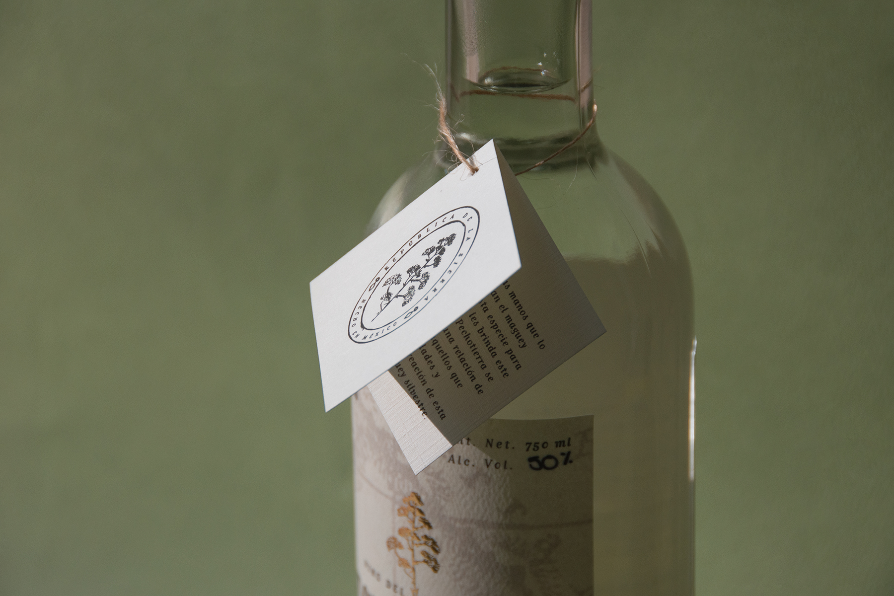
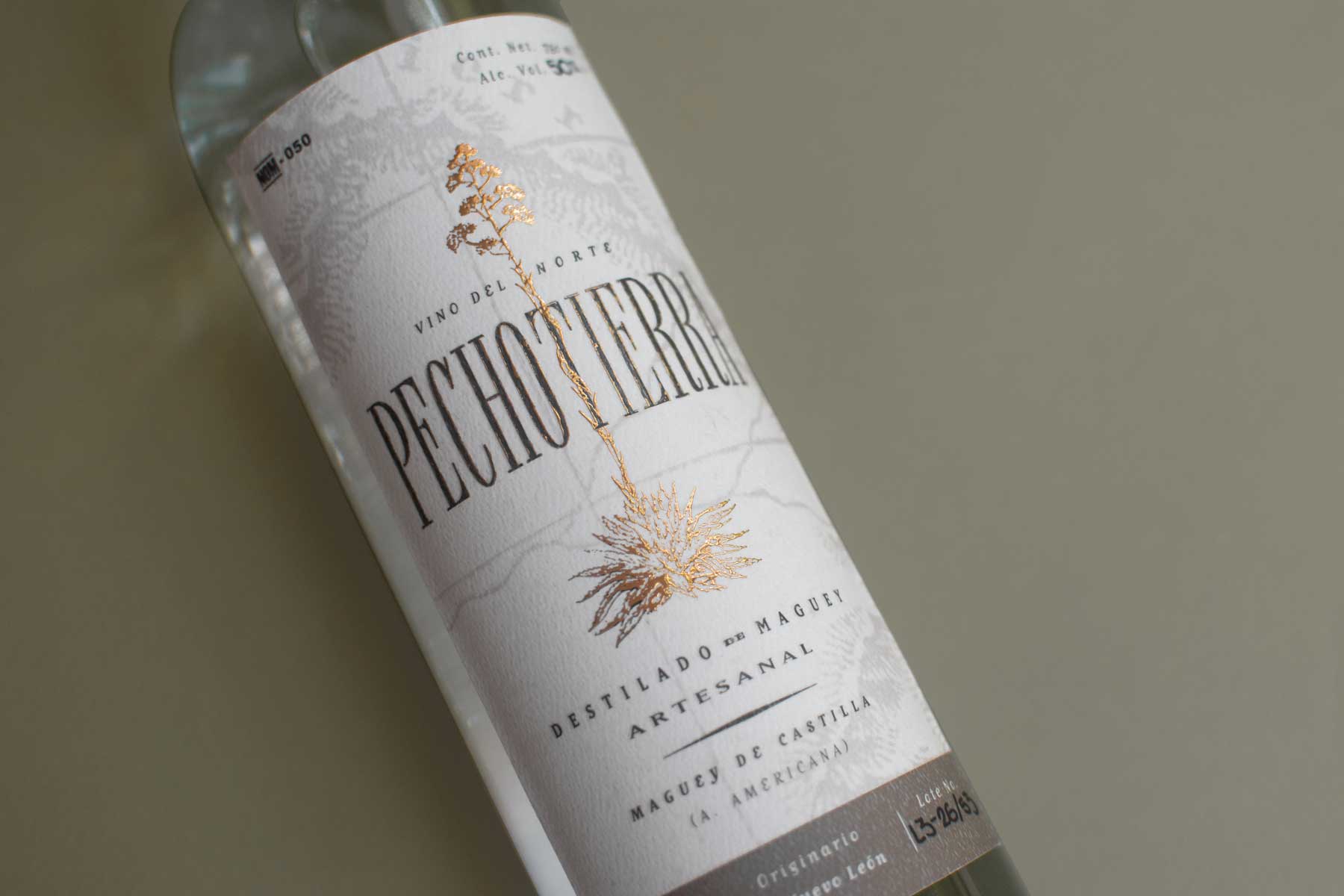
For this project, we were contacted by a team of mezcal aficionados to create one of the first better-known brands of northern Mexican mezcal. This project was very exciting for us because firstly, we love mezcal, but also because we are very proud Norteños. Initially we traveled to the nearby places where this product was being made and enjoyed the investigation process as we got to know the people and process behind the creation. The resulting brand is one that is fully inspired by the history of northeast Mexico. We decided to highlight a tough, yet elegant personality and history because this “mezcal” is proudly northern, unlike most others that come from central Mexico. The name Pechotierra has different reasons behind its meaning. It comes from the phrase “pecho a tierra,” which is relevant to times of war and hardship. But we also love that it has the word “tierra” in it (which means “soil”) and highlights the organic, hand-to-earth aspect behind the artisanal process of creating this product. Pechotierra’s brand elements are well-chosen and done with great detail.
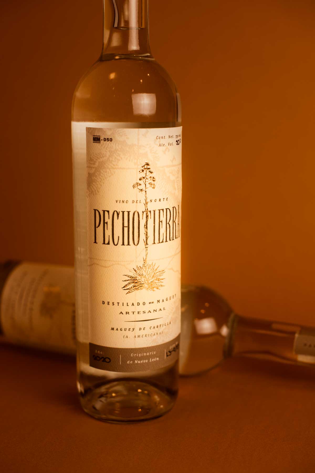
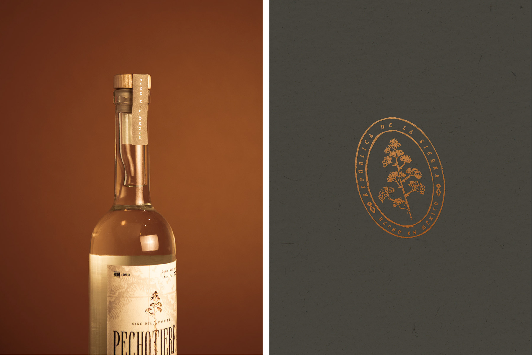
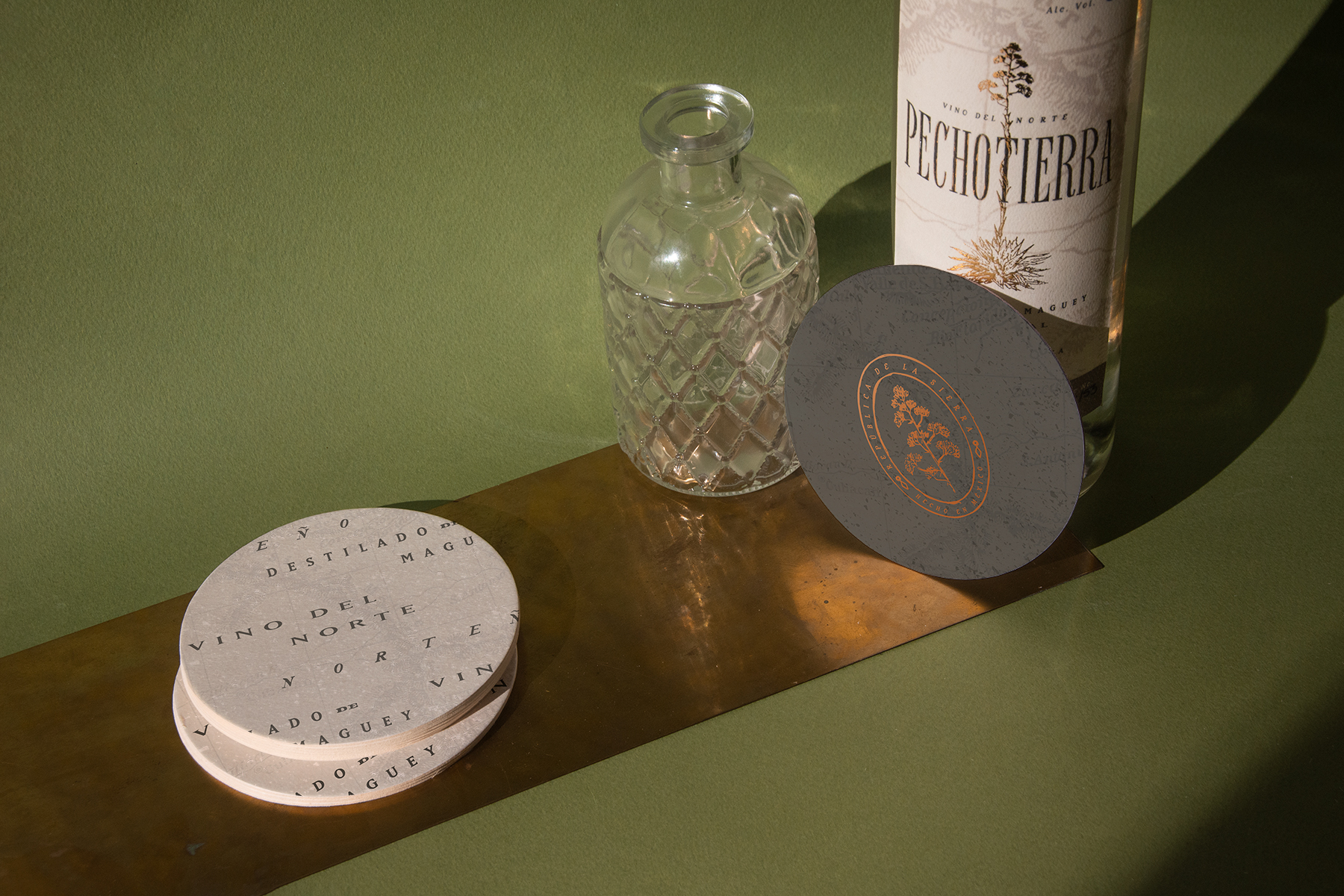
The wordmark is hand-crafted, but based on newspapers and prints we found from this era. The very narrow serifs reflect the way newspapers use small space for headlines, much like the way we are using the label to define the width. This worked perfectly for a long name that has to live on quite a narrow bottle. By creating this manually, we were able to add details to give it a worn-out feel. The maguey (the plant) is used as a marketing tool, to make sure that when customers see this product for the first time, they relate it directly to mezcal. Since Pechotierra is from Nuevo Leon, it cannot be called “mezcal” because of its designation of origin, so we cannot write this word on the label, but we can definitely put it in people’s minds.


CREDIT
- Agency/Creative: Caracter
- Article Title: Northern “Mezcal” Branding
- Organisation/Entity: Agency, Published Commercial Design
- Project Type: Packaging
- Agency/Creative Country: Mexico
- Market Region: North America
- Project Deliverables: Brand Architecture, Brand Creation, Brand Experience, Brand Guidelines, Brand Identity, Brand Naming, Brand Strategy, Brand World, Branding, Identity System, Packaging Design, Product Naming, Tone of Voice
- Format: Bottle, Tag
- Substrate: Glass Bottle


