


Introduction: In the fast-evolving tech landscape, companies must continuously adapt to remain relevant and competitive. A critical component of this adaptation is branding, which encompasses much more than just a logo or a catchy tagline. It’s about creating a comprehensive identity that resonates with clients, partners, and employees alike. Recently, we had the opportunity to undertake the rebranding of NorthAlley, a global tech company renowned for its expertise in collaboration, software development, product innovation, and technological advancement. This rebranding initiative was not just a cosmetic overhaul; it was a strategic endeavor to realign NorthAlley’s identity with its mission and values.
Understanding NorthAlley: NorthAlley has built a reputation as a pioneer in the tech industry, with a focus on delivering cutting-edge solutions that foster collaboration and drive innovation. The company’s vision is to be a guiding star for its clients, providing direction and clarity in an often chaotic tech landscape. This vision is grounded in their core values of innovation, reliability, and customer-centricity. As we embarked on this rebranding journey, it was crucial to ensure that the new brand identity would reflect these principles and convey them effectively to a global audience.
The Branding Challenge: The primary challenge was to encapsulate NorthAlley’s ethos in a visual identity that would be instantly recognizable and memorable. The existing brand identity, while functional, did not fully capture the innovative spirit and dynamic nature of the company. The leadership at NorthAlley wanted a brand that would stand out in the crowded tech market and position them as a forward-thinking and trustworthy partner.
Conceptualisation and Design Philosophy: The rebranding process began with an in-depth analysis of NorthAlley’s market position, competitors, and target audience. We conducted interviews with key stakeholders, including employees, clients, and industry experts, to gain insights into the brand’s strengths and areas for improvement. This research phase was critical in understanding the unique value proposition of NorthAlley and how it could be visually represented.
One of the core requirements from the client was to incorporate elements that symbolize guidance and direction. After exploring various concepts, we settled on the idea of using a star or a compass as the central motif of the new logo. These symbols not only align with NorthAlley’s mission of providing direction but also evoke a sense of reliability and aspiration.
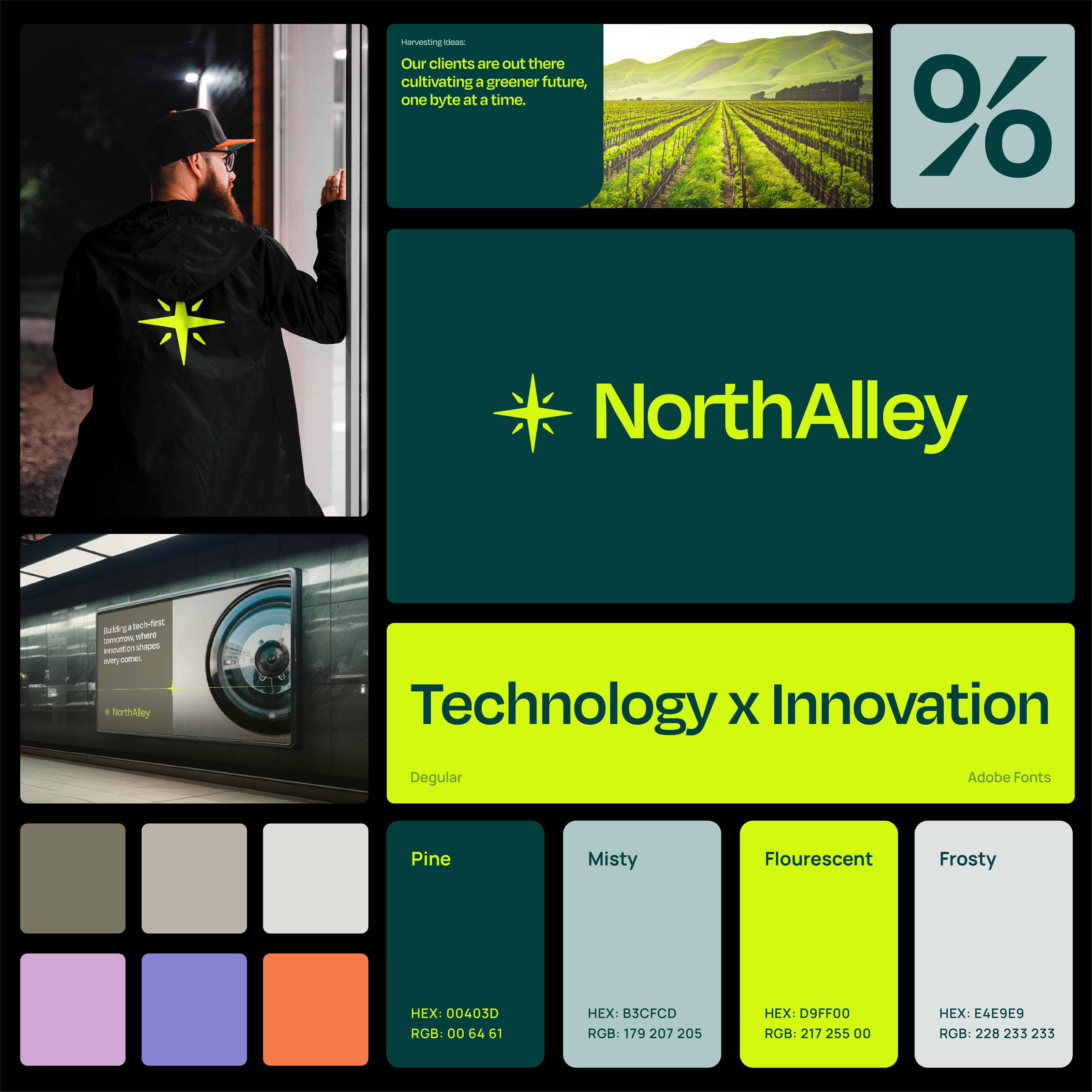
The Logo: A Symbol of Direction and Clarity. The final logo design features a stylised star, integrated with subtle compass elements. This design serves as a metaphor for NorthAlley’s role as a guiding force in the tech industry. The star is depicted with clean, modern lines to reflect the company’s innovative approach, while the compass elements add a layer of sophistication and depth. The colour palette chosen for the logo includes shades of blue and green, representing trust, growth, and technological prowess.
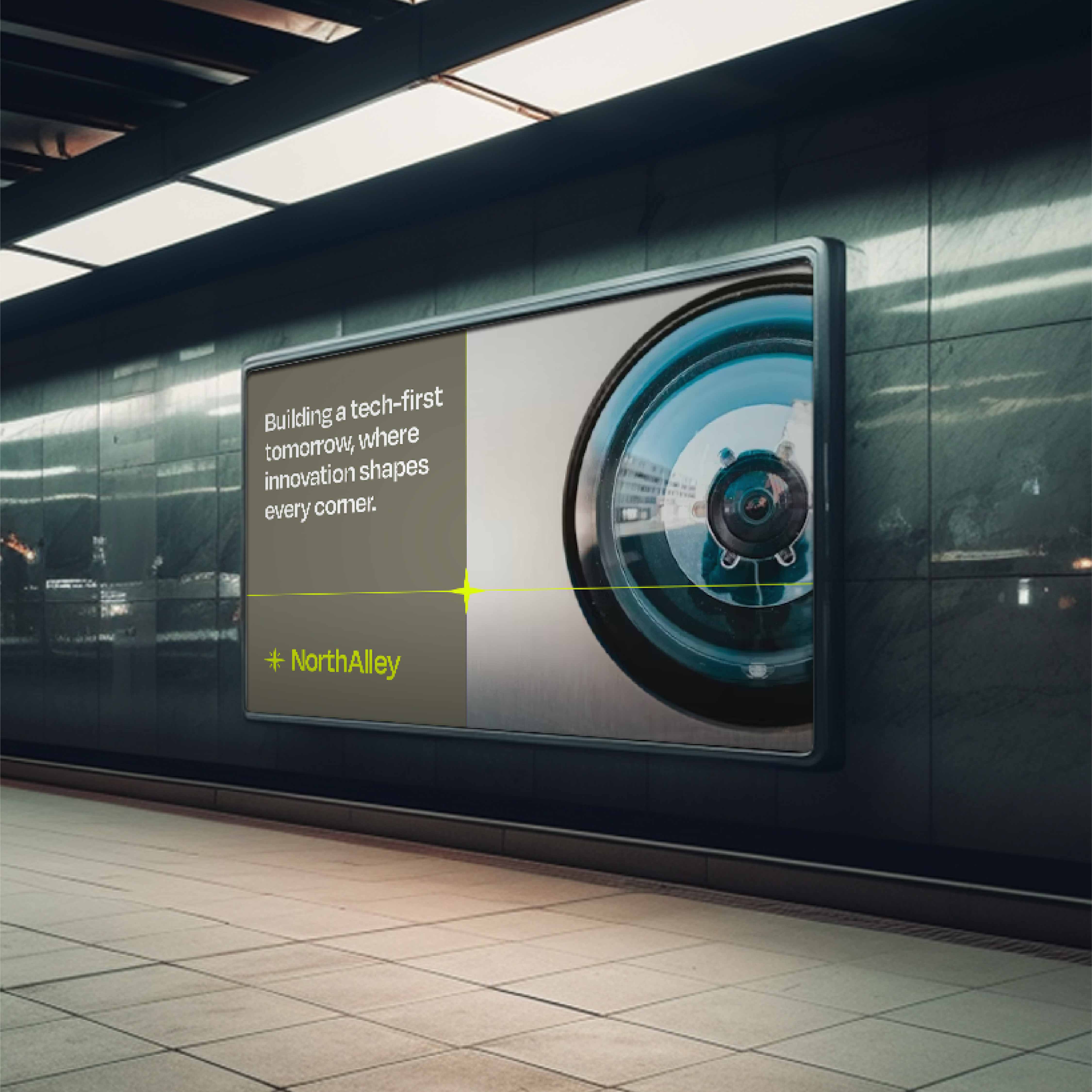
The Star Trail: A Unique Brand Element. In addition to the logo, we developed the “Star Trail” – a distinctive graphic element featuring intersecting lines and a star. This element is versatile and can be used across various brand assets, from marketing materials to digital interfaces. The Star Trail serves multiple purposes: it enhances brand recall, helps organize information visually, and adds an aesthetic touch to the communication. It’s designed to be a supporting element that complements the primary content without overshadowing it.
Implementing the New Brand Identity: With the logo and Star Trail in place, the next step was to implement the new brand identity across all touchpoints. This included the company’s website, social media profiles, marketing collateral, and office spaces. We ensured that the new design language was consistently applied, creating a cohesive and unified brand experience.
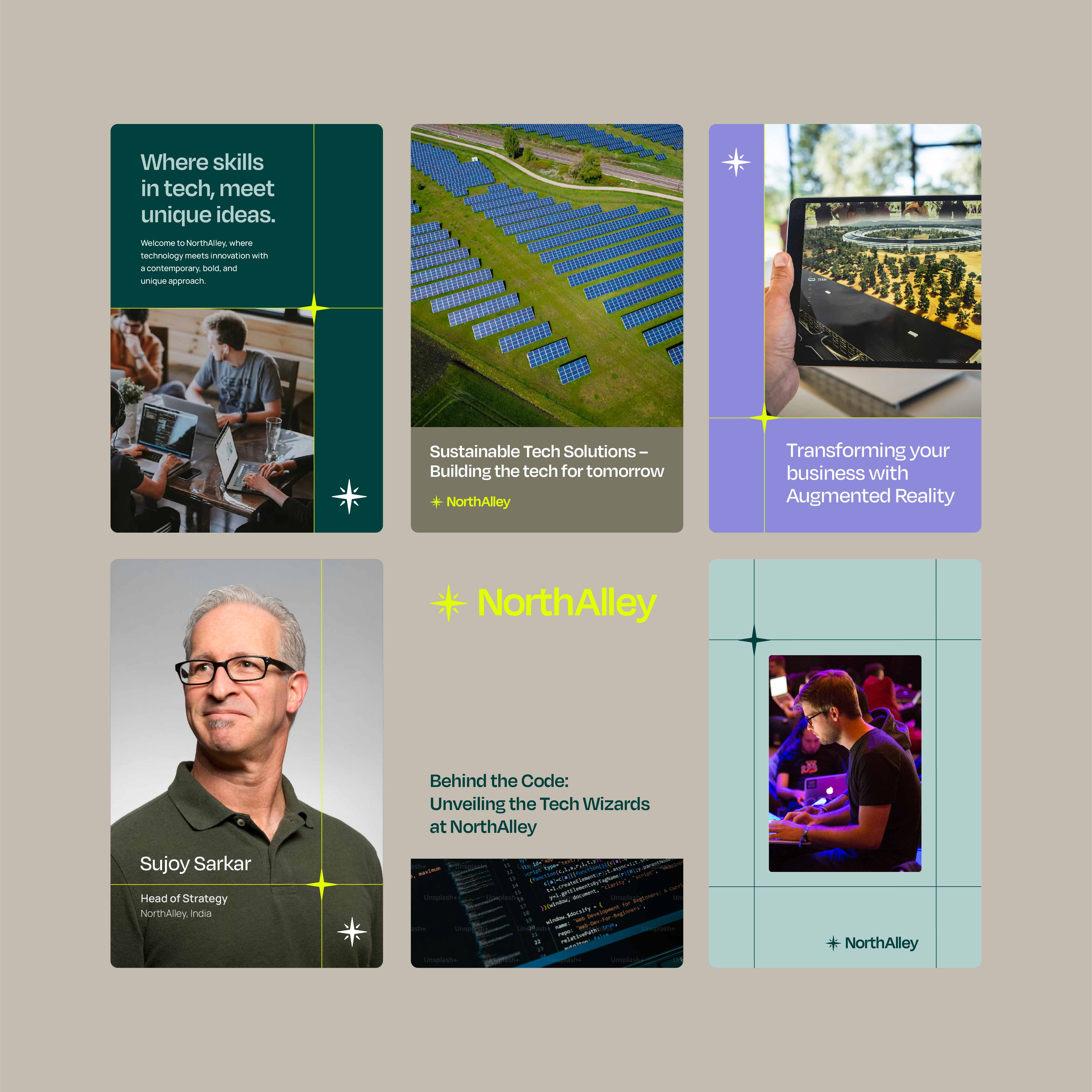
Website and Digital Presence: The company’s website is often the first point of contact for potential clients and partners. Therefore, it was essential to redesign the website to reflect the new brand identity. The revamped website features a clean, minimalistic design with intuitive navigation. The Star Trail is subtly integrated into the layout, adding visual interest without distracting from the main content. High-quality images, concise messaging, and strategic use of white space all contribute to a professional and engaging user experience.
Marketing Collateral: Marketing materials, such as brochures, business cards, and presentation templates, were also redesigned to align with the new brand identity. The use of the Star Trail in these materials helps create a strong visual connection to the brand. Each piece of collateral is designed to communicate NorthAlley’s value proposition clearly and compellingly, whether it’s a detailed product brochure or a simple business card.
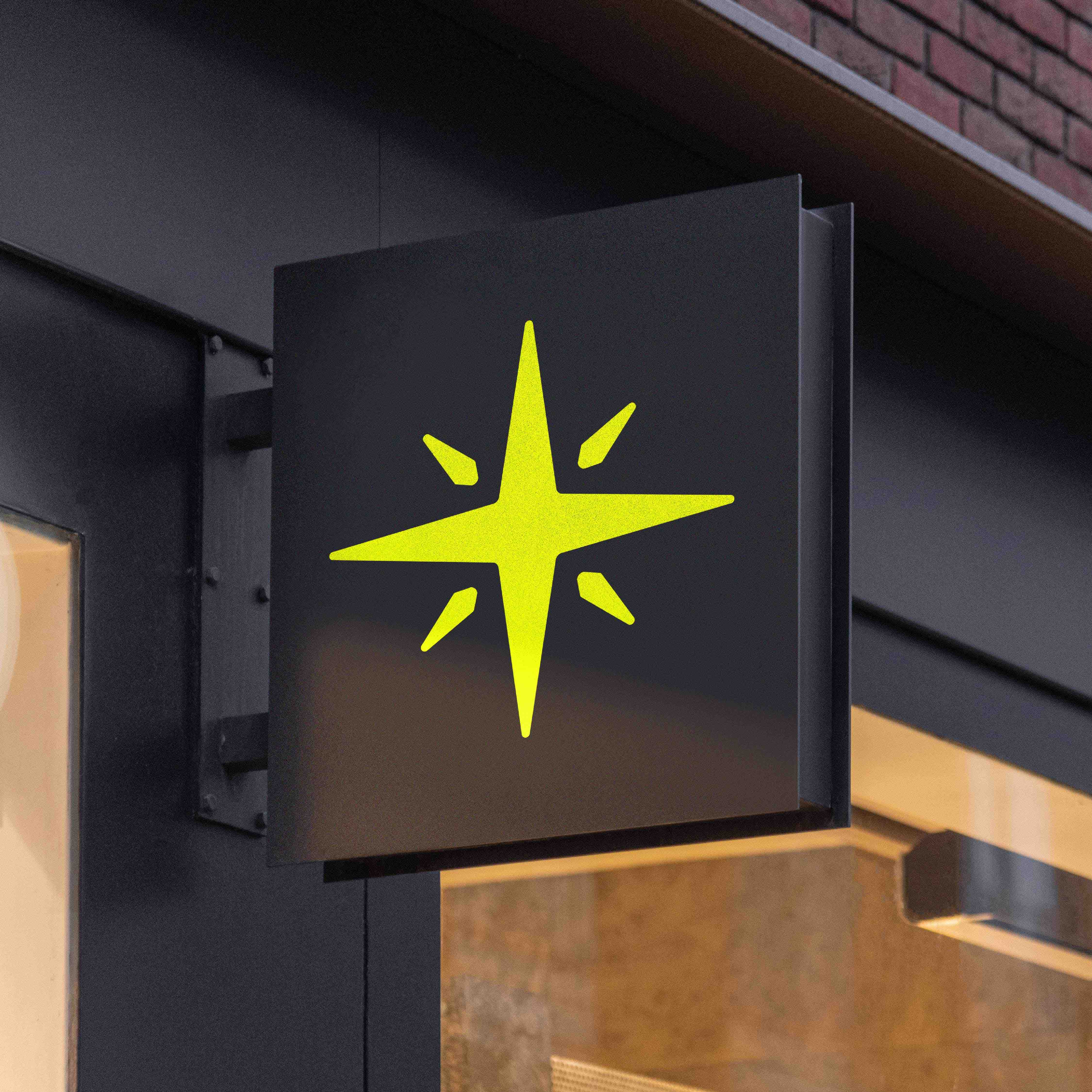
Office Spaces: The physical environment in which a company operates can significantly impact employee morale and client perception. As part of the rebranding effort, we extended the new design language to NorthAlley’s office spaces. This included updating signage, interior design elements, and even employee uniforms. The goal was to create a workspace that embodies the brand’s innovative spirit and fosters a sense of pride among employees.
Employee Engagement: A successful rebranding initiative requires buy-in from all stakeholders, especially employees. To ensure smooth adoption of the new brand identity, we conducted a series of workshops and training sessions with NorthAlley’s staff. These sessions aimed to educate employees about the new brand values, visual identity, and how they can embody the brand in their daily work. By involving employees in the rebranding process, we fostered a sense of ownership and enthusiasm for the new brand.
Client and Partner Communication: Rebranding can sometimes be met with resistance from clients and partners who are accustomed to the old identity. To mitigate this, we developed a comprehensive communication plan to inform NorthAlley’s clients and partners about the rebranding. This included personalized emails, press releases, and a launch event where we unveiled the new brand identity. The feedback was overwhelmingly positive, with many clients expressing excitement about the fresh and modern look of NorthAlley.
Branding Beyond the Logo: As we always emphasise, branding is more than just a logo – it is the culmination of all the small elements that create a memorable identity. Every touchpoint, from the tone of voice in communications to the user experience on the website, contributes to the overall brand perception. For NorthAlley, this meant redefining every aspect of their brand to align with their vision of being an innovative and reliable tech partner.
Differentiating in the Tech Space: The tech industry is known for its rapid pace of change and fierce competition. To stand out, NorthAlley needed a brand identity that not only reflected their expertise but also positioned them as thought leaders with fresh ideas and execution prowess. The new brand identity achieves this by breaking away from the usual corporate aesthetics often seen in the software and product development space. Instead, it presents NorthAlley as a company that is bold, dynamic, and ready to lead the way in innovation.
Conclusion: Rebranding NorthAlley was a comprehensive and multifaceted project that required careful planning, creative design, and strategic implementation. The new brand identity successfully captures the essence of NorthAlley – a company that is a guiding star in the tech industry, offering direction, clarity, and innovative solutions. By focusing on elements that symbolise guidance and integrating them into a cohesive visual language, we created a brand that is both memorable and meaningful.
The rebranding effort not only refreshed NorthAlley’s image but also reinforced its market position and strengthened its connection with clients, partners, and employees. It serves as a testament to the power of thoughtful and strategic branding in driving business success.
Through this case study, we have demonstrated how a well-executed rebranding initiative can transform a company’s identity and help it stand out in a competitive market. NorthAlley’s new brand is a reflection of its commitment to innovation, excellence, and customer-centricity, and we are proud to have been part of this transformative journey.

CREDIT
- Agency/Creative: Studio Fable
- Article Title: NorthAlley’s Brand Transformation by Studio Fable Showcases Innovation and Customer Focus
- Organisation/Entity: Agency
- Project Type: Identity
- Project Status: Published
- Agency/Creative Country: India
- Agency/Creative City: Kolkata
- Market Region: Asia
- Project Deliverables: Brand Design, Brand Guidelines, Brand Identity, Logo Design
- Industry: Technology
- Keywords: Branding, Technology, Identity Design, Contemporary,
-
Credits:
Creative Director, Designer: Sakshi Jalan
Motion Director: Ankit Gajjar
Logo Designer: Rithvika Reddy


