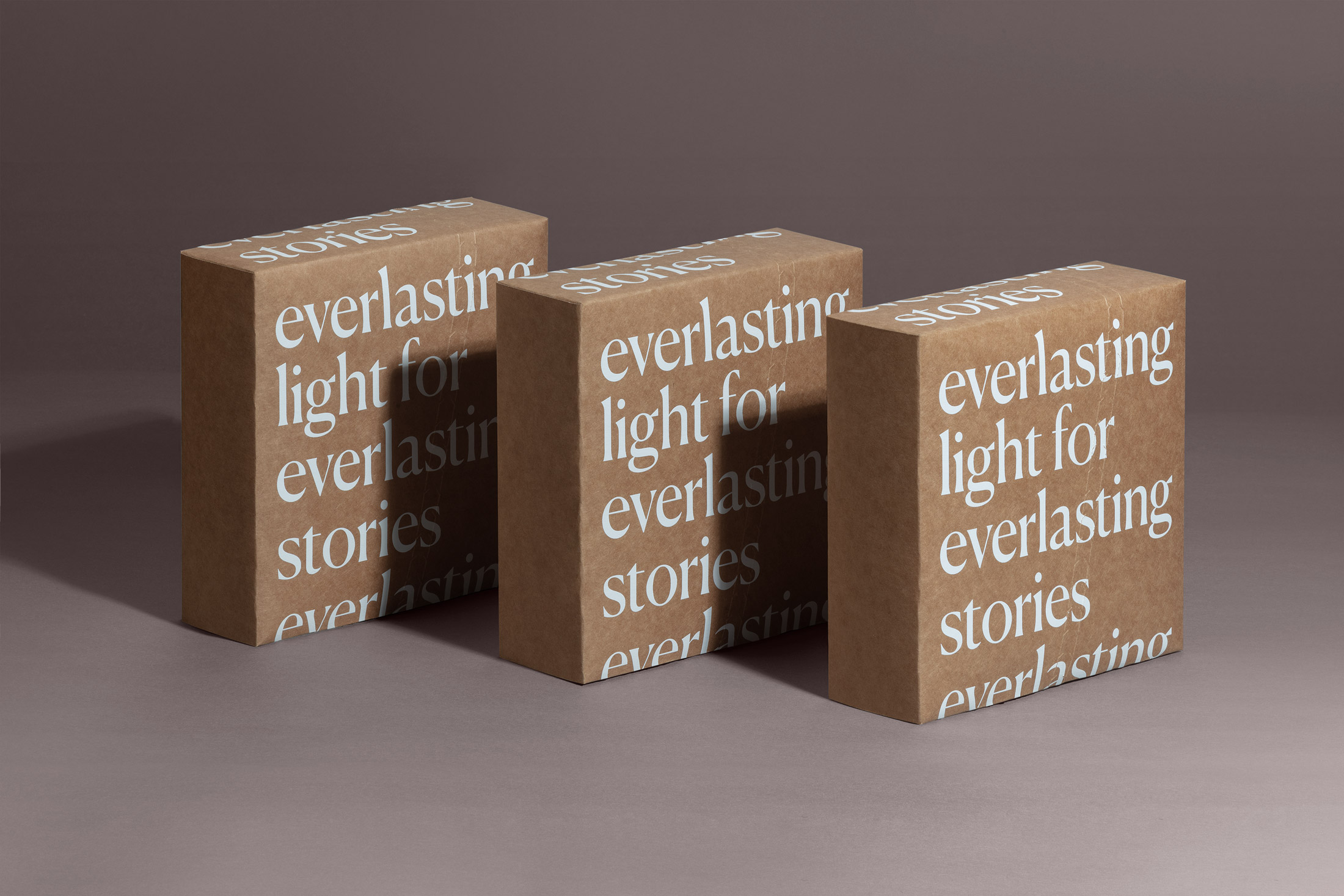
We like to thank our clients for the good synergy and relationship we develop during our ongoing projects with an annual surprise.However, 2020 set some challenges that strengthened our ties, so we decided to create something that would help them feel our support and gratitude in these difficult times. This is a great project for us. It symbolizes moments of reflection, change and transformation as individuals and as a society. After this cathartic situation we decided to design a product completely made of recycled and reusable materials.
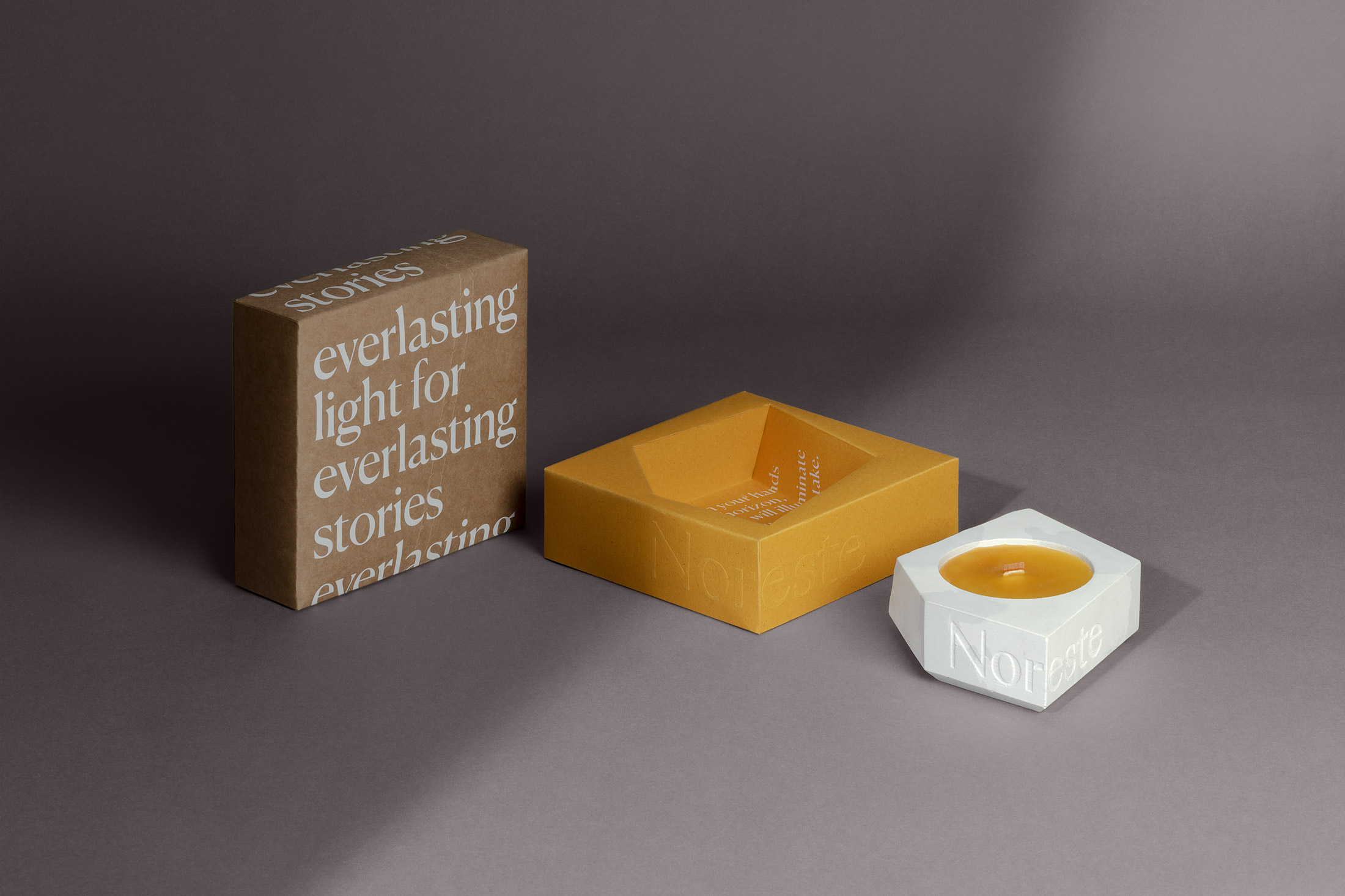
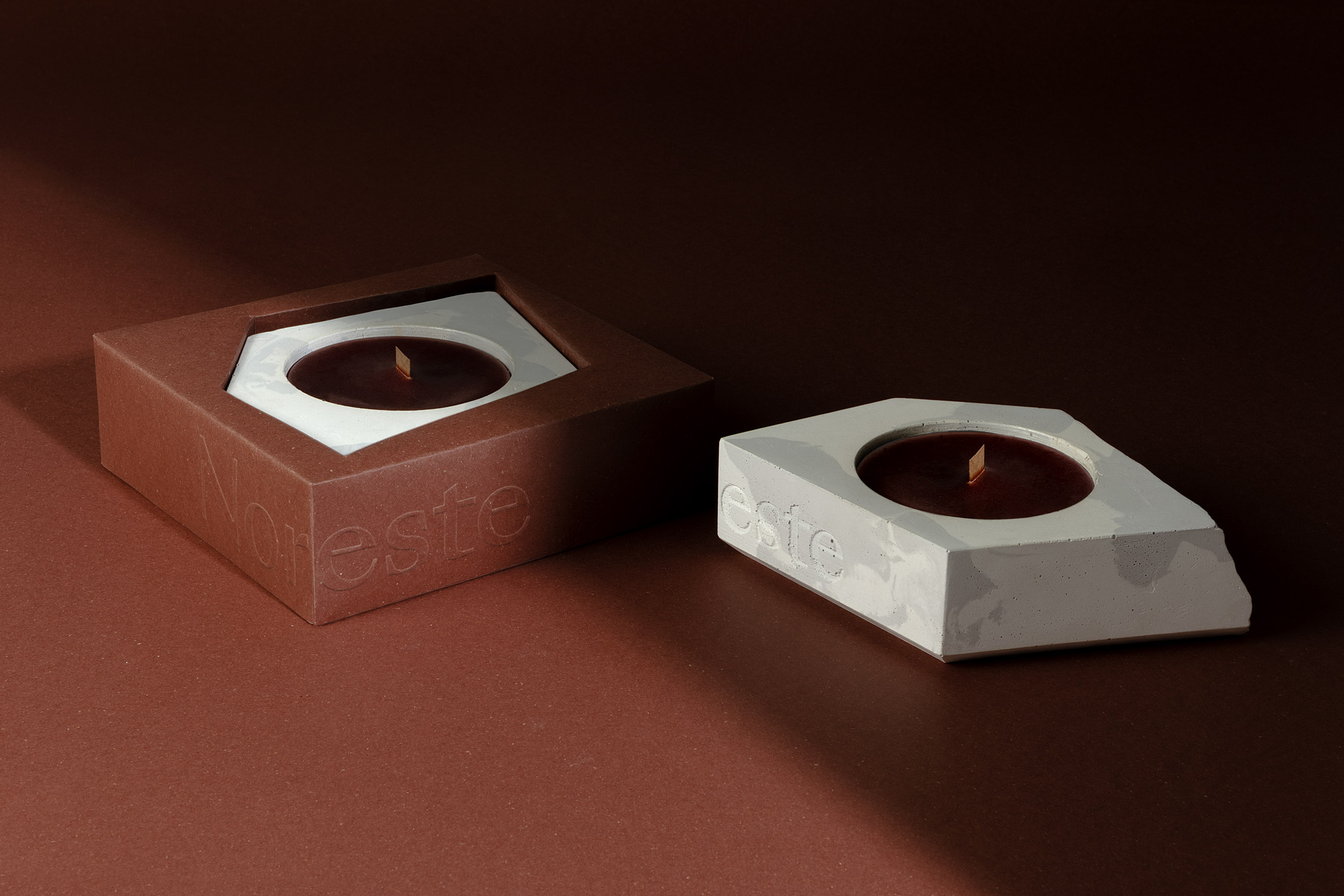
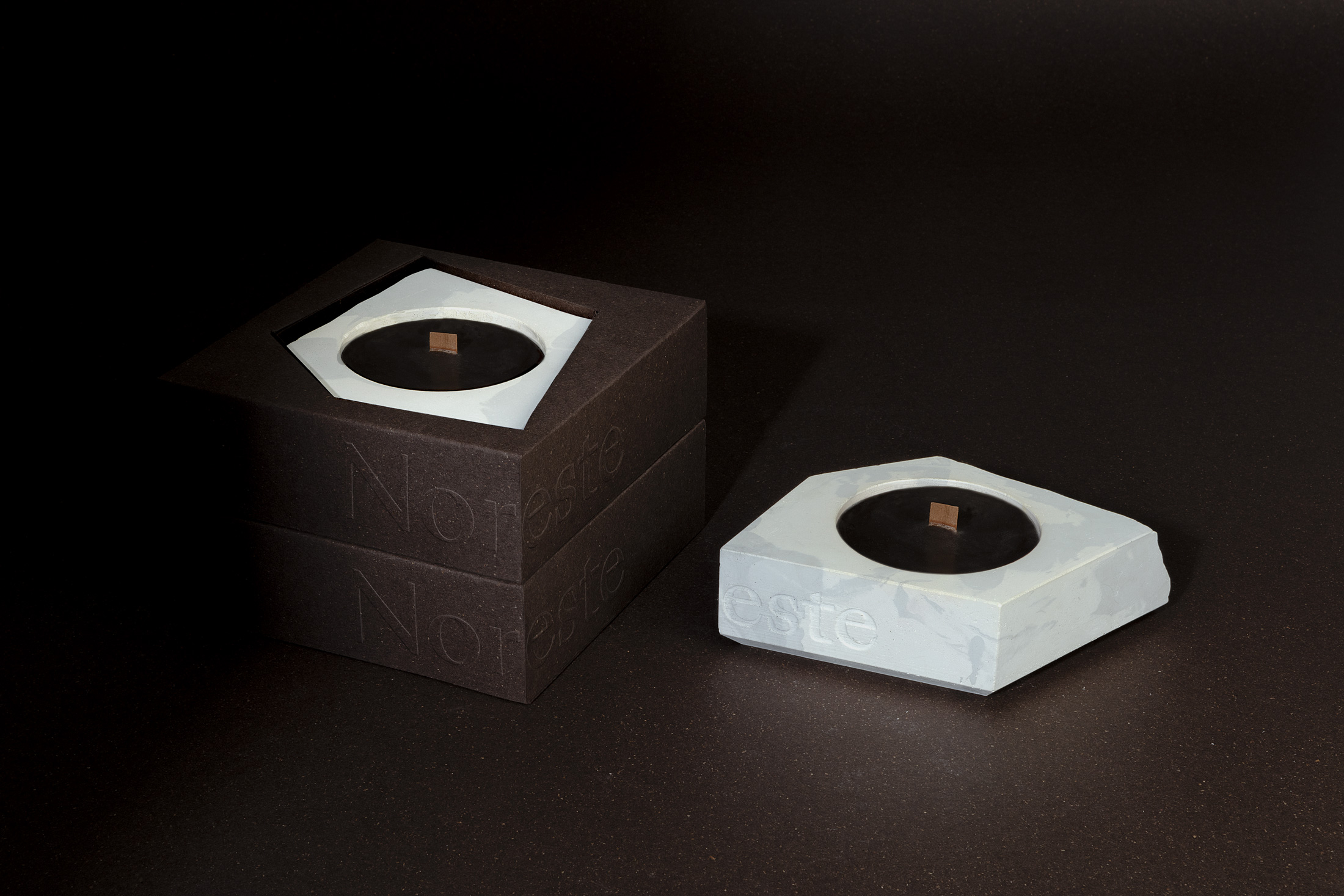
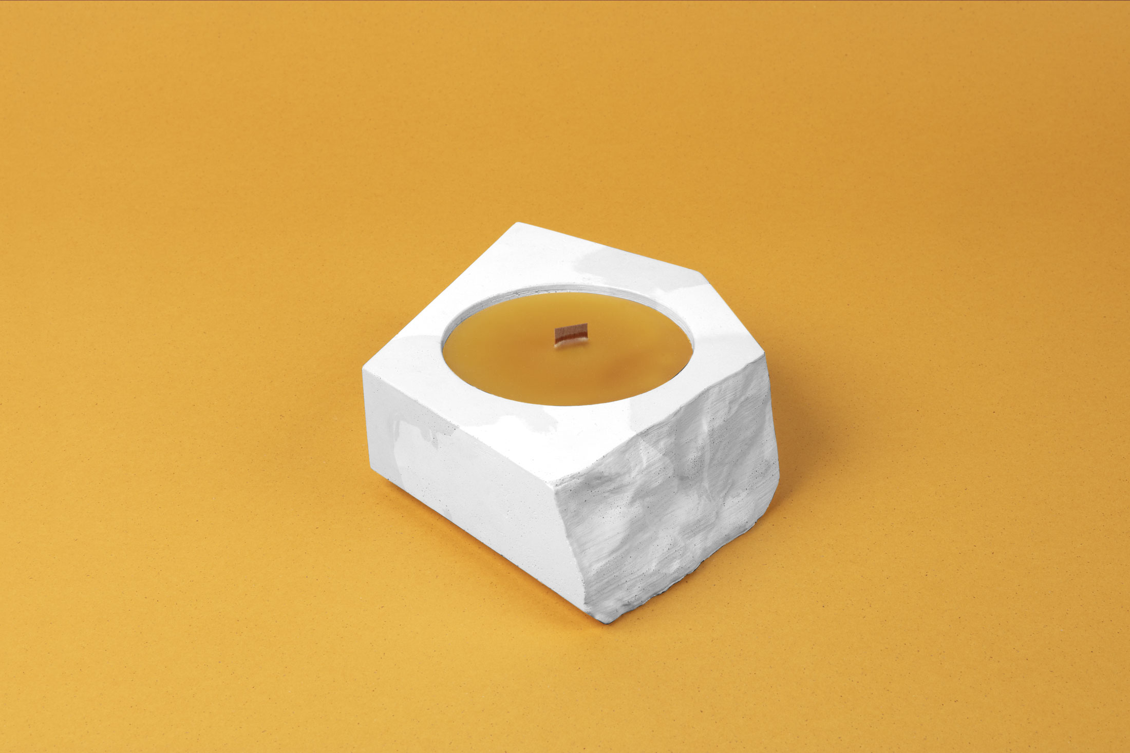
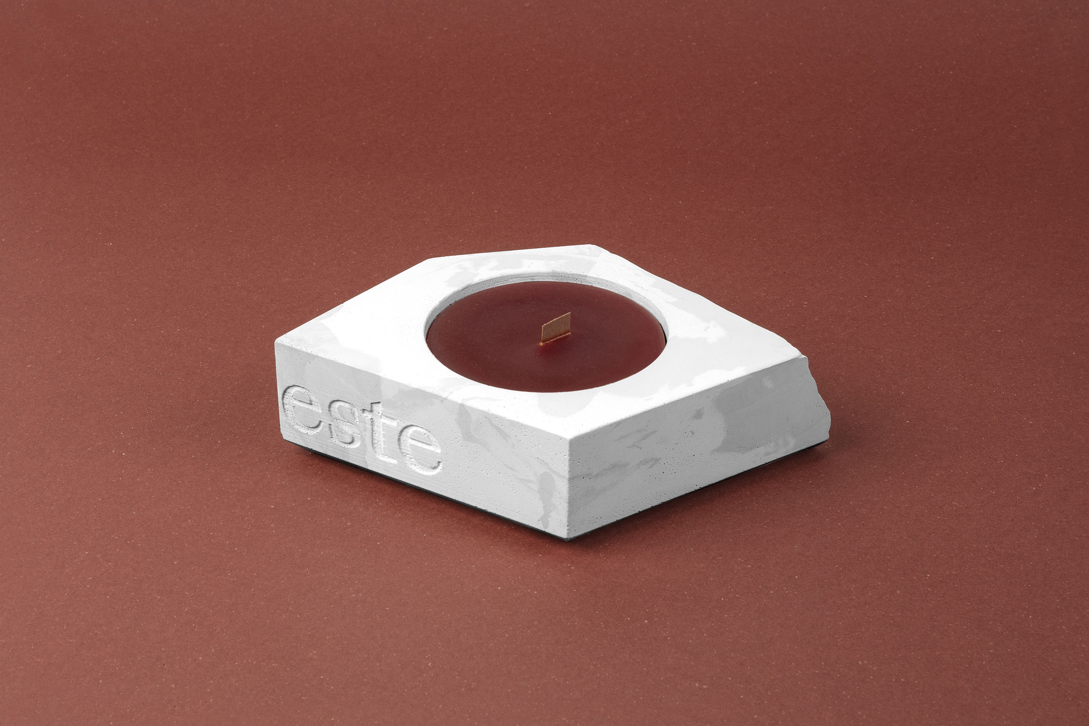
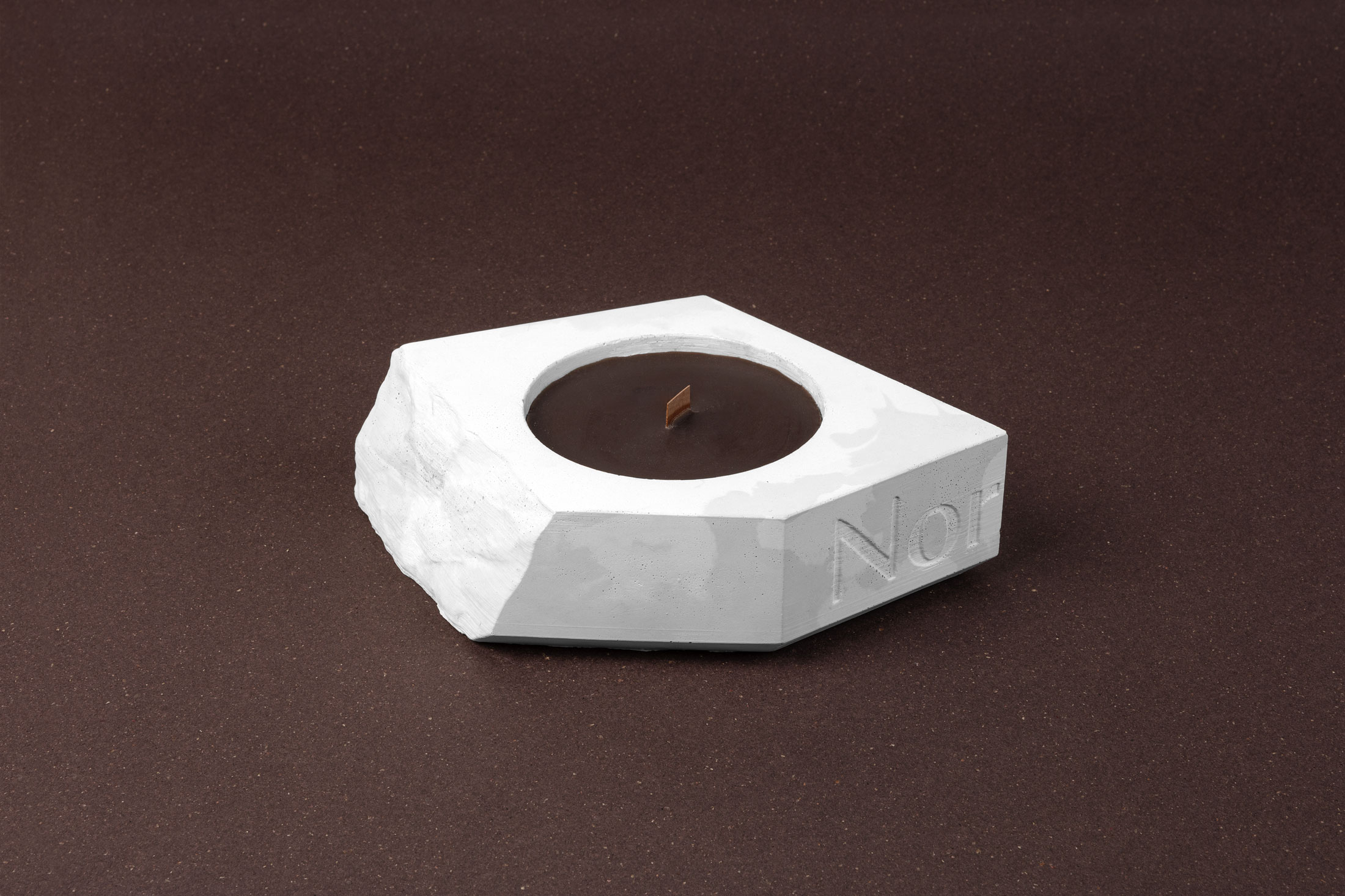
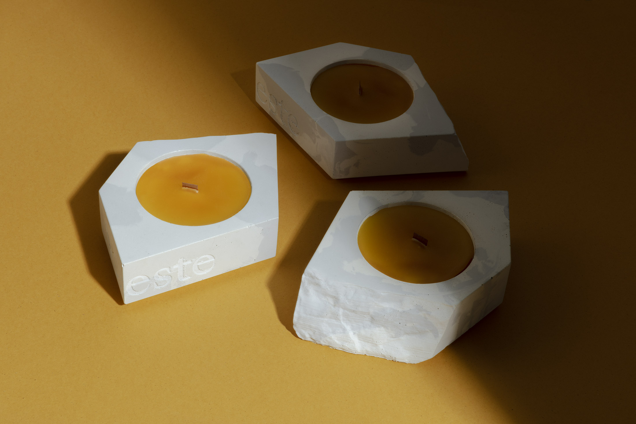
Our intention was to create a piece with an infinite life cycle using eco-efficient concrete, and through this recycled material achieve a natural look similar to marble. By creating a texture of broken rock on one of the sides of the piece, we wanted to generate a dialogue between a clean, minimalist aesthetic and the raw natural essence of the material.
We played with the magic of the material in order to obtain a marbling effect that makes each object different and authentic. The beauty of each piece lies in its asymmetrical, versatile and unique characteristics.
For the candles and looking to support local commerce we have collaborated with Cerería Subirá, a family business with more than 250 years of history, creating three very warm fragrances: Honey, Pine and Cedar. We have used recycled wax and a wood pellet to have a more lasting and pleasant combustion. The colors of each candle and their corresponding fragrances were chosen in tune with the paper colors of the packaging to generate a balanced composition and creating a feeling of peace and relaxation.
Once the candle is finished, the piece can be re-used as a flowerpot, a jewelry dish, among other things. The imagination has no limits especially for those who have this piece in their hands.
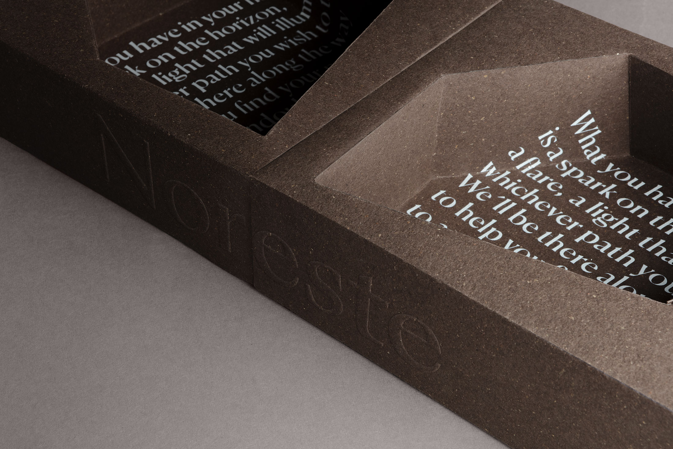
Symbolizing the Reuse and Reduce philosophy, the packaging of this candle was designed to open with a 360 degree gesture revealing the interior of the product. Staying true to the recycling discourse, we selected recycled Kraft cardboard for the exterior of the packaging celebrating its nude elegant color. As for the interior nest, we used Gmund Bier Paper, also distributed by G.F Smith, which is elaborated using hints of hops, malt, yeast and organic pigments. With the objective of creating a cosy atmosphere and creating a link with nature, we selected these papers because of their elegance, soft touch, earthy tones and artisanal essence. And as a last surprise, when you remove the piece from then nest, we discover a text with which we seek to convey peace and hope to all those who have entrusted us with their beautiful stories.
CREDIT
- Agency/Creative: Noreste
- Article Title: Noreste Create Everlasting Light for Everlasting Stories
- Organisation/Entity: Agency
- Project Type: Packaging
- Project Status: Published
- Agency/Creative Country: Spain
- Agency/Creative City: Barcelona
- Market Region: Global
- Project Deliverables: Art Direction, Graphic Design, Packaging Design
- Format: Box, Jar, Sleeve, Wrap
- Substrate: Ceramic, Pulp Carton
- Industry: Non-Profit
- Keywords: concrete, sustainable design, Recycle
-
Credits:
Creative Director: Noreste Team


