


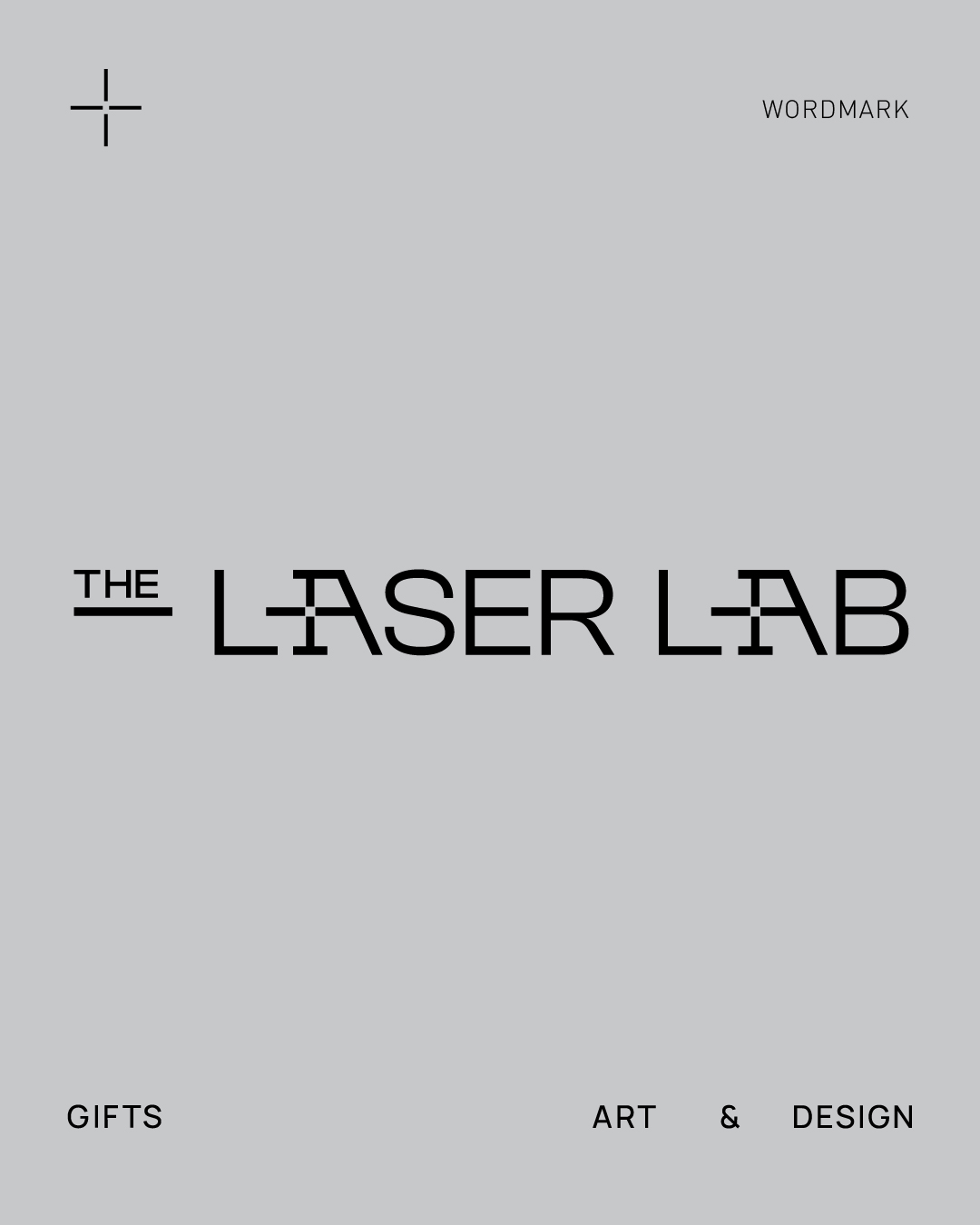
The Laser Lab – Precision in Motion
A strategic rebranding of a laser engraving studio where technology meets imagination.
At its core, design is more than aesthetics. It’s a method of thinking, a strategy for communication, and a lens through which a brand reveals its values, function, and purpose. When we were approached to redefine the identity of The Laser Lab, it became immediately clear that this was not a typical branding exercise. This was an opportunity to articulate a philosophy. To visually translate how a studio that operates with light and movement could communicate ideas rooted in precision, accuracy, and human creativity.
The Laser Lab is a modern laser engraving studio that merges technology with artistry. It transforms raw ideas into finely crafted design objects and creative expressions. But more importantly, it is a space of process — a lab in the true sense of the word — where experimentation, iteration, and excellence come together.
From the Ground Up: Rethinking Identity as Philosophy
Our rebranding process began with a foundational question:
What does The Laser Lab truly represent, not just visually, but in essence?
From this, three guiding values emerged:
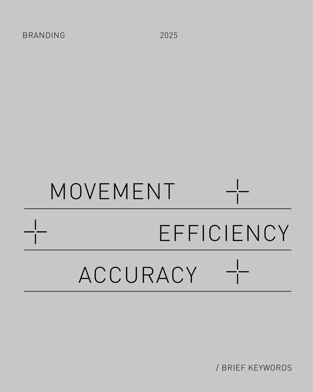
Precision. Motion. Efficiency.
Not only are these technical descriptors of CNC laser engraving systems, but they also reflect deeper brand pillars: accuracy in execution, dynamism in process, and streamlined functionality across every interaction.
These values became the strategic bedrock for the new identity.
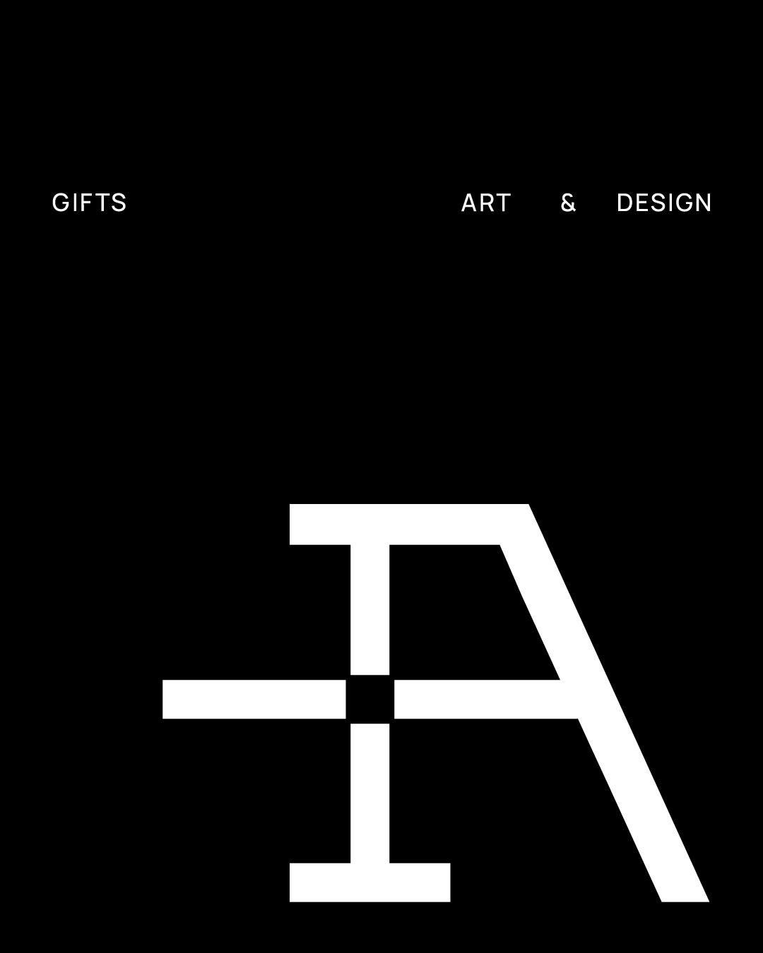
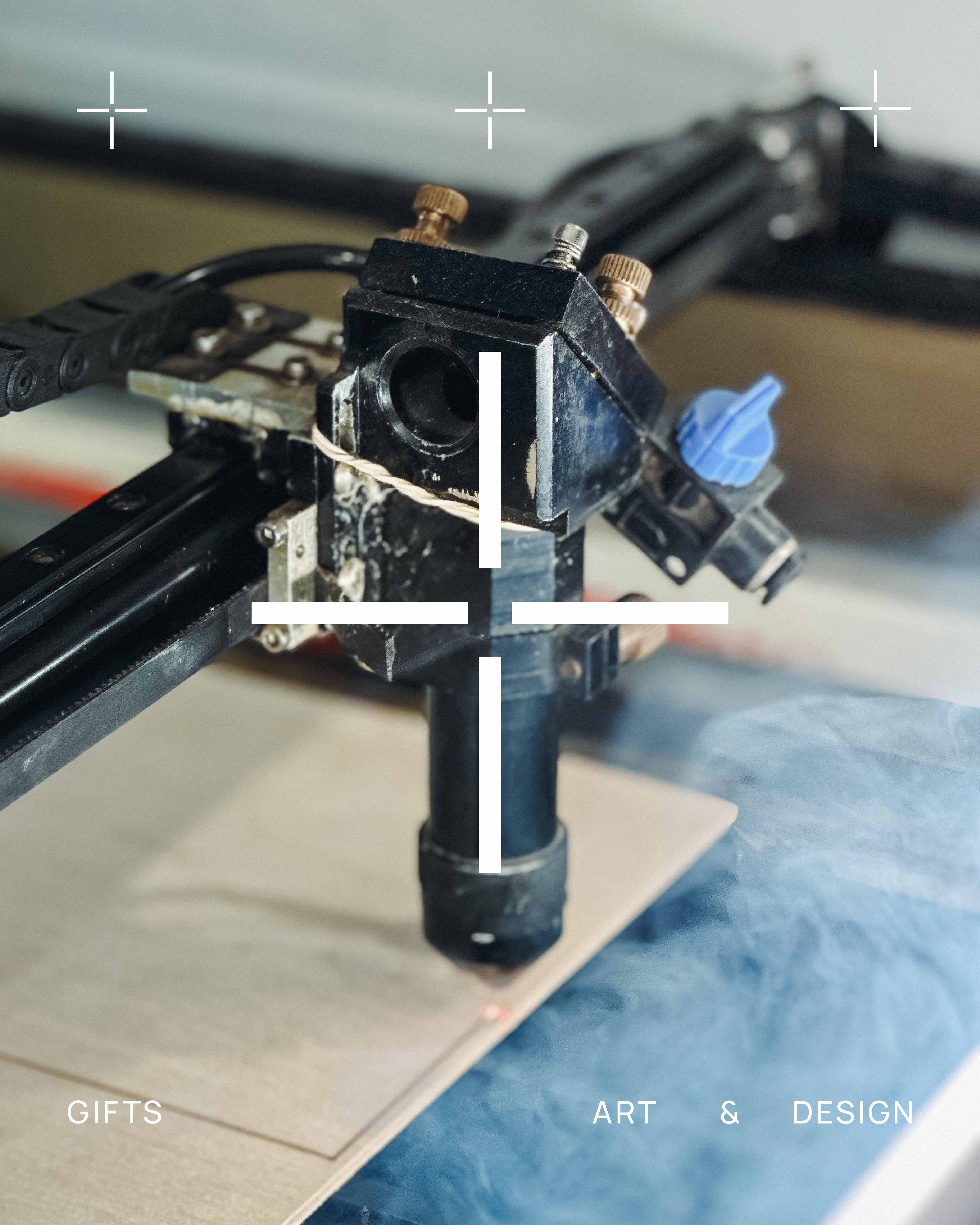
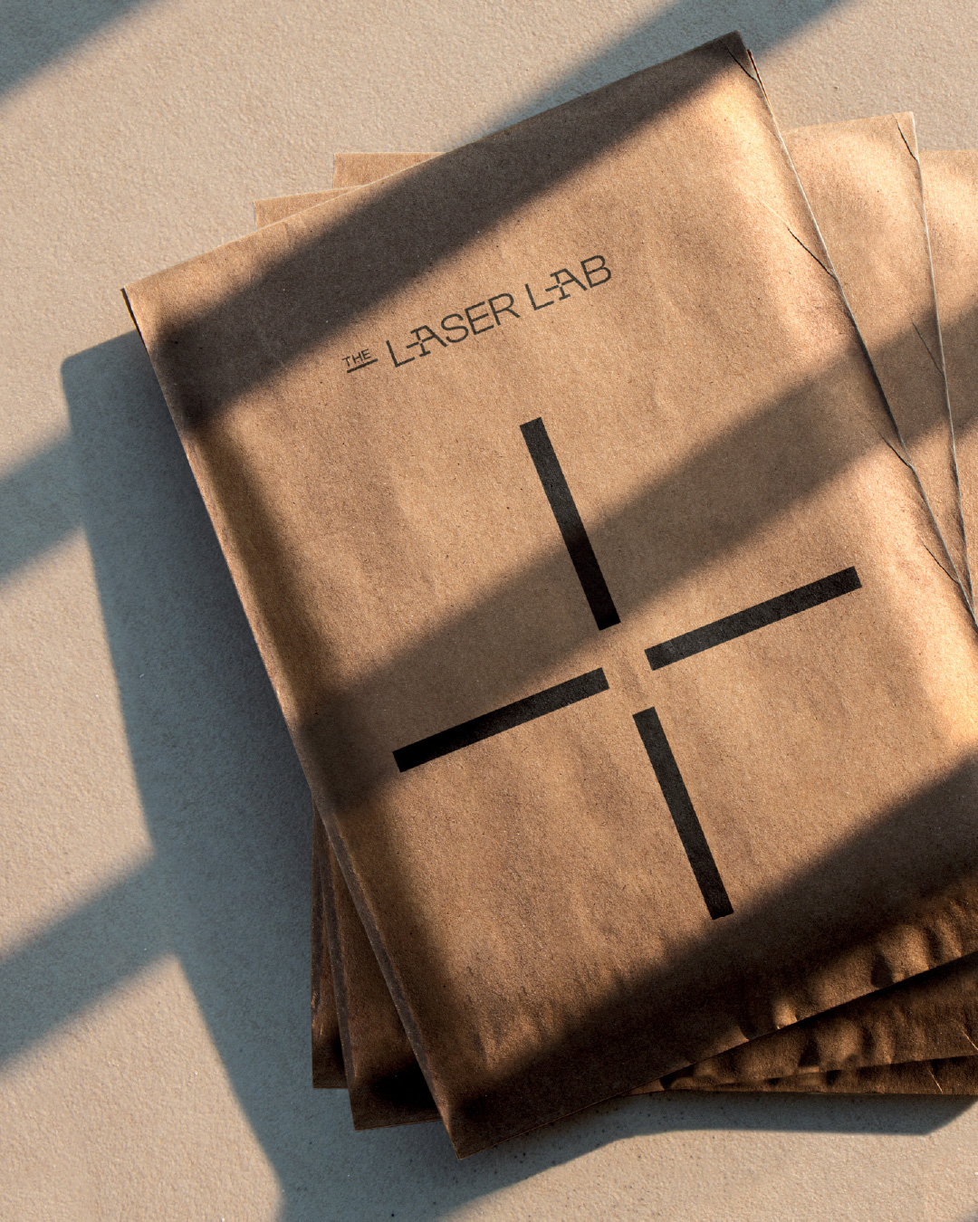
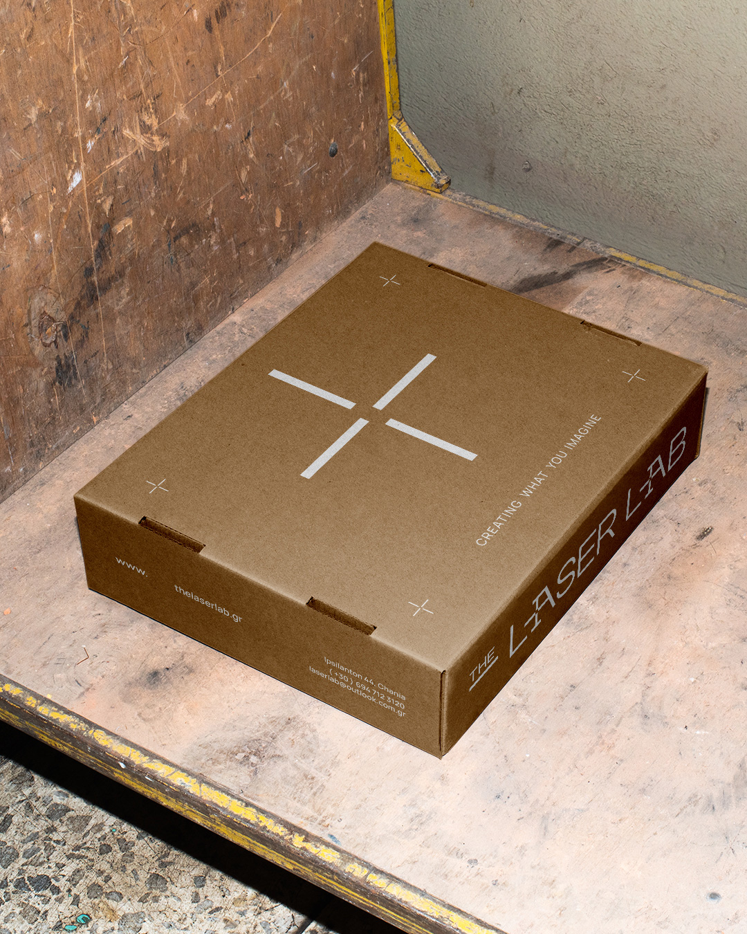
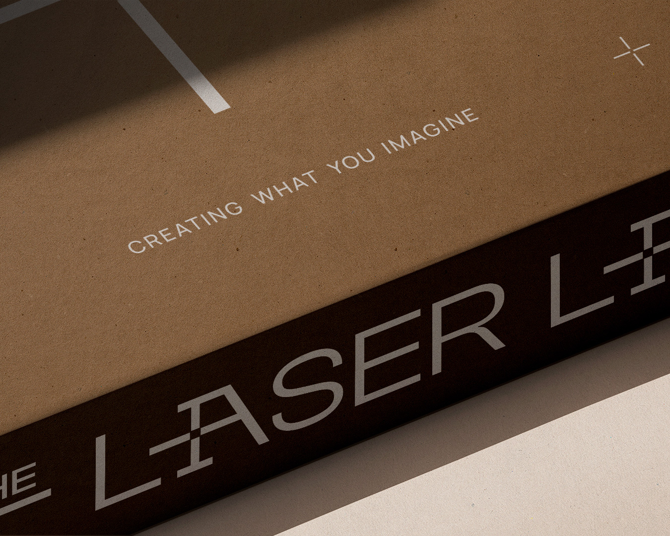
We designed a logo that draws direct inspiration from the focal point of a laser beam — the very moment where energy becomes transformation. This symbol of focus and convergence doesn’t simply describe what the machine does. It communicates how the studio approaches its craft. Every line engraved, every detail perfected, every surface considered — all are expressions of this precise, controlled power.
The logo’s circular geometry, fine lines, and intersecting axes suggest both mechanical calibration and conceptual clarity. It is a symbol that speaks of technological rigor while allowing room for creative interpretation.
Beyond the Logo: A Complete Visual Ecosystem
But a brand is never just a logo. For the Laser Lab, we developed a full visual system to surround and amplify the core identity. This included:
Geometric patterns are inspired by machine-generated paths and light projections.
Linear elements that echo the motion of engraving and the idea of directionality and intent.
Minimal, modular layouts that adapt across applications while retaining a unified visual language.
This visual system serves two functions:
It mirrors the machine’s capabilities — precision, repetition, and control — while also reflecting the human imagination that fuels the work. Because no two engraved objects are the same. Every project is a collaboration between tool and thought.
The system’s flexibility allowed us to build consistent but non-repetitive assets — something vital for a brand that deals with custom, one-of-a-kind creations. Whether it’s used on a product label, a website interface, or printed collateral, the design always reinforces the brand’s ethos.
Design as a Strategic Tool
Branding is not decoration. It is a strategic tool that guides perception, builds trust, and tells a story before any words are spoken. For The Laser Lab, every touchpoint had to speak the same visual language — concise, sharp, intentional.
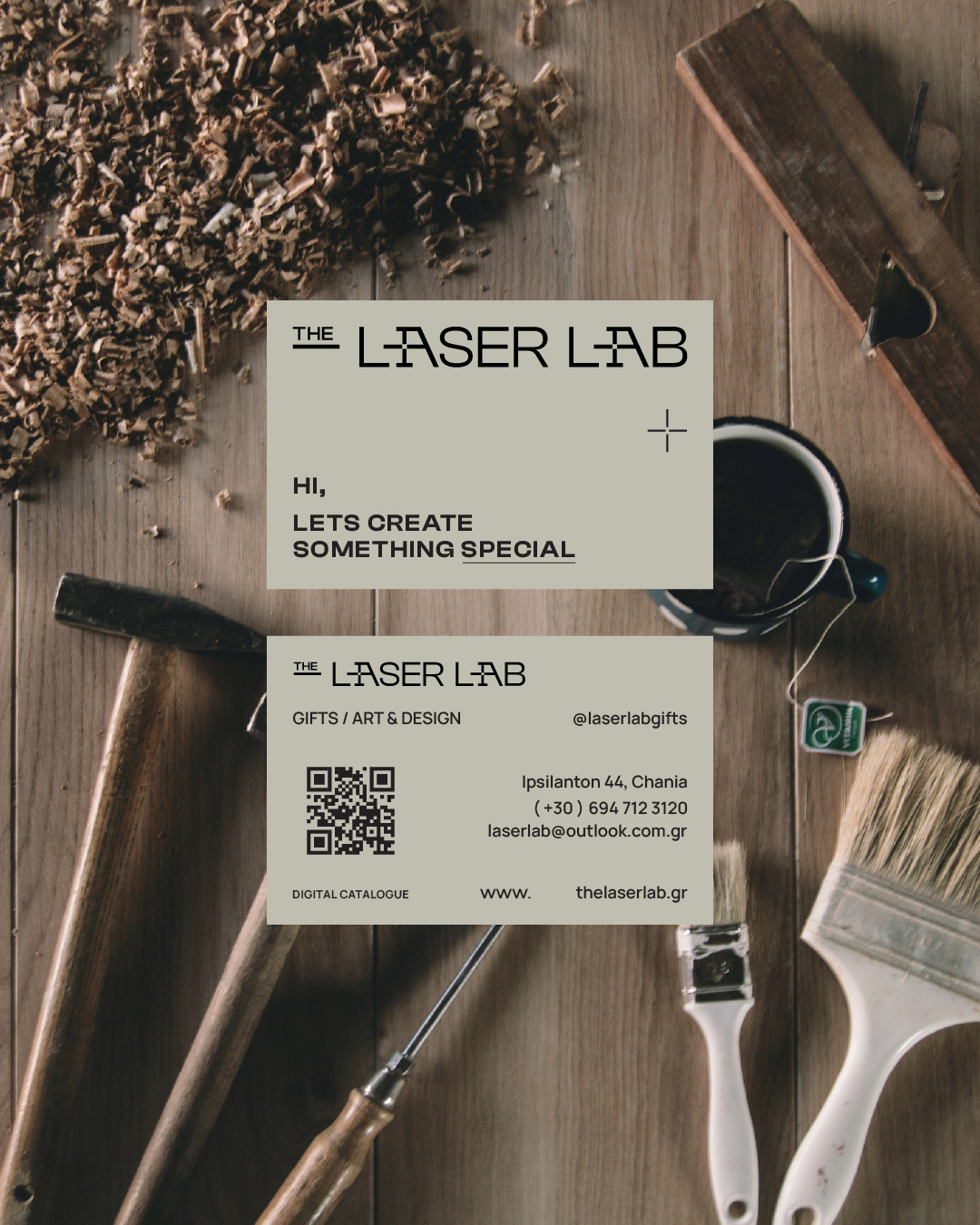
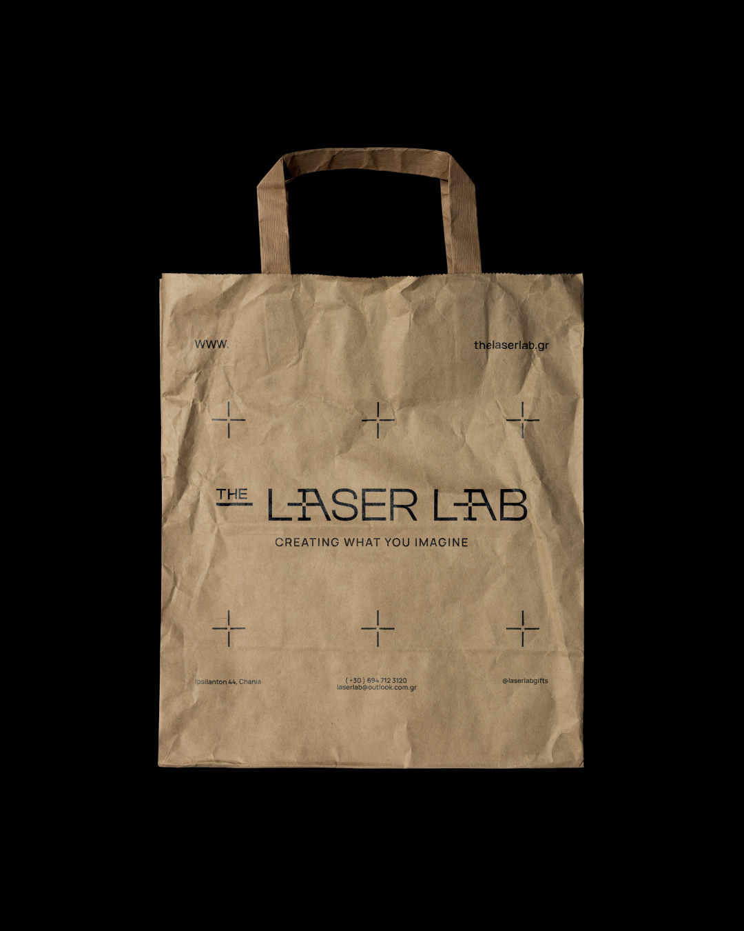
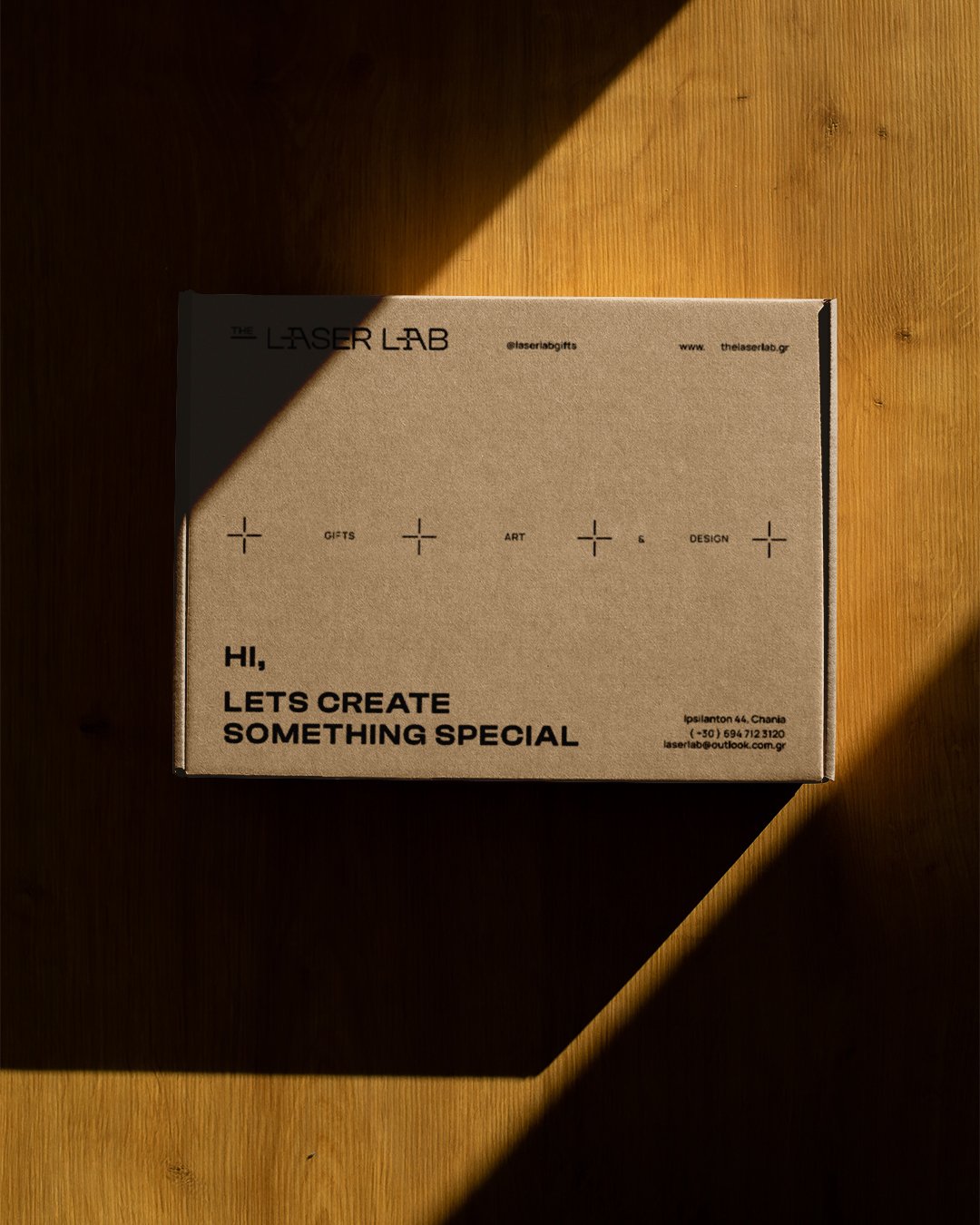
From packaging to business cards, every surface was treated as a canvas of communication. The layout decisions were not arbitrary; they were rooted in a conceptual framework of targeting, focus, and handcrafted accuracy.
Typography was selected for clarity and modernity, echoing the machine’s precision while remaining accessible and human.
Color choices were restrained and purposeful, with a primary palette built on monochromatic greys and silvers, referencing machinery and materiality, accented with laser-inspired highlights like electric blue or high-contrast red when needed.
The idea was to ensure that the brand communicates before the laser even activates. That a customer interacting with any branded material — physical or digital — instantly understands that this is a company built on clarity, control, and creativity.
Motion and Focus: Extending the Concept
One of the more profound visual metaphors we explored was the idea of motion through focus. Unlike brands that rely on chaos or spontaneity, The Laser Lab operates through discipline. The machine’s motion — while fast — is not erratic. It’s controlled, purposeful, and aligned.
This inspired a system of motion graphics and animations for digital platforms. Micro-interactions and loading screens were built on linear movements and progressive reveals, mimicking the path of a laser beam etching across material. These subtle design decisions add a layer of experiential meaning, ensuring consistency not just in look but in behavior.
Applications: Cohesion Through Consistency
As part of the full identity rollout, we developed a suite of branded materials that showcase the system’s flexibility:
Stationery & Business Cards: Clean, minimalist layouts with engraved finishes and precise grid structures.
Packaging Design: Structured and intentional, with information hierarchy optimized for both clarity and elegance.
Engraving Samples: Co-branded objects that reflect the balance of technology and craft.
Studio Signage: Custom-cut acrylic signs with backlit focal-point symbols, creating depth and contrast.
Social Media Templates & Digital Assets: Built with modularity in mind, allowing quick adaptation while maintaining integrity.
Each piece — while visually distinct in format — is unified through the identity’s conceptual DNA. That’s the power of strategic branding: not to control every design, but to set a system that scales with intention.
A Brand That Engraves Itself in Memory
Through this project, we didn’t simply refresh a logo or modernize a color palette. We helped The Laser Lab define its voice. A voice that speaks in lines, light, geometry, and clarity. A voice that reflects both the technical mastery of its process and the creative potential of its output.
Most importantly, we created a brand that understands its own nature — that it is not static, but always in motion. That its value lies not only in what it produces but in how it produces it:
With precision, efficiency, and focus.
Because the Laser Lab is not just a laser engraving workshop.
It is a space of creation — a meeting point between human imagination and machine perfection.
And in that space, design is not ornament.
It is a strategy. Clarity. Purpose.
A beam of identity, sharpened to a single point of focus.
CREDIT
- Agency/Creative: Nook Studio
- Article Title: Nook Studio Redefines Precision for The Laser Lab with a Futuristic Visual Identity
- Organisation/Entity: Agency
- Project Type: Identity
- Project Status: Published
- Agency/Creative Country: Greece
- Agency/Creative City: Chania
- Market Region: Europe
- Project Deliverables: Art Direction, Branding, Graphic Design, Packaging Design
- Industry: Manufacturing
- Keywords: Laser, Lab, Branding, Design, Arts, Gifts, Art Direction, Visual Identity
-
Credits:
Agency: Nook Studio


