


Nongfu Spring, founded in 1996, is China’s largest bottled water producer and holds the top market share in the industry.
As one of the top 20 beverage companies in the country, Nongfu Spring sought to expand its product offerings by enhancing its coffee line.
They tasked us with redesigning their coffee packaging, including industrial design, to ensure it stands out on supermarket shelves, surpasses competitors, and boosts sales.
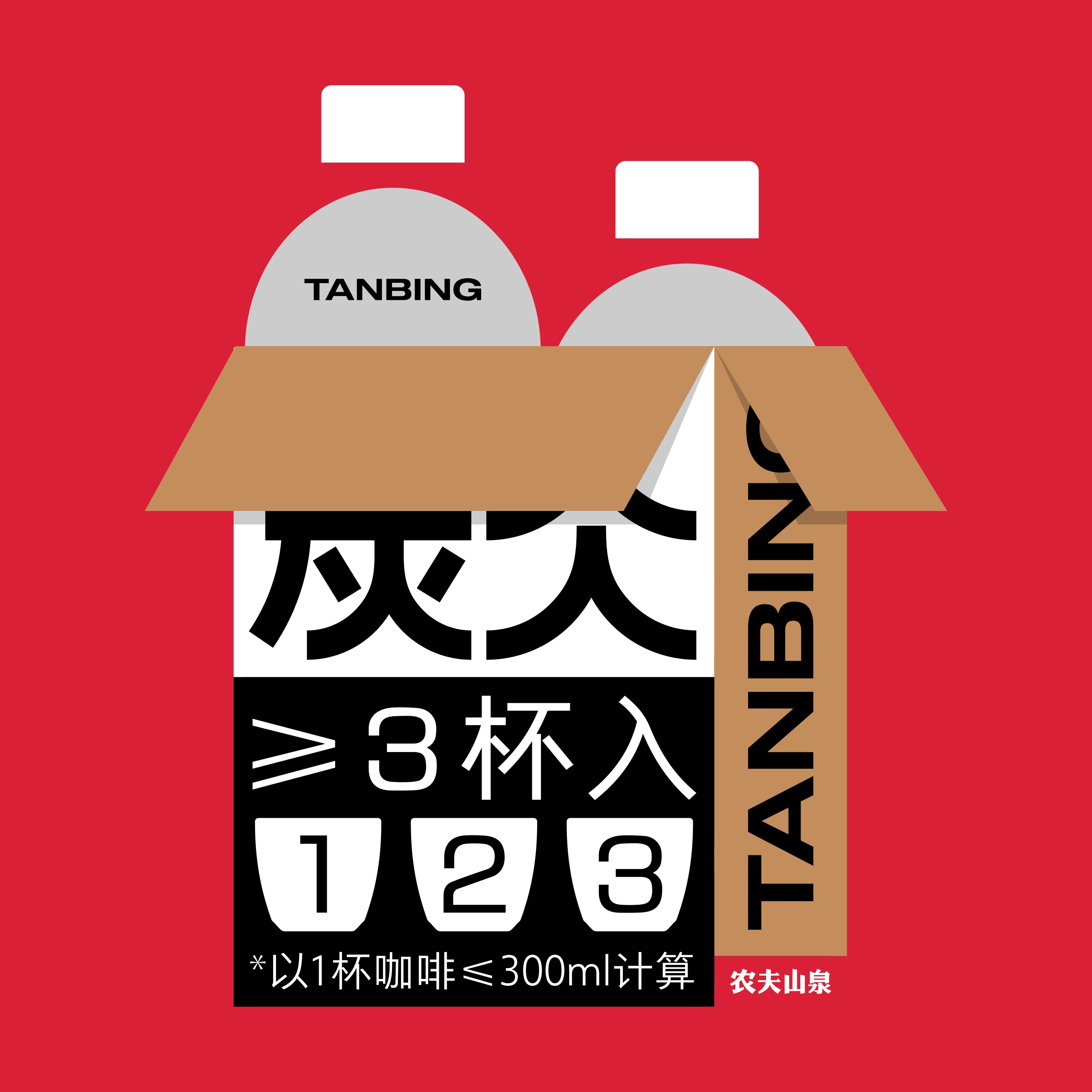
The primary goal of this project was to create a packaging design that clearly indicates it is coffee and appeals to moderate coffee drinkers who consume more than one cup daily. These consumers often enjoy coffee in both home and office settings, with storage in refrigerators. Therefore, the packaging needed to be user-friendly, easy to hold, and visually appealing.
Research indicates that coffee consumption in China has evolved into a fashion trend, where aesthetics are just as important as taste. The growing coffee culture emphasizes the need for packaging that enhances the consumer experience, both visually and conceptually. Our design reflects this trend by focusing on elements that resonate with the coffee experience.
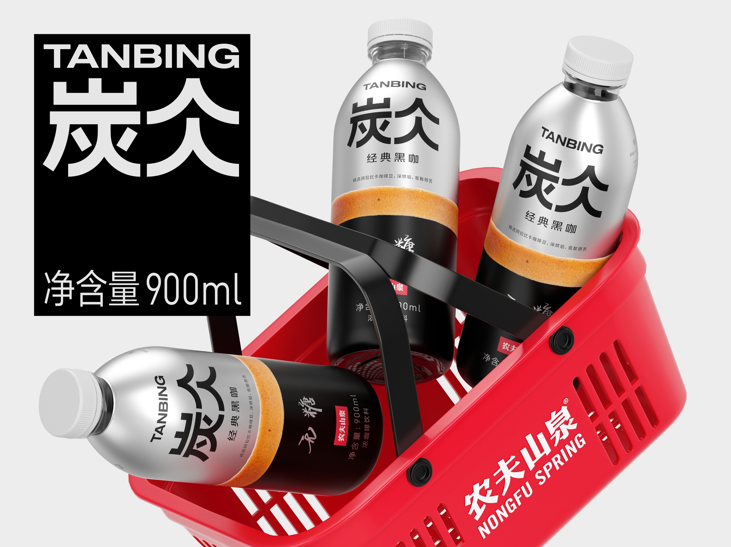
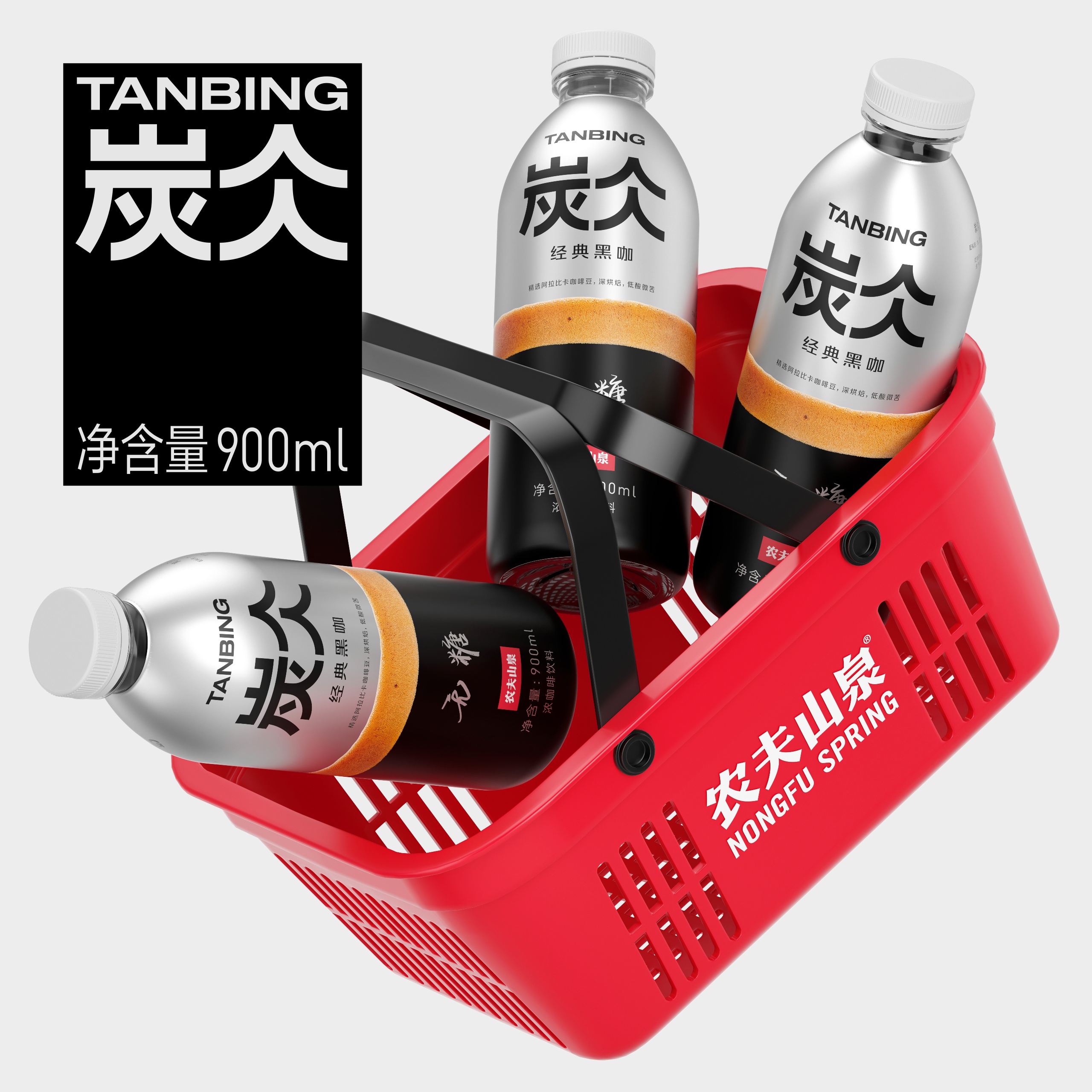
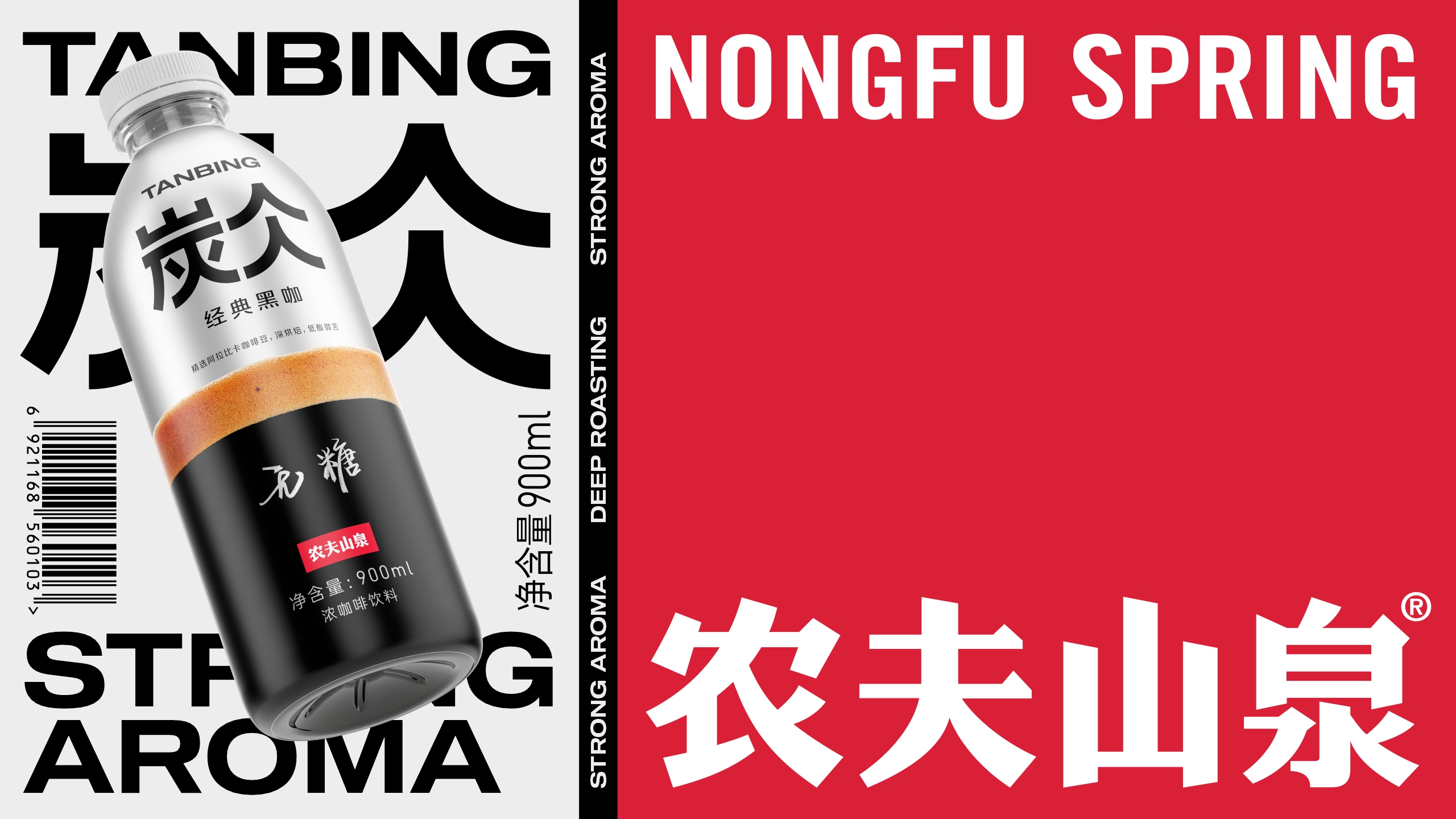
The packaging design for the coffee revolves around the theme of a complete coffee experience, where each component enhances the consumer’s interaction with the product. We explored visual associations with coffee, focusing on colors and shapes that resonate with coffee culture and strengthen the emotional connection to the product.
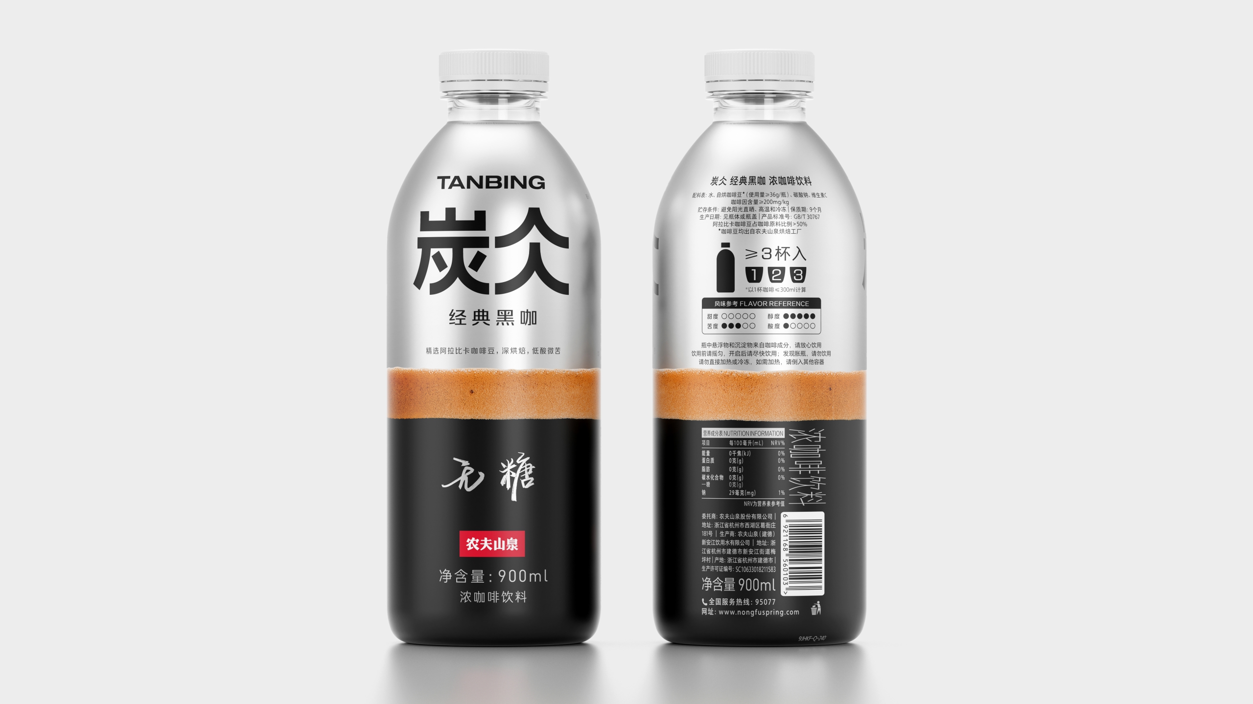
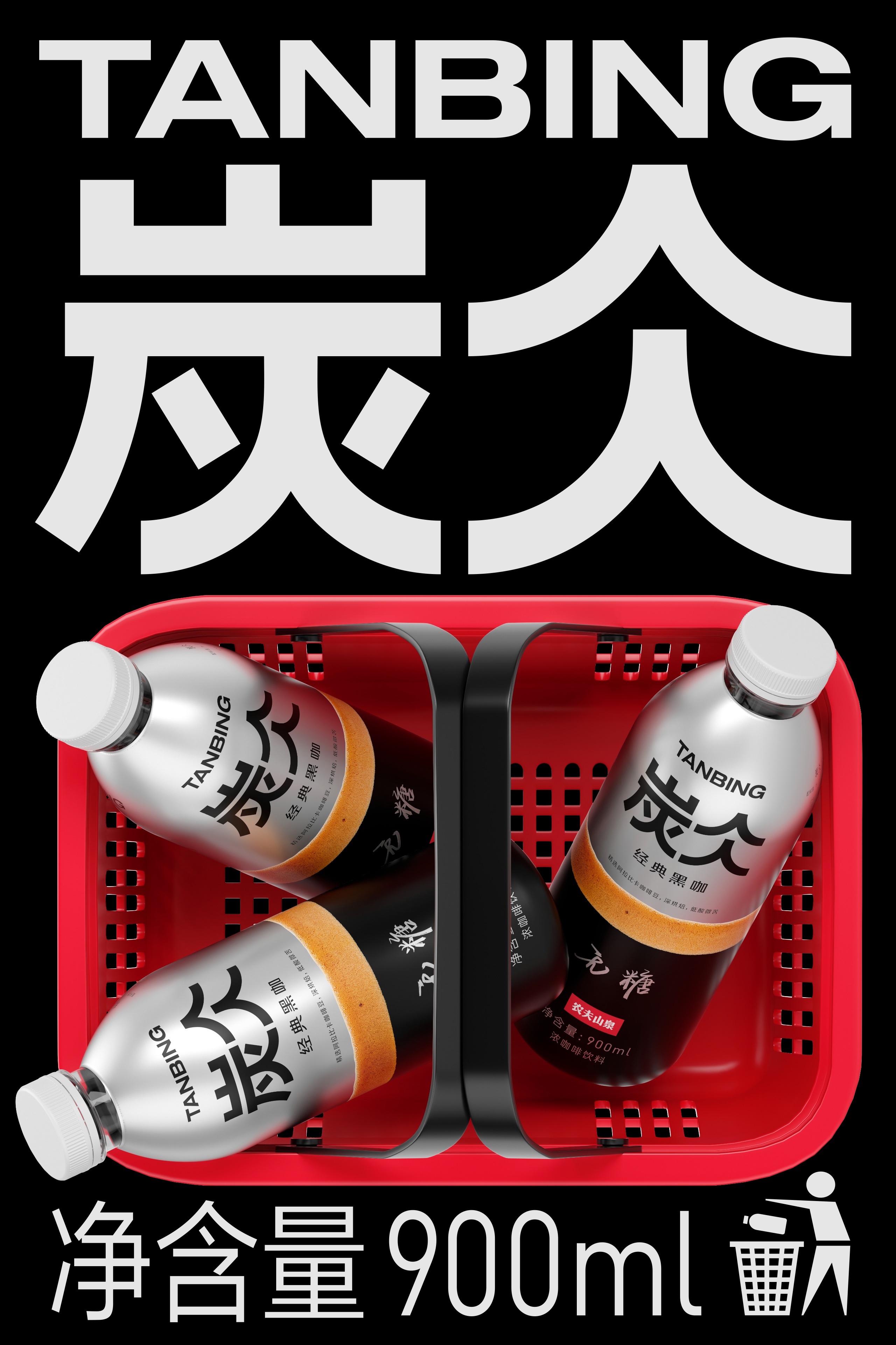
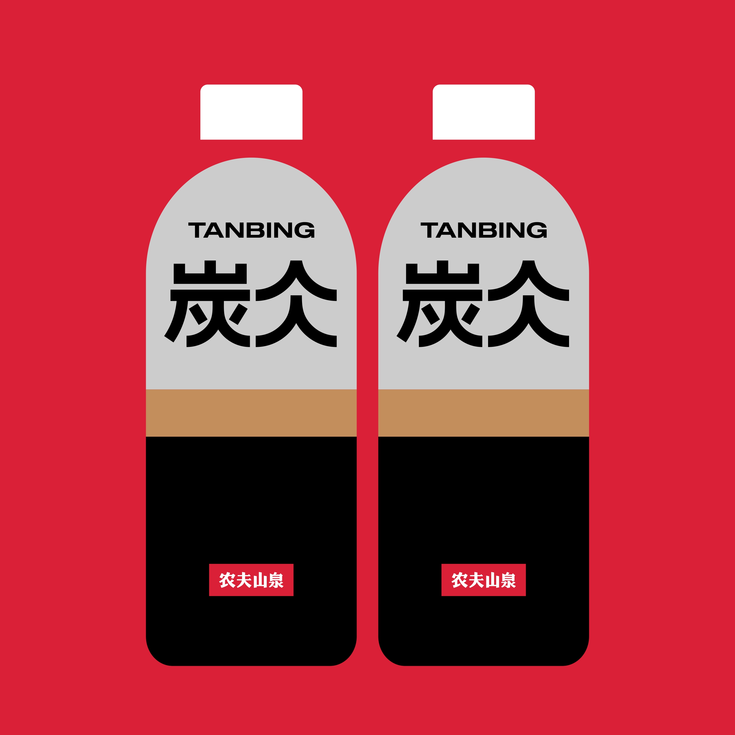
The design is divided into three parts, each with distinct color coding to symbolize different aspects of the coffee experience:
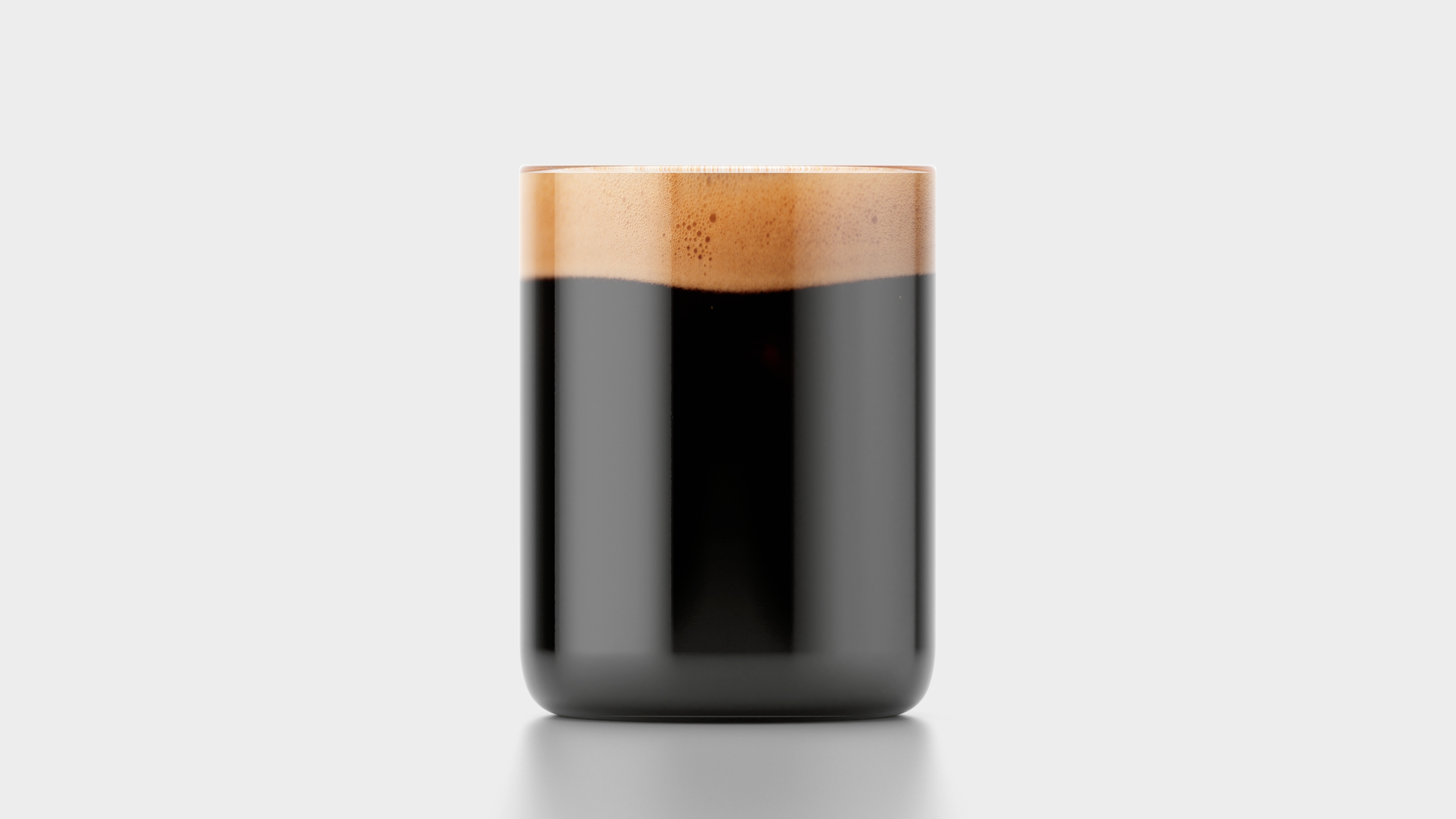
• Lower Part: Black, representing a coffee cup and indicating the strength of the coffee.
• Middle Part: Frothy Foam, suggesting the texture and richness of a freshly brewed cup.
• Upper Part: Metallic Color, evoking high-quality coffee machines and emphasizing the product’s premium quality.
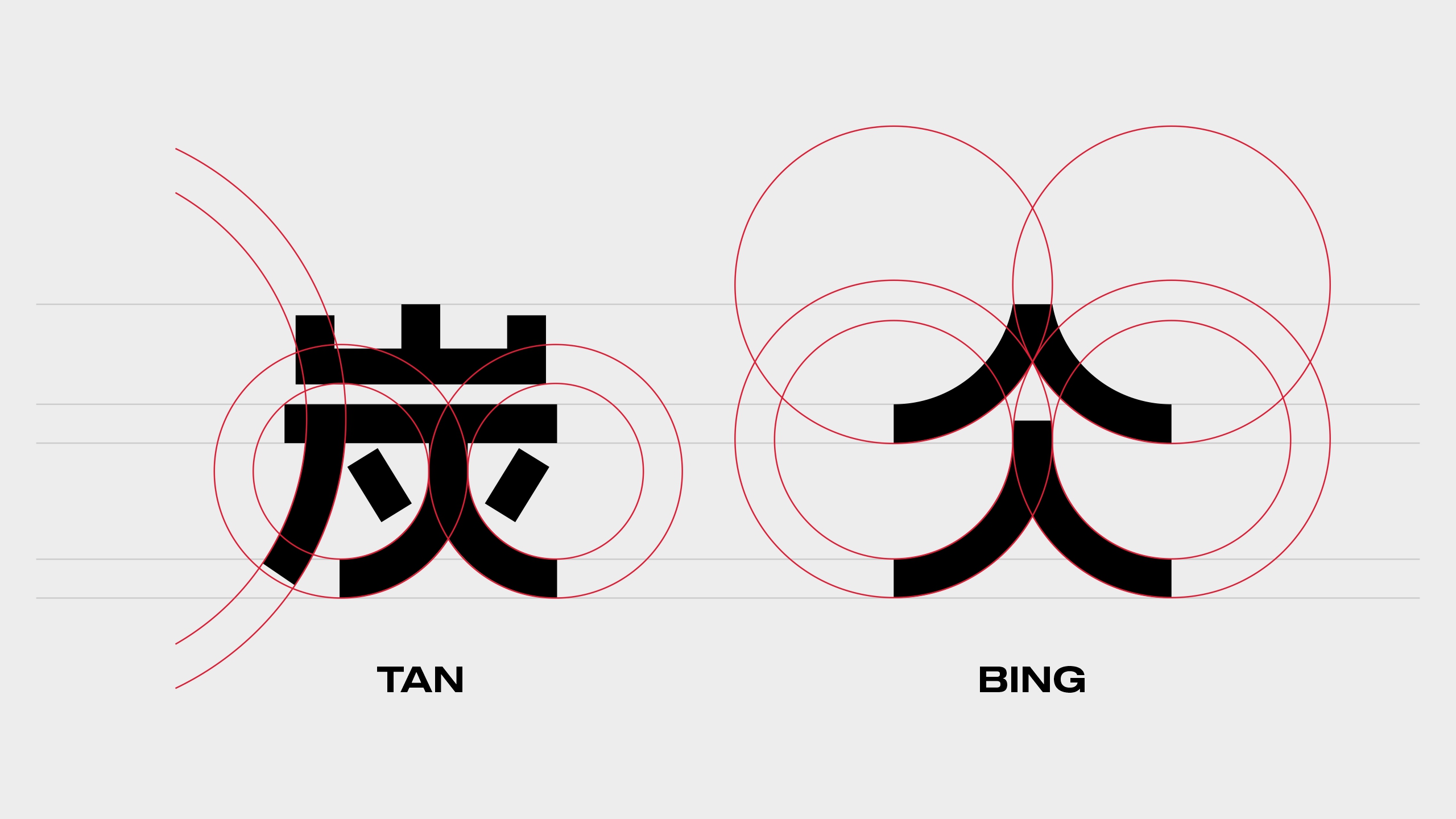
We also simplified TANBING’s logo to its essence, using a circle and a line as the foundation. This design choice creates a cohesive logo with a stable and solid form. The user-friendly design ensures that the packaging is easy to hold, with a tactile feel that complements its visual appeal. The thoughtful color coding and ergonomic form contribute to an enhanced user experience, making this product a preferred choice for coffee enthusiasts seeking both quality and style.
CREDIT
- Agency/Creative: formascope agency
- Article Title: Nongfu Spring’s Coffee Packaging Redesign by Formascope Agency
- Organisation/Entity: Agency
- Project Type: Packaging
- Project Status: Published
- Agency/Creative Country: Armenia
- Agency/Creative City: Yerevan
- Market Region: Asia
- Project Deliverables: Industrial Design, Label Design, Packaging Design
- Format: Bottle
- Industry: Food/Beverage
- Keywords: coffee, design, minimal, foam, china, layers, bottle, coffee machine, metallic
-
Credits:
Agency: formascope agency


