


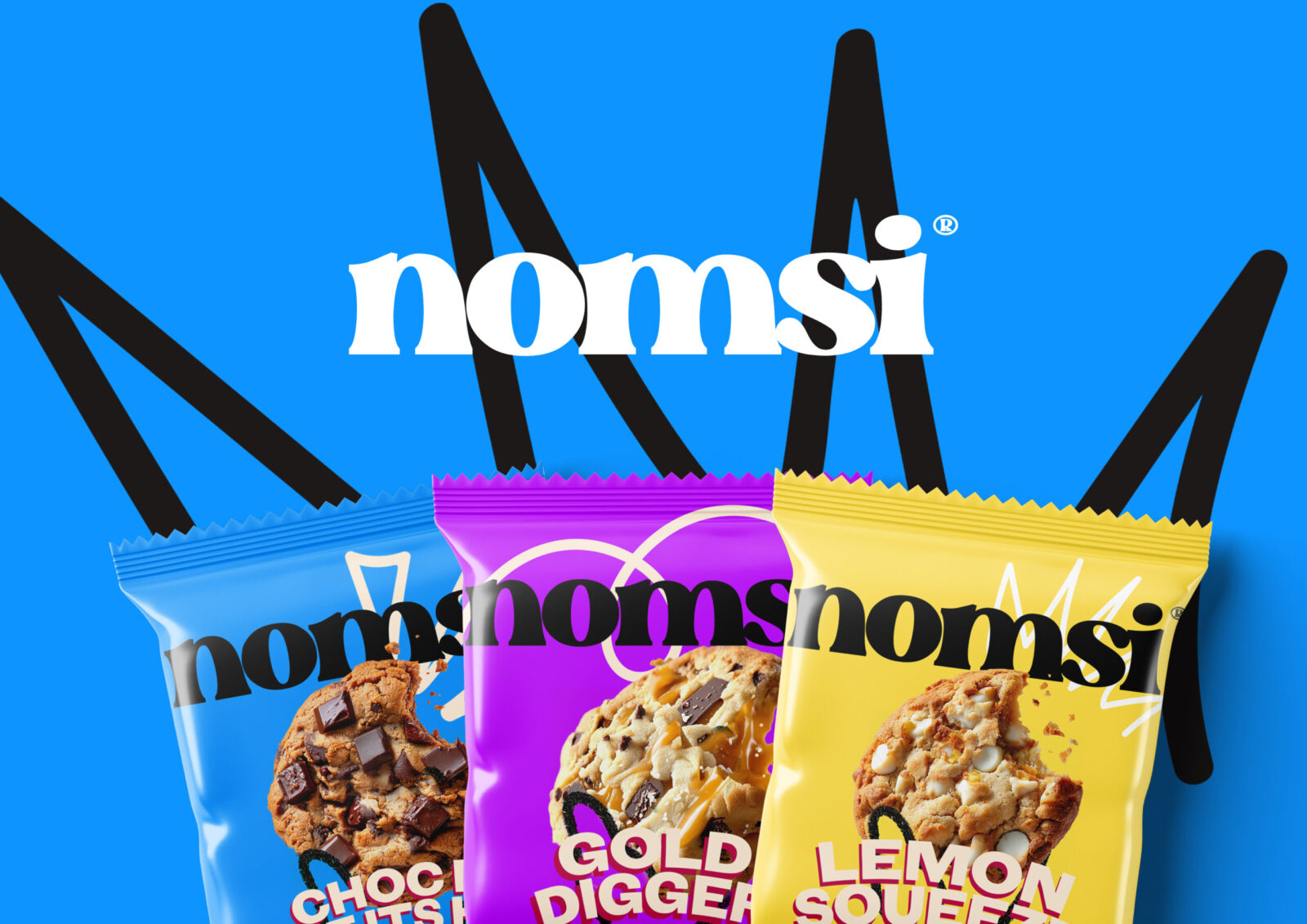
Nomsi: A Feel-Good Cookie With a Bold Identity
Nomsi began with a deceptively simple brief: create the name and brand for a cookie designed for the health-conscious mind. A product that is good for you, but doesn’t feel worthy or boring. A cookie that embraces balance. A cookie that’s fun, bold, and genuinely enjoyable.
CREO was approached to build Nomsi from the ground up – name, brand, visual world, tone of voice, illustration, 3D product renders, and everything in between.
Naming: Playful, Memorable, Human
We knew the name needed to instantly signal approachability and joy while avoiding cues from the hyper-serious health and wellness space.
Our naming exploration began with words and sounds that communicated warmth, energy, and personality. We experimented with playful phonetics, snack-friendly syllables, and names that felt at home on both a bakery shelf and in a gym bag.
Nomsi emerged as the clear winner – a name that feels friendly and energetic, with a rhythm that’s easy to say and even easier to remember. It evokes comfort without being indulgent, and positivity without preachiness.
Brand Strategy & Positioning: Health Without the Halo
Modern wellness branding often leans into minimalism and restraint. Instead, Nomsi needed vibrancy. Our strategic approach centred on reframing “healthy” through a more joyful lens – not restriction, but reward.
Nomsi’s positioning became:
“A better cookie for better days.”
A small treat you can feel good about, wrapped in big personality.
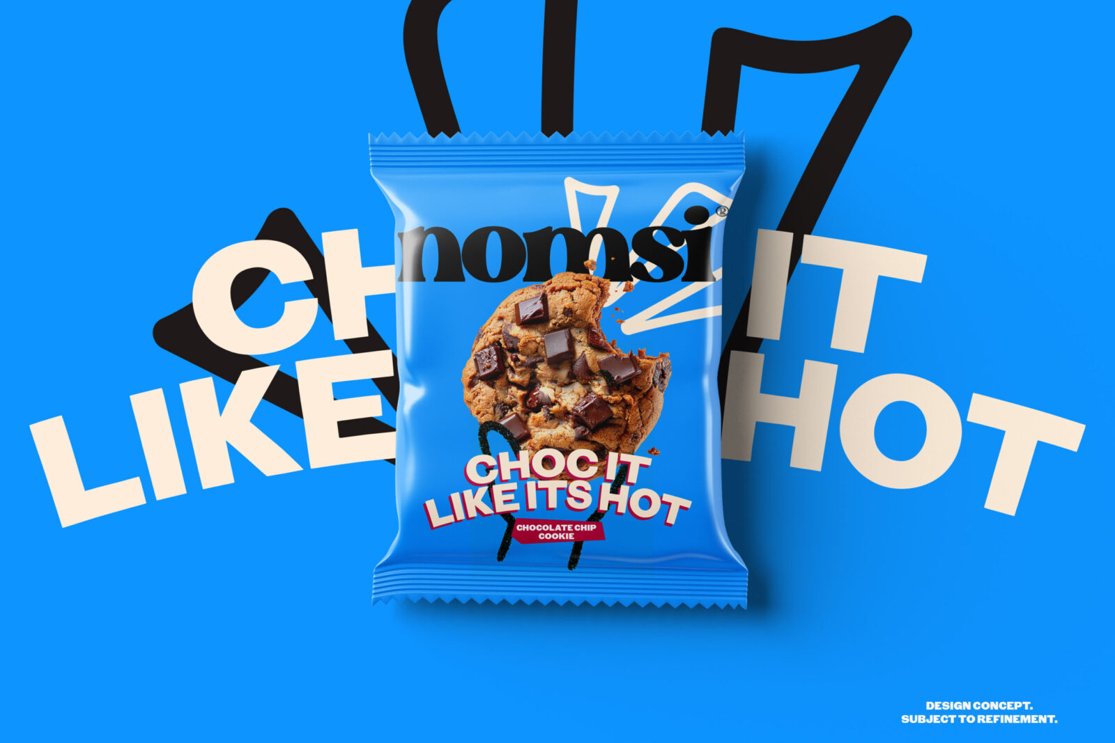
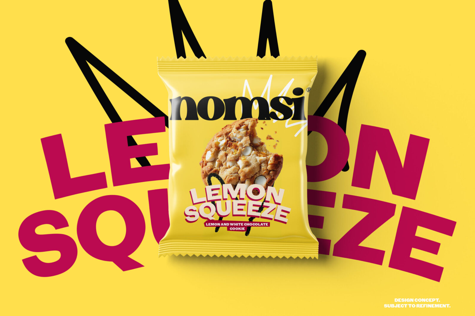
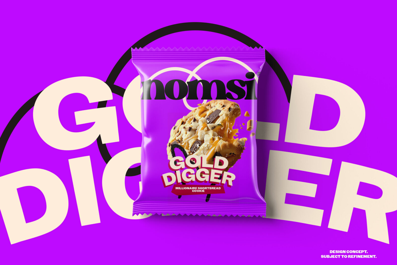
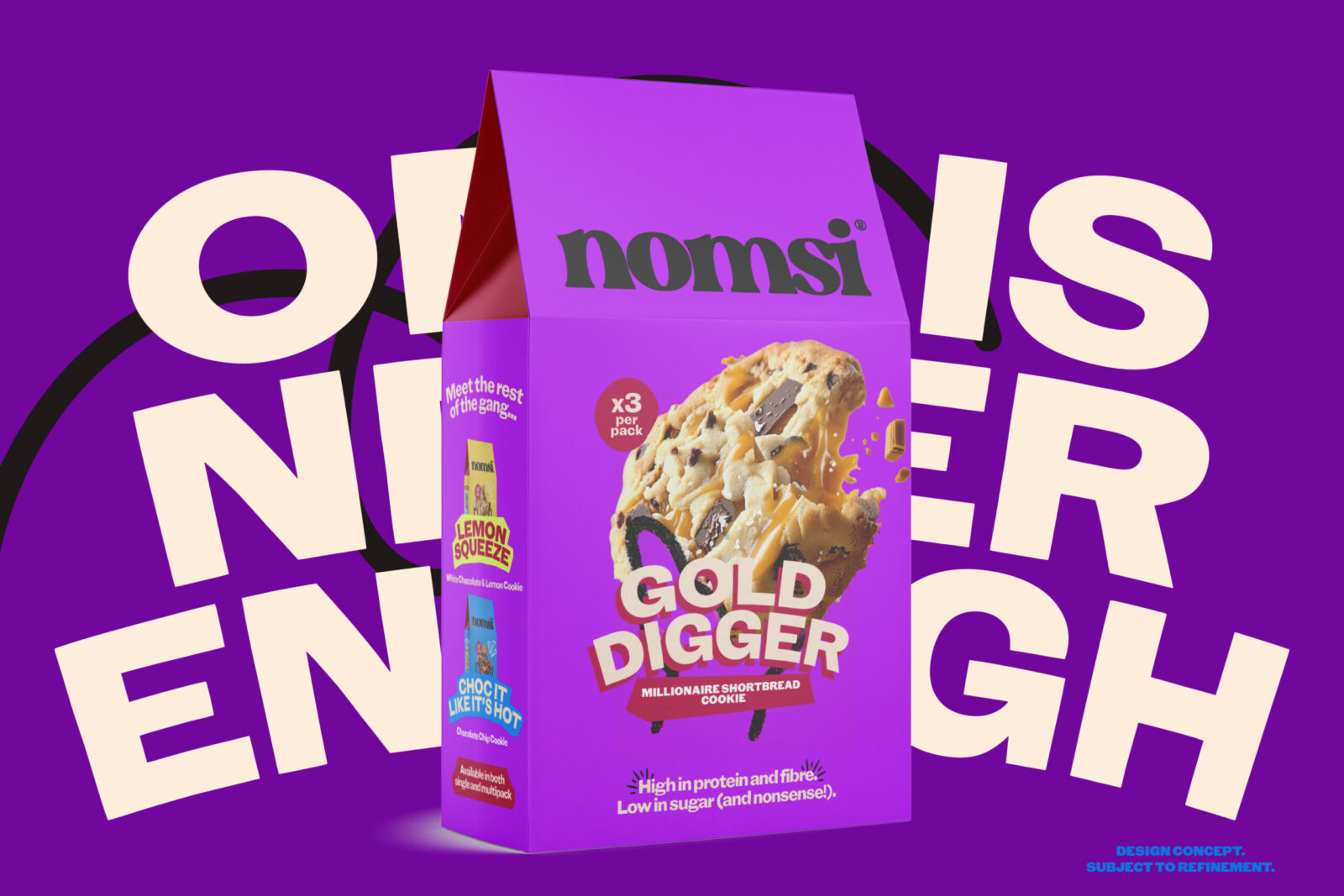
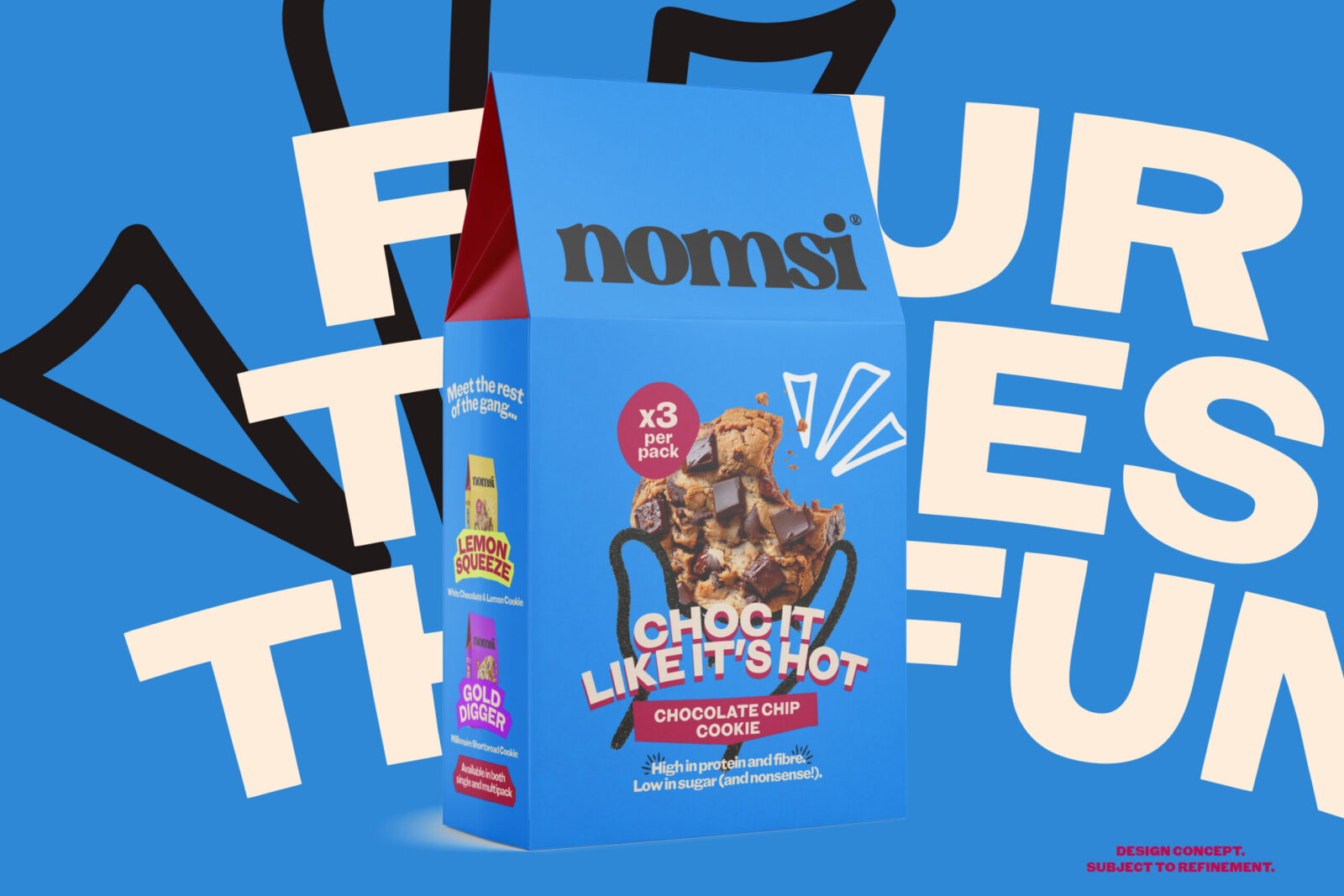
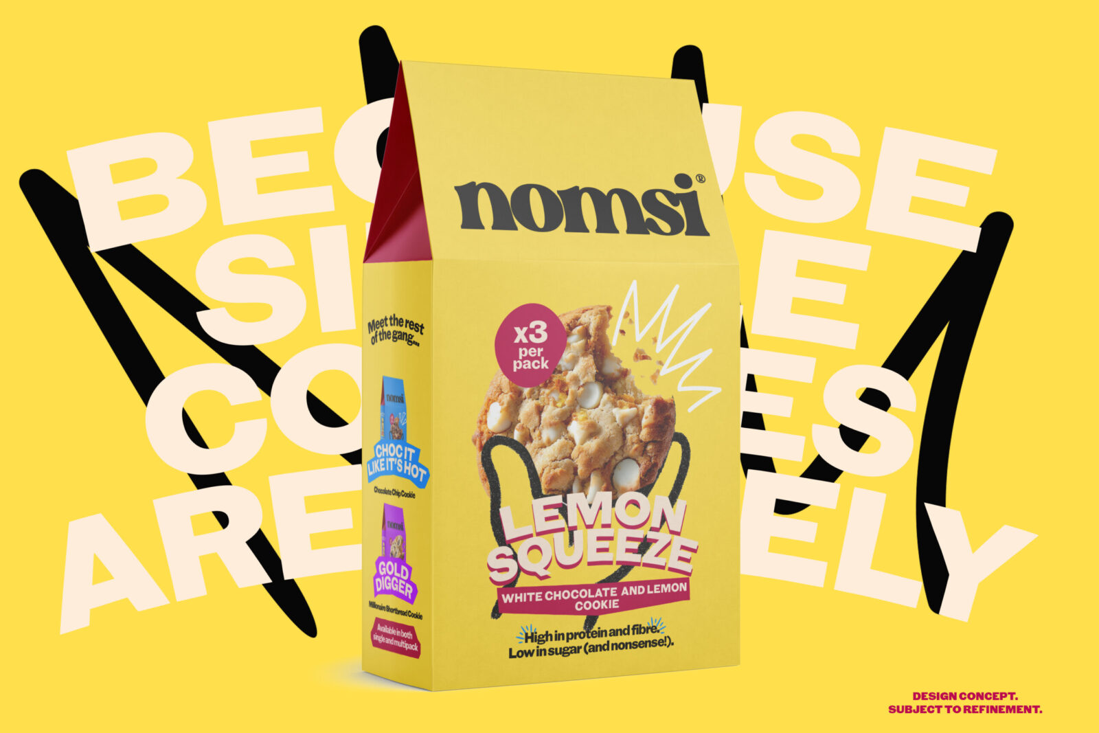
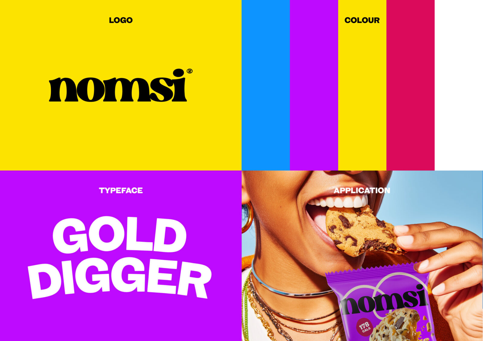
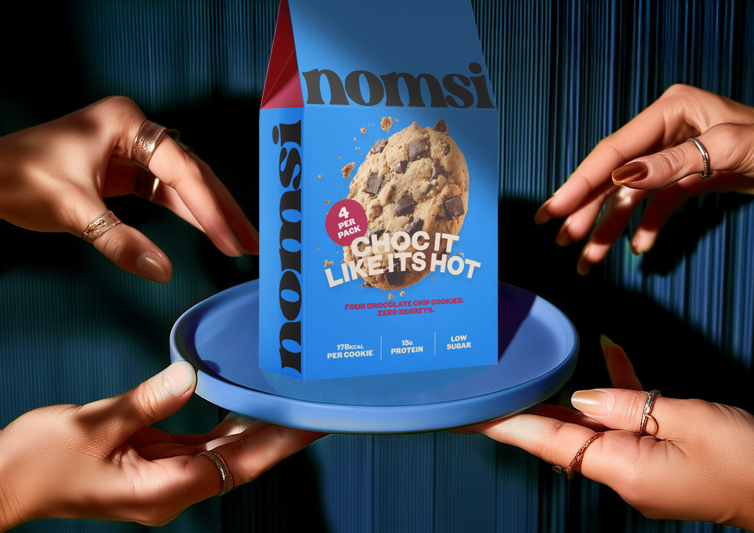
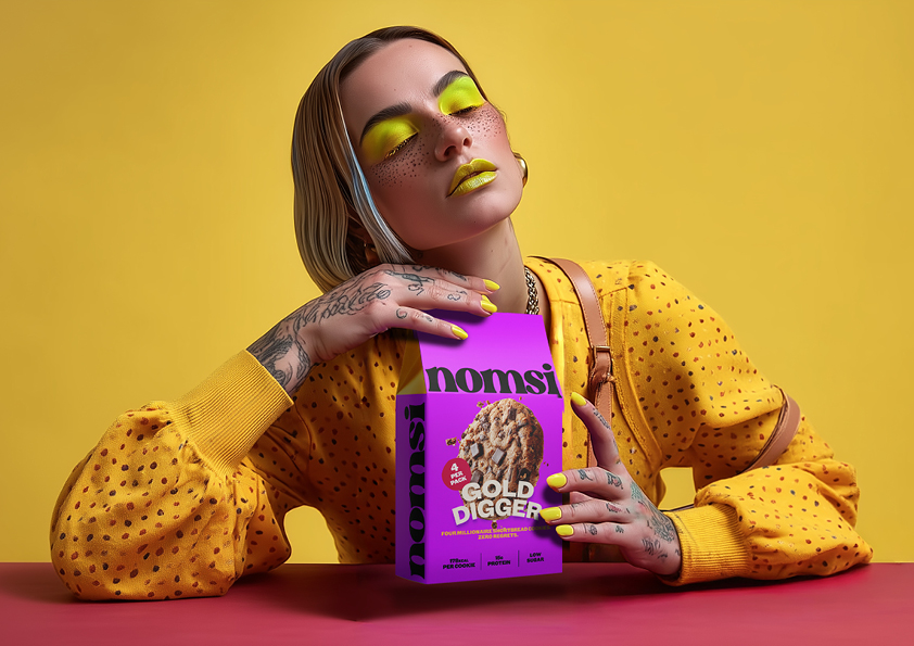
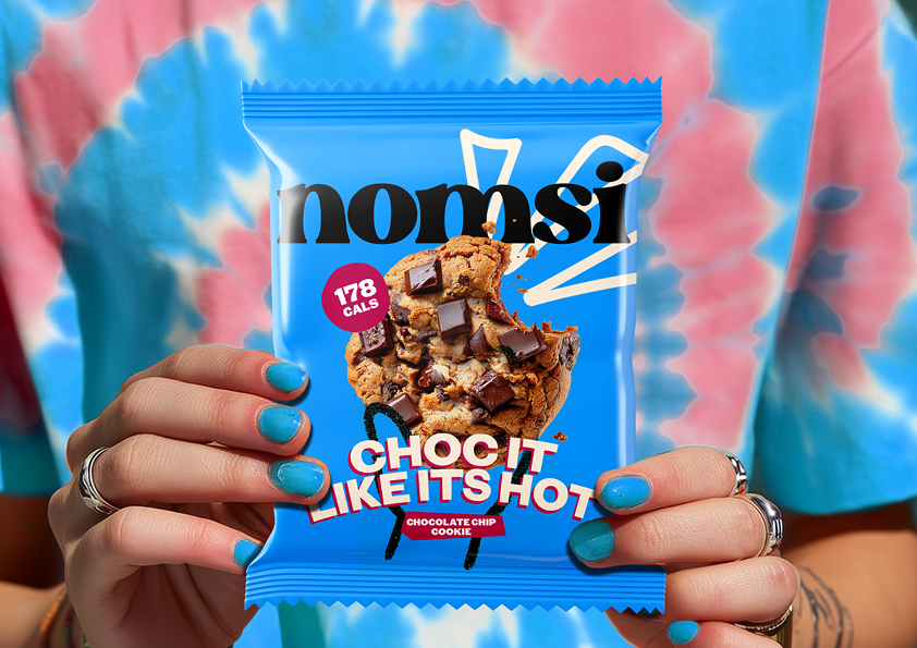
Visual Language: Bold, Bright, and Unapologetically Fun
The visual world of Nomsi is built on confident colours, soft-edged shapes, and expressive typography. We created a bold palette that feels modern and uplifting, with a typographic system that balances clarity with character.
The design language leans into friendliness – rounded forms, playful compositions, and graphic elements that echo the shape and texture of the cookies themselves. Each part of the system needed to look as joyful as the product tastes.
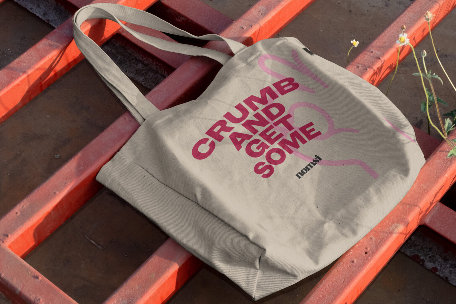
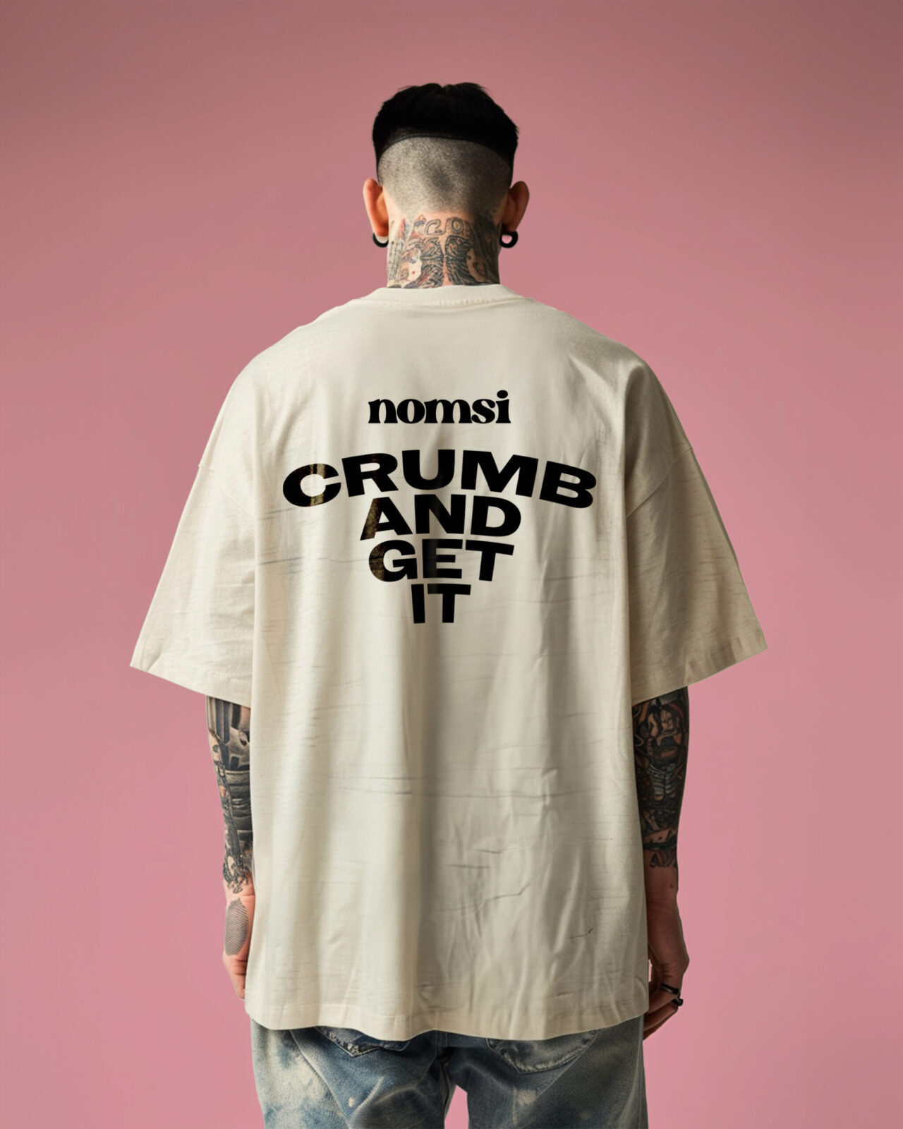
Copywriting: Energetic, Optimistic, and Human
Nomsi’s voice was crafted to sound like the supportive friend who cheers you on. The tone is positive, warm, and a little cheeky, avoiding the guilt-driven tropes of diet culture.
Taglines, pack copy, and digital touchpoints all share the same philosophy:
Healthy food shouldn’t lecture you. It should lift you.
Short, punchy lines deliver personality while keeping everything accessible and light-hearted.
Illustration: A Playful Look at a Healthier Treat
We introduced a series of bespoke illustrations that bring personality to the brand without leaning into childishness. These soft, rounded visuals echo the brand’s warmth and create moments of charm across packaging and digital design.
The illustrations also help simplify product benefits – showing ingredients, flavours, and nutritional positives in a way that feels fun rather than clinical.
3D Cookie Rendering: Making the Product a Hero
To showcase the cookies with maximum appetite appeal, we created high-fidelity 3D renders that highlight the product’s texture, grains, and mix-ins.
These renders became central to the brand world, appearing across advertising, website visuals, social content, and packaging mockups. Each render strikes a balance: delicious yet wholesome, premium yet fun.
The 3D approach allowed Nomsi to launch with world-class visuals while also giving the brand flexibility for future flavours and campaigns.
Outcome: A Feel-Good Brand With Global Potential
Nomsi emerges as a stand-out product in a crowded health-food category. The name is memorable, the identity is distinctive, and the visual language feels fresh, modern, and uplifting.
By approaching the project holistically – naming, branding, visual language, copywriting, illustration, and 3D rendering – we built a brand that reflects exactly what the product stands for: joy, balance, and a better way to snack.
Nomsi isn’t just a healthier cookie.
It’s a happier one.

CREDIT
- Agency/Creative: Creo Interactive
- Article Title: Nomsi by Creo Interactive Redefines Healthy Snacking Through Playful Brand Design
- Organisation/Entity: Agency
- Project Status: Published
- Agency/Creative Country: United Kingdom
- Agency/Creative City: Cardiff
- Market Region: Global
- Project Deliverables: 3D Modelling, Advertising, Advertising Photography, Art Direction, Brand Architecture, Brand Creation, Brand Design, Brand Experience, Brand Guidelines, Brand Mark, Brand Naming, Brand Strategy, Brand Tone of Voice, Brand World, Branding, CGI, Copywriting, Creative Direction, Design, Graphic Design, Identity System, Illustration, Logo Design, Packaging Design, Packaging Guidelines
- Industry: Food/Beverage
- Keywords: WBDS Agency Design Awards 2025/26 , Naming strategy, Brand identity, Visual language, Bold design, Playful branding, Packaging design Tone of voice Copywriting Illustration design 3D product rendering Product storytelling Brand positioning Colourful identity


