Nom Nom is not just another fast food brand, it is an identity built to feel alive, full of fun, and impossible to forget. When I started this project, my goal wasn’t simply to make a logo or design some wrappers, but to create a brand world that feels like a friend, one of those playful, energetic friends who can turn even an ordinary meal into a celebration.
I asked myself a simple question at the beginning: how can a fast food brand go beyond serving food and instead become something people smile about, talk about, and even feel connected to? That question shaped everything. Nom Nom is meant to bring joy and energy into every bite, and while fast food is usually about speed and convenience, I wanted Nom Nom to also create an emotional connection. It is not just a restaurant identity, it is a character, a personality, a companion.
To get there, I looked at both global giants like McDonald’s, KFC, and Jollibee, who have built their brands around iconic mascots, and at the street food vendors around South Asia, where food is loud, messy, full of life, and always shared with people. I also studied old school mascots from the 70s and 80s, those quirky characters that weren’t just logos but personalities that stuck in people’s minds. That retro influence inspired Nom Nom’s mascot, which sits at the heart of the identity.
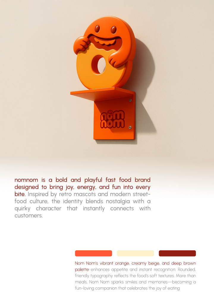
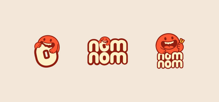
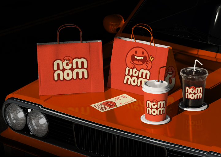
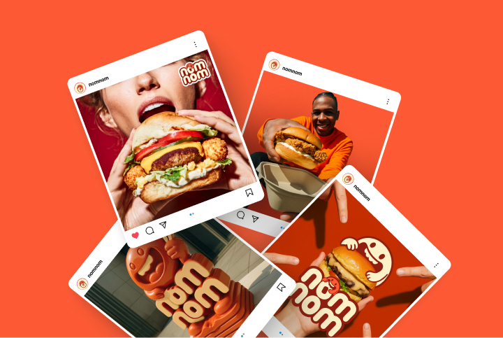
The brand itself was imagined as that one cheerful friend who always knows how to make you laugh, the friend who makes even a simple burger feel like a story worth sharing. The mascot isn’t a decoration, it is the brand’s face and voice, expressive and adaptable across packaging, signage, and social media. It brings emotion, humor, and energy into every touchpoint, making the brand more like a companion than just a business.
Visually, the whole system was designed to feel bold, simple, and playful. I worked with a trio of colors, vibrant orange, creamy beige, and deep brown, that balance energy and comfort. Orange grabs attention and makes people hungry, beige softens it and adds warmth, and brown ties it all back to indulgence and flavor. For typography, I chose rounded, friendly typefaces that echo the softness of food itself, the fluff of a bun, the melt of cheese, the creaminess of sauce. Nothing sharp or rigid, everything approachable. At the center sits the mascot led logo, modern but inspired by retro fast food characters, designed to be versatile, expressive, and never boring.
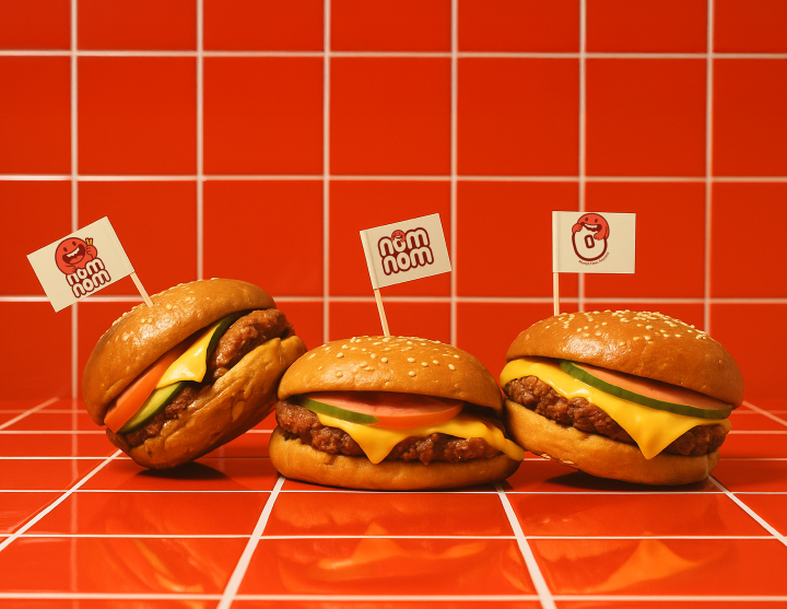
Together, these elements form a brand system that’s flexible enough to grow in any direction while always staying recognizable. Packaging became a huge part of telling the story. In fast food, the first real interaction often happens with a cup or wrapper, so I treated them like canvases for personality. The cups feature funny mascot expressions, the wrappers use bold blocks of color, and the bags carry cheeky little lines that add humor to the eating experience. The idea was to make every item feel alive, so even something as ordinary as a burger wrapper could bring a smile or become shareable online. This wasn’t just packaging, it was storytelling.
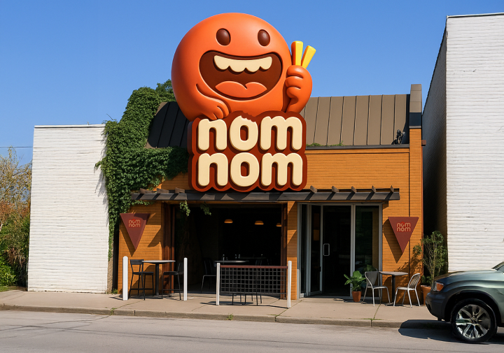
And the story extends beyond packaging into the environment. The signage, the menu boards, even the interiors were imagined with the same vibrant energy, bold colors, cheerful graphics, and clear layouts that make ordering simple and fun. Whether you are dining in or grabbing a bag to go, the experience should feel like a little celebration, bright and playful but easy and welcoming at the same time.
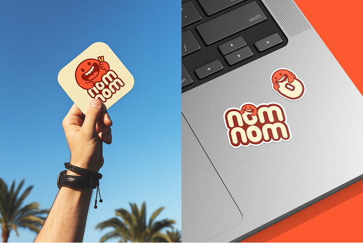
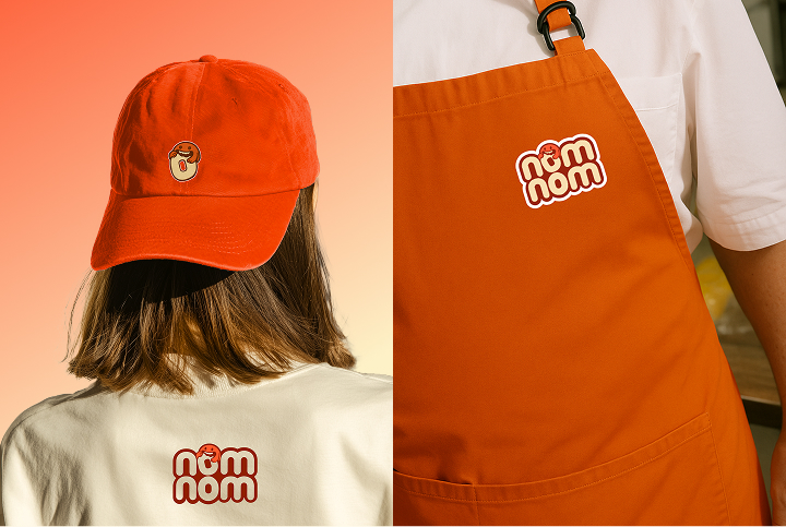
Another big challenge I set myself was proving that the brand could stretch. Could Nom Nom stay consistent if it grew into new campaigns, seasonal promotions, or even merchandise? With the strong mascot and palette driven system, the answer was yes. The design is flexible enough to adapt without losing its voice, which is key for any brand that wants to grow.
What I love about Nom Nom is how it balances two worlds, nostalgia and modern relevance. The mascot driven system pays tribute to the old school characters of fast food history, but the execution with clean layouts, refined typography, and bold colors keeps it fresh and contemporary. This balance makes the brand resonate with younger people, who love playful, Instagram worthy design, but also with older generations, who find comfort in the familiar charm of mascots.
In today’s crowded market, where so many fast food brands go minimal or generic, Nom Nom does the opposite. It embraces humor, energy, and personality as its biggest strengths. That’s what makes it instantly recognizable, shareable, and culturally relevant. The outcome is a brand that doesn’t just stand out visually but also connects emotionally. It is packaging and storytelling that enhance the eating experience, turning meals into moments of fun.
Nom Nom isn’t selling just burgers and fries, it is selling joy, memories, and the idea that eating can be something more than routine. For me, this project is also a reflection of how I approach design. I don’t only aim to make things look good, I aim to make systems that can grow, adapt, and stay consistent over time.
Nom Nom was a chance to prove that even a fictional brand can evolve in a strategic and believable way, and that packaging design can be the backbone for an entire identity system. At its core, this project shows how branding can spark emotion, build trust, and create delight. By blending bold design with strategic clarity, Nom Nom becomes more than a fast food brand, it becomes a companion that celebrates the joy of eating, and that to me is the real value of design.
CREDIT
- Agency/Creative: Irin Shorme
- Article Title: Nom Nom With a Bold and Playful Fast Food Identity by Irin Shorme
- Organisation/Entity: Freelance
- Project Type: Packaging
- Project Status: Published
- Agency/Creative Country: Bangladesh
- Agency/Creative City: sylhet
- Market Region: Asia, North America, Global
- Project Deliverables: Brand Design, Brand Identity, Illustration, Logo Design, Packaging Design
- Format: Box, Cup, Wrap
- Industry: Food/Beverage
- Keywords: Nom Nom, Fast Food Branding, Playful Mascot, Packaging Design, Street Food Identity, Food Branding, Bangladesh Design, Bold Visual Identity,illustration, packaging,logo design,food packaging
-
Credits:
Illustration, Packaging and Branding: irin Shorme


