


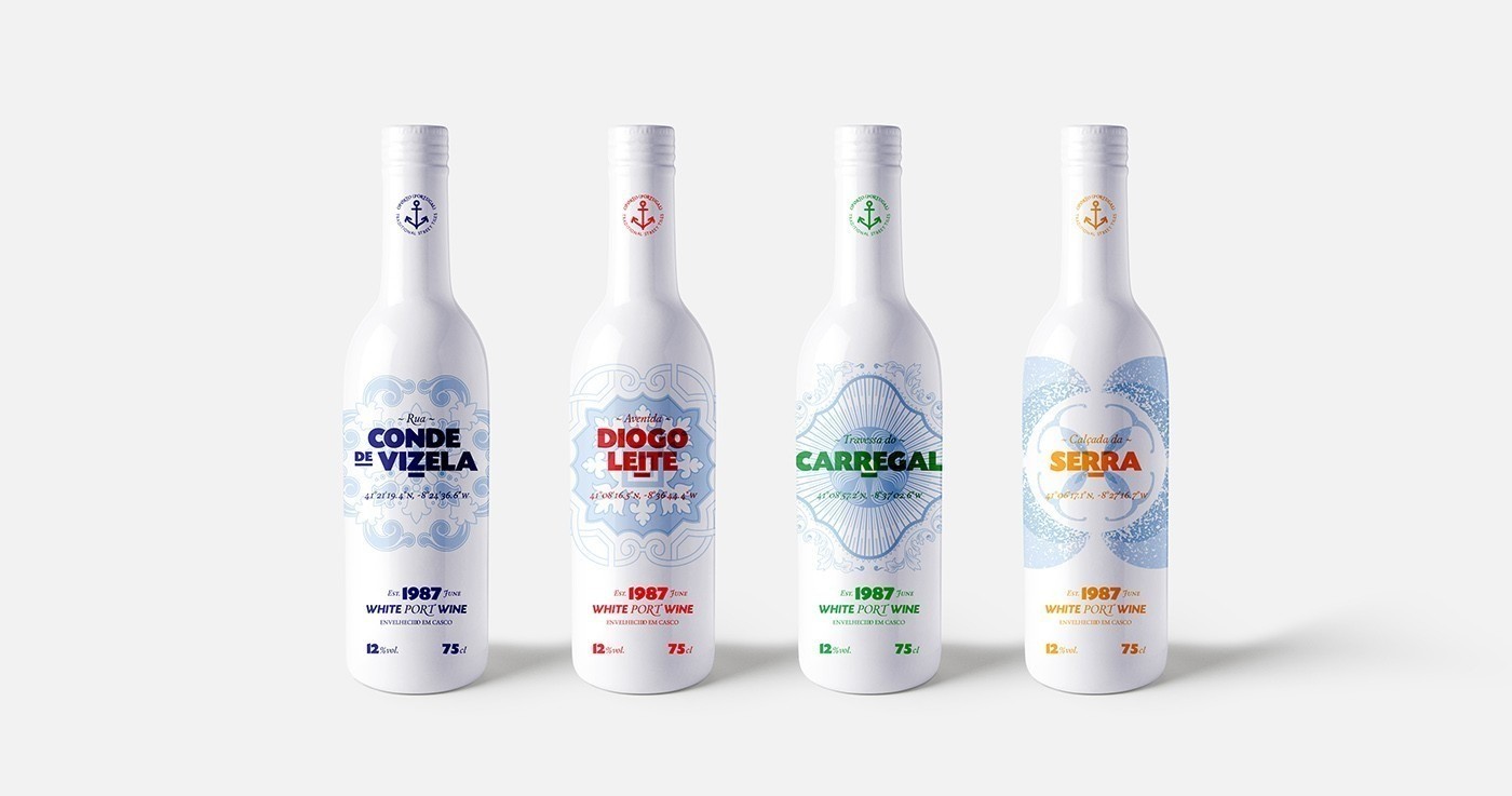
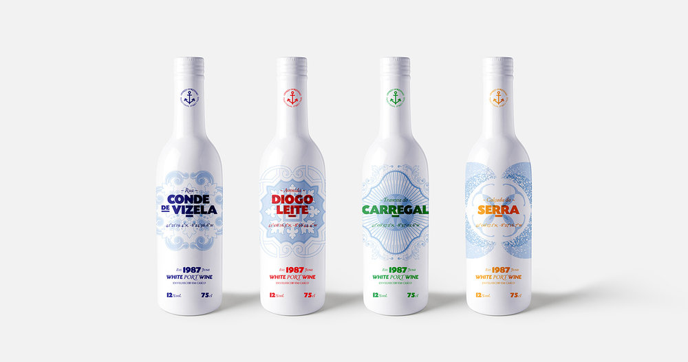
“Porto is a city in northwest Portugal known for its stately bridges and port wine production. Its name comes from the Portuguese Porto which means port.
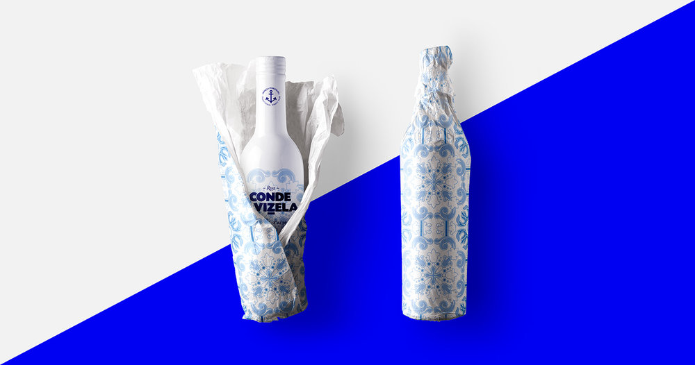
The project shows a visual representation of the city and its streets. It is the graphic synthesis of the city of Porto.
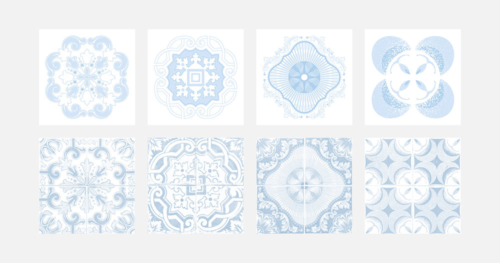
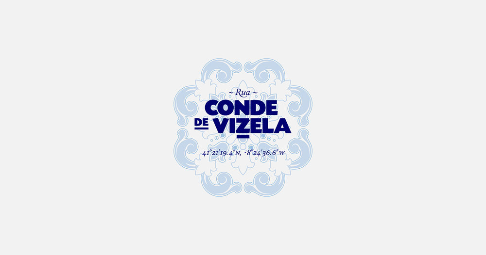
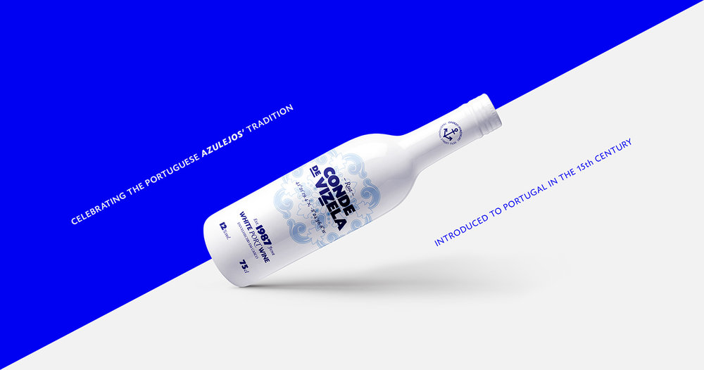
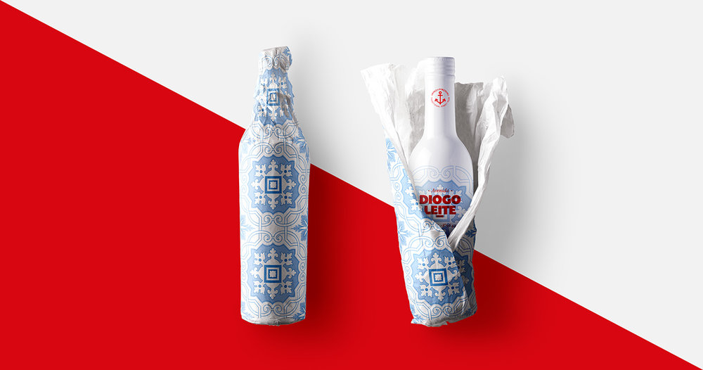
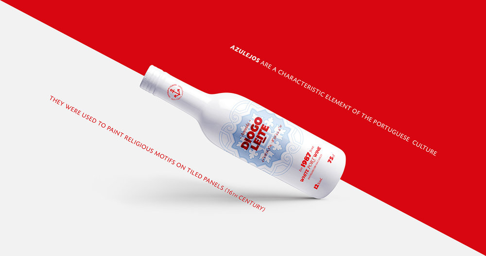
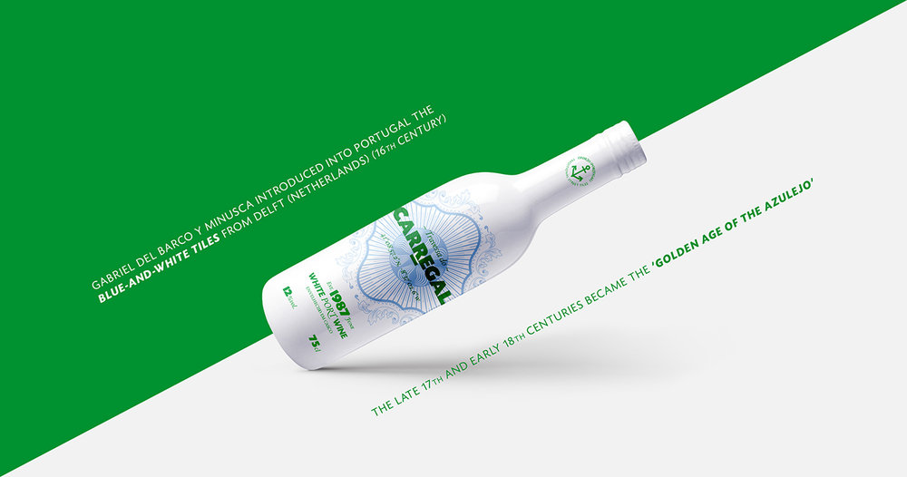
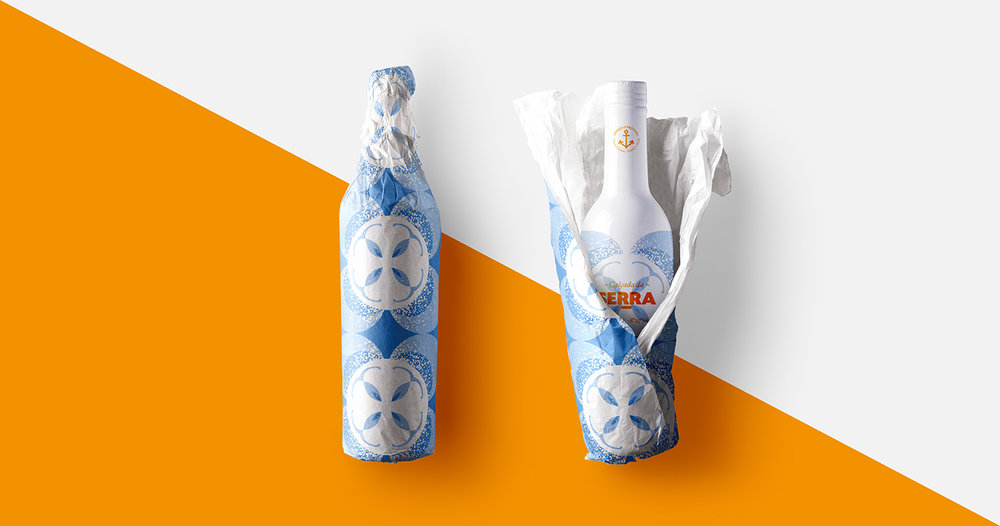
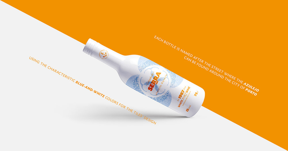
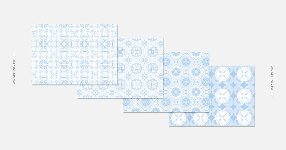
The different designs are inspired by specific “azulejos” found around the streets of Porto. The real street/avenue name is on the front of each bottle alongside with the GPS coordinates (in case you want to admire the original art).
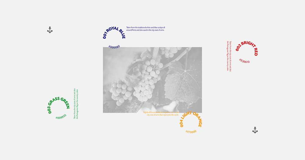
The main four colors used to differentiate the bottles were selected from the city coat of arms, plus the shades of blue that are used in the traditional “azulejos”.”


CREDIT
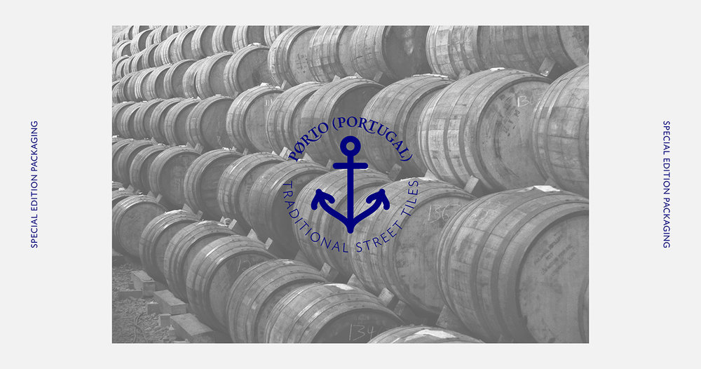
- Agency/Creative: Noem9 Studio
- Article Title: Noem9 Studio – Porto Special Edition (Concept)
- Project Type: Packaging
- Format: Bottle
- Substrate: Glass, Pulp Paper
FEEDBACK
Relevance: Solution/idea in relation to brand, product or service
Implementation: Attention, detailing and finishing of final solution
Presentation: Text, visualisation and quality of the presentation


