


Launching into a crowded category the Dulwich founders tasked design strategist Silas Amos – silasamos.com – and design team Derek & Eric – derekanderic.co.uk – with figuring out a distinctive way to distil the essence of Dulwich, London into an engaging brand and bottles.
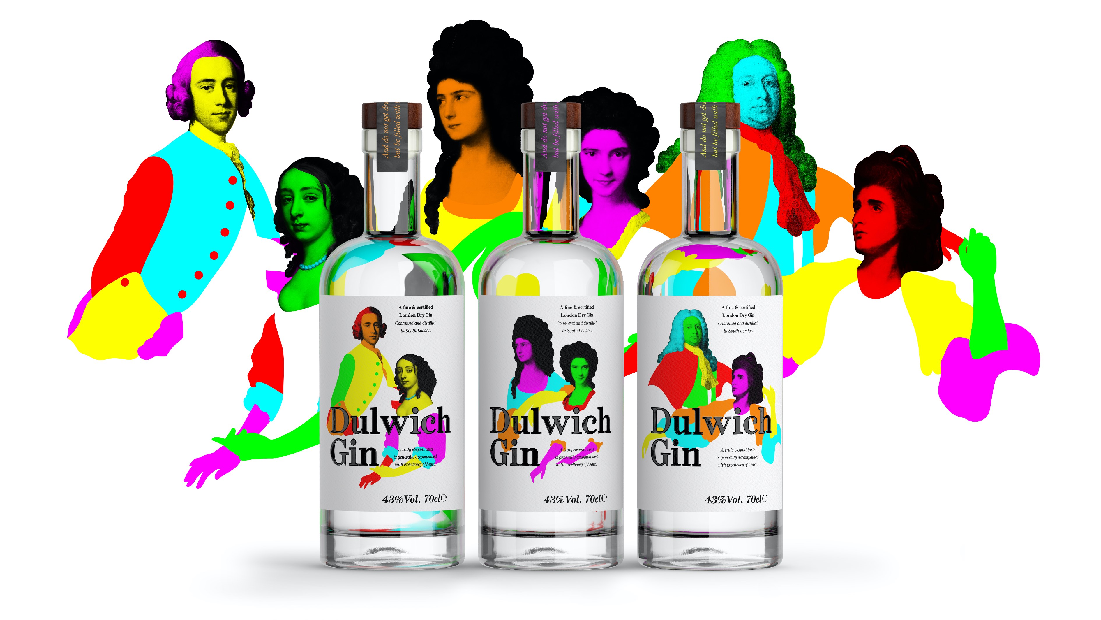
Leafy Dulwich is an arty London neighbourhood that’s also home to the Dulwich Picture gallery, England’s first public art gallery, dating back to 1811. The gallery boasts some of the finest portraits from the Georgian era – a time when gin was the quintessential London drink for the decadent and the dissolute, from street corners to stately homes.
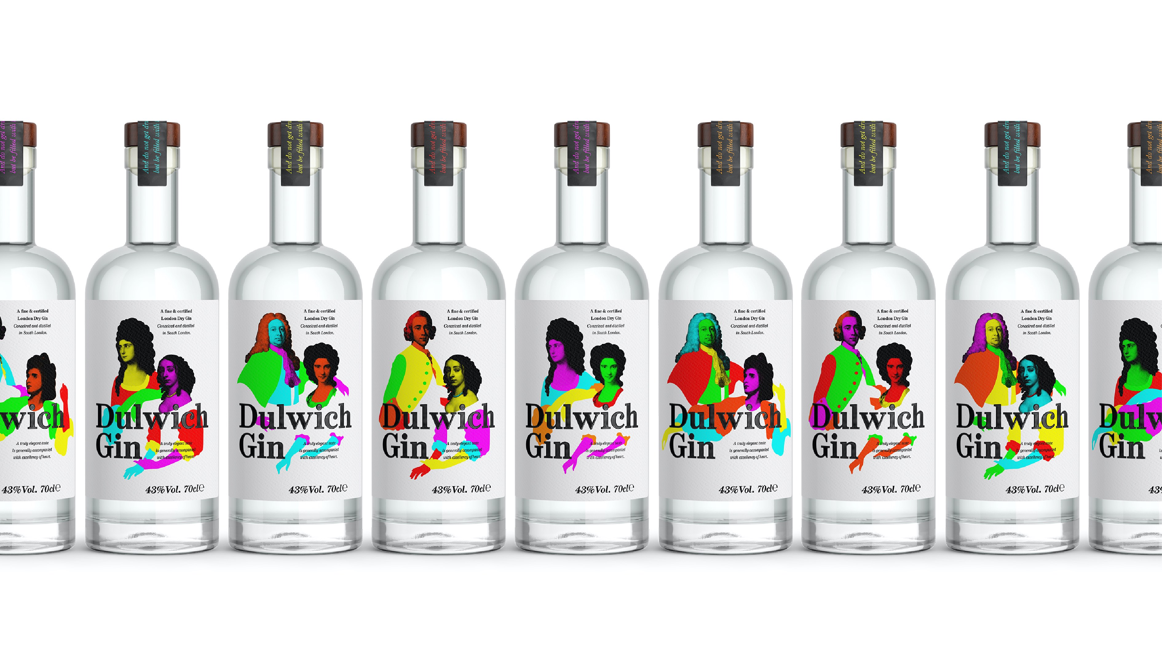
We chose a handful of notable Georgians from the galleries amazing collection and gave them a contemporary twist – Each bottle label remixes the portraits in unique combinations of characters and colours. No two bottles are the same.
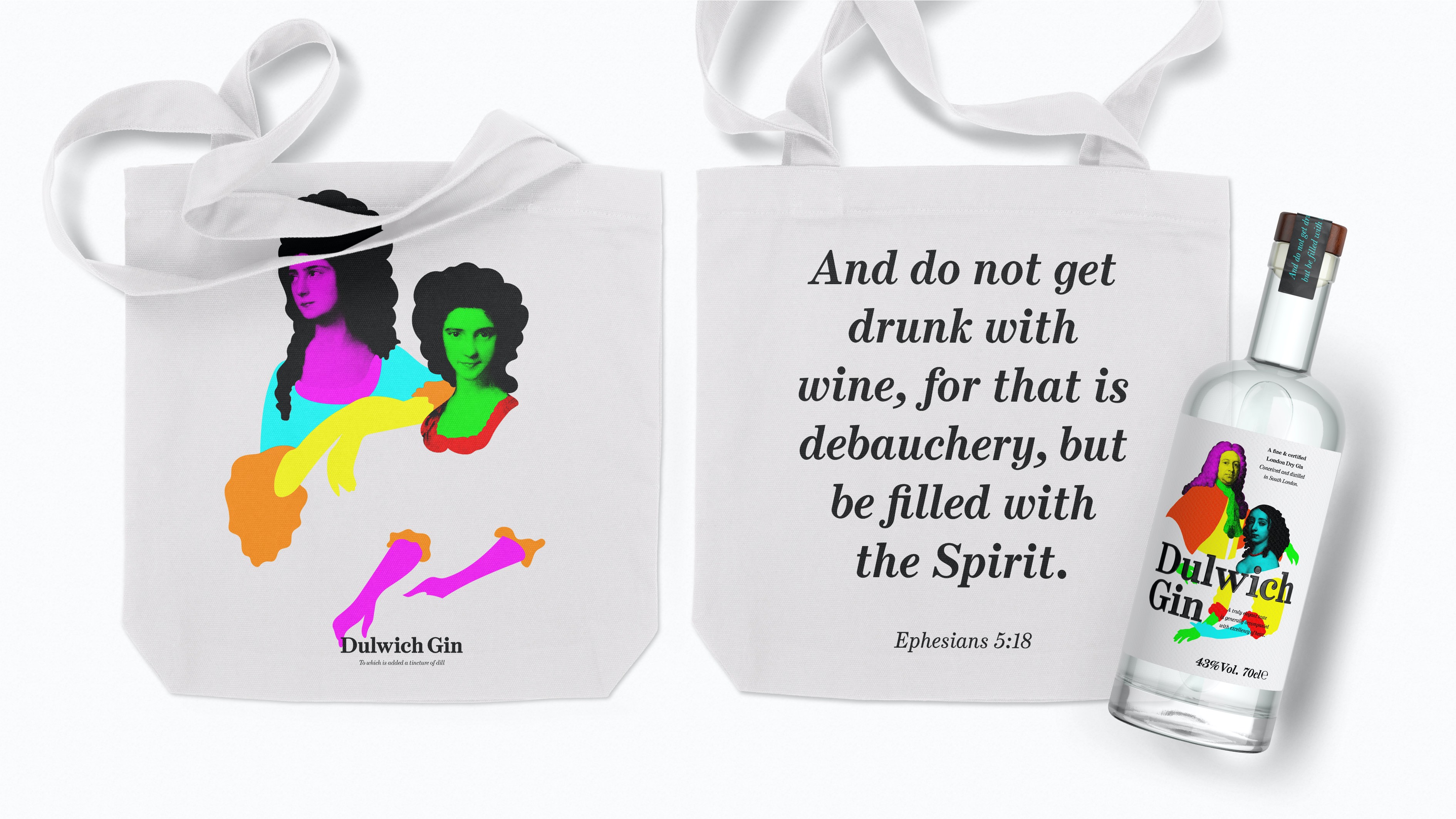
We wanted the design to feel both classical and playful. The neck label uses a biblical quote (as would commonly be found in a Georgian pamphlet ) but used with its tongue firmly in its cheek: “And do not get drunk with wine, for that is debauchery, but be filled with the Spirit”. Ephesians 5:18.
Likewise the maxim on the front label “A truly elegant taste is generally accompanied with excellency of heart” is a line from Henry Fielding, author of Tom Jones, and a campaigner (in the face of the original London gin craze ) for temperance.
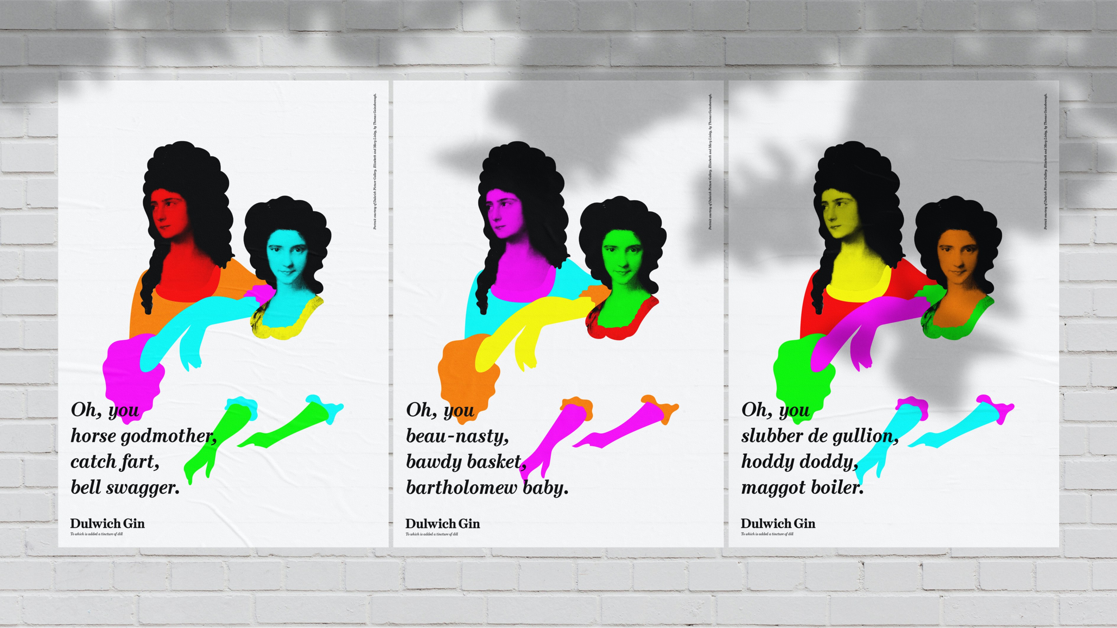
This playful spirit carries though into bags intended to act as premium packaging for the bottle, as well as walking advertisements for the brand. We also created a set of posters, intended to accompany gifted bottles, which each carry a unique Georgian insult, drawn from street-slang of the era – an elegant way of insulting your friends and acquaintances. The Georgians certainly had a way with creative insults.
Print nerd sidebar: The labels were digitally printed to ensure the portraits ‘popped’ and their colours could be ‘shuffled’. ‘Colour shuffling’ has been possible in digital print for some time, but we wanted greater control over which colours went where, and that required technical innovation. HP Indigo’s Creative Tools planned to create the unique label artwork but since its ‘Color Shuffle’ abilities could not specify which parts of the illustrations to change, Guy Bibi of HP Indigo provided the technical support by creating a tool to generate a database with the correct logic in it for HP SmartStream Designer to read. Dulwich Gin can claim a world-first in using (and asking for) this more nuanced utilisation of the software. That’s kind of fun, given the age of the original paintings.
The brand has had a successful hyper-local launch in Dulwich and is now rolling out its distribution footprint.
CREDIT
- Agency/Creative: Derek & Eric
- Article Title: No Two Bottles Alike – The Design of Dulwich Gin
- Organisation/Entity: Agency, Published Commercial Design
- Project Type: Identity
- Agency/Creative Country: United Kingdom
- Market Region: Europe
- Project Deliverables: Brand Advertising, Brand Creation, Brand Identity, Brand Strategy, Branding, Graphic Design, Identity System, Illustration, Packaging Design, Tone of Voice
- Industry: Food/Beverage
- Keywords: Gin, Dulwich, Packaging, Branding, Illustration, Colourful, Unique, Localised, Digital printing, Georgian


