


Sophia Georgopoulou | Design – Avramidis Family Tsantilla Strained Yogurt
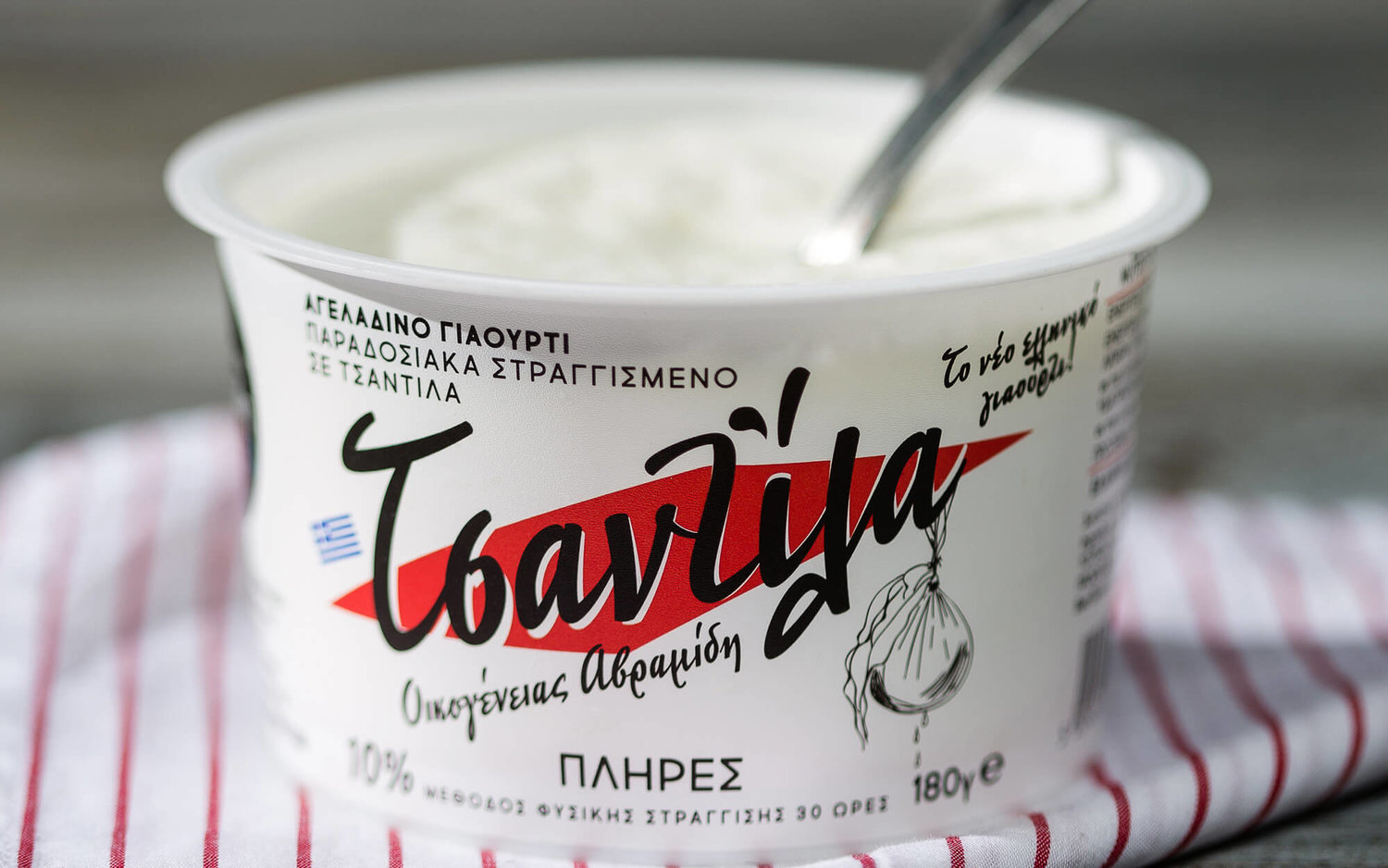
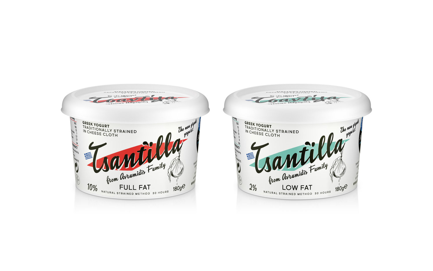
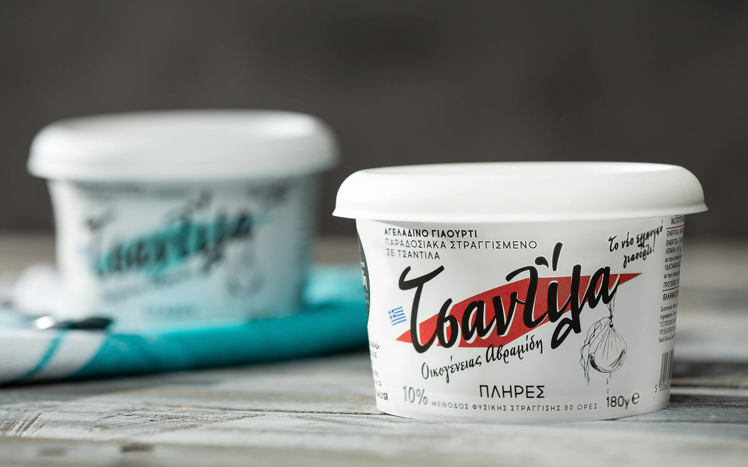
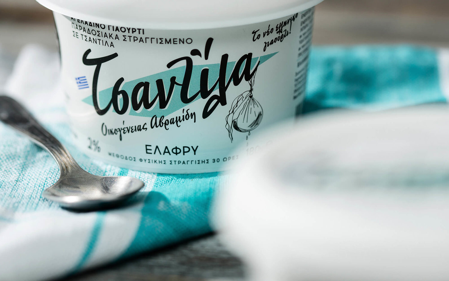
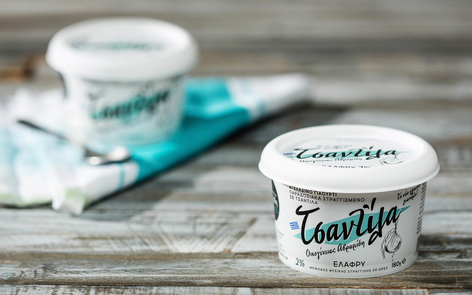
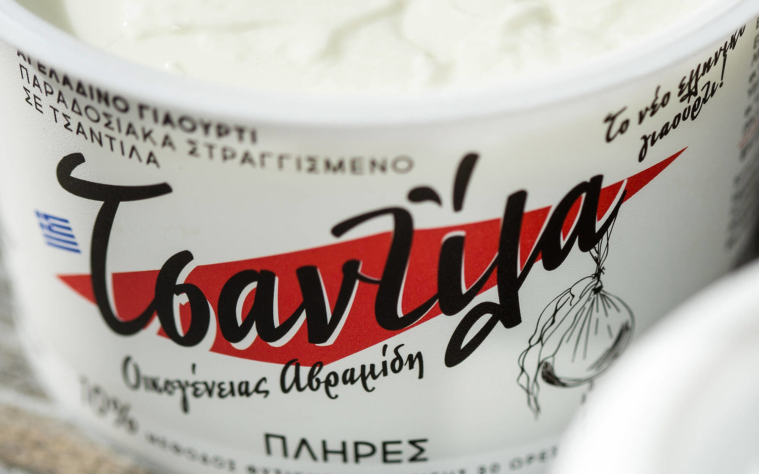
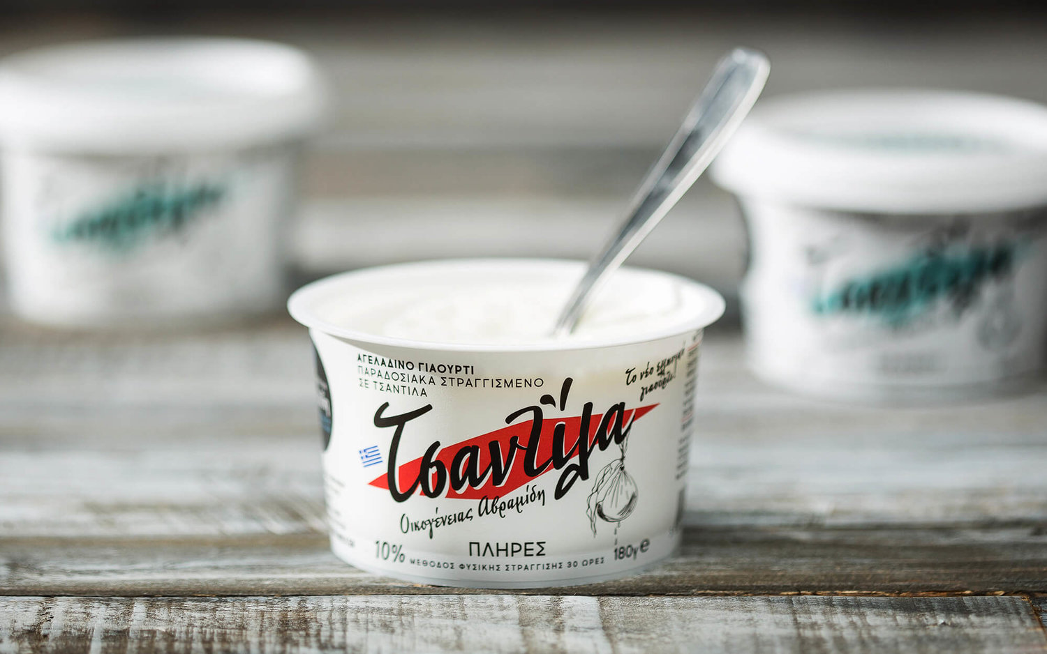
BRIEFIt is only natural that Greek yogurt reigns supreme in its birthplace, Greece. Countless options from big and small producers from all over the country vie for a very demanding and increasingly educated audience. Avramidis Family is a small-scale dairy with big plans. Their comprehensive line across dairy category was complemented by a new proposition, Tsantila Yogurt – which roughly translates to ‘Cloth’, a reference to the traditional method of straining that was applied in this case. This is the traditional way of doing things, a method that is time-consuming, labor-intensive and tricky to apply at a mass-production scale, but also absolutely rewarding when it comes to flavor and the whole sensory experience. The yogurt name celebrates the production method which is so central to what the product is all about – and thus vital to what was needed from the brand’s identity.TARGET GROUPMature (experience-wise) consumers of Greek yogurt with high expectations and demandsCREATIVE CONCEPTAs the straining cloth method defines the product and the brand, it was very much expected to constitute the key inspiration source. The method and what it stands for (traditional, true yogurt experience) should dominate the brand’s identity.DESIGN APPROACHWhat was needed was a vintage character brought to today. For starters, the shape of the straining cloth was used a backdrop against the text of the logo. The text itself is reminiscent of script typefaces very characteristic of mid-20th century Greek brands and advertising – immediately recognizable even among younger people, as everyone is exposed to them time and again through classical Greek movies that are a basic staple of TV. The nostalgic connection and the authenticity connotations are a knee-jerk reaction for most Greeks. The intonation mark that goes to the word is constituted by two drop-like shapes, an allusion to the straining method itself. Finally, a straining bag black & white illustration was added to the end of the word, just in case someone did not get it already!


CREDIT
- Agency/Creative: Sophia Georgopoulou | Design
- Article Title: No Strain Between Tradition And Modernity
- Organisation/Entity: Agency, Published Commercial Design
- Project Type: Packaging
- Agency/Creative Country: Greece
- Market Region: Europe
- Format: Case, Cup
- Substrate: Plastic


