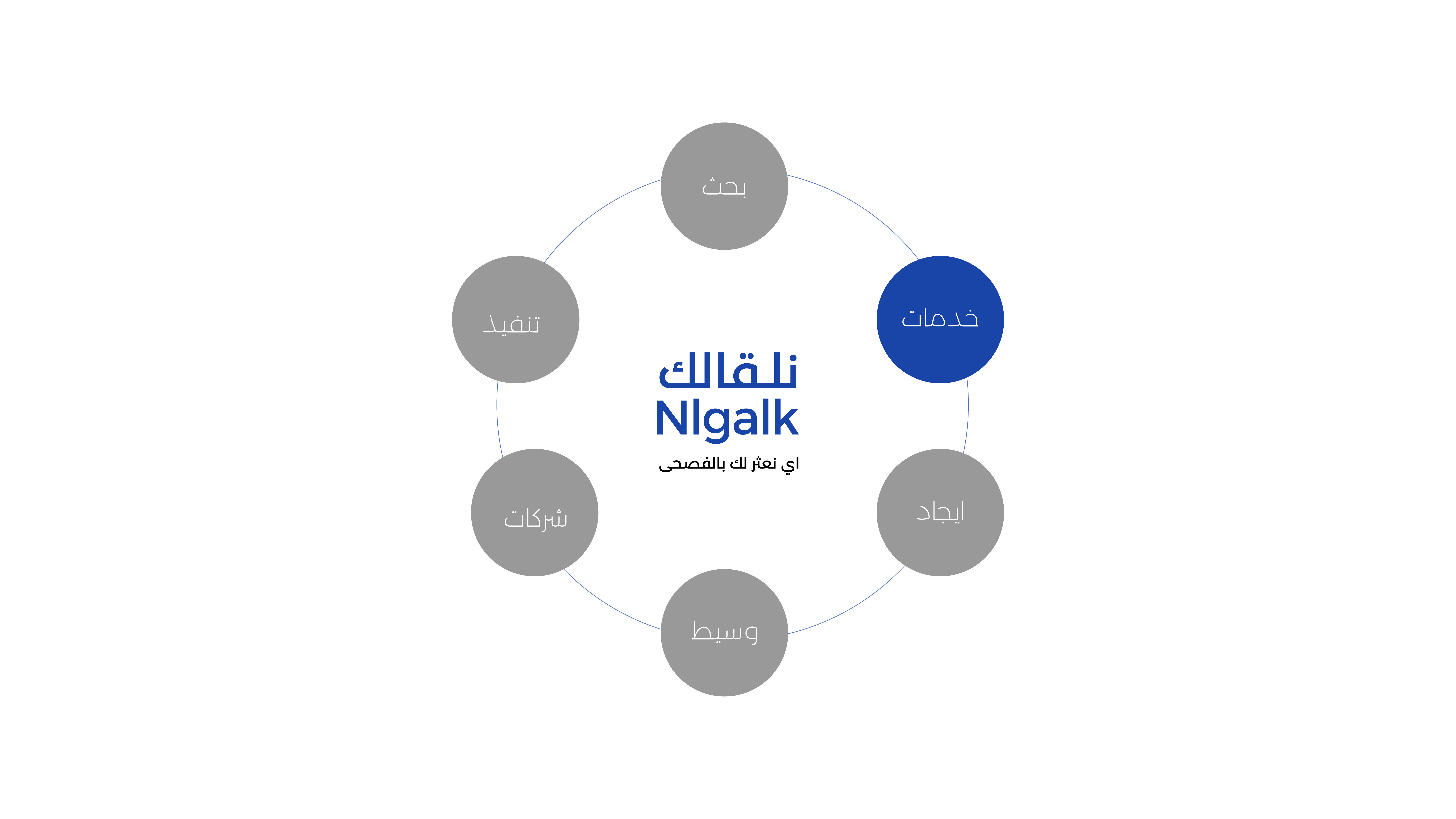
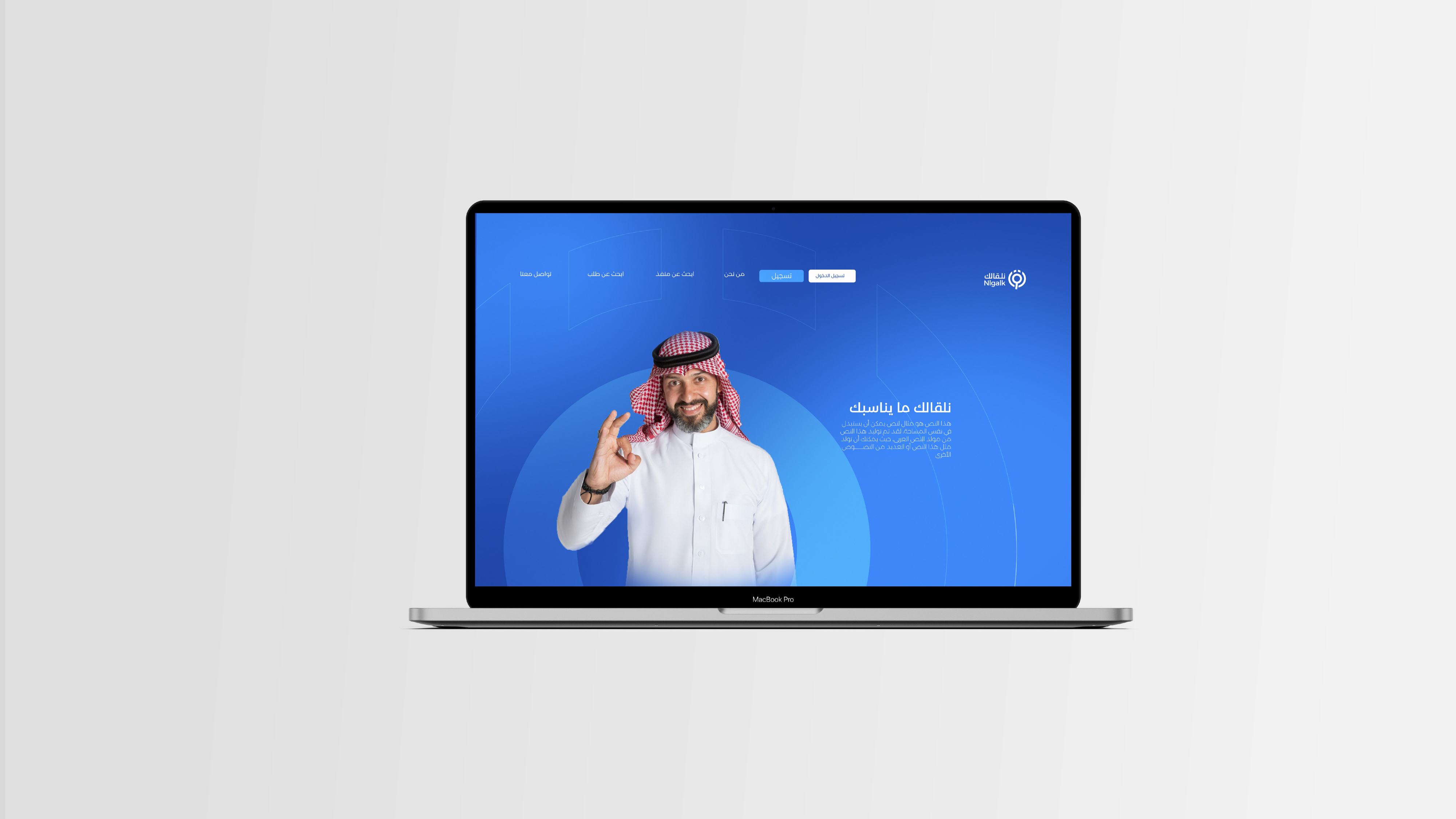
Nlgalk an intermediary website between companies implementing contracting services and individuals and companies looking for someone to implement their projects With all mastery and professionalism, it was created to facilitate the connection of those responsible for its implementation and those in need to each other in a much easier way than it was before…
To facilitate the work of implementing companies that are well-professional and to connect work with companies that search through the presence of multiple, easy, fast, precise, professional and reliable options.
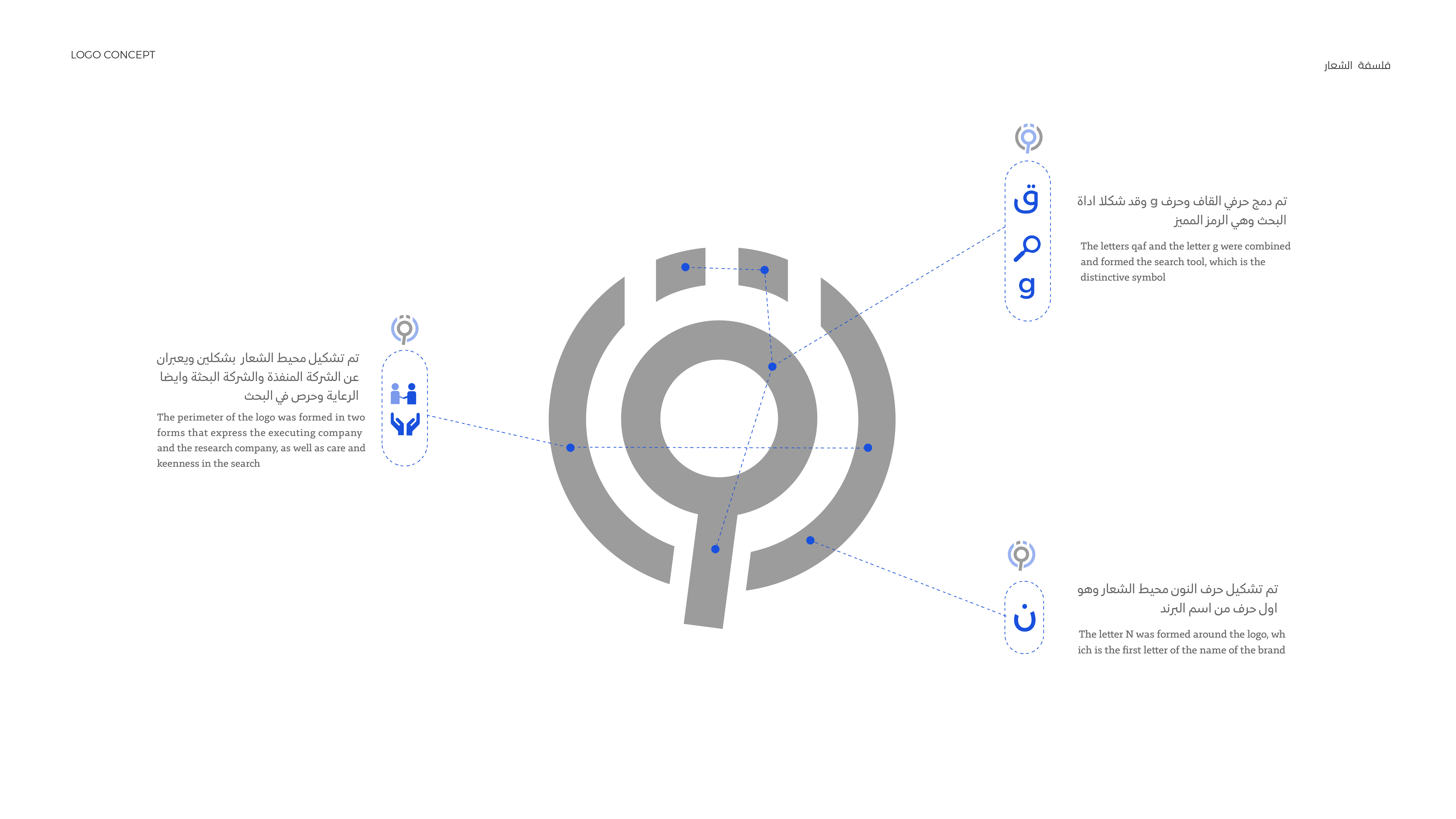
The composition of the name is in Arabic: “We will meet you,” or “We will find you,” or “We will find you” in classical Arabic. The formation of the logo from the name took the finding phase, which is the searching phase.Find an important stage
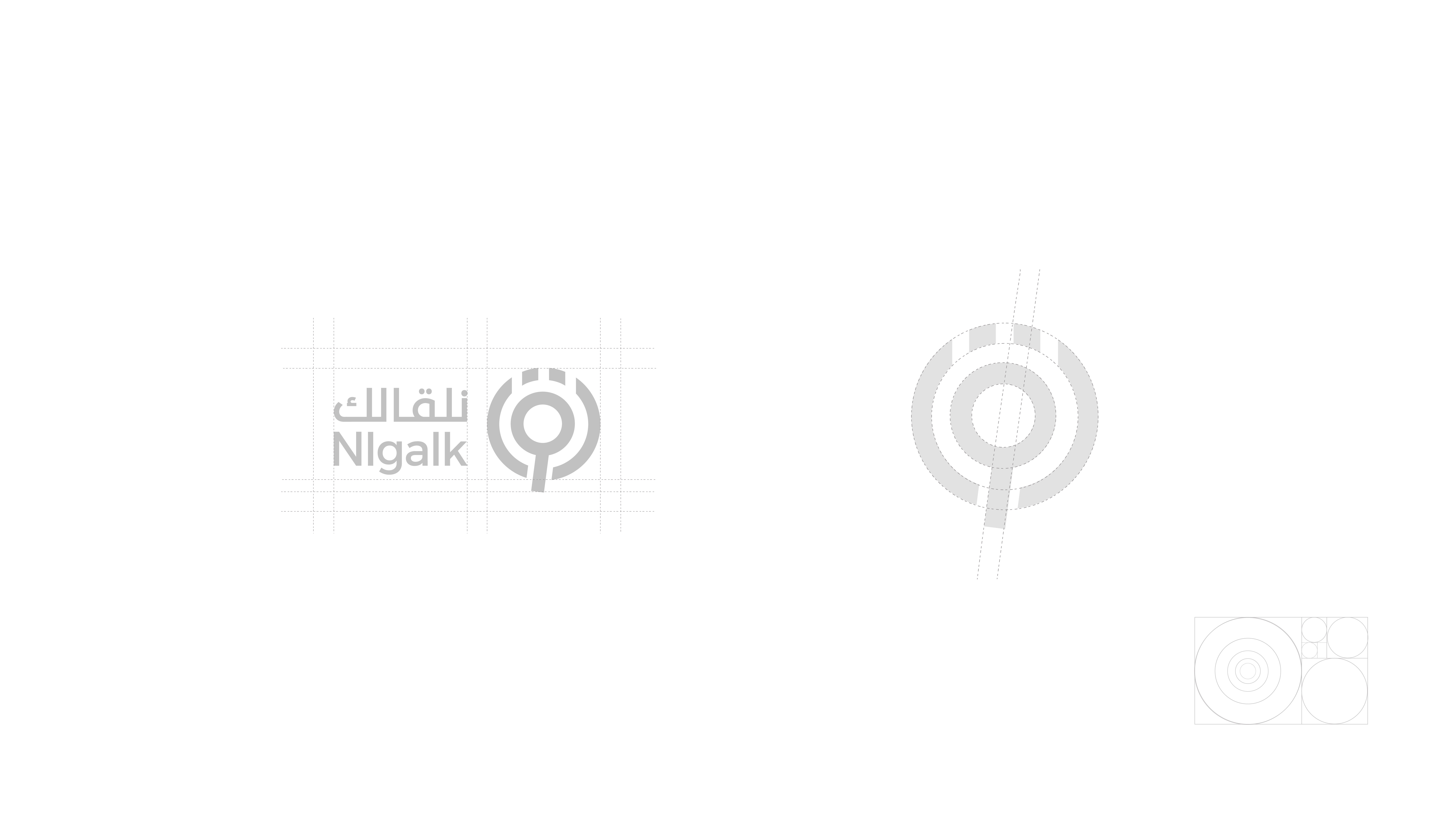
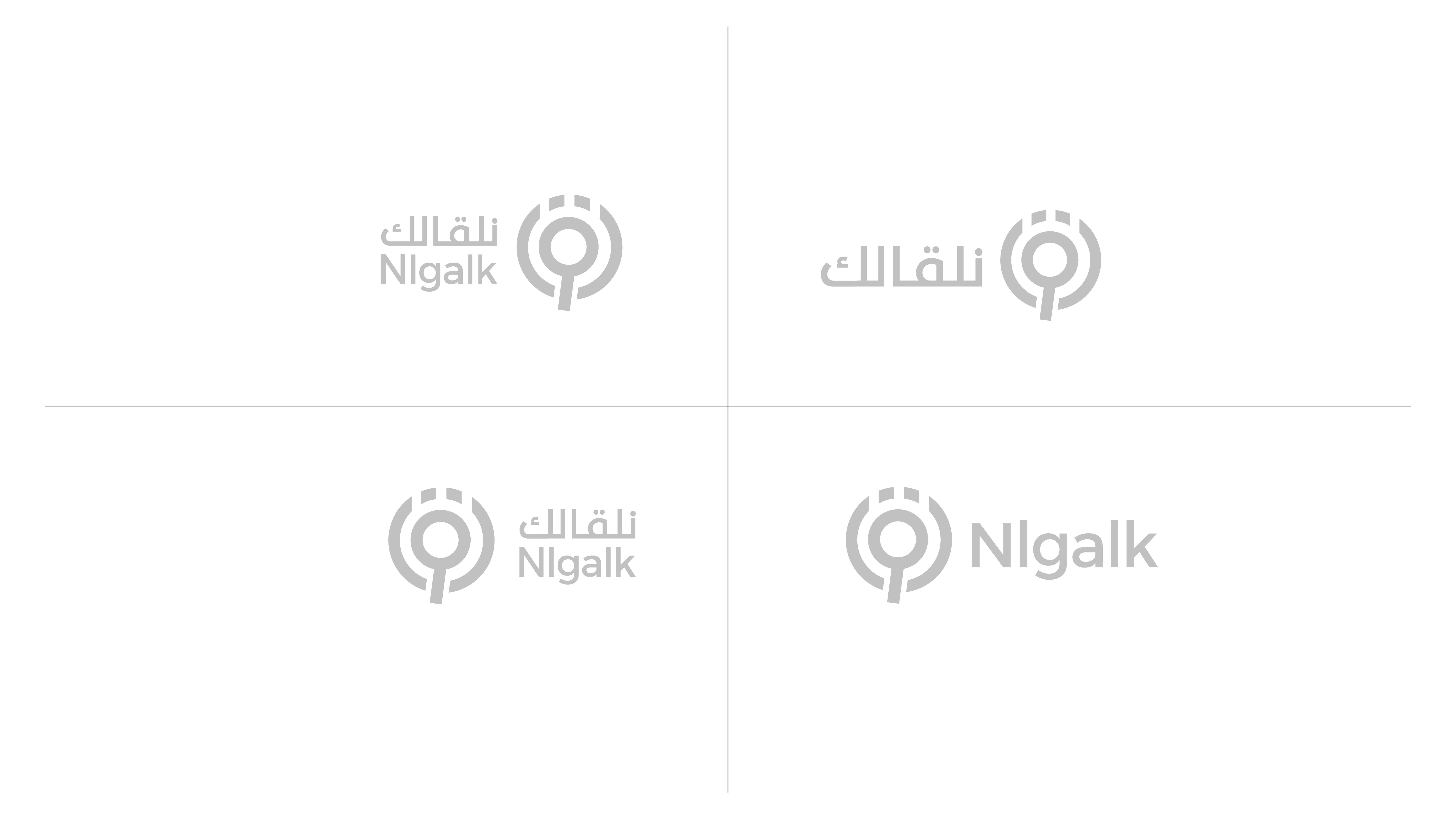
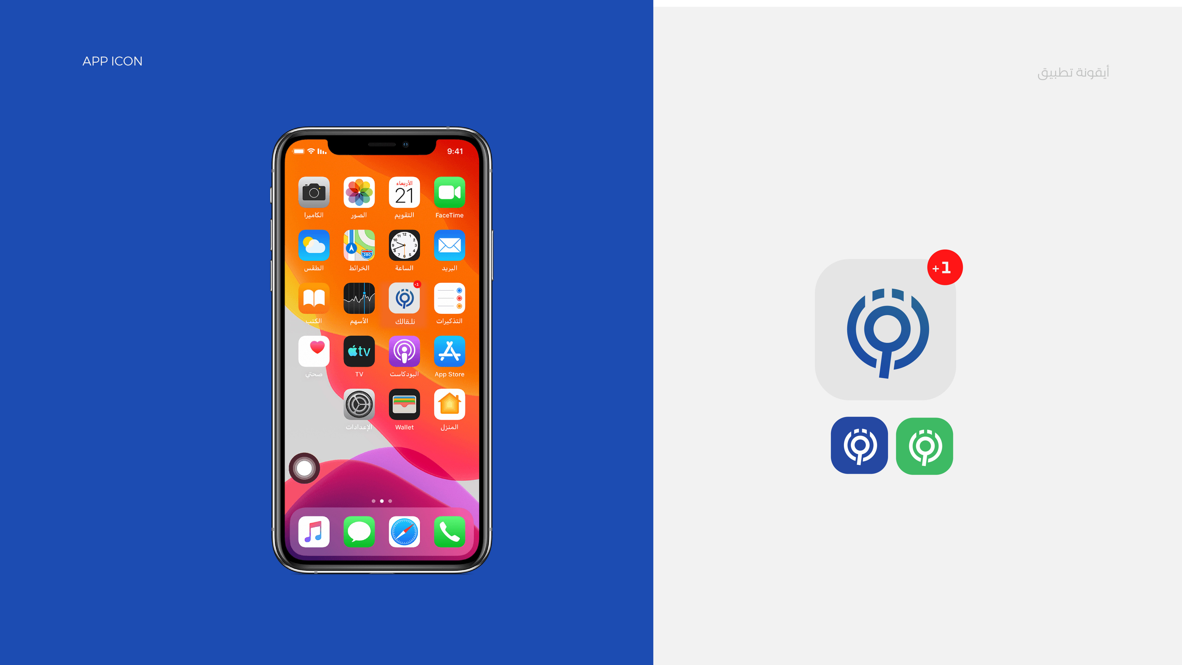
Logo Philosophy: As we know, Nlgalk serves as an intermediary site to search for selected companies. The search tool icon is selected. The name of the letter “g” in English is taken from the letter Qaf “g” in Arabic. The two lines surrounding the search tool indicate protection and caution, the two companies and their connection.
The logo was built on simplicity and ease of remembering by customers in order to maintain and establish it as a reliable and safe brand.
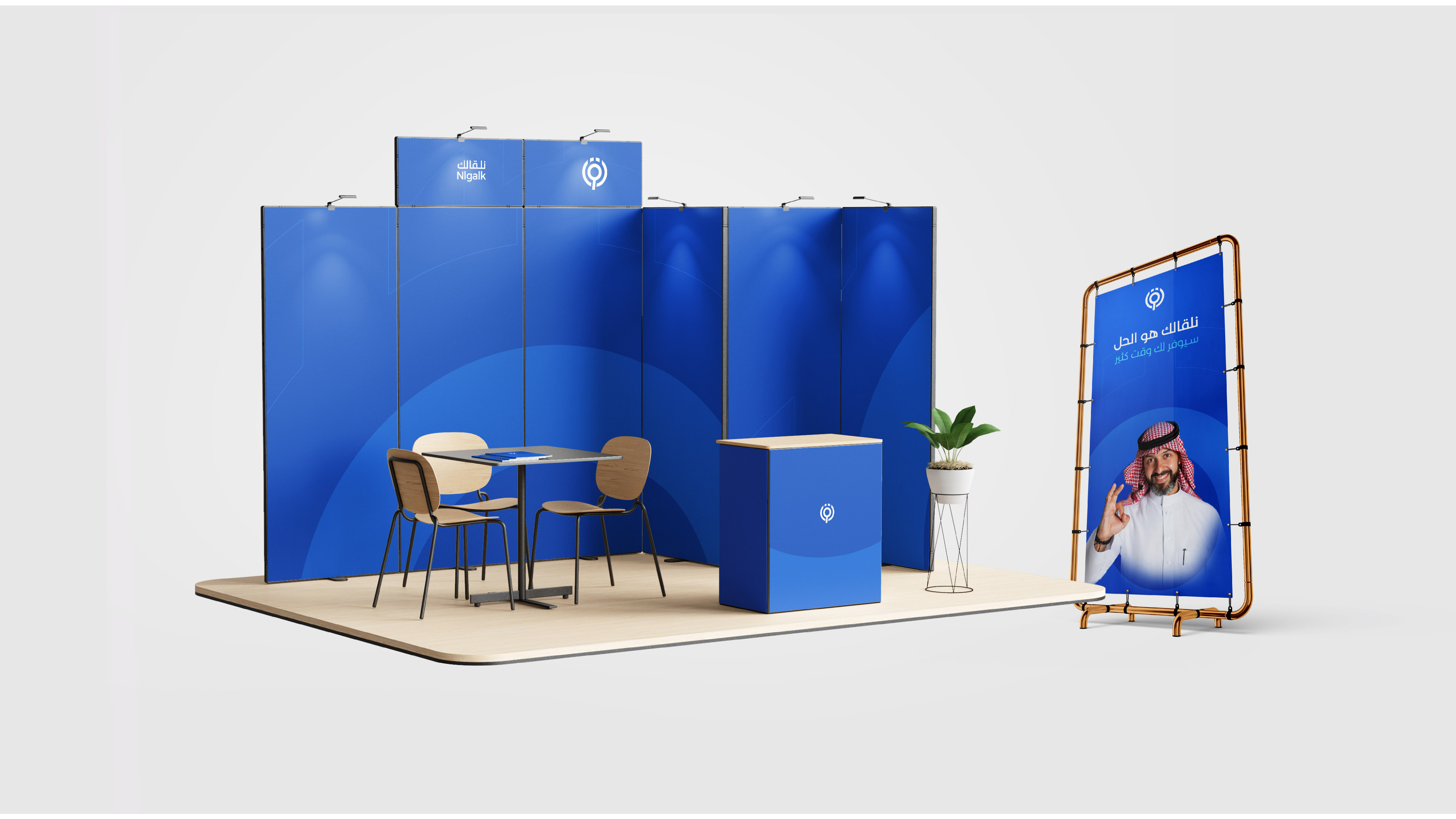
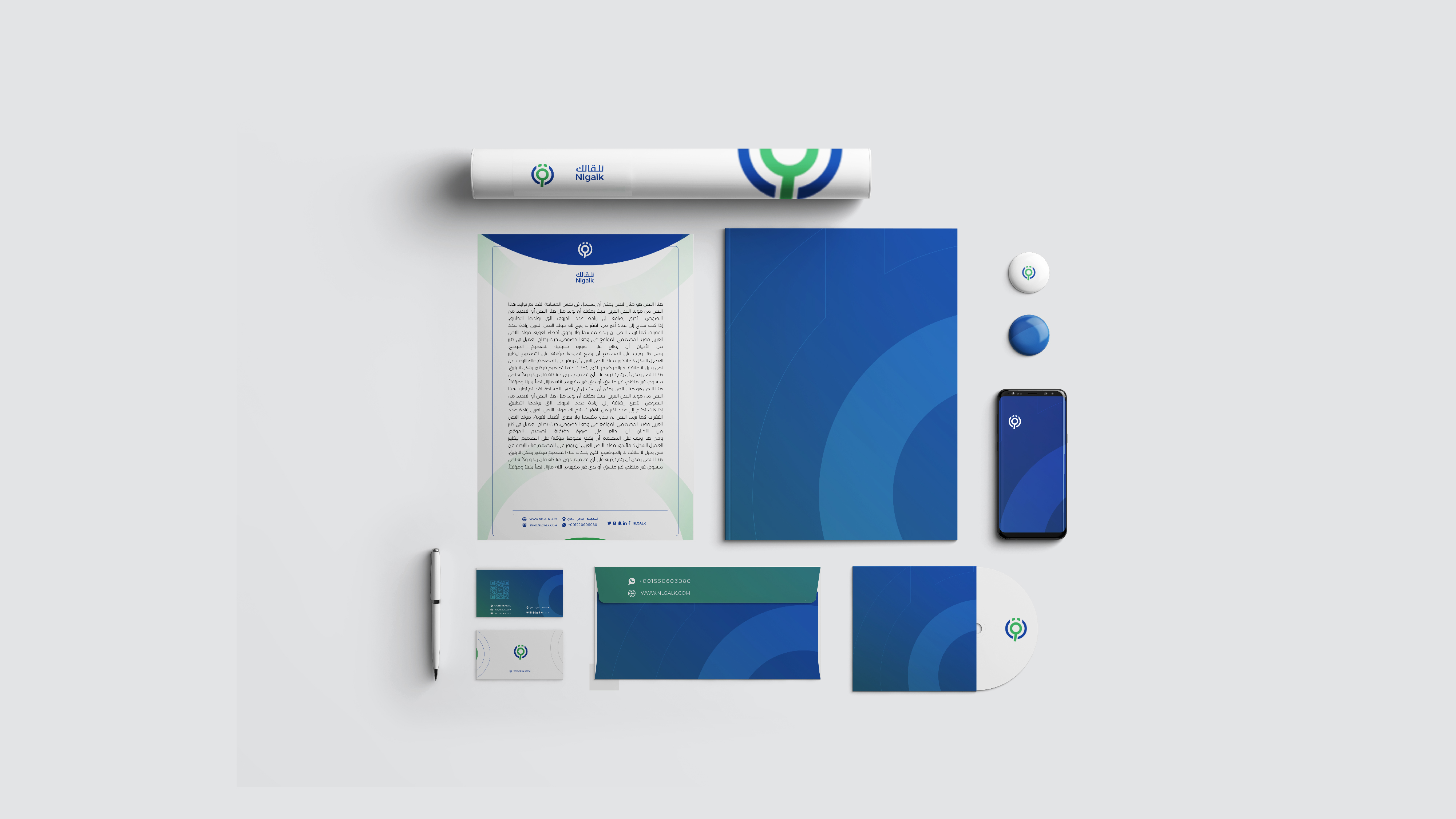
The logo is well designed, precise, specific and symbolizes the business. Logo colour: The colors were carefully chosen.The color blue denotes security and trust, and blue is the main color of a major brand.
CREDIT
- Agency/Creative: Kamel Junaid
- Article Title: Nlgalk Brand Identity
- Organisation/Entity: Agency
- Project Type: Identity
- Project Status: Published
- Agency/Creative Country: Saudi Arabia
- Agency/Creative City: Riyadh
- Market Region: Middle East
- Project Deliverables: Brand Creation, Brand Design
- Industry: Technology
- Keywords: logo , Logos , Brand identity
-
Credits:
Graphic Designer: Kamel Junaid


