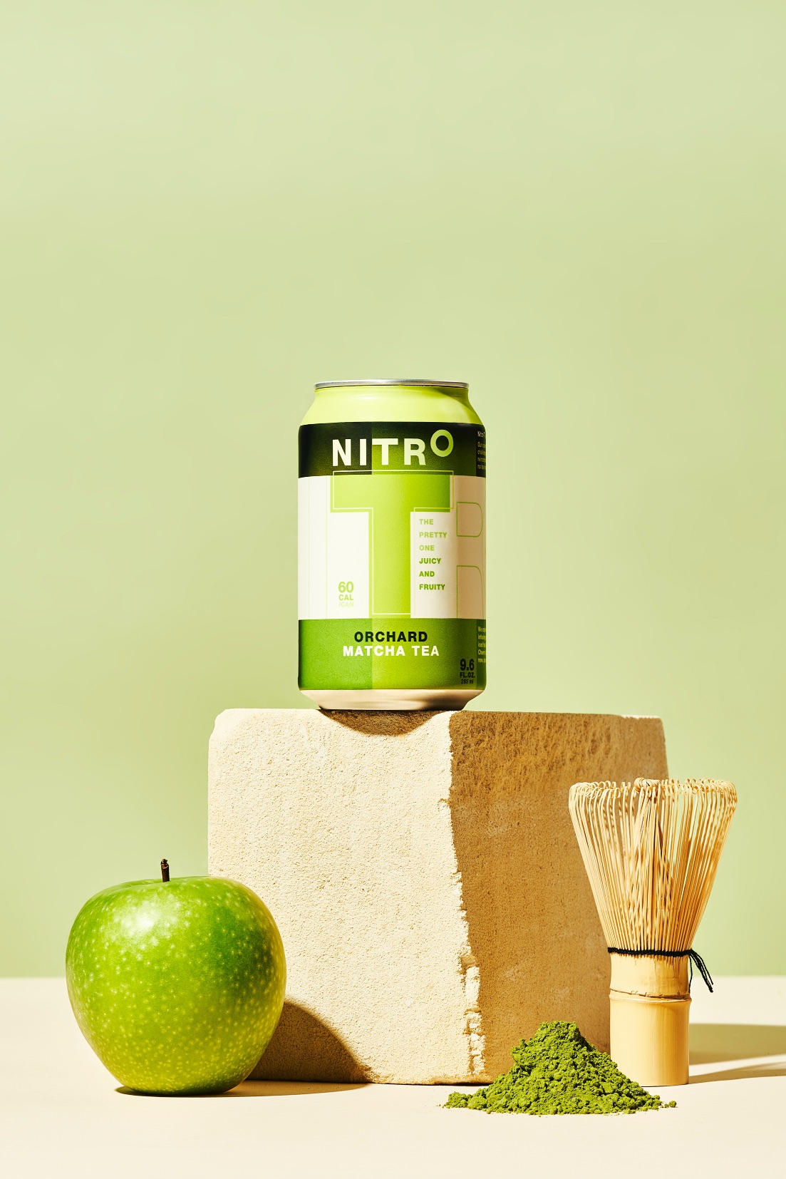
Yamamotoyama (www.yamamotoyama.com), established their tea shop in Tokyo in 1690. Now, the oldest tea company in the world remains family owned and operated, drawing from its rich heritage and vast expertise to provide healthy and deliciously innovative foods. As a new innovation, they developed nitro infused tea. A game changer for the tea category – whereas Nitro coffees have been launched by many.
Modern tea-mastery
How do you marry the old with the new? By never leaving out the heritage of your product. Nitro-T is the brainchild of Yamamotoyama (a more than 300-year-old Japanese family owned tea company) and Stash Tea. Naturally we used all of this expertease. So, a big and loud shout-out to our tea masters, always at the forefront of tea innovation, fair trade farming and new beverage creation.
It still all starts out with a small batch of the finest tea leaves. Naturally brewed in a traditional keg style. During the canning process, we infuse nitrogen into the beverage. This nitrogen is housed in a small device at the bottom of the can, maintaining freshness until the moment you open your can of Nitro-T. That’s what you get when innovation meets heritage.
Brandnew was asked to develop their brand from scratch. Together with the team at Yamamotoyama USA, we developed a brand name, logo, visual identity, pack design, website, tagline and communication style.
Don’t judge a book by its cover
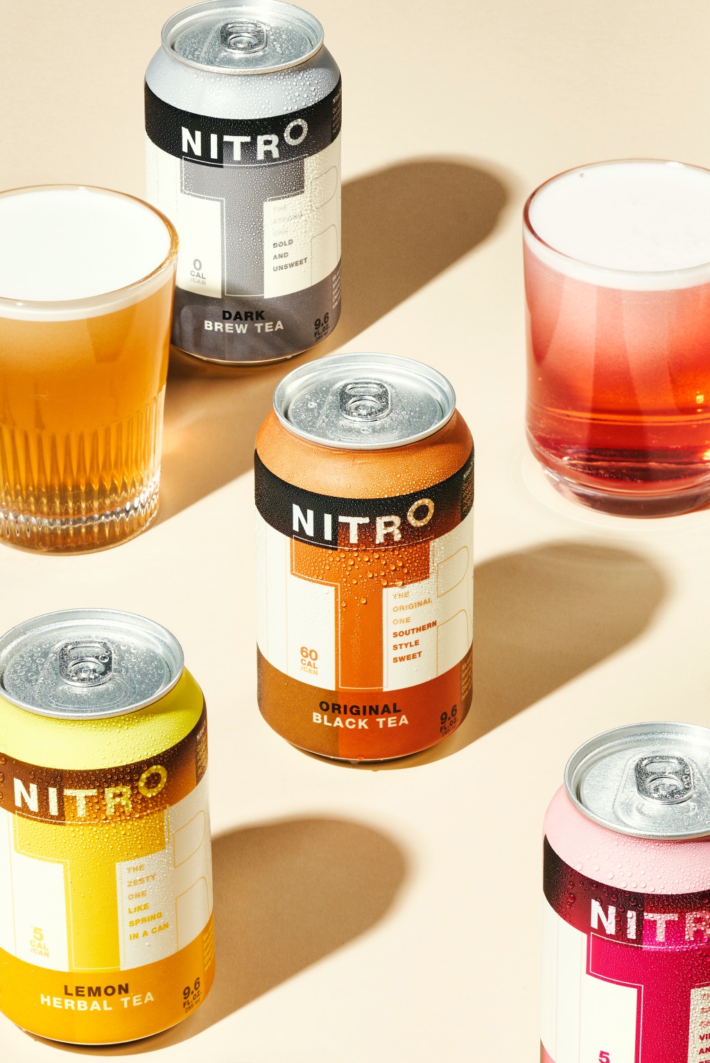
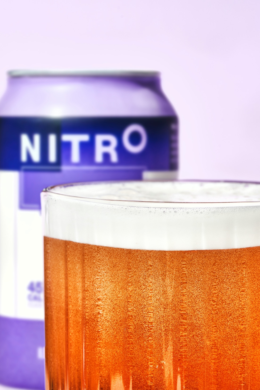
Whatever you’re expecting of an iced tea, it will be nowhere near what you’re going to experience. By infusing our meticulously picked flavors of iced tea with nitrogen, it creates millions of tiny bubbles that rise to the top of your drink creating a thick, creamy foam. A new, invigorating and exciting taste and mouthfeel, incomparable to anything you’ve ever tasted.
We started with tasting the actual product, and immediately got blown away by it. We started developing the underlying Brand Strategy, circling around the Brand Spririt: What the froth?
Bold, daring, cheeky and most of all unexpected!
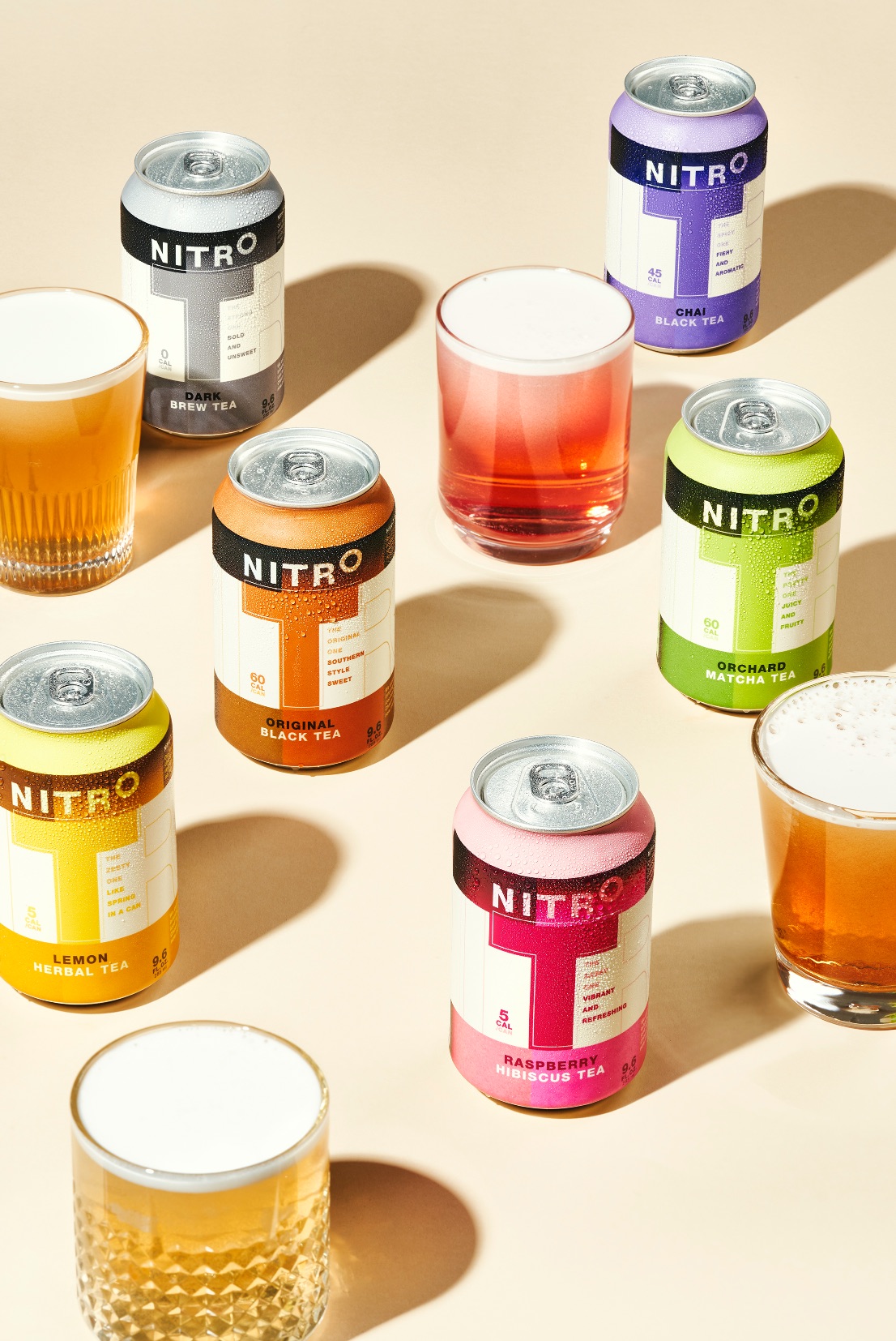
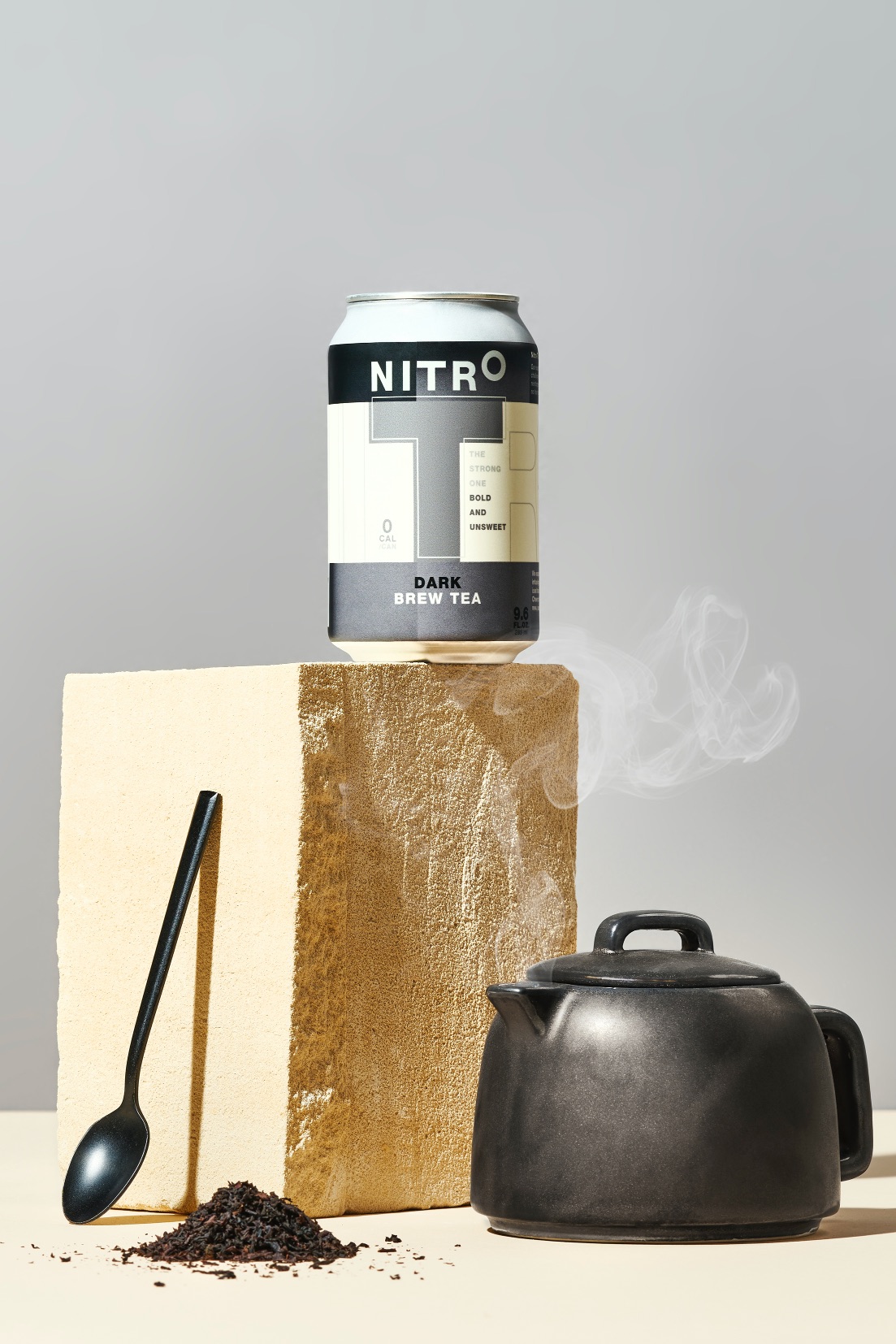
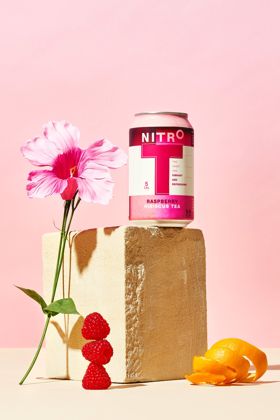
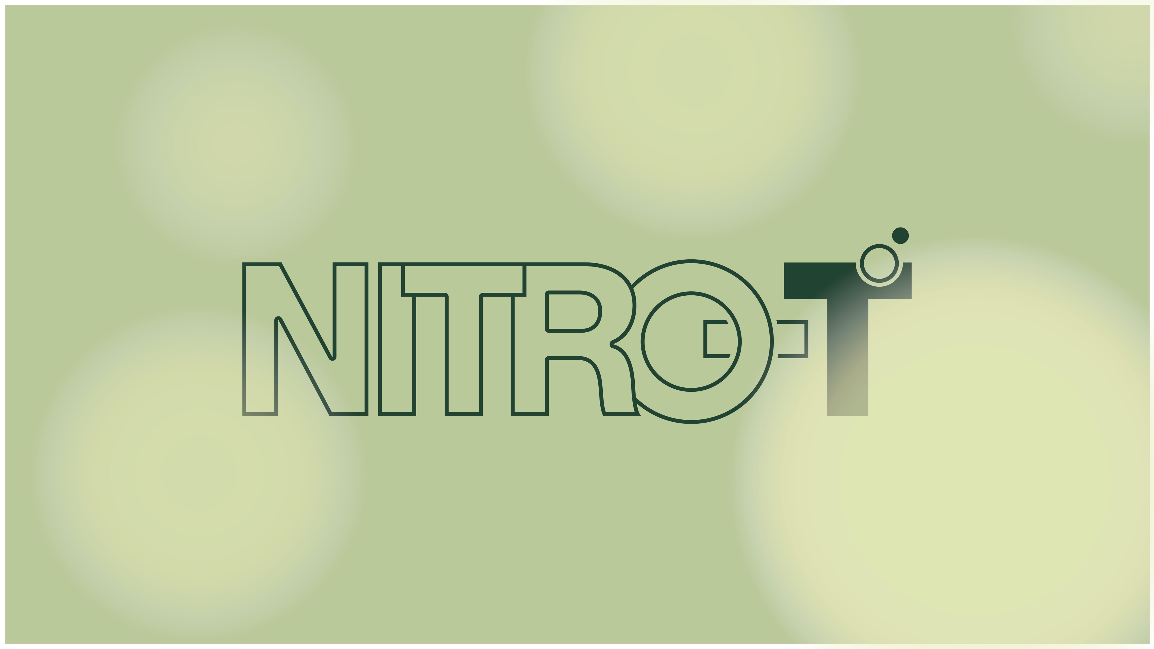
The Brand Name Nitro-T, was developed as a clear product offer to the consumer, meanwhile claiming the category. The stand-alone Brand Logo has a transparant quality adapting itself to the bold colourful world of the brand. The little bubbles at the T mark the nitrogen effect. The logo on pack has an elevated ‘o’ to refer to the nitrogen temperature. By using a bold logo in combination with the vivid flavors, we created a unique shelf appearance and a memorable design for our consumers. Each pack has a sassy flavor description fitting the brand’s tone of voice. The visual style developed for web and social reflects the tranquility and quality of the product, a unique experience and a true me-moment. Detailed, intense, meaningful and enjoyable. The tagline (and Brand Spirit) ‘What the froth?’ reflects what this drink does for your taste buds. Expect the unexpected. Experiencing a creamy froth on top of a refreshing iced tea.
Nitro-T has been launched throughout California in 2021 and is expected the reach nation wide distribution in 2022.
CREDIT
- Agency/Creative: Brandnew
- Article Title: Nitro-T Packaging Design by Brandnew
- Organisation/Entity: Agency
- Project Type: Packaging
- Project Status: Published
- Agency/Creative Country: Netherlands
- Agency/Creative City: Amsterdam
- Market Region: Global
- Project Deliverables: Packaging Design
- Format: Can
- Substrate: Metal
- Industry: Food/Beverage
- Keywords: WBDS Agency Design Awards 2021/22
-
Credits:
Creative Director: Arthur van Hamersveld
Senior Designer: Malu de Goede
Art Director: Jantine Knijnenburg
Strategy Director: Willemijn van Herwijnen
Brand Director: Robert Kuiper


