


Evoking diversity and multiculturalism in a cultural institution’s identity
About the project:
Nima is a museum and cultural platform devoted to popularizing the art of peoples and countries across disciplines and time. To highlight Nima and the important work they do as an emerging cultural institution, we created a striking identity that evokes diversity and multiculturalism.
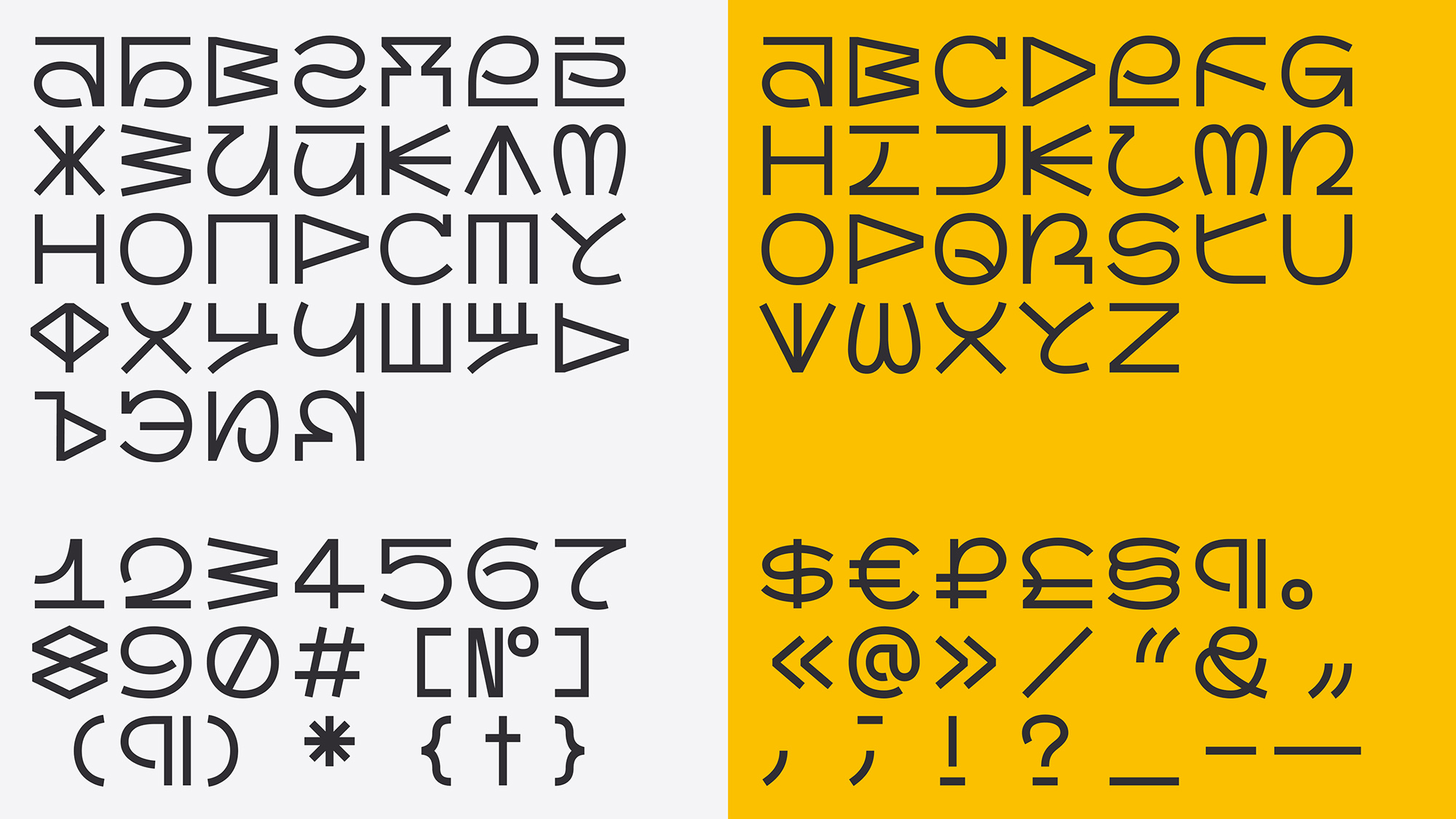
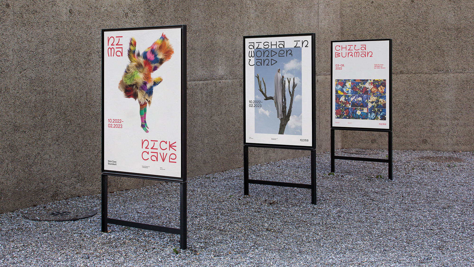
For Nima’s identity, we designed a custom typeface of the same name. Nima’s projects focus on non-Eurocentric art, so we decided to base the characters on the world’s writing systems, merging the west’s Latin script, the north’s runic alphabet, the east’s hieroglyphs, and the south’s Oceanic glyphs.
By closely examining these scripts and fusing their unique visual traits, we aimed to produce a system that functions as a whole. Because of this complexity, the font appears ornate, eclectic, almost pictographic.
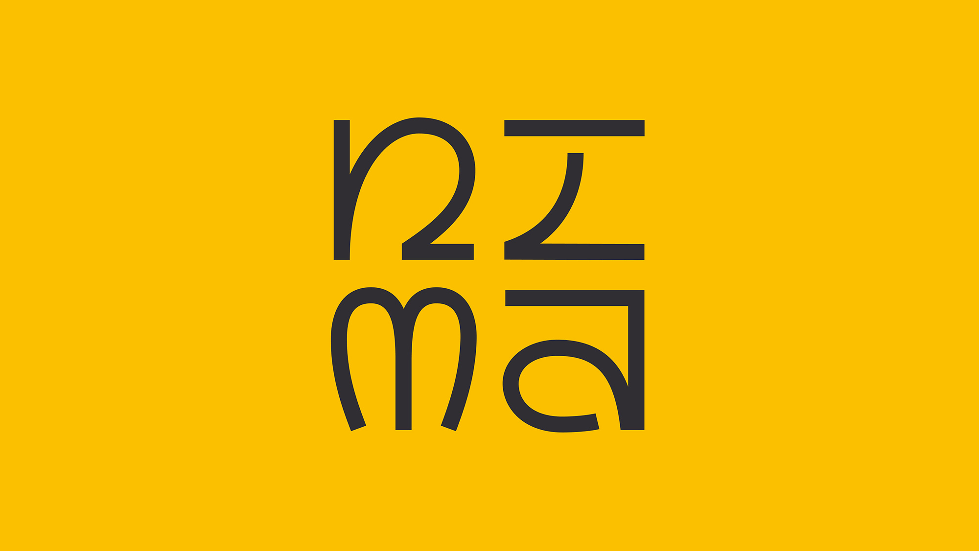
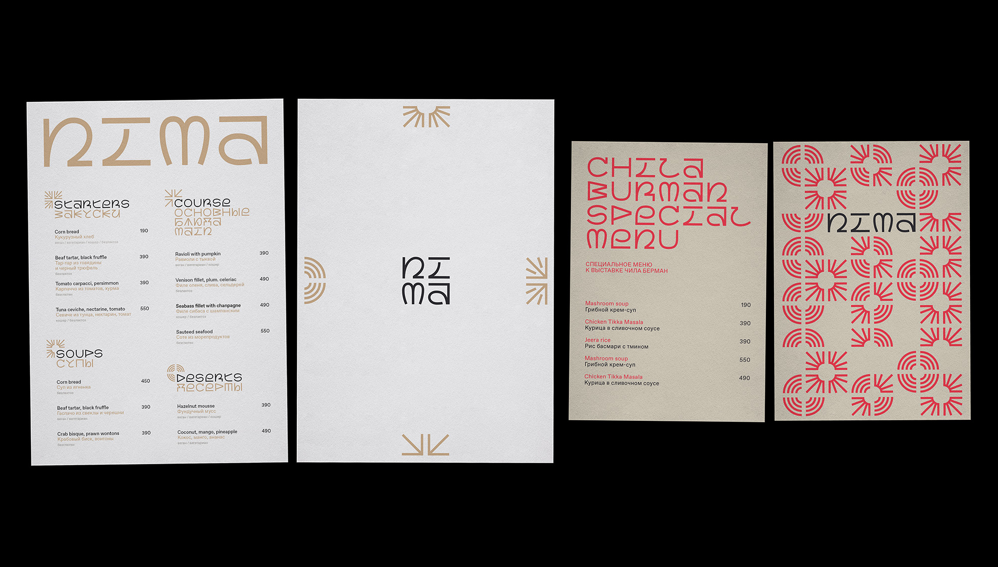
Nima, which means “sun” in Tibetan, represents the institution’s mission to shed light on long-hidden and marginalized cultural phenomena. To emphasize this idea, we used solar symbols from various cultures in the identity. We adapted these graphic elements to match the font and fit the grid.
The system:
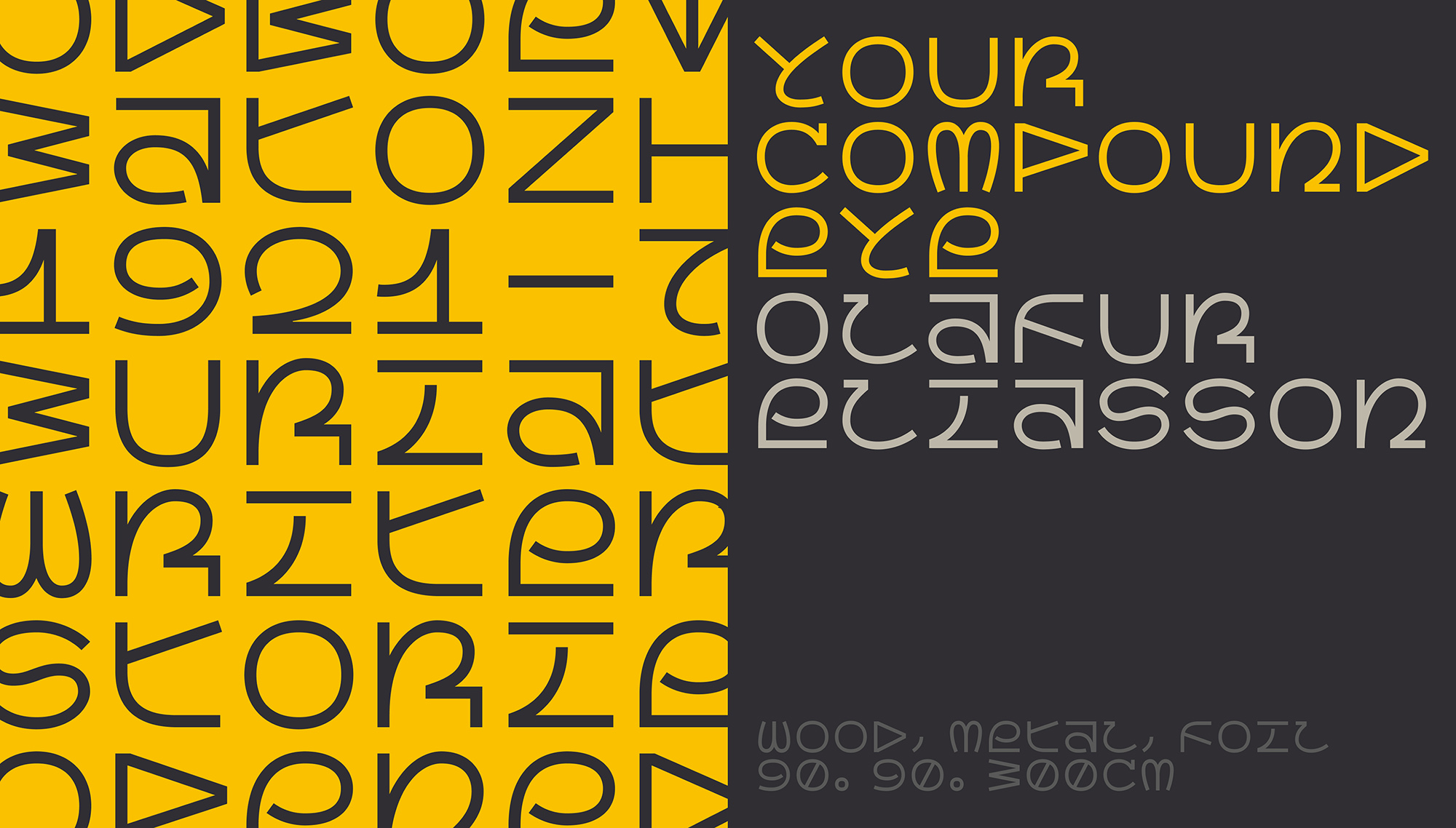
We decided to use a monospaced font in tandem with a grid: the characters are square, and all media layouts are built on a square grid. This rule prompted creative solutions to make even outline elements (in letters like Й, Ё, Д, Ц, Q) fit in.
The idea of using a grid came from the museum’s emphasis on the diversity of cultural output. This clear, modular structure helps unify all the diverse elements. The font itself supports the concept of diversity by including alternate versions of characters that can be freely mixed.
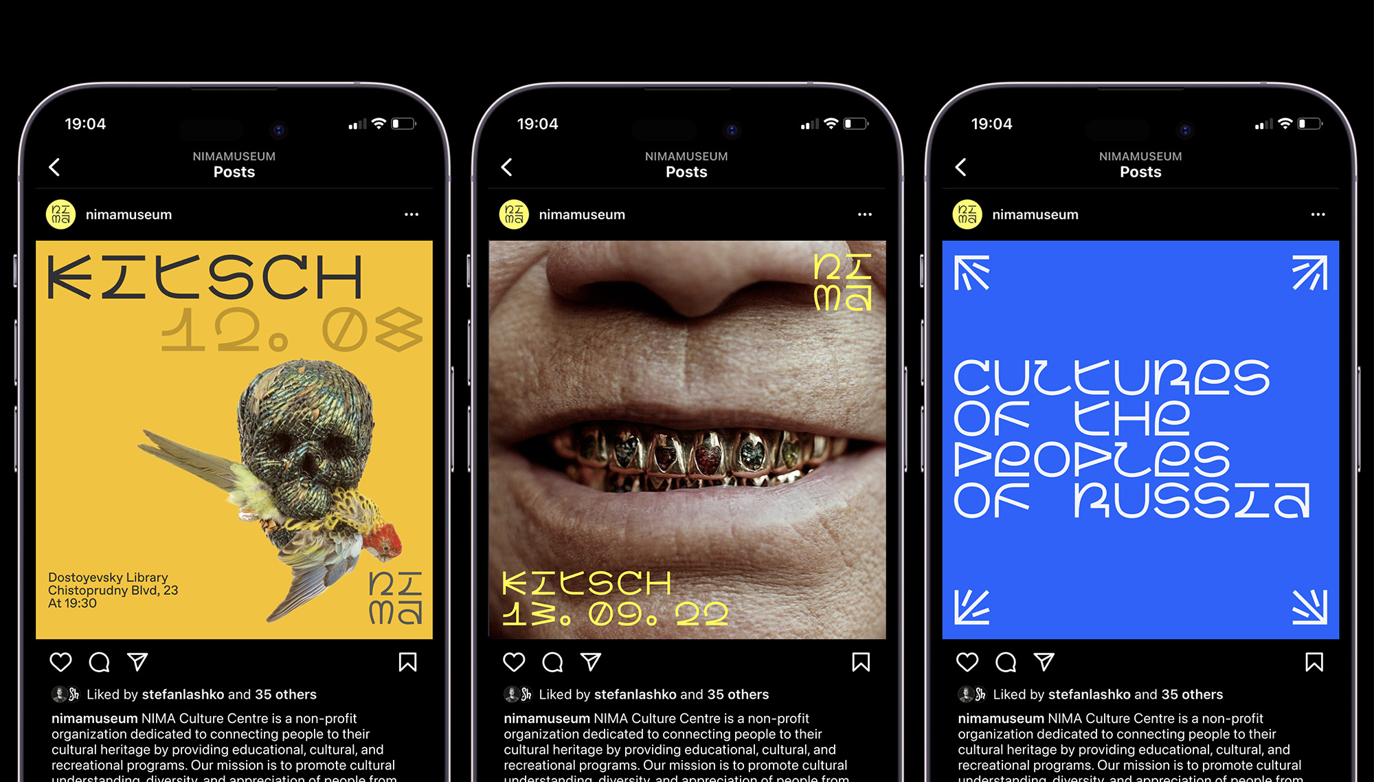
The NIMA font is so expressive, it becomes the primary graphic language for the museum. As a result, rather than creating a new logo, we chose to type it out using the NIMA font.
CREDIT
- Agency/Creative: ESH gruppa
- Article Title: Nima Cultural Institution’s Identity
- Organisation/Entity: Agency
- Project Type: Identity
- Project Status: Published
- Agency/Creative Country: Georgia
- Agency/Creative City: Tbilisi
- Market Region: Europe
- Project Deliverables: Animation, Brand Identity, Logo Design, Poster Design
- Industry: Education
- Keywords: #brandidentity #visualidentity #typedesign #typeface #graphicdesign #graphicdesignstudio #typography #museumdesign #eshgruppa
-
Credits:
Art Direction: Phillip Tretyakov
Design: Anastasia Lipyagovskaya
Typeface design: Ekaterina Daugel-Dauge


