


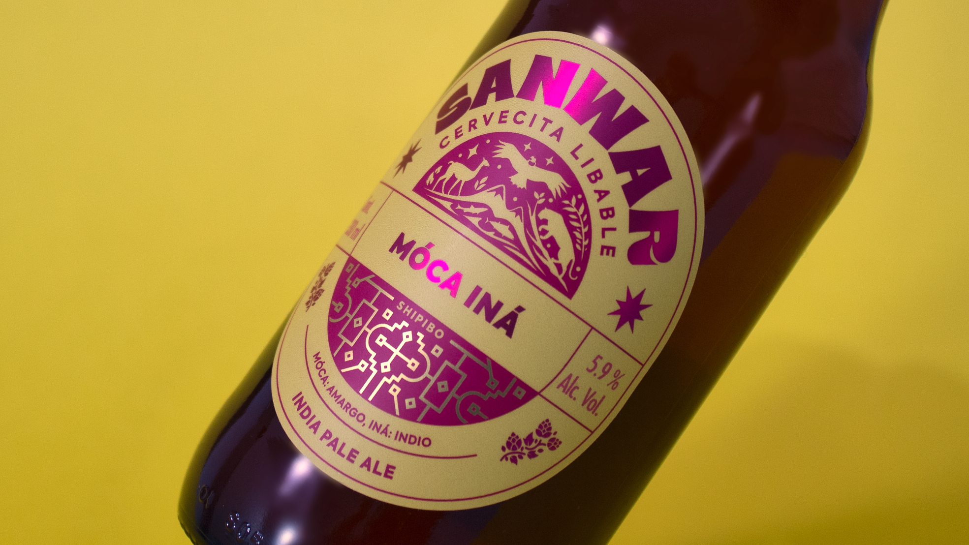
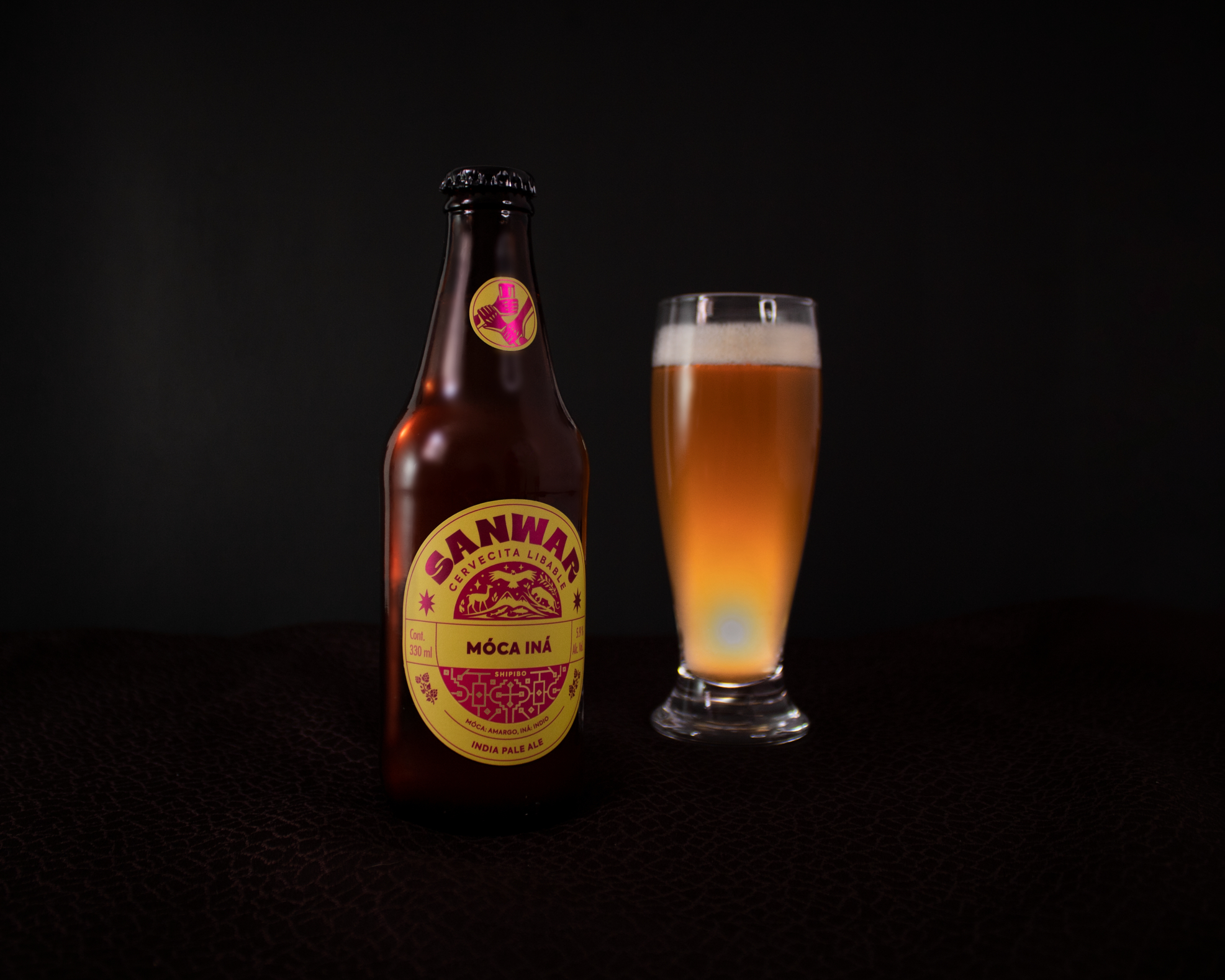
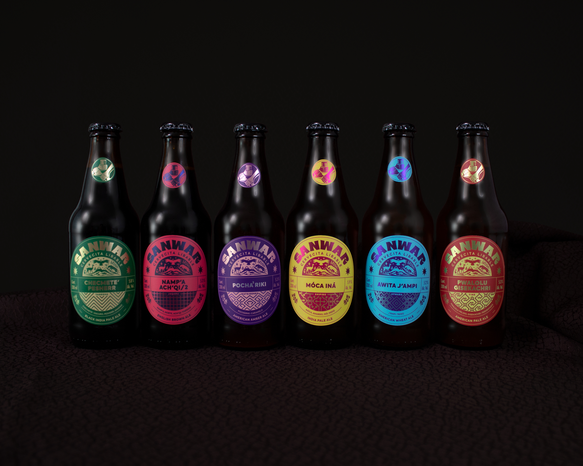
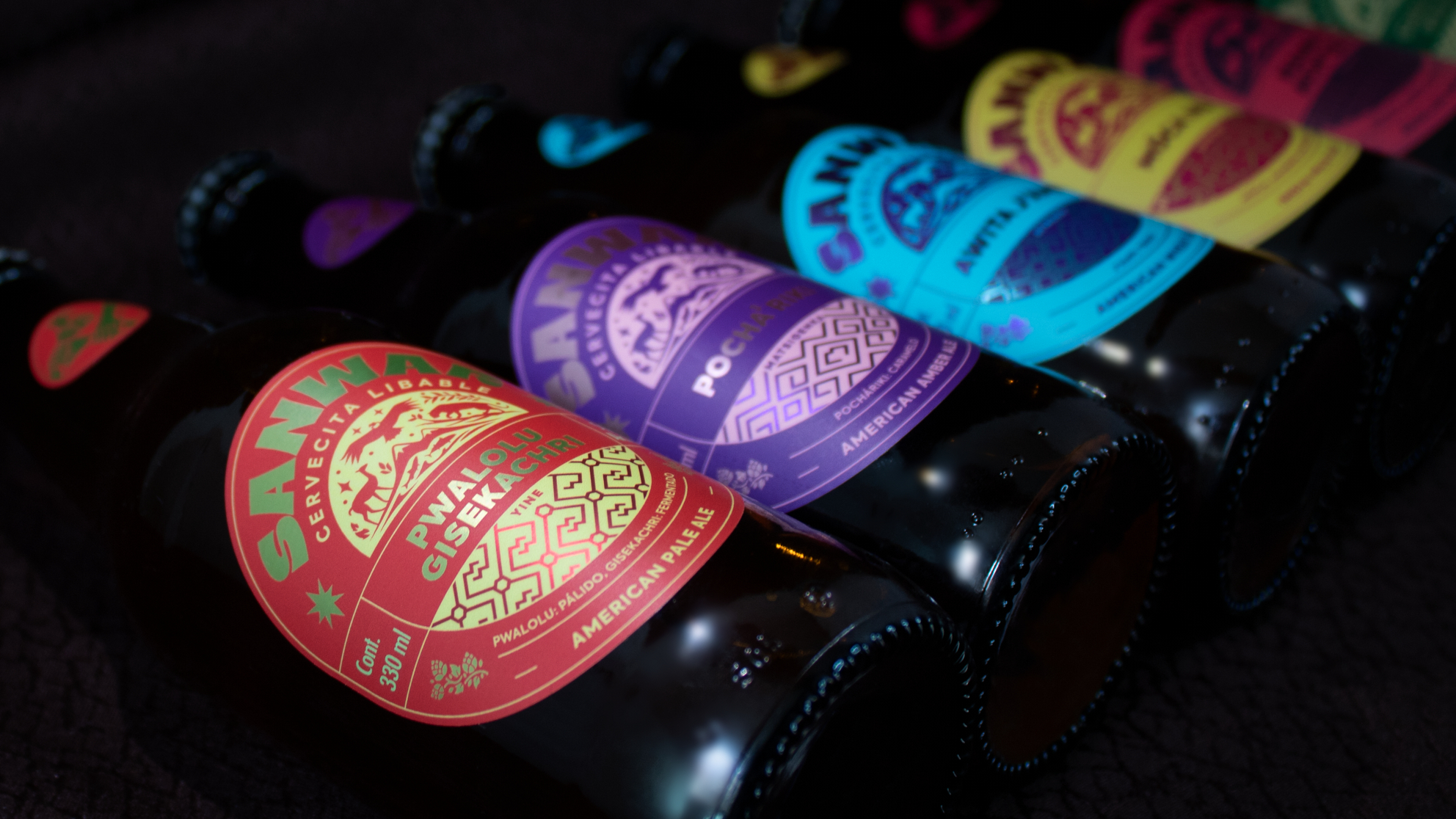
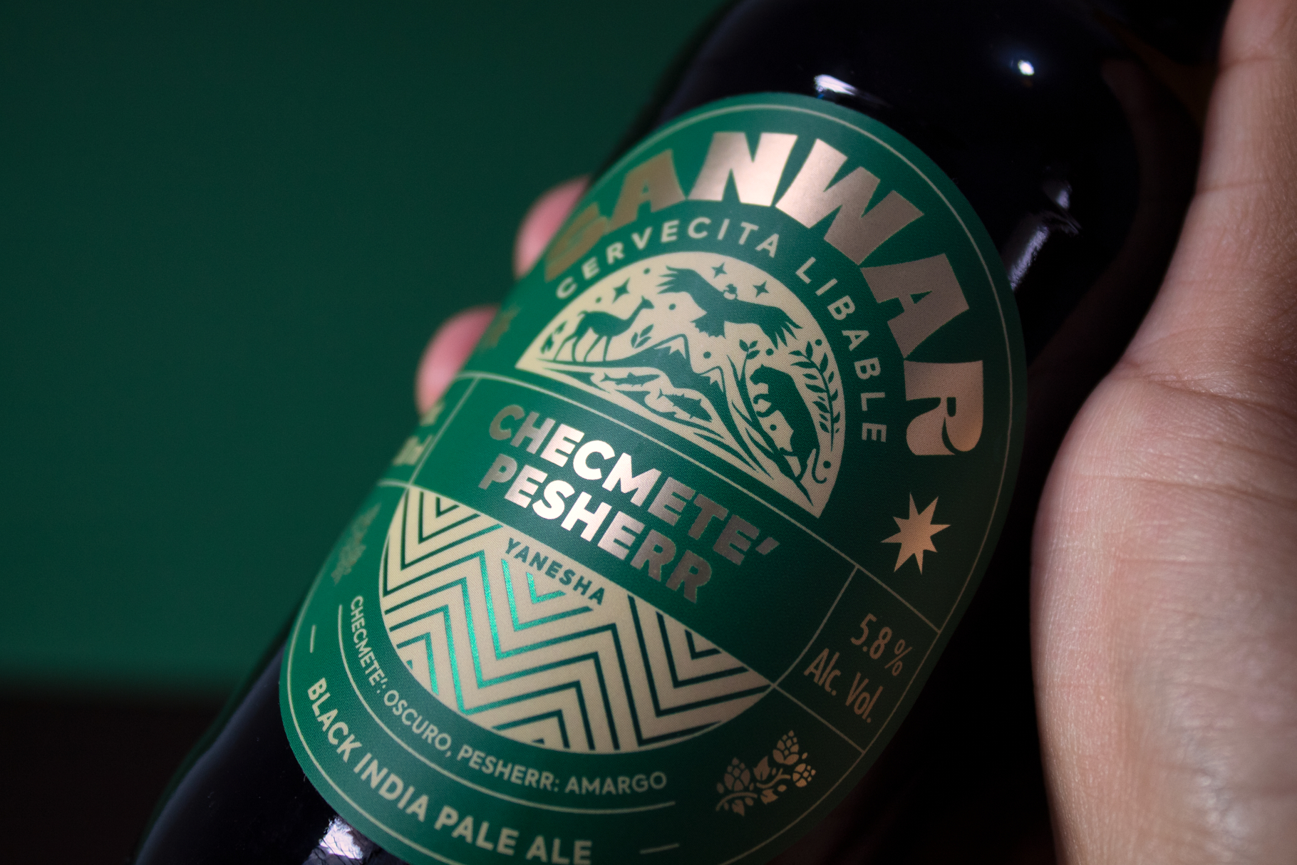
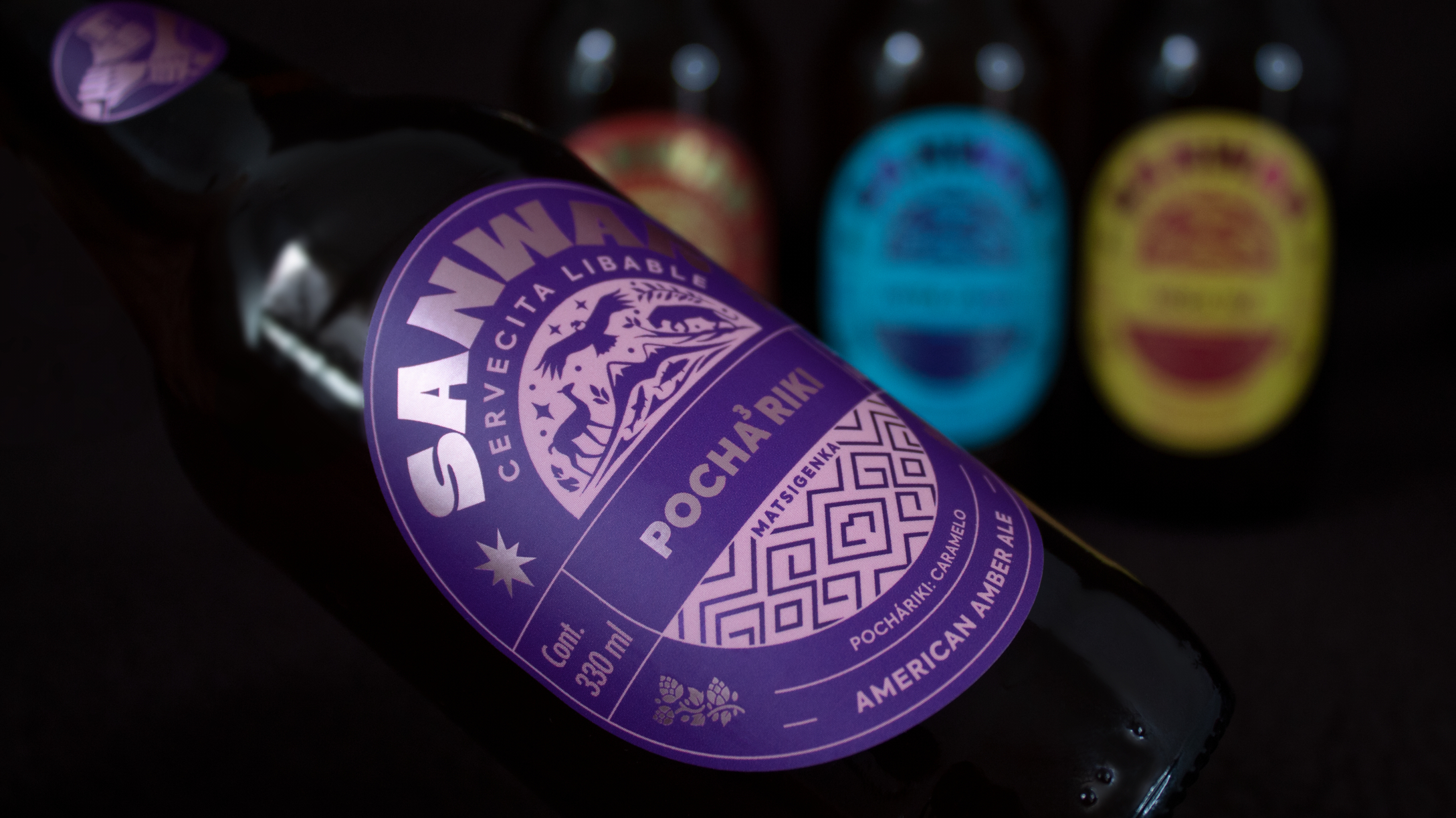
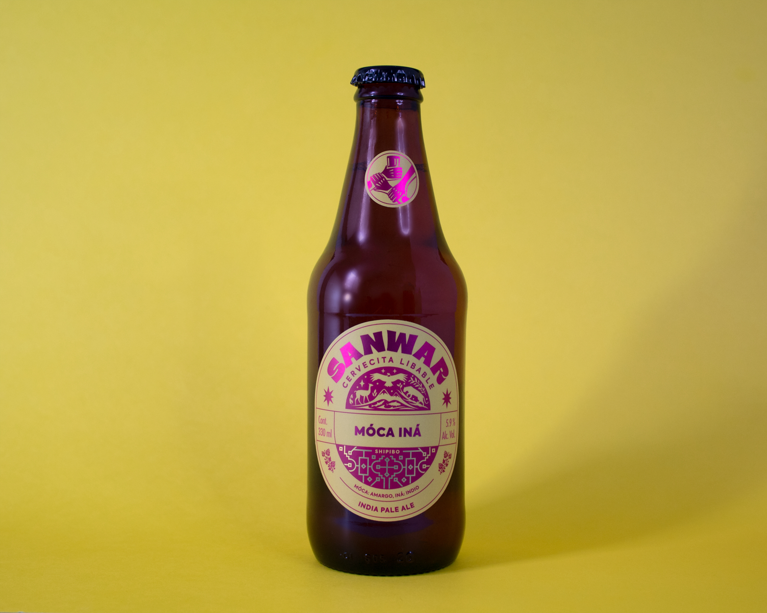
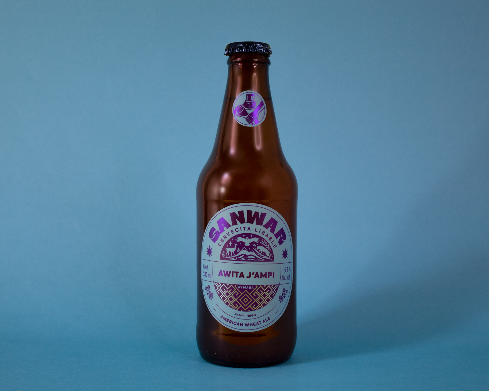
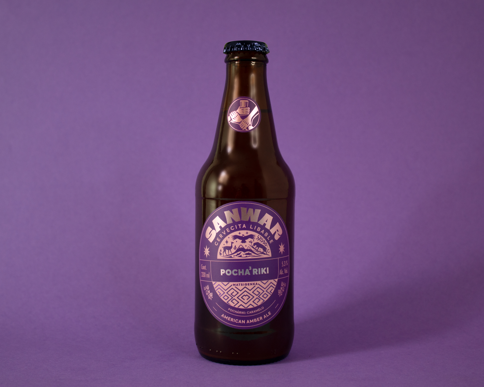
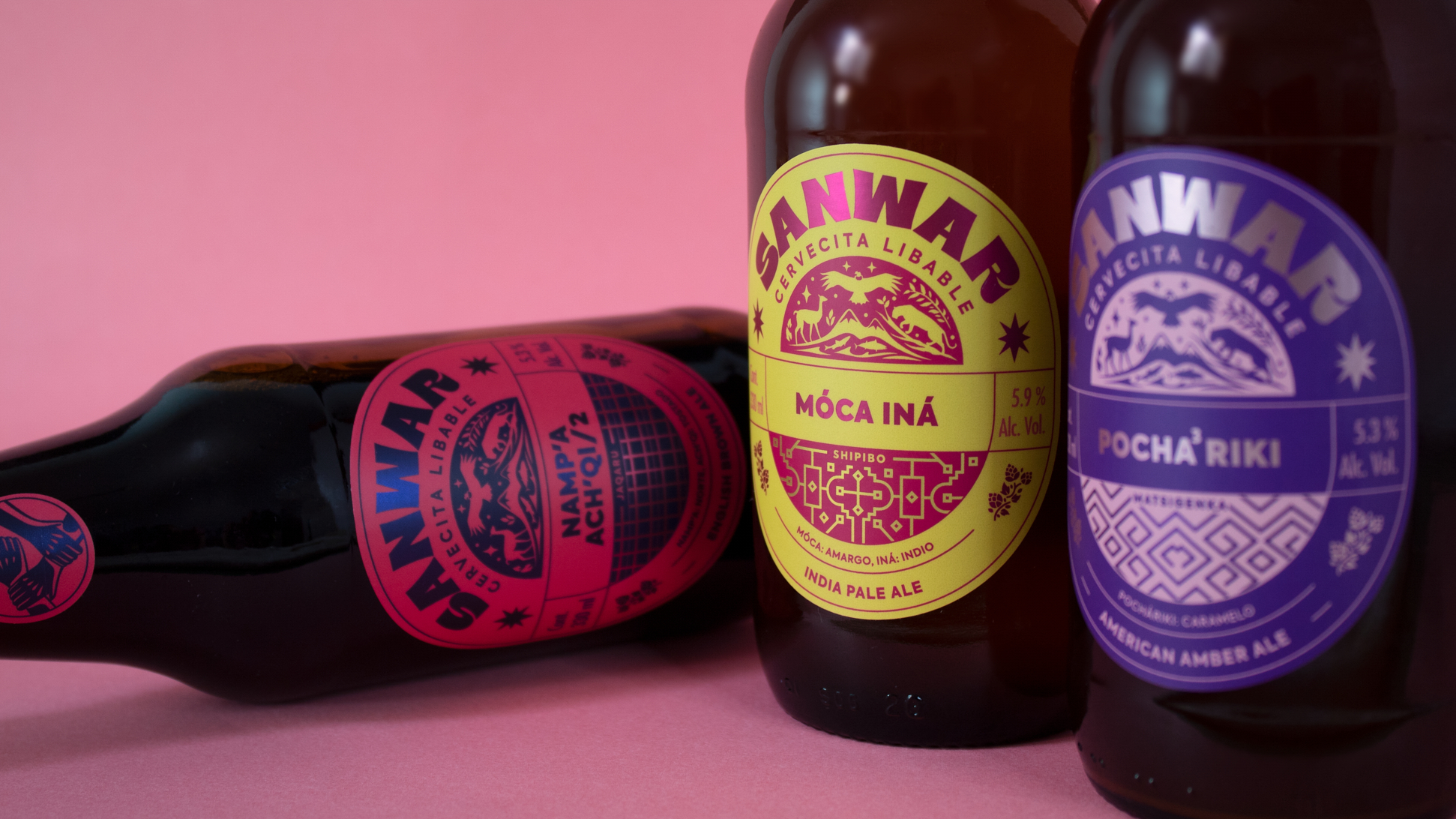
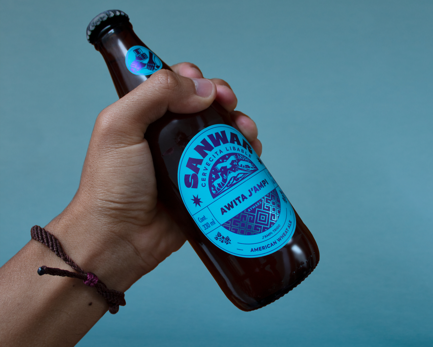
SANWAR is the union of the word “sangre” (blood) in Spanish and Quechua: san (sangre) + war (yawar). This word that is born from that fusion represents the mixing and unification of different cultures / roots that define us as people and society. In addition, blood symbolizes the essence of each individual, that despite being different from each other, when it comes to sharing moments of various kinds, these differences are lost and in some way we are all the same.
We also transfer this diversity, conceptually to the nature of beer, since its production depends on different factors linked to the combination of four basic ingredients, but capable of providing different characteristics to achieve a unique sensory result.
The objective was to create a graphic identity that represents in an efficient and unified way the concept of cultural diversity, since each presentation of the beers will be represented by a native language of a particular peruvian culture.
CREDIT
- Agency/Creative: Nicolás Pérez
- Article Title: Nicolás Pérez Creates Brand and Packaging Design for Sanwar
- Organisation/Entity: Freelance, Published Commercial Design
- Project Type: Packaging
- Agency/Creative Country: Peru
- Market Region: South America
- Project Deliverables: Brand Architecture, Brand Identity, Branding, Identity System, Illustration, Packaging Design, Research
- Format: Bottle, Tag
- Substrate: Glass Bottle


