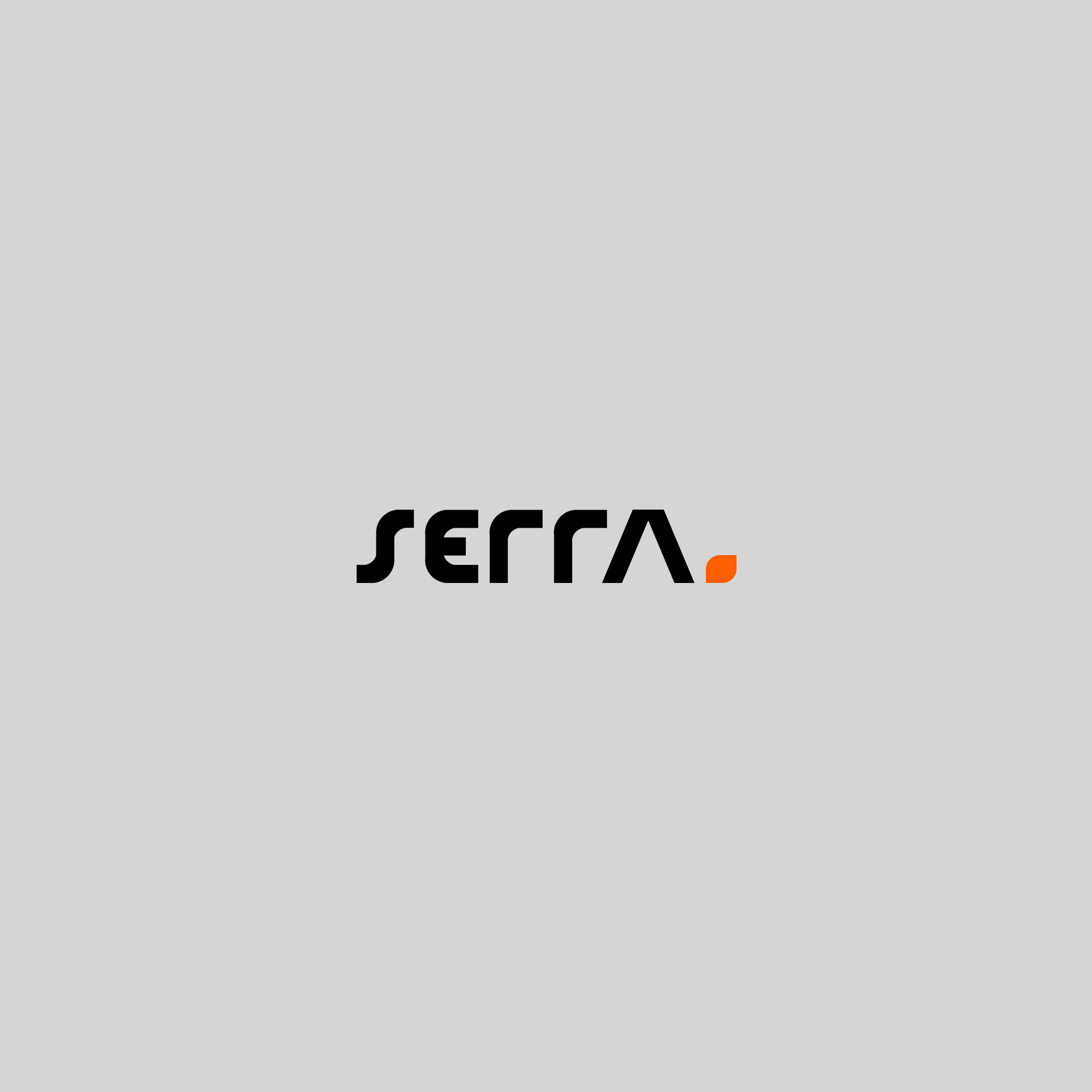
Serra is a construction company dedicated to high-end residential and corporate works, with the objective of promoting improved quality of life and the corporate environment through customized, technological, innovative and intelligent constructions.
Its goal is to expand the company and carry out corporate projects throughout Brazil and become the largest builder of high-end residential homes in 3 years.
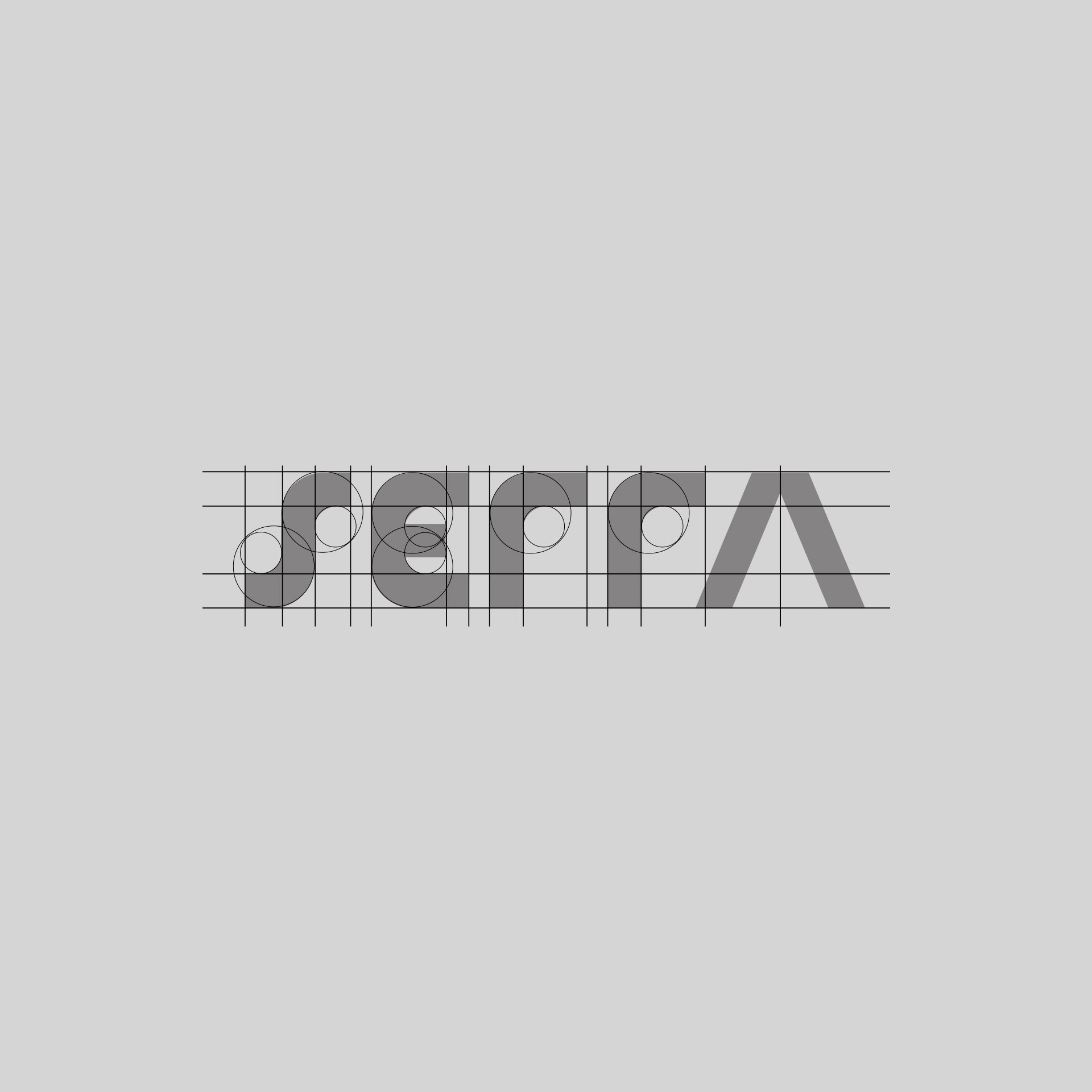
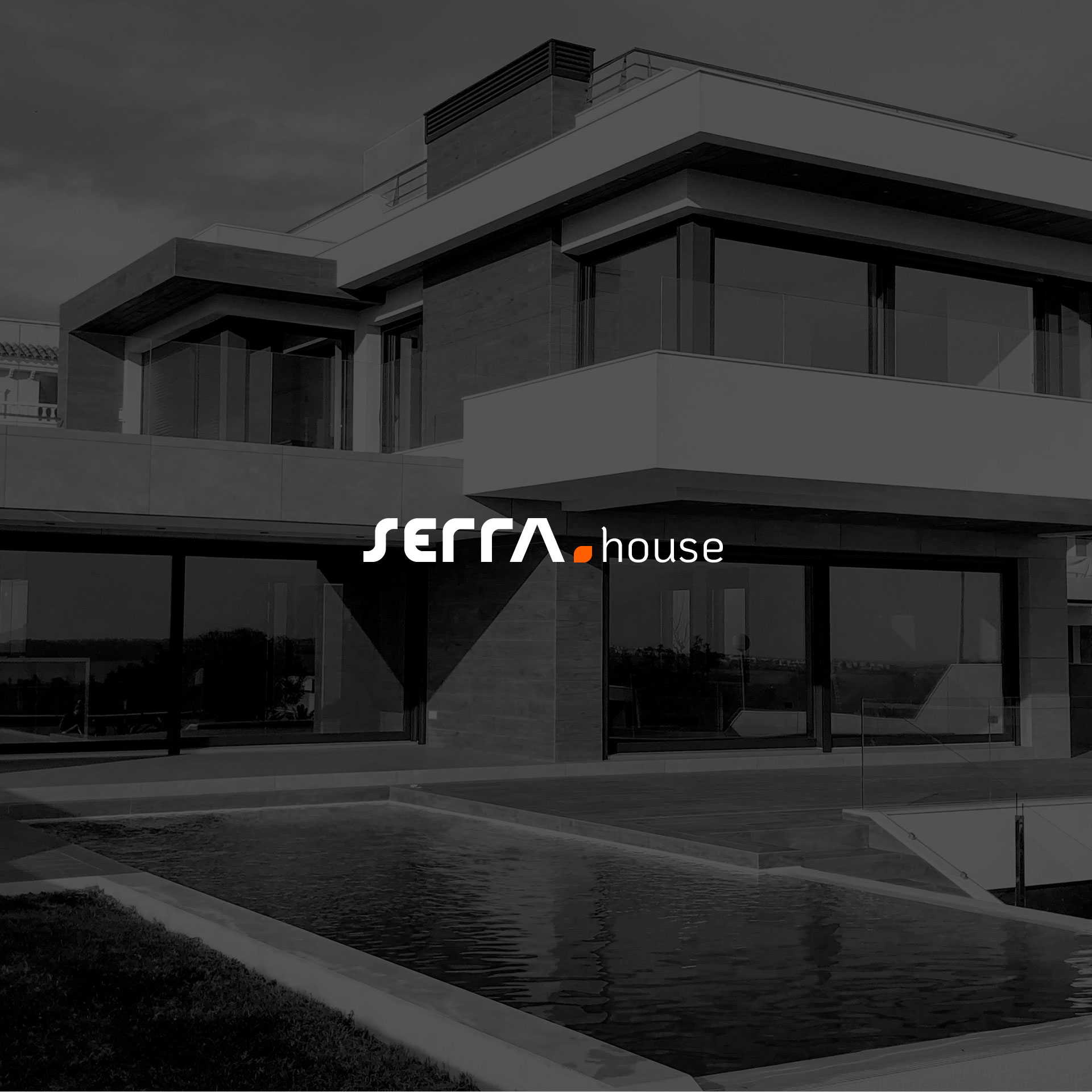
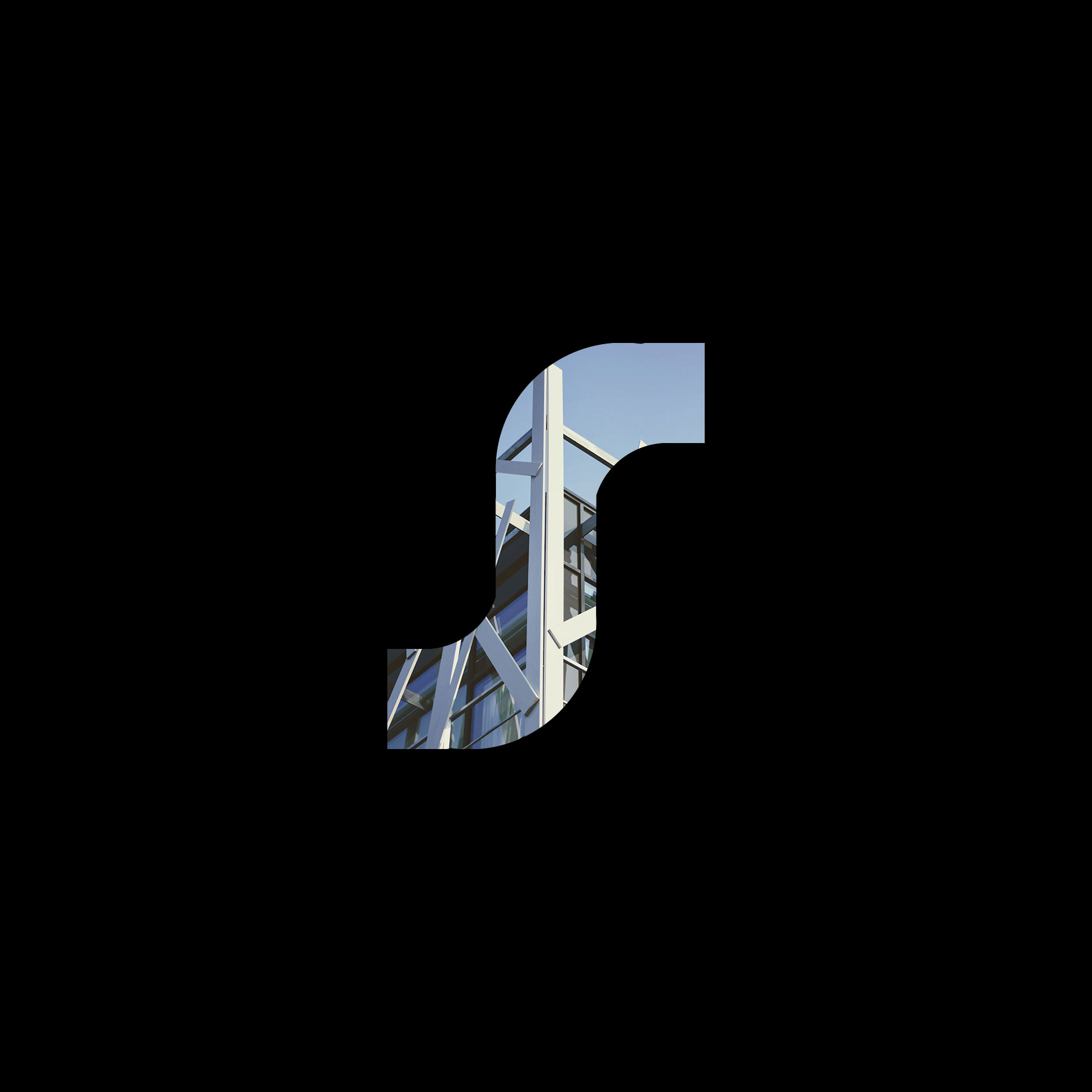
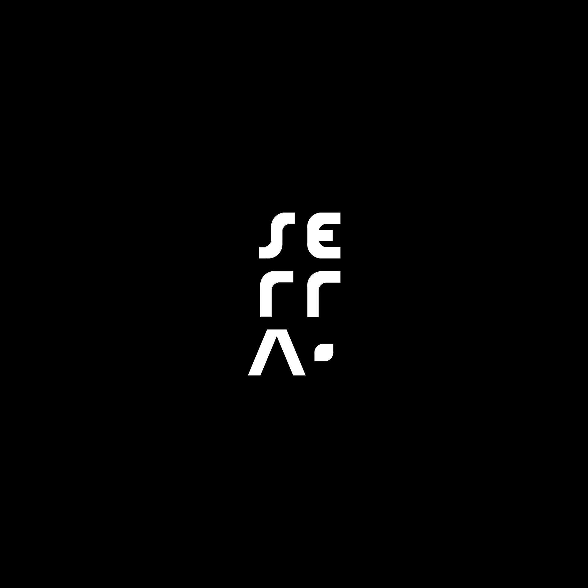
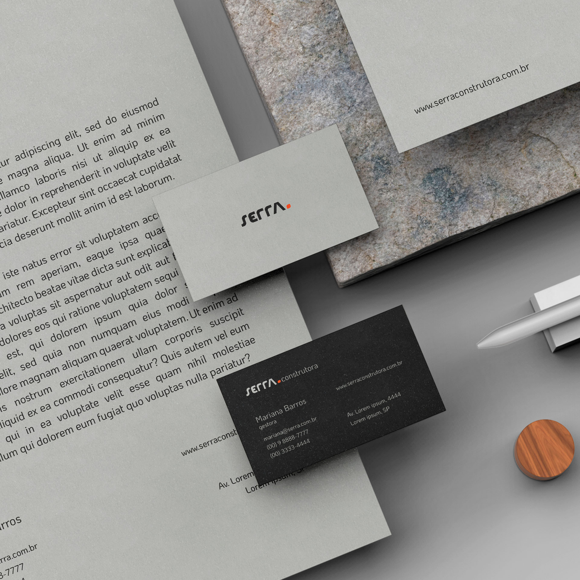
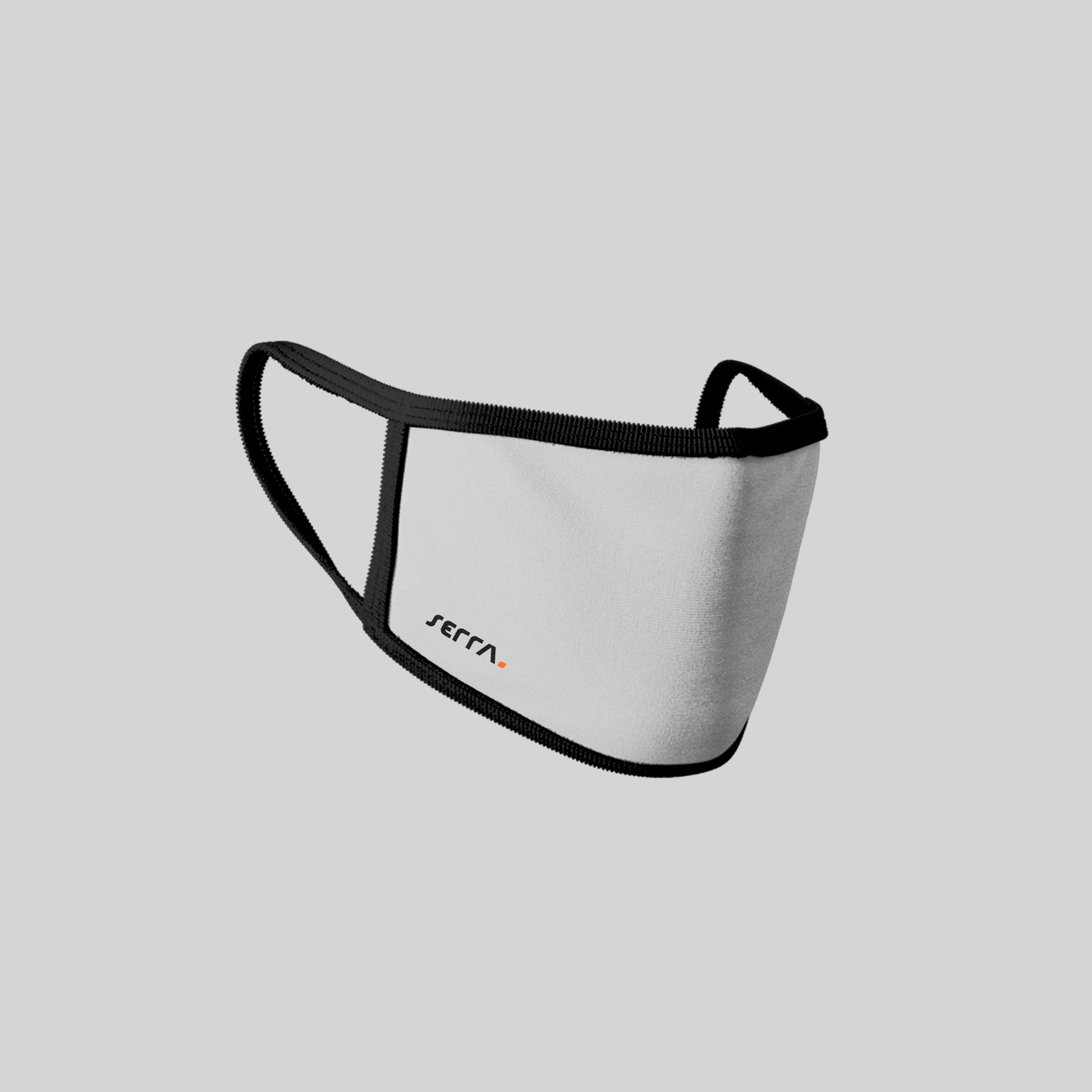
The brand was created seeking to convey the right feelings to the target audience, all the security and professionalism that the area requires, in addition to high sophistication and modernity, which by its look already conveys that it is a technological, capable and modern company, which intends to work in the forefront of the construction market. The font is the main element of the brand, it was originally created for the company following geometric values, which conveys comfort and security in the look.
Using a more subtle style with personality, a very sophisticated style that brings a “premium” and “upscale” look. Less literal letters and with less accentuated curvatures but which still preserve an easy reading of the word. In addition to all the originality that the identity carries along with a handmade typography. The colours were thought within the adjectives “sophisticated”, “premium”, “elegant” and “modern”.
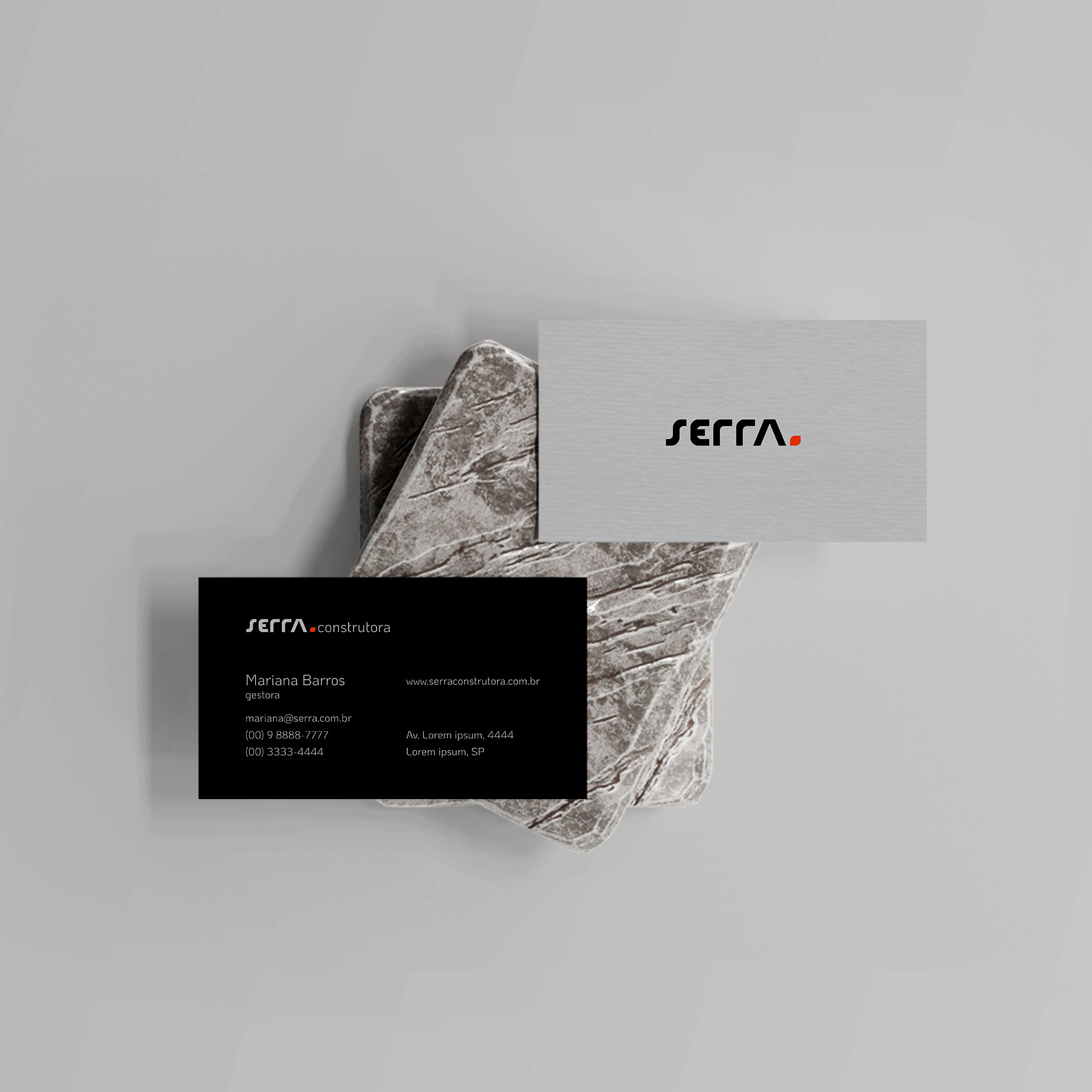
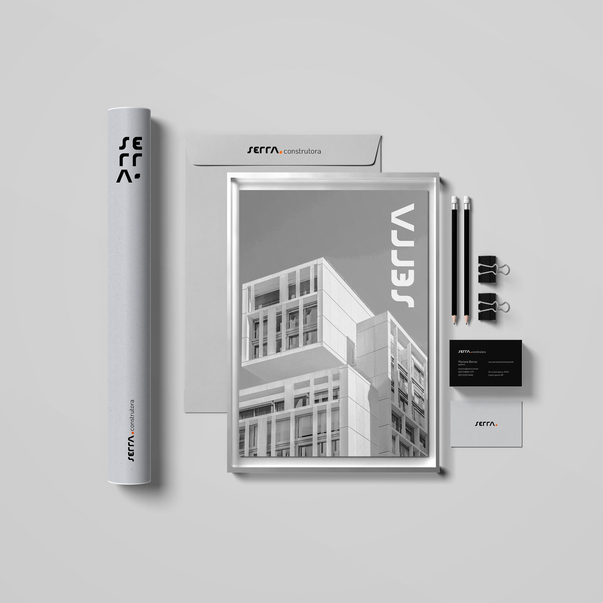
The main color would be a very light tone between “off-white” and gray, an elegant tone that brings a feeling of trust, preventing the visual universe of the identity from getting too dark, this is the base color of the entire visual identity .
The supporting color is black, black, in addition to being a strong color, is the color of elegance, every gala event carries the color black, it is the color of modernity, companies at the forefront of technology are increasingly using black in their products, in addition to being the color that best matches other colors, black within the identity provides a very good visual basis.
And orange was inserted very subtly to be an extra color, always used subtly as a “brushstroke”, orange is the color of creativity and technology.
CREDIT
- Agency/Creative: Nícolas Kosienczuk Design
- Article Title: Nícolas Kosienczuk Design Creates Serra Construction Company Brand Identity
- Organisation/Entity: Freelance
- Project Type: Identity
- Project Status: Published
- Agency/Creative Country: Brazil
- Agency/Creative City: Londrina
- Market Region: South America
- Project Deliverables: Brand Design, Brand Guidelines, Brand Identity
- Industry: Construction
- Keywords: Construction company, brand, logo,
-
Credits:
Designer: Nícolas Kosienczuk


