


Nicka K New York PR Box — A Modern Gift System for Social-First Beauty
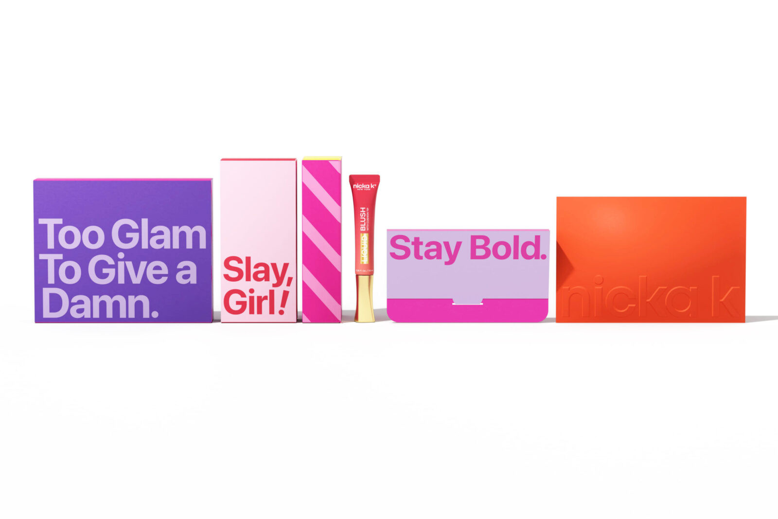
The Nicka K PR Box is a complete redesign of the brand’s previous press kit, transforming a simple and inconsistent structure into a presentation piece that embodies the brand’s youthful, quirky, sleek, bold, and inspiring personality. The new visual system features bright candy-tone colors and clean layouts aligned with Gen Z aesthetics, resulting in a package that stands out naturally on social media and digital platforms.
Gift-inspired graphic elements were integrated into the design to create an immediate sense of a “curated gift box” rather than a standard shipping package. The typography and slogan system also reflect Nicka K’s fresh, modern, and confident brand character, delivering a light yet premium tone that strengthens the overall presentation.
To ensure the PR box accommodates the entire Nicka K product range, every product was measured and categorized through a full dimension analysis. Multiple insert formats were developed based on this data, allowing products of different sizes and shapes to fit securely and align neatly, creating a balanced and visually organized display.
The material strategy balances transportation safety, visual quality, and cost efficiency. The outer master shipper uses durable corrugated paper for reliable protection, while the inner boxes are made with coated paperboard to achieve bright colors and refined graphic output. All components underwent strict color proofing to ensure consistency inside and out.
A one-piece, one-time-opening structure was engineered to provide a smooth unboxing experience. Upon opening, all products are presented in a clean, aligned, and visually balanced arrangement. This “ready-to-shoot display moment” enhances comfort and clarity while making the PR box highly suitable for influencers, media, and consumers to share on social platforms.
KEY FEATURES
1. Youthful Candy Palette: Bright and lively colors that communicate vibrancy, energy, and playfulness.
2. Gift-Inspired Graphics: Clear visual cues that immediately communicate “gift box” and elevate the first impression.
3. Quirky Details: Small visual accents that reinforce accessibility, friendliness, and personality.
4. Sleek One-Piece Structure: A clean, seamless opening structure that provides a smooth and organized reveal.
5. Bold Presentation: Candy tones combined with strong graphics deliver a visually impactful presence.
6. Product Dimension Analysis: Data-driven insert development ensures perfect fitting for the full product assortment.
7. Material & Structural Design: Corrugated master shipper for protection; coated paperboard inner boxes for crisp color output and refined details.
8. Organized & Comfortable Unboxing: A balanced, tidy, camera-ready layout that enhances user experience.
9. Brand Alignment: Color, typography, and graphic language precisely reflect Nicka K’s lively, distinctive, polished, impactful, and engaging brand qualities.
10. Social-Media Optimization: The structure opens directly into a photo-friendly display, increasing shareability and organic exposure.
PROJECT RATIONALE
The previous PR box lacked clarity, consistency, and visual appeal. Its muted colors and loose structure did not reflect the brand’s growing focus on youth-driven expression and social media visibility. Influencers and recipients often struggled to present clean unboxing content, limiting the brand’s digital presence.
The new PR box solves these issues by combining candy-tone colors with gift-inspired graphics to convey a curated, celebratory experience from the first glance. A one-piece structure provides a clean, organized reveal, while dimension-based insert development ensures stability and uniformity. Paired with material upgrades and controlled color proofing, the new PR box delivers aesthetic consistency and functional performance throughout shipping, unboxing, and content creation.
IMPACT STATEMENT
The redesigned PR Box significantly improved Nicka K’s organic exposure on TikTok, Instagram, and other platforms. The clean, structured layout allows influencers to capture high-quality unboxing moments without rearranging products, lowering content creation barriers and increasing willingness to share.
The combination of candy-tone colors, organized layout, and gift-inspired graphics performs exceptionally well on camera, enhancing viewer retention, engagement, and share rates. This redesign strengthened brand recognition in the Gen Z market and reinforced Nicka K’s identity as a modern, expressive, and socially relevant beauty brand.
BEFORE / AFTER
Before
The previous PR box had plain visuals, muted colors, and lacked a cohesive brand identity. Its internal structure relied heavily on Monster Crinkle Paper to fill empty space for safe shipping, resulting in a messy and chaotic first impression. Products often shifted during transit and arrived disorganized, making the unboxing experience visually cluttered, difficult to photograph, and unsuited for social media sharing. It failed to convey the premium or curated nature expected from a beauty PR package.
After
The new PR box removes filling paper entirely and replaces it with a data-driven system of dimension-based inserts that securely hold each product in place. The unboxing reveal is clean, aligned, and balanced—ready for photography the moment the box is opened. Bright candy tones, gift-inspired graphics, and the sleek one-piece structure create a fresh, modern, and highly shareable presentation. The PR box naturally becomes a standout highlight in influencer content, substantially increasing digital visibility and strengthening brand impact.

CREDIT
- Agency/Creative: Nicka K New York In-house Design Team
- Article Title: Nicka K New York In-house Design Team Designs the Nicka K PR Box for Social-First Beauty Visibility
- Organisation/Entity: In-House
- Project Status: Published
- Agency/Creative Country: United States of America
- Agency/Creative City: New York
- Market Region: United States
- Project Deliverables: Advertising, Art Direction, Brand Design, Brand Redesign, Brand Refinement, Brand Rejuvenation, Brand Strategy, Branding, Design, Industrial Design, Packaging Design, Rebranding, Research
- Industry: Beauty/Cosmetics
- Keywords: WBDS In-House Design Awards 2025/26 , Structural Packaging, Visual System, Color System, Beauty Packaging, Unboxing Experience, Promotional Packaging, Improved functionality, Brand Rejuvenation, Brand Storytelling, User-centered Design, Evleated Aesthetics
-
Credits:
Art Director: Yoon Oh, Hailey Yoon
Principal Designer: Shuairen Wang


