


WINE IN NEW LIGHT.
Earthling Studio partners with Nice to unveil a magnetic new redesign and brand platform.
Modern, female-led wine brand Nice has unveiled its most significant evolution since the brand was founded in 2019: a complete brand redesign and a new category-defying platform, ‘Wine in New Light.’ Created in collaboration with Earthling Studio, the move unifies Nice’s multi-format portfolio under a single magnetic design system.
The transformation is driven by Nice’s founding mission: liberating drinkers from wine headaches. From confusing labels to rigid formats, wine hasn’t always kept up with modern life. Nice exists to change that.
One magnetic design system
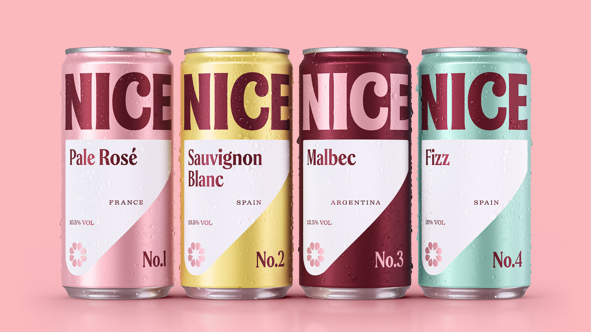
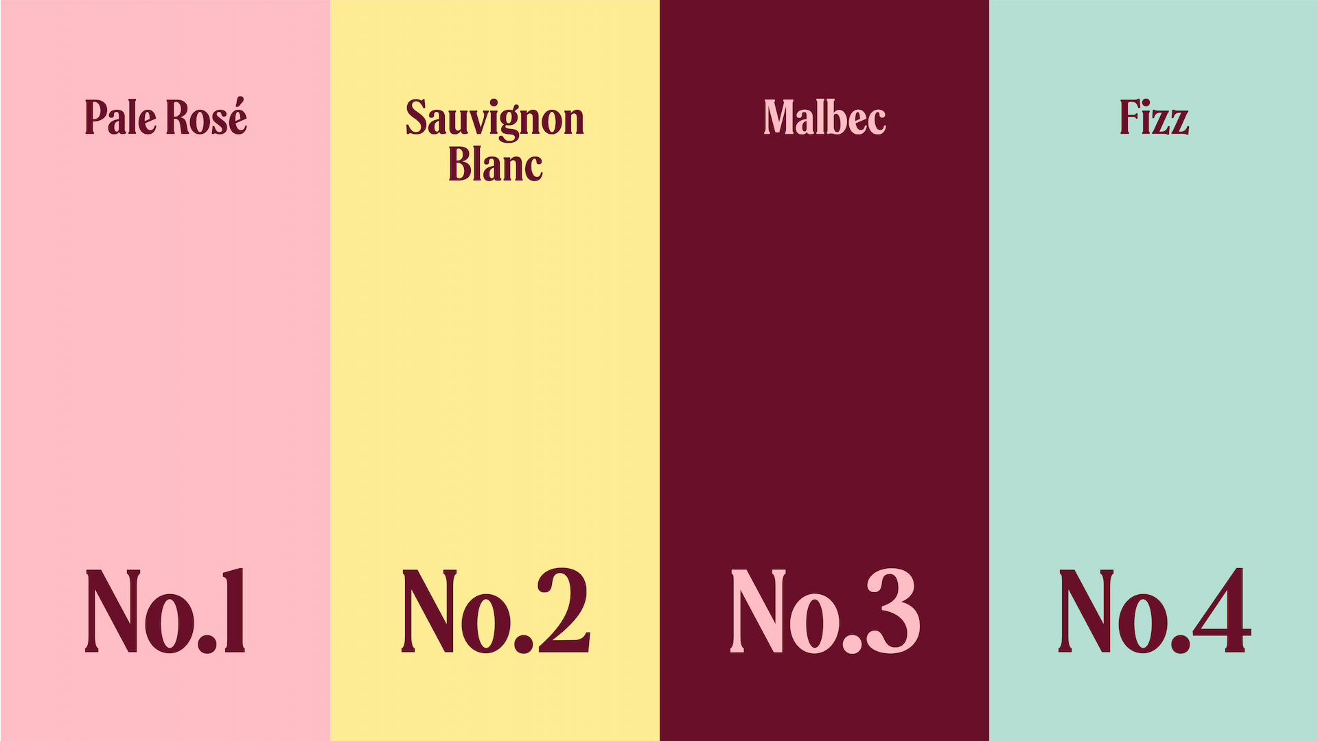
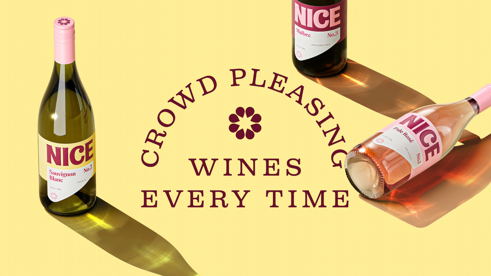
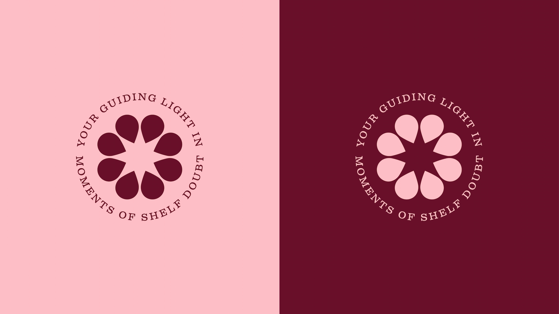
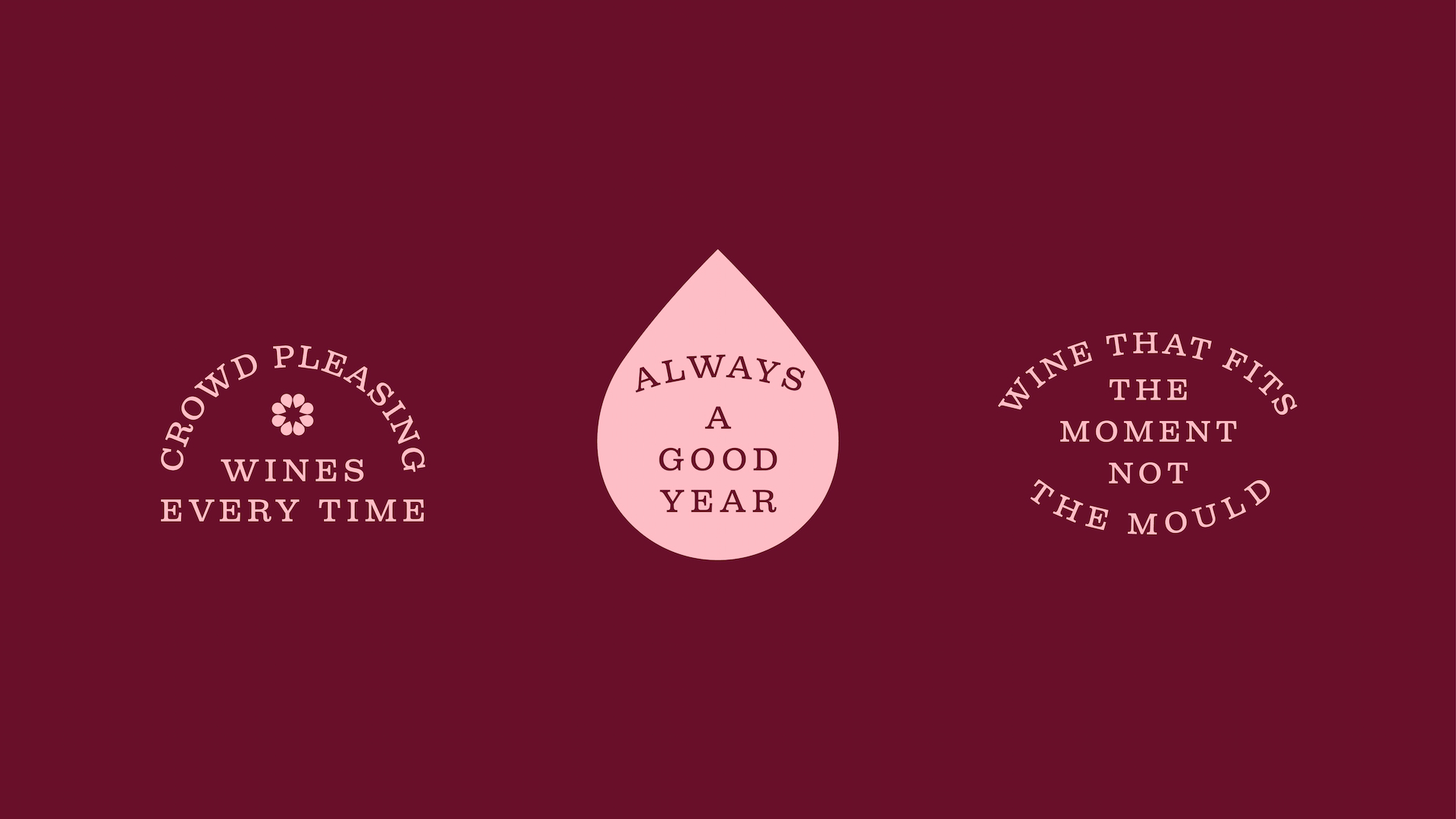
The new identity introduces a unified visual language across the entire Nice range: cans, bottles, boxes and kegs. While the brand has matured, its challenger spirit remains. What emerges is a bolder, brighter and more crafted world, with a magnetic brand presence designed to stand out and relieve wine aisle anxiety. At the heart of the system is a striking new beacon-of-light device, paired with an icon formed from wine droplets. Together, they cut through category confusion, guiding drinkers to the information they actually look for and removing anything that gets in the way. Nice’s iconic pink remains, now paired with a deep claret and a fresh flash of
white. The secondary palette has also been refined, bringing renewed boldness and impact.
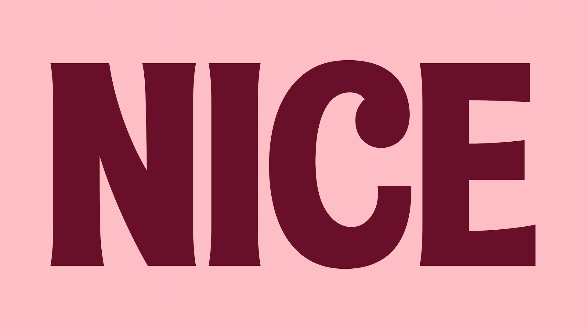
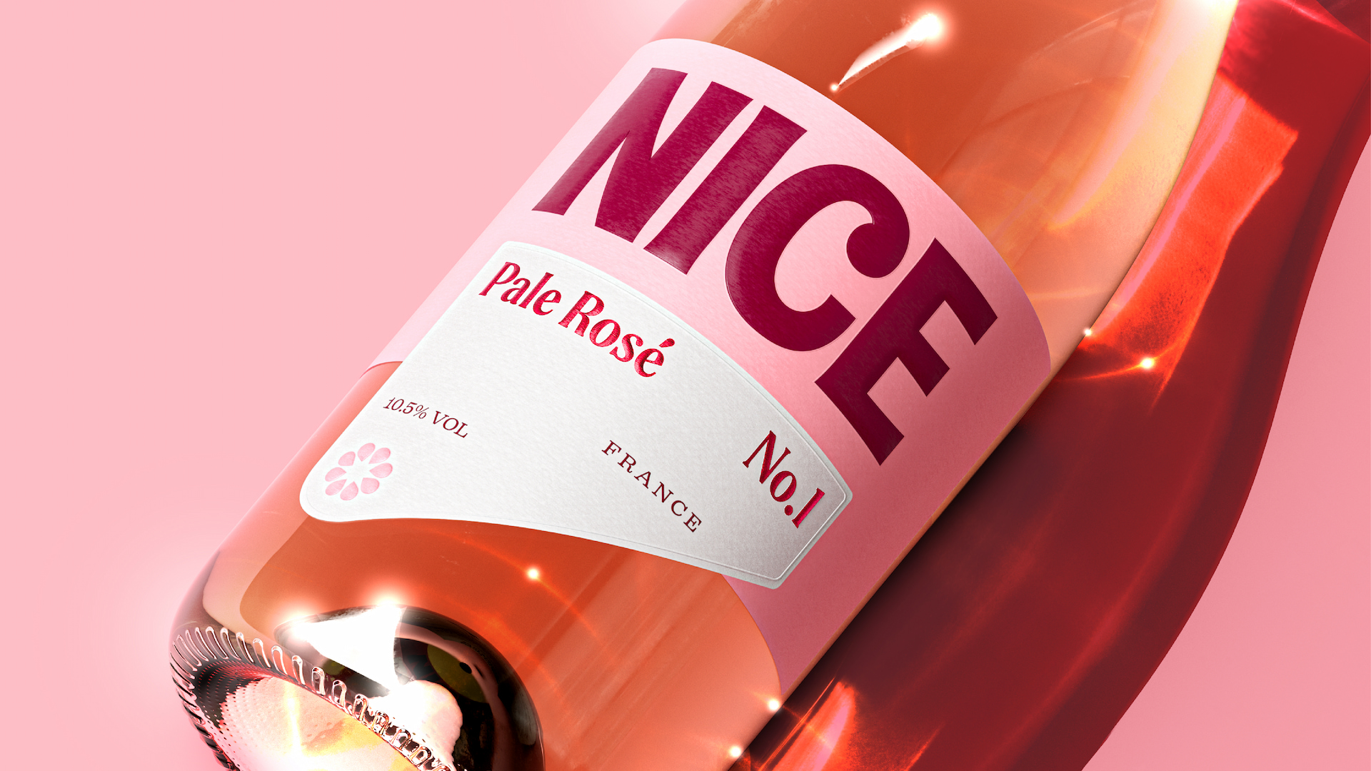
A bespoke wordmark balances simplicity with sophistication. A generous droplet in the “C” enhances taste appeal, while subtle flared serifs nod to the quality of the liquid and the traditions of the category. This is paired with a complementary headline typeface, Spirits Neutral, and a body font, Firelli, inspired by authentic wooden wine crates, adding rhythm and character across the identity. Previously, Nice relied on tone of voice to cut through the pomp of the category but it lacked direction. Now, it delivers a fully unified purposeful expression – with a tone that is bright,
magnetic, fearless and raises a smile.
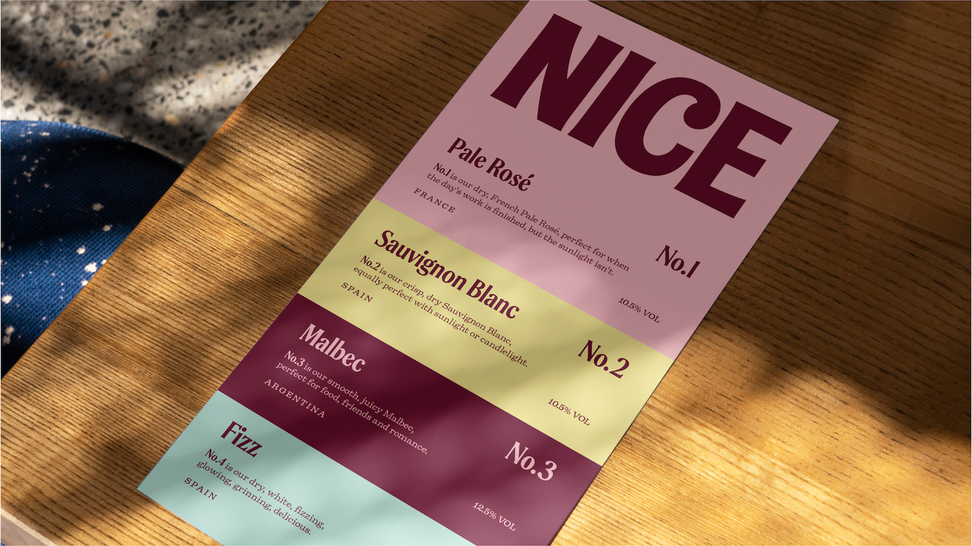
The Crowd Pleasers portfolio
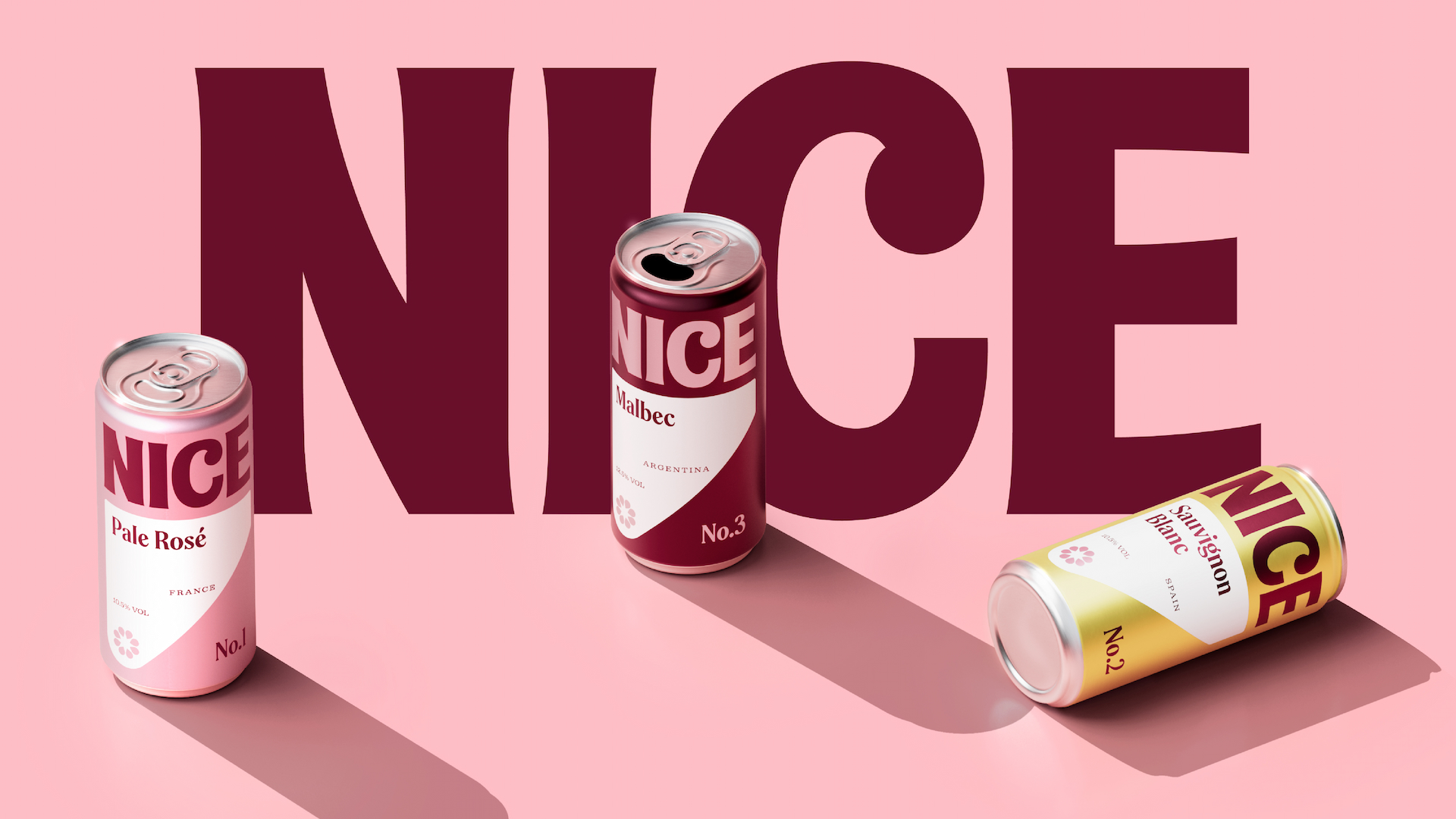
Nice’s core range, the ‘Crowd Pleasers’ focuses on four well-known, trusted grape varietals, available across all formats. The range is now organised through a simple numbering system, a clear visual shorthand that removes guesswork and creates space for future innovation. Whether enjoying a ‘No. 1 Pale Rosé’ can at a festival or picking up a ‘No. 1 Pale Rosé’ box in a supermarket, drinkers can trust the liquid inside is exactly the same.
Always a good year
The new identity also reinforces Nice’s commitment to quality. Working closely with trusted winemakers, the team ensures consistency year after year, tasting, refining and debating until every wine meets the Nice standard. The brand now has an identity that reflects its founder’s relentless passion for delivering a quality product in a way that is
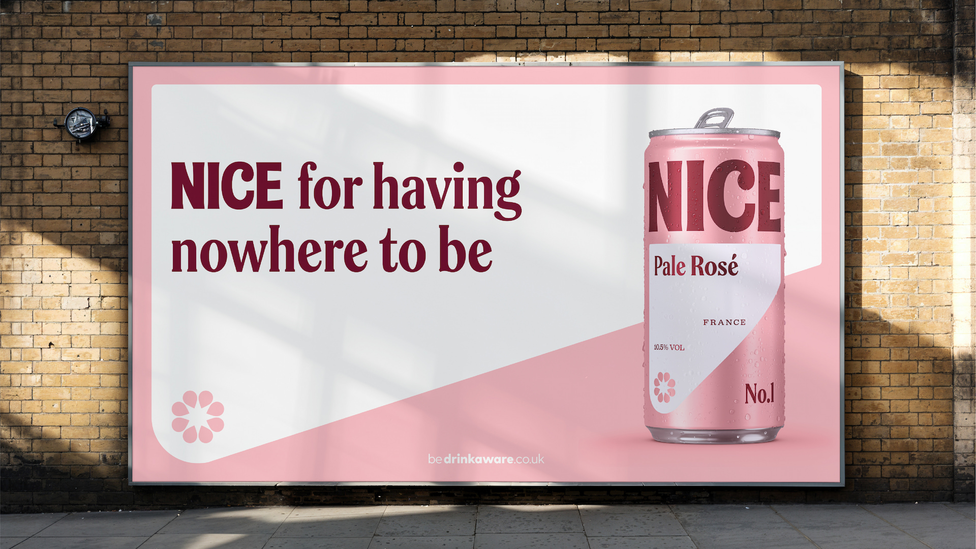
fit for a modern audience. In 2026, Nice is set to reach over 30 million consumers through a high-impact, year-round campaign programme. From disruptive stunts and immersive experiences to bold in-store activations across both off- and on-trade, the ‘Wine in New Light’ platform will come to life at every touchpoint.
Lucy Busk, Co-Founder of Nice, says:
“We’re incredibly excited to be launching our new identity. It’s cleaner, bolder and simpler. From our logo to our color palette, we’ve redesigned every touchpoint so our brand reflects the quality inside every can, box, tap, and bottle. Earthling really understood our mission – Pink stays, but everything else has been elevated to make navigating a historically confusing category, easier than ever.”
Stephen McDavid, Creative Partner of Earthling Studio, says:
“Wine in New Light positions Nice as a brand revealing a new refreshing side to wine, more relaxed, less constrained and culturally relevant. The new platform and reimagined identity will enable consumers to confidently choose and share Nice, a brand that talks to modern wine drinkers, feels elevated but isn’t constrained by stuffy traditions.”
CREDIT
- Agency/Creative: Earthling Studio
- Article Title: Nice by Earthling Studio Transforms Wine Packaging Through a Magnetic Design System
- Organisation/Entity: Agency
- Project Type: Identity
- Project Status: Published
- Agency/Creative Country: United Kingdom
- Agency/Creative City: London
- Market Region: Europe
- Project Deliverables: Brand Identity, Brand Redesign, Brand Strategy, Brand Tone of Voice, Packaging Design
- Industry: Food/Beverage
- Keywords: Wine Brand Redesign
-
Credits:
Creative Partner: Stephen McDavid


