


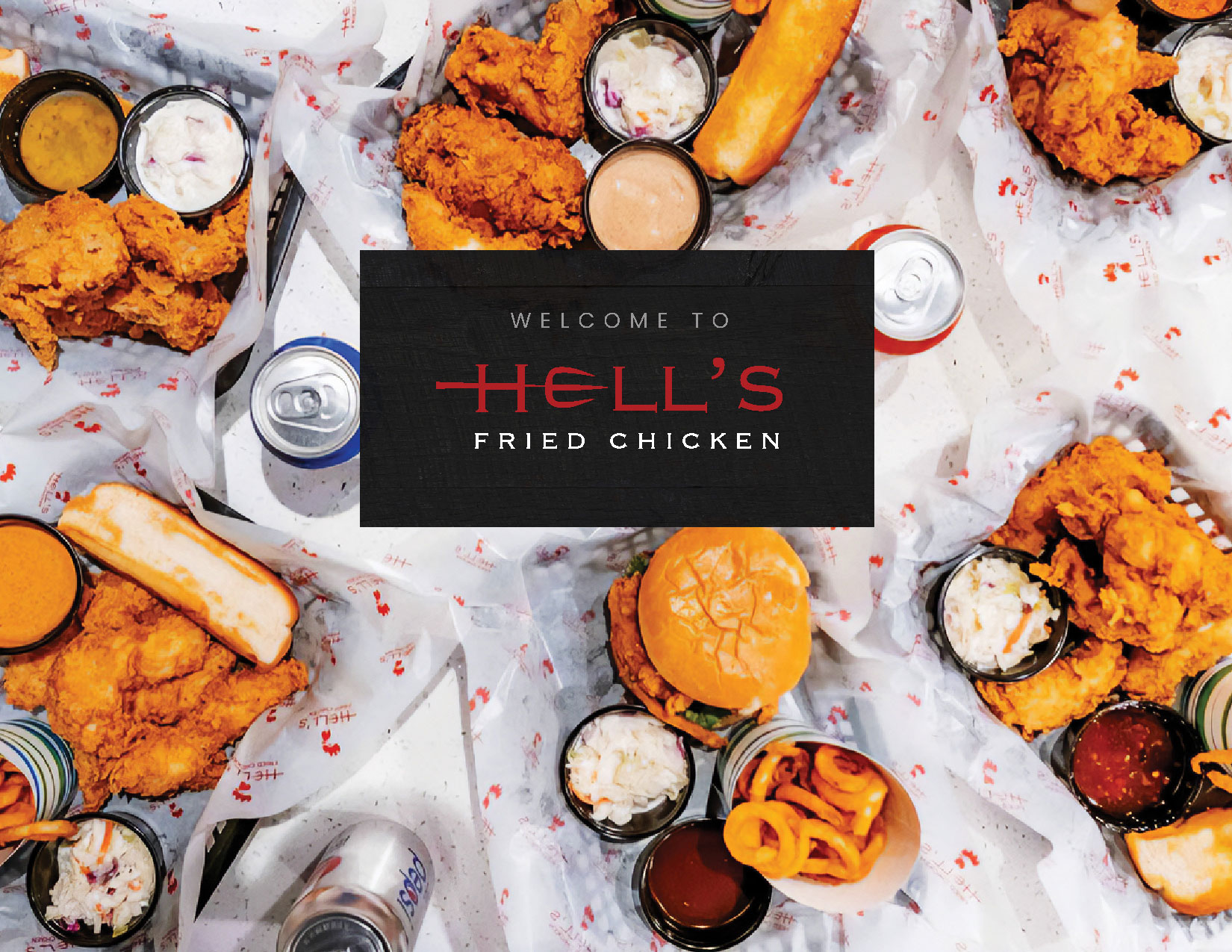
Hell’s Fried Chicken is a franchise restaurant specializing in spicy fried chicken. The company sought to establish a strong brand identity that highlights the intense spiciness of its chicken while exuding a more premium dining experience than typical casual franchise restaurants, ensuring it stands out from competitors.
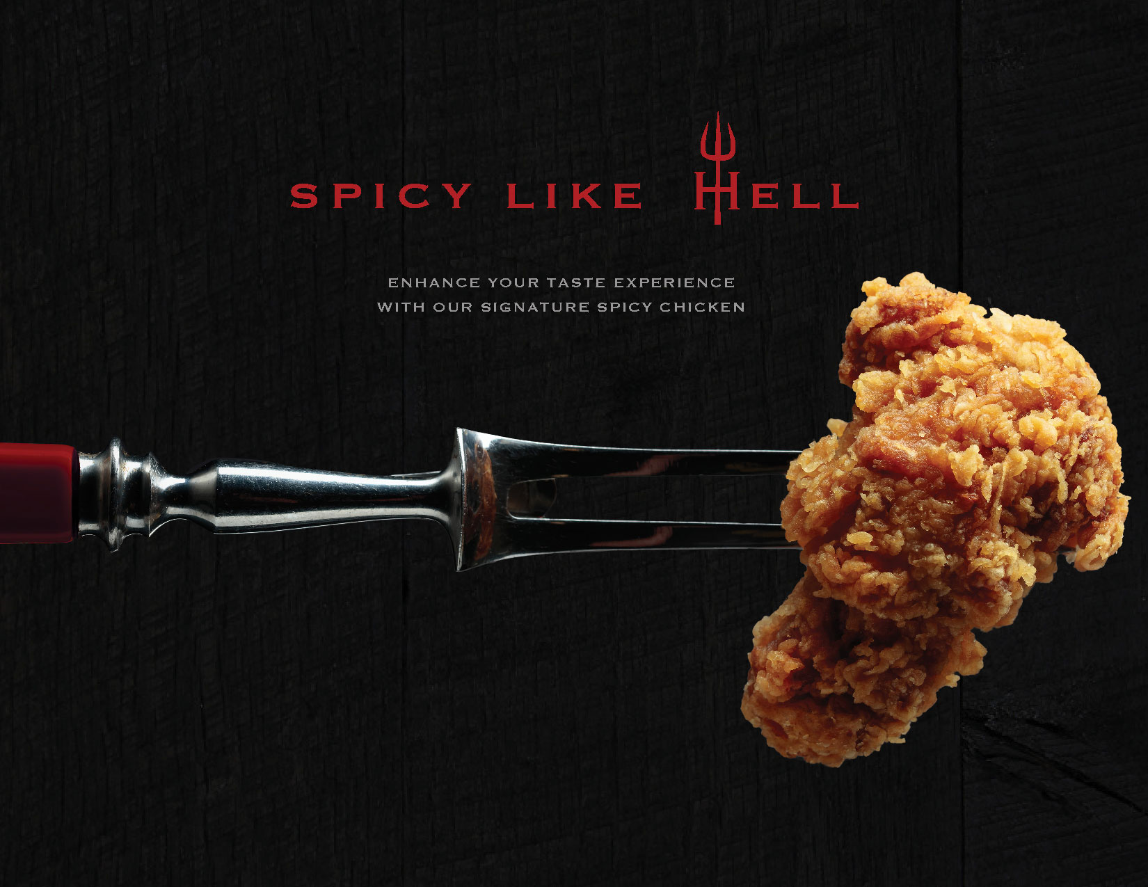
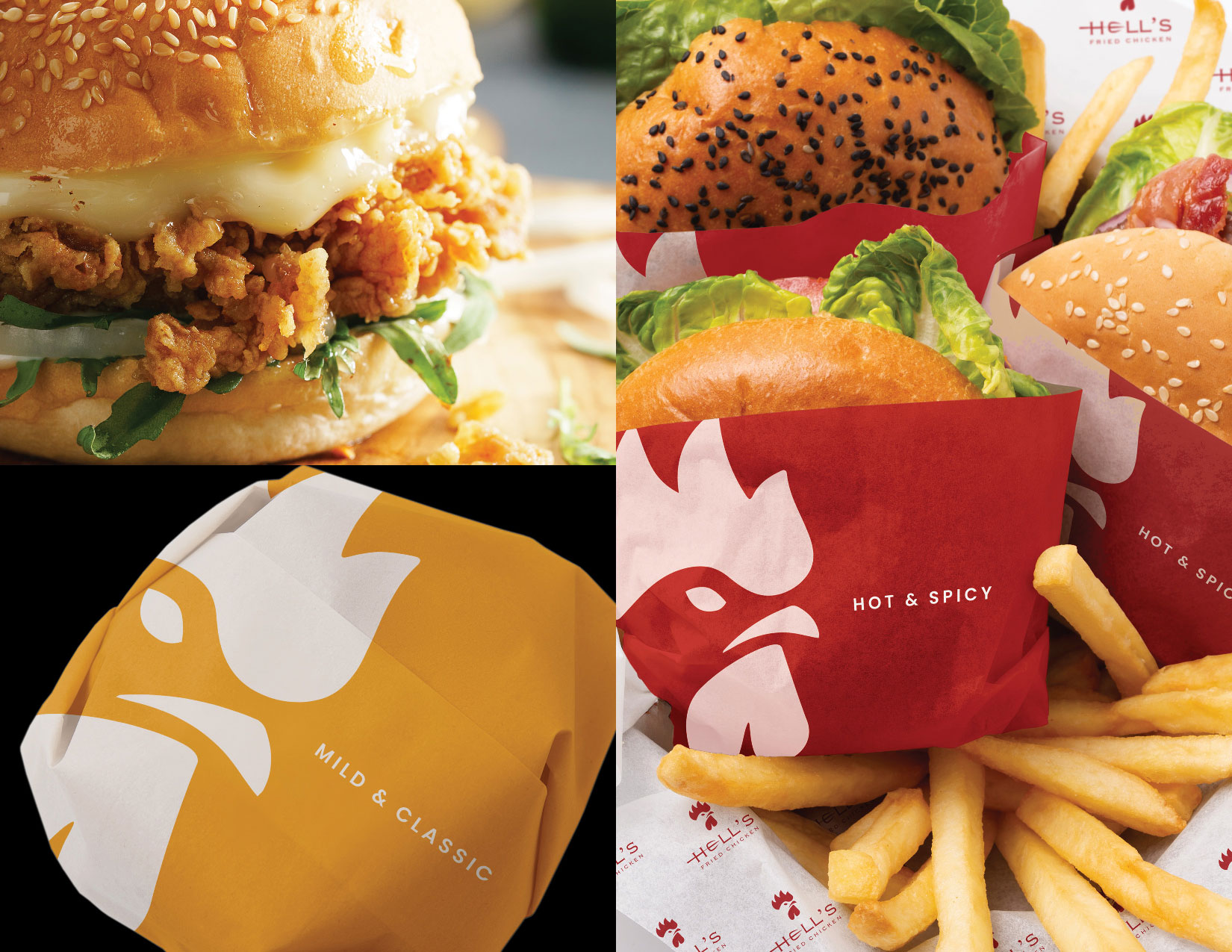
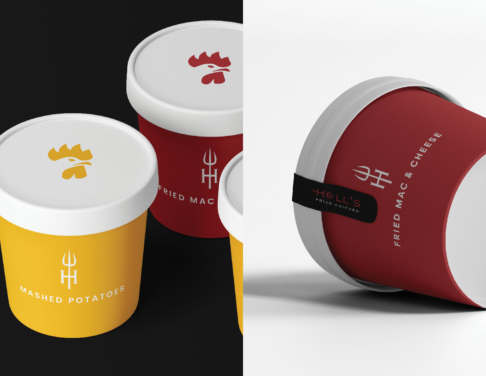
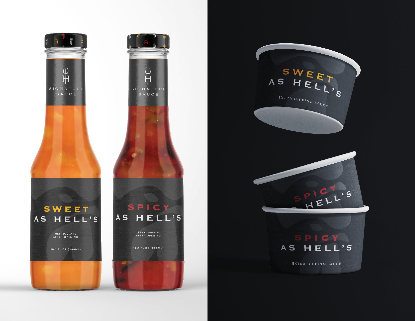
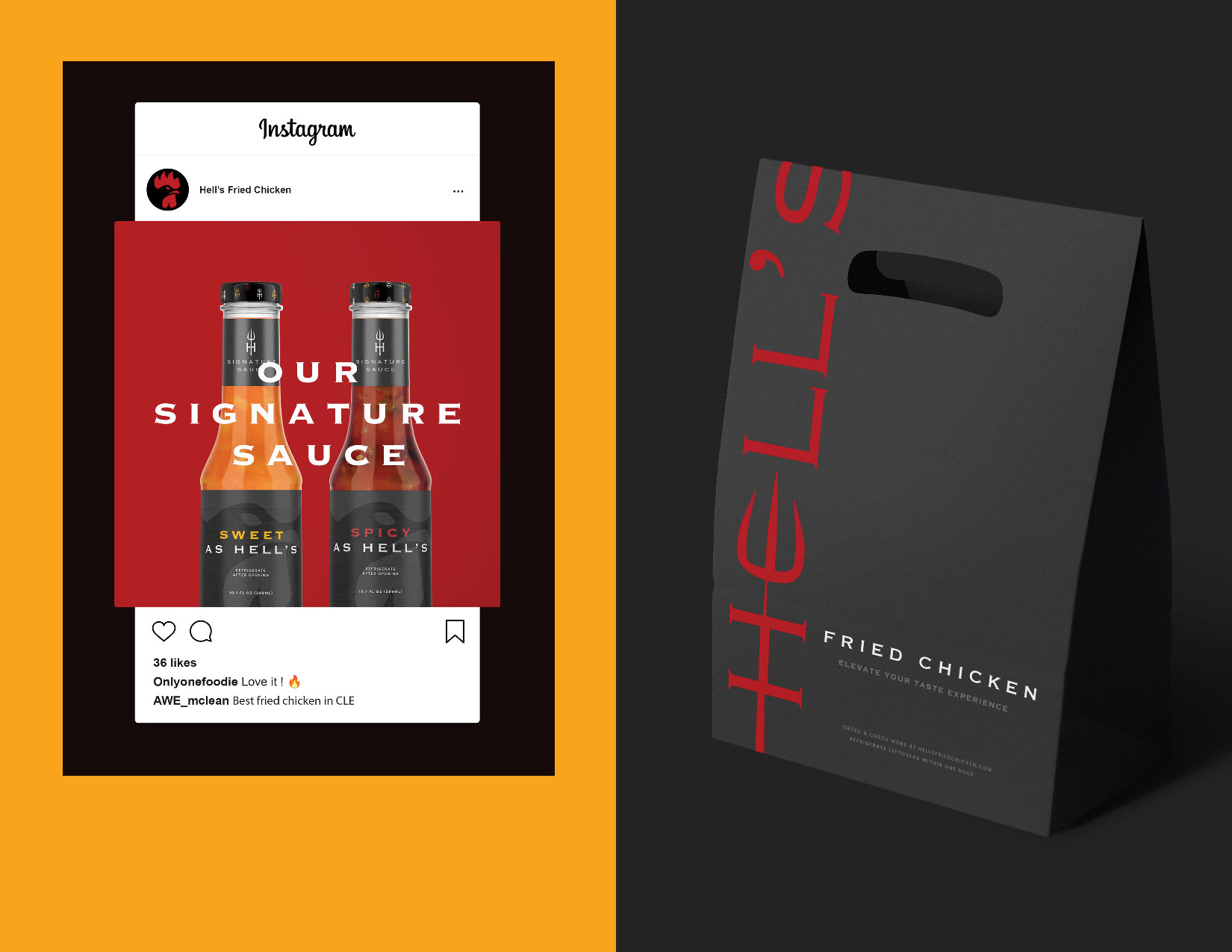
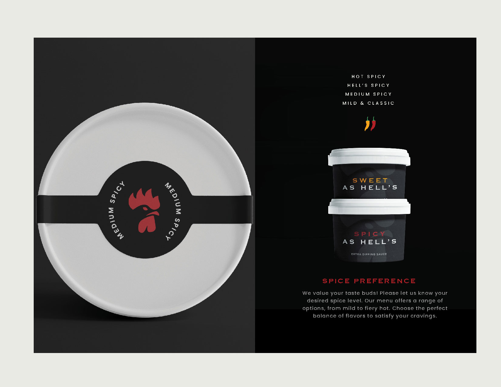
The identity system prominently features a fierce and energetic chicken illustration, reinforcing the brand’s ‘spicy as hell’ concept. Red was chosen as the primary color to intensify this fiery message. Additionally, the letters ‘H’ and ‘E’ in “Hell’s Chicken” incorporate a trident graphic, strengthening brand recognition and memorability. The letterforms and color choices were deliberately crafted to evoke an upscale aesthetic while remaining bold and dynamic.
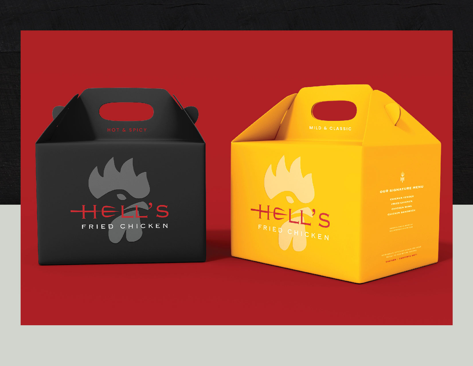
As part of the branding system, a variety of packaging designs were created, all prominently showcasing the signature fierce-looking chicken graphic. The trident motif is consistently applied across packaging to reinforce the identity system. Furthermore, yellow was introduced into the color scheme to represent the mild flavor, serving as a visual contrast to the dominant red, which signifies extreme spiciness.
Black and gray tones are also strategically used throughout the identity system to further enhance the premium feel while complementing the red and yellow palette. The consistent repetition of key visual elements—such as the chicken head, trident motif, and custom letterforms—solidifies brand identity, boosting recognition, strengthening brand awareness, and ensuring long-term memorability.

CREDIT
- Agency/Creative: NHN Design
- Article Title: NHN Design Combines Spice and Style for Hell’s Fried Chicken Visual Identity
- Organisation/Entity: Freelance
- Project Type: Identity
- Project Status: Published
- Agency/Creative Country: United States
- Market Region: North America
- Project Deliverables: Brand Design
- Industry: Food/Beverage
- Keywords: HFC Co. Indentity System
-
Credits:
Art Director: Hyena Nam


