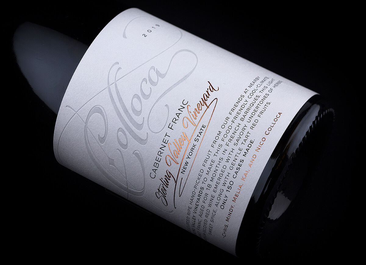
The Project: My story with Colloca started many years ago when the winery opened doors. Together with Chris Colloca we created the winery logo and their first label. Eventually our partnership evolved into a remote friendship until nowadays. One day I received a call from Chris because he wanted to restyle the existing labels and lift them at a higher level. He also had certain idea about it. We discussed it in details and after I got all info from him, I started working on this project.
The Challenge: Challenges are part of my life for many, many years. I am not chasing them, but I accept them once they come to me. The first Colloca wine label design was a challenge itself but its heir was no exception. I was again trapped in same situation I face many times – to redesign my own design, to improve it and to make it shine in a new way. I am very used to such moments as they happen pretty often, but they also drive me crazy because you have to walk out not just from your own shoes but to walk out of your own self and act as a different creative. Luckily I am Gemini and there are at least 4-5 personalities inside of me to tackle this challenge.
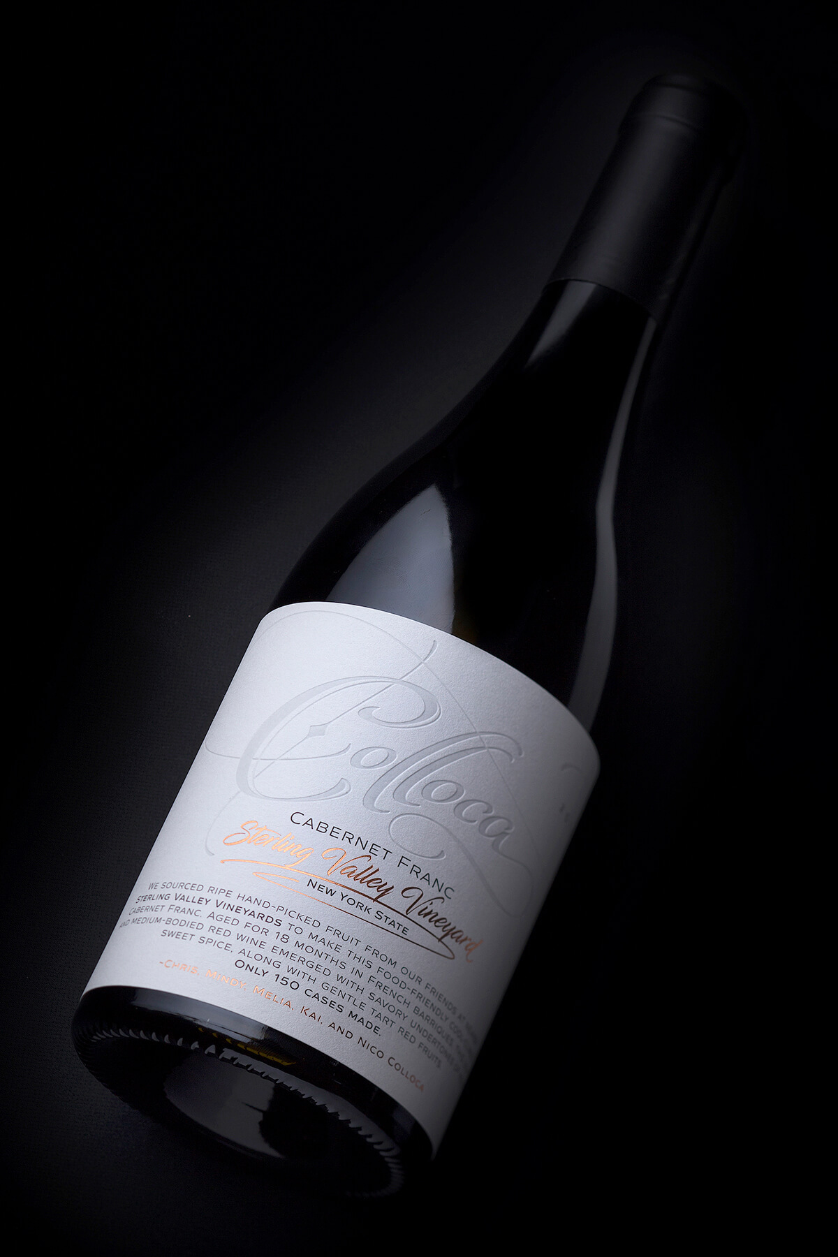
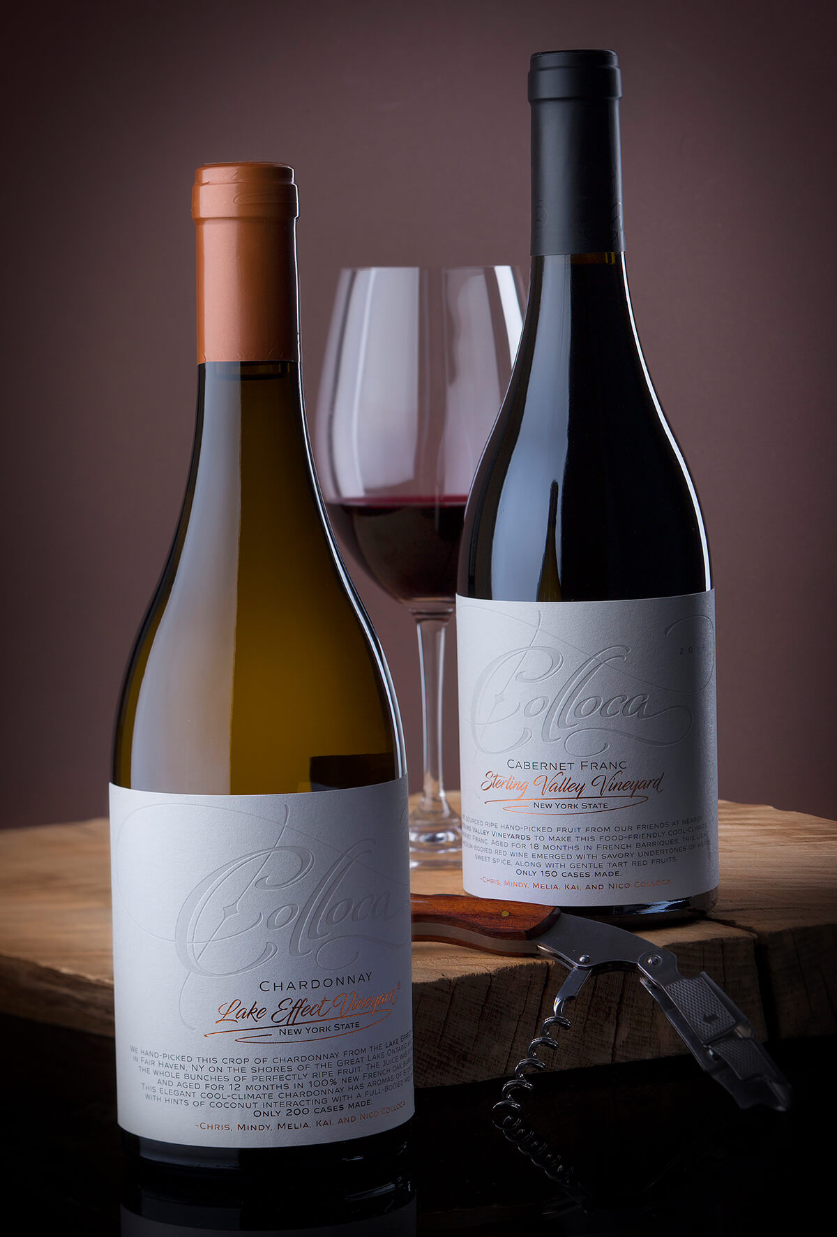
The Result: Chris and I were looking for very clean label. He was very keen to have a label which looks almost completely white from a distance, but when you approach it eventually you discover more and more details while the distance gets closer. It’s really difficult to work with huge white backgrounds because everything you put on it becomes extremely visible. In this situation I decided to focus on technology first and then create my design. The first thing I wanted to decide was the paper or canvas like I often call it.I got my eye on Arconvert’s Moonlight paper as it was visibly thicker but what really attracted me was its amazing performance when debossed with hot stamping die. This paper is actually made of some acrylic fibers and when they are heated at high pressure the fibers melt down creating astonishing deboss effect combined with another incredible transformation – the debossed areas become semi transparent which makes them really beautiful. In my design we debossed the Colloca lettering on the top and achieved stunning effect.
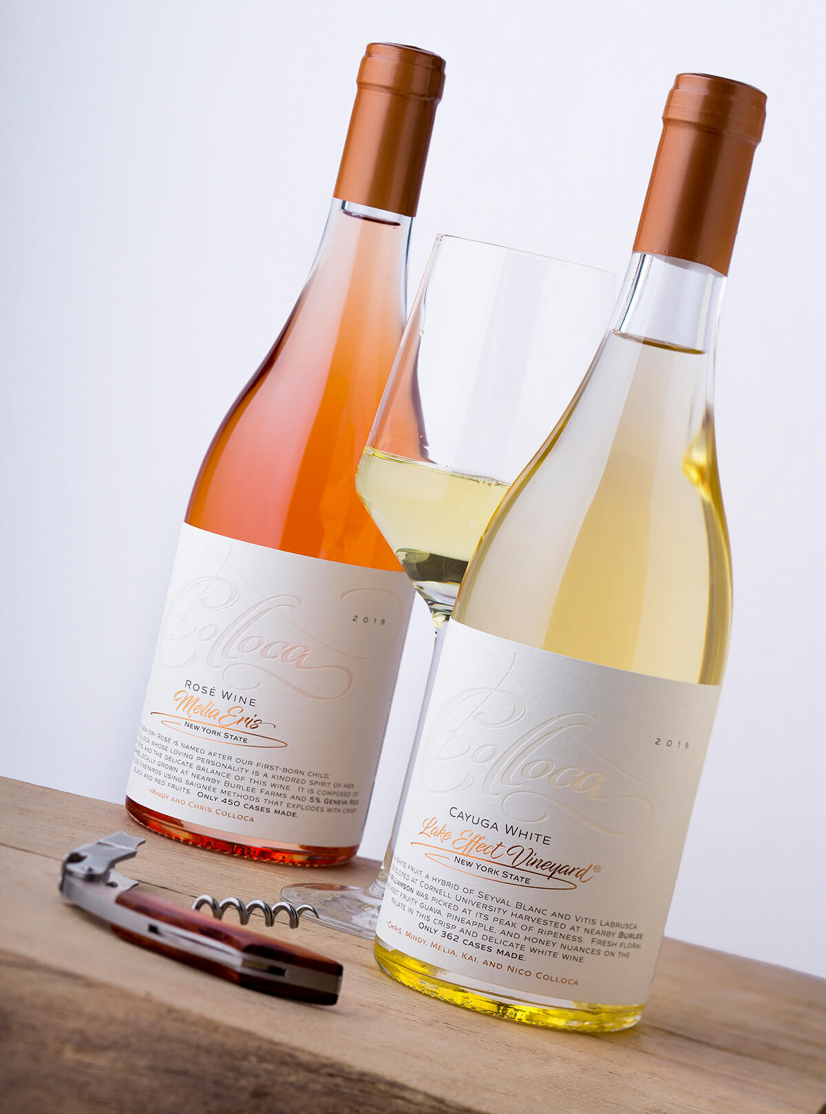
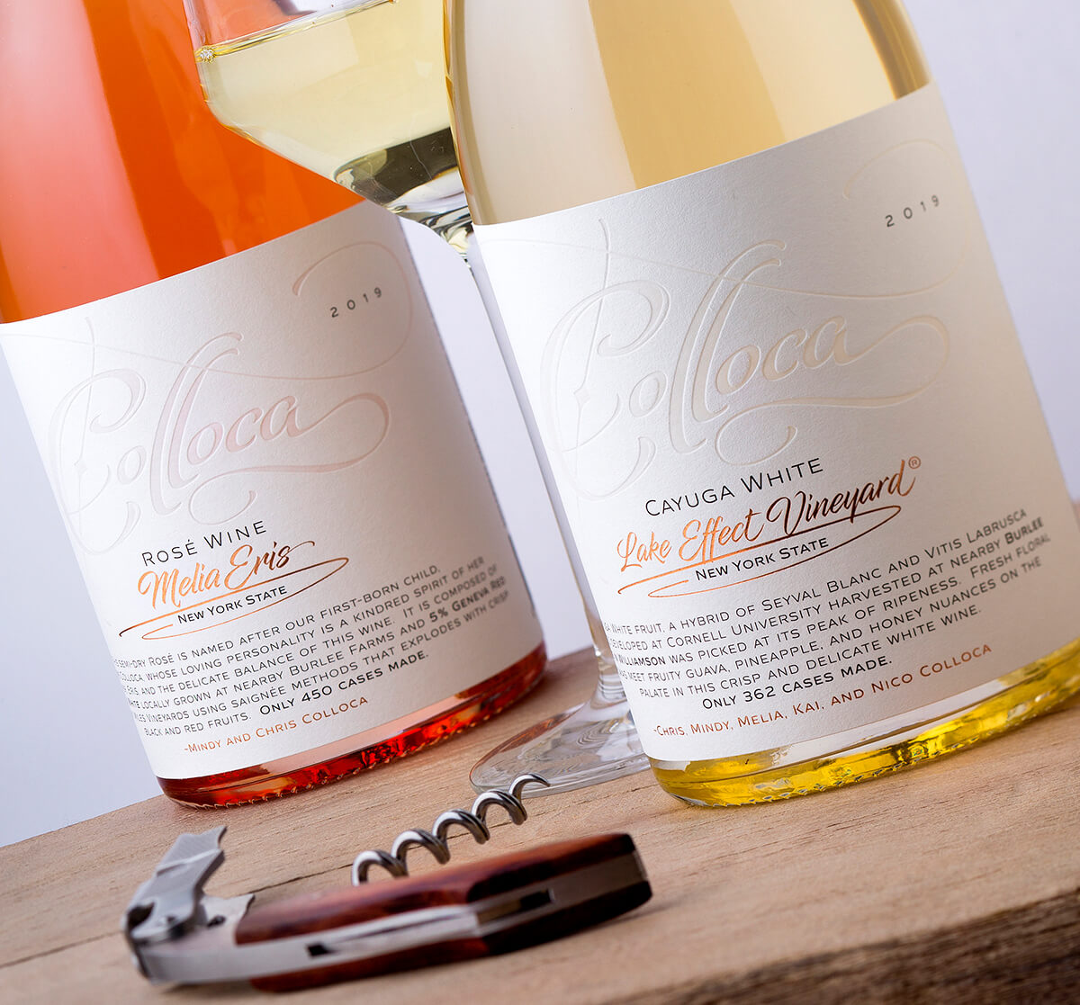
When you apply the label on a white or rose wine bottle from clear glass and you have a back light you see that the paper opacity remains unchanged except in the areas of debossing. What is debossed now becomes also semi-transparent, part of the light goes thru the glass, the wine and the paper and colorizes and illuminates the debossed Colloca lettering. It took a lot of time to my colleagues from Daga Print to find the right balance between the pressure and temperature and get the best result possible. They did a great job. This paper was a real breakthrough because for this project it allowed me to keep large background areas remain white but at the same time added some really amazing effects that made the whole label stand out.
The bottom half of the label was reserved for grape variety and wine region, stamped in copper matt hot foil. Below them is a text paragraph describing the wine and the terroir.
The original Colloca label was somehow more colorful, with more embellishments. In this new one we carried the tradition from the original but transformed it into more clean contemporary design. Just like in my Profundo project the fascinating Moonlight paper played the leading role and was the key to the success of this new wine label design. Without having it available the evolution of this label would have be very different and probably not that much successful.
CREDIT
- Agency/Creative: the Labelmaker
- Article Title: Next Level Design for Colloca Winery by the Labelmaker
- Organisation/Entity: Agency, Published Commercial Design
- Project Type: Packaging
- Agency/Creative Country: United States
- Market Region: North America
- Project Deliverables: Brand Redesign, Brand World, Branding, Graphic Design, Packaging Design, Photography, Rebranding
- Format: Bottle
- Substrate: Glass Bottle


