


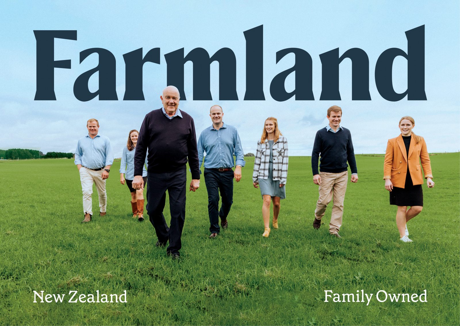
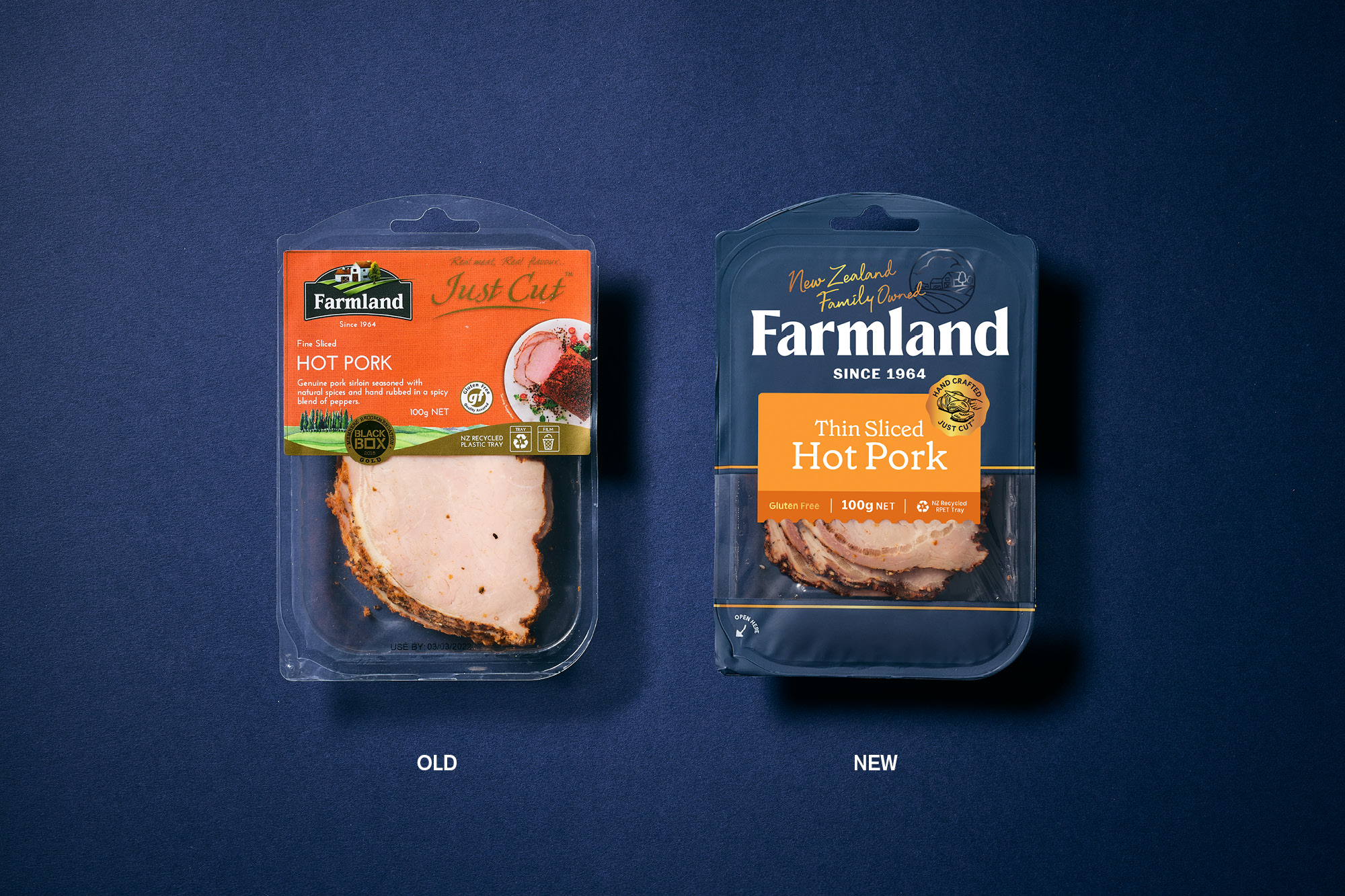
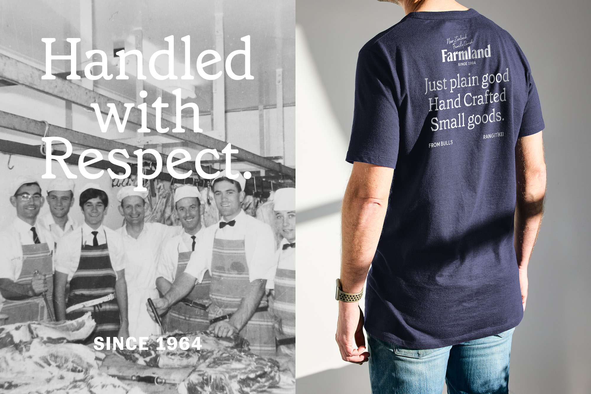
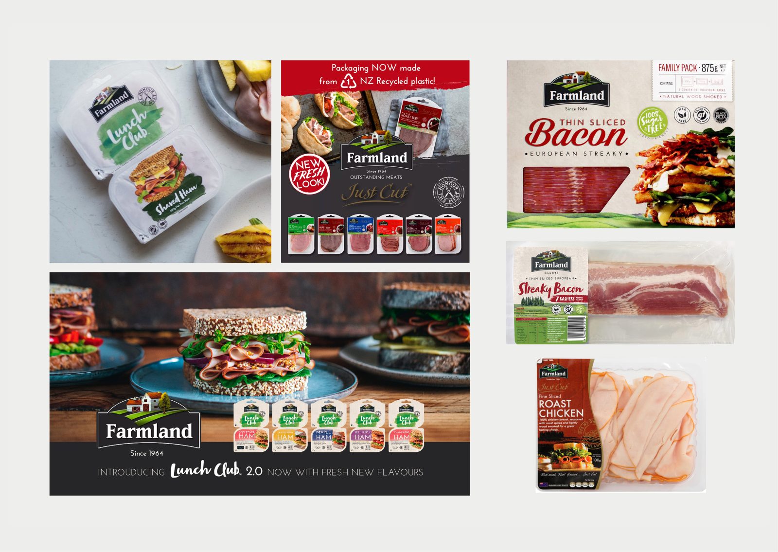
A proud New Zealand family business started from humble beginnings…Farmland Foods began as a butchers shop in 1964 and is now one of NZ leading smallgoods producers. The business fundamentals were strong; unfortunately, the retail packaging was confusing through a series of muddled pack updates, rage extensions, and NPD rollouts. Across a wide range of offerings, there was a distinct lack of brand awareness, brand blocking and a confusing mixture of messaging and statements.
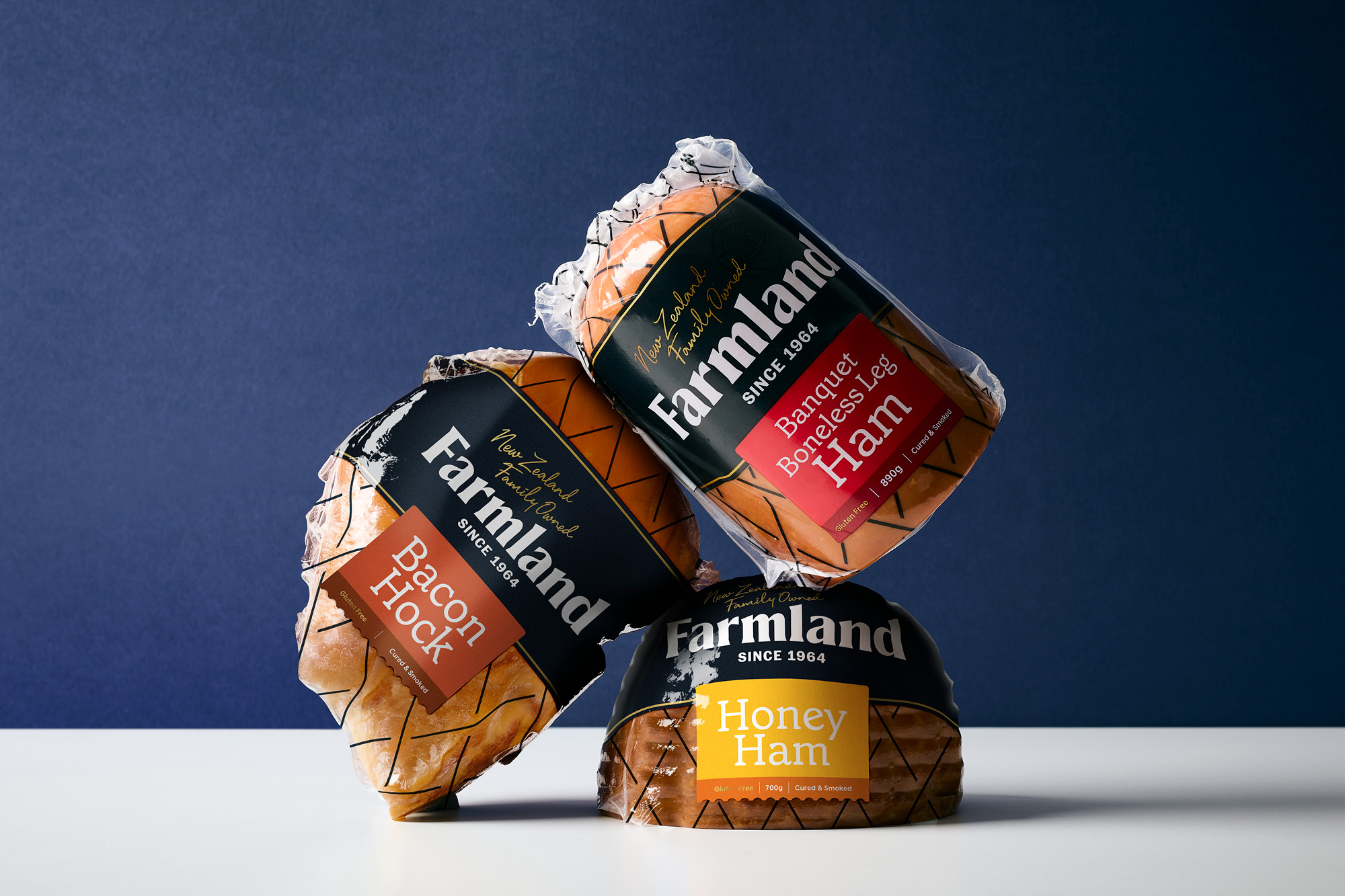
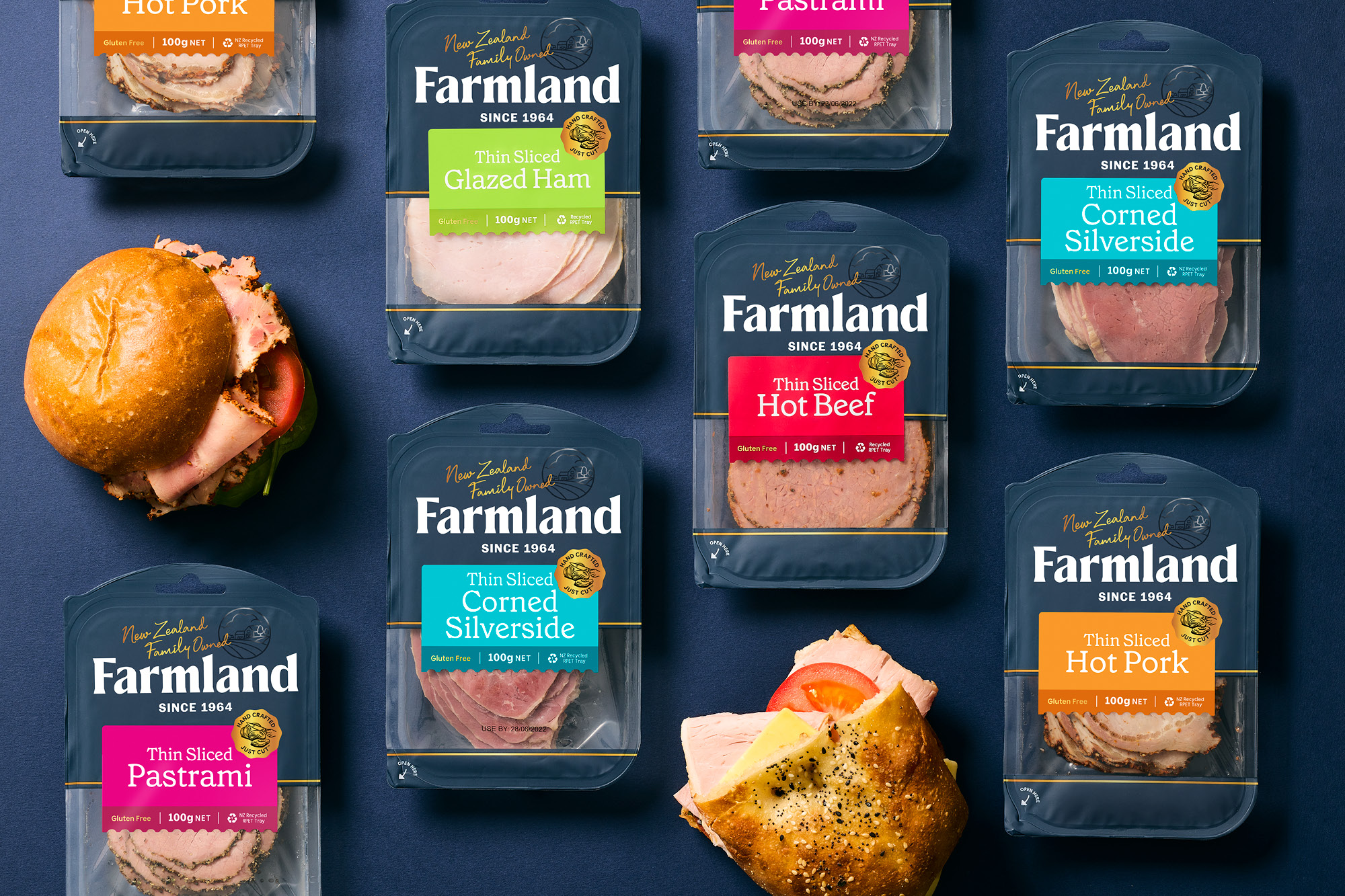
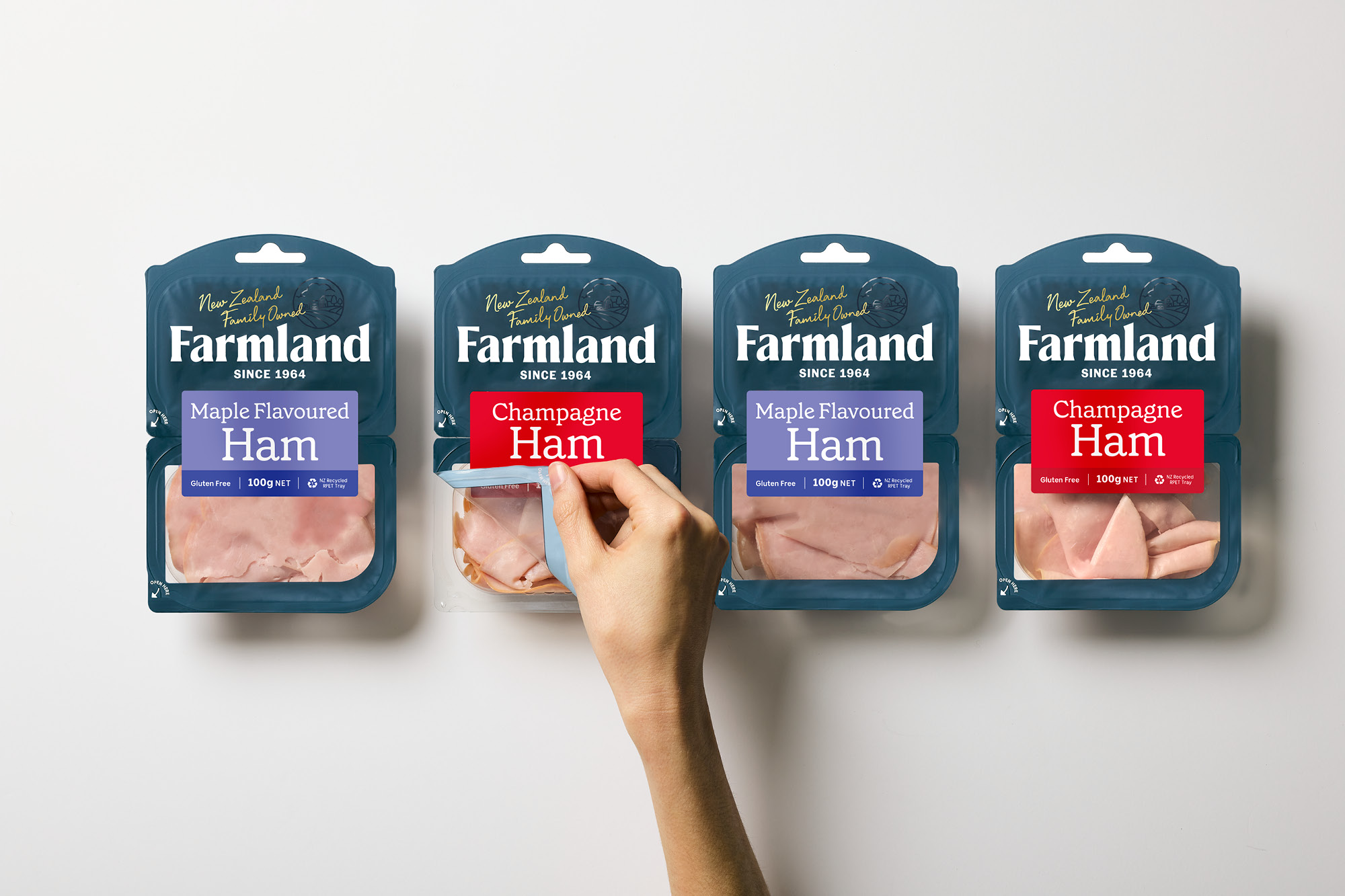
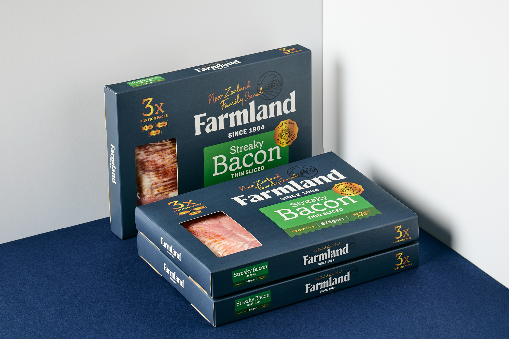
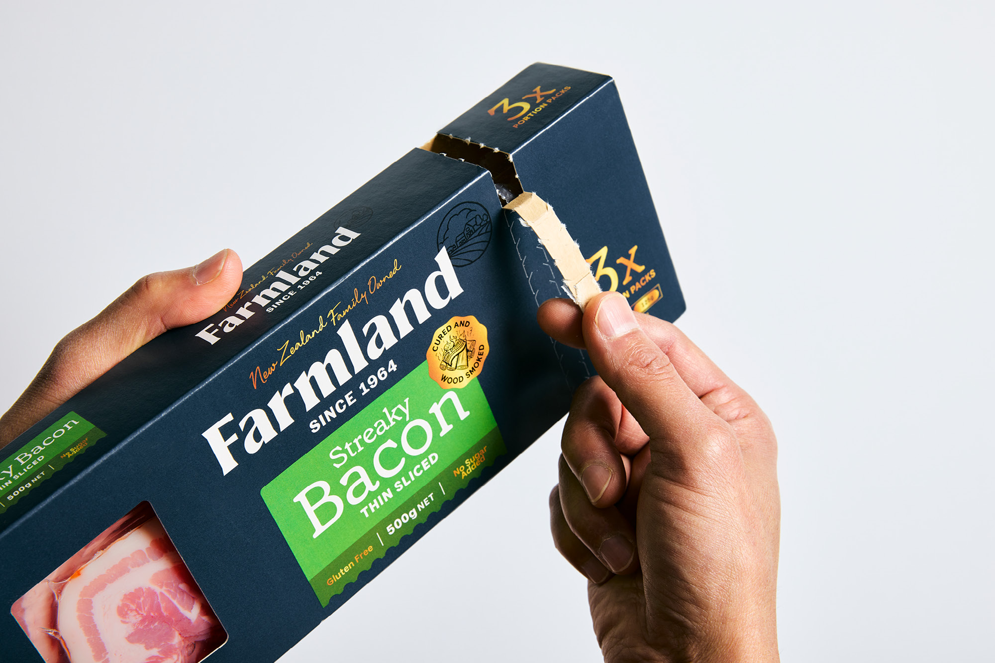
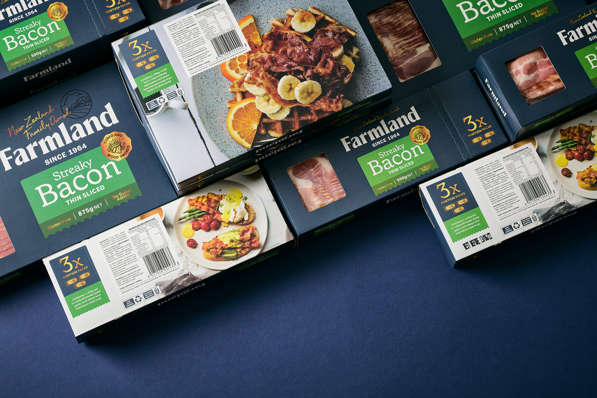
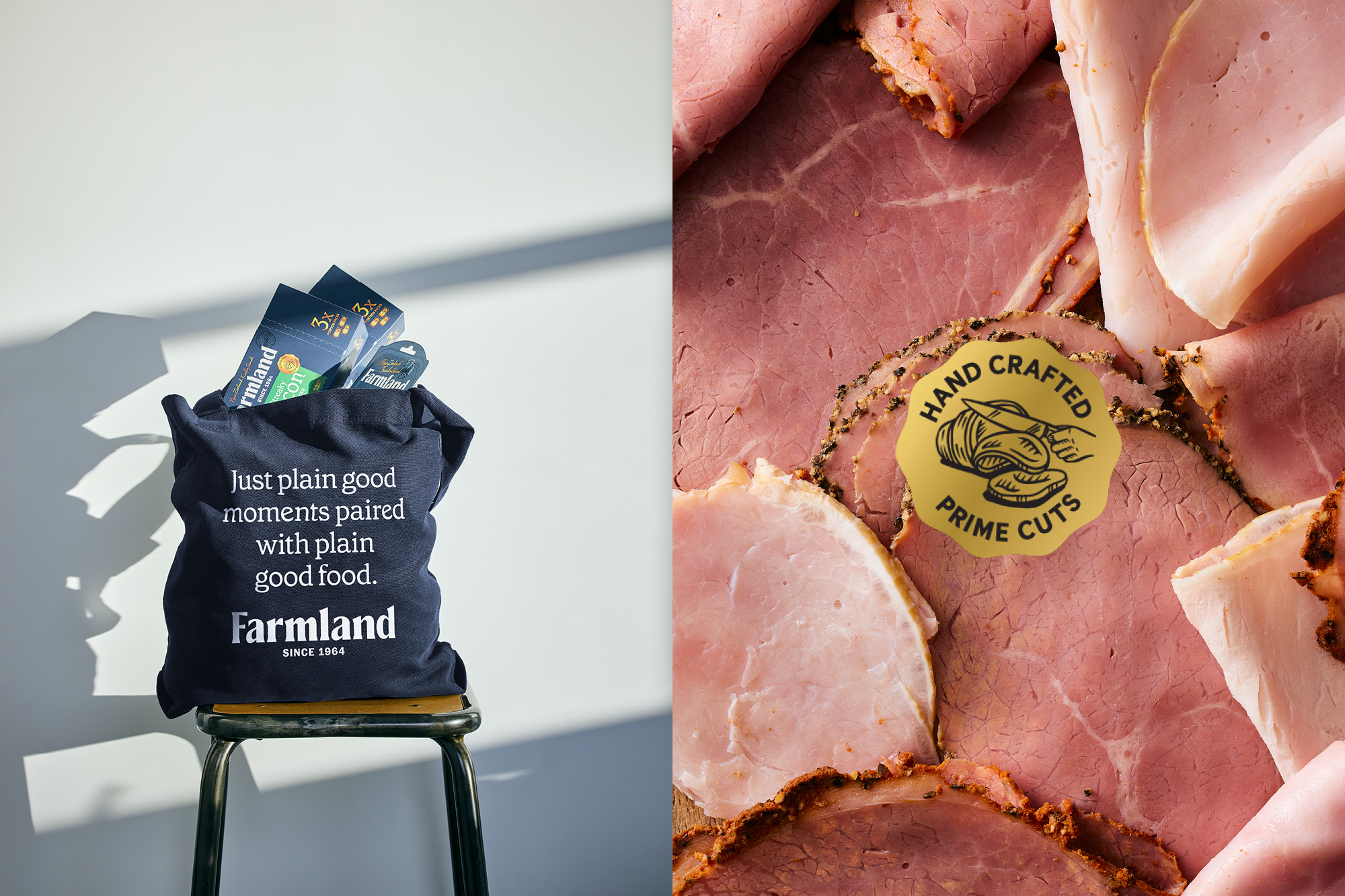
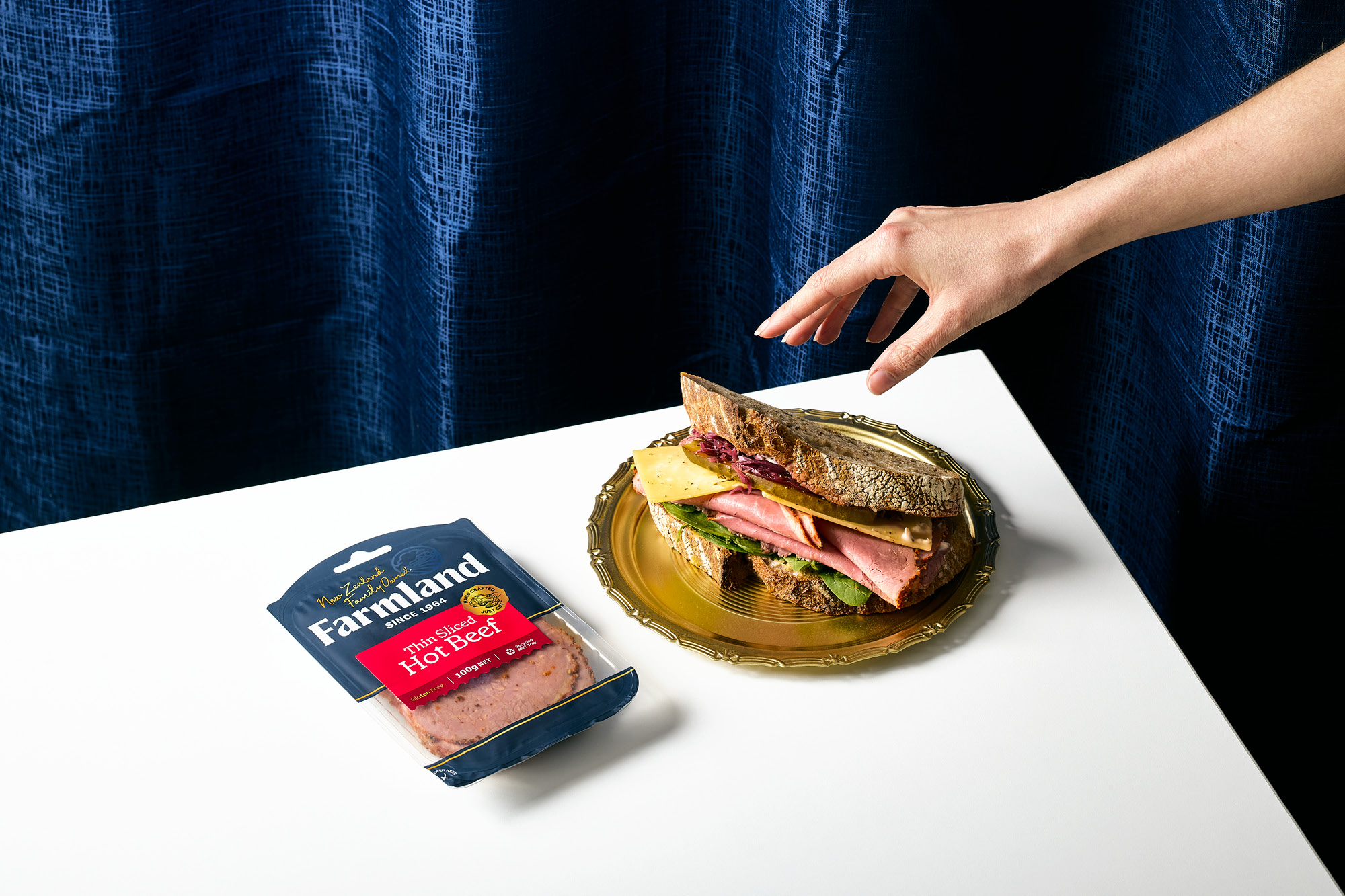
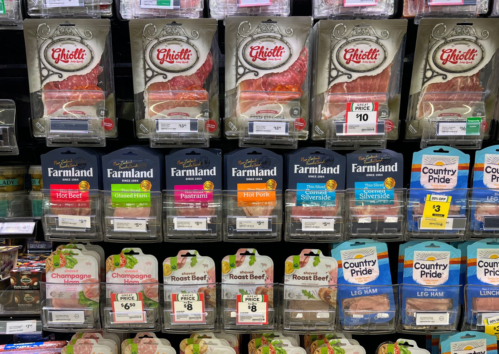
A new brand strategy was developed. Focusing on the family-based business, the brands’ new goal is to bring people together around the dinner table – delivering products that are ‘just plain good since 1964’. The new packaging design language illustrates this intention through New Zealand born humble simplicity and sheer pride in the products they make. Farmland’s range of products stretches from everyday meat slices, cuts fit for social cheese boards through to meats to feed the whole family. The fragmentation of these created a muddled brand presence, in some instances, the brand was so minimal it was hard to decipher from whom it came. Brand blocking was virtually non-existent against its price point competitors. A dramatic change was implemented across the entire product portfolio which took cues from the back catalogue of photography and images in the family businesses archive. A rich monotone navy blue, taken directly from the traditional butcher’s apron, was applied across the entire product portfolio – this created a unique and standout out brand block across all category areas when contrasted against competitors who used full-colour print. To further enhance the impact of this colour, no food photography was used which would hinder or distract from the colour blocking effect.
Across all ranges, brightly coloured stickers are used for easy product navigation and product information hierarchy. The contrast against the new brand blue creates strong colour pops on shelves. Various ranges cover different price points and occasions – these are denoted by careful use and placement of gold embellishments.
The final result is an expansive range of consumer-based small goods which owns a stand-out colour across various category sectors. Which in this instance is not easily achieved. It is a colour that has strong links to the family’s past heritage, adherence to traditional craft and honouring the product they have been handling since 1964.
CREDIT
- Agency/Creative: Onfire Design
- Article Title: New Zealand’s Farmland Foods Rebrand
- Organisation/Entity: Agency
- Project Type: Packaging
- Project Status: Published
- Agency/Creative Country: New Zealand
- Agency/Creative City: Onfire Design / Auckland
- Market Region: Oceania
- Project Deliverables: Brand Design, Brand Mark, Brand Redesign, Brand Rejuvenation, Brand Strategy, Packaging Design, Rebranding, Typography
- Format: Blister-Pack
- Substrate: Plastic
- Industry: Food/Beverage
- Keywords: WBDS Agency Design Awards 2022/23
- Keywords: Artisan, Packaging, Rebrand, Colour, Blue, Typography, Meats
-
Credits:
Creative Director: Matt Grantham
Design: Matt Grantham
Design: Sam Allan
Account Management: Jade Woods


