


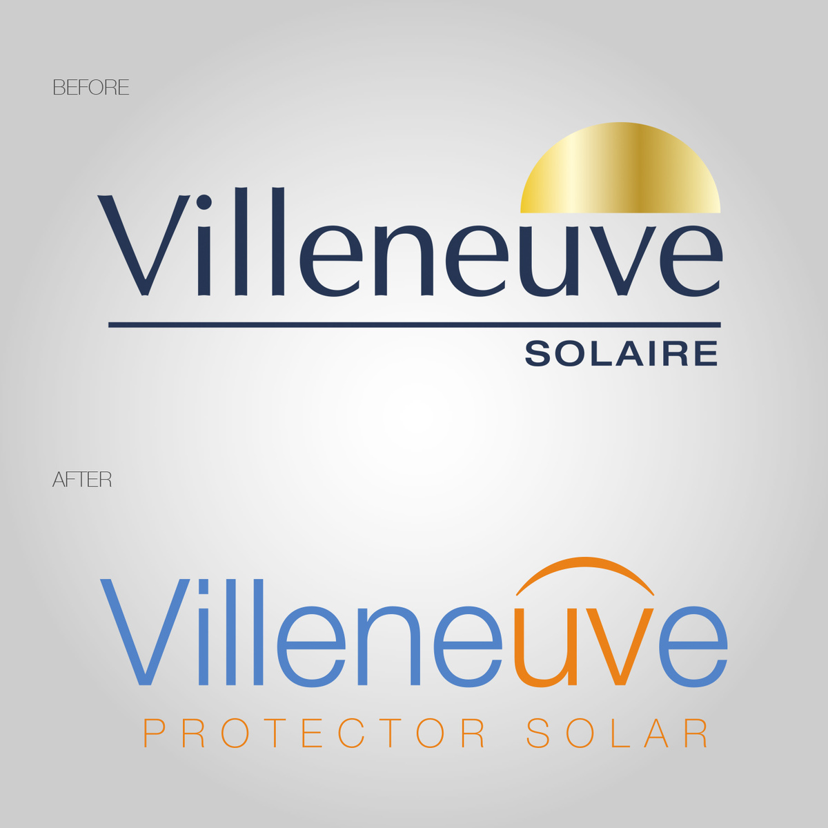
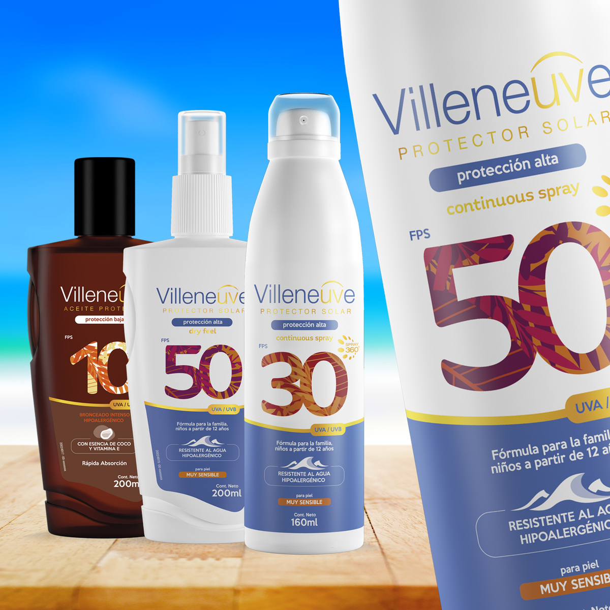
In order to be innovative and to be at the forefront of trends, the company decided to relaunch Villeneuve Suncare with an improved formula and new design.
The brand was designed with a light and more modern typography. A color difference is distinguished in the “UV” letters with a shield on top that connotes protection against UV rays.
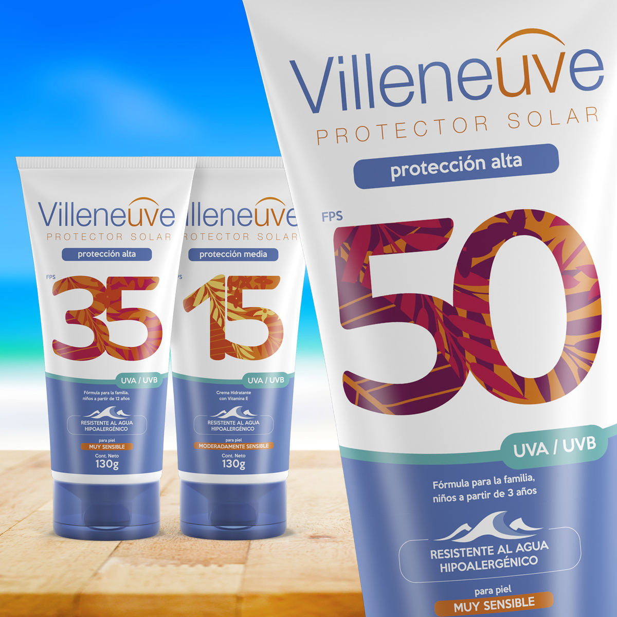
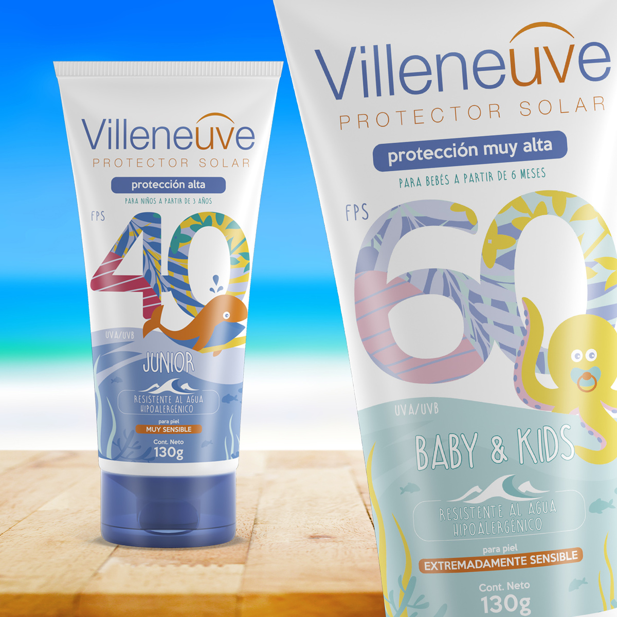
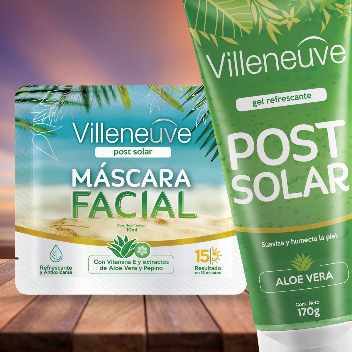
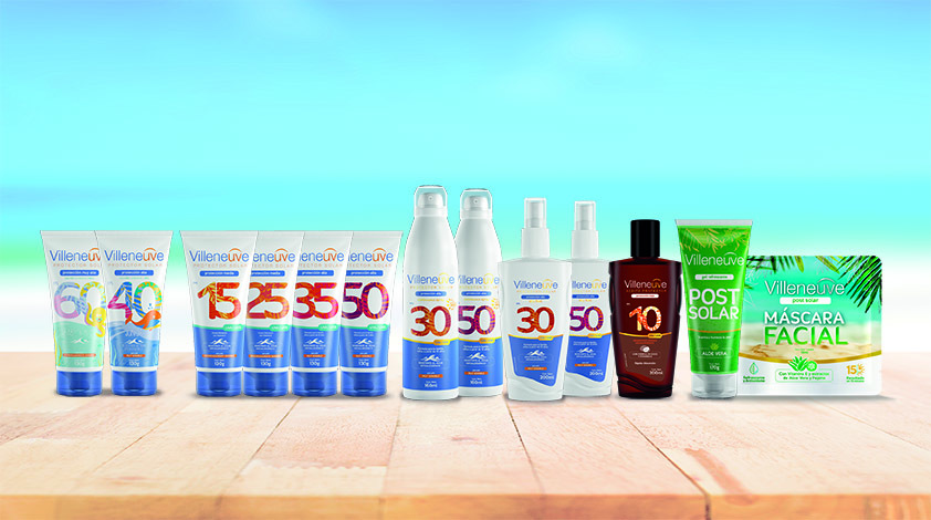
Regarding the packaging, a more organic, fun and informal design was thought for the the brand to generate a closer proximity to the consumer.
The focus was put mainly on the degree of protection with an exaggerated big body type and a mix of tropical flora in vibrant colors. Each protection has its own color combination palette.
CREDIT
- Agency/Creative: Godrej Argentina Design Team
- Article Title: New Villeneuve Sunscreen Packaging Design
- Organisation/Entity: In-house, Published Commercial Design
- Project Type: Packaging
- Agency/Creative Country: Argentina
- Market Region: South America
- Project Deliverables: Brand Architecture, Brand Identity, Brand Redesign, Brand Rejuvenation, Branding, Graphic Design, Identity System, Illustration, Packaging Design
- Format: Bottle, Can, Sachet, Tube
- Substrate: Plastic
FEEDBACK
Relevance: Solution/idea in relation to brand, product or service
Implementation: Attention, detailing and finishing of final solution
Presentation: Text, visualisation and quality of the presentation


