Afterhours Studio – Riise
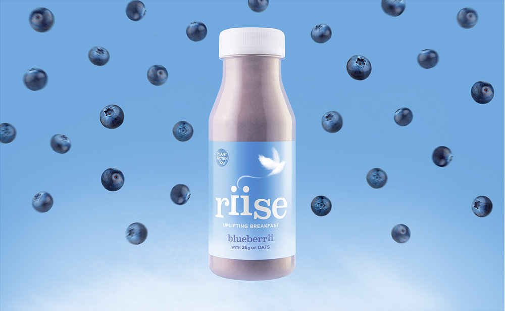
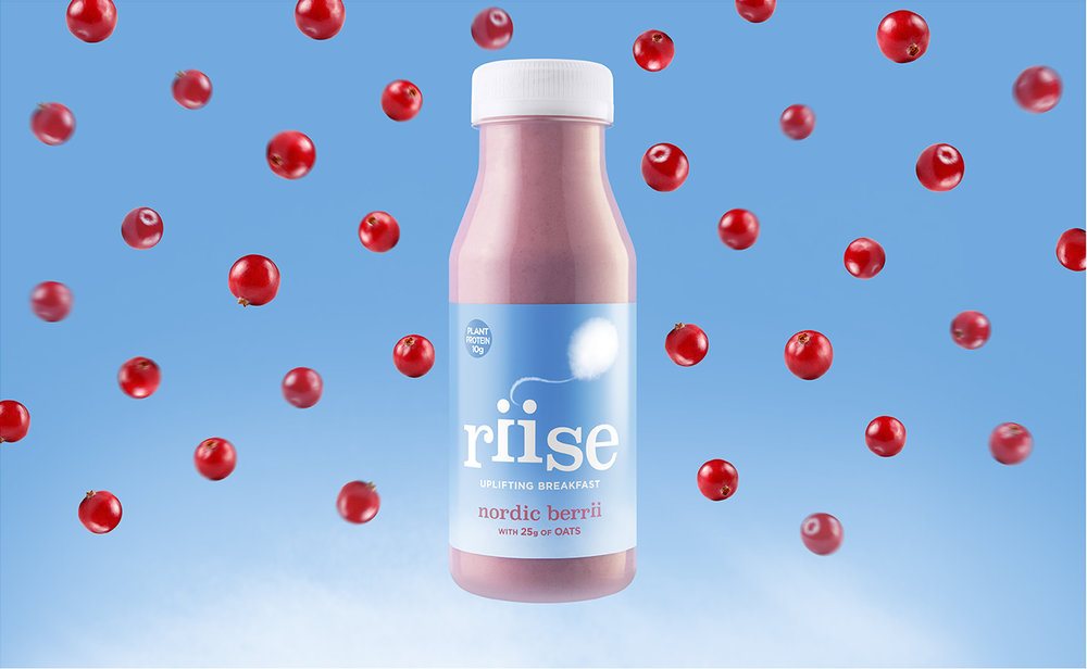
New brand identity and packaging for Riise, a range of all natural, fruit, oat and almond miilk breakfast drinks nutritionally balanced to deliver all the goodness required to uplift both body and mind at the start of each day.
The ID is closely connected to the new positioning we developed “Blue Sky Mornings” which seeks to capture not just the functional benefits of a healthy start but also brand’s higher purpose of promoting a positive mindset in the mornings too.
Waking up to a sunny, blue sky day creates a real feel-good factor in the morning, and the new identity sets out to reflect and leverage this truth…
Riise promises the same emotional lift whatever the weather, encouraging a more engaged, happy and purposeful start to each day, particularly for those of us who struggle in the mornings.
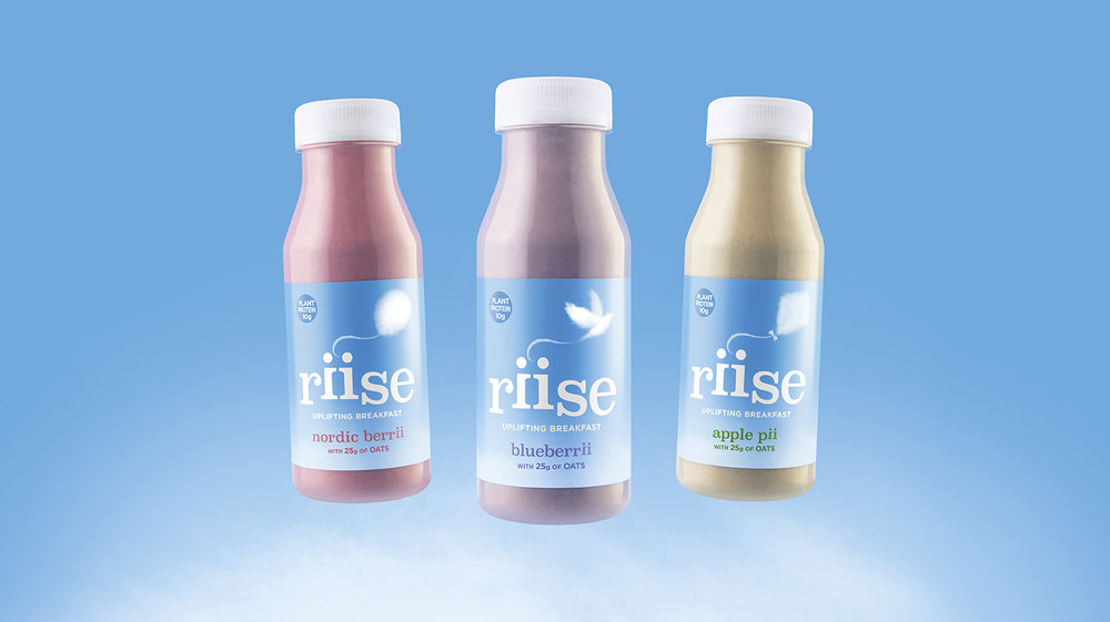
The new labels utilise this sky blue canvas to reflect the above and each variant carries a unique cloud illustration, the subject of each- a bird, a balloon and a kite – were chosen to evoke the uplifting feeling each breakfast recipe offers.
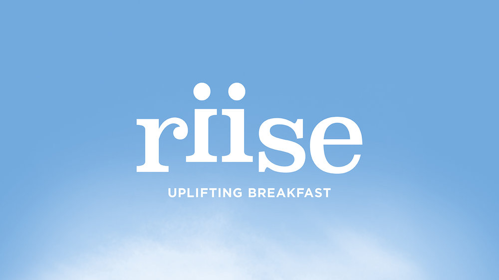
The Riise word mark creates further symbolism through the double ii spelling, the two reflected ii’s representing two people uplifted by the experience.
The treatment of the two type characters which are raised from the baseline is designed to visually reinforce the emotional and physical benefits of the product.
The two characters also reflect a core value of the brand which is that ‘We Riise by helping others’.


CREDIT
- Agency/Creative: Afterhours Studio
- Article Title: New Uplifting Breakfast Drinks Brand Launching in UK
- Organisation/Entity: Agency Commercial, Published
- Project Type: Packaging
- Agency/Creative Country: United Kingdom
- Market Region: Europe
- Format: Bottle
- Substrate: Plastic


