Drinks design specialist Denomination creates a brand and packaging identity for Quinta da Pedra Alta’s new white Port – Pedra No 3 – giving the classic beverage a 2020 makeover and making it relevant to today’s consumers.
For many years, Port has been seen as being all about tradition. Something to be consumed straight up on specific occasions only, and often by older generations. But white Port’s fortunes have been changing over the past few years, with new consumers increasingly seeing it as a delicious and lower-ABV alternative to gin and tonic. In fact, when Madonna announced to the world that white Port had been helping her get through her grueling Madame X tour, she shone a light on a growth in popularity of this classic, but often misunderstood, fortified wine.
This Portuguese vineyard wanted to capitalize on this renewed and developing consumer interest. Denomination’s challenge was to position Quinta da Pedra Alta Pedra No 3 as part of the modern consumer’s drinking repertoire. The results celebrate this classic beverage and the vineyard’s impressive history, while opening up the story to a new generation of Insta-savvy drinkers.
Old meets new
Quinta da Pedra Alta has a legacy that dates back to the late 18th century. Isabelle Caprano, who took over the estate ahead of the 2018 harvest, approached Denomination because she wanted to inject new energy into the brand with a fresh identity and bottle design to accompany the launch of its new white Port.
“Isabelle wanted to introduce her white Port to a new generation of drinkers,” says Rowena Curlewis, CEO, Denomination. “People are looking for exciting new drinks, but they still want them to have integrity, heritage and depth.
“Choosing Pedra No 3 needed to convey that, as a consumer, you have knowledge and good judgement, as well as a finger on the pulse of the latest drinks trends. So a major part of our strategy was to celebrate the estate’s history, while creating a modern drinking experience that conveyed a sense of ‘accessible luxury’.”
Bringing the past into the future
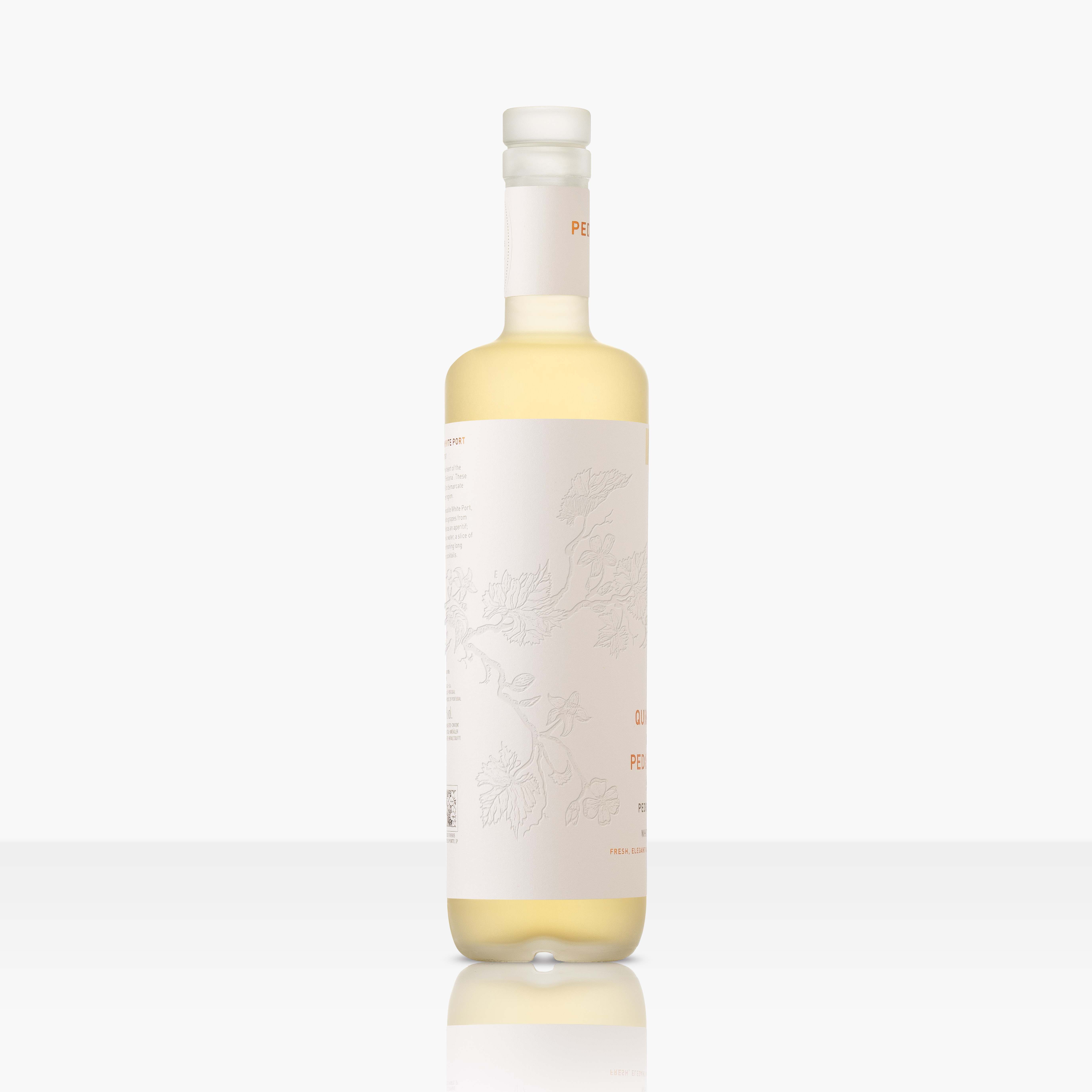
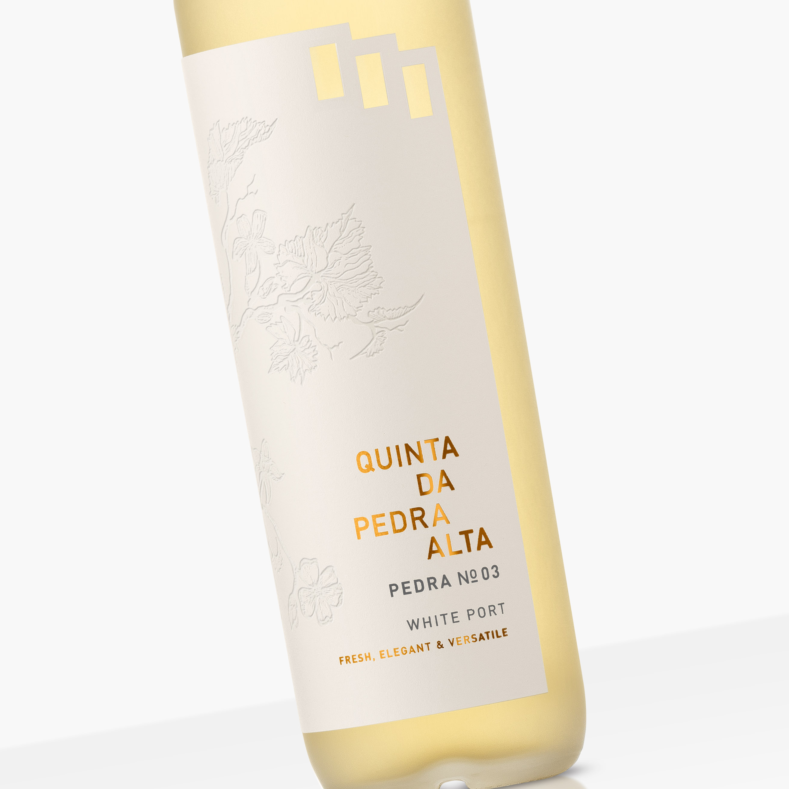
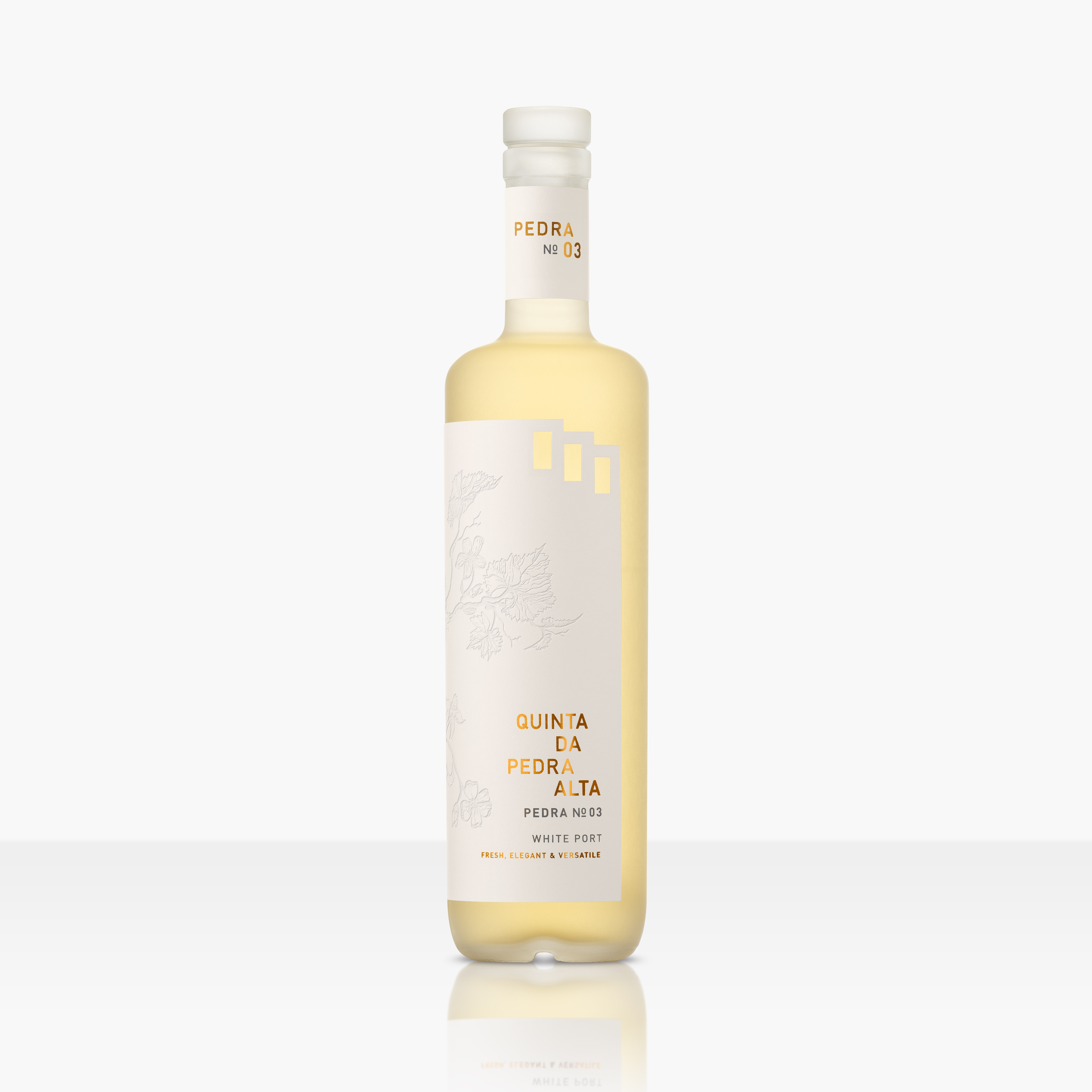
Quinta da Pedro Alta, which is located in the Douro Valley, is the only Quinta with three of the original granite markers – called ‘feitoria’ – that were put in place in the 18th century to demarcate the best Port-producing regions in Portugal. These appear as diecut graphic representations in the top right corner of the label, creating an iconic brand asset and a modern reference to the past.
An illustration of the botanicals typically found on the estate has been heavily embossed into the label using new technology, and can be fully appreciated when held up to the light. A heavy frosted glass bottle and copper foiled elements on the label and glass stopper all combine to deliver premium cues, both visually and in-hand.
Isabella Caprano, owner and director, Quinta da Pedra Alta, says: “We approached Denomination because the team has a strong track record in taking legacy drinks and making them work in a modern premium context. I love the interpretation of our three feitoria into a distinctive brand icon. I also love that they use the latest production and print innovations, coupled with a strong understanding of market trends, to get the best results possible.
“We now have a subtle, sophisticated product with just the right amount of iconicity for our target consumer. It’s innovative, beautiful and encourages people to think differently about Port.”
Quinta da Pedra Alta Pedra No 3 is being launched in the UK this month, and at the ProWein Trade Fair 2020 in March.

CREDIT
- Agency/Creative: Denomination
- Article Title: New Quinta Da Pedra Alta Pedra No 3 Leads the White Port Zeitgeist
- Organisation/Entity: Agency, Published Commercial Design
- Project Type: Packaging
- Agency/Creative Country: Australia
- Market Region: Oceania
- Project Deliverables: Brand Architecture, Brand Identity, Brand Naming, Brand Strategy, Branding, Packaging Design, Product Naming, Research, Structural Design
- Format: Bottle
- Substrate: Glass Bottle


