Cartils – Il Dottore GIn
“”Gin is currently the most competitive market in the alcoholic beverage industry. New gins are being launched almost every week. So, how can you succeed when there are so many fighting for attention? Be different! On every possible level. Not only in liquid or in design but also in story.
As a branding and design company specialised in alcoholic drinks it is surprising how rarely you get handed a blank canvas. So when this unicorn appears, we must ride it into the wind!
First Step: Come up with a brand story that ties together the liquid but also will connect with the consumer emotionally. This is so important for the success of a brand, as this emotional connection will drive loyalty, love and memory.
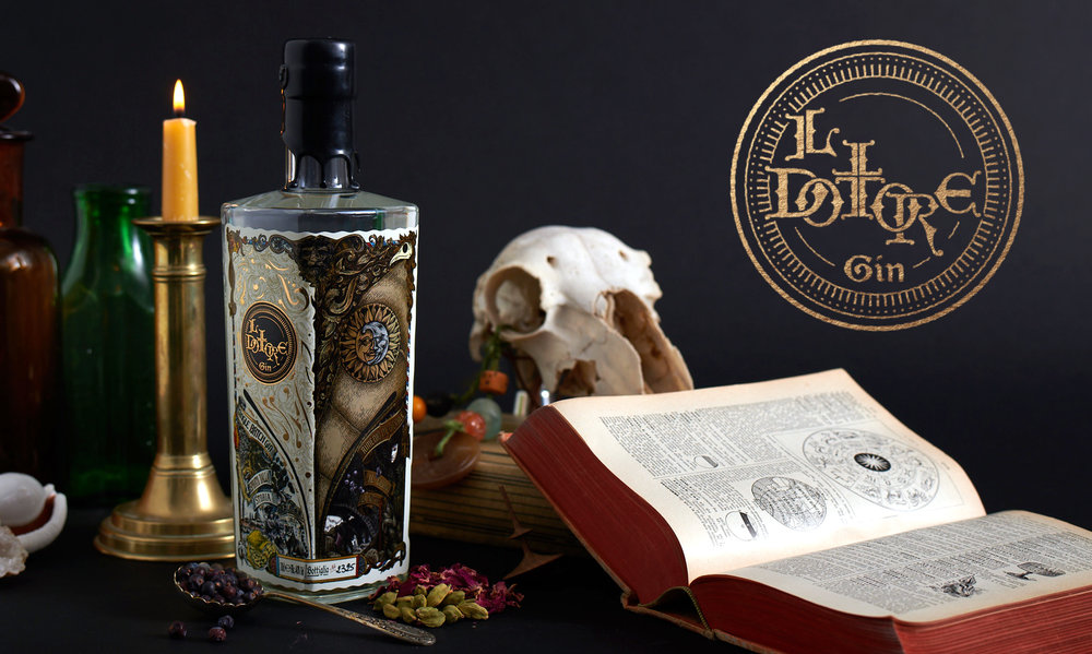
The gin came from Italy, not a place known for gin making… or was it? After plenty of digging in history it turns out that over a 1000 years ago people in Italy made juniper distillates for medicine. After much further reading we grew attracted to the notion of doctors around that time. They were shunned people, or cast off monks, yet still pursued their passion of helping people despite getting shunned. During the plague doctors were often synonymous with death. What really sparked interest was that during this time the notorious plague doctor beak mask was stuffed with juniper to protect them from the plague. This was a great foundation for our brand, the finishing touch, of course in the very contrast with the Venetian ball extravagance, also celebrating the doctors mask. The old and the new, the medicine and the party, the dark and the light. It is precisely these contrasts that make this such an enticing story that consistently inspires us.
Step Two: Make a design that stands out from the rest. With so many gins in the world this was just as much a challenge, because what is the point of telling such a cool story if no one will hear it.
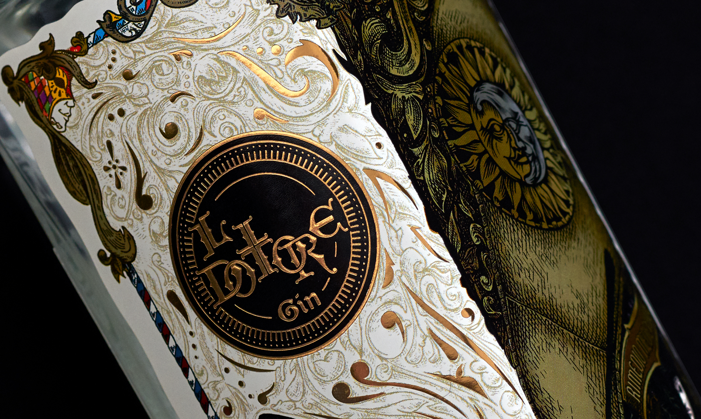
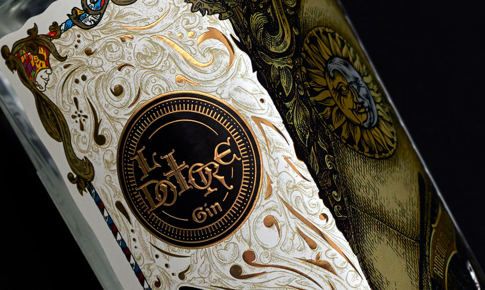
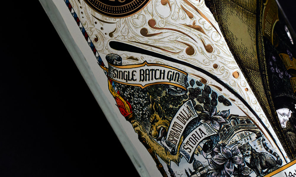
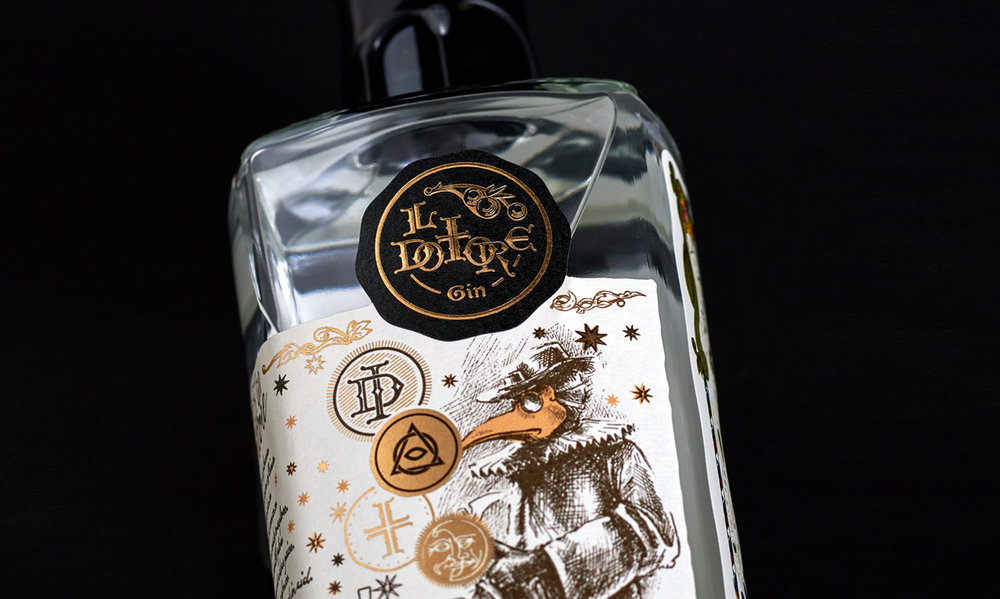
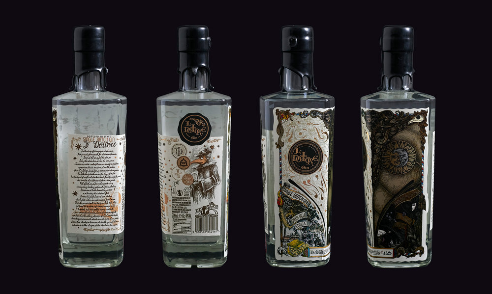
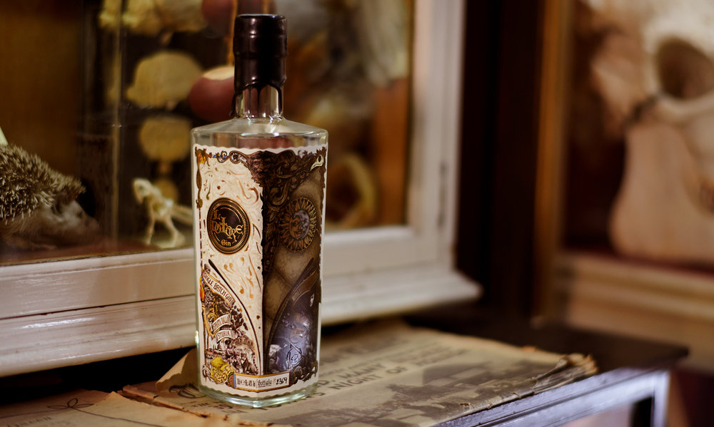
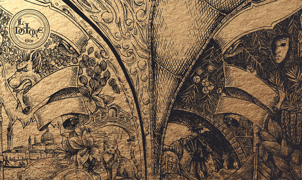
This is why we created a design that is both impactful but can also be looked at for hours. It needed to have an immediate attraction. This is created by the hand applied, over the edge look, and the connecting doctors masks. But then as you look closer, you might start to think; wait, is it one doctors mask staring at me? Or if the light catches the bottle notice the hidden illuminati symbol. Is the gondolier wearing a crown? Are all the gins botanicals hidden somewhere in the illustration? Is the back text actually a poem? And suddenly you find yourself on a design with so many layers and symbols that it creates more questions than it answers. This is why the design merges so well with the story, and why it captivated with the flair only something inspired by the going ons of one thousand years ago could. It draws you in just like it did to us.””
CREDIT
- Agency/Creative: Cartils
- Article Title: New Product Development of Small Batch Italian Gin
- Organisation/Entity: Agency Commercial / Published
- Project Type: Packaging
- Agency/Creative Country: United Kingdom
- Market Region: Europe
- Format: Bottle
- Substrate: Glass, Pulp Paper
- Industry: Food/Beverage


