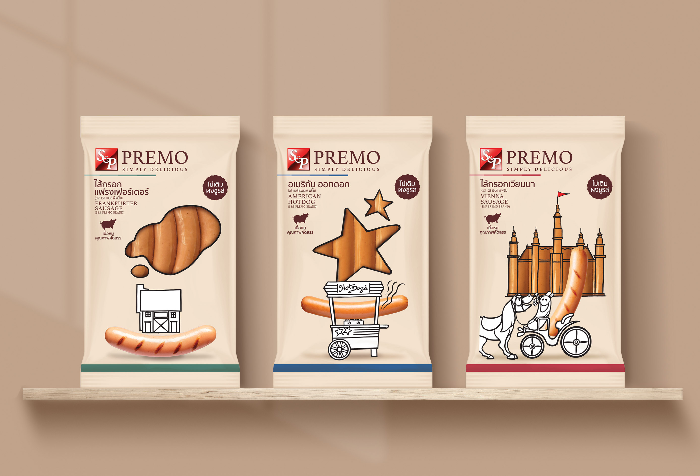
“Premo” is a brand that sells a variety of sausage products produced by S&P Syndicate Public Company Limited with the intention to produce good quality, clean and safe sausages for consumers.
S&P selects quality pork. No MSG is added. Some products use natural casing. It’s probably a few brands in the market that produce sausages made with 100% pork without any chicken added. That’s why the concept “Happy Sausage” comes from the sausage that has been meticulously made. Use quality raw materials so that consumers are happy to eat.
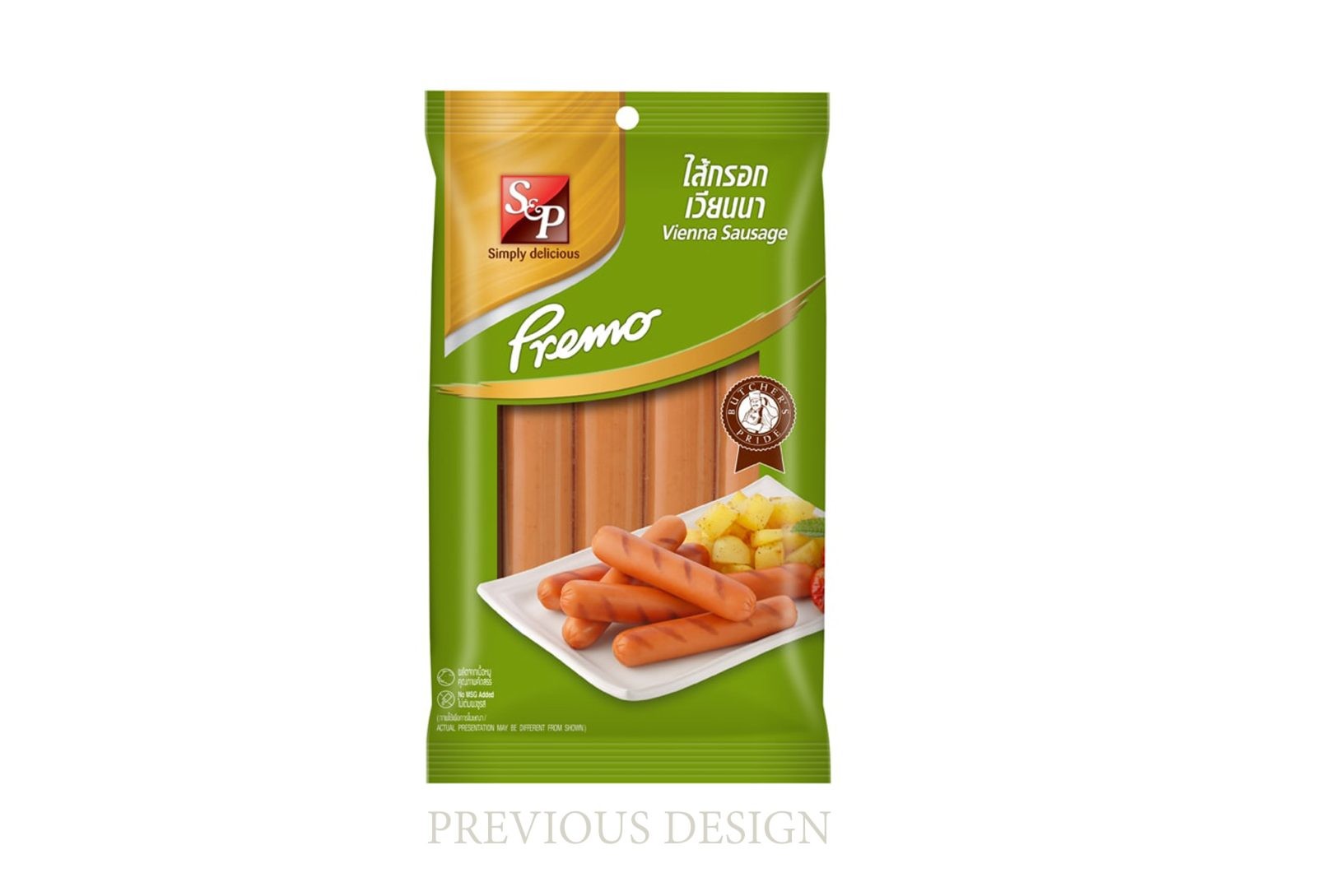
From the market share of sausages, which is more competitive every year. But the packaging design in all markets is still in the same direction. Including the original design of Premo as well, all brands use similar color schemes that are difficult to recognize.
From the concept “Happy Sausage”, we intend to change the design completely different from the competition. Both in color and design, based on the Happy approach as a strategy to make consumers happy since seeing the packaging, buying, and bringing quality sausages back to eat happily.
Sausages are a foreign food but when produced and using raw materials in Thailand, the design and color of the package were selected from the Thai natural color palette. The white background is not the usual white but uses an off-white, which is the color of handmade mulberry paper, which has a natural whiteness. Even the various color bands that are expected at the bottom of the sachet are meticulous in choosing colors that come from nature, Thai styles such as pandan green, indigo blue, betel nut red, purple shrimp paste, and coconut brown. These are the small details that are intended to add value to the design.
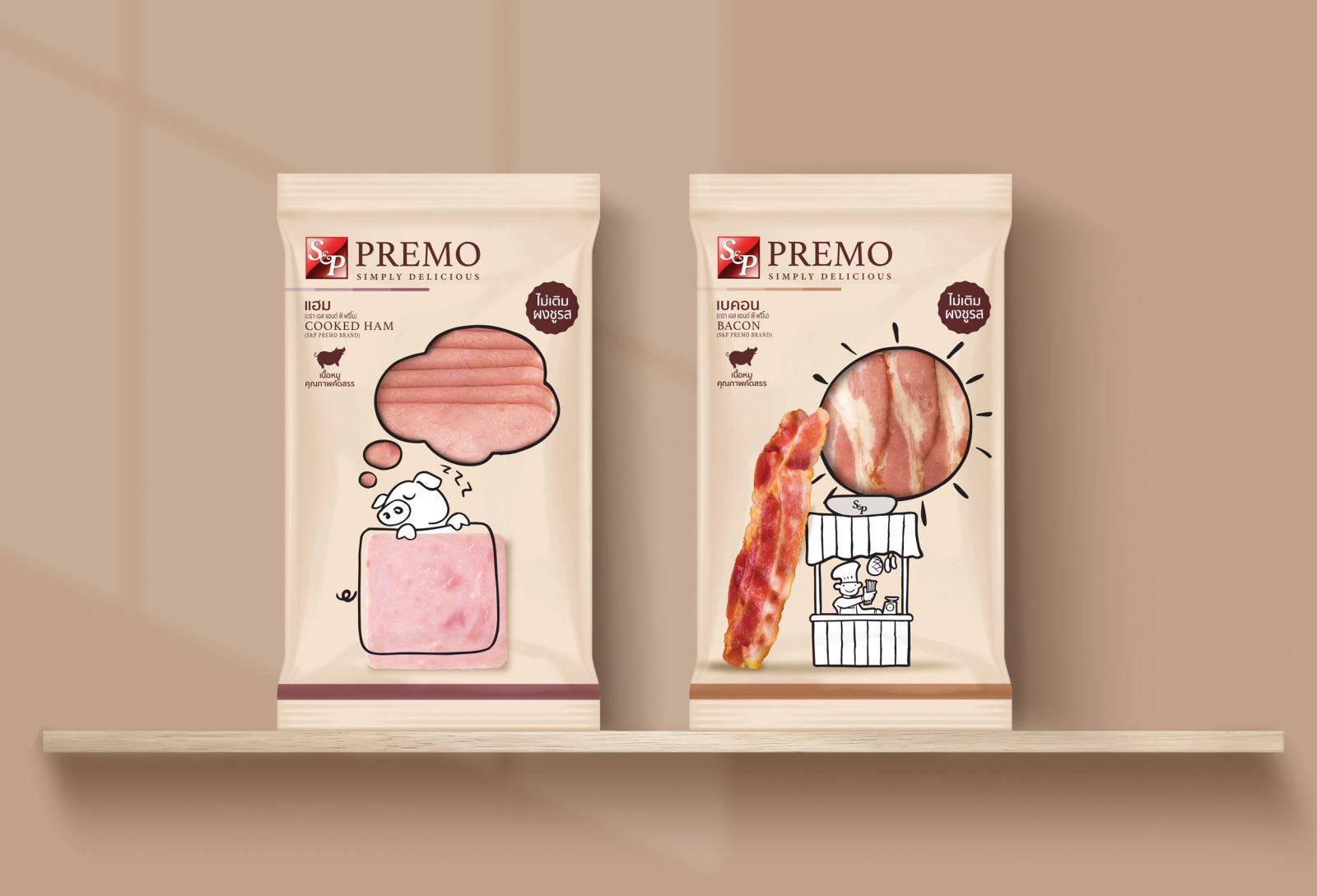
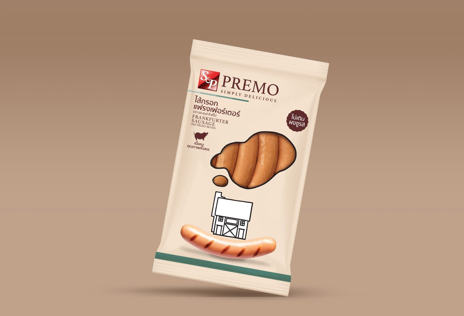
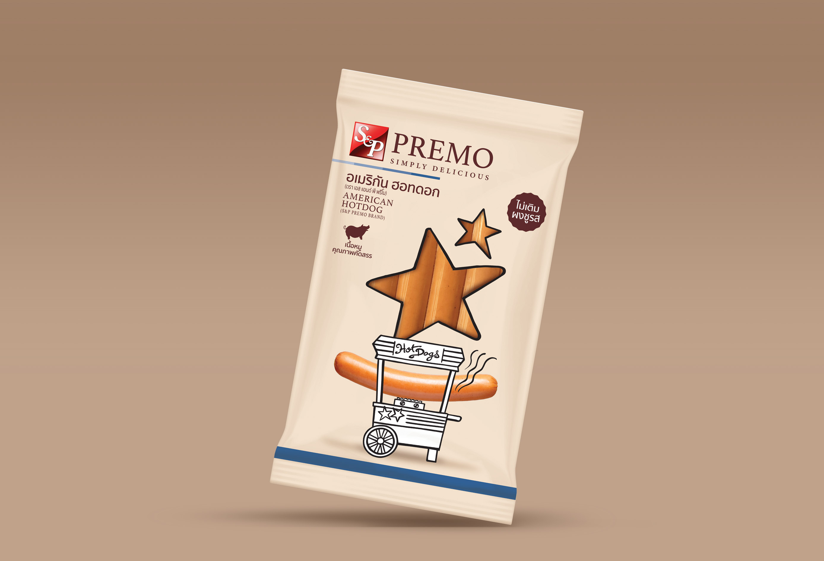
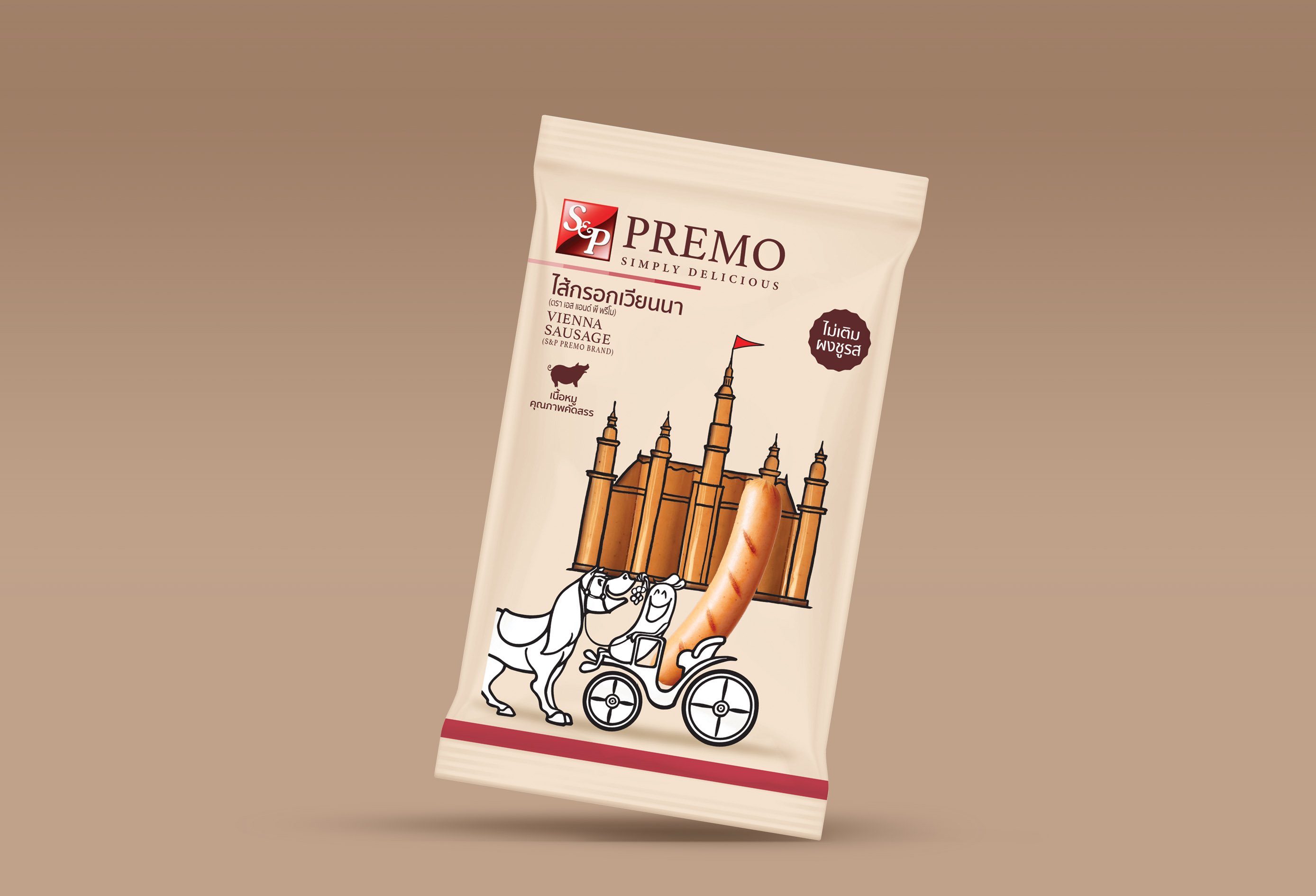
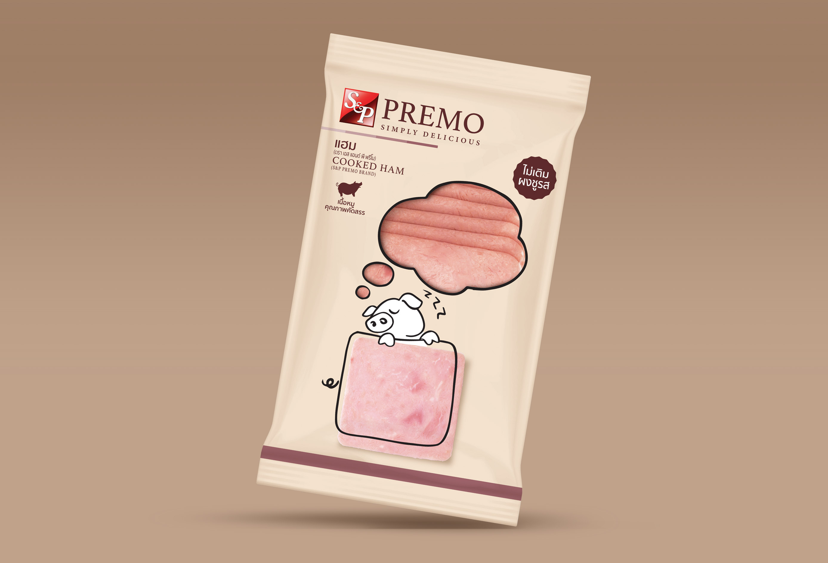
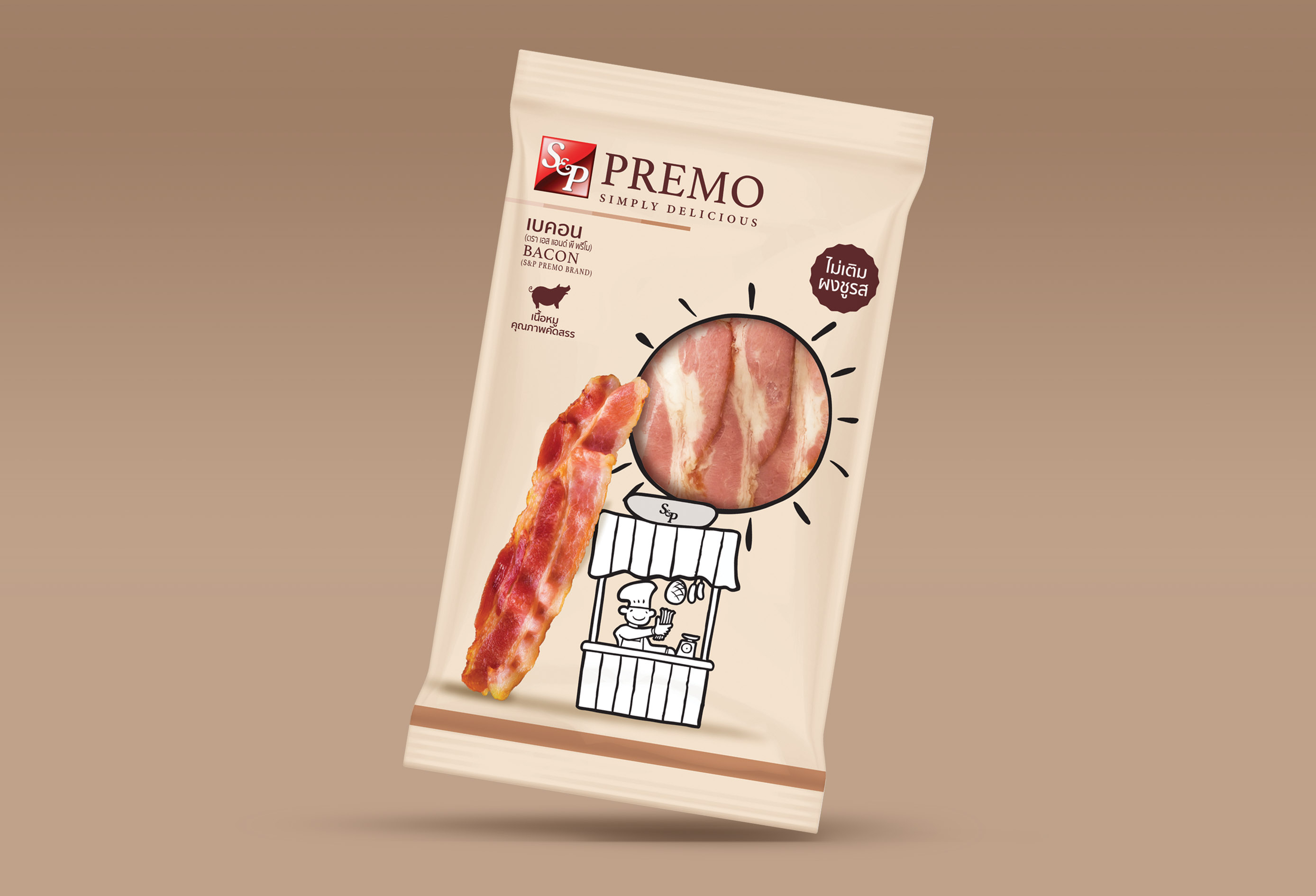
Because beauty is happiness. The concept of “Happy Sausage” intends to design a sausage sachet to be different from the usual format by using an off-white background. Designing the package of each flavor is like a drawing with a story and opt for creative images. Each flavor, accompanying pictures, and die cut windows describe the flavor.
For example, a frankfurter sausage using a German barn. At the chimney, smoke gushed out. The smoke will be die cut as the window to see the product inside. The package also has a picture of sausages that are strung together to form the same story as the key visual, where all points must be harmonized as one. So are the other flavors. The hot dog uses the image of a hot dog cart and stars representing the USA, the Vienna sausage uses the image of the Viennese palace and carriage, etc. From this design, I hope that there will be more interesting sausage packaging designs for sale in the market.
The brand “Premo” is the consumer’s choice to eat the sausages that are crafted. By selecting only pure quality pork, no MSG, no other meat additives, clean and hygienic with a chic and beautiful package. Just seeing the packaging makes customers happy, but when eating, They will be happier. This is where the design comes in.
CREDIT
- Agency/Creative: Dusadee Lamkijja , Chanwut Hothai
- Article Title: New Premo Sausage Packaging Design
- Organisation/Entity: Freelance, Creative
- Project Type: Packaging
- Project Status: Published
- Agency/Creative Country: Thailand
- Agency/Creative City: Bangkok , Pai
- Market Region: Asia
- Project Deliverables: Brand Strategy, Packaging Design
- Format: Bag, Sleeve
- Substrate: Plastic
- Keywords: WBDS Creative Design Awards 2022/23
-
Credits:
Designer : Dusadee Lamkijja
Co-Designer: Chanwut Hothai
Illustrator: Chanwut Hothai
Photographer: Somchai Kongpaisal


