Krasnobor is one of the largest meat producers in Russia. The company asked us to develop a packaging design for a new brand of natural dumplings and sausages in connection with the expansion of their assortment line and attraction of their audience.
Product
Turkey is a dietary and healthy meat. It is often recommended by doctors and nutritionists and you can even serve it to babies. The main benefits include minimum calories, a high source of protein and energy.
Krasnobor’s healthy product line is phosphate-free. In order to retain moisture, the raw materials are ripened before the meat is ground. Almost no one else uses such a process due to its duration. The composition does not contain stabilisers, food colouring and flavour enhancers, which is why the products have a short shelf life and a natural grey colour.
Consumers
Our consumers are people who are not indifferent to what they eat and how food affects their physical health. They seek to diversify their weekly menu and make it healthier. Our consumers always read labels, pay attention to the compositions and try to choose something both healthful and tasty.
Our consumers lead a hectic life. They rarely spend their weekends sitting at home. In a nutshell, they often go out and stroll in parks or squares. They basically live life to the fullest.
Design
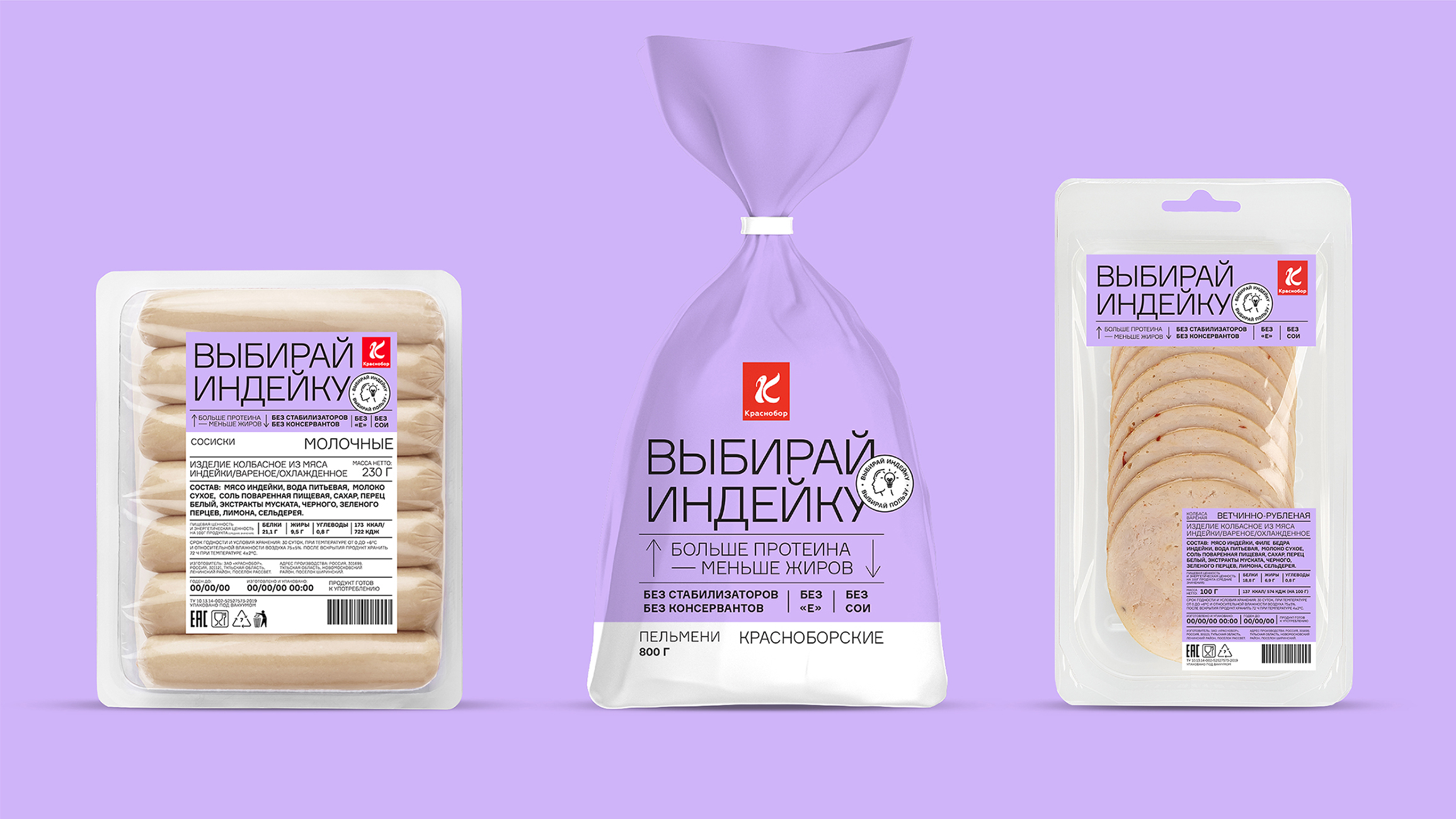
Sausages and dumplings are not perceived as healthy products. Therefore, entering the market with such a positioning is practically revolutionary. Our design reflects the idea of revolutionising the market of traditional products, while announcing to the consumers the new tastes and benefits of the products.
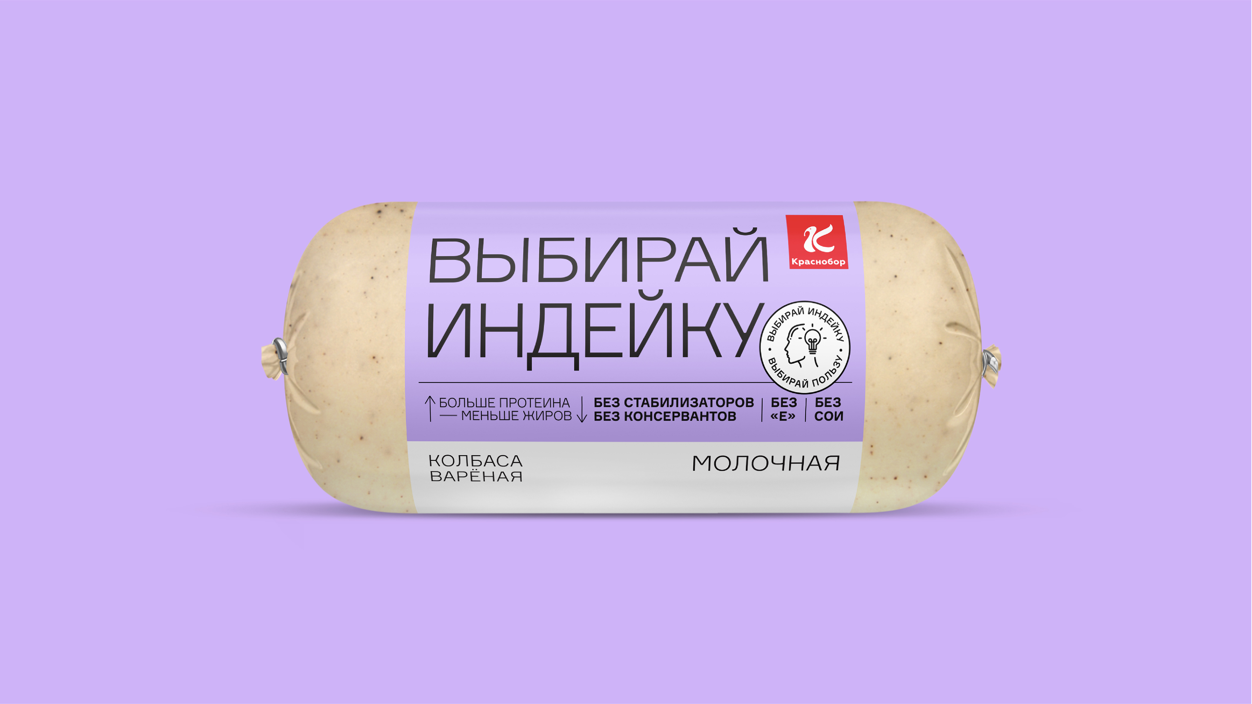
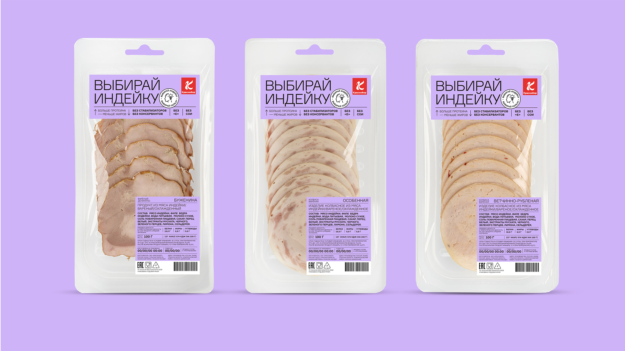
In order to do so, we developed an absolutely non-classical solution for the industry by breaking down the canons and principles. The design makes the product stand out on the shelf due to the absence of a food zone and any other graphic images. The typography, which is the main focus of the packaging design, tells the consumers about the benefits as well as the composition.
The large-scale slogan “Choose Turkey” also differentiates the product on the shelf. Such a solution really breaks down the classical composition of packages. On the other hand, the slogan almost “speaks” a revolution and attracts consumers’ attention.
Further information about the product can be found in blocks in order to read it easily.
Communication
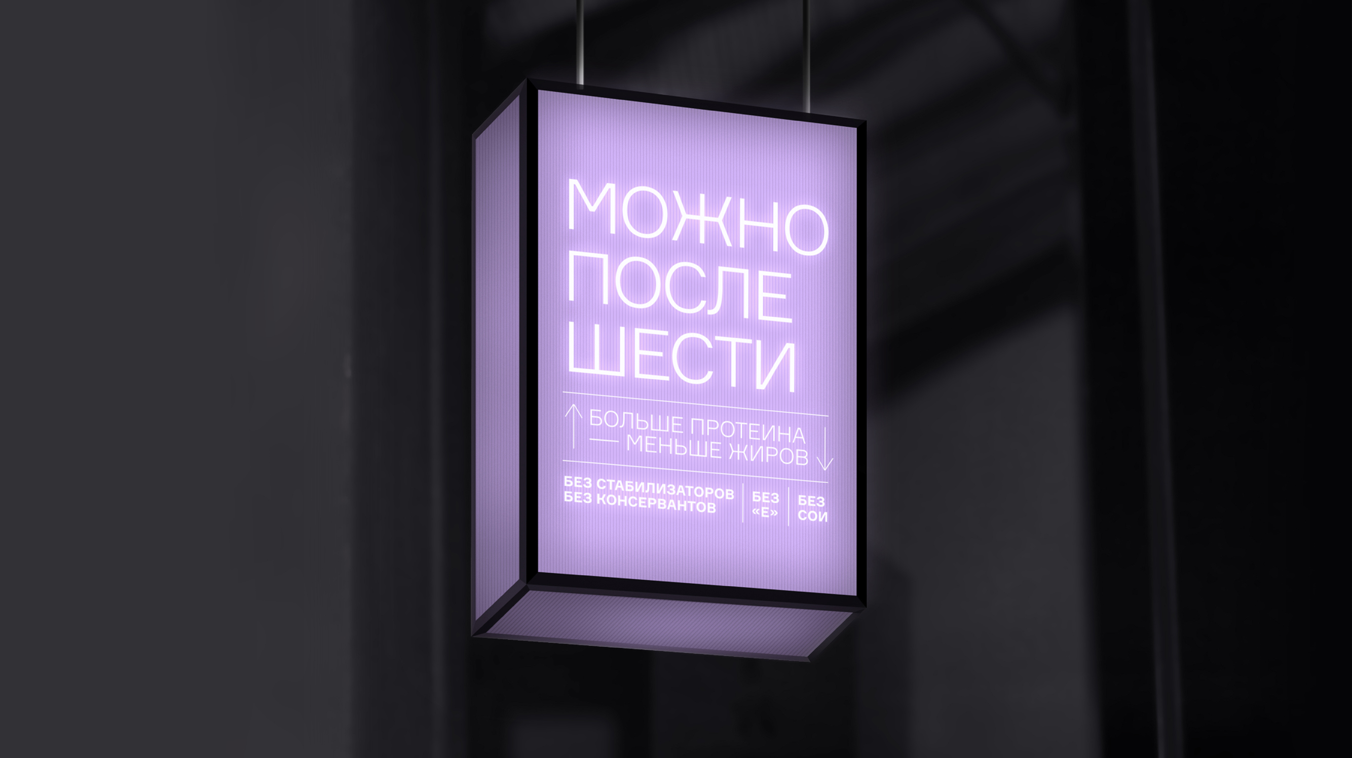
The consumers value the honesty of manufacturers. They speak openly about their desires and ask to be heard. Their comments are similar to the slogans: “I want to eat after 6pm”, “food should be healthy” and so on. That is why, the brand responds to the needs of the audience through its communication vector. The company speaks openly about the benefits of its products, the compositions and ingredients, urging consumers to have some turkey.
Results
Created a provocative packaging that attracts consumers’ attention. Transferred USP about the benefits and naturalness of the product through the design and stood out from competitors due to non-standard design solutions

CREDIT
- Agency/Creative: Ferma Branding Agency
- Article Title: New Packaging Design for Krasnobor by Ferma Branding
- Organisation/Entity: Agency
- Project Type: Identity
- Project Status: Published
- Agency/Creative Country: Russia
- Agency/Creative City: Saint Petersburg
- Market Region: Europe
- Project Deliverables: Packaging Design
- Industry: Food/Beverage
- Keywords: meat, sausages, turkey, healthy, dumplings
-
Credits:
Photographer: Ferma Branding


